Cassette Brand Identity and Sensory Branding
Romal Mann
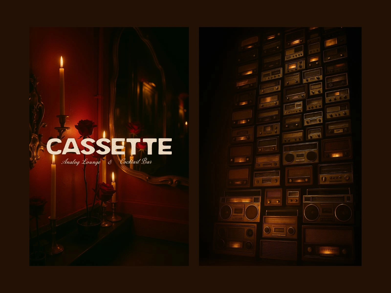
Cassette — Analog Cocktail Bar & Lounge Identity
Brand Strategy | Visual Identity | Sensory Branding | Content & Art Direction
Cassette is a slow-living sound lounge and nostalgic cocktail bar based in Toronto, designed to bring back the romance of analog sound, dimly lit interiors, and meaningful conversation. Rooted in 60s–80s listening culture, Cassette offers a cinematic escape where time slows, music crackles, and memory becomes mood.
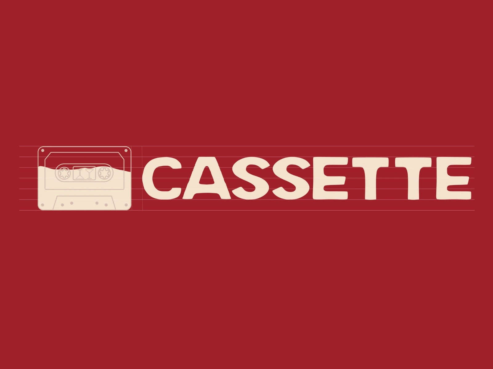
Logo Design - BTS
The Challenge
In an age of digital overstimulation and fast hospitality trends, Cassette sought to do the opposite — to create stillness.
The challenge was to design a brand that:
Visually captured the texture, warmth, and imperfection of analog sound.
Balanced nostalgia with refined modern design.
Extended its sensory concept across interiors, menus, digital presence, and events.
Invited guests to not just visit, but feel — through visual tone, voice, and experience.
Cassette needed to embody “the art of slowing down” in every detail — a cinematic refuge from the city’s noise.
Strategy — “Mood Over Volume”
The strategic idea, “Mood Over Volume,” became the foundation for the brand.
Rather than shouting for attention, Cassette whispers stories through atmosphere and tone.
I positioned Cassette as a sensory world built on emotion-first storytelling — where visuals, lighting, sound, and design merge into a living experience.
Defined brand archetype: The Creator meets The Sage — expressive, reflective, timeless.
Established narrative tone: poetic, cinematic, and quietly confident.
Set the brand’s North Star Message: “It’s not about how loud the night is — it’s how deep it feels.”
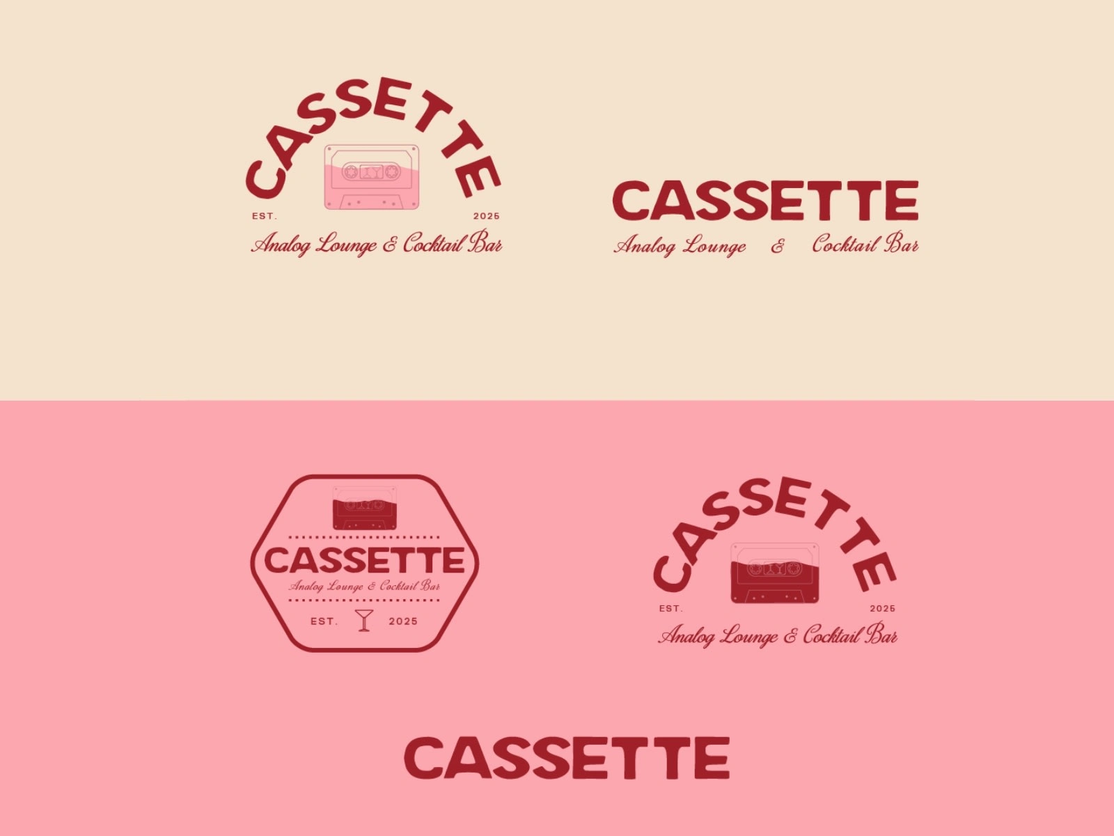
Visual Identity Design
Cassette’s identity system blends retro tactility with modern structure — designed to feel timeless, like film grain frozen in motion.
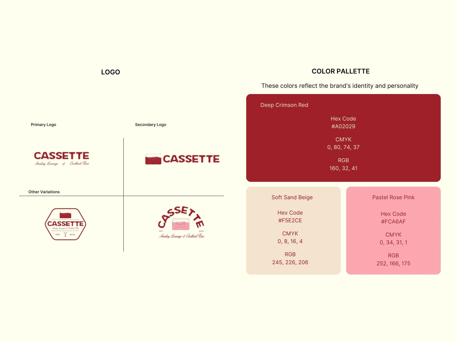
Logo System:
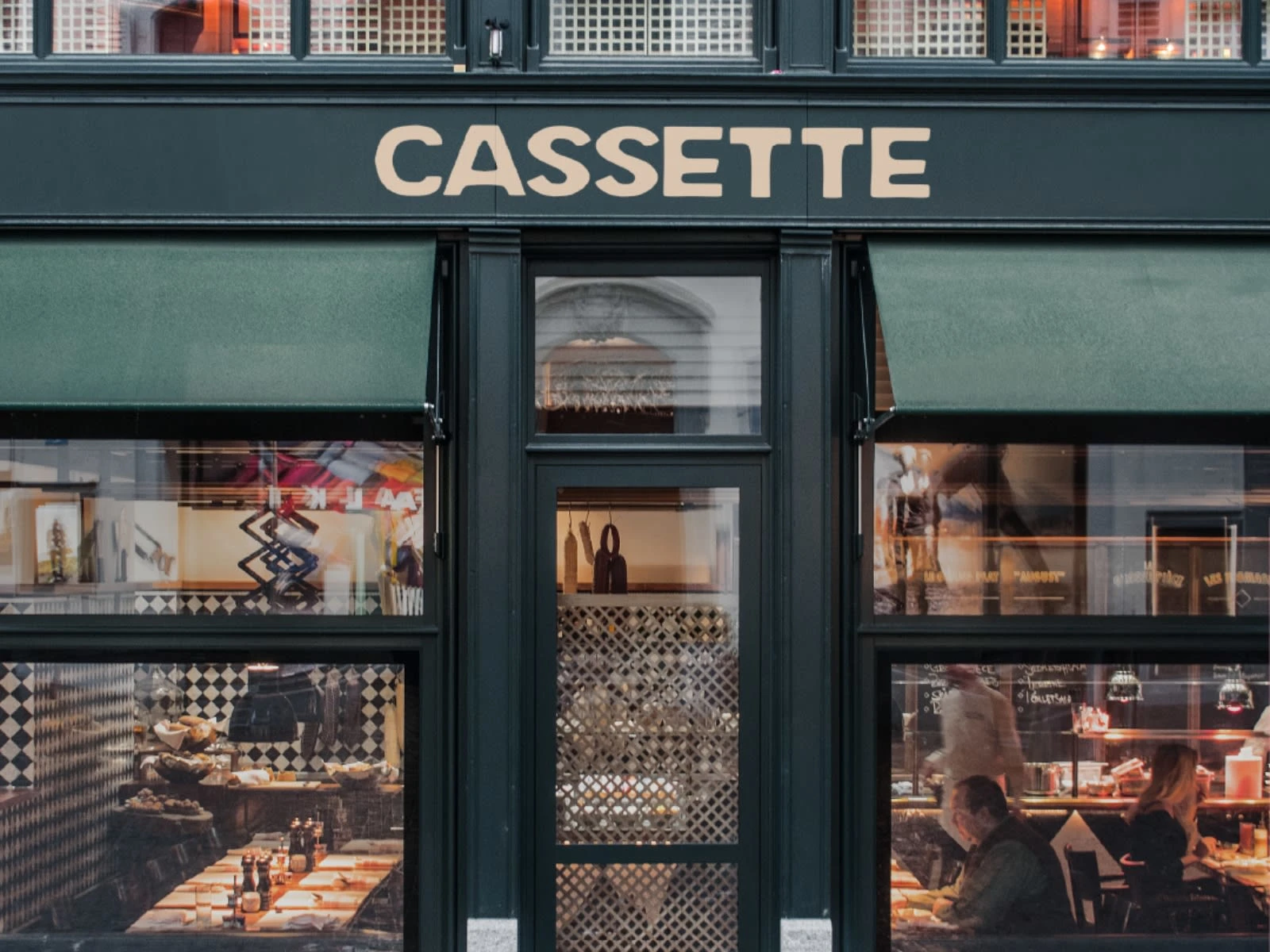
Inspired by cassette tape geometry and mid-century signage. Created variations for horizontal, stacked, and emblem use — allowing flexibility across print, signage, and social formats.
Typography:
A curated blend of bold retro sans and expressive cursive serif — evoking vinyl covers, 70s film titles, and handwritten tracklists.
Color Palette:
Maple Red — warmth of analog light.
Dusty Cream — aged paper and candle flame.
Blush Rose — nostalgia in a glass.
Charcoal Brown — dim interiors and bar shadows.
Texture & Detail:
Grain overlays, halftone shading, and subtle film imperfections were introduced to simulate analog tactility.
Content & Art Direction
Creative Process
Concept Development & Moodboarding
Researched listening lounges and 60s–80s bar design.
Built visual moodboards of analog tech, candlelit lounges, and tactile surfaces.
Defined tone words: Nostalgic, Cinematic, Intimate, Slow.
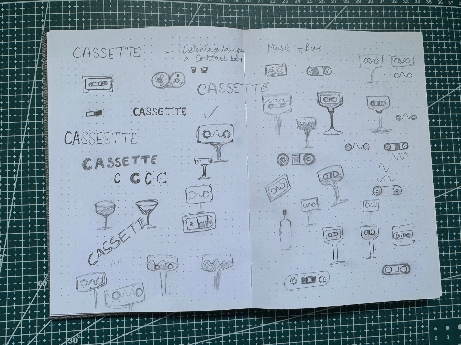
Sketching & Logo Exploration
Explored tape motifs, drink silhouettes, and waveform-based letterforms.
Iterated hand-drawn sketches (see image) merging cassette tape shapes with bar glass forms — creating a visual dialogue between music and mixology.
Design Refinement & System Building
Digitized and balanced proportions for legibility and memorability.
Built structured grid alignment for typography and spacing.
Created adaptable versions for signage, menus, and merchandise.
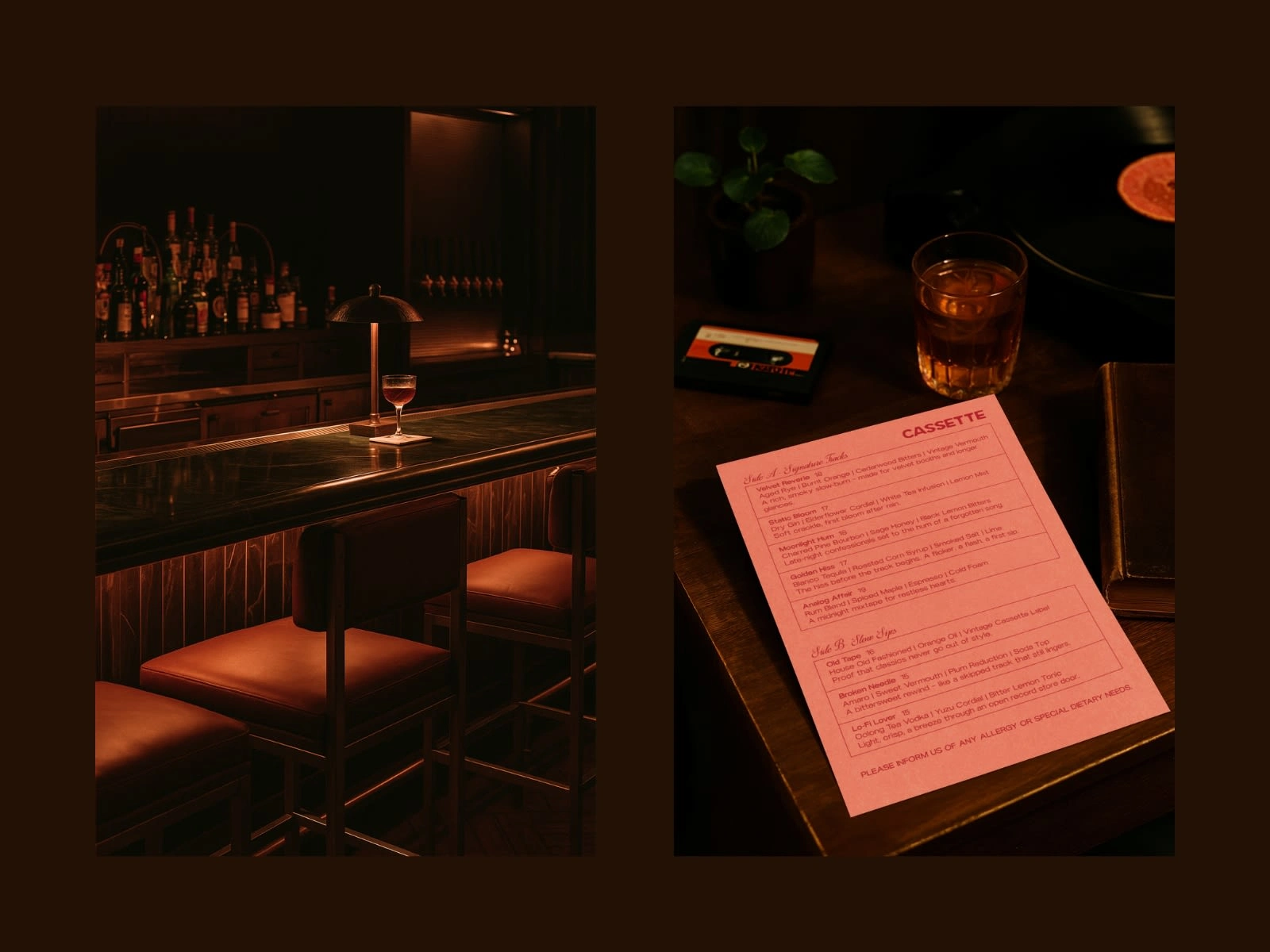
Menu & Print Collaterals
Crafted poetic menu titles (“Velvet Reverie,” “Broken Needle,” “Lo-Fi Lover”) — each line written as a micro-story.
Designed pink and red menu cards with tactile paper finish and side A/side B tracklisting — echoing cassette culture.
Content & Art Direction
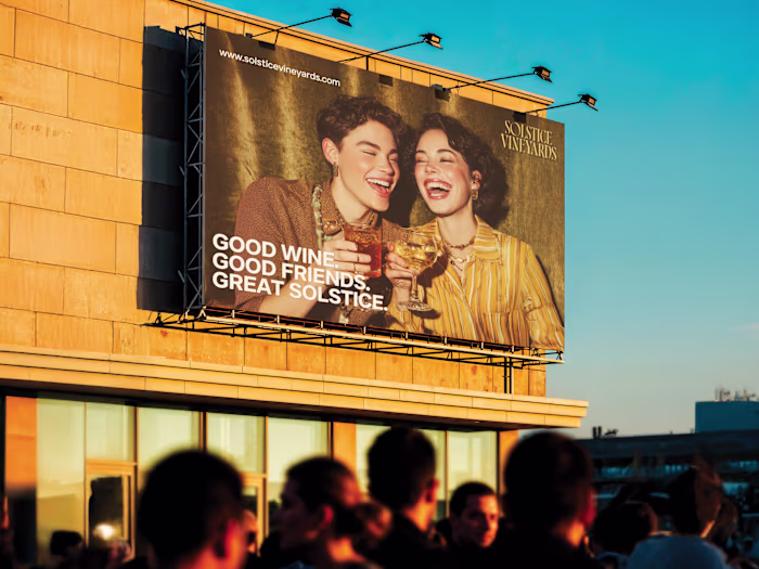
Directed AI-driven visuals replicating analog film tone — warm lighting, motion blur, cinematic intimacy.
Styled interior scenes to feel like frames from a film you wish you lived in.
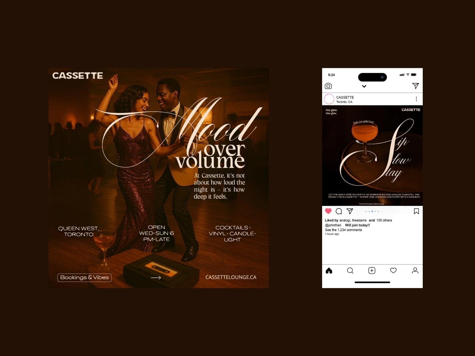
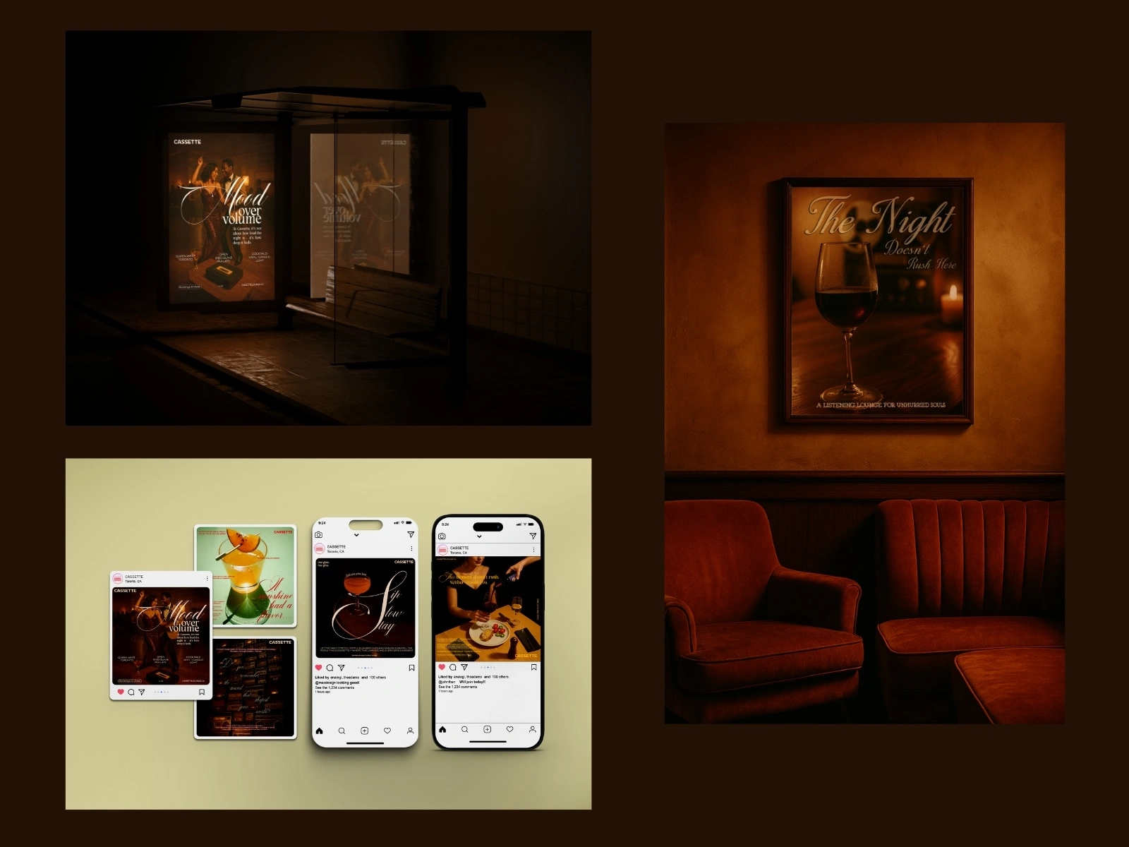
Designed campaign posters (“Mood Over Volume”, “Sip Slow, Stay”) and digital teasers blending retro typography with storytelling copy.
Digital & Social Experience
Built a cohesive online presence where each post, reel, and photo felt part of the same slow-living rhythm.
Used rich gradients and serif-led typography to sustain emotional tone across media.
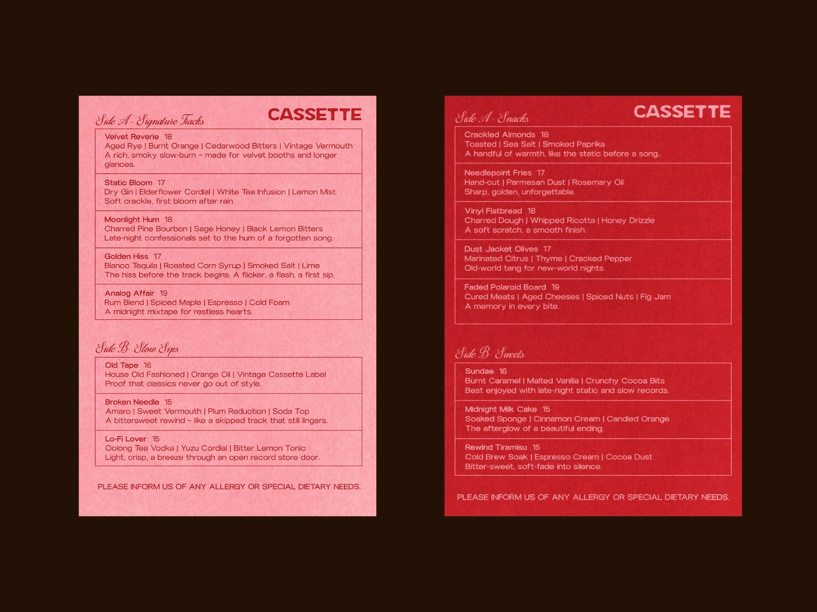
Menu Design
Sensory Storytelling & Campaign Design
Cassette’s storytelling blurs the line between branding and film direction.
Tone: Slow. Warm. Lyrical.
Each element — from lighting to copy — was designed to evoke feeling before form.
Hero Line: “Mood Over Volume.”
This campaign defined Cassette’s presence both on Instagram and in physical marketing.
Every post became a short poem in visual form:
“Sip slow. Stay awhile.”
“If sunshine had a flavor, it would sound like this.”
Social Media & Campaign
Art Direction
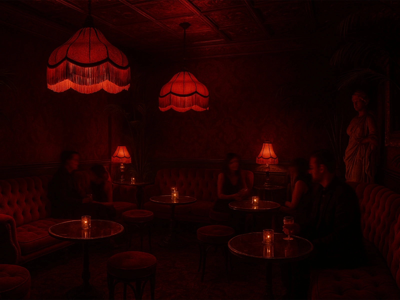
Every frame is designed as an invitation to pause.
Interior scenes bathed in red light and shadow, inspired by jazz-era lounges.
Compositional focus on textures — leather, glass, flame, and vinyl.
Use of analog imperfections (grain, vignette, motion blur) to create emotional realism.
The entire visual ecosystem feels cinematic — you can almost hear the soft static.
Implementation & Consistency
Delivered a cohesive, scalable design system:
Full brand toolkit (logos, color guide, textures, and typography system).
Menu and print design files are ready for production.
Social media campaign assets and templates.
Art direction guide for photography and AI-generated visuals.
Every medium — print, digital, and environmental — communicates the same sensory language.
Impact
Distinctive Positioning: Cassette stands apart as an emotional experience brand in Toronto’s hospitality scene.
Memorable Storytelling: The poetic tone and analog design evoke nostalgia, creating deep guest recall.
Cohesive Identity: The system bridges interior ambiance and digital storytelling seamlessly.
Scalable Brand World: Cassette now owns a timeless visual identity adaptable across future product lines, merchandise, and events.
Like this project
Posted Nov 5, 2025
Developed Cassette's brand identity, focusing on analog nostalgia and modern design.
Likes
2
Views
6
Clients
Cassette