Eira Skincare Brand Identity and Packaging Design
Romal Mann
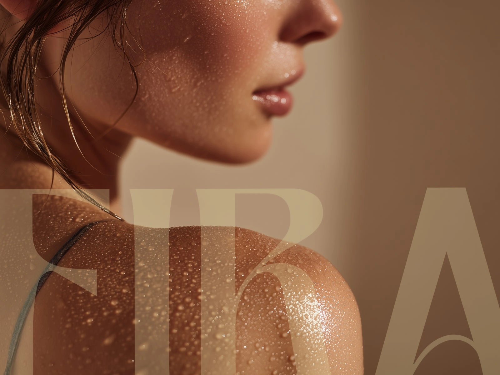
Eira Skincare — Nordic Calm for Modern Skin
Brand Strategy | Visual Identity | Packaging Design
Eira Skincare is a modern wellness brand inspired by Nordic purity and natural healing traditions. It’s built around a belief that calm, balanced skin begins with simplicity — and that nature, when treated with respect, offers the gentlest care.
Rooted in the serene landscapes of the North, Eira combines minimal design with organic integrity, creating a visual experience that feels pure, grounded, and timeless.
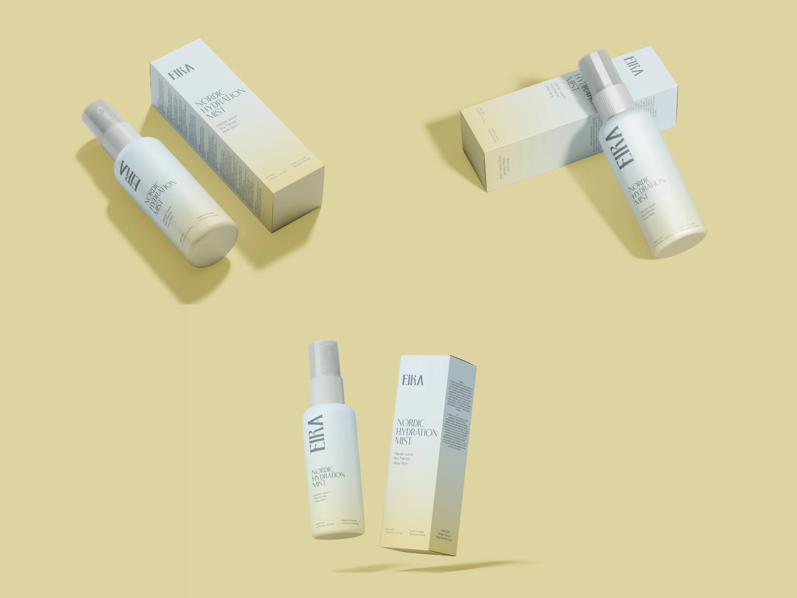
Eira Mist Packaging Design
Eira Purifying Soap
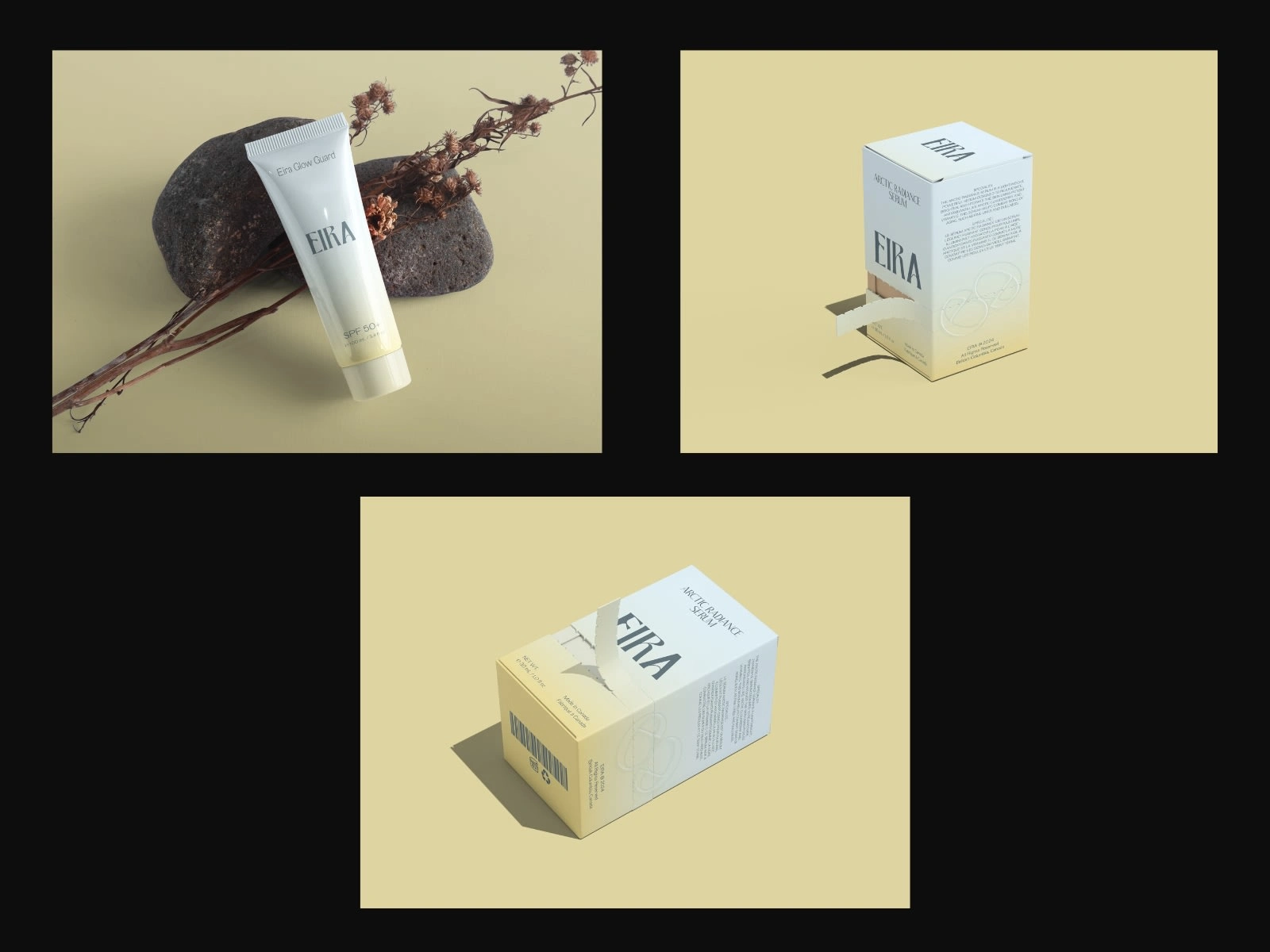
Eira Serum Packaging Design
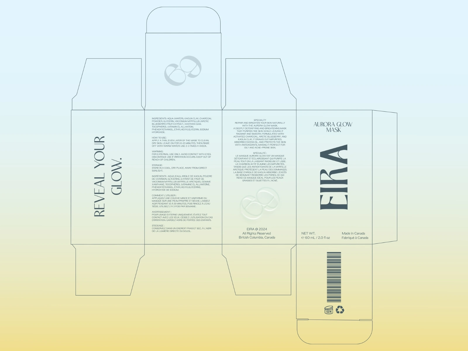
Packaging Layout
Challenge
The goal was to design a brand that feels calm.
Eira Skincare needed to communicate purity, trust, and sophistication without leaning into cold minimalism. The challenge was to bridge two worlds — the clinical precision of skincare and the warmth of natural wellness.
The visual language had to:
Capture the serene essence of Nordic nature.
Feel soft, elegant, and contemporary.
Translate effortlessly across packaging, digital, and print touchpoints.
Build immediate trust through refined simplicity.
Strategy & Concept
I defined the brand positioning around the idea of “Nordic Calm.”
A design philosophy where every element — space, color, and type — breathes.
Brand Essence: Purity through stillness.
Personality: Honest, minimalist, nurturing, elegant.
Tone of Voice: Gentle authority — informative but never clinical.
This became the guiding lens through which the brand identity, packaging, and storytelling were developed.
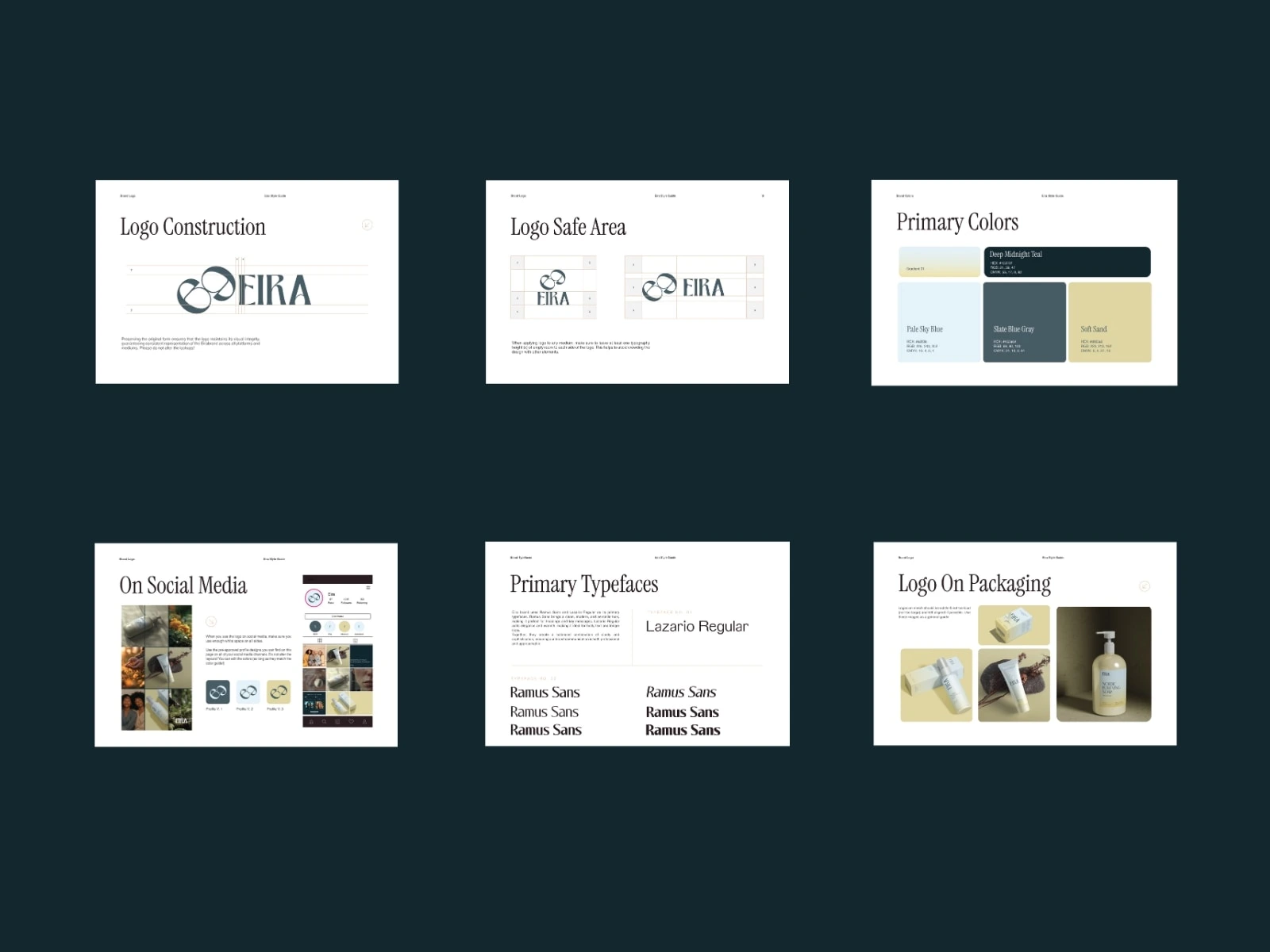
Brand Identity System
Design Solution
Eira’s identity system balances restraint with warmth, combining natural textures with minimalist geometry.
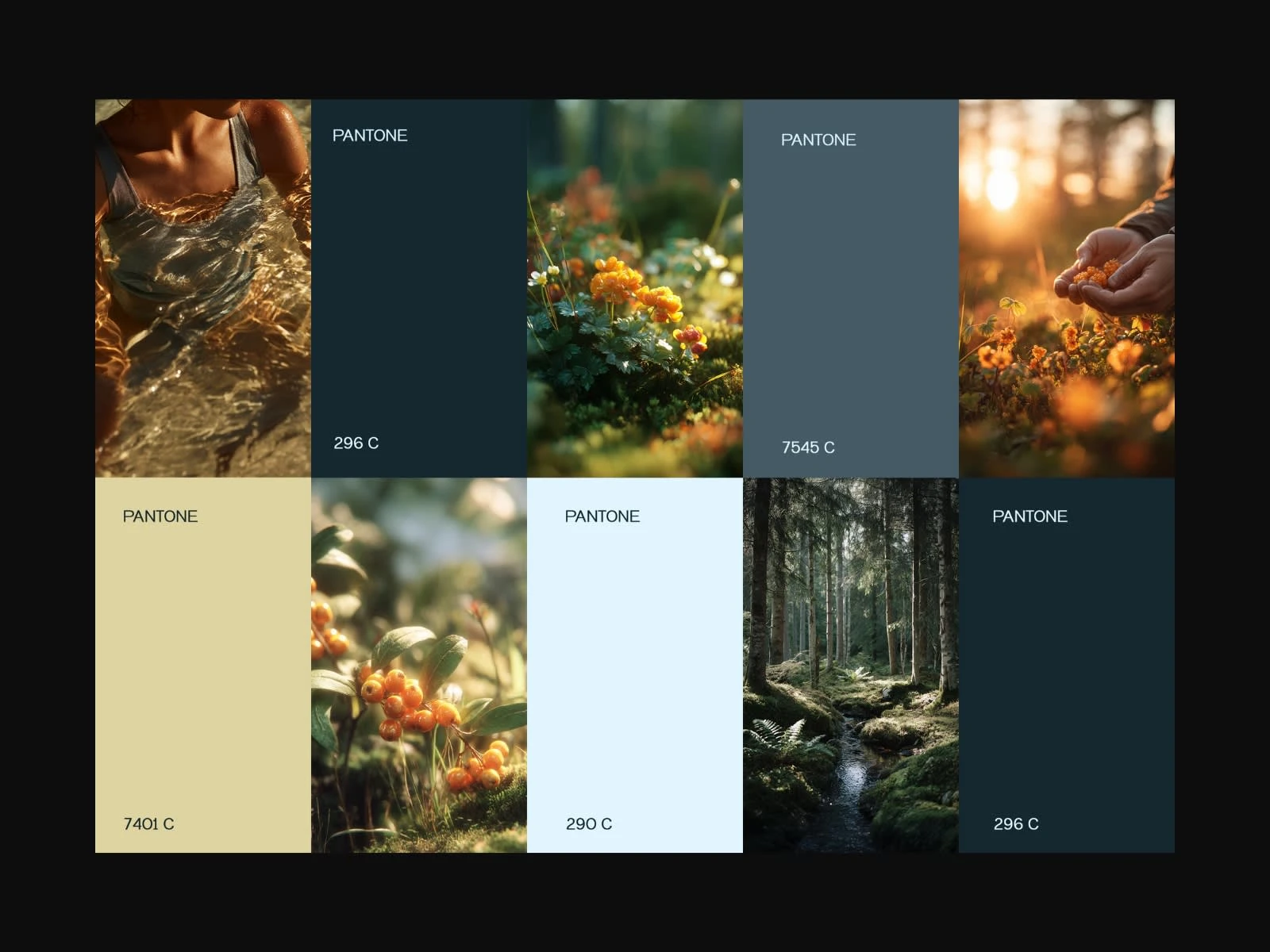
Color Palette:
Soft neutrals — ivory, mist, and clay — paired with muted greens and stone blues. These tones evoke fog over fjords, birch bark, and mineral waters, translating nature’s calm into modern simplicity.
Typography:
A clean sans-serif base paired with delicate serif details for sophistication and flow. The contrast mirrors science meeting serenity.
Layout & Composition:
White space acts as Eira’s “oxygen.” Every label, bottle, and digital element is designed to breathe, allowing the product and story to take center stage.
Visual Language:
The visual system reflects Nordic restraint — minimal, calm, and precise — while subtle textures add warmth and tactility to prevent sterility.
Social Identity Campaign — Art Direction & Narrative Design
Creative Process
1. Research & Inspiration
Studied Scandinavian skincare and wellness aesthetics, drawing from Nordic landscapes, herbal healing traditions, and design philosophies rooted in simplicity and function.
Collected moodboards that merged natural imagery with architectural minimalism.
2. Concept Development
Sketched early packaging structures and experimented with different tones of botanical hues. Explored label placements and typographic balance to evoke elegance while maintaining clarity.
3. Refinement
Refined color temperature, adjusted typographic hierarchy, and perfected spacing for label readability. Developed a cohesive grid system that adapts across various product formats — bottles, tubes, and boxes.
4. Finalization & Delivery
Produced print-ready dielines and packaging mockups. Created a concise brand guideline outlining color usage, logo spacing, and photography direction. Delivered all assets as a unified, scalable system.
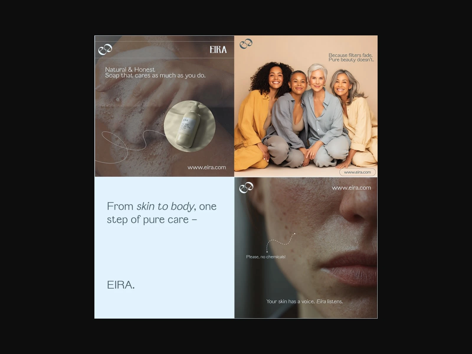
Human-Centric Campaign — Real Beauty, Real Care
Digital Launch Campaign — Strategy, Design & Storytelling
Like this project
Posted Nov 6, 2025
Developed brand identity and packaging for Eira Skincare, inspired by Nordic calm and purity.