Solstice Vineyards
Solstice Vineyards
Brand Strategy | Visual Identity | Illustration | Packaging Design | Campaign Direction
Nestled in the sun-kissed hills of Sonoma Valley, Solstice Vineyards stands as a celebration of nature, artistry, and sustainable winemaking. The brand represents more than exceptional wine—it embodies a philosophy of harmony between land and craft. Every bottle begins with organically grown grapes, slow harvesting, and traditional cellar techniques, creating wines that honour the earth and elevate the senses.
As Solstice prepared to expand its presence in the premium wine market, it needed a brand identity that could match the depth of its craftsmanship. The goal was to build a visual world rooted in luxury, inspired by nature, and expressive enough to become instantly recognizable on shelf, online, and in experience-driven tastings.
The Challenge
Solstice Vineyards required a refreshed brand identity that reflected their core values—elegance, sustainability, and artisanal craftsmanship—while appealing to both wine connoisseurs and environmentally conscious consumers. Their previous visuals lacked emotional storytelling, visual consistency, and the elevated aesthetic required to compete in a crowded premium market. The challenge was to craft an identity that felt refined yet earthy, art-inspired yet modern, capable of positioning Solstice as a heritage-quality brand for today’s audience.
Solution
The solution was to build a brand ecosystem that feels elegant, botanical, and artfully expressive—a visual identity that translates the vineyard’s natural beauty into a premium, modern experience.
I created a refined brand language anchored in:
A warm, organic color palette inspired by golden-hour vineyards and earthy greens.
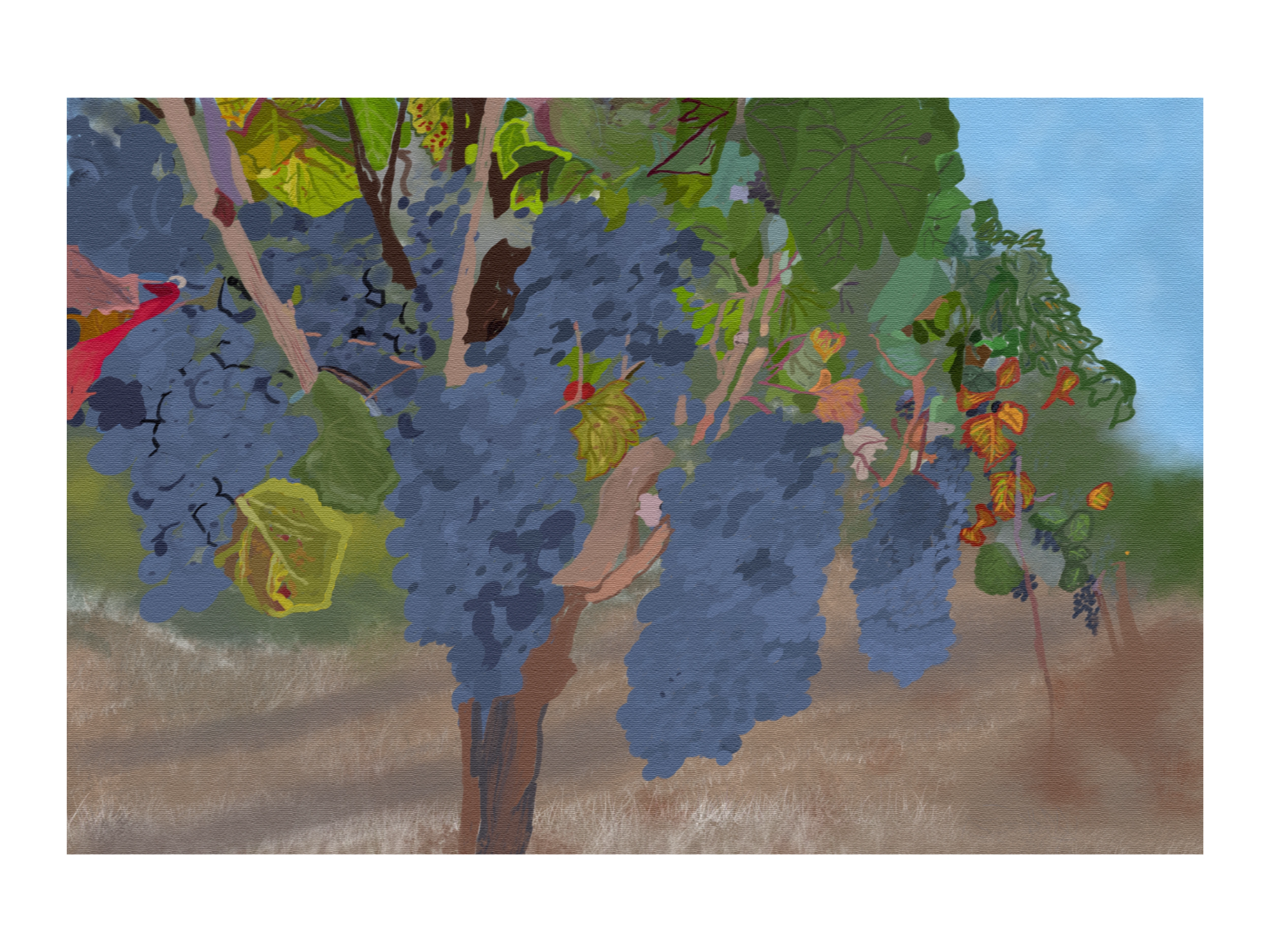
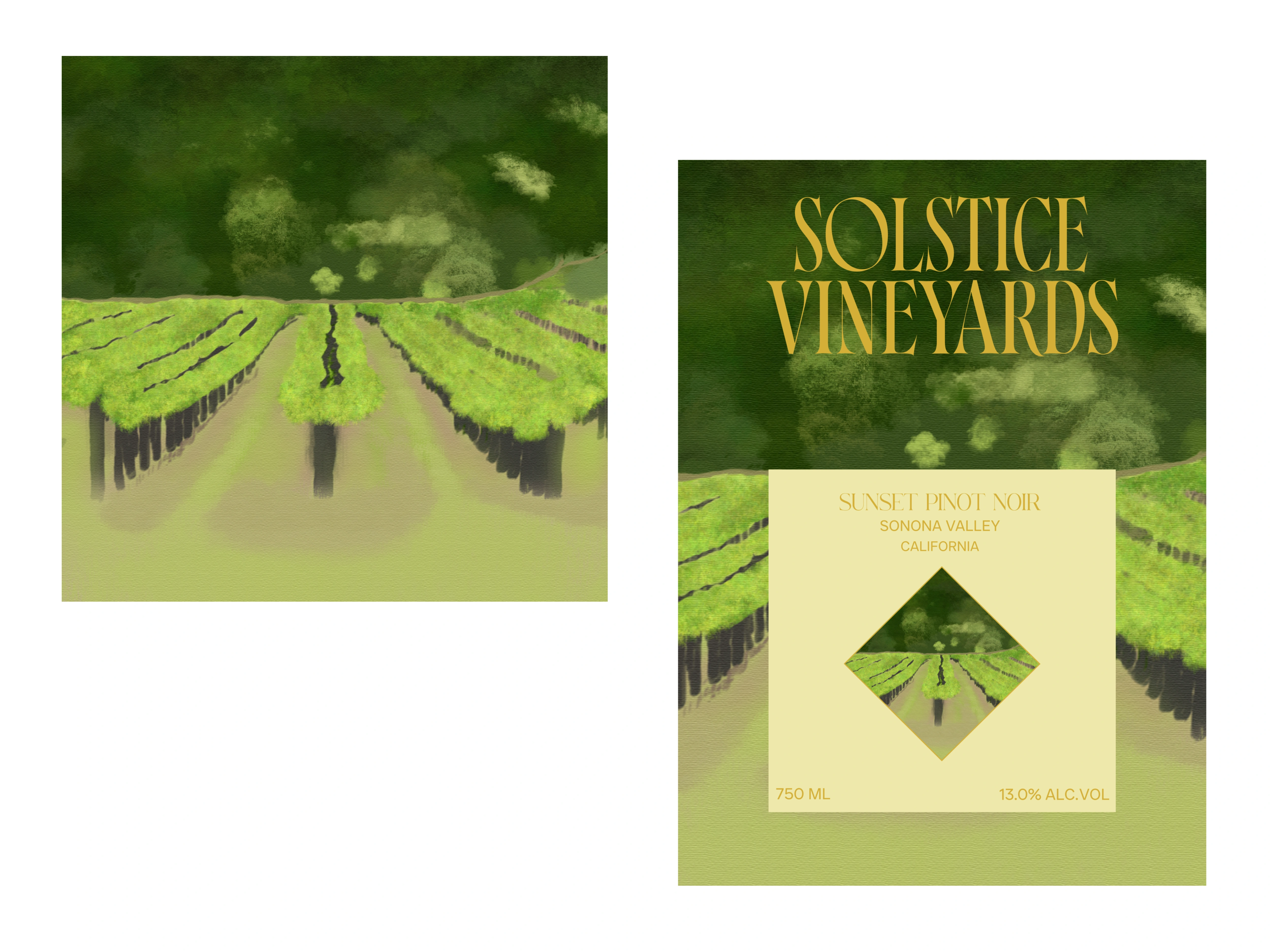
Hand-illustrated textures and abstract landscape forms that evoke Sonoma’s rolling hills.
A sophisticated typographic system combining contemporary serif elegance with modern minimalism.
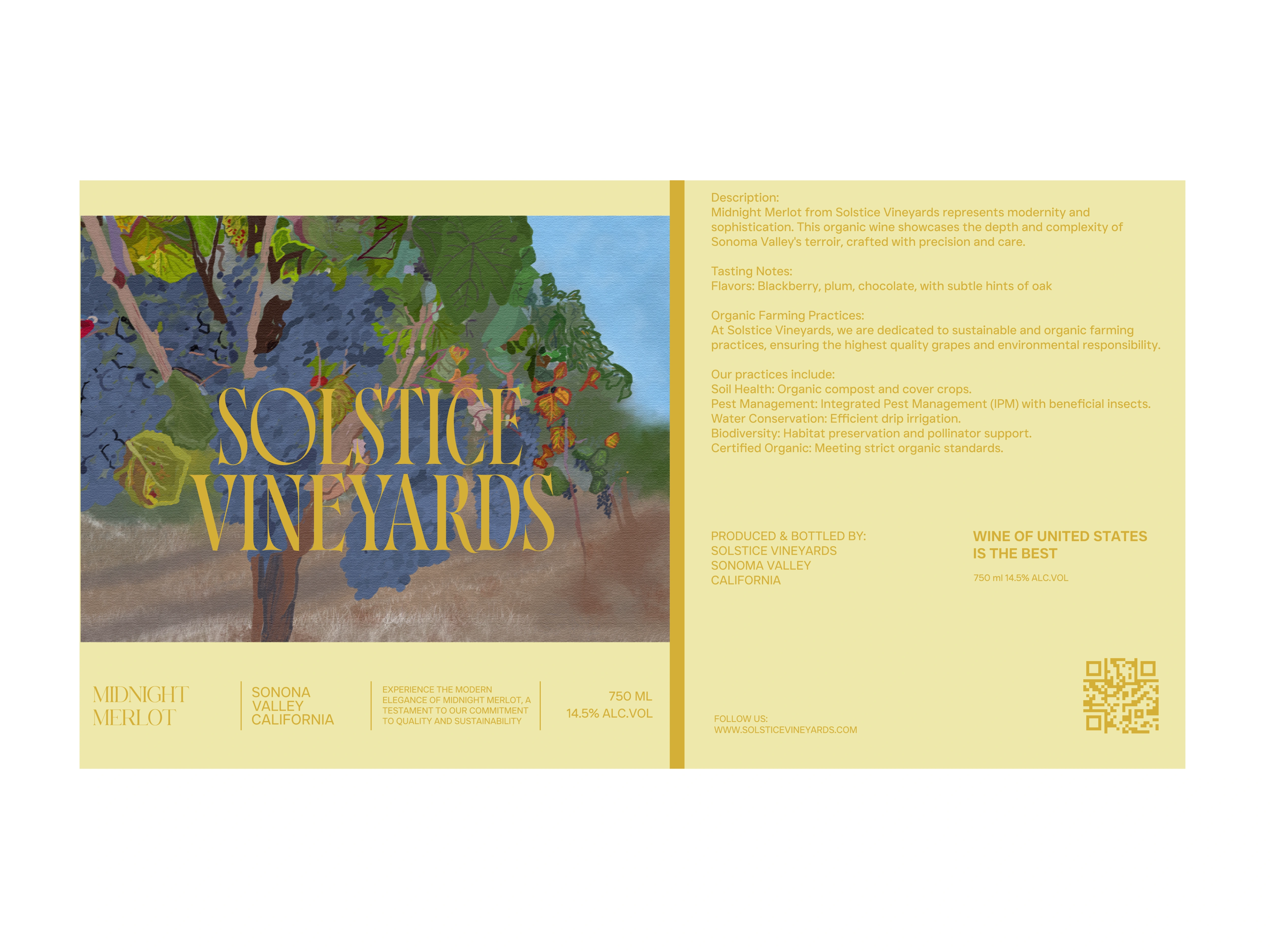
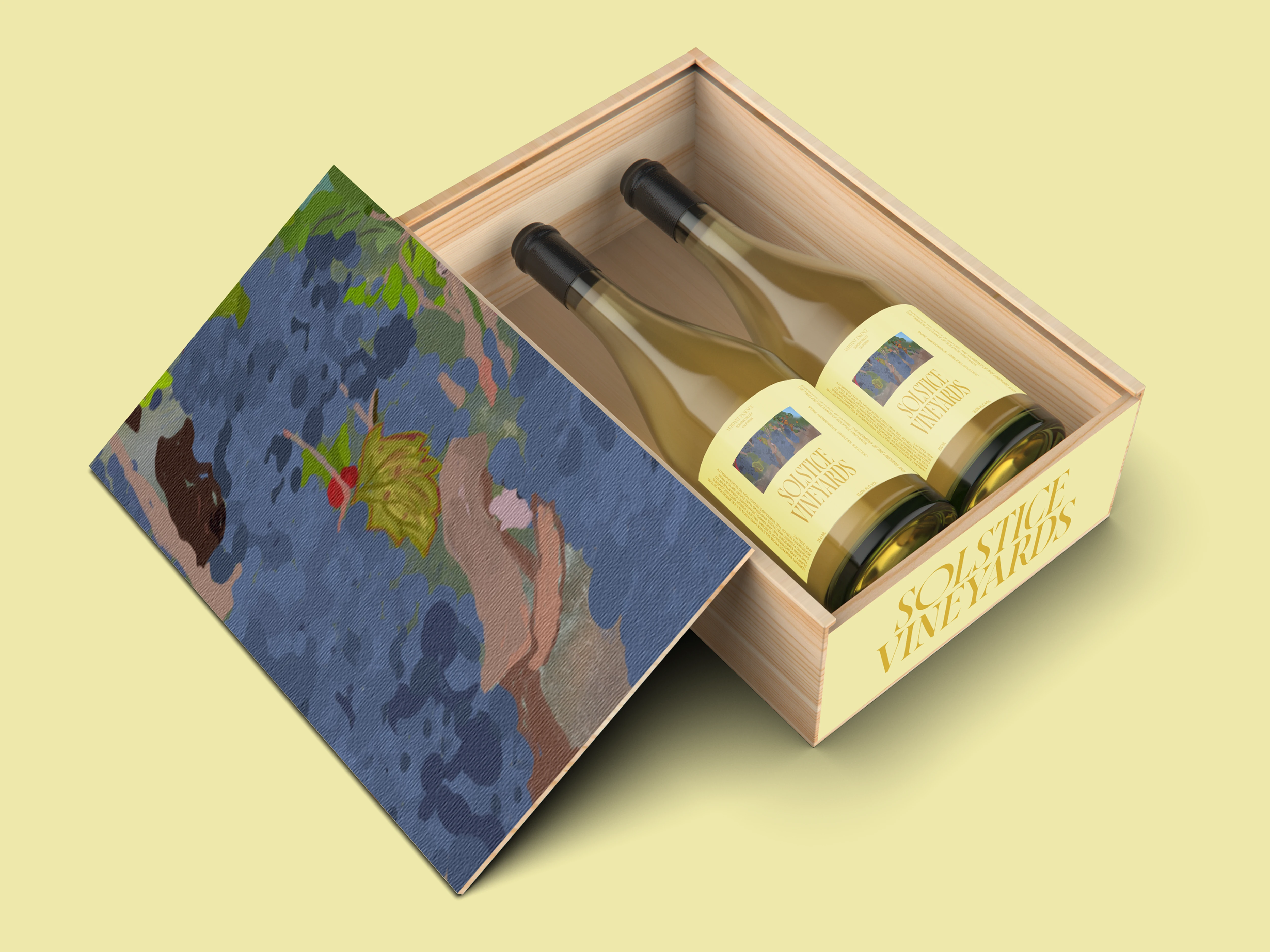
Premium packaging that blends illustration, texture, and refined color blocking.
Lifestyle-driven campaign direction that humanizes the brand and amplifies emotional connection.
The result is a visual identity that is deeply rooted in nature yet elevated with artistic storytelling, ensuring Solstice stands out across shelves, digital touchpoints, and experiential brand moments.
Creative Process
01 — Discovery & Brand Positioning
Analyzed the client’s heritage, values, vineyard process, and sustainability efforts. Identified the brand’s emotional core:
“Nature crafted. Artistically expressed.”
02 — Visual Exploration & Mood Development
Explored a balance between modern luxury and earthy authenticity. Gathered references from editorial photography, fine-art textures, botanical sketches, and high-end wine brands.
03 — Illustration & Texture Development
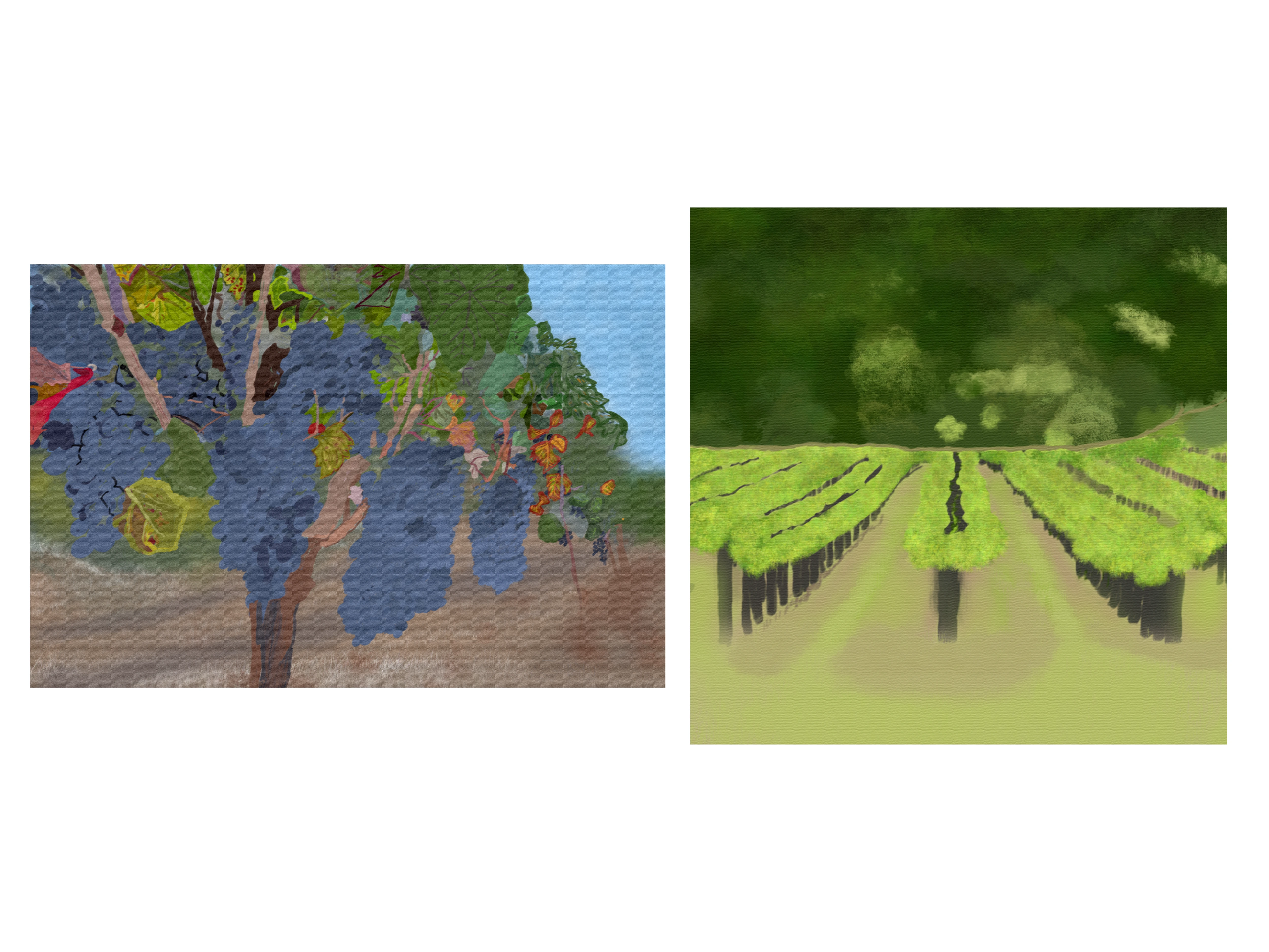
Created layered landscape-inspired artwork using painted strokes, paper textures, and organic shapes—symbolizing terroir, warmth, and the changing seasons of winemaking.
04 — Identity Refinement
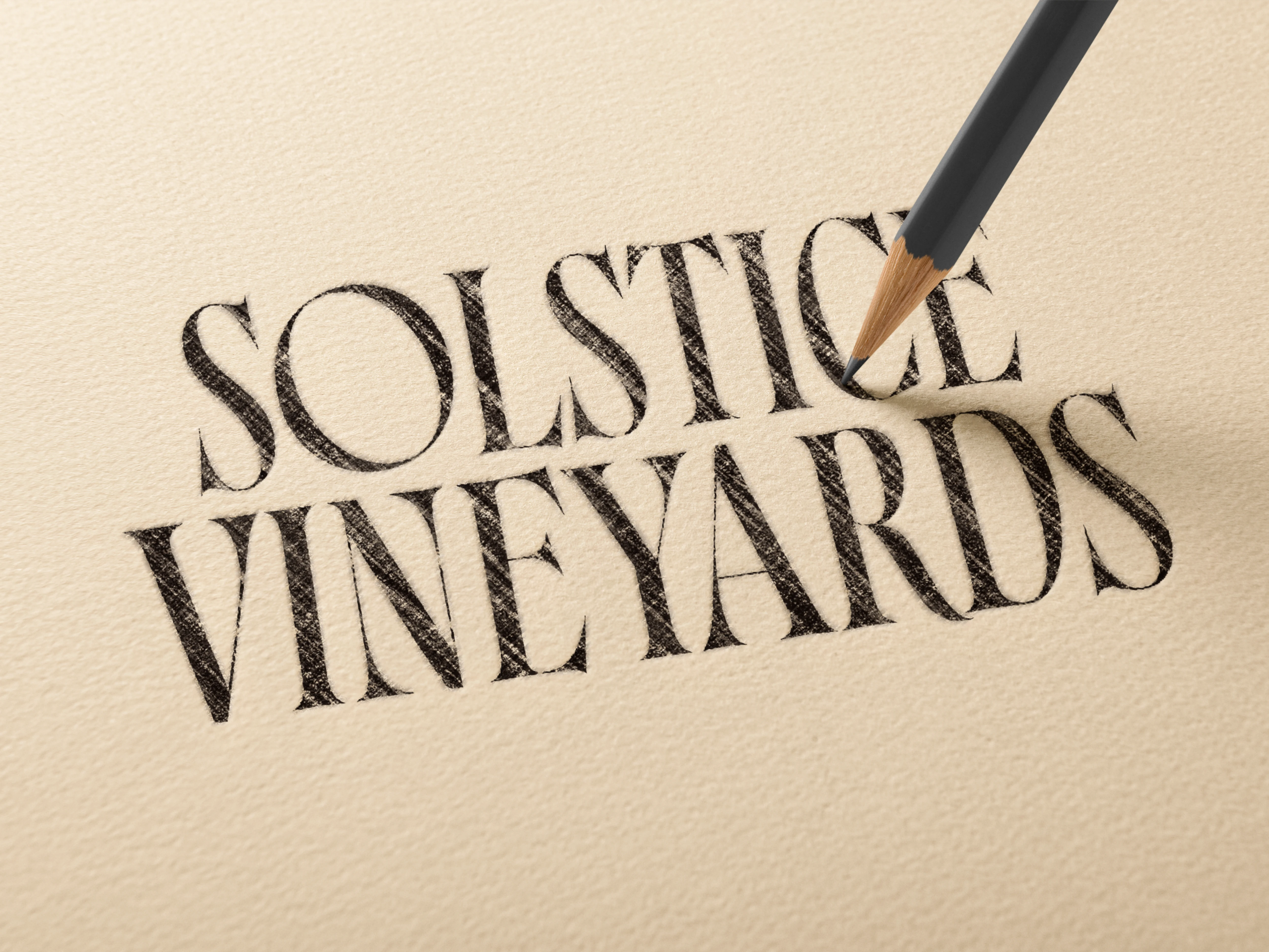
Crafted the Solstice wordmark with sharp, elegant letterforms and subtle ligatures, ensuring memorability and premium feel.
05 — Packaging & Label System
Designed a modular label structure that accommodates future wine varieties while maintaining strong brand consistency.
06 — Campaign Direction
Developed a visual campaign positioned around real human connection, golden-hour tones, and editorial-style photography to bring warmth, joy, and lifestyle relevance to the brand.
Visual Identity Breakdown
Color Palette
Warm golden whites, muted sage greens, clay browns, and organic yellows inspired by vineyards at dusk.
Typography
Primary Serif: Elegant, timeless, refined.
Secondary Sans-Serif: Clean, minimalist, ideal for modern layouts and campaign work.
Illustration System
Soft, artful compositions based on natural textures, abstract landscapes, and hand-painted layers.
Each element is crafted to evoke “sun, soil, and seasons.”
Brand Mark
A clean, confident logotype that aligns with premium wine aesthetics—easy to scale across print, packaging, signage, and campaigns.
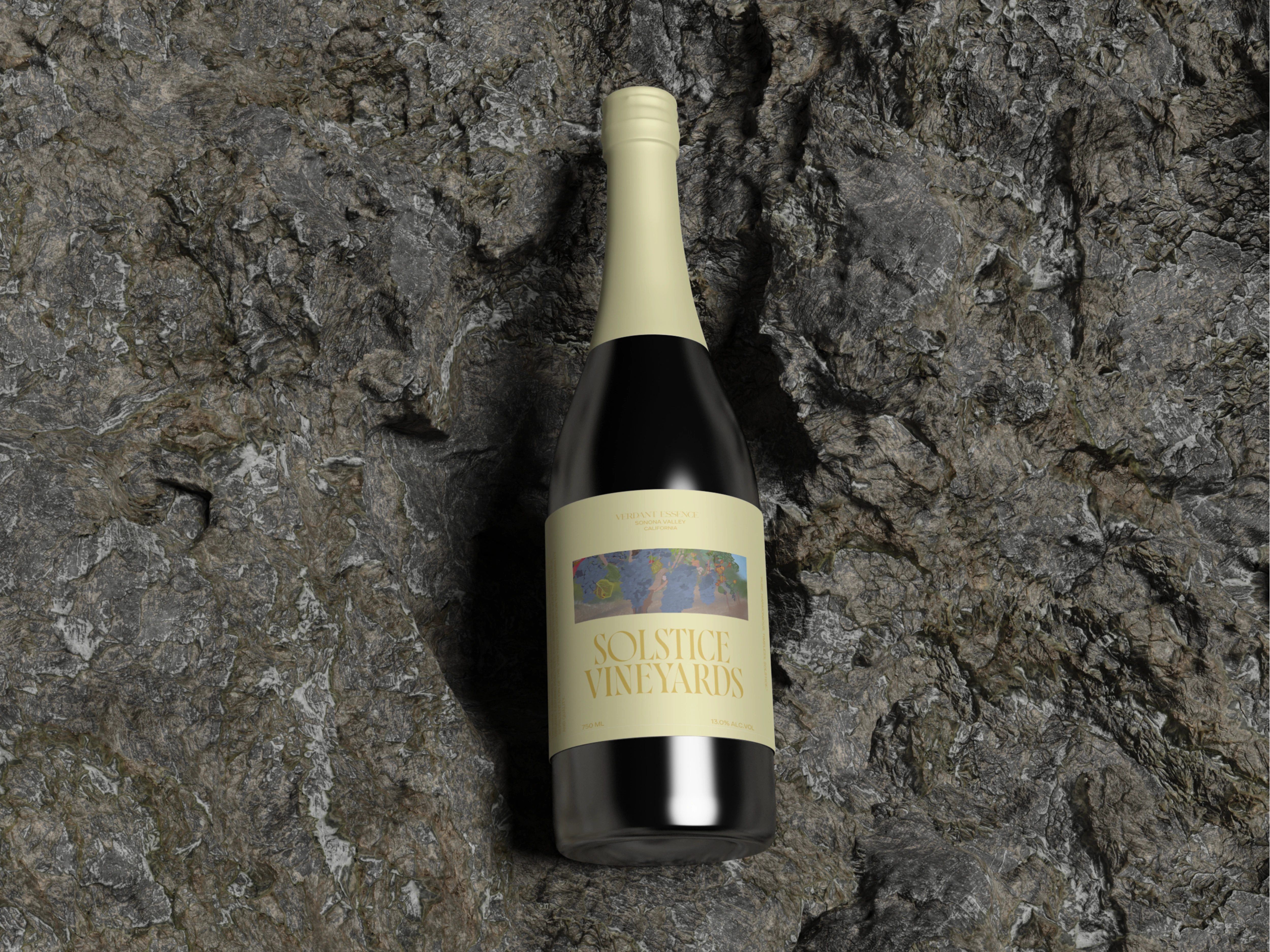
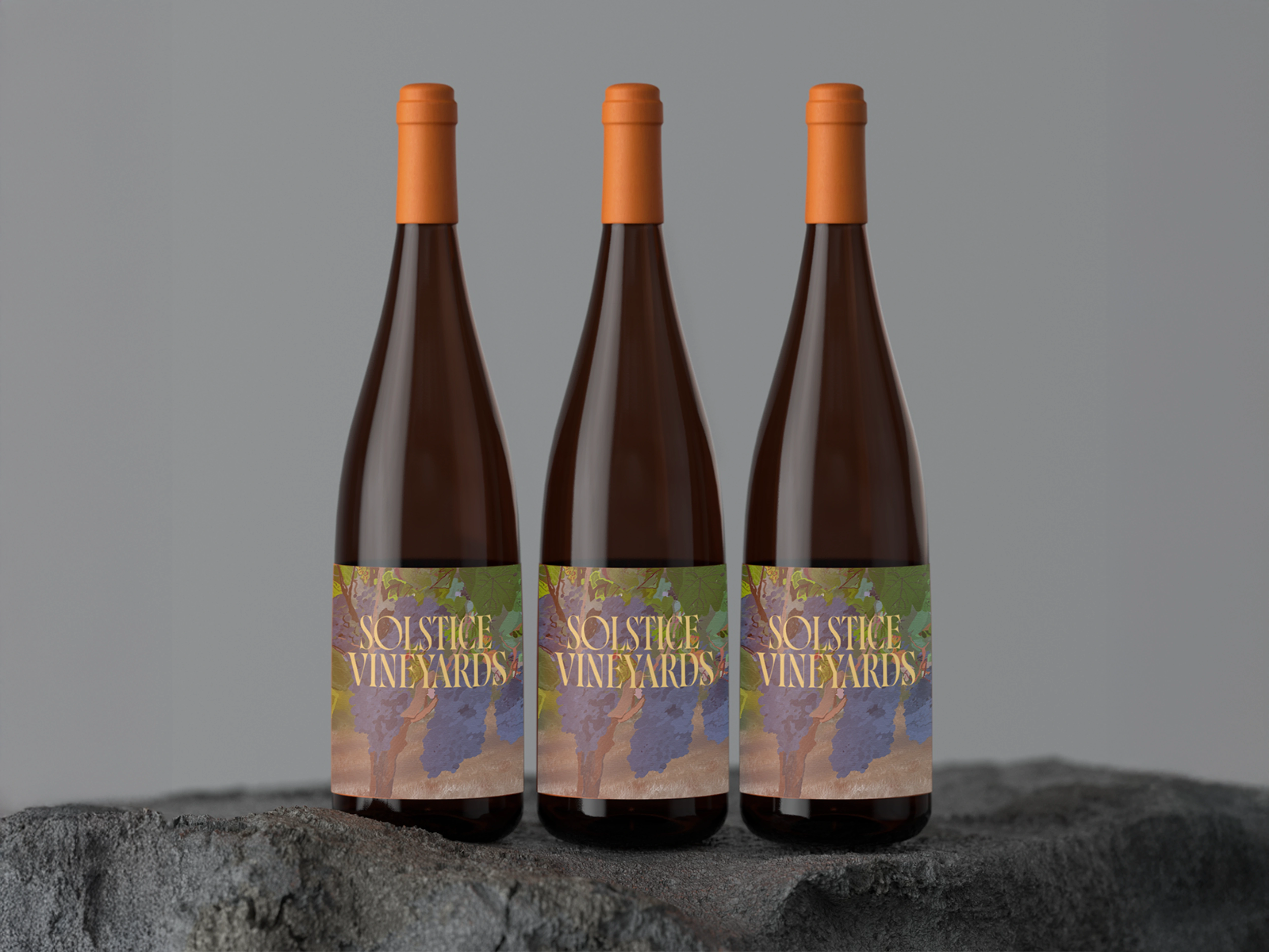
Packaging Rationale
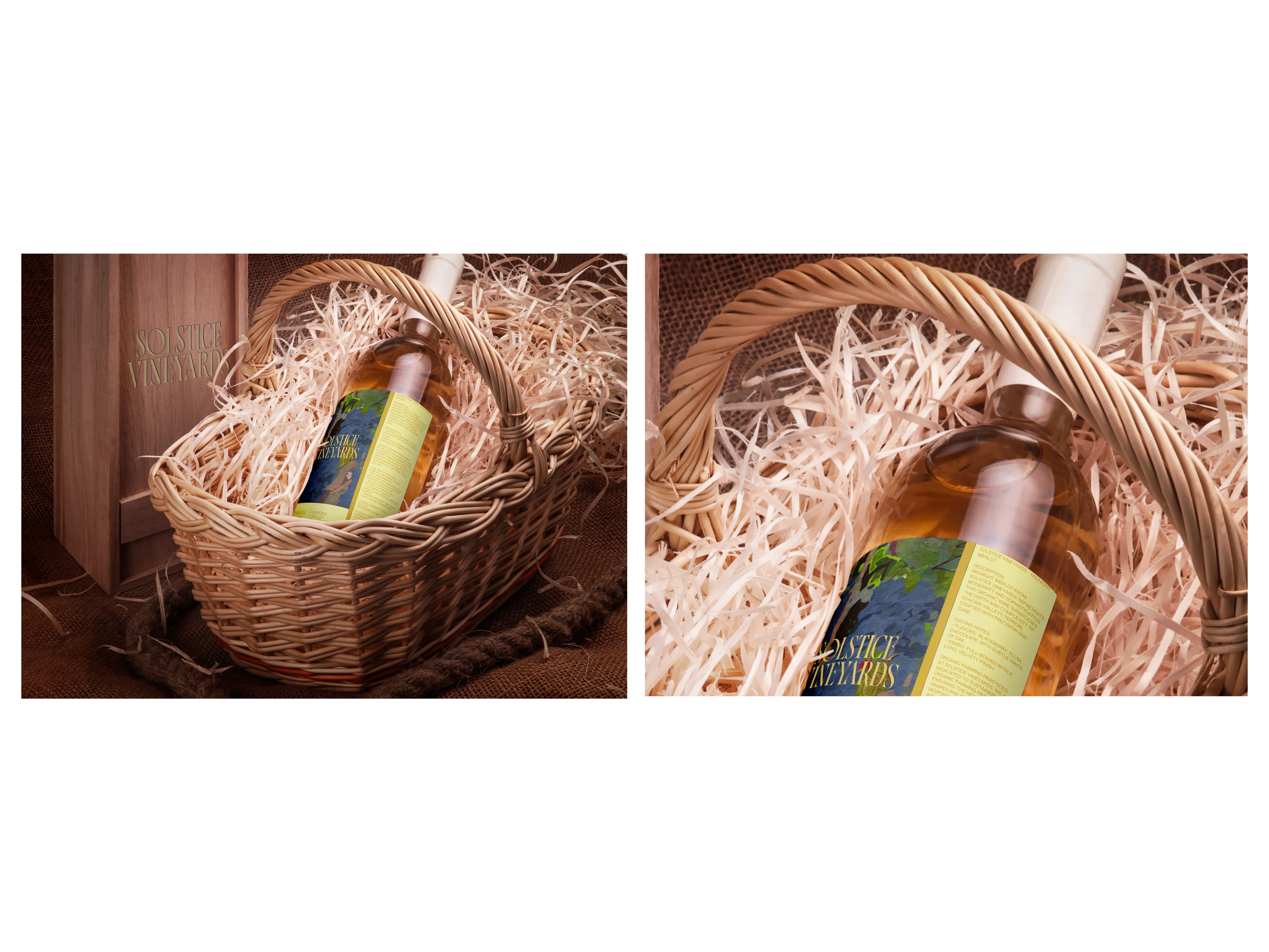
The Solstice packaging is designed to be both collectible and expressive—the visual equivalent of a handcrafted story in every bottle.
Key decisions:
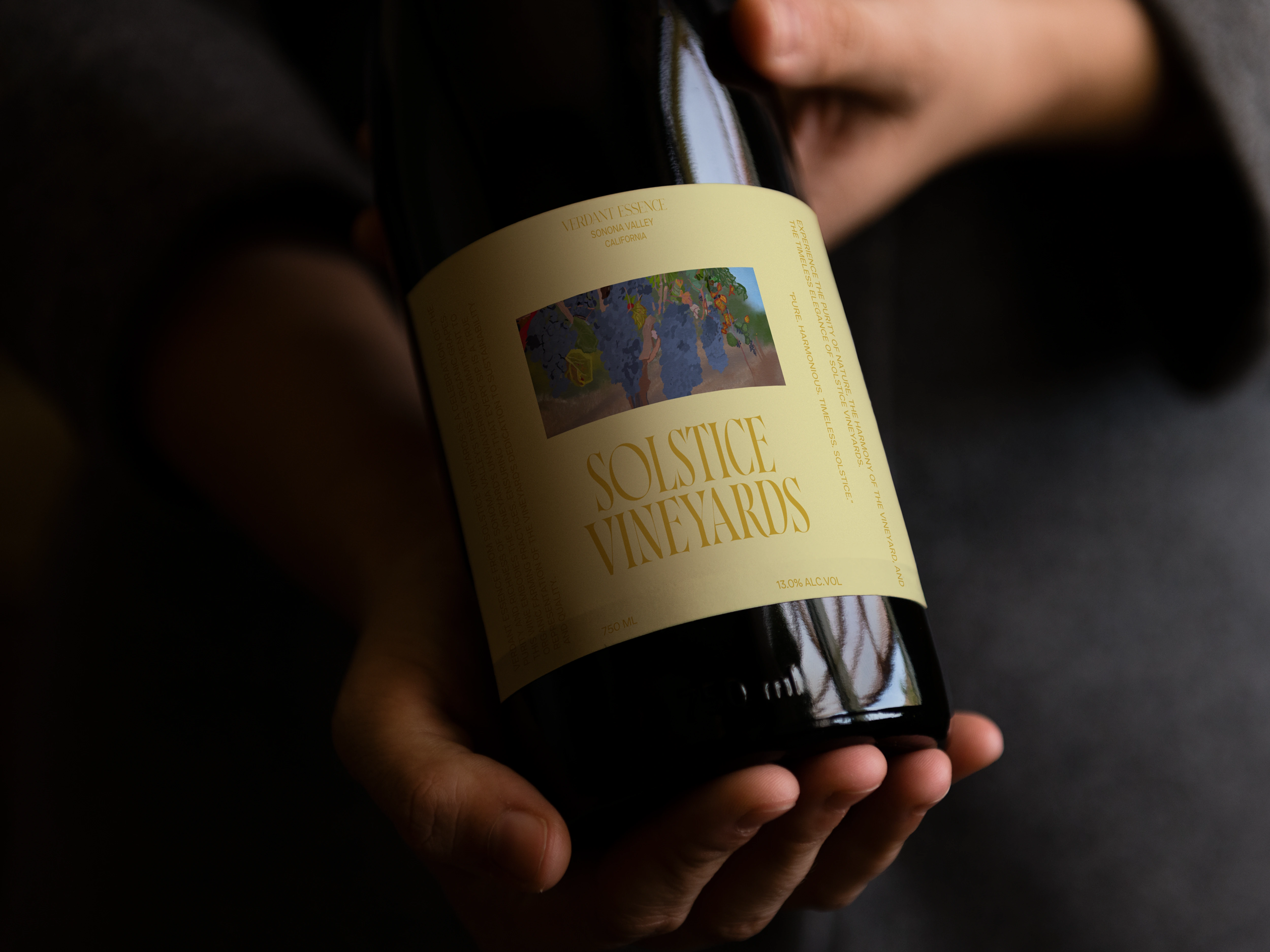
Vertical label layout to elongate the bottle silhouette and enhance shelf presence.
Art-led illustration panel to distinguish Solstice from minimalist labels and carve a unique space on the shelf.
Soft matte textures to create a tactile, premium unboxing moment.
Muted cream foundation to contrast beautifully with the wine’s natural tint.
Ingredient transparency & sustainability messaging subtly included to reinforce eco-conscious values.
Overall, the packaging acts as the brand’s strongest storytelling asset—balancing fine art with organic simplicity.
Impact
Elevated Perception – My designs positioned the brand as a true premium, sustainable winery.
Stronger Storytelling – The vineyard imagery and sustainability focus allow customers to connect emotionally with the brand.
Market Differentiation – The hand-painted style and elegant typography stand out among competitors.
Sales-Ready Assets – The packaging, website concept, and mockups are ready for retail, e-commerce, and promotional campaigns.

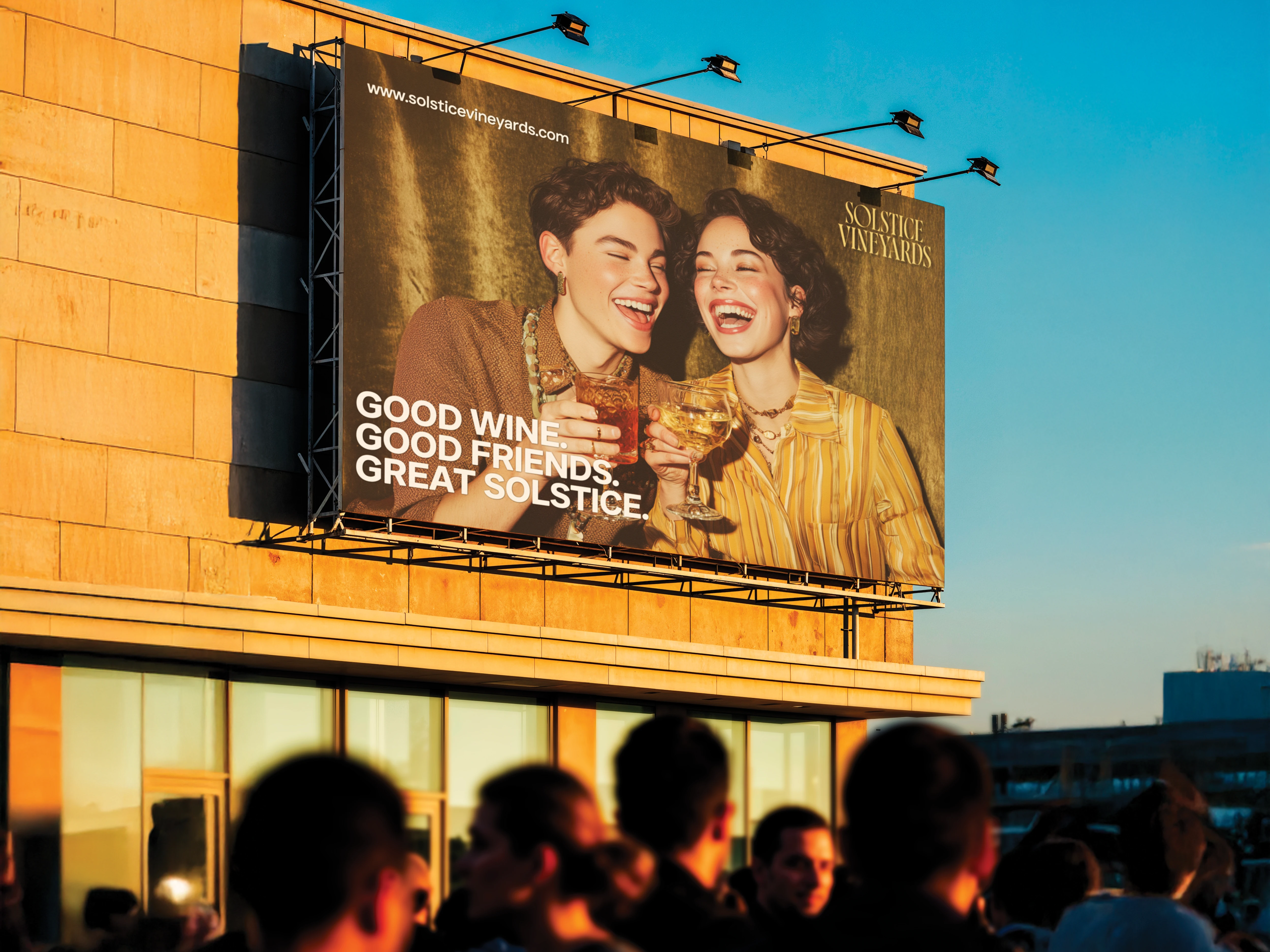
Campaign Design
“Good Wine. Good Friends. Great Solstice.”
This hero campaign visual celebrates Solstice as a connector—of people, of moments, of memories worth keeping.
The golden-hour light, candid laughter, and editorial framing position the brand as modern, social, and deeply human.
This execution establishes Solstice as the wine made for moments that feel effortlessly joyful.
Like this project
Posted Nov 21, 2025
A boutique winery crafting elegant, small-batch wines inspired by the rhythms of the seasons.
