Simão Festas - Brand Identity
The Challenge 🤔
The old logo was confusing and full of graphic elements, too many colors, too many fonts that were difficult to read and memorize, which made the brand extremely expensive to reproduce. As the company planned to expand, brand variations would generate more noise.
The Solution ✨
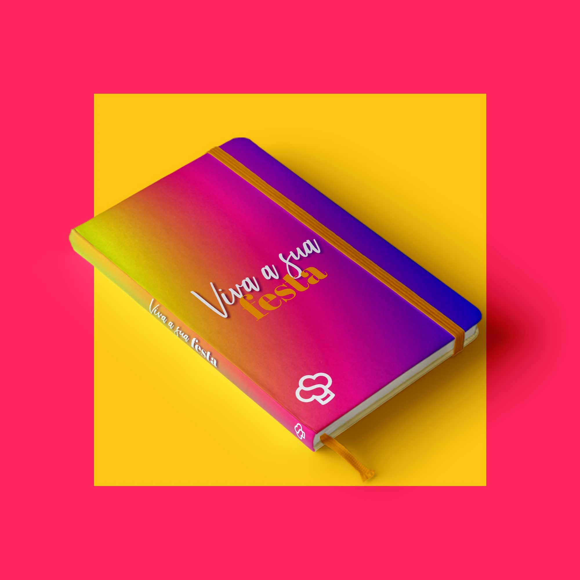
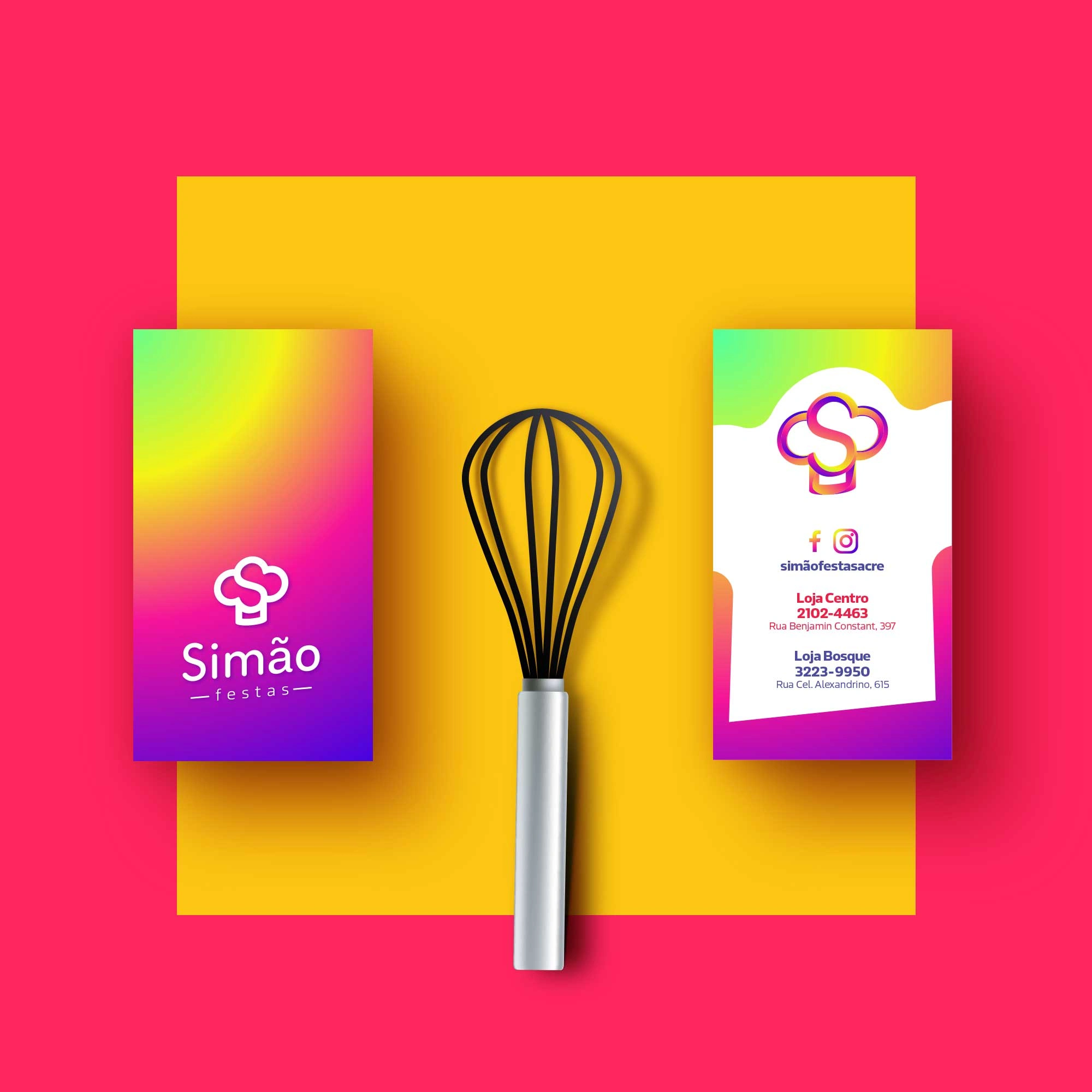
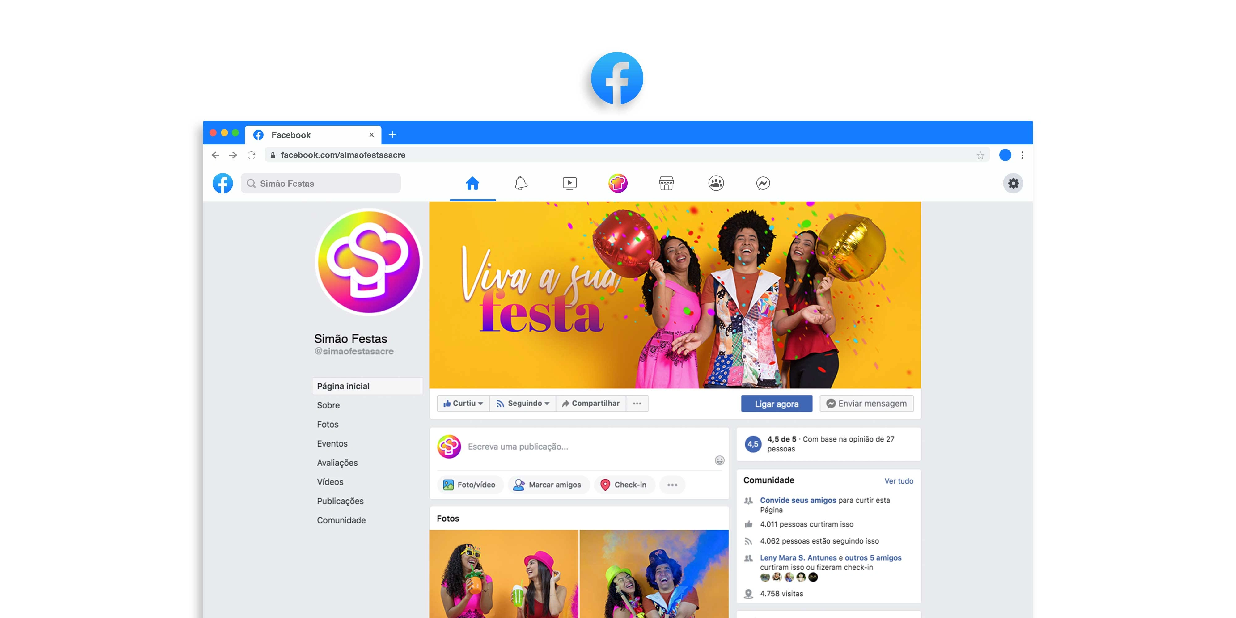
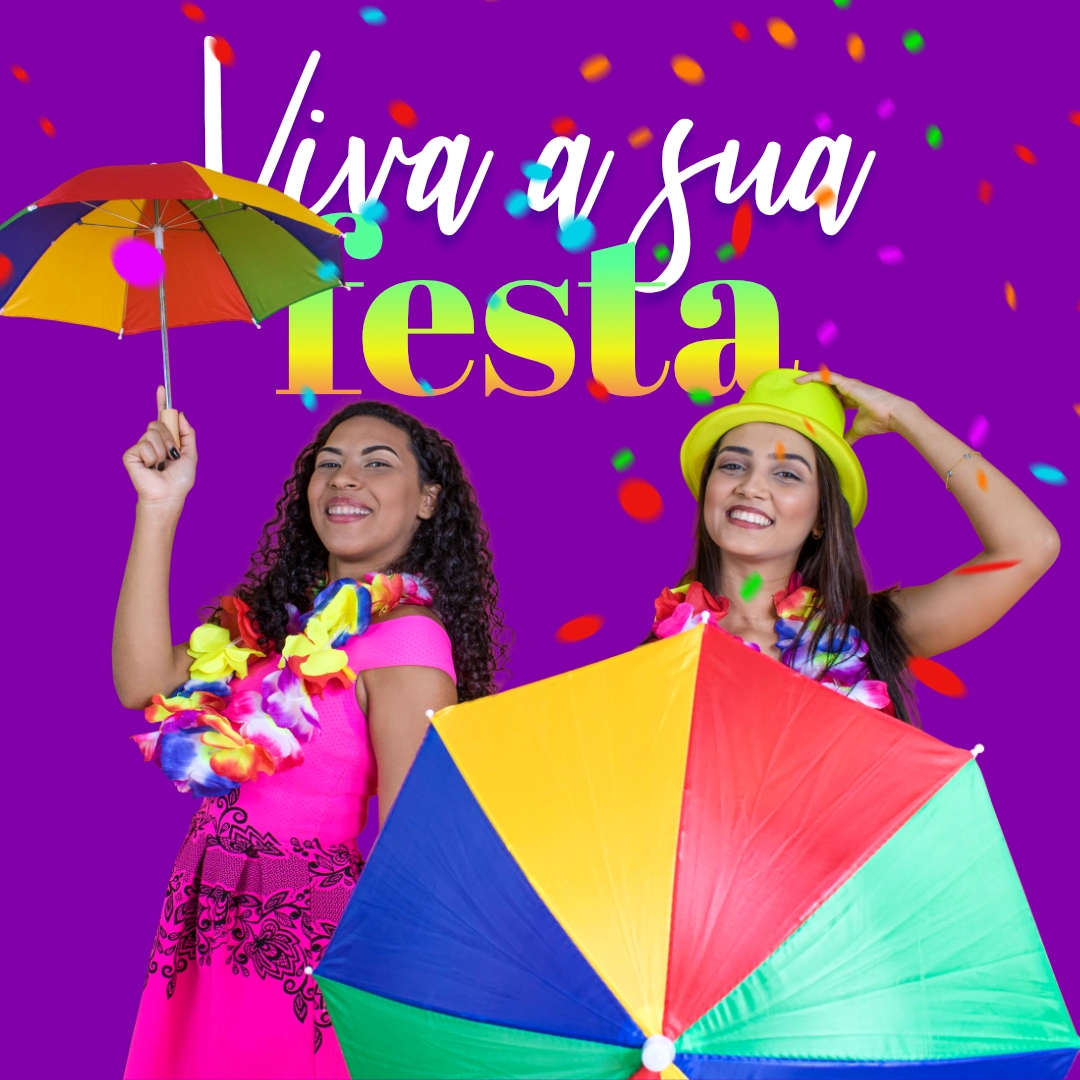
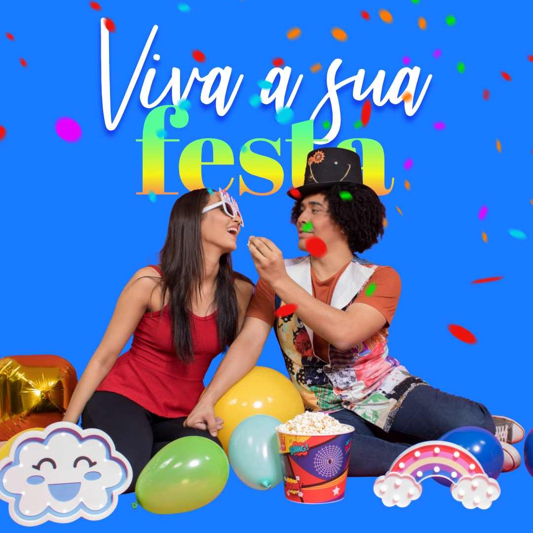
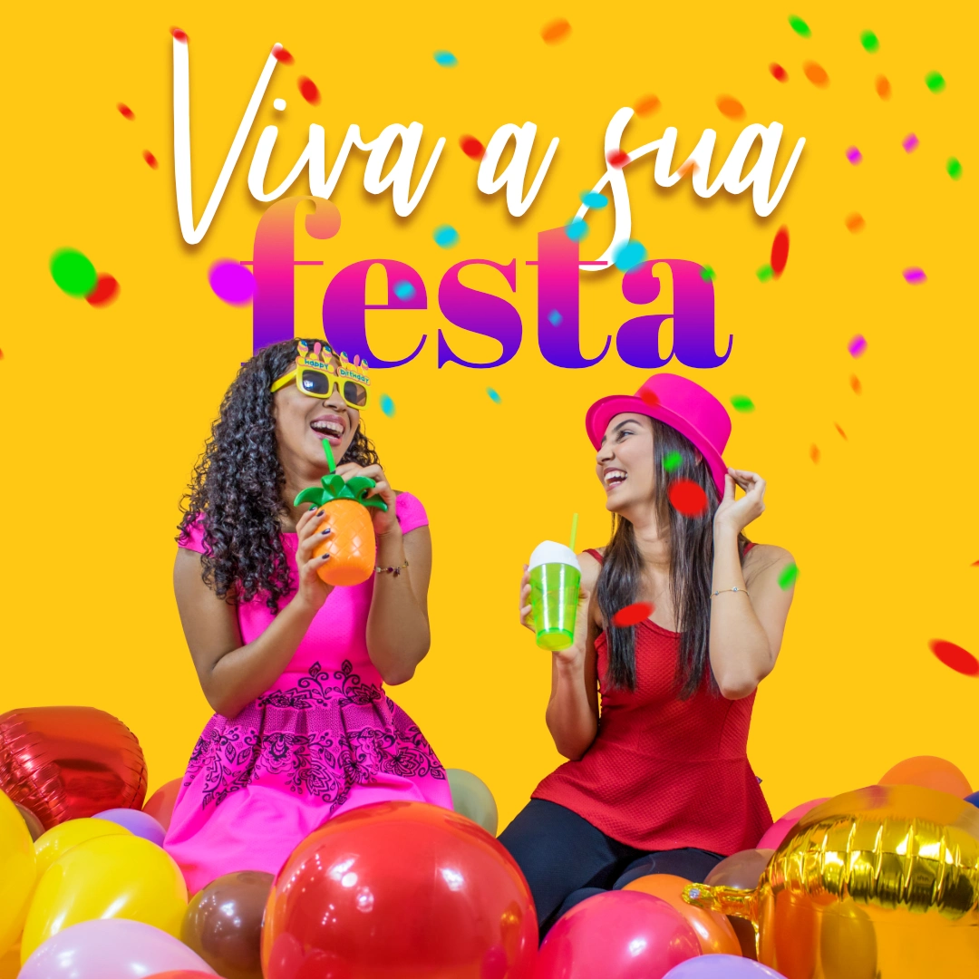
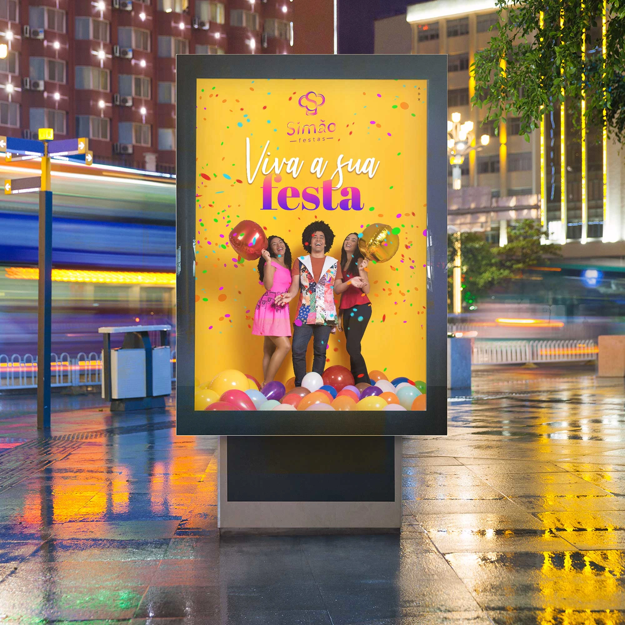
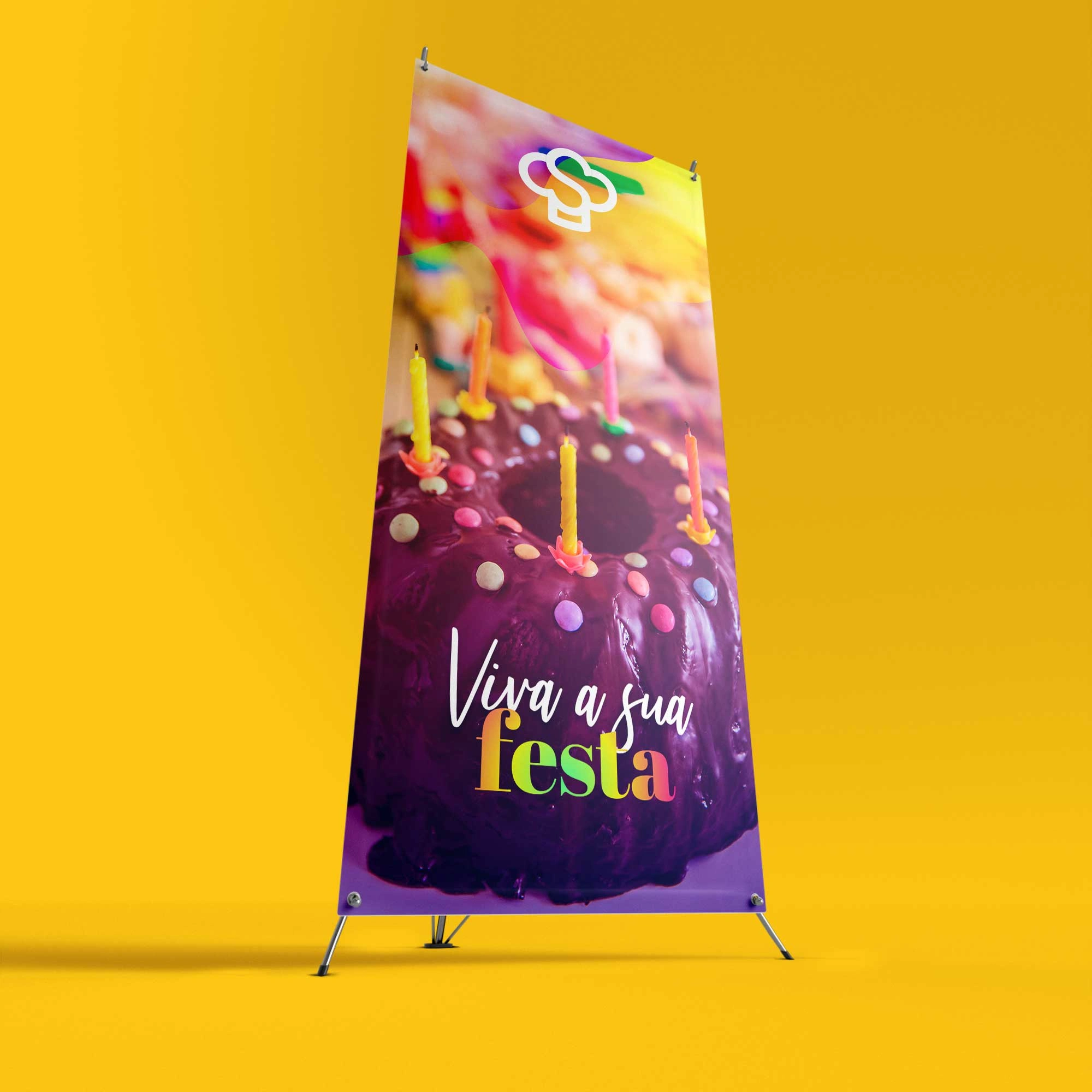
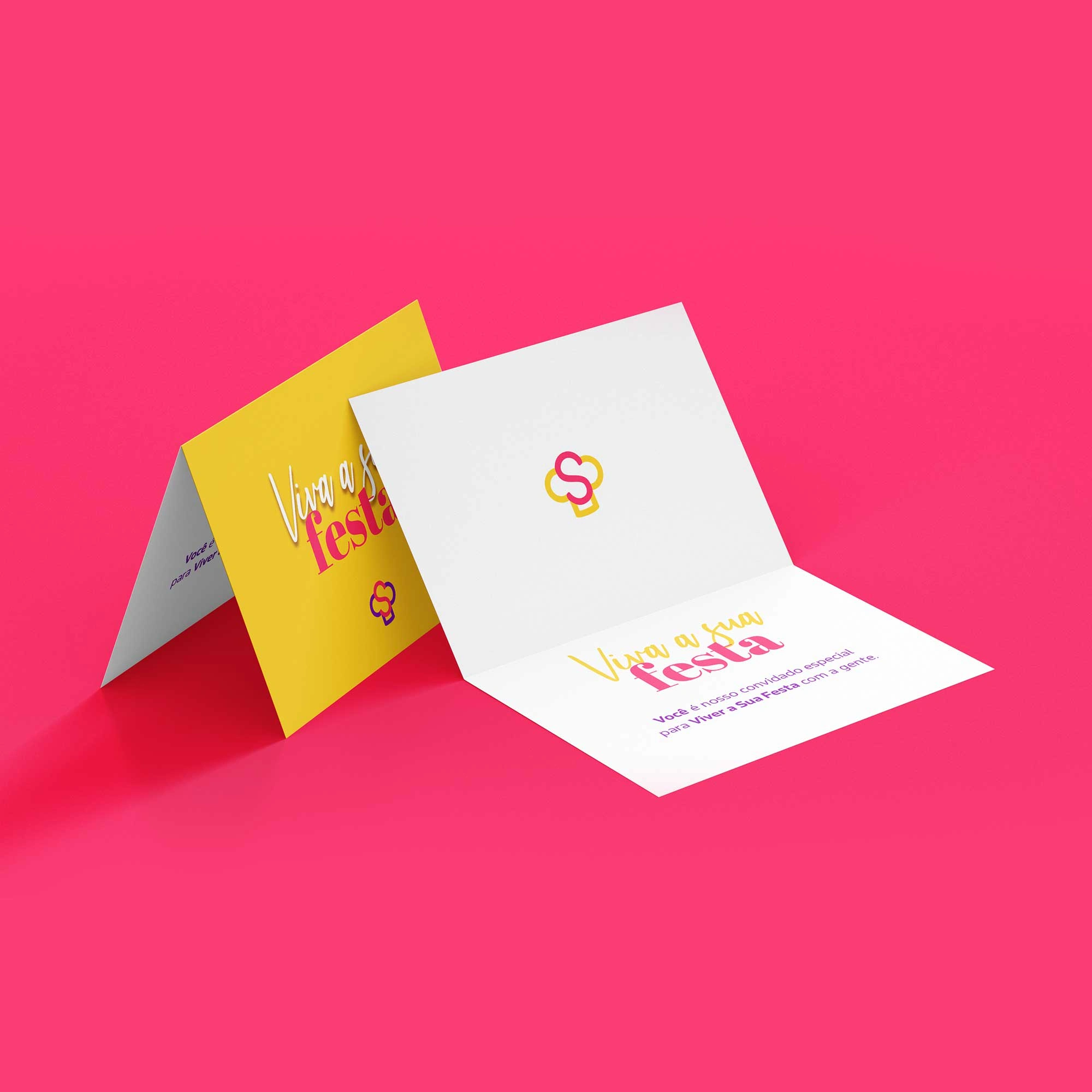
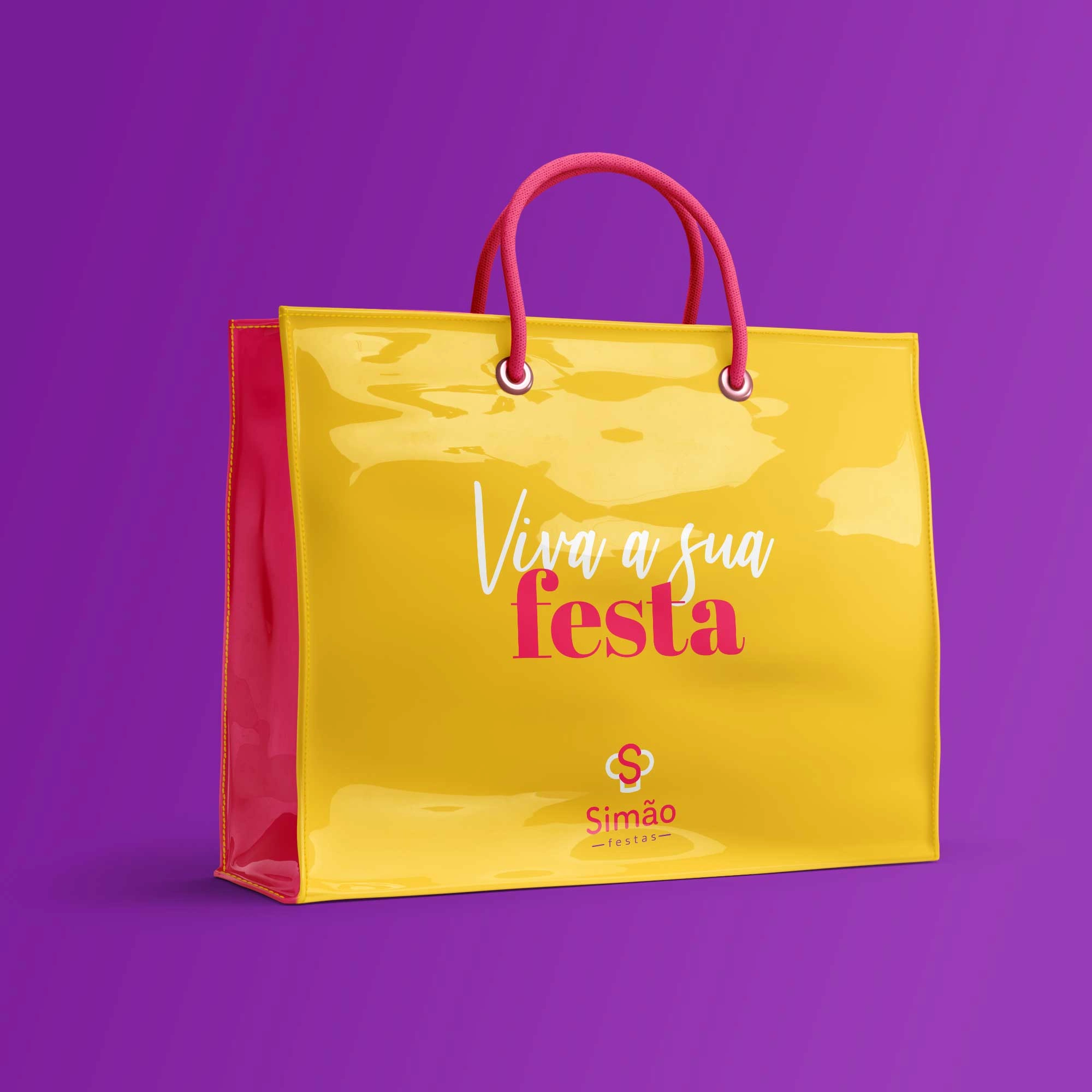
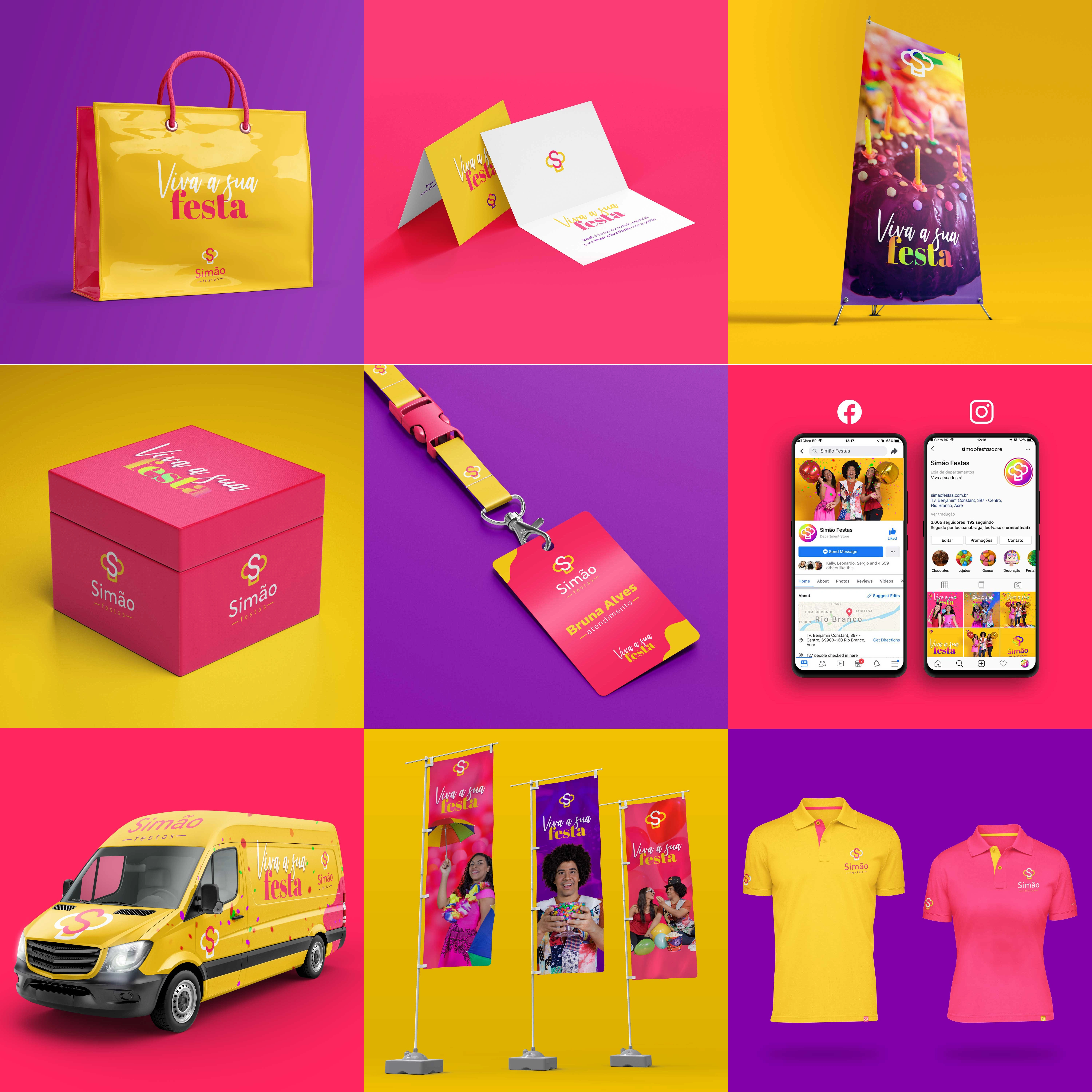
Building a project from scratch helped make the brand stronger, easier to read and apply in its customer contact channels. In addition to the new brand, a new visual identity was needed to convey the company's message.

The Stats 💯
Timeline: 3 months
Budget: U$ 2,000
Deliverables
Logotype
Symbol
Variations
Support elements
Brand color system
System default color
Support color system
Visual signature color options
Incorrect use of color
Standard typographic font
Typeface family
Supporting typefaces
Special types for titles
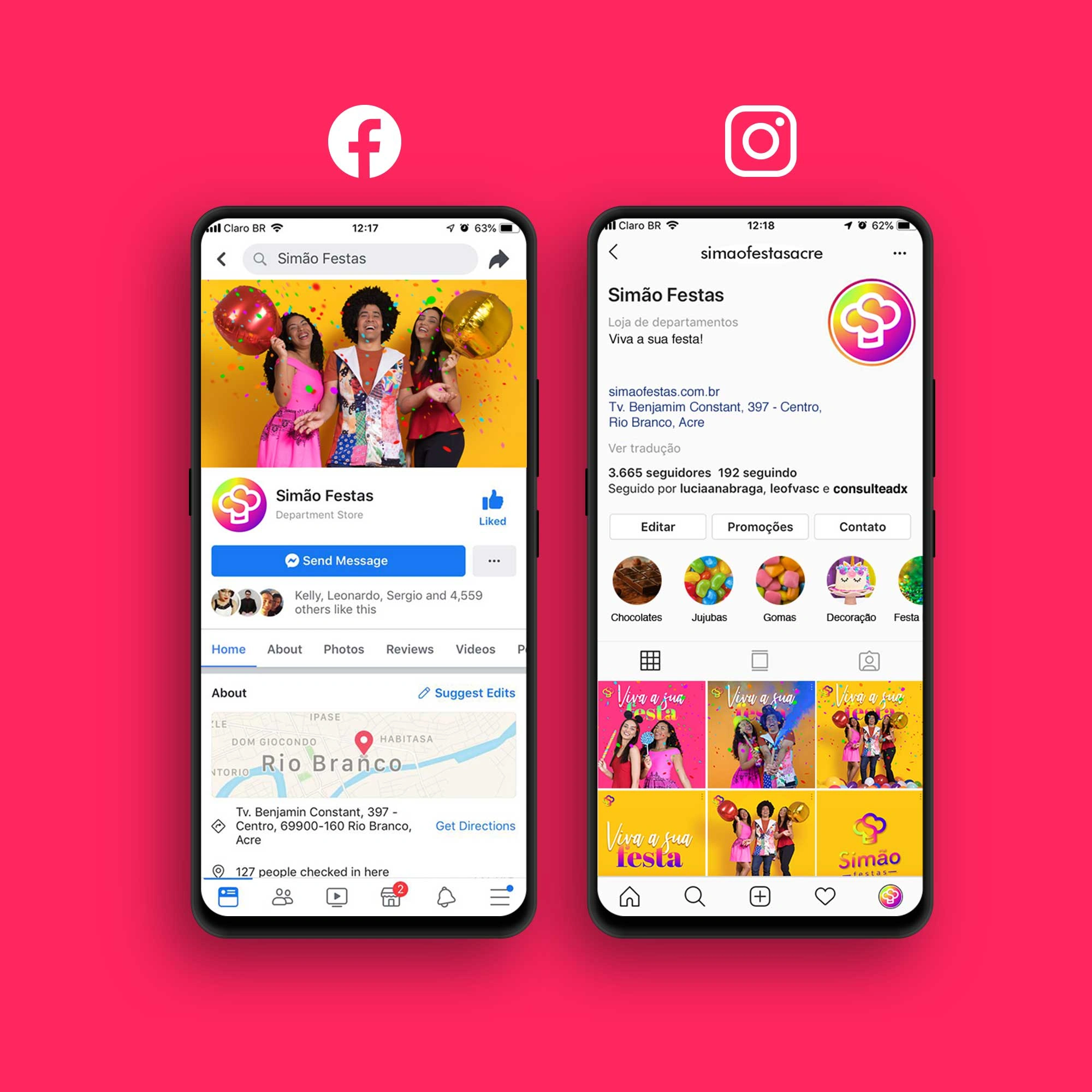
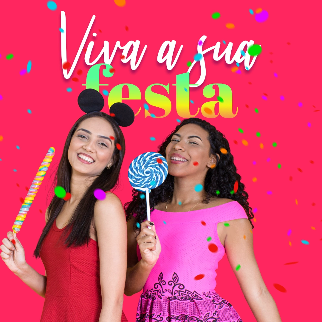
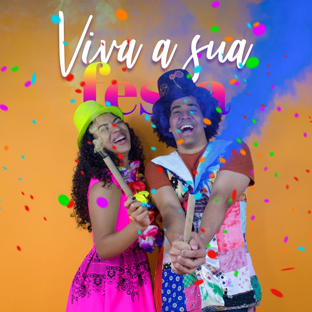
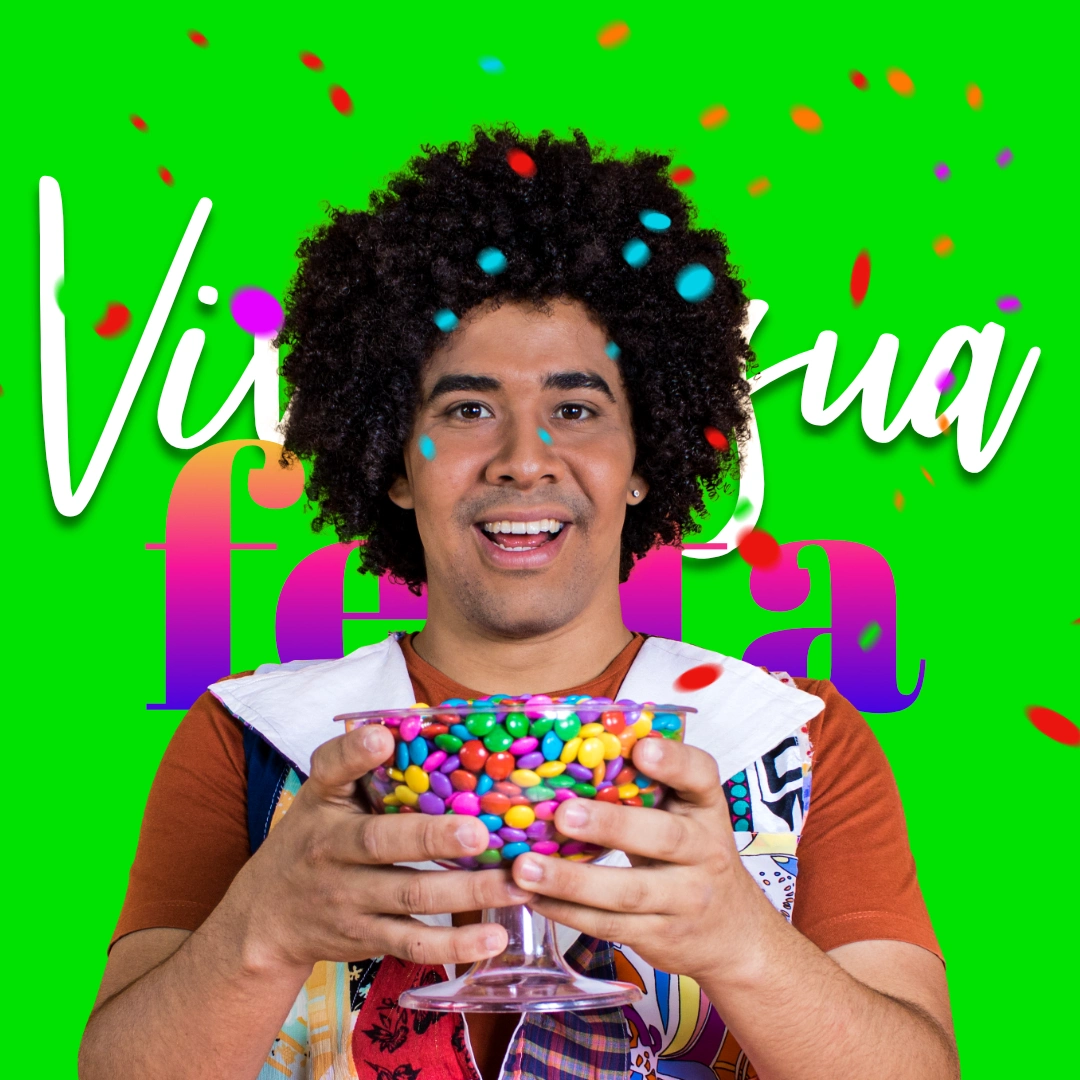
Social post templates
Style guide
Images
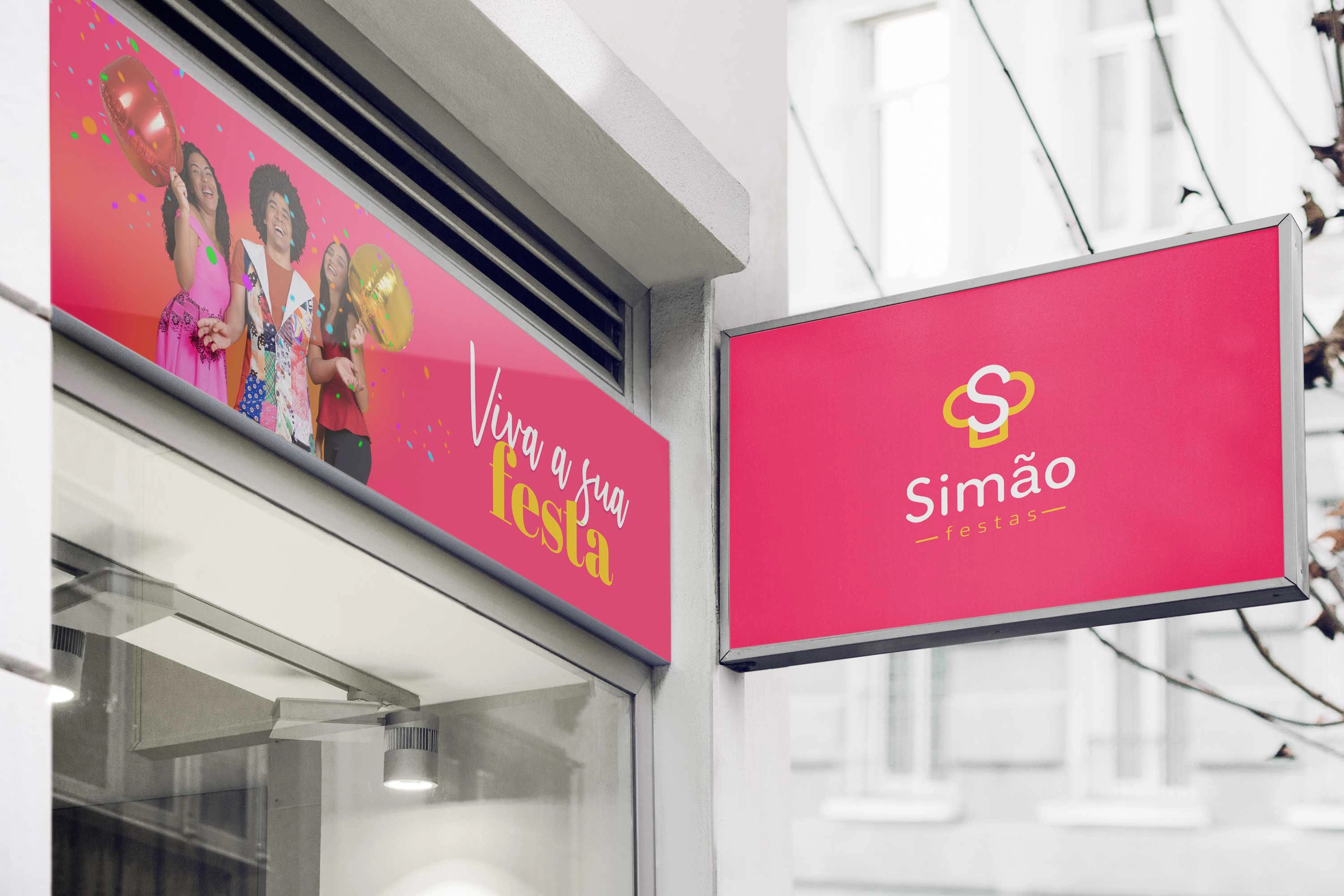
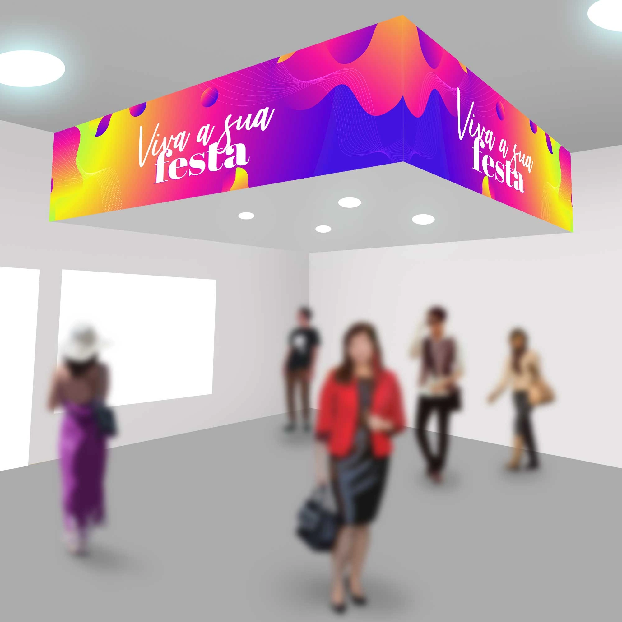
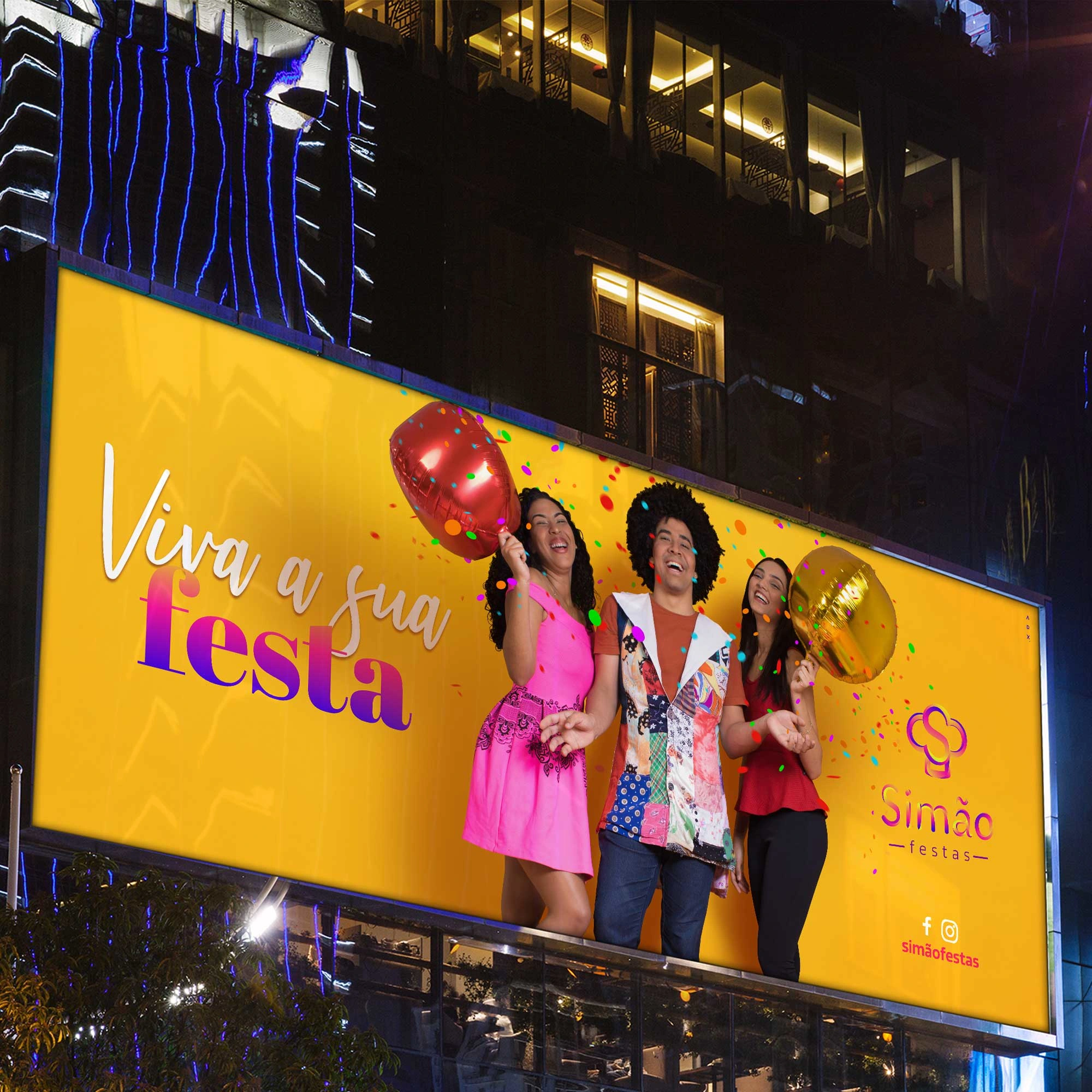
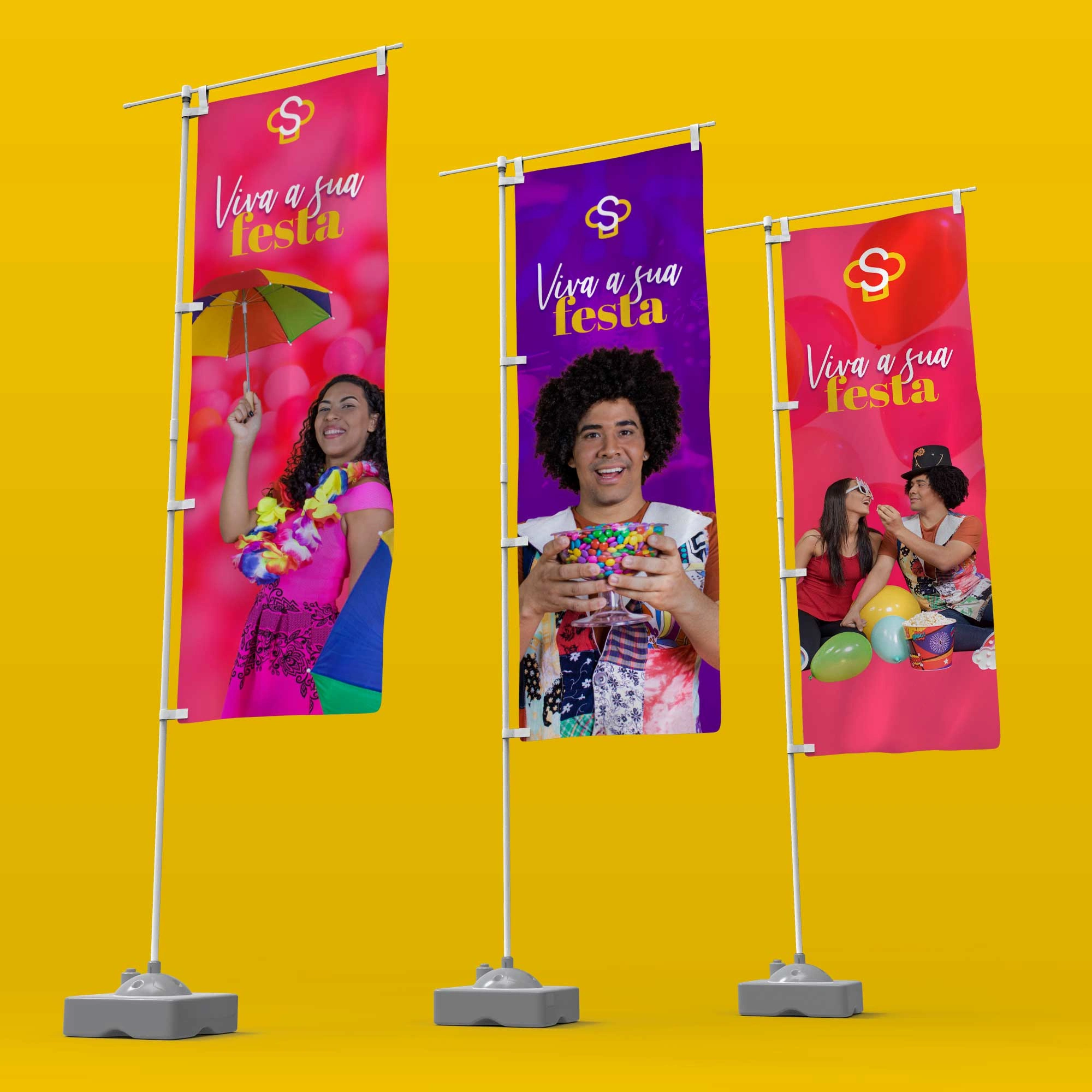
External store signage
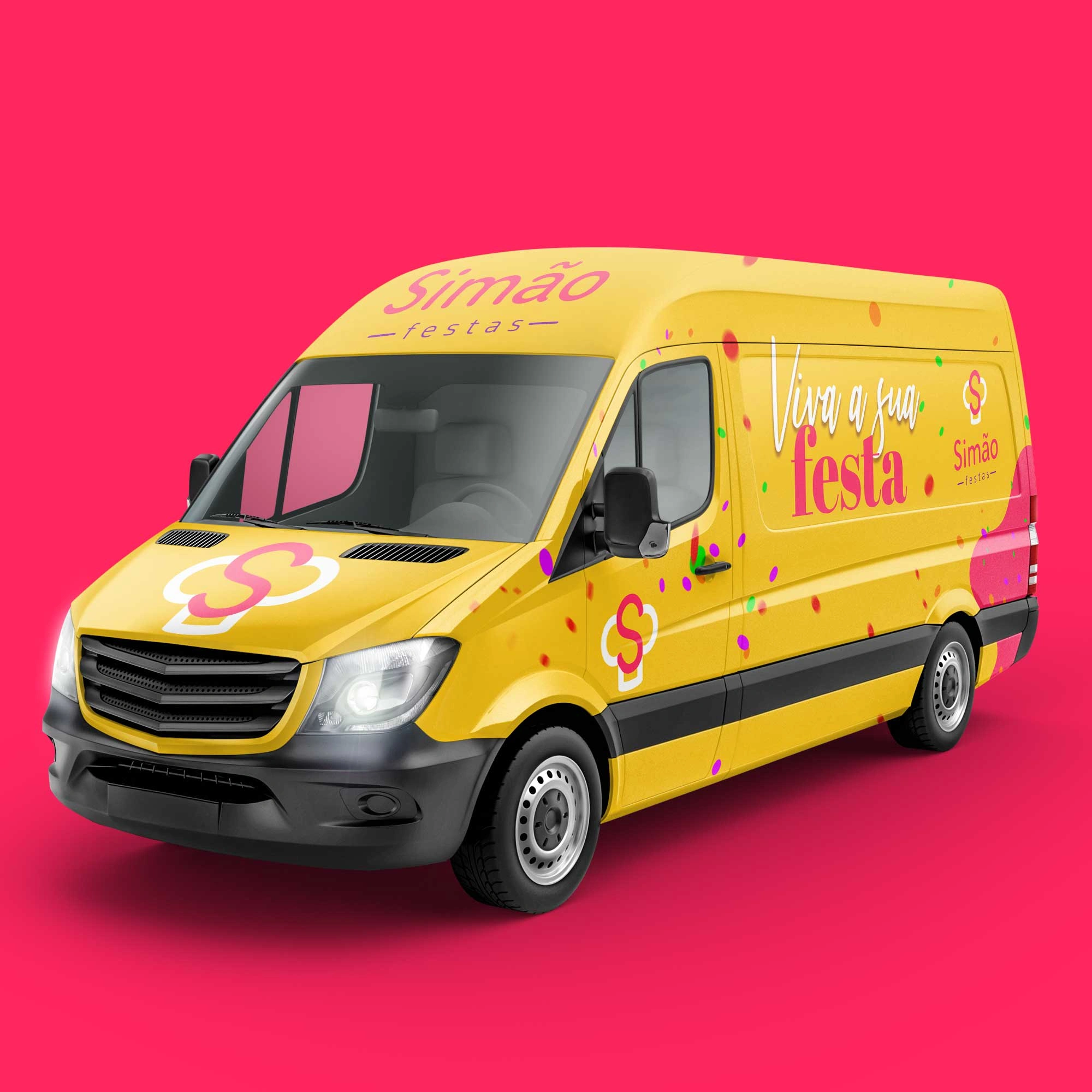
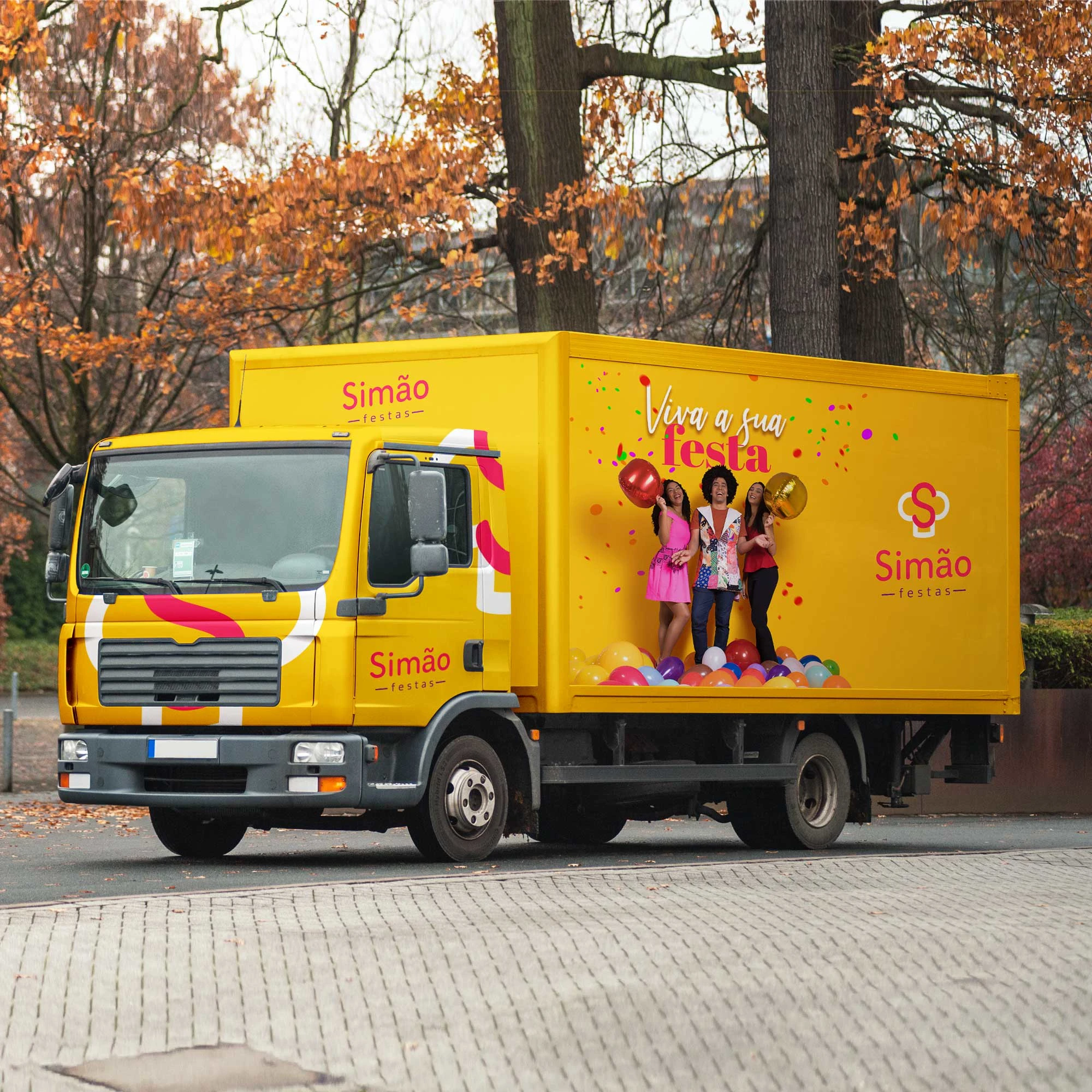
Fleet signaling
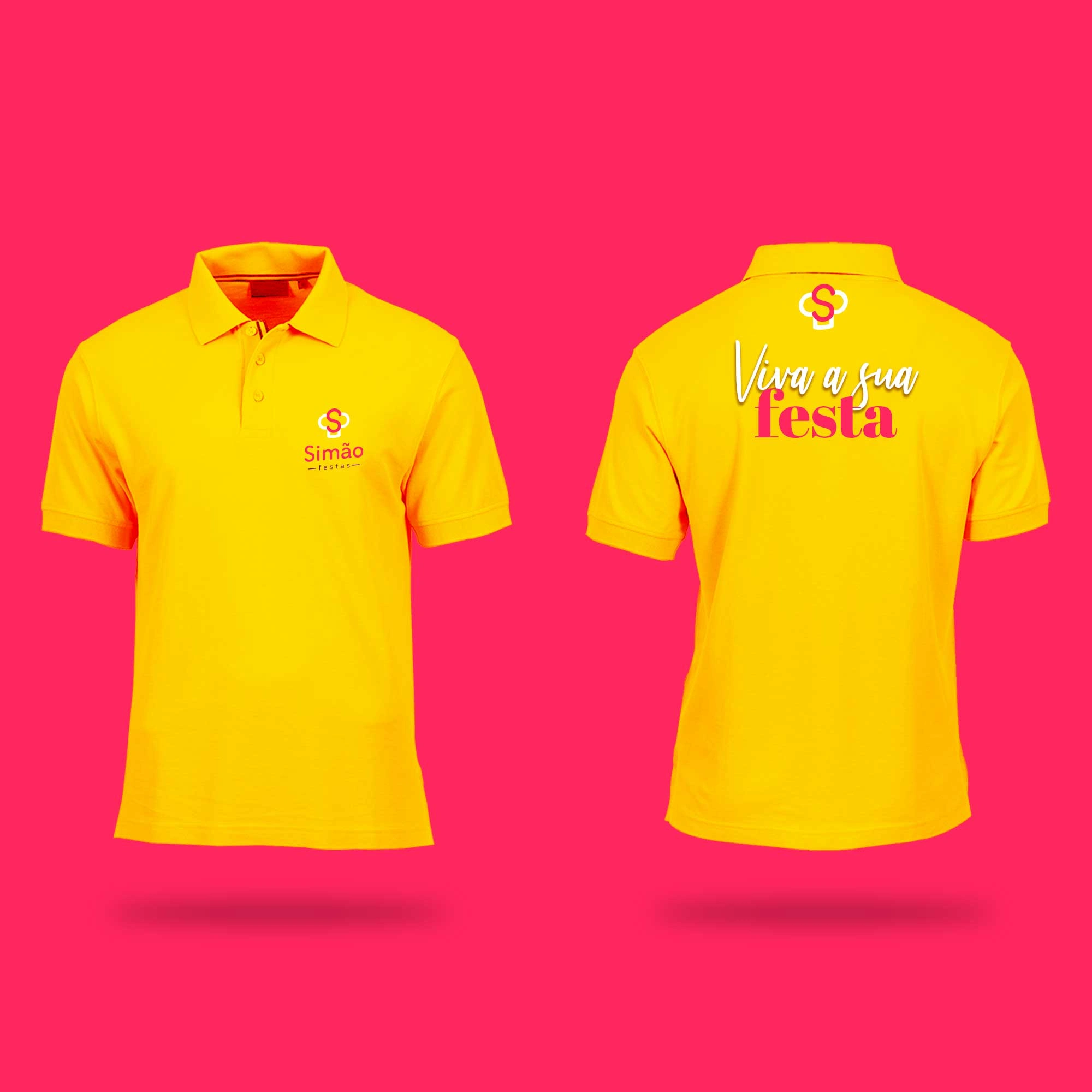
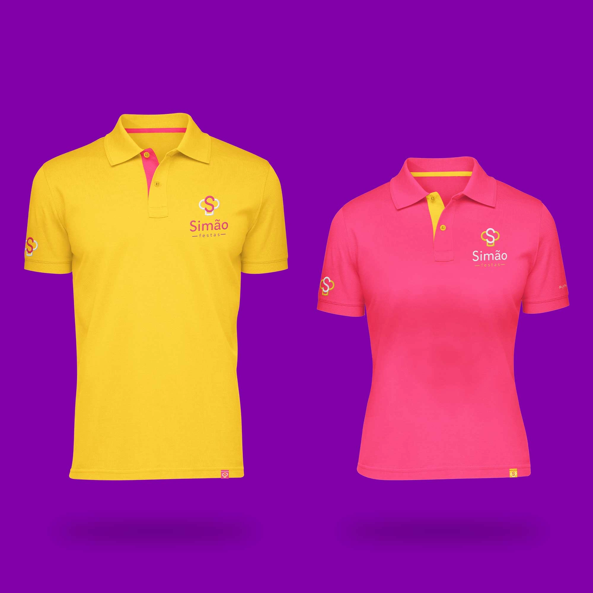
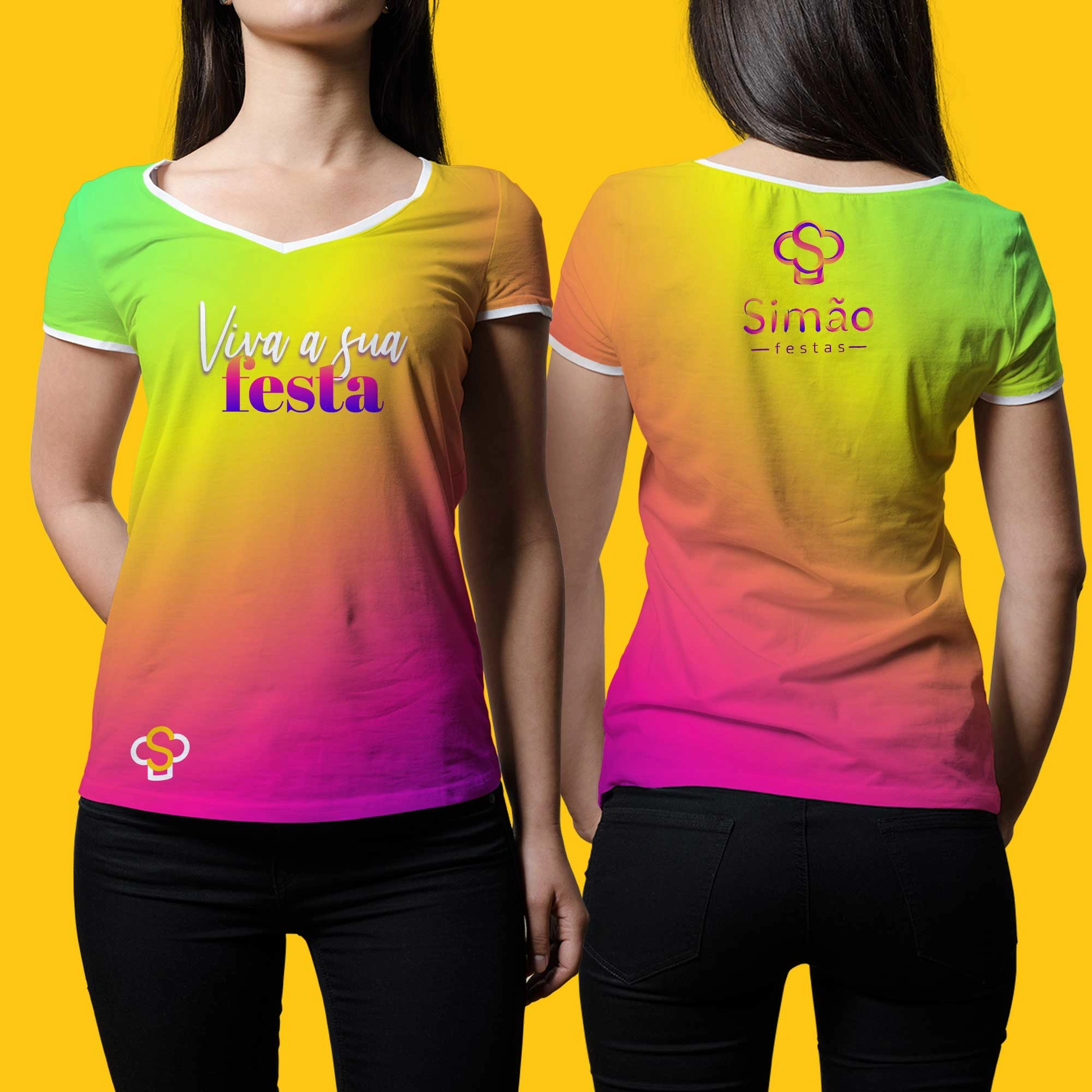
Uniform
The new brand helped me to reduce costs in the company. It's easier to understand and customers love it. 🚀
Name Paulo Simão
Role Founding partner
With a more beautiful uniform, customers feel more comfortable asking for help and even praise the uniform. 💪
Name Jessika Mamed
Role Manager
Like this project
Posted Jan 12, 2023
The new brand of Simão Festas, represents all the festivities of the human being.


