Exploring a dark-theme music player

Dmytro Zelinskyi


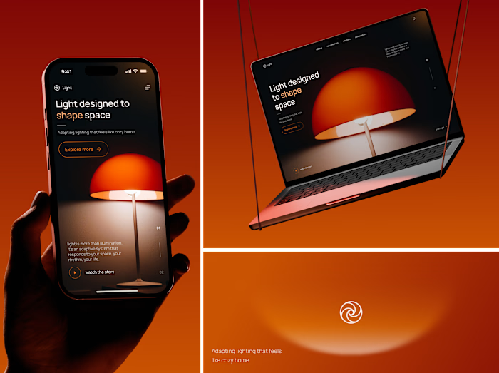
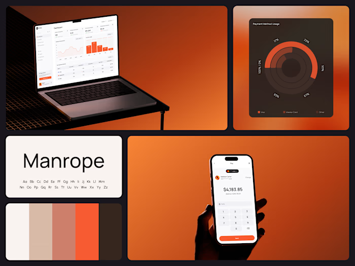
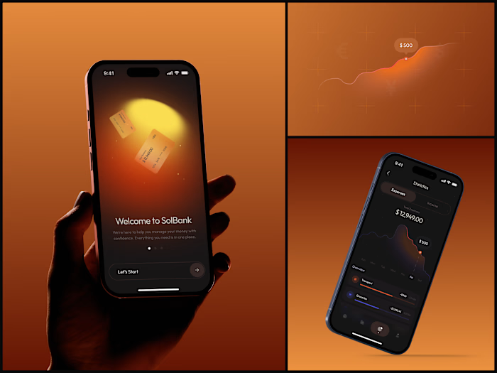
Exploring a dark-theme music player concept. Wanted to push the contrast between deep blacks and that warm orange accent - the waveform visualizer was the fun part to get right.
Dark UIs in audio apps aren't new, but the details make or break it: how the album art bleeds into the background, how the controls feel touchable without being oversized, how the genre chips stay scannable without competing with the artwork.
Small things that took the most time: getting the waveform scrubber to feel precise, making the playback controls feel weighted, and keeping the now-playing screen immersive without losing navigation clarity.
#UIDesign #MobileDesign #AppDesign #DarkUI #MusicApp #ProductDesign
Like this project
Posted Jul 19, 2026
Exploring a dark-theme music player concept. Wanted to push the contrast between deep blacks and that warm orange accent - the waveform visualizer was the fu...
Likes
0
Views
5