SolBank - Banking Mobile App
Dmytro Zelinskyi
SolBank - Banking Mobile App UI/UX
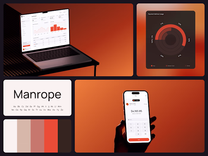
Banking apps have a problem: they all look the same. Blue gradients, sans-serif headers, account balance at the top, transactions list below. Trustworthy and boring in equal measure. SolBank wanted to break the mold without breaking trust.
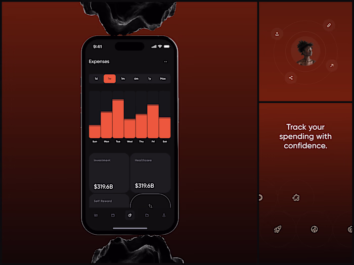
The visual direction is built around warmth. Deep ambers, sunset oranges, golden glow effects. Sounds risky for a financial product but it actually does the opposite of what you'd expect: instead of looking less serious, it makes the app feel approachable in a category that usually treats users like risk assessments. Your money lives here. It should feel like your money, not like a vault.
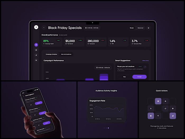
Honestly my favorite part of this project was the small detail that nobody asks for: the way each section uses light and color to create emotional rhythm. Bright for onboarding (welcome, excitement). Dark for daily banking (focus, calm). Most fintech apps pick one mood and force every screen into it. This one breathes.
#MobileAppDesign #UIDesign #UXDesign #Fintech #Banking #ProductDesign #DigitalExperience #iOS #CreativeDirection #Innovation
Like this project
Posted Jun 9, 2026
SolBank - Banking Mobile App UI/UX Banking apps have a problem: they all look the same. Blue gradients, sans-serif headers, account balance at the top, tran...
Likes
0
Views
3