Cryptowallet
Mark Hrechukha
Challenge
Most wallets are powerful but built for people who already understand crypto. Interfaces overload beginners with options, and transaction flows assume context they don't have. The opportunity was reducing that complexity without losing what makes these tools useful.
Overview
A mobile crypto wallet for people new to crypto - built around simplicity and clear navigation, so managing assets doesn't require knowing what a seed phrase is before you start.
Research & Insights
I started with research - wanting to understand both how crypto wallets actually work and where they tend to lose people. The first part was technical: blockchain interaction, private key management, Web3 integrations, security. Without that foundation, design choices would've been guesswork.
From there I moved into competitor analysis, going through several popular wallets to see how they structured the things that matter most - onboarding, navigation, security, the dashboard, supported chains. The products were powerful, but most of them were built for people already comfortable with crypto. I also ran a few interviews with people who'd used wallets before, to ground the analysis in real behaviour rather than my own assumptions.
Key findings:
Setup overwhelms. Creating a wallet felt complicated, especially the security setup
Technical overload. Interfaces overloaded beginners with technical detail they couldn't parse
Unclear steps. Transaction steps weren't always clear, and people often weren't sure what stage they were at
Rework as the fix. The main opportunity wasn't adding features, it was translating the ones already there
Solutions
Four things from the research had to be solved in the design. I worked through it in three passes - architecture first, then wireframes, then UI - each one a tighter version of the same answer.
Architecture
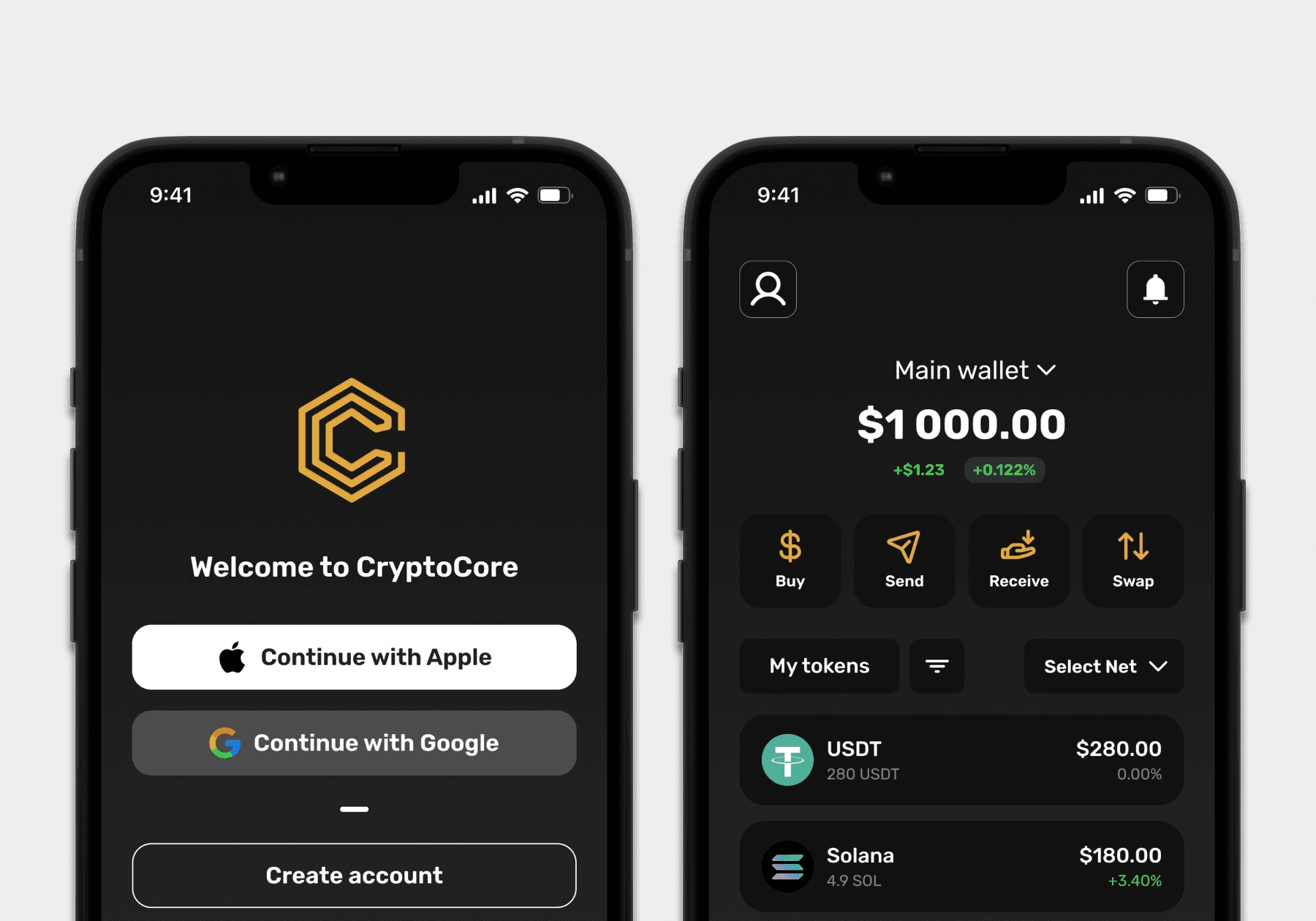
The onboarding goes linear - language, account, login, security. No branches, no optional paths: a beginner shouldn't be making choices before they know what they're choosing between. Past the home screen the app splits into four sections - operations, balance, assets, profile. Grouped by what you're trying to do, not by what the wallet technically supports.
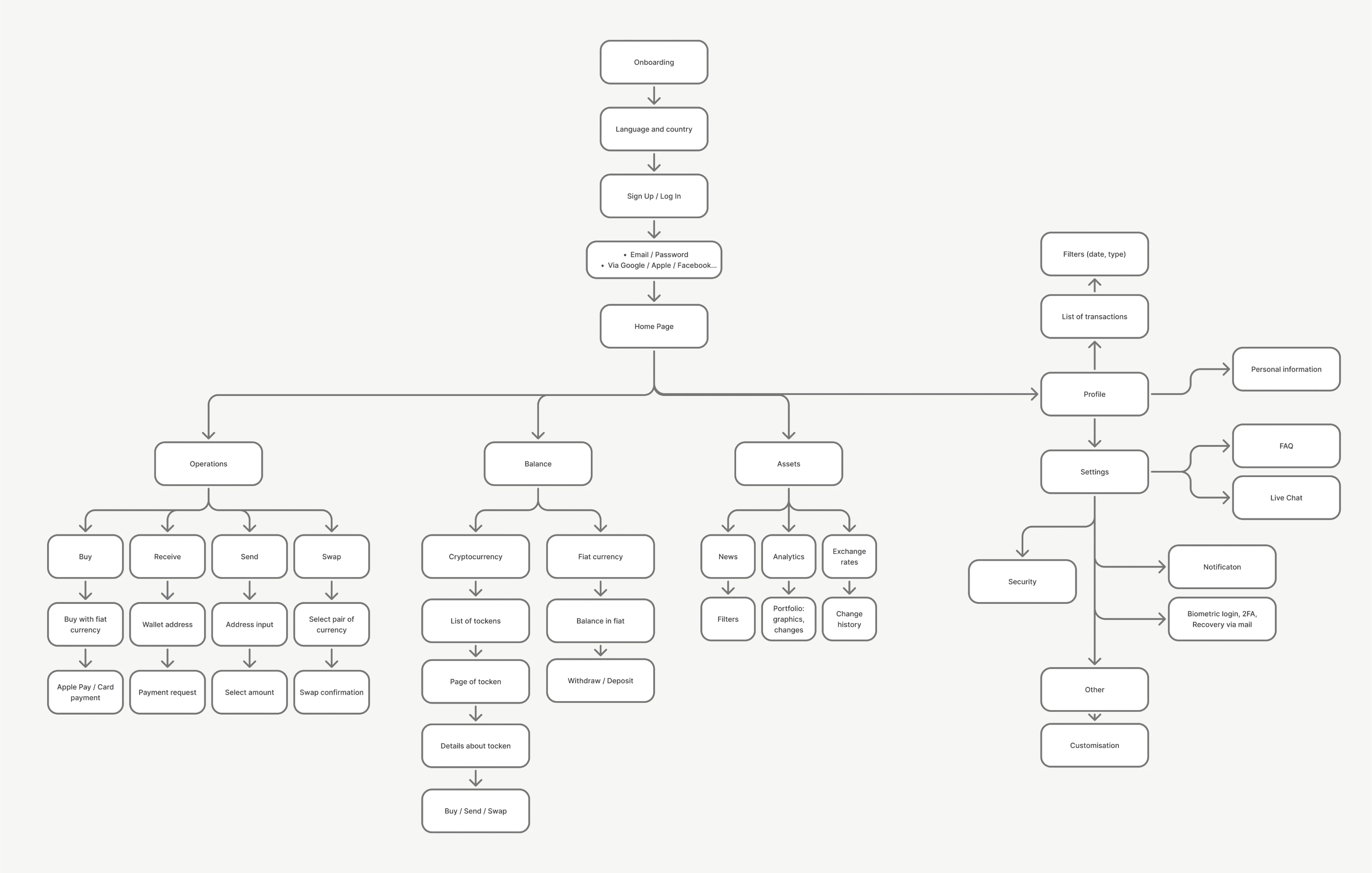
Architecture diagram
Wireframes
After the architecture I started drawing - every flow, lo-fi, all the way through. Onboarding through swap. The goal wasn't screens, it was finding where the logic falls apart. What's missing, what's doubled up, what made sense on paper but doesn't hold once you walk through it.
Errors and empty states came early too, not as an afterthought. A new user hitting a wrong password or an empty address book - that's not a small moment. That's where they make up their mind.
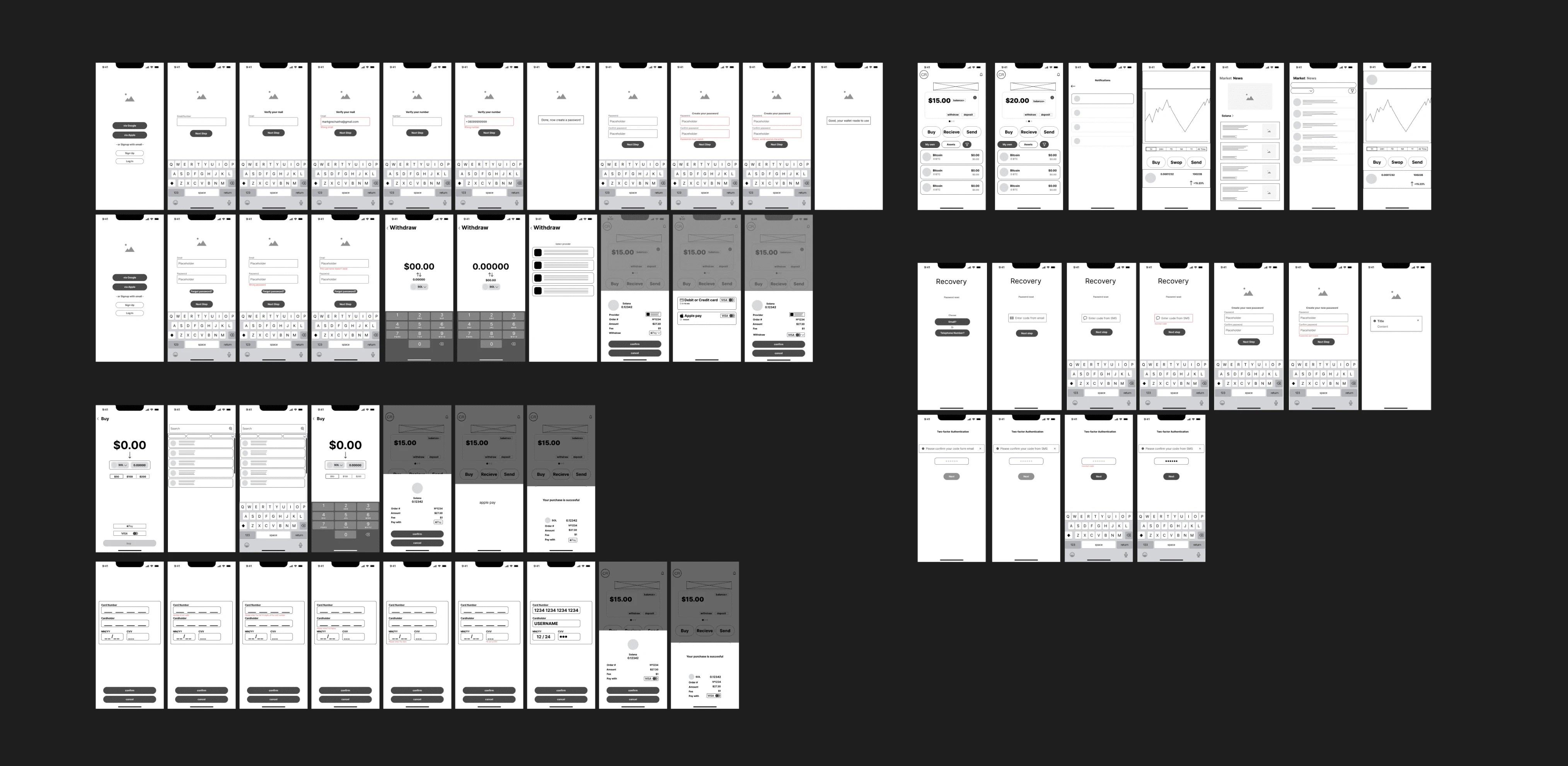
Wireframes
UI
Dark mode by default - large balance numbers sit easier on dark, especially if you're checking the wallet often. Balance is the biggest element on the main screen, with buy / send / receive / swap directly underneath. Amber as the only accent, reserved for primary actions so it always means "do this next."
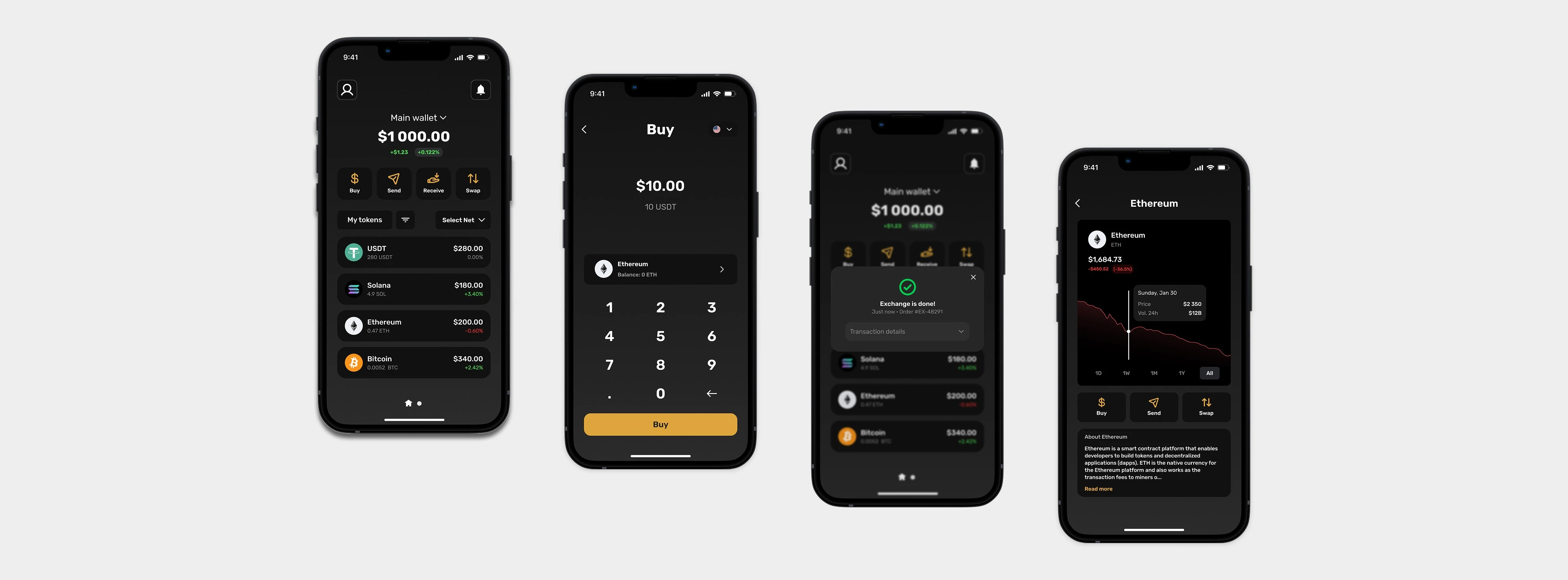
UI screens
Outcome
A clear onboarding flow, a focused dashboard, and a simple way to move assets around. A lot of what reads as crypto being complicated isn't really technical - it's structural. Once the app stops asking beginners to decide things they don't have the context to decide, most of the "complexity" just isn't there anymore.
Like this project
Posted Jun 23, 2026
A mobile crypto wallet with linear onboarding, a dashboard grouped by intent, and zero assumed knowledge of seed phrases or gas fees.
Likes
0
Views
1
Timeline
Mar 1, 2025 - Aug 31, 2025