SubSpark - Mobile Video Editor with Auto Subtitles
Mark Hrechukha
Challenge
A mobile video editor focused on auto-generated subtitles. The shortest path in the app leads to subtitles, but the editing tools around it are full enough to take a video from import to export without leaving.
Overview
Most mobile editors fall on one side or the other: simple but basic, or feature-rich but laid out flat, with tools sitting next to tools and no real hierarchy. The challenge was building an interface with a clear hierarchy without losing fast access to the rest of the tools.
Research & Insights
I went through the main mobile editors, paying attention to how the home screen sets you up, how tools are grouped, how flows hold together, and how much the interface assumes you already know. After mapping everything into a table, I used the apps — edited real footage, exported, tried to fix things that went wrong.
Key findings:
No hierarchy. Projects float without order, nothing signals what's recent or where to pick up
Simple ≠ well organised. Simpler apps are simple by being basic, not by being thoughtfully structured
Tools without weight. Plenty of tools, little depth; they handle easy cuts but fall apart on anything precise
The cost of control. Automation-heavy apps do the work for you but leave little room to fix the result
Solutions
The solution came together in three layers: architecture, features, and visual feel.
Architecture
Subtitles sit before the editing tools - that's what people open the app for. Tools stay flat in four groups instead of nested menus. Profile, projects, and settings each get their own lane off the main page, so nothing competes with the work.
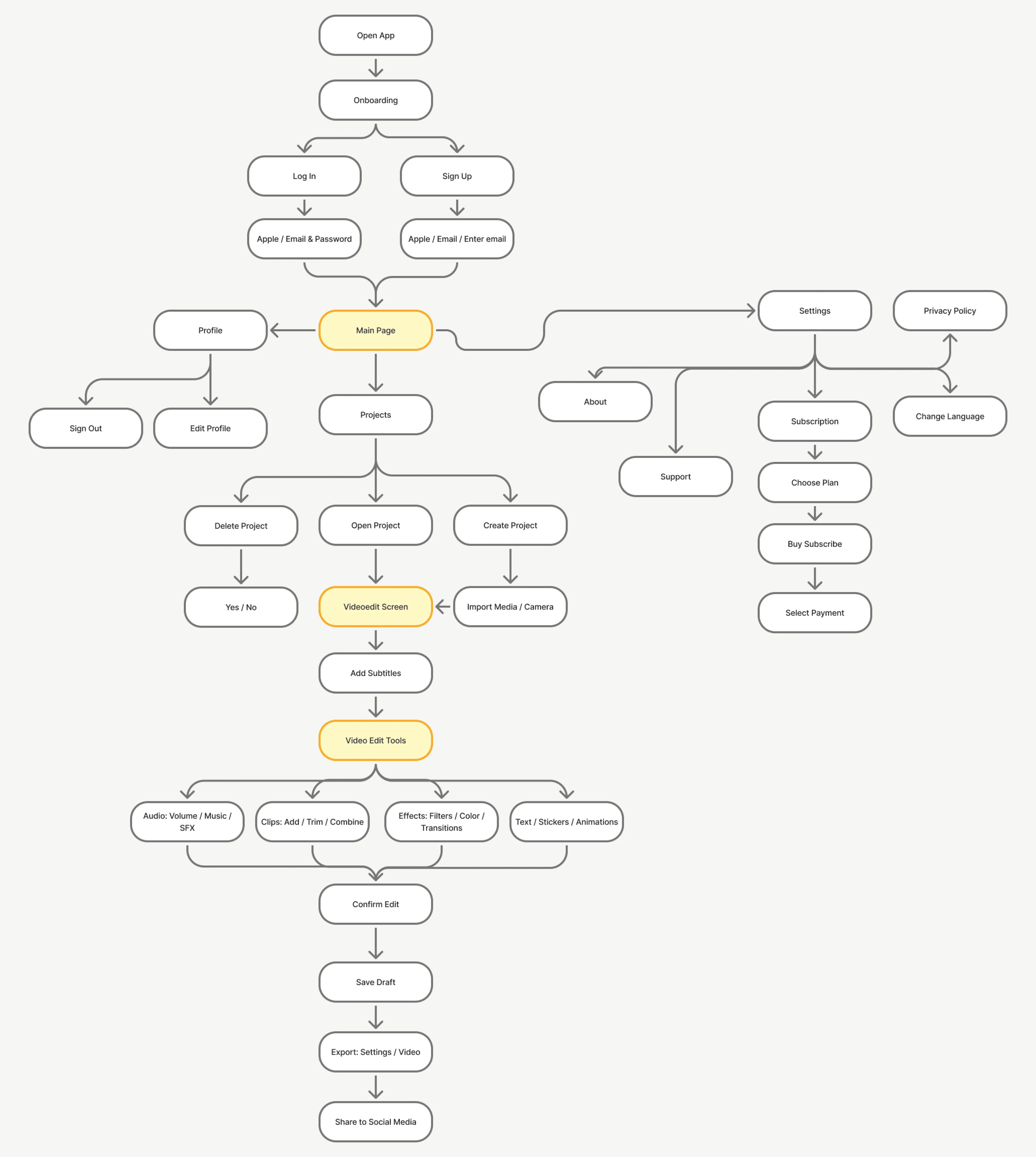
Architecture diagram
Subtitle Styling
Caption styling goes deeper than most mobile editors bother with: full type controls (size, spacing, line height, stroke), a proper font library, separate fill and border colours, all split across four tabs. If the app positions itself around auto-subtitles, the tools around them have to actually let you design something.
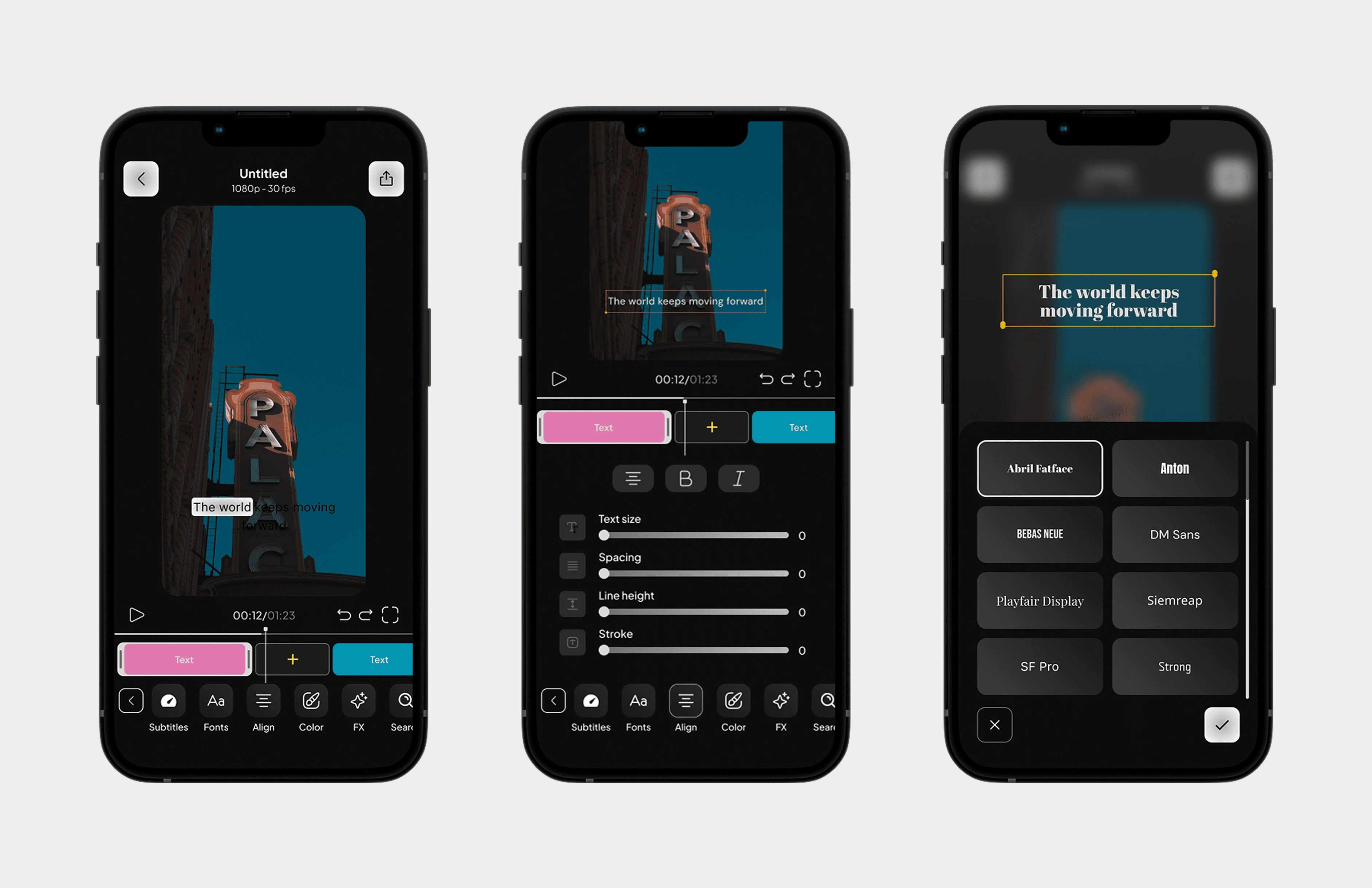
Subtitle styling screens
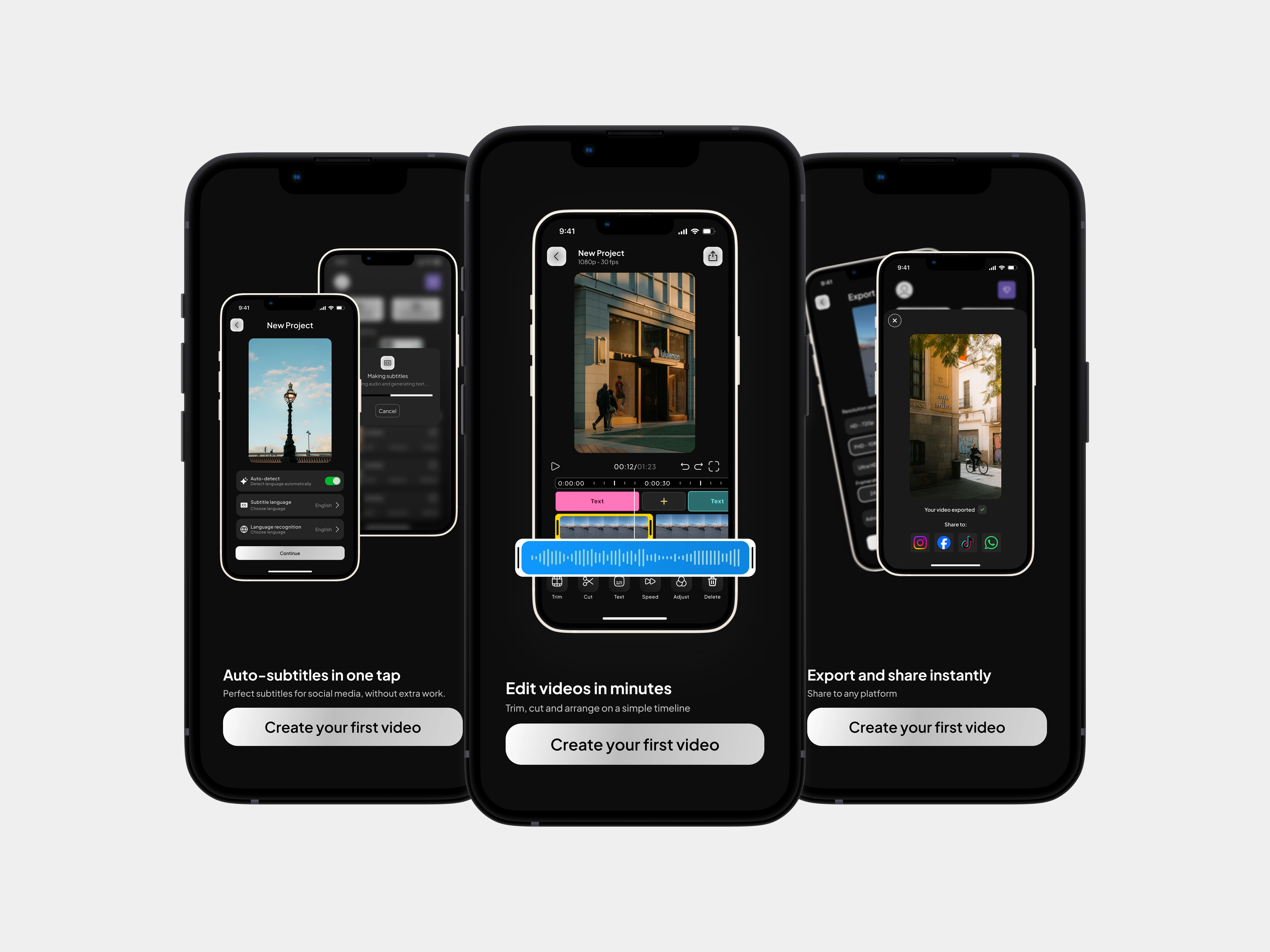
One-Tap Subtitles
Auto-subtitles got their own card on the home screen, next to "Create new project." Most editors hide subtitle generation 2-3 screens deep. If the app's whole point is fast subtitles, that path shouldn't exist. One tap from open, pick your video, done.
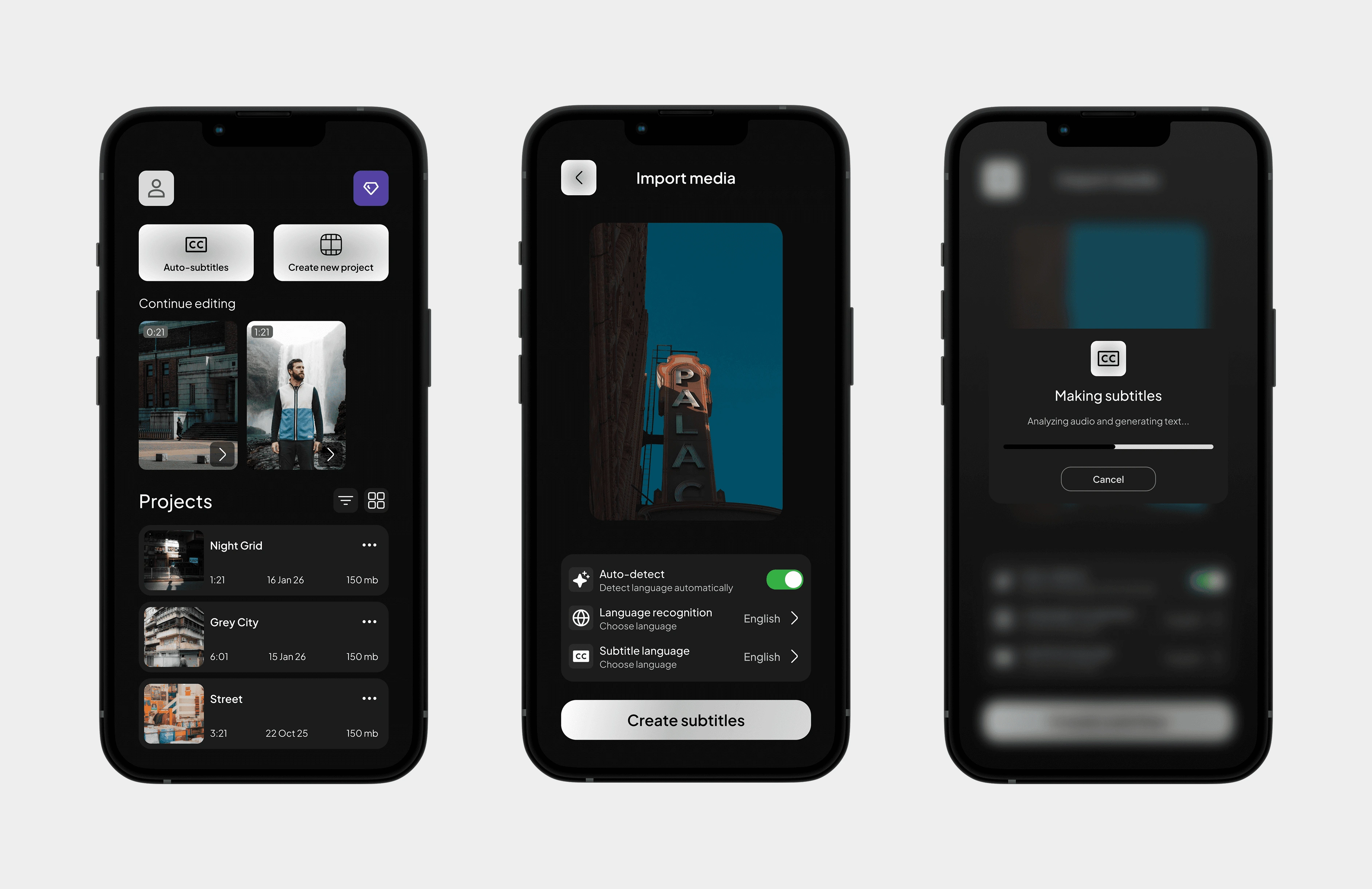
One-tap subtitles flow
Outcome
An editor that's quick to get into and deep enough to finish in. Subtitles are two taps from open, the rest of the tools sit one layer down without feeling buried. The bigger takeaway: "simple vs powerful" is a false choice - you can have both if hierarchy does the work instead of stacking features flat.
Like this project
Posted Jun 22, 2026
Mobile video editor built around auto-subtitles. Designed the full UI/UX - from architecture and flows to the tools that make it worth finishing in.
Likes
0
Views
1
Timeline
Sep 1, 2025 - Apr 30, 2026