ShopFlow Admin Dashboard Design
Mark Hrechukha
ShopFlow
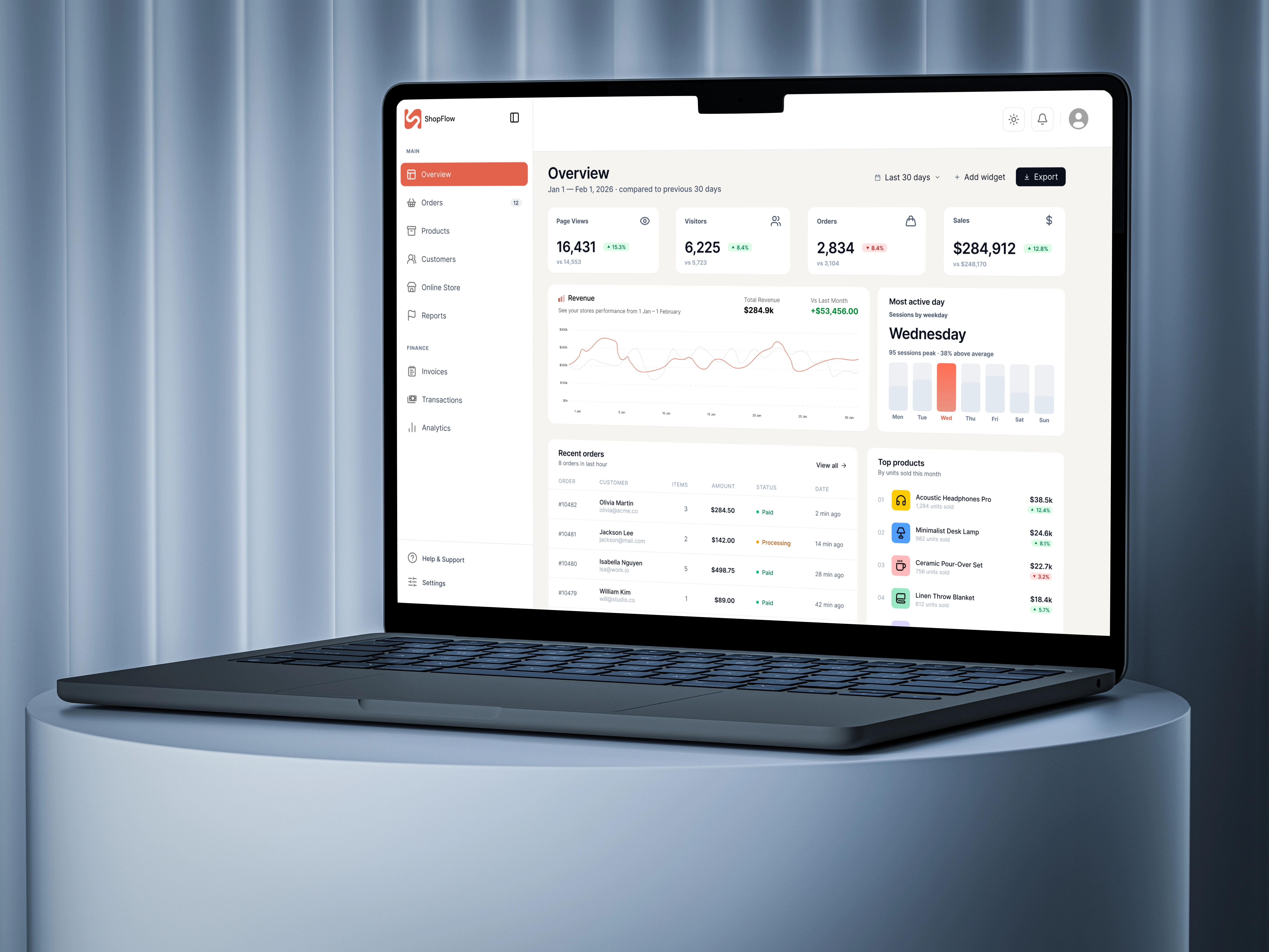
ShopFlow is an admin dashboard for e-commerce store owners that brings sales analytics, order management, and product management together into a single workspace.
Most small and mid-sized online store owners end up juggling disconnected tools - one tab for tracking sales, another for inventory, a third for finances. As a result, important decisions (when to restock, which product to push, whether the store can handle peak-day traffic) get made late, or on gut feeling. The goal of this project was to bring all of that data into a single screen, so a store owner could gauge the state of their business within the first 10 seconds of logging in.
Goals
Surface key business metrics (page views, visitors, orders, sales) at a glance, with change indicators relative to the previous period.
Let users move seamlessly from the big picture down to specifics - a single order or product - without extra clicks.
Surface behavioral patterns (like which day of the week is busiest) so owners can plan resources ahead of time.
Build a navigation system flexible enough to scale across different areas of the business: sales, inventory, customers, finance.
Process
I started by mapping out the typical tasks of a small store owner: what they check every morning, what they react to urgently, and what they only glance at weekly. That task list shaped an information hierarchy - top-level metrics needed to be visible immediately, with order and product details just one click deeper.
For the main screen, I went with a system of metric cards (page views, visitors, orders, sales), each with a percentage change indicator - green for growth, red for a drop. This lets an owner instantly read whether things are on track, without doing the math themselves.
I paired the revenue chart with a "most active day" panel - essentially two different views of the same sales data, but from different angles: trend over time, and distribution across the week. That answers two separate questions an owner asks: "is the business growing?" and "when is my store busiest?"
I kept the orders and top-products tables compact, but expandable via "View all," so the main screen doesn't get overloaded while quick access to detail is still one tap away. Order statuses (Paid / Processing) are color-coded with a dot indicator, so they can be read at a glance without having to read the text.
The sidebar navigation is structured by frequency of use: the Main section (day-to-day work - Overview, Orders, Products, Customers) is separated from Finance (Invoices, Transactions, Analytics), which owners check less often but still need quick access to.
Results
The end result is a dashboard that balances data density with readability: owners get the full picture of their business on one screen without getting lost in numbers. The next step is usability testing with real store owners, to validate whether this information hierarchy actually matches how they make day-to-day decisions.
Like this project
Posted Jul 2, 2026
Designed an admin dashboard for e-commerce to streamline business insights.
Likes
1
Views
1