Alloy • Website Redesign


Alloy Therapeutics • Better Medicine Together
Biotechnology | Biopharma
The Project Approach
After a recent website redesign, Alloy aimed to enhance the user experience and overall structure to accommodate their ongoing addition of offerings. To achieve this goal, I partnered with the Wizardly team to conduct user interviews, identifying the current pain points in the website. Together, we devised a more streamlined user flow and implemented a color-coding system to easily distinguish Alloy's various offering categories.
Our Process
Understand the business + project goals
Conduct a user survey based on current website ( 2 surveys, 17 responses)
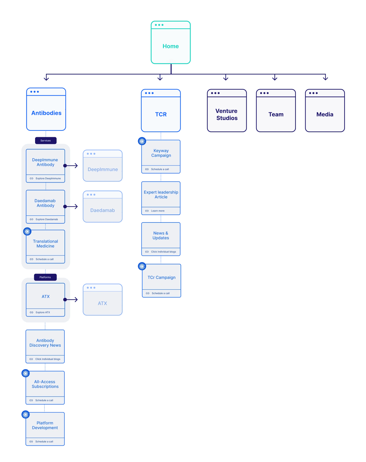
Restructure sitemap, starting with home page.
Define KPI’s for each page
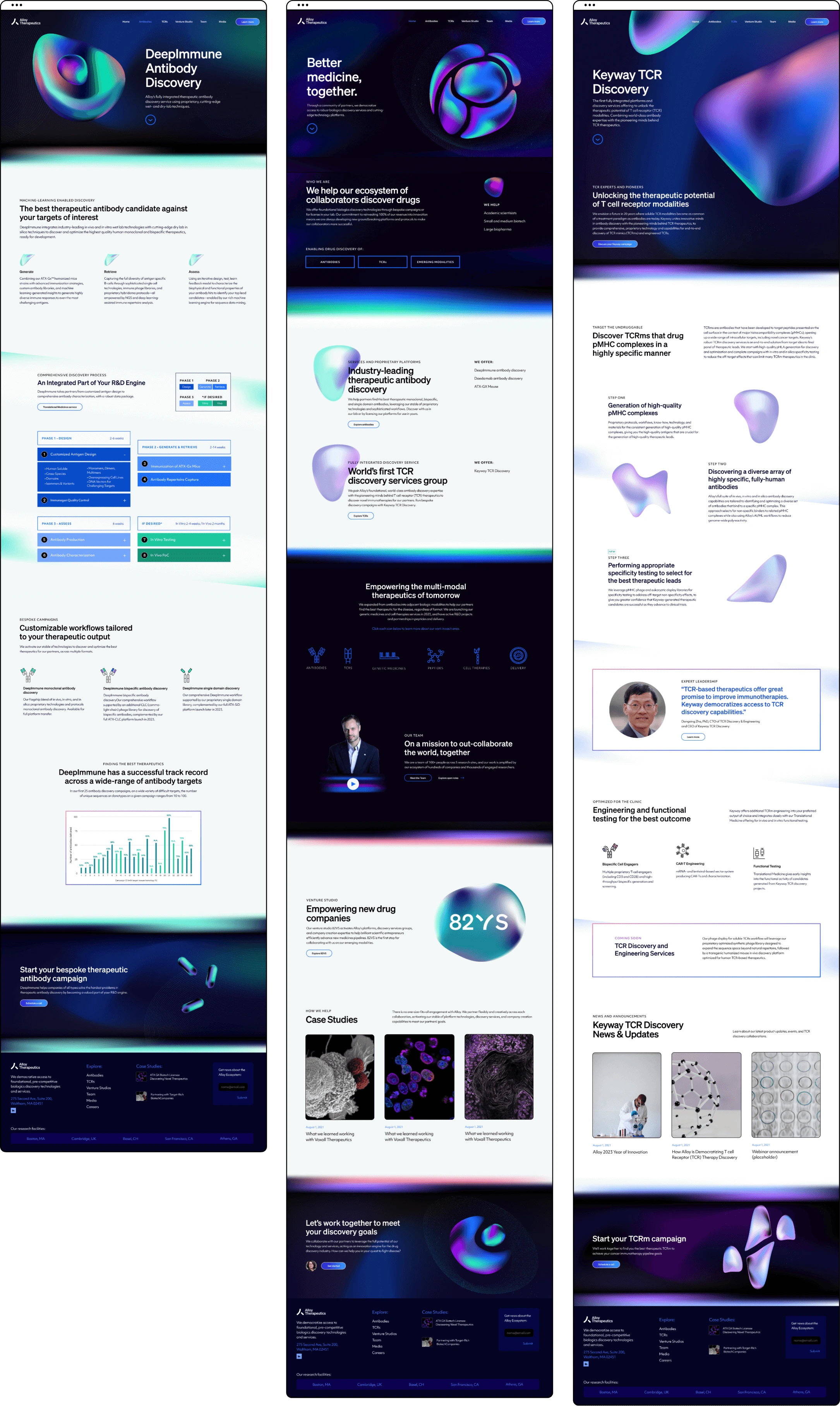
Create design prototypes primarily for desktop use, with the addition of a few mobile mockups where necessary.
Understanding the users
The client had received feedback regarding pain points on their website. After conducting an audit, I identified several of these issues myself. However, as I'm not their primary target audience and the biopharmacy industry is unfamiliar territory for me, I recognized the importance of comprehending the user's perspective. To achieve this, I developed two surveys.
• The first survey targeted potential users who had not yet visited the website, aimed at capturing their initial impressions.
• The second survey was tailored for existing users to gather valuable feedback and actionable insights to improve the overall user experience.
Uncovering the feedback from users
The two surveys received 17 responses that confirmed the findings of my website audit and uncovered other issues that had not previously been identified.
Identifying areas for improvement
Website Audit
While awaiting user feedback from the survey, I embarked on a comprehensive site audit to pinpoint potential areas for enhancement.
In the initial stages of the audit, I concentrated on evaluating the website's user navigation aspects. There was a notable degree of confusion stemming from unclear copy, inconsistent button naming conventions, and sections that lacked substantial value.
Although the home page was not initially included within the project scope, recognizing the user flow challenges prompted me to create a wireframe. This wireframe was aimed at establishing a more coherent user flow and facilitating seamless navigation throughout the website. I viewed this step as pivotal for the project's success and was able to persuade stakeholders.
User flow
To gain a deeper insight into how the existing website was guiding users, I created a user flow mockup and identified areas for potential improvement. Subsequently, I designed a new flow and presented this concept to the client. I successfully persuaded them to include the homepage in the redesign, recognizing its crucial role in ensuring a successful user journey from the very start.
Identifying areas for improvement
Like this project
0
Posted Sep 11, 2023
Conducted user research to inform the project's redesign of the user flow & create space for the their expanding range of offerings.


Deck Design

Priority Payment • Web Design

Travely App • App Design

Siento.AI • Landing Page