Travely App • App Design


Background
Problem Statement
Group travel is a balancing act that involves coordinating schedules, deciding on activities, and keeping track of documents. Each trip offers its own challenges, and most of the apps available are restricted in how their features can be customized.
Hypothesis
When people can customize their plans with collaboration add-ons, it will facilitate the planning process and, in turn, allow them to focus on what makes their vacation fun.
Research
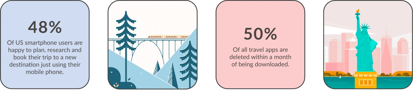
In the foundational research, users were surveyed to study how they planned a group trip for 3 or more people. In the secondary research, competitors in the market, as well as statistics from booking trends on Google, were examined.
Methodologies:
• Surveyed 10 participants
• Conducted a competitive analysis
• Researched travel trends on Google Consumer Insights & Condor Ferries
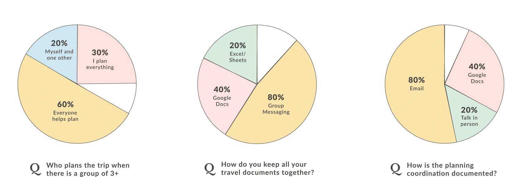
Survey
The more people involved in planning a trip, the more complicated it becomes. My goal was to understand how people plan for groups that have 3 or more people. But, what I was most curious about were the tools they used.
I wanted to learn more about:
• Who plans a group trip when there are 3 or more people
• How does the group decide on the location, activities...etc.
• How is the planning coordination documented?
• How do you keep all your travel documents together?
Insights
These are the results from the survey I conducted with the 10 participants.
Opportunities
Based on my research into what the target audience is currently doing for group trips, these are the initial ideas I wanted to test and incorporate into the app.
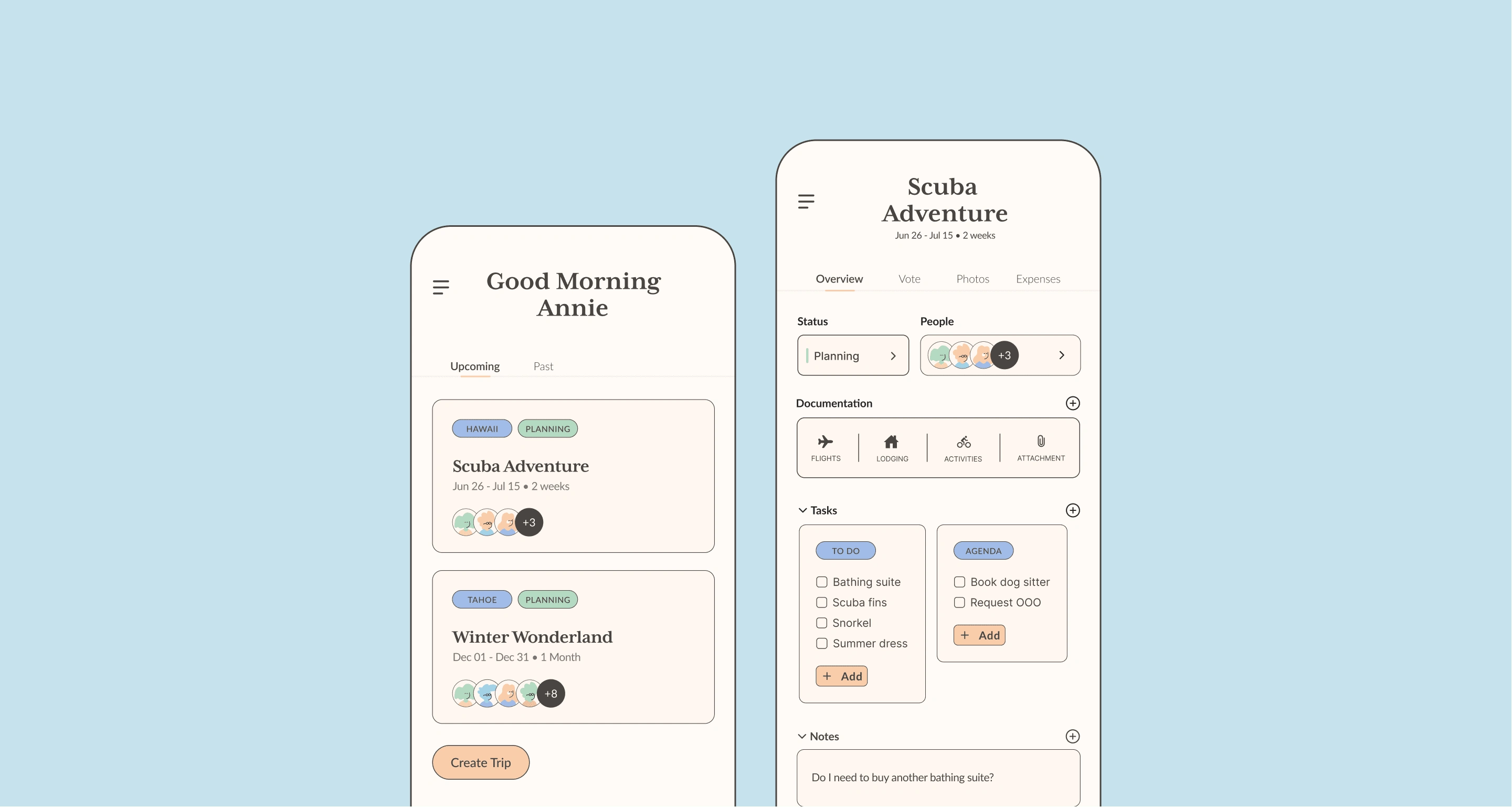
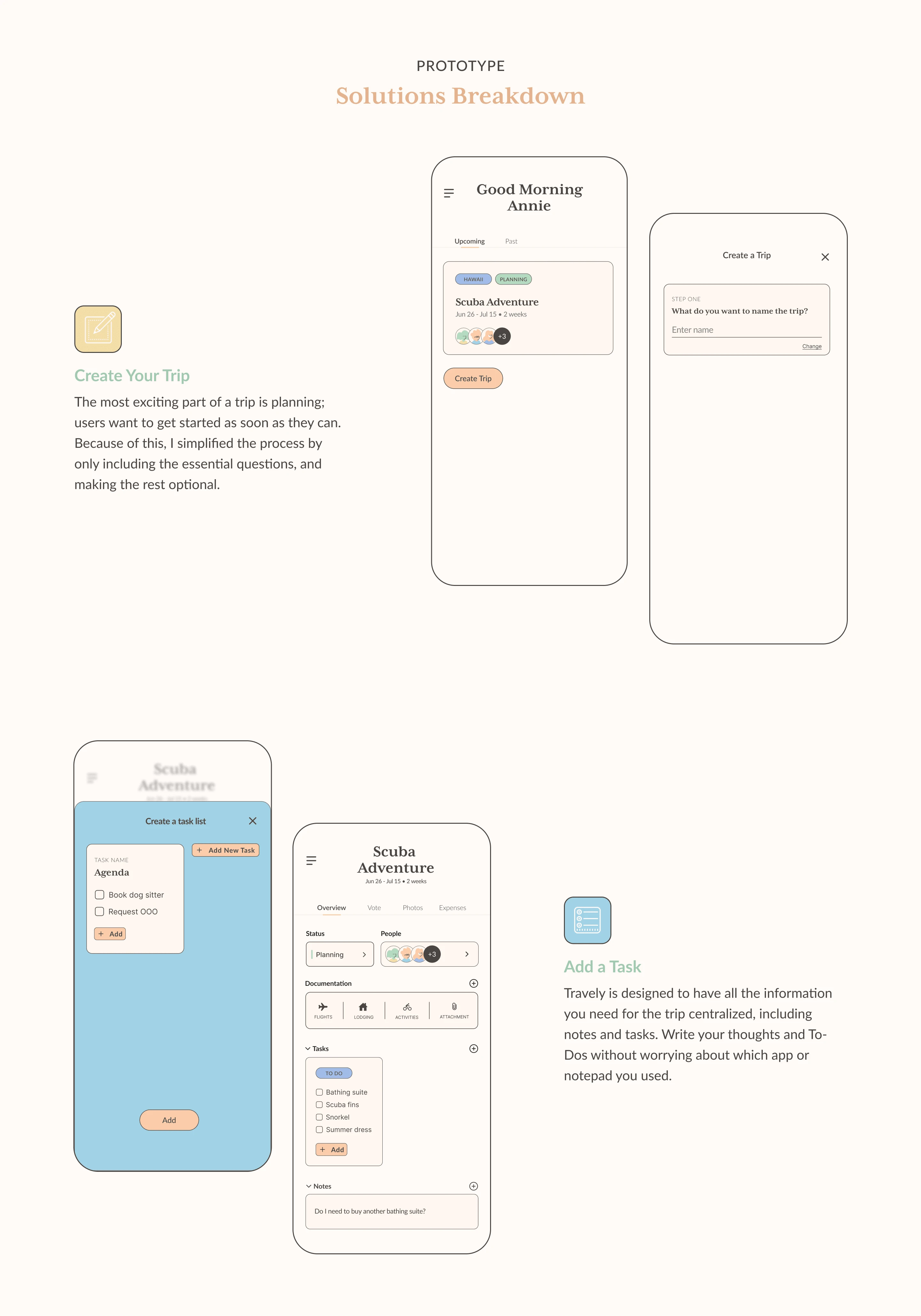
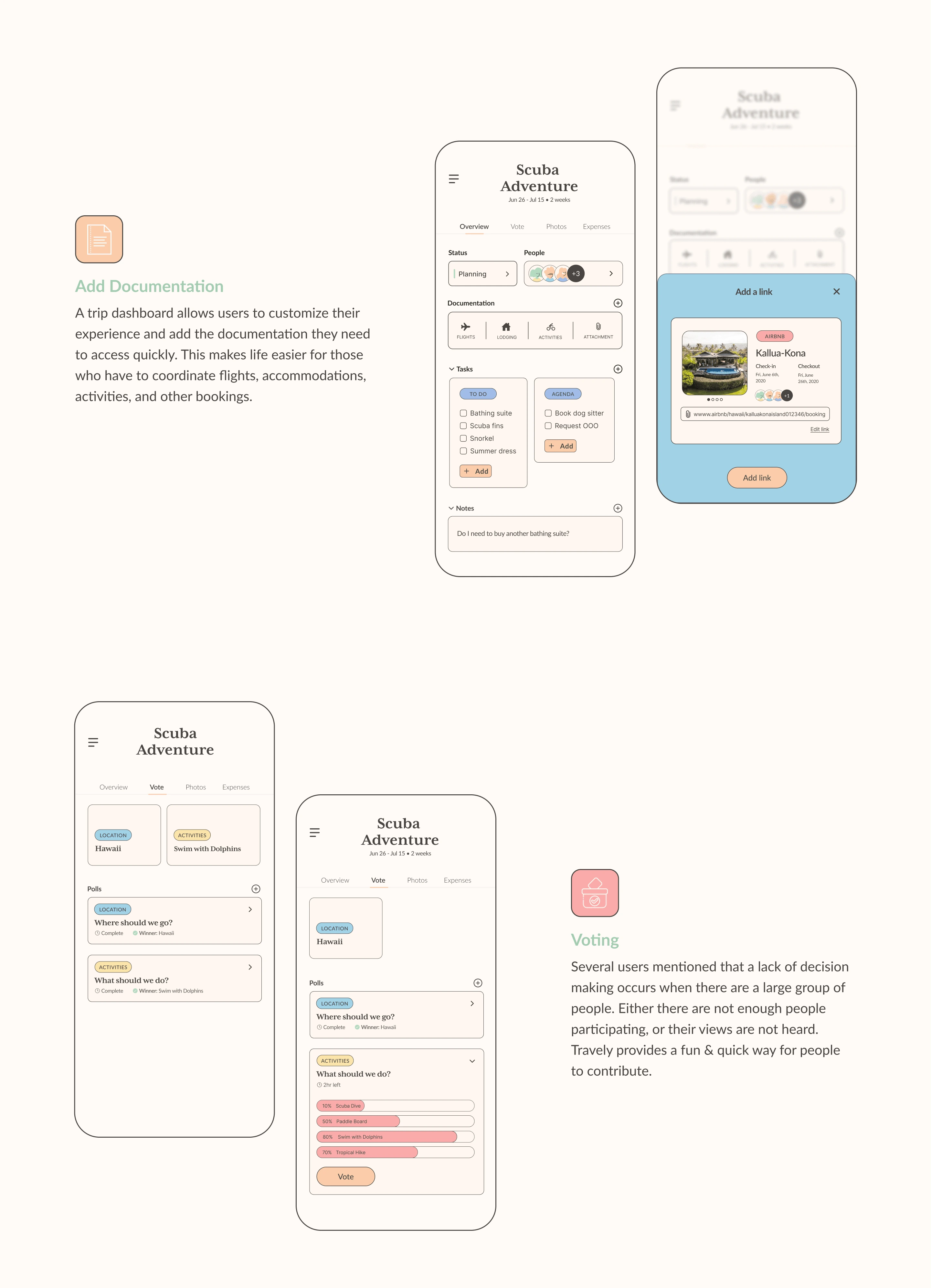
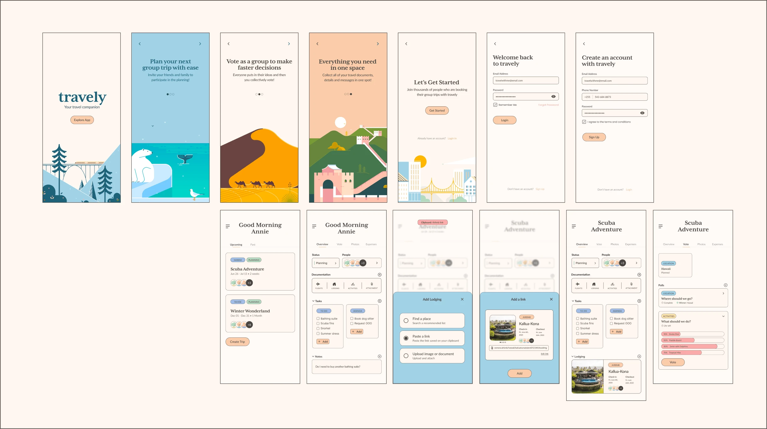
Dashboard: The dashboard is a central place to collect and share all documentation, links, tasks, and thoughts.
Voting: With group trips, decisions are a common pitfall. A voting section could help the group to make decisions faster.
Tasks: No matter how people keep track of their tasks, having a centralized task list keeps them organized.
Mid-fidelity Wireframes
Listening to Users
Research Goals:
I tested the initial concept of having a dashboard, voting, and tasks section, along with the general flow of the app with the target audience.
Methodologies:
Unmoderated usability study with 5 individuals
Moderated usability study with 5 individuals
Finding Patterns
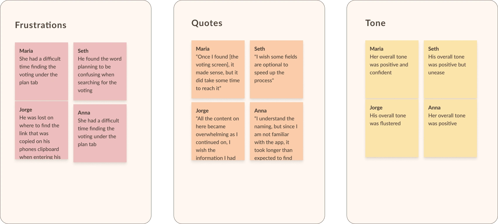
Testing Insights
As a result of the insightful feedback users provided, I gained a better understanding of what worked well and what needed to be improved.
I learned the following from the usability test:
Users struggled to find the voting section under the plan tab
The ‘create a trip” layout was overwhelming the users due to lack of white space and step indications
They were missing an indicator that there was a link copied to their phones artboard when they copied a link from another app
APP ADJUSTMENTS
I applied the direct feedback from the target audience to the design and conducted a moderated usability test to verify that the updated designs aligned with their requests.
Plan → Vote
The group as a collective found the voting screen difficult to find due to the name of the tab, so I changed it from plan to vote.
Simplify “Create a Trip”
This flow layout was overwhelming for users, and they prefer to know which step they are on. I simplified the layout and added a step indicator.
Adding Links
A notification is included when adding outside links, such as an Airbnb reservation, as users requested a way to know it was there.
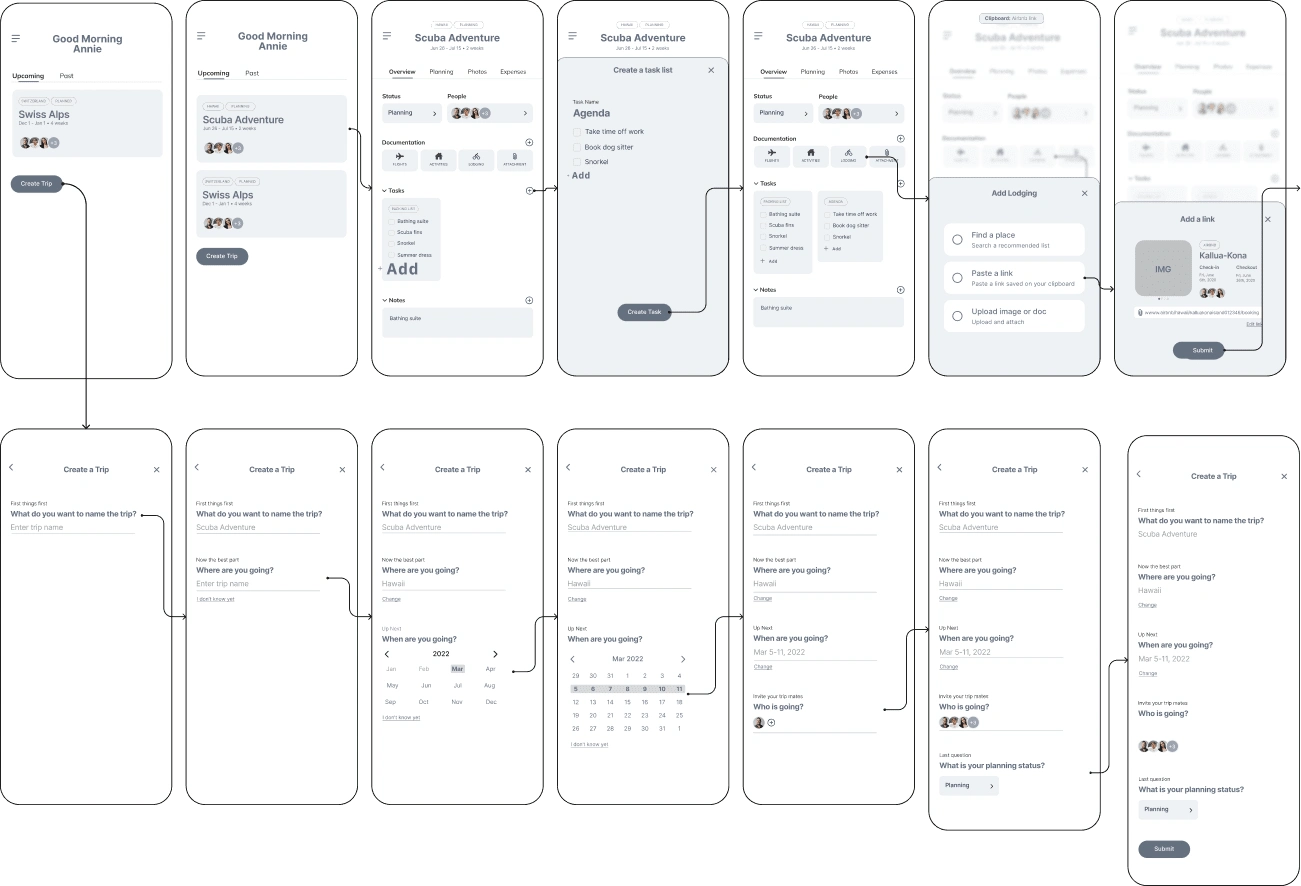
Prototyping The Solutions
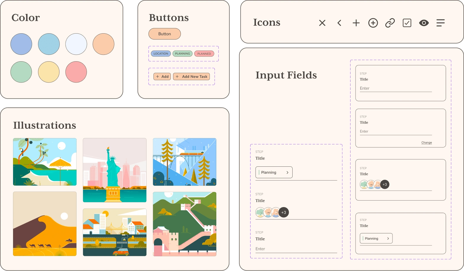
Establishing the Design System
Final Deliverables
Around 30 screens designed and developed in Figma.
To continue - check out the full case study linked below!
Like this project
0
Posted Oct 10, 2022
Engaged with users to uncover insights into group trip planning, leading to the design of an app that streamlines the planning process.
Likes
0
Views
18


Siento.AI • Landing Page

Working with me: The outlook

Wizardly • Website Redesign

Alloy • Website Redesign