Design the UI and UX for the onboarding flow for a website
About DoSomething.org
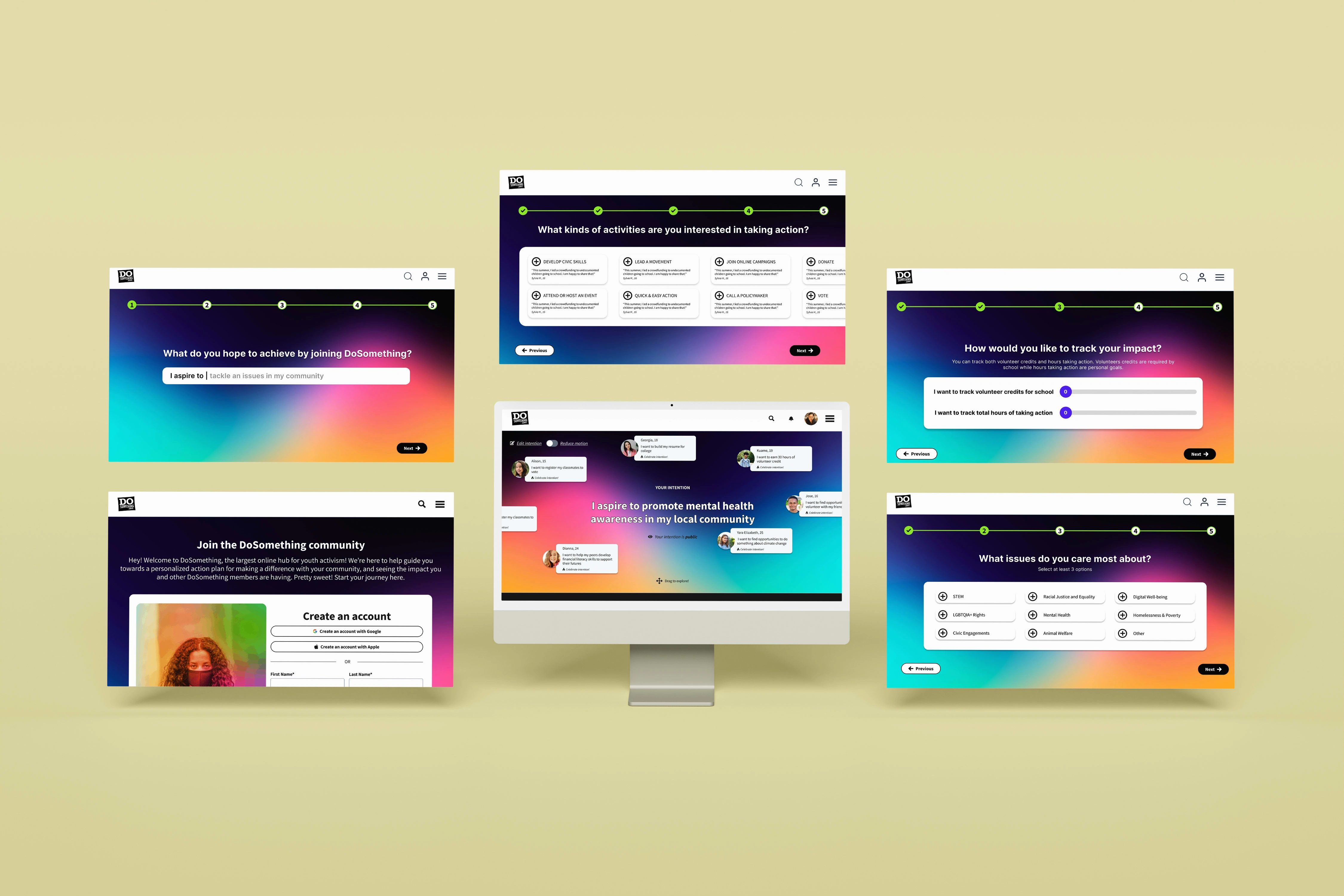
DoSomething.org is a national non-profit organization in New York City that fuels young adults ages 13 to 25 to make positive changes in the world through both physical and virtual programs on its platform. Currently, we are renovating our website to personalize our member's volunteer experience. Within that scope, I created the onboarding flow to collect information to curate the relevant content for the member's dashboard.
Design Challenge
Currently, we are renovating our website to personalize our member's volunteer experience. Within that scope, I created the onboarding flow to collect information to curate the relevant content for the member's dashboard.
After members create the account, new members will land on a blank dashboard with no programs curated for them. Our team sees that is confusing and discouraging for users to use the platform.
Delivery & Impact
After many rounds of iterations, and getting feedback from both the internal team and our potential users, I can create a meaningful onboarding flow to support the needs of both our members and the organization.
Quick, easy, and meaningful onboarding
By working closely with the communication team, especially with a senior graphic designer and program team member, I can make sure the user interfaces are on brand and the survey questions not only collect the right information for our organization but are also meaningful to our members.
In usability testing, 100% of users commented that the flow is quick to go through and the questions are relevant to their experience in volunteering
MVP Launch in May 2024
The design is being launched on our site in May 2024 for mass users
Process
1. Understand business requirements
To understand business requirements, I read old documents, did competitive analysis, and had discussions with other stakeholders
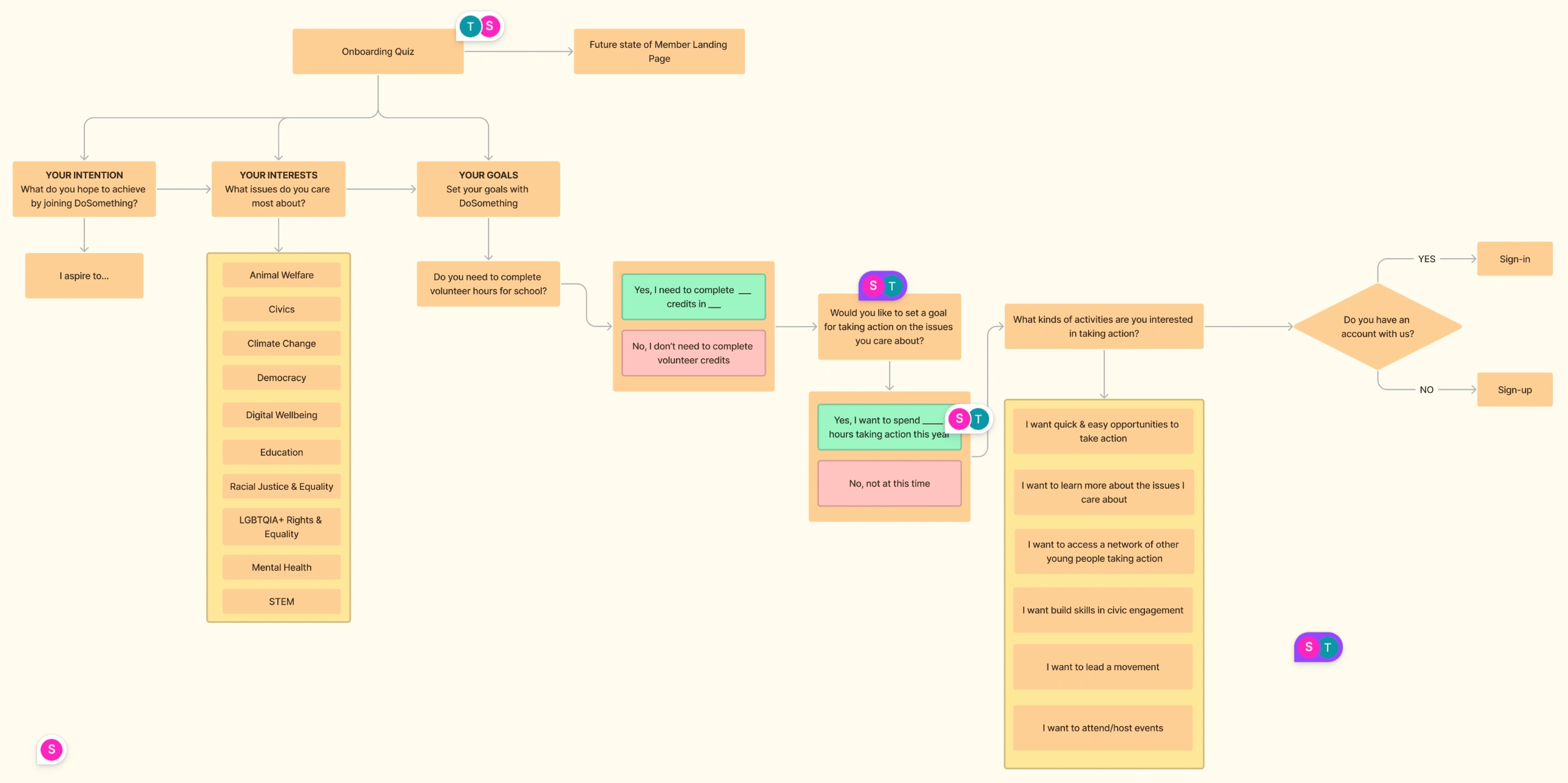
2. Define expectations with HMW questions and UX Flow
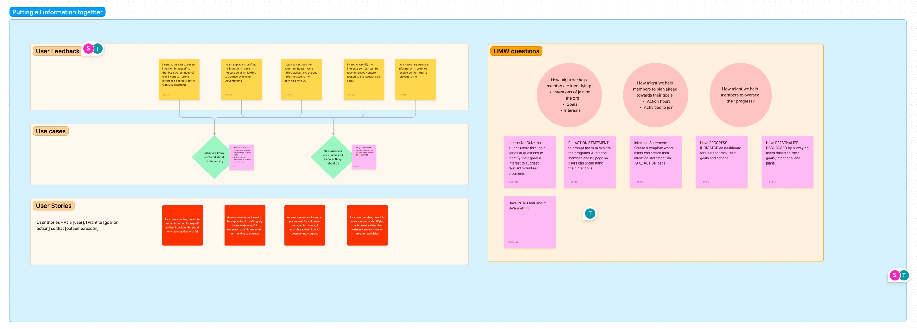
Then, I led meetings with stakeholders to identify their expectations for the onboarding using HMW questions:
How might we create a fun and easy onboarding?
How might we ask informative questions that are beneficial for both our members and the organization?
How might we tell our brand stories through the onboarding?
3. Wireframing
After going back and forth with the product and communication team, I successfully defined what questions to ask and its UX flow. Then, I created wireframes to see how it would look on our digital platform.
Paper wireframes
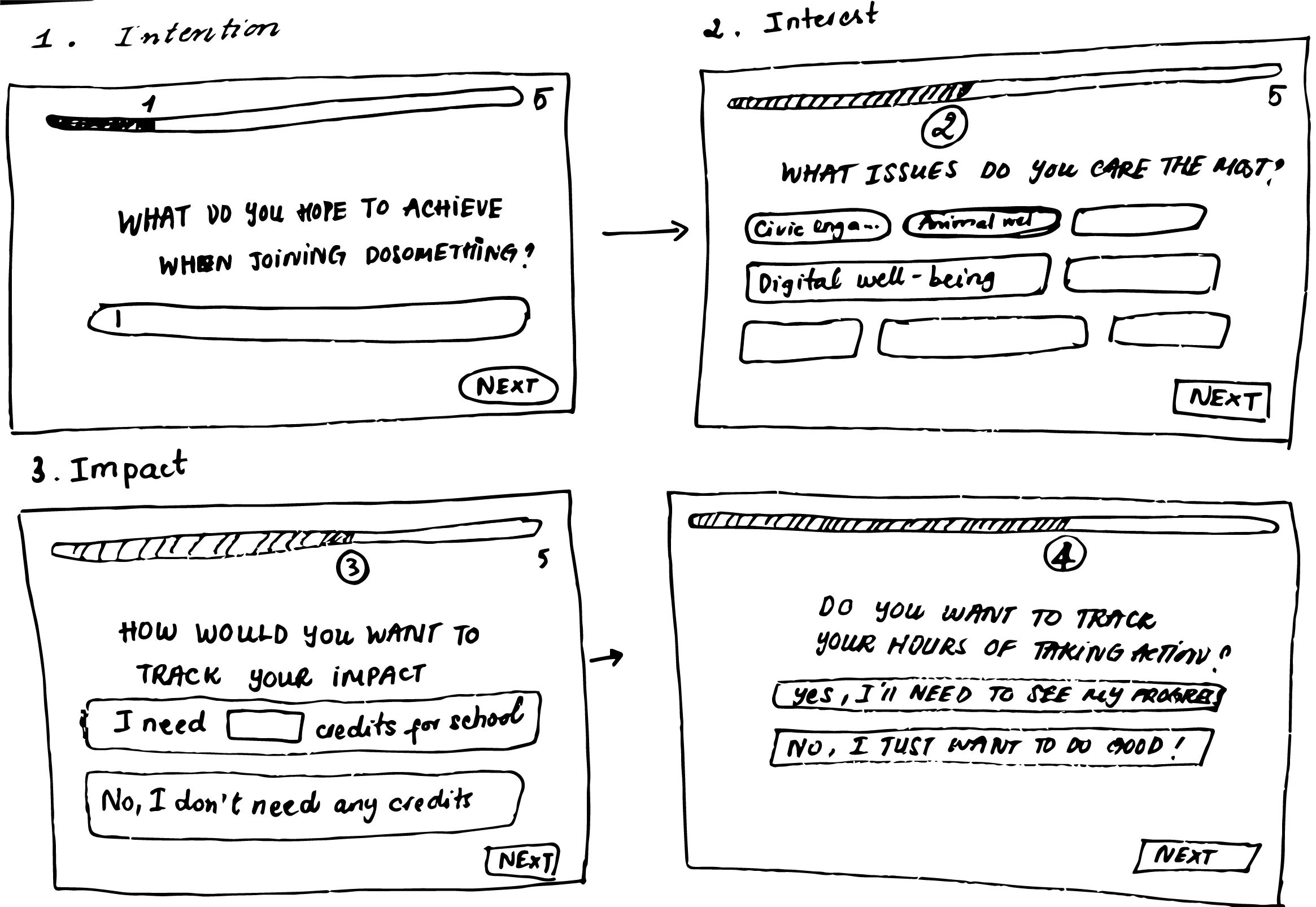
(Please click here for the flow) After sketching the flow, I turned it digitally by Figma.
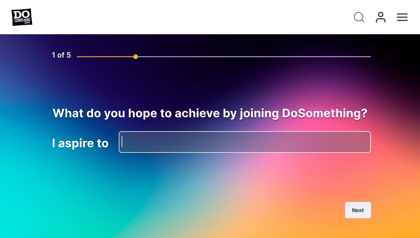
Intention question is the first question in the onboarding flow
4. Gather 1st round of feedback on wireframes
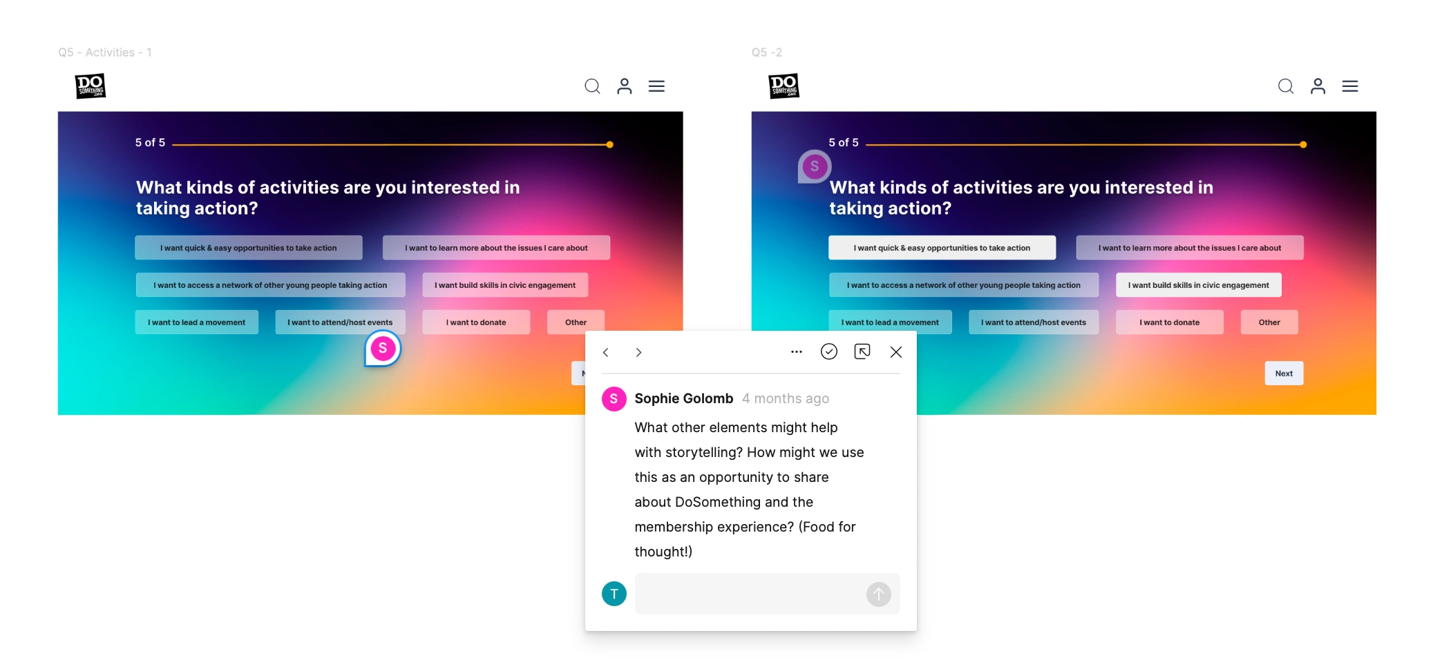
I collaborated with my senior designers to see whether my designs satisfy the expectations that we set in How Might We questions. I organized the feedback so that I can update my designs accordingly:
Positive feedback: Quick + Easy flow
Rooms for improvement:
5. Apply the design system to current design and explore more ways to create fun interactions for Impact questions
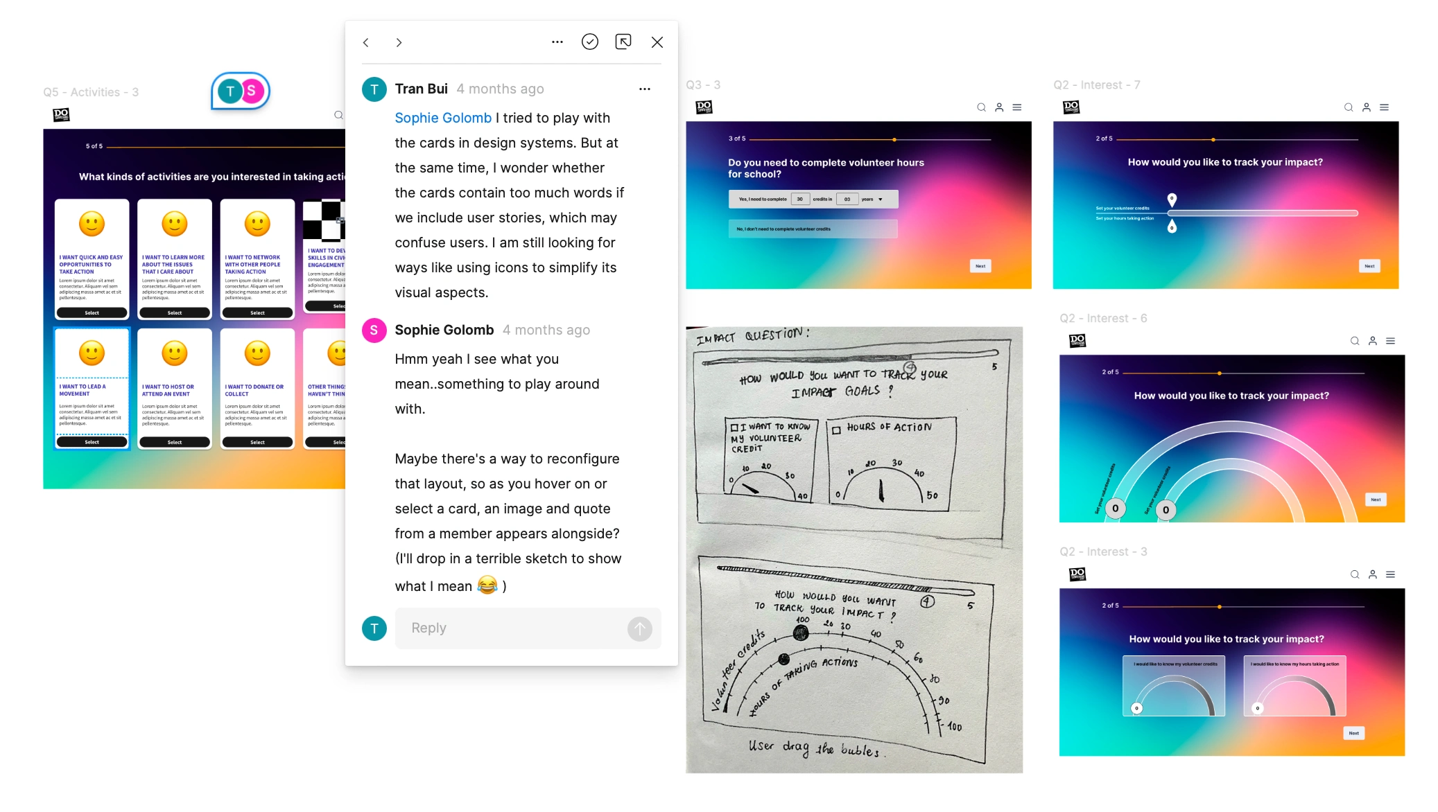
From the guiding questions, I started exploring many ways to answer:
Are there any ways to tell our brand stories? — I add a "Welcome screen" and our member's stories in "Activity Questions"
Are there any fun interactions to add? — I brainstormed some creative interactions for members to track their impact
6. Finalize for prototype (Click for interactive prototype)
Then, we have another discussion to finalize the flow for a prototype. Because of some business requirements, I need to add some screens for email communications, which changes the UX flow. Therefore, the arrangement of questions:
Welcome -> Intention (What do you hope to achieve when joining DoSomething?) -> Issues (What issues do you care about the most?) -> Impact (How would you like to track your impact?) -> Activity ( What kinds of activity that you want to take action?) -> Email Communication
7. Usability Testing
After finalizing the flow and the content of the questions, I launched usability with 5 potential members. The purpose of the test focuses on 3 questions:
How is the overall flow?
Do users have difficulty answering the questions?
Do users have difficulty interacting with the interfaces?
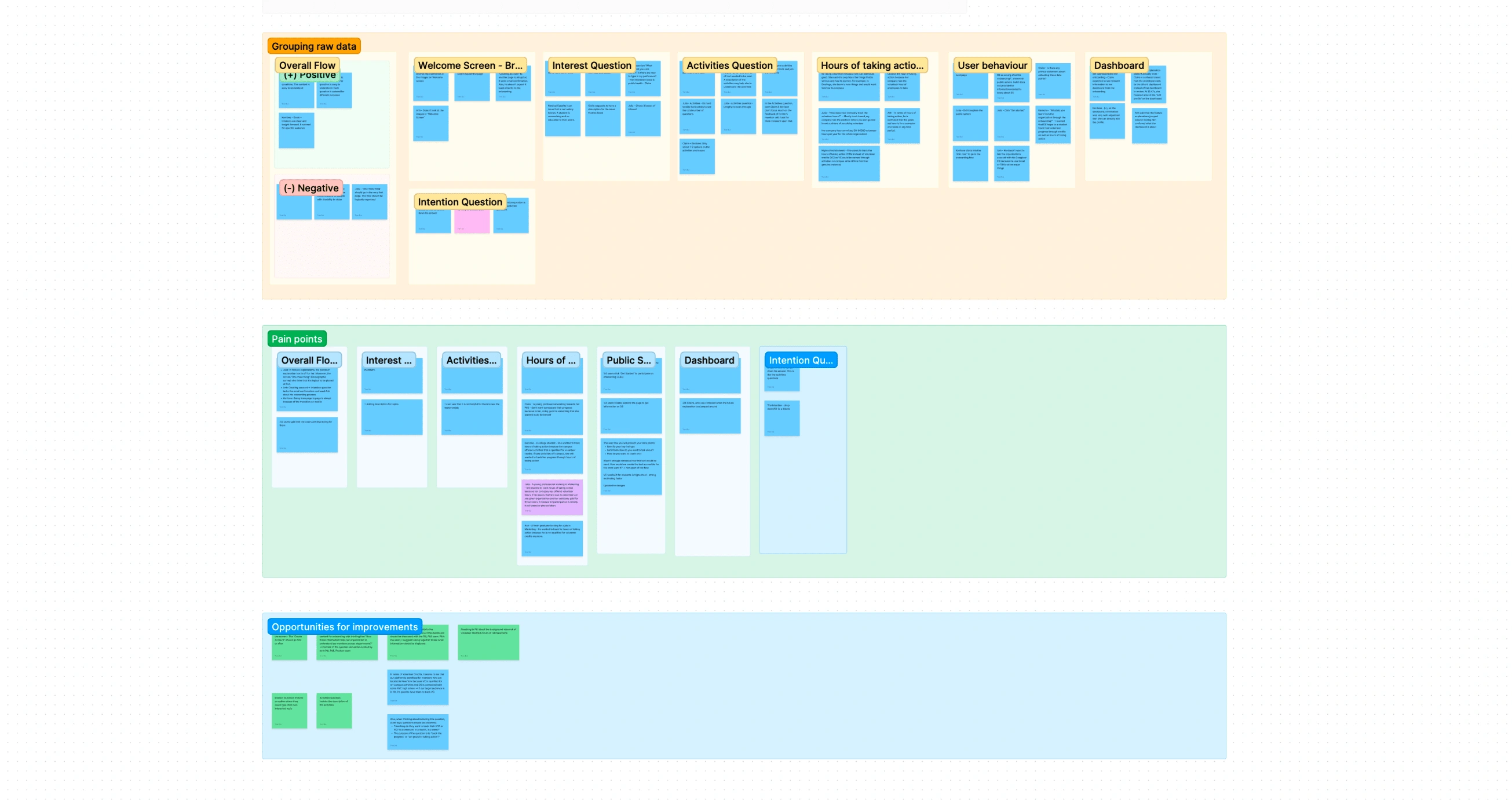
For the analysis, I used the Figma board to synthesize all the user insights.
8. Optimizing some features based on the UX insights for final delivery
After consolidating the raw data into insights, I led a presentation to update my stakeholders about the necessary changes based on the insights from our users. Here is an overview of the UX feedback and according changes that I made to the interfaces:
The overall flow is quick and easy
The overall flow takes less than 1 minute to complete
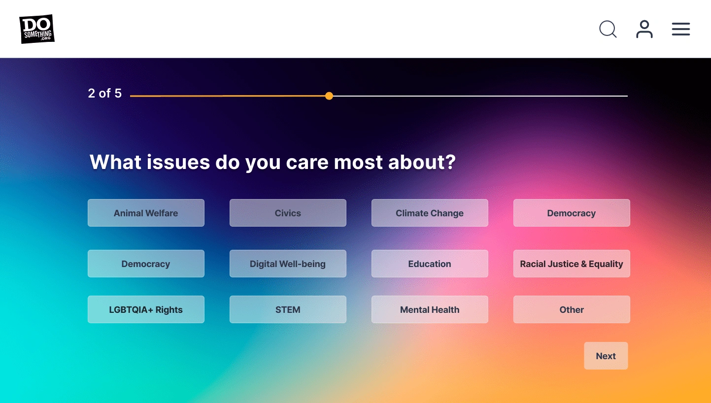
Issue question (What issues do you care about the most?)
Lesson
Like this project
Posted Mar 26, 2024
As we're renovating the website to personalize the members' volunteer experience, I worked on designing the interfaces and experience for the onboarding flow.

