Kromak Visual Identity Redesign

Eduardo Maciel


Kromak — Where precision drives industry
Challenge____
Reposition Kromak’s visual identity to reflect its evolution from an industrial maintenance provider into an engineering consultancy partner. The identity needed to communicate precision, reliability, and the ability to deliver complex automation projects, while avoiding visual codes associated with workplace safety and common technology clichés.
Solution____
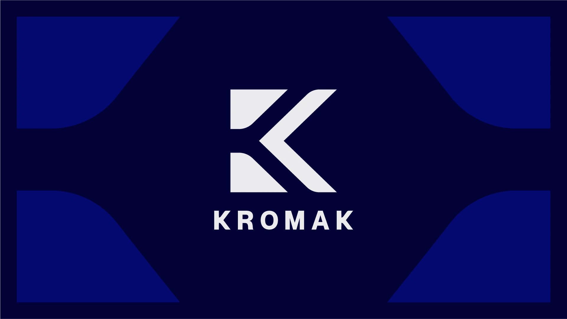
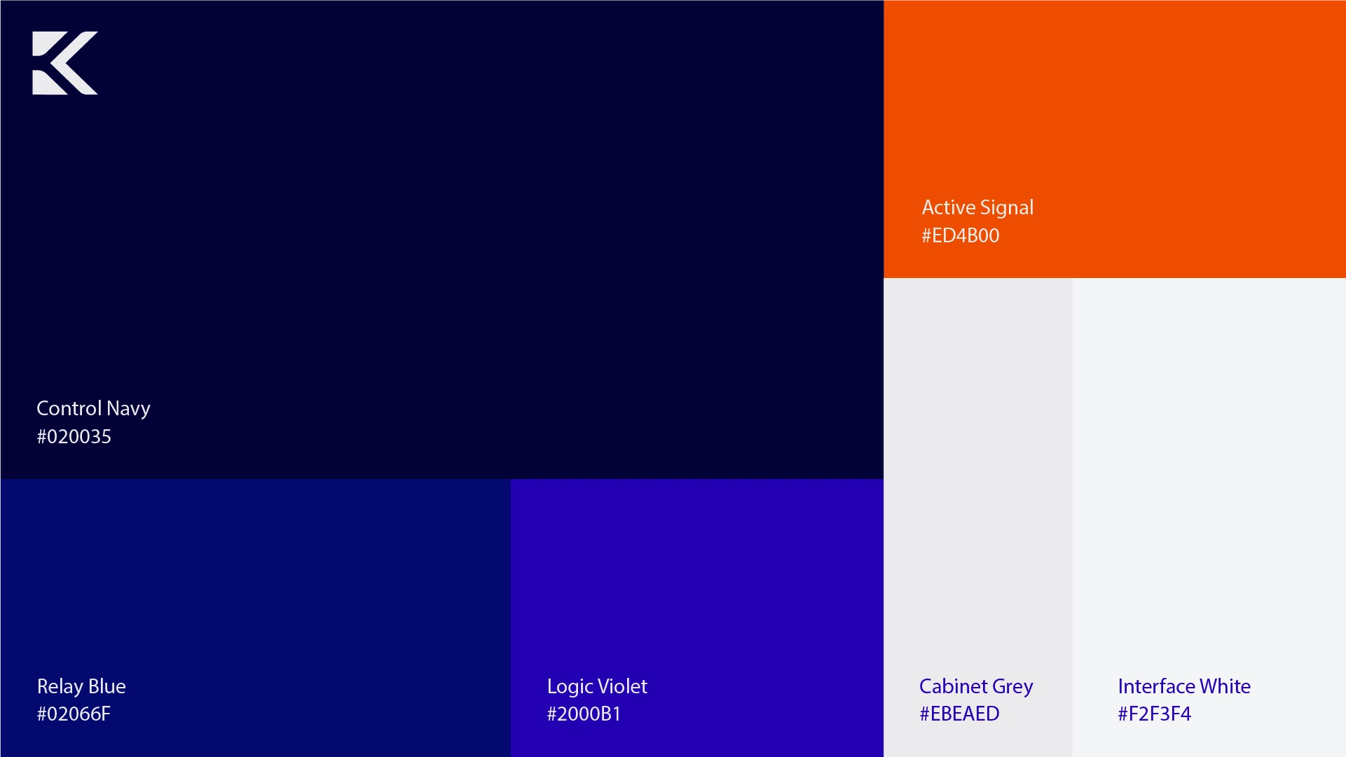
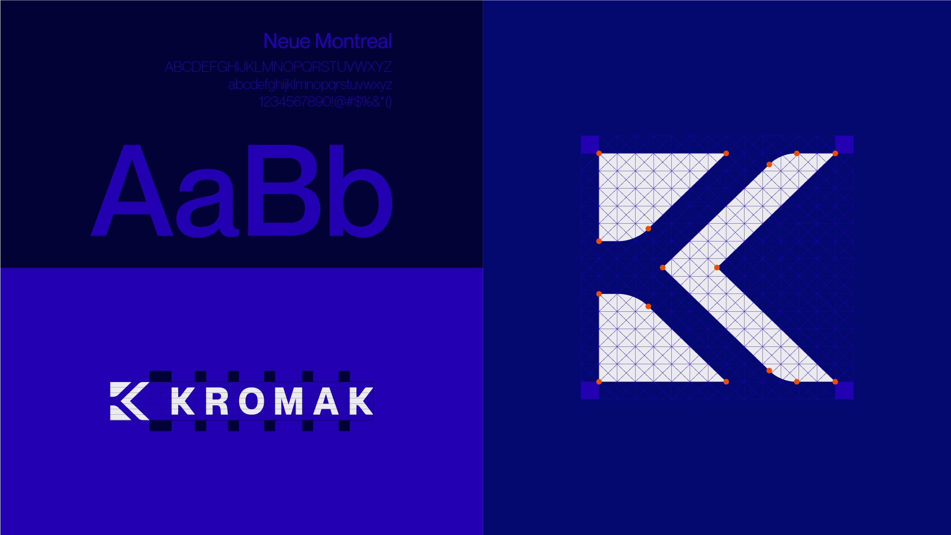
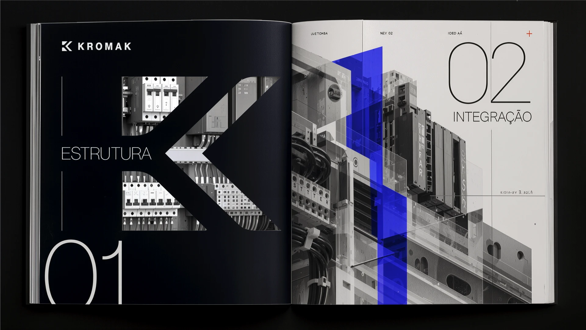
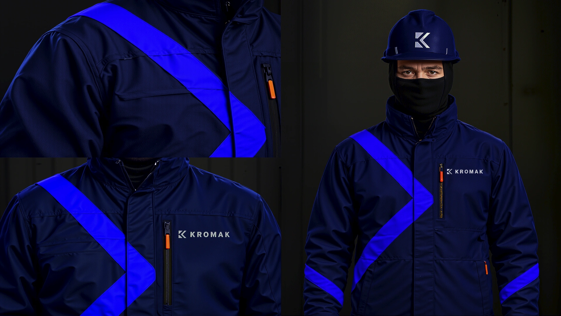
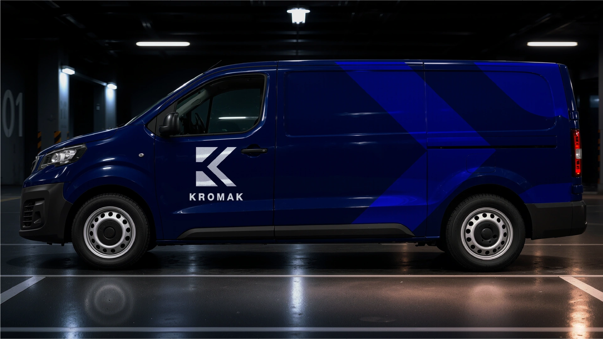
The solution draws from the integration logic found in industrial systems. Geometric modules, diagonal cuts, and controlled curves create a symbol that combines direction, connection, and precision. Deep blue establishes a solid foundation, while violet strengthens the technological character and orange works as a functional signal. Neue Montreal provides clarity and an institutional presence.
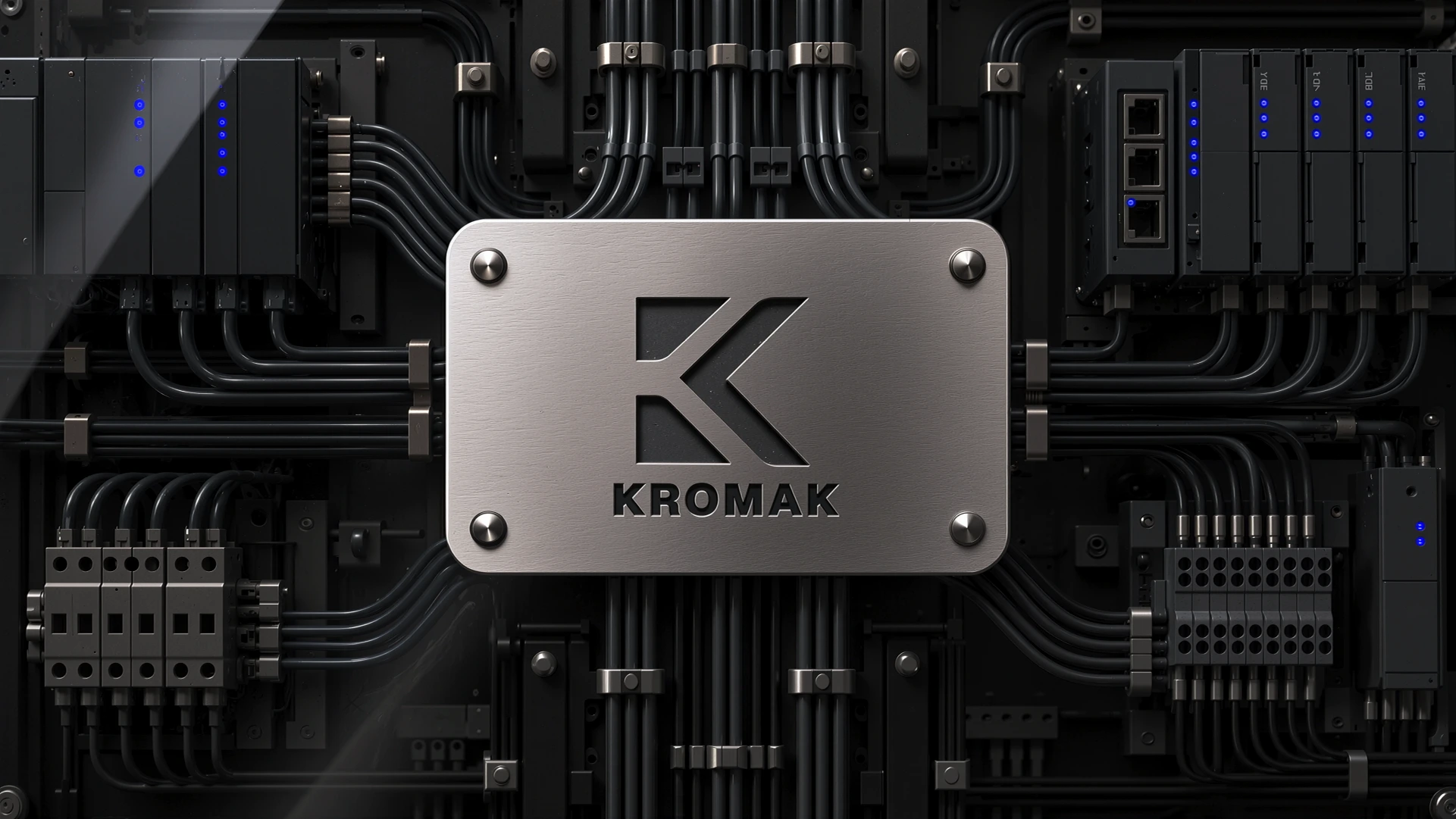
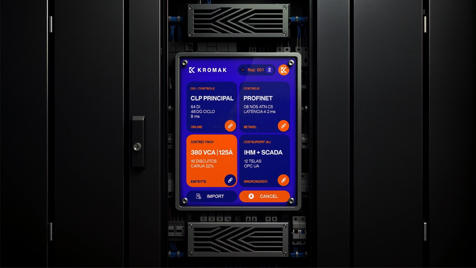
The graphic system expands the symbol’s elements into flexible and recognizable compositions. This language allows the identity to organize control panels, interfaces, uniforms, technical documents, and vehicles without relying on the constant presence of the logo.
Project developed by:
Eduardo Maciel de Bortoli
Creative Direction, Visual Identity & Graphic System:
Eduardo Maciel de Bortoli
Concept Project for:
Kromak
Like this project
Posted Oct 26, 2026
Repositioned Kromak's visual identity to reflect its engineering consultancy evolution.