A Cohesive Visual System for Financial Wellbeing
Catherine Gomersall
A cohesive digital product ecosystem for financial wellbeing and recovery
Gina is an author and educator working in financial wellbeing and recovery support. She'd built real expertise and multiple digital offers to show for it. The problem was coherence: her online presence didn't reflect the calm, trustworthy quality of her work. Products sat in isolation. The visual language shifted from page to page. And managing everything was becoming a second job.
She needed a system that tied brand, product, and operations together, without adding complexity.
The Approach
I structured the engagement around four interconnected areas, working through them in sequence so each layer informed the next.
1. Offer structure. Before touching any visuals, I mapped Gina's full product suite: what each offer was, who it served, and how the products related to each other. This gave us a clear hierarchy to design around.
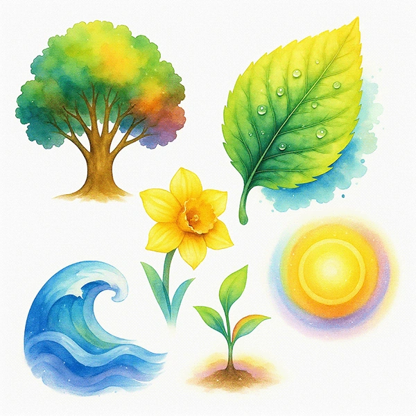
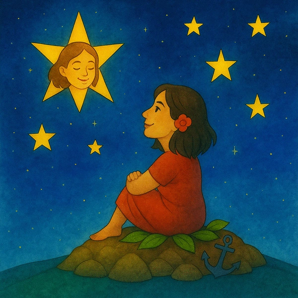
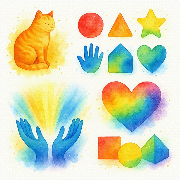
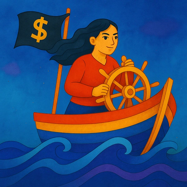
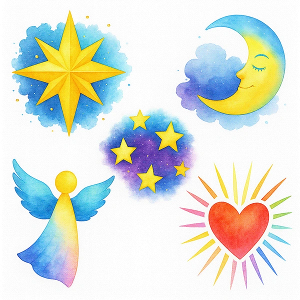
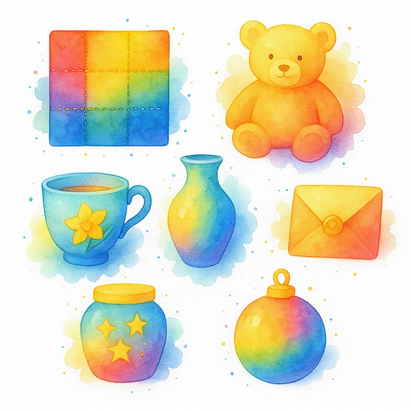
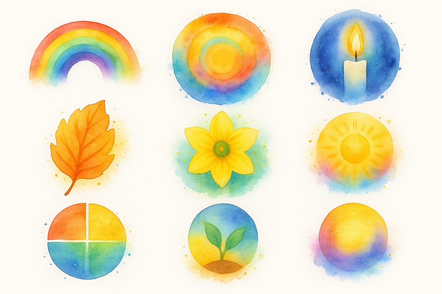
2. Visual identity. I developed a complete illustration system built from motifs drawn directly from Gina's own writing: anchors for stability, candles for hope, stars for guidance, waves for emotional release, leaves for growth, and pathways for forward movement. Two complementary colour palettes govern the system. A defined brand palette (vivid reds, blues, yellows, leaf green, gold) provides structure across UI elements, icons, and buttons. A watercolour palette (soft yellows, aqua blues, warm golds, violet) provides atmosphere across backgrounds, illustrations, and marketing assets.
3. Product pages. Each page was rebuilt to match the new brand tone and communicate value clearly. The copy, layout, and visual hierarchy were aligned so buyers could understand what they were getting and why it mattered.
4. Client delivery infrastructure. Two Notion dashboards were built to support onboarding and ongoing client experience, removing manual admin from Gina's workflow.


Deliverables
Website product pages with restructured offer hierarchy
Brand style guide for consistent design and messaging
Custom brand illustration library (motif-based system)
Watercolour background system for use across web, product, and social
2 Notion dashboards for client delivery and experience

What made this work
The visual system is both functional and emotionally resonant. It's structured enough to stay consistent across touchpoints, and warm enough to reflect the nature of Gina's work: helping people through difficult financial situations with care, not corporate detachment. Every motif has a reason. Every colour choice maps back to the brand's emotional register.
Like this project
Posted Jun 24, 2026
The engagement covered four interconnected areas: offer structure, visual identity, product pages, and client delivery infrastructure. The offer suite was clarified and structured first — defining what each product was, who it was for, and how it sat in relation to the others. Product pages were then built to match brand tone and communicate value clearly to buyers. A complete visual identity system was developed through custom illustrations and a brand style guide. Two Notion dashboards were built to support client experience and delivery without adding manual admin load.
Likes
0
Views
0
Clients
Gina Kasmas