Branding & Product Design for a Podcast Studio
Robby Davis
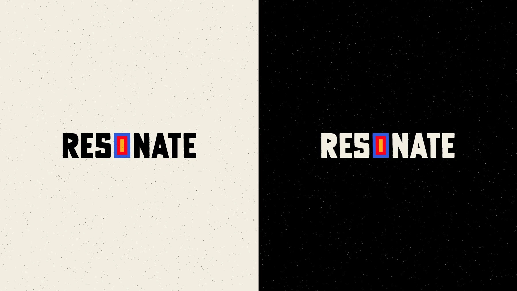
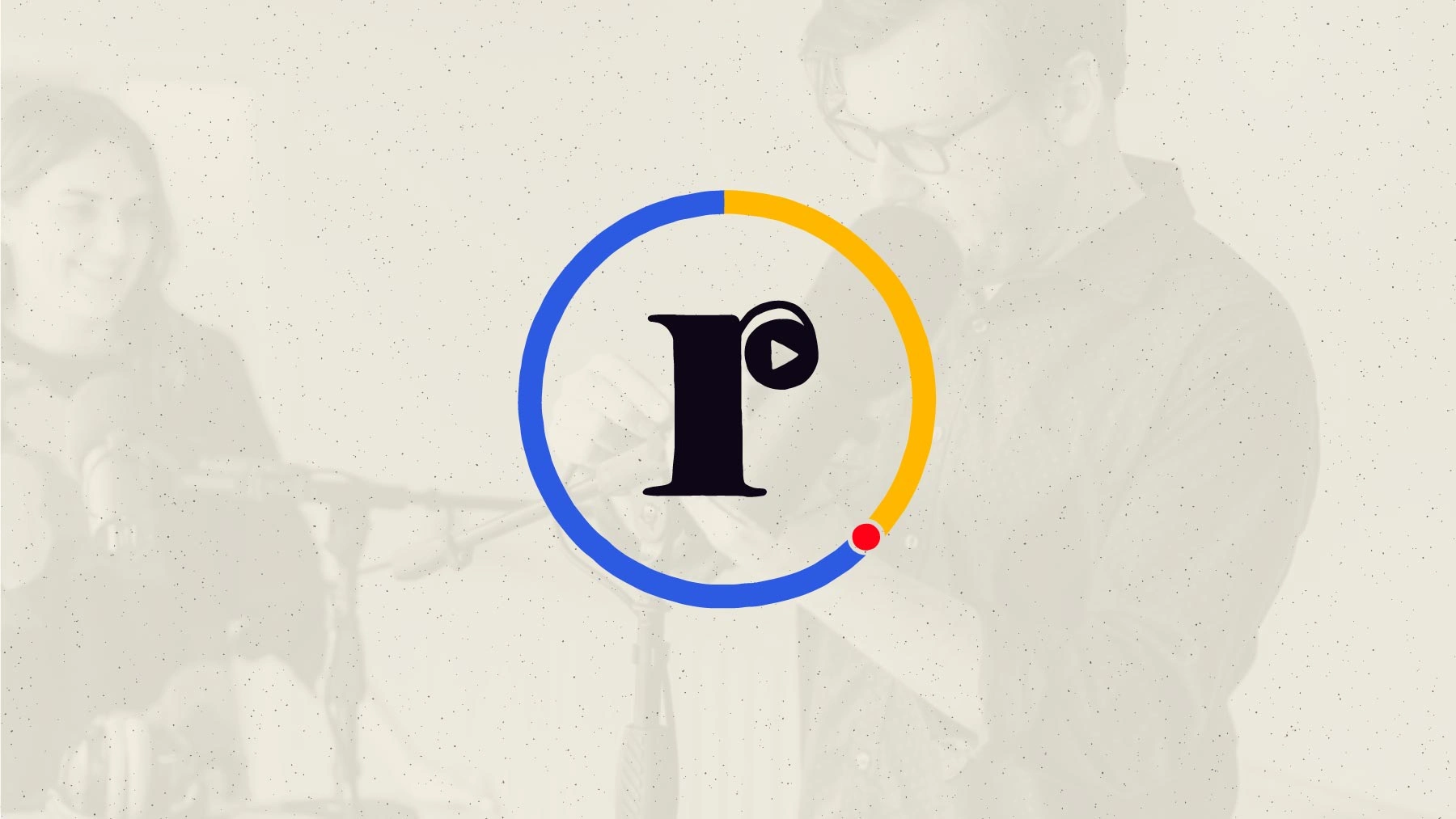
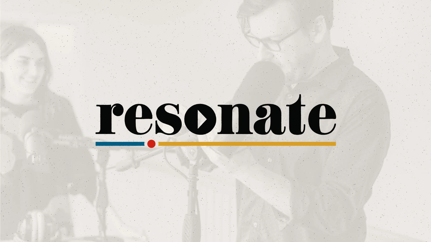
Resonate Recordings
How a rebrand project blossomed into a long-term collaboration
My Role: Brand Identity, User Research, Product Design, Creative Direction
Overview: 2020 – 2022, Podcast Industry, B2B SaaS, iOS App
Brand Identity
The power of co-creating and sneaker metaphors
Discovery and research
I started by interviewing the Resonate team to gain a clear understanding of their immediate needs, long-term goals, and success metrics. However, I wanted to go beyond the surface, so I asked them to imagine their company as something entirely different. For example, if Resonate were a sneaker, what type would it be, and why? If it were music, what might it sound like? These metaphorical questions revealed the brand's deeper personality, capturing the essence of the desired brand feel. Their responses became a crucial foundation, guiding the creative process and setting the right direction.
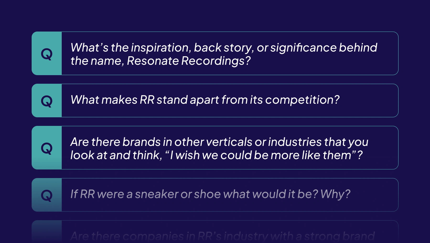
A sample of the interview questions I crafted. With Resonate, this process was conducted entirely asynchronously.
Next, I conducted competitive and analogous research. I set up a Dropmark board to collect visual inspiration and invited the Resonate team to collaborate. This was a perfect opportunity for co-creation, allowing the team to contribute visual examples they liked, and perhaps more importantly, those they didn’t. Before long, I had the direction and creative insights needed to start developing visual concepts for the brand’s identity.
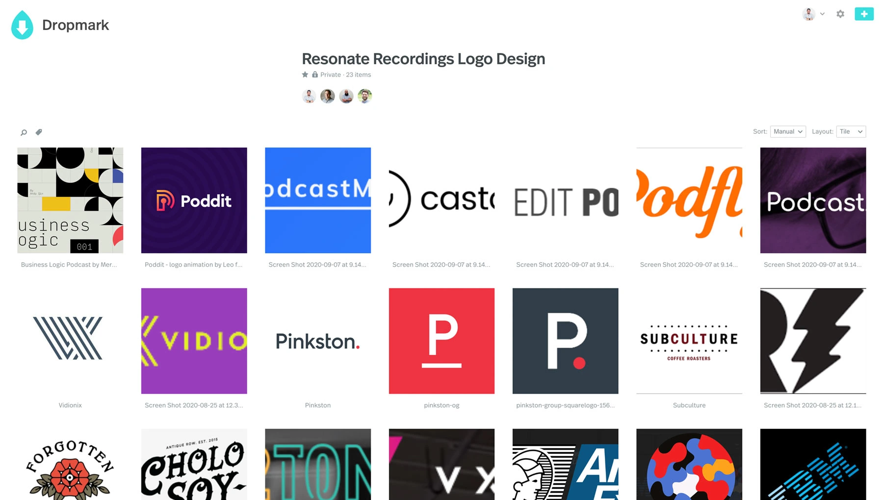
We used a Dropmark board to collaborate and collect things we liked and disliked.
Ideation and visual concepts
Ah, the blank canvas—this is where the real fun begins! The freedom to explore creatively is both exhilarating and a bit daunting. This is when those metaphorical questions, like envisioning your brand as music, really come into play. The creative process can be messy and unpredictable, but it ultimately led to three polished conceptual directions that I was excited to share with the team.
Here are two example tracks shared by the team that embody what the Resonate brand could sound like if it were music. I found myself repeatedly drawn to these artists during the ideation phase, as their music helped me capture a vibe that’s difficult to express with words.
Three conceptual directions
The ideation phase resulted in three refined conceptual directions, each carefully crafted and presented to the Resonate team. The slides below showcase examples from that presentation. The team responded positively to different aspects of each concept but chose to take some time to reflect before making a decision.
Concept 1: Solid, bold, strong, masculine.
Concept 1: One-color logo.
Concept 1: Full color logo.
Concept 1: Monogram treatment.
Concept 1: Additional monogram treatments.
Concept 1: Logo & brand color framing.
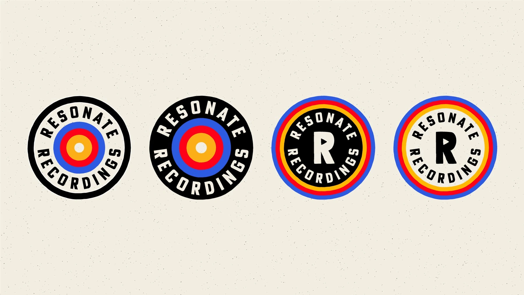
Concept 1: Badge design concepts.
Concept 2: Approachable, friendly, fluid, slightly more feminine
Concept 2: One-color logo.
Concept 2: Full color logo.
Concept 2: Monogram treatments.
Concept 2: Badge design concept.
Concept 2: Badge design on pattern background.
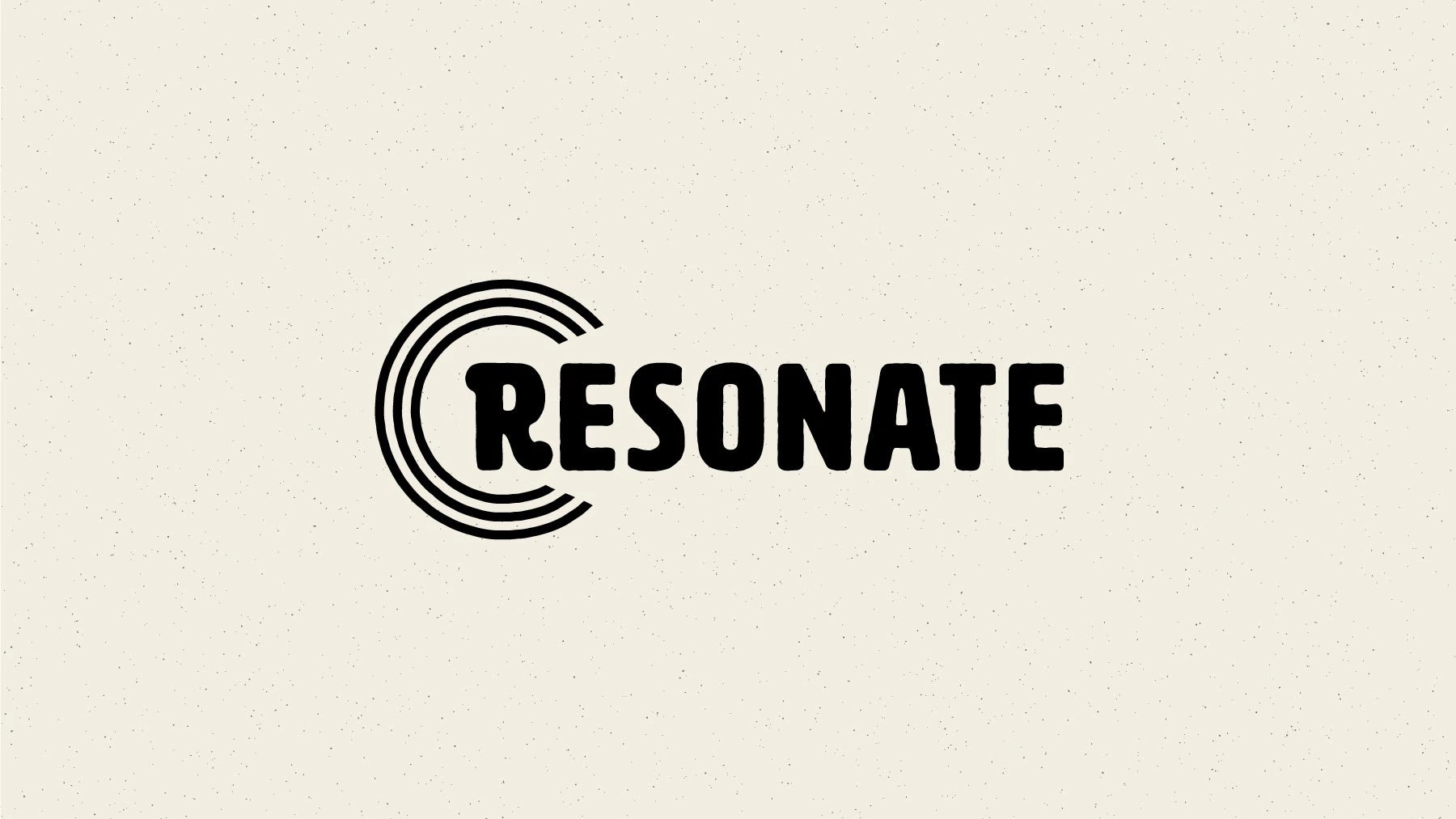
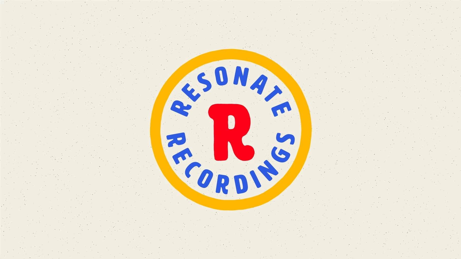
Concept 3: Classy, contrast, luxury, minimal
Concept 3: One-color logo.
Concept 3: Full color logo.
Concept 3: Monogram treatment.
Concept 3: Additional monogram treatment.
Concept 3: Logo with background treatment.
Concept 3: Pattern concept.
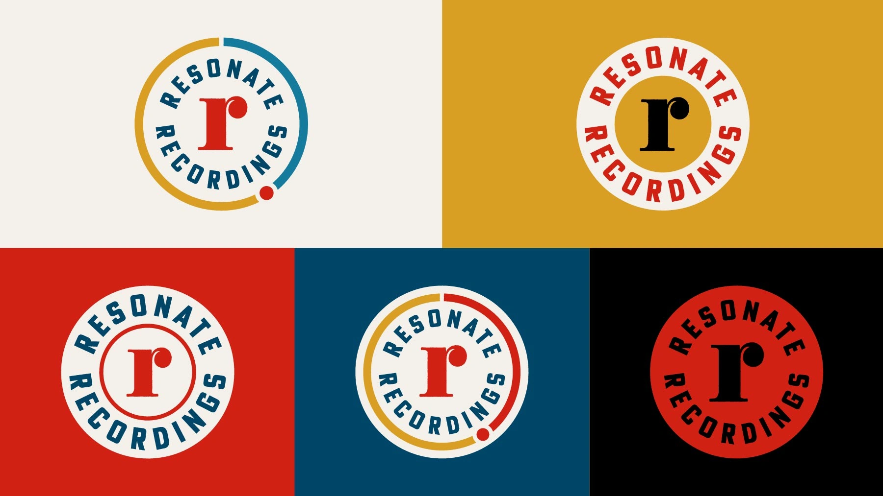
Finalization and brand kit deliverables
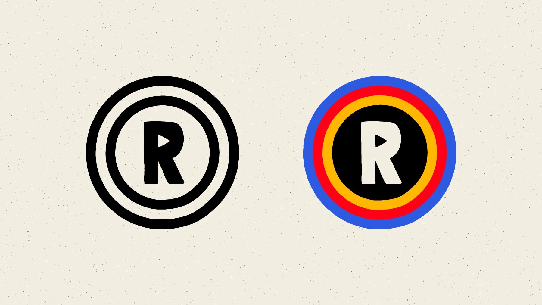
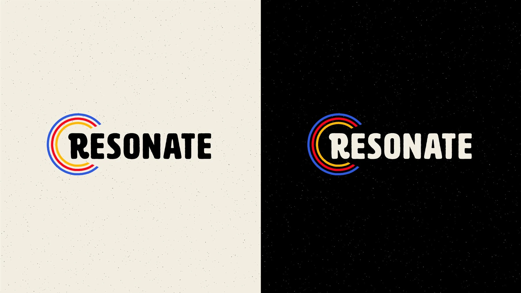
The team ultimately chose Concept 3. After making a few adjustments, I expanded it into a more complete visual brand identity, including logos, badges, monograms, color palette, web typography recommendations, etc. With that foundation in place, it was time to shift my focus to the website refresh.
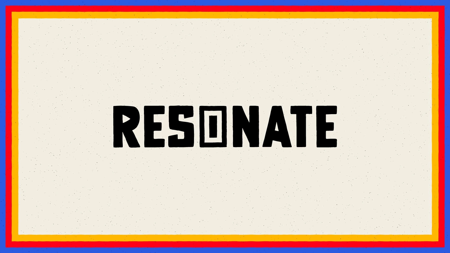
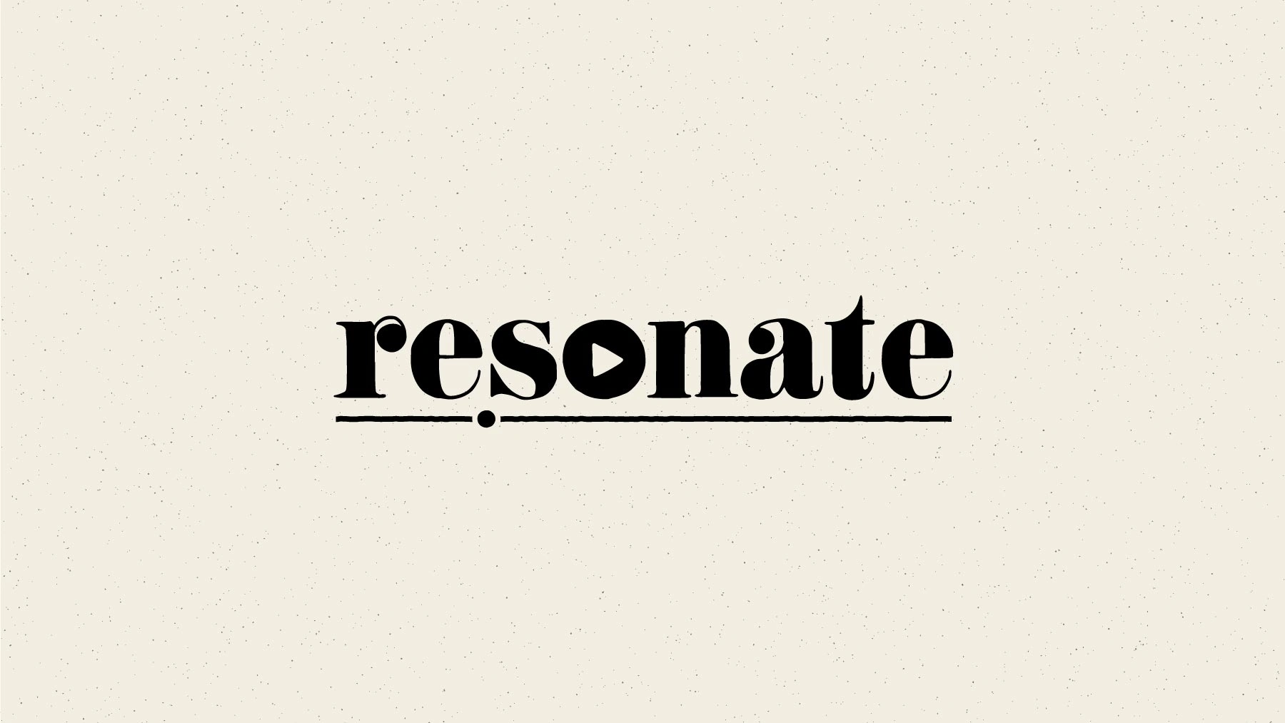
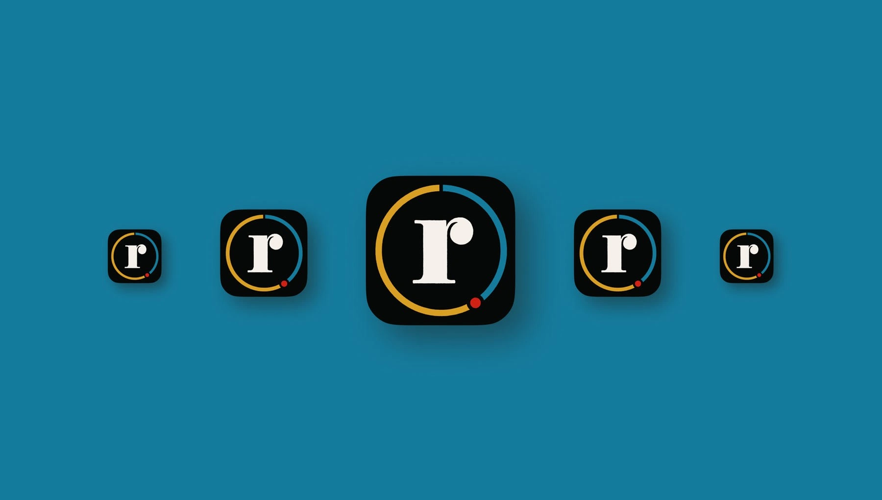
Final logo.
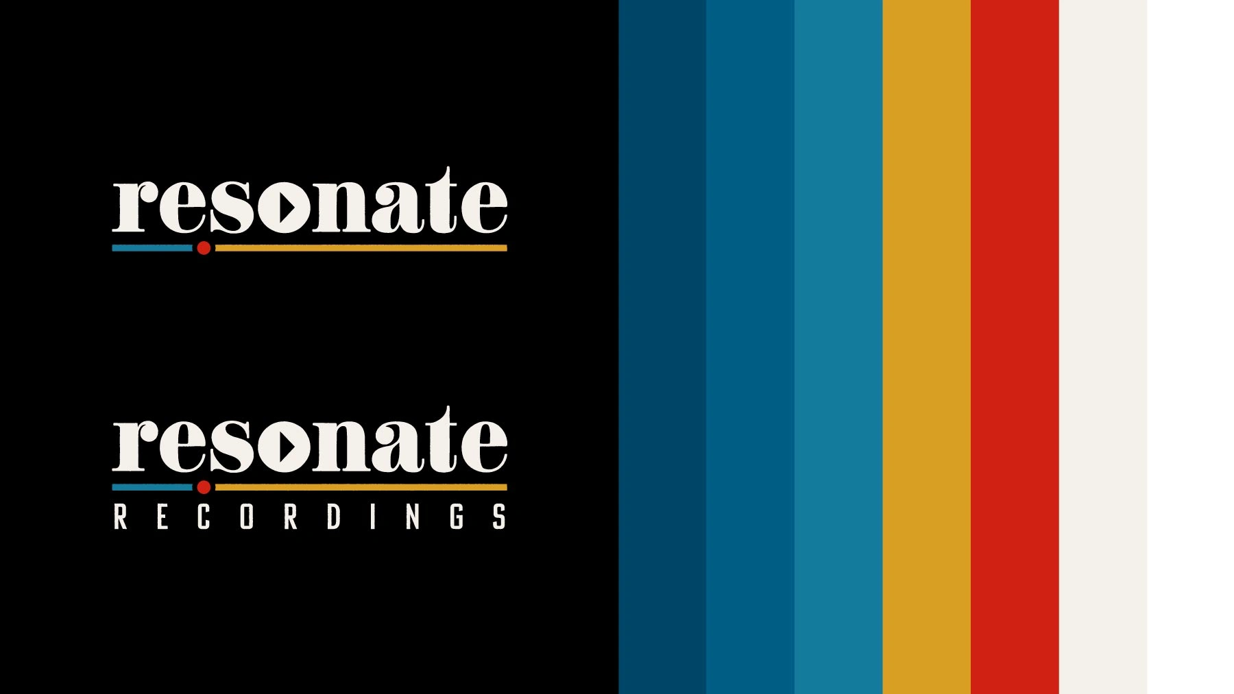
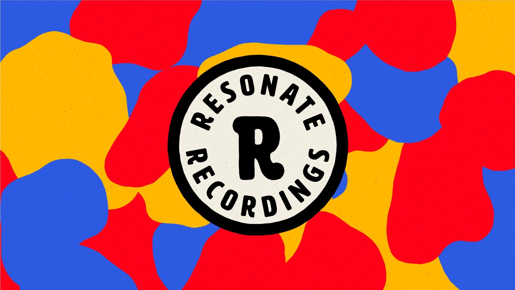
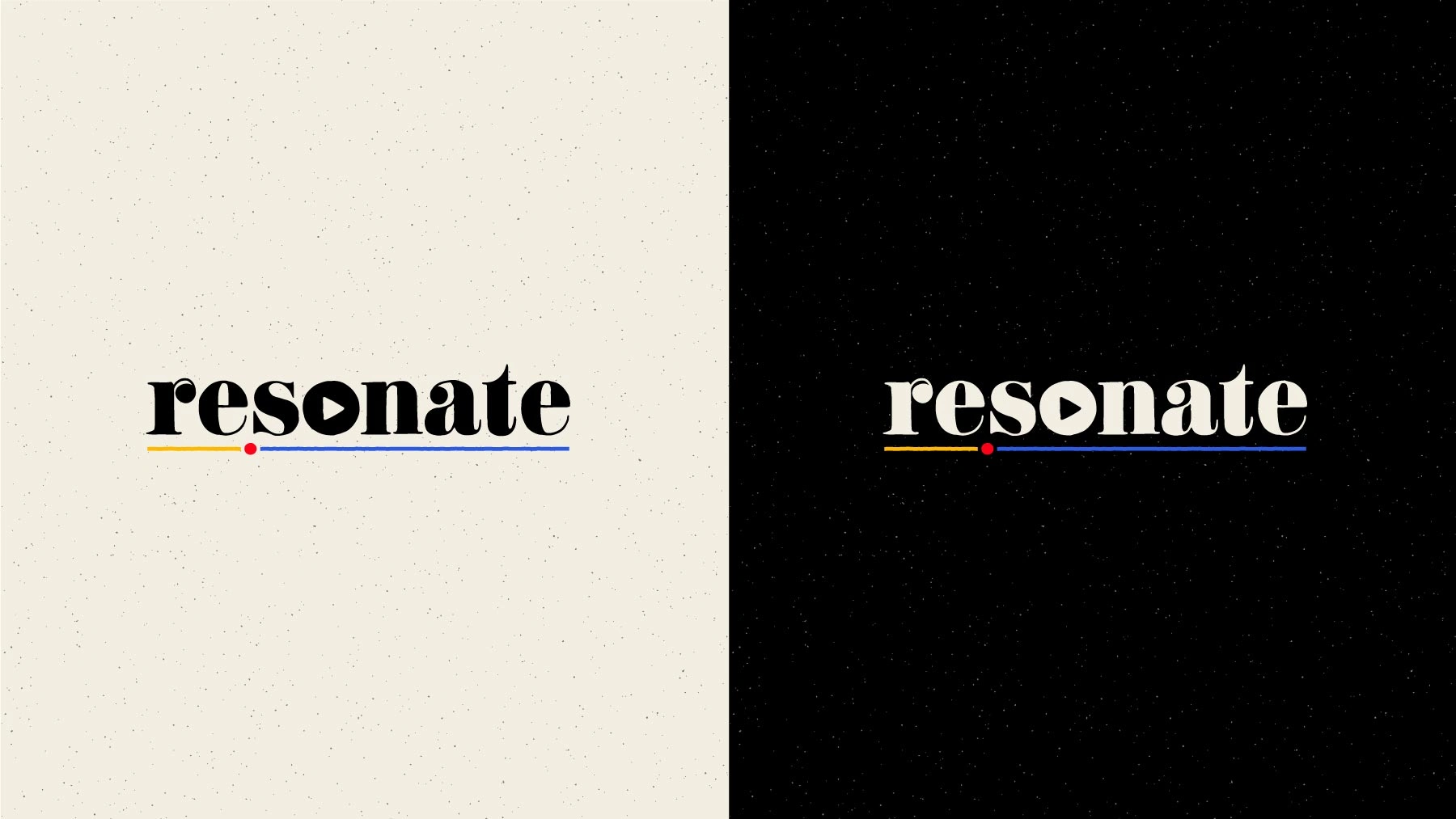
Final logo variations and core color palette.
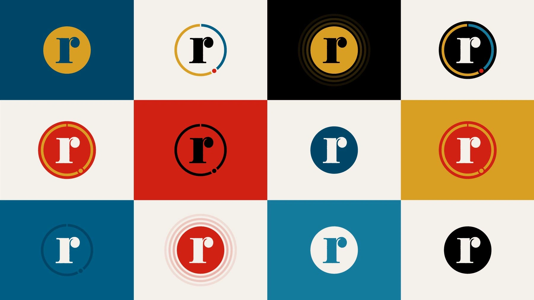
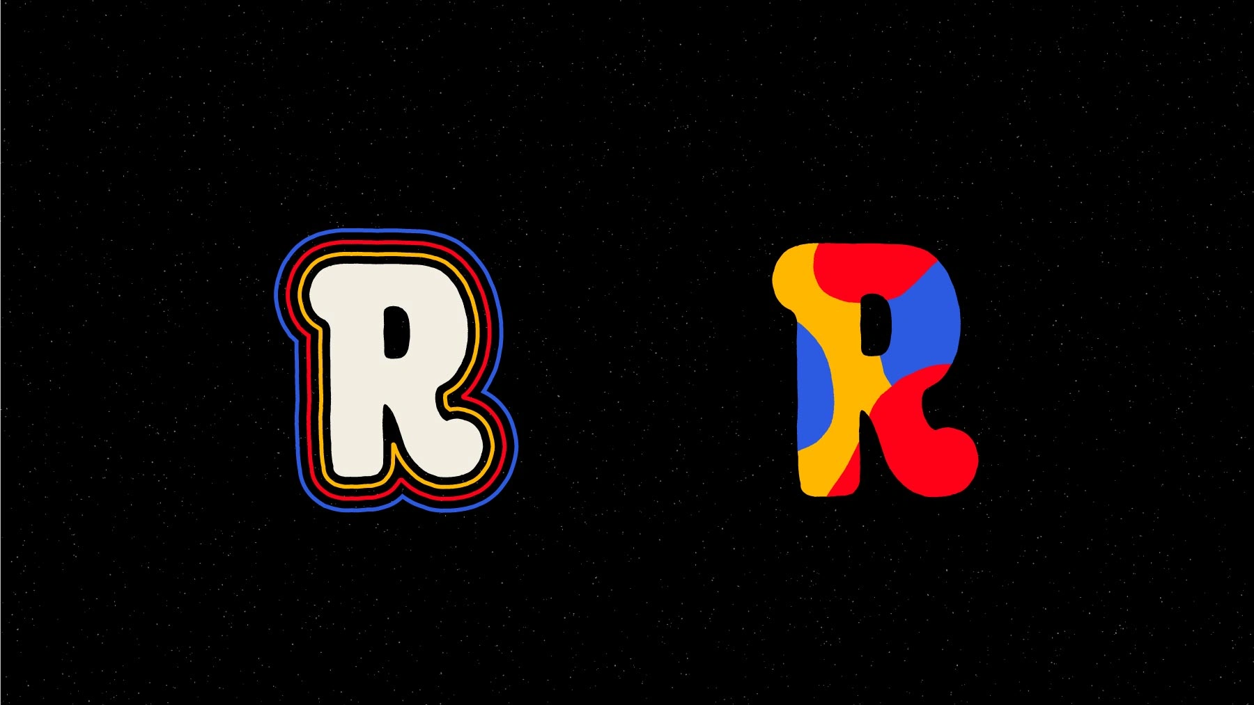
Monogram variations.
Example badge photo overlay treatment.
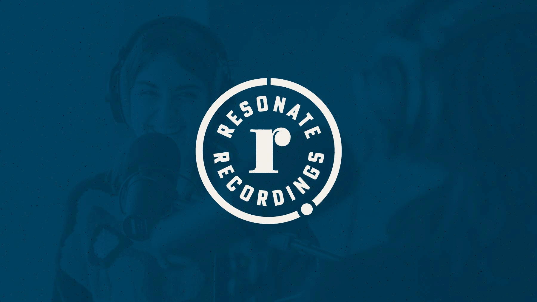
Badge variations.
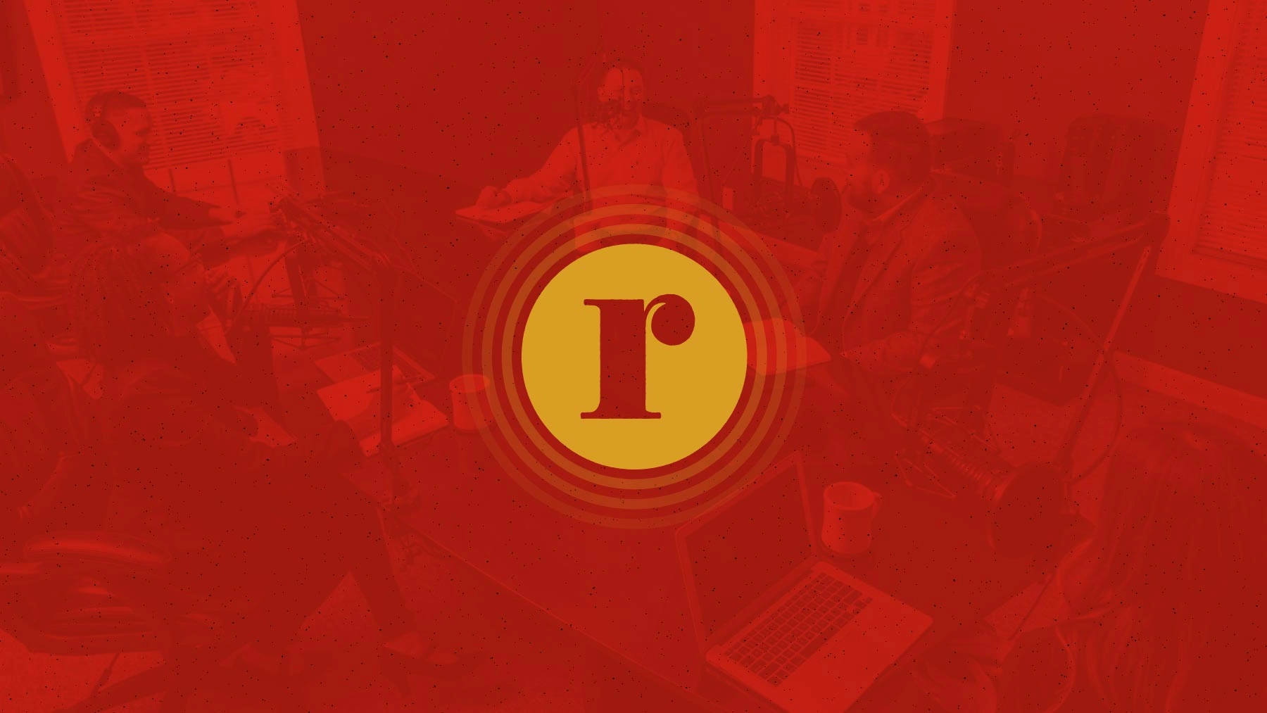
Example monogram photo overlay treatment.
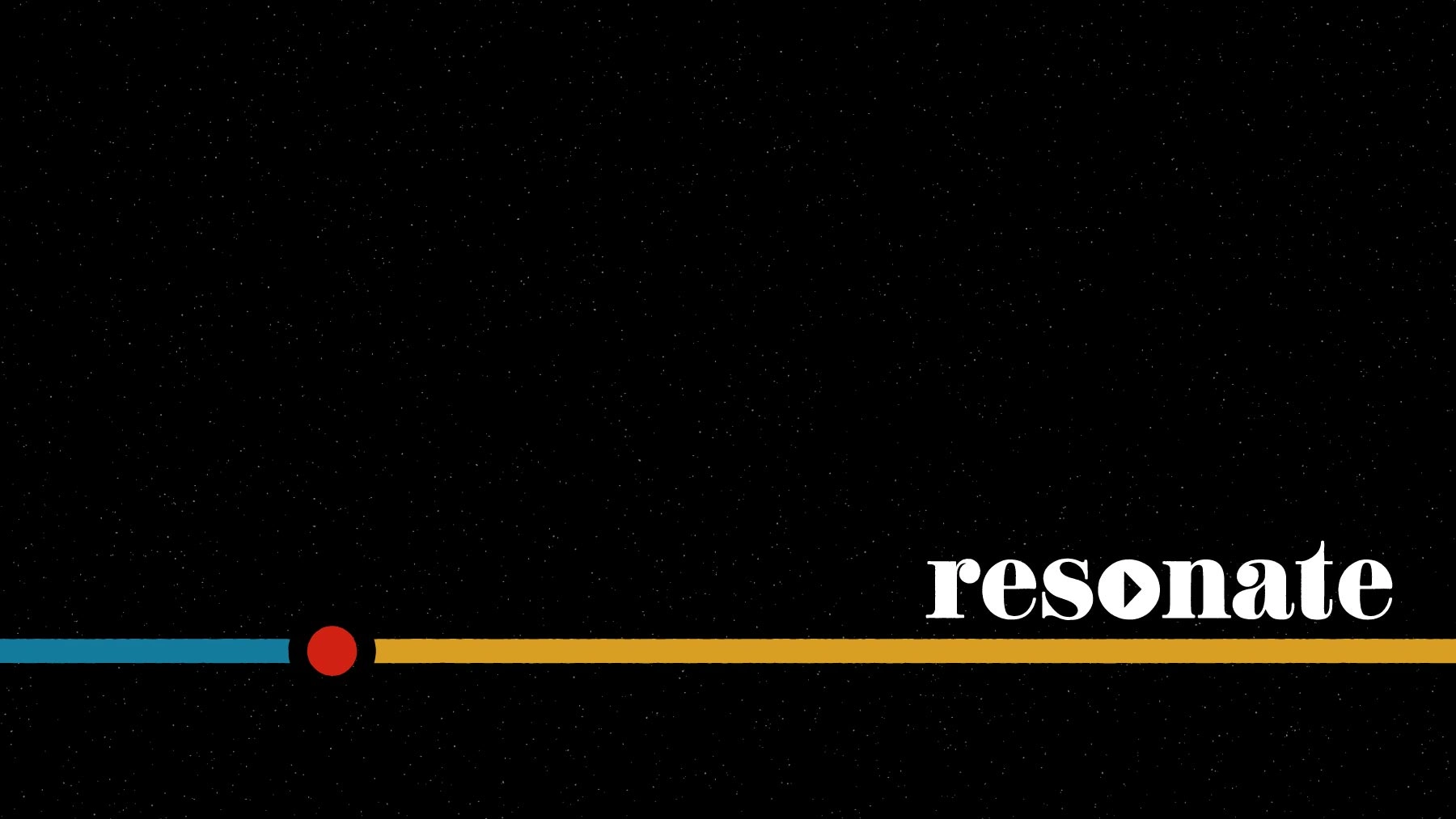
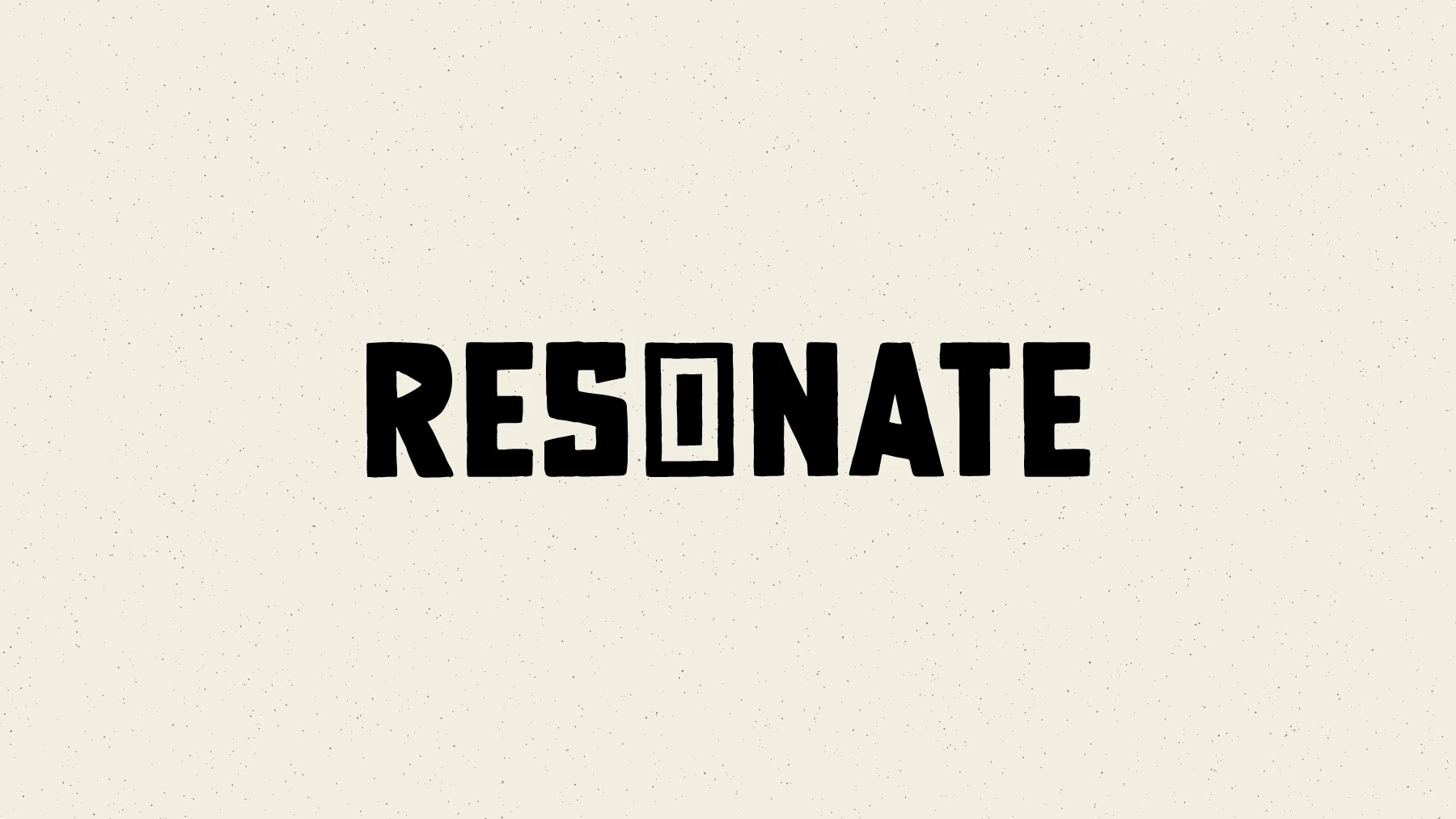
Playback bar accent.
Working with Robby on the rebrand for Resonate Recordings and brand creation for Resound were both fantastic experiences. His eye for design and ability to create visuals that truly resonate with audiences is unparalleled. Robby intuitively understands what makes a brand stand out, and his work elevates the message in a way that’s both modern and timeless. Whether you’re a start-up or a large enterprise, Robby’s creative expertise will take your brand to the next level.
Mark Minnery – Co-Founder of Resonate Recordings & Resound
Website Refresh
Polishing <p> tags and honing hexadecimals
The Resonate website needed some love to visually align with the rebrand. We cleaned up the navigation and infused the site with the brand’s new color palette and typography. Although it wasn’t a full overhaul, the site received a substantial visual upgrade that helped complement the new brand launch.
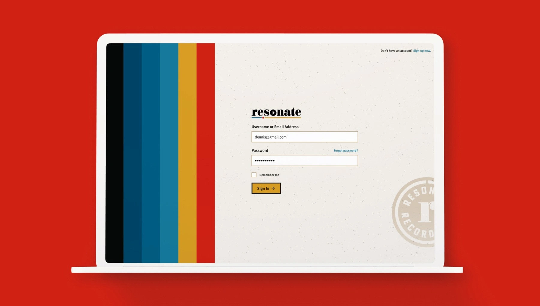
Redesigned sign in page.
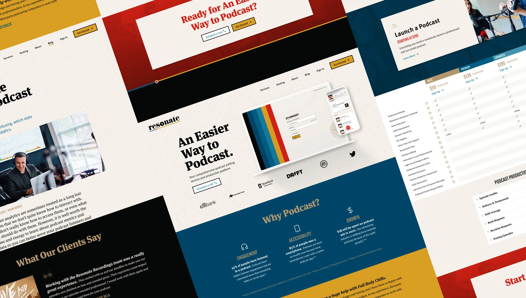
I collaborated closely with the Resonate team to revitalize their website design, aligning it with the new branding.
Long-Term Collaboration
From pilot project to part of the team
After the pilot branding project wrapped up, we decided to extend our collaboration. It started with a 90-day work agreement, then expanded to 6 months, and eventually we transitioned to annual renewals. The longer I worked with Resonate, the more I became an extension of their team. During this time, we tackled several major projects, including:
Interviewing users to uncover new opportunities
Designing and launching Resonate's iOS app
Branding the "How I Built This" of podcasting
Interviewing users to uncover new opportunities
The Product Manager and I interviewed five internal users to gather feedback on the existing web app experience. Our goals were to better understand how Resonate team members and end customers interacted within the app and to uncover common pain points we could address.
This lean research effort enabled us to identify and prioritize several quick wins. It also provided valuable insights that shaped our approach to the next major project: designing Resonate's customer-facing iOS app.
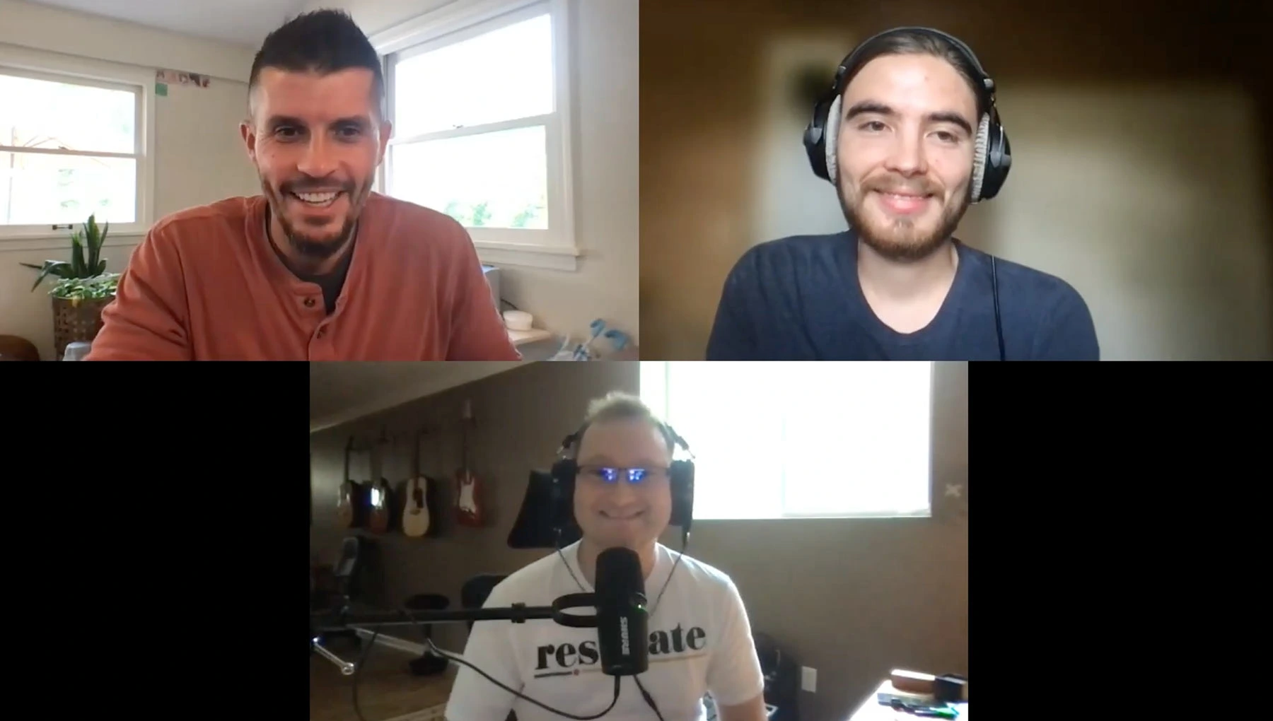
One of the video interview I conducted with a Resonate Audio Engineer.
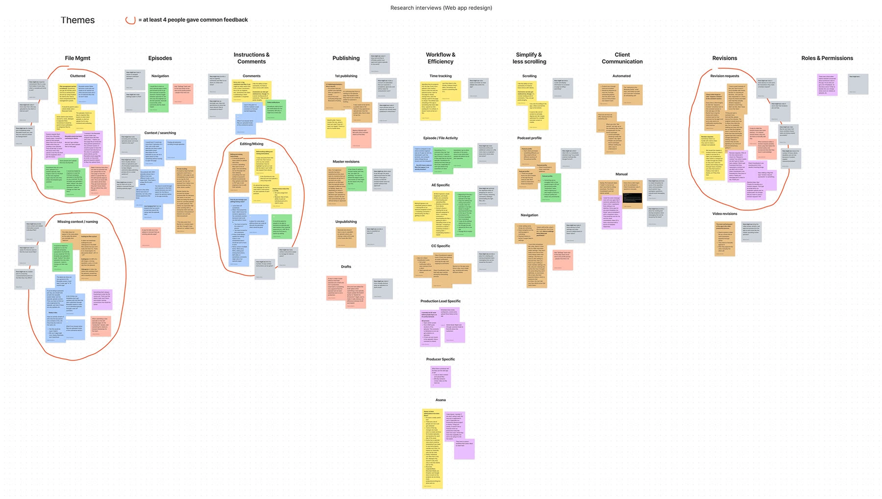
We organized the feedback into common themes, allowing us to prioritize quick wins effectively.
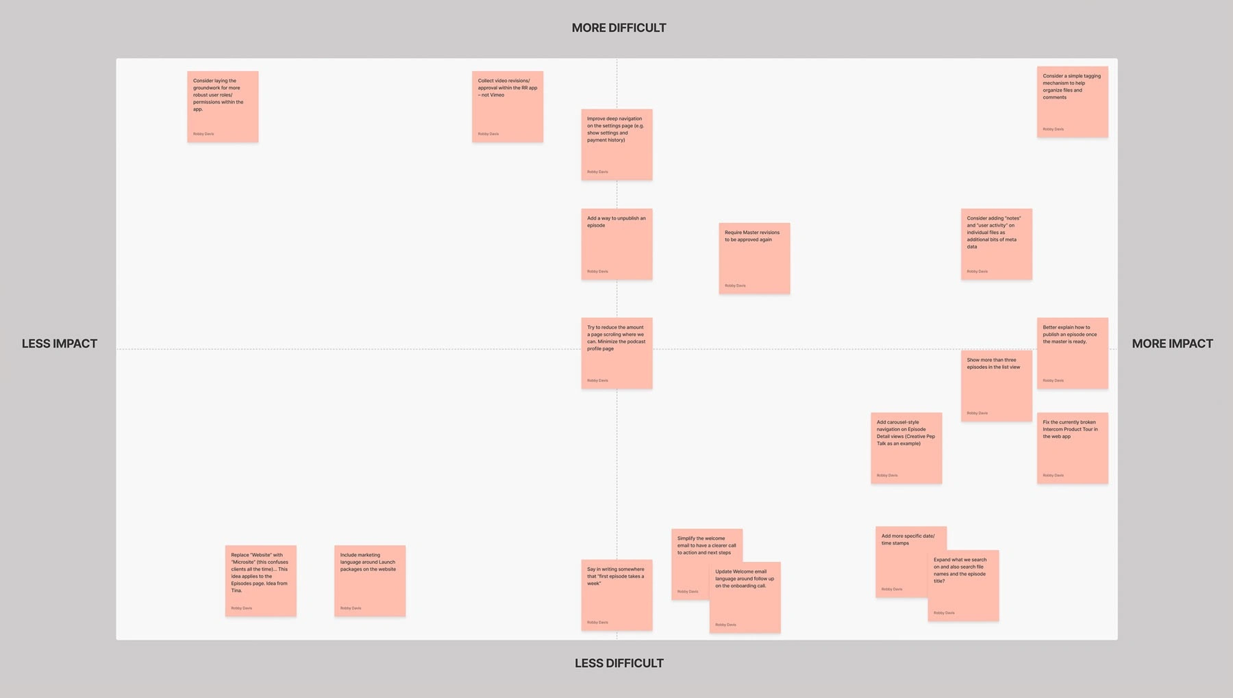
We mapped the opportunities onto a difficulty/impact matrix to guide the team in determining which initiatives to prioritize now vs later.
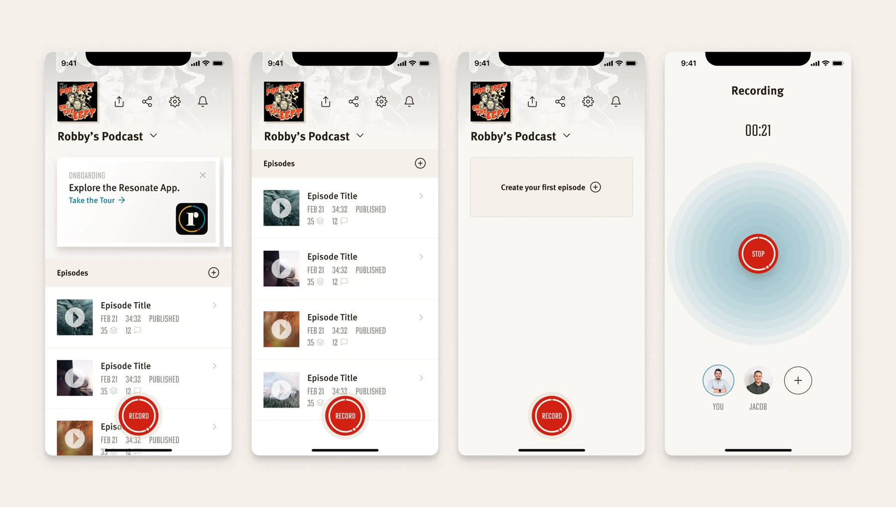
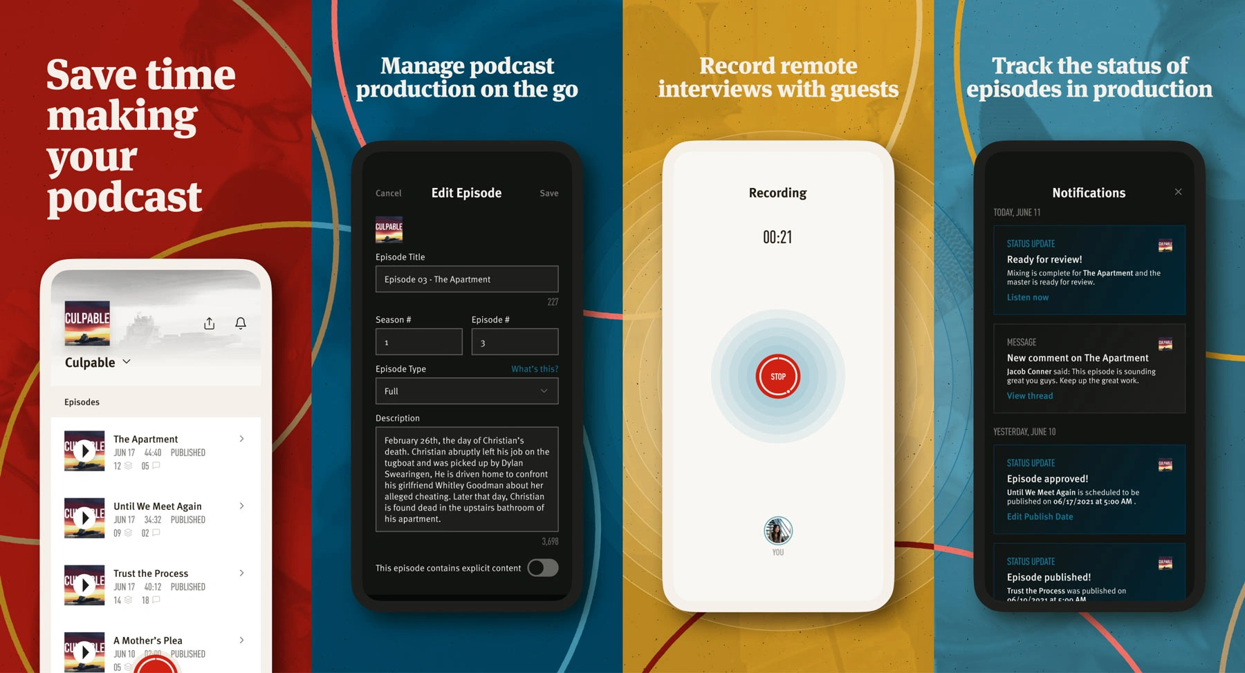
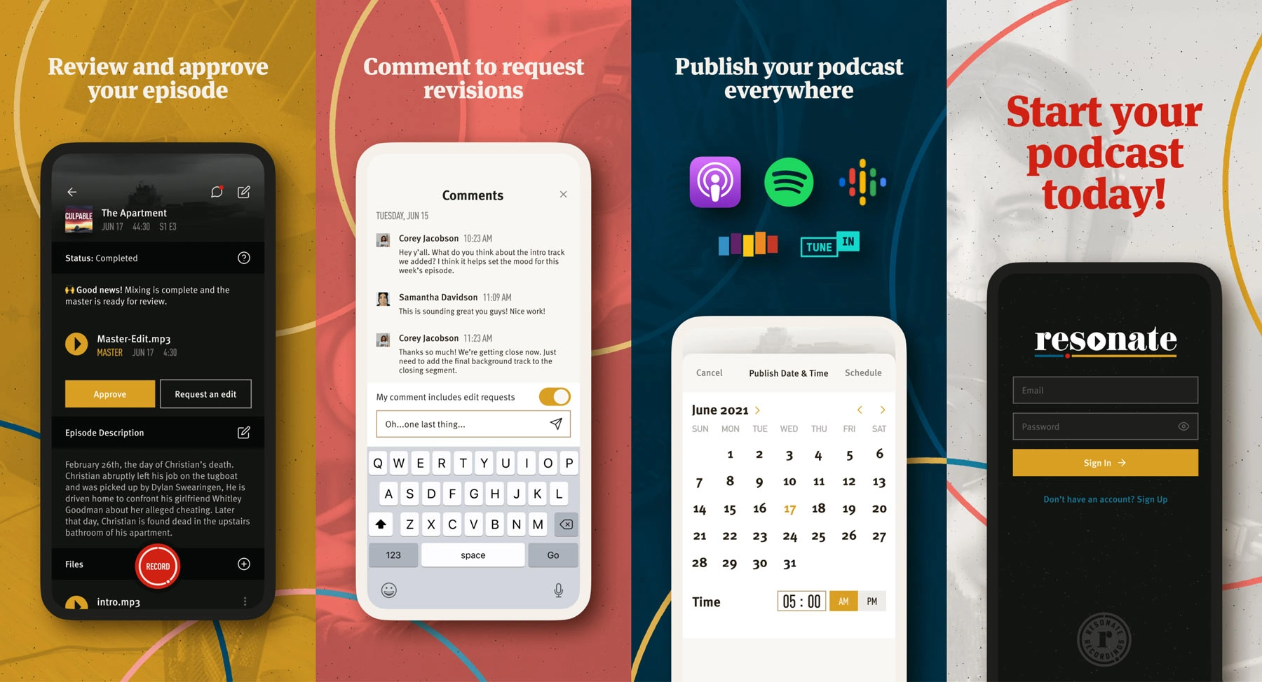
Designing and launching Resonate's iOS app
The iOS app was developed in response to customer demand and to address workflow challenges faced by the Resonate team. This project required close collaboration across design, product, business, iOS engineering, and web app engineering teams. The result was a best-in-class native app experience that seamlessly integrated with existing internal tools, setting a strong foundation for future growth.
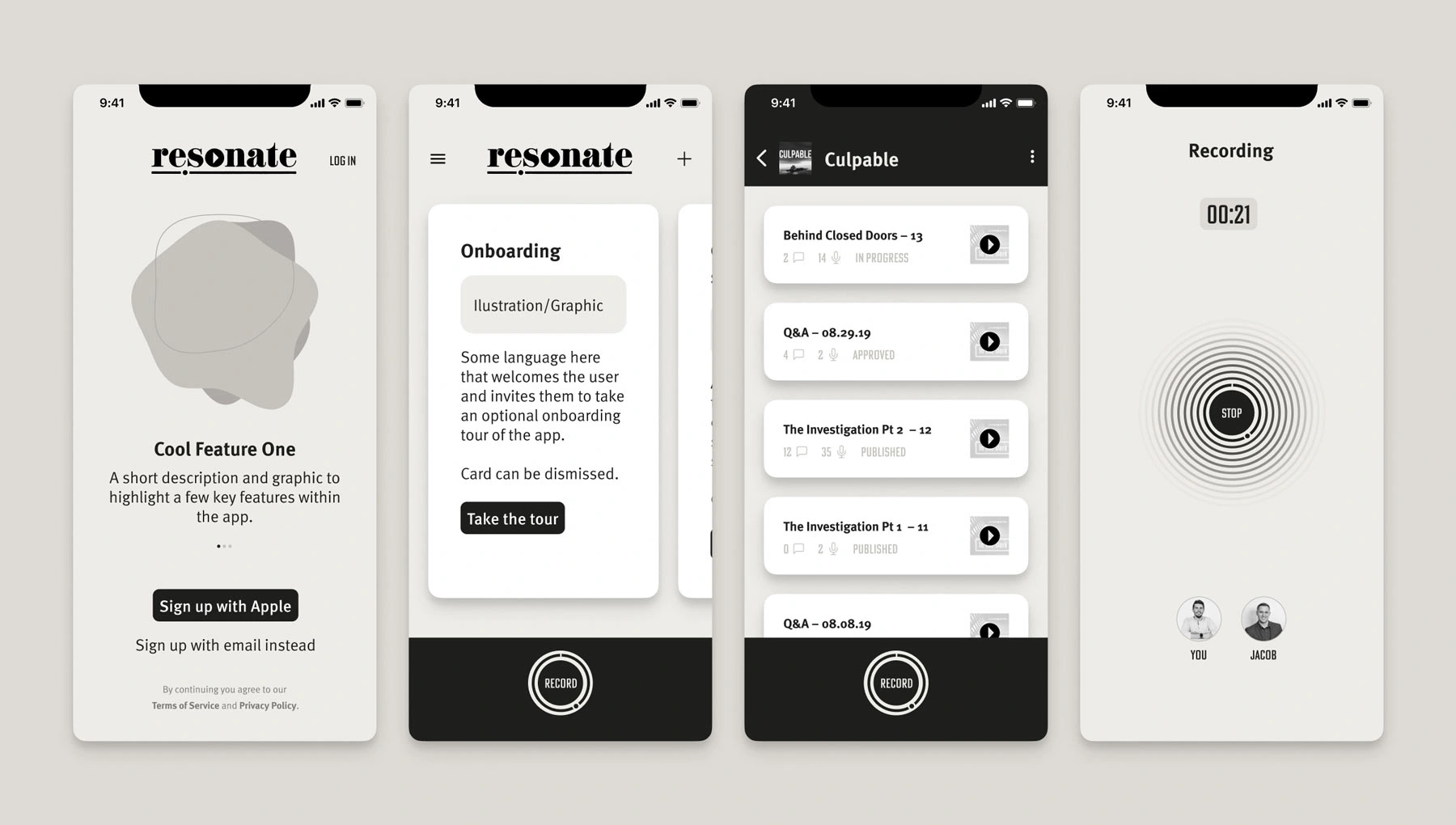
A glimpse of some initial wireframe views.
Wireframe iterations and exploration for what the higher fidelity design might look like.
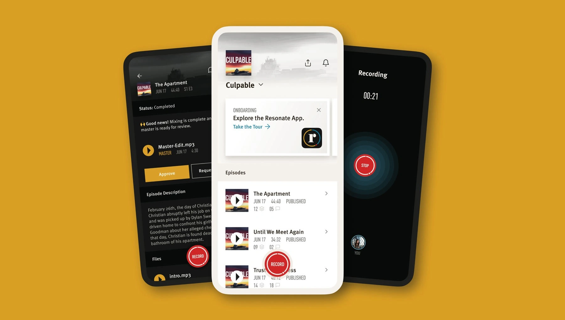
The final version featured designs for both light and dark modes.
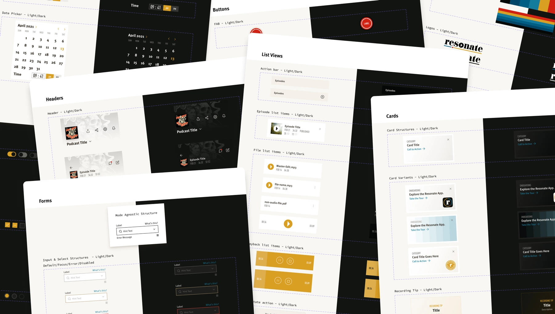
A comprehensive Figma design system, UI kit, and developer documentation were created to support the app’s design and build process.
I collaborated with Robby as a developer on the Resonate Recording iOS project, where his exceptional attention to detail was particularly impressive. The comprehensive design he developed for the application showcased meticulous planning and thorough execution, including a carefully curated color palette, typography system, and reusable UI components tailored to platform-specific requirements such as light and dark theme configurations.
Jeffery Trespalacios – Senior iOS Engineer, Yahoo!
iOS app icon design.
Marketing images for the Apple App Store launch.
Marketing images for the Apple App Store launch.
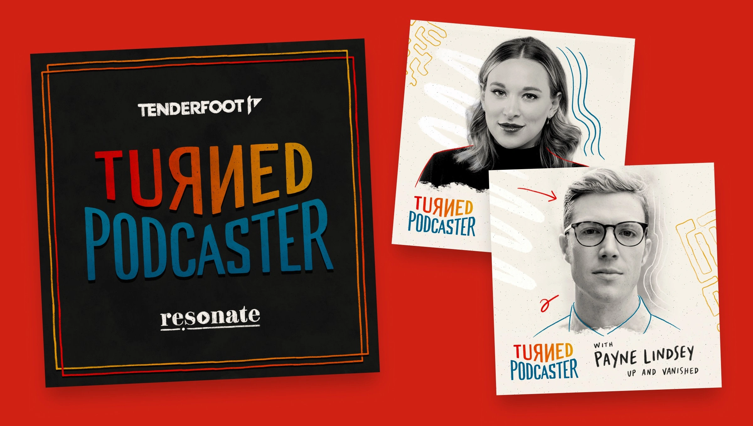
Branding the "How I Built This" of podcasting
In partnership with Tenderfoot TV, the Resonate team embarked on an exciting new venture by launching their own series of original podcast shows under the brand name Resonate Originals. The flagship show, Turned Podcaster, delves into the art of podcast creation, featuring top podcast hosts who reveal the untold stories behind their shows.
I played a key role in shaping the visual identity for both Resonate Originals and Turned Podcaster, helping to bring these concepts to life.
Resonate Originals logo.
During the conceptual phase, we explored various iterations of the show cover art.
Ultimately, we chose a clean show cover art design paired with concepts for distinctive episodic artwork, each highlighting a different guest.
New Opportunity
How a key challenge led to the birth of a new company
One of the major pain points for Resonate’s audio engineers was the tedious and repetitive nature of editing audio for their clients. To address this, the team embarked on an internal project to explore how AI could streamline their workflow. They began developing and training their own machine learning model to automate these common tasks. The results were not only promising—they were transformative. This innovation sparked the idea for a new startup.
In early 2022, the decision was made to go all-in on a consumer-facing AI podcast editor. The spin-off company would be called Resound. It's mission: automate podcast editing for creators. And…I was coming along for the ride!
See how the story continues with Resound.
Like this project
Posted Aug 22, 2025
Rebranded Resonate Recordings, revamped website, launched iOS app, and collaborated on new AI startup.
Likes
1
Views
6
Timeline
Aug 1, 2020 - Dec 31, 2022
Clients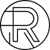
Resonate Recordings