Project Overview
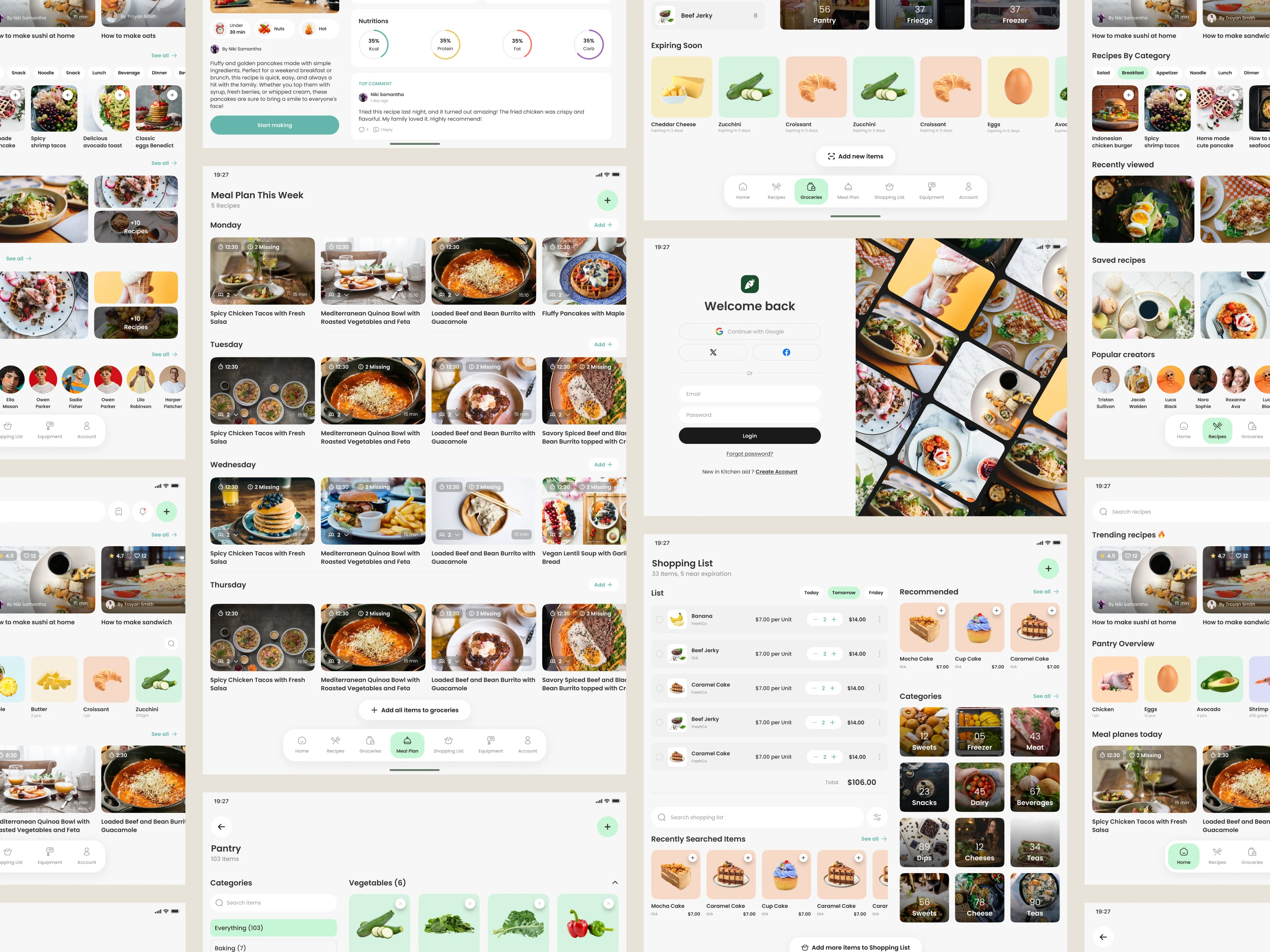
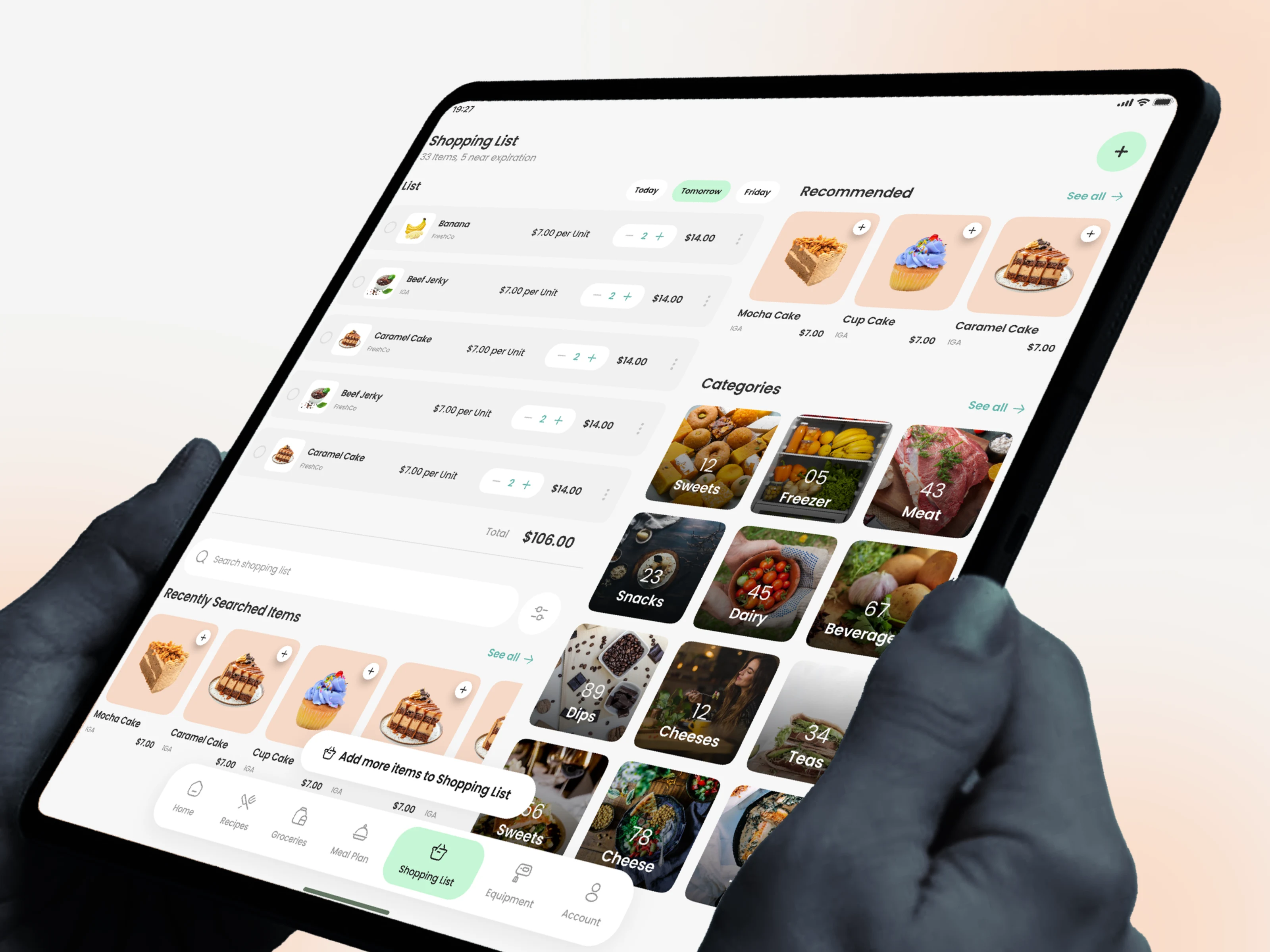
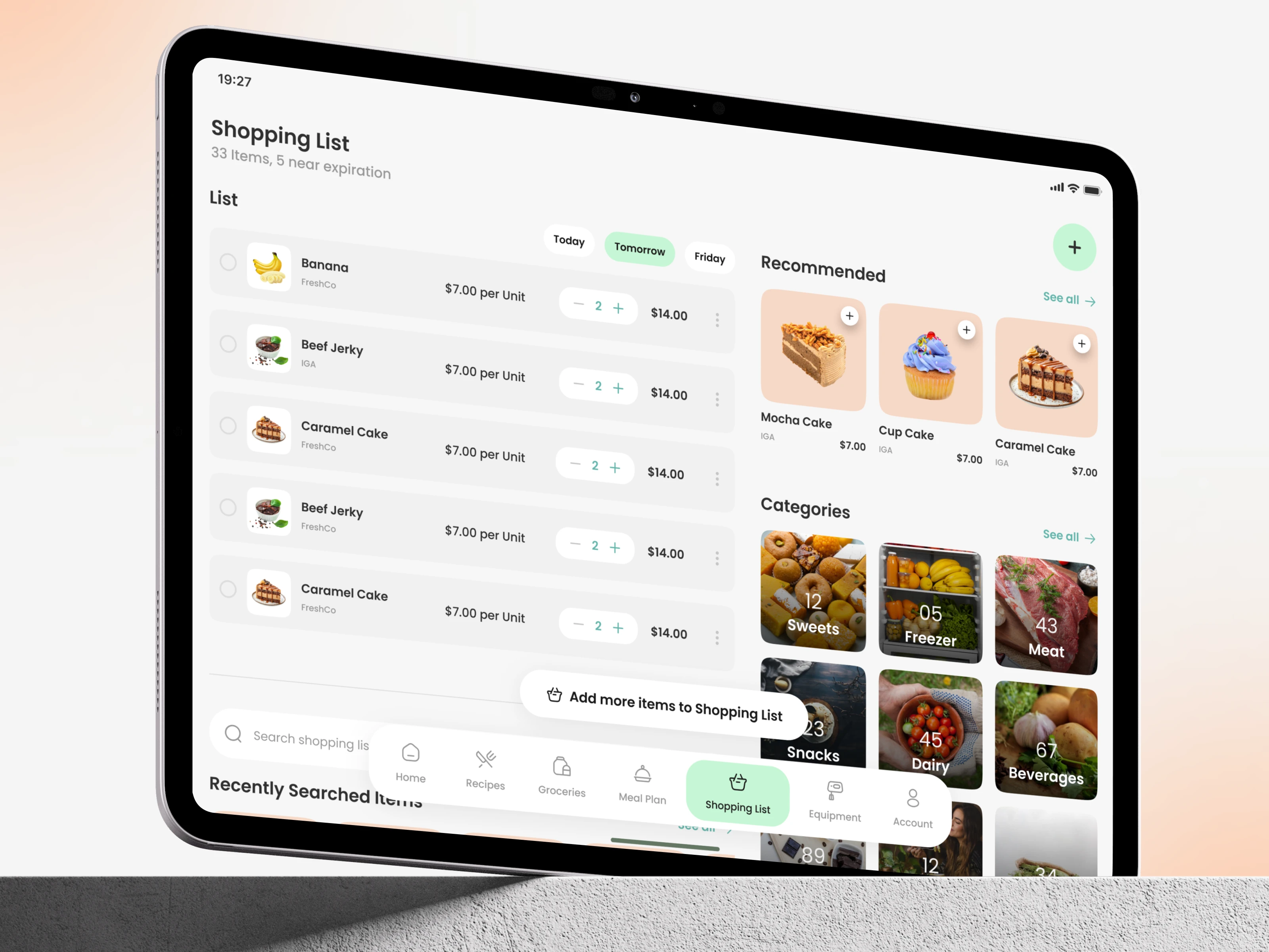
This screen is part of a smart grocery planning experience designed to help users manage their shopping lists with clarity and ease. The goal was to create a layout where users can track items, adjust quantities, and explore recommendations—all in one intuitive interface that feels organized and stress-free.
Design Approach
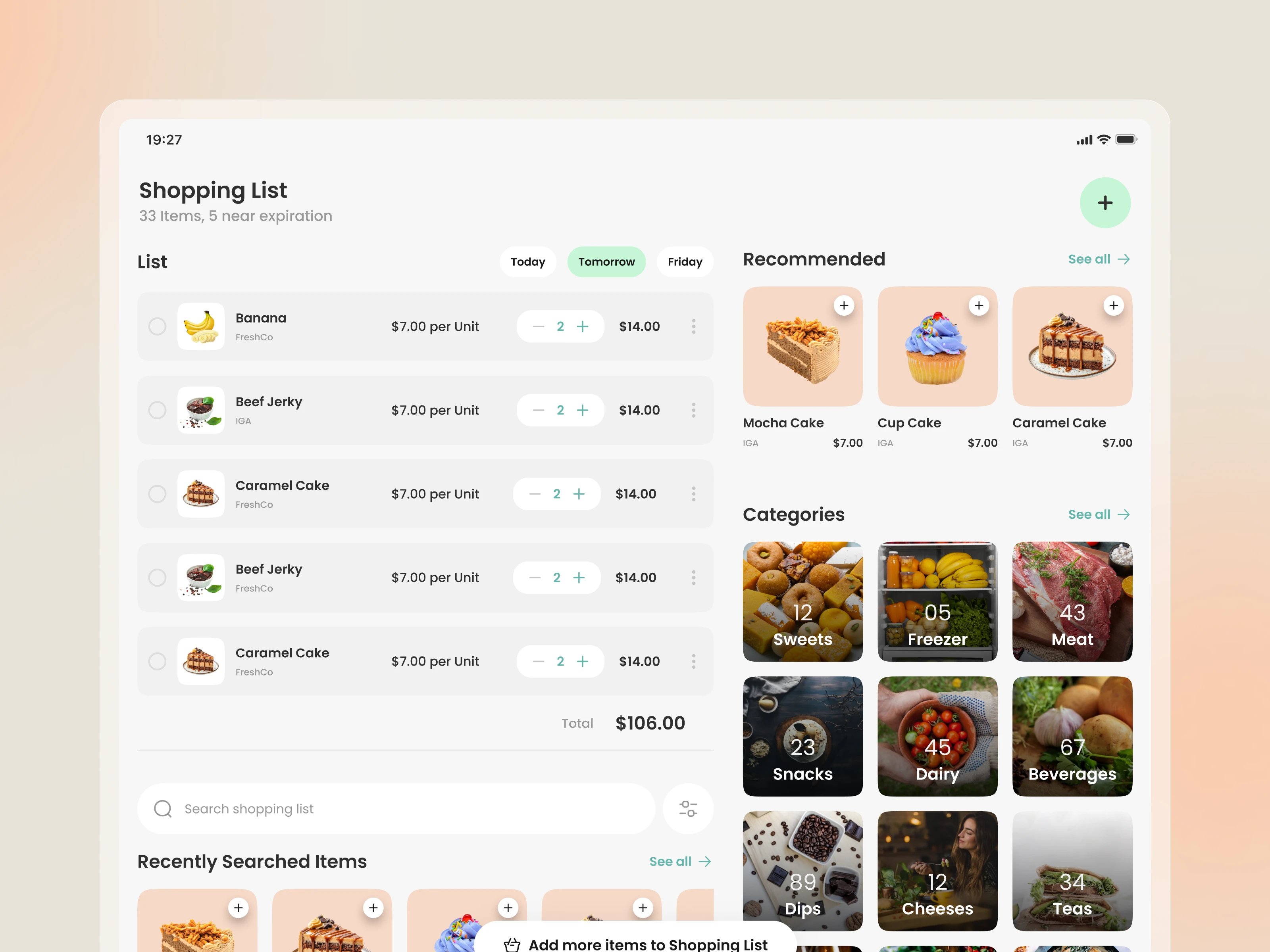
We focused on building a calm, structured layout that supports quick decision-making. A clean grid, subtle shadows, and soft neutrals keep the interface lightweight, while bold product cards and category blocks guide user attention. Functional elements—like quantity controls and list filters—were designed to be simple, accessible, and visually consistent.
Key Features
Smart quantity adjustments for each item
Recommended products based on user activity
Category-based browsing for faster selection
Recently searched items for quicker repeat actions
Clear total cost calculation for transparency
Final Experience & Result
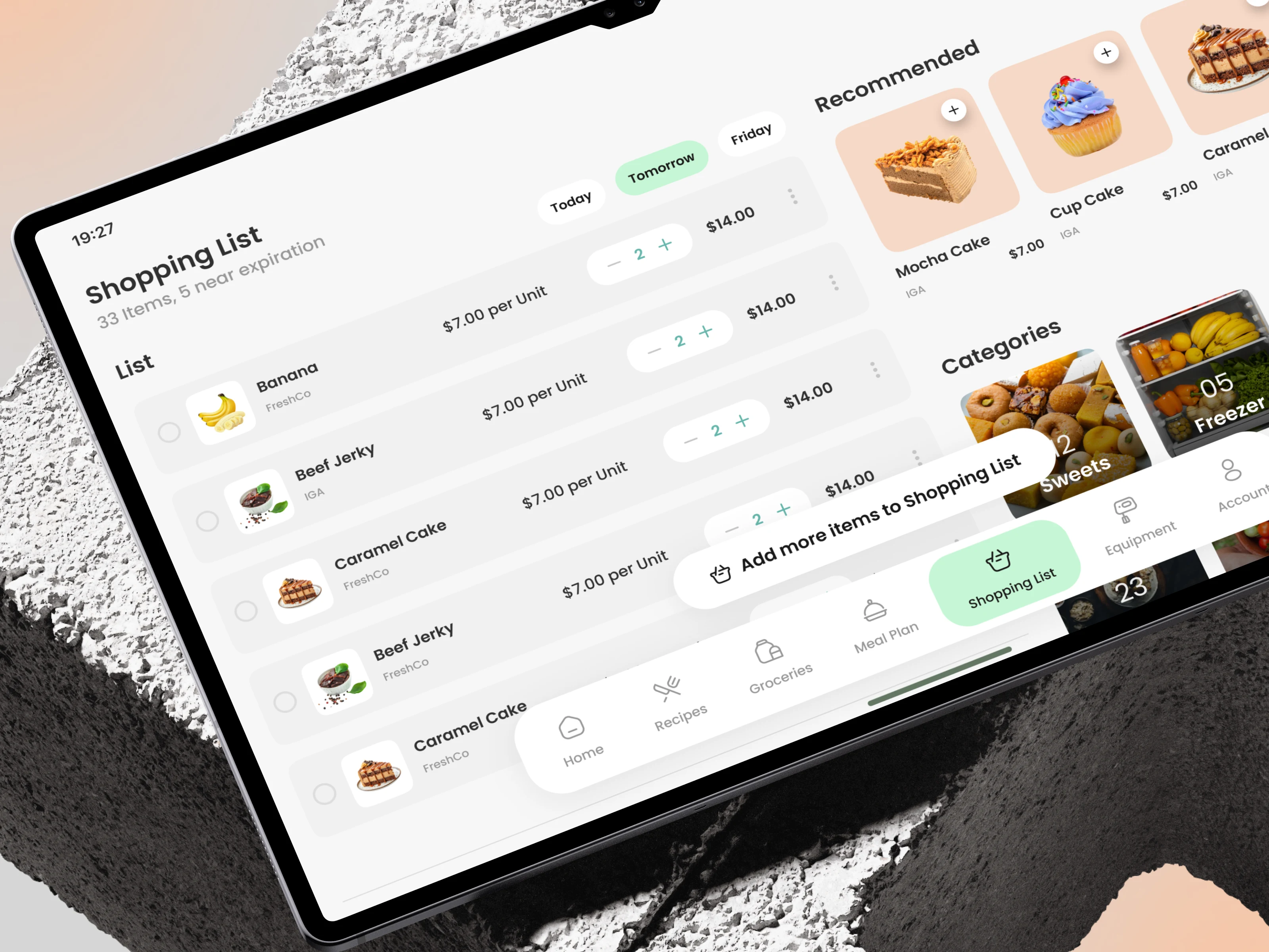
The final design delivers a seamless shopping flow where users can manage essentials, discover new items, and stay organized without clutter. By balancing visual hierarchy with functional clarity, the screen creates a shopping experience that feels both efficient and enjoyable.