Tave Coffee Shop POS System Design

Cansaas Agency

Overview
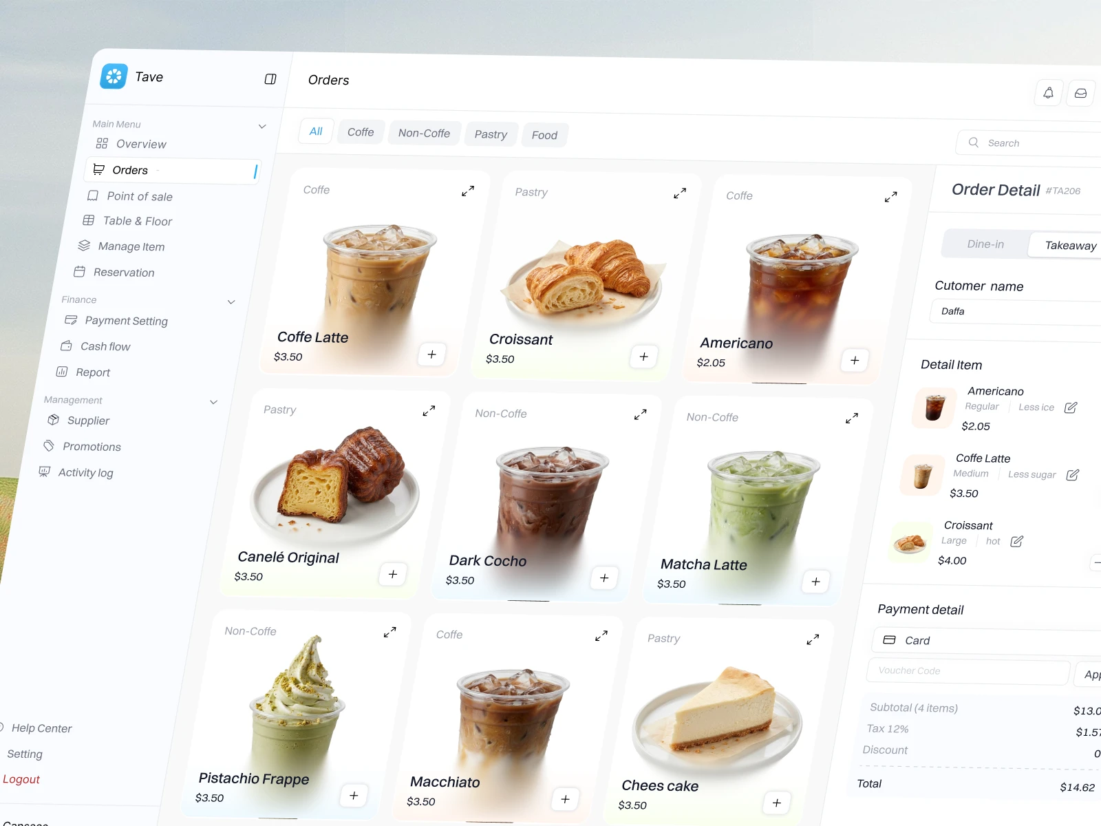
Tave is a modern Coffee Shop POS System designed to simplify café operations, order management, and payment processing through an intuitive digital workspace. The platform brings together product browsing, customizable orders, customer details, and checkout management in one organized dashboard. With a minimalist light-mode interface, high-quality food and beverage photography, and soft pastel accents, Tave introduces a fresh approach to Point of Sale (POS) software that balances visual appeal with everyday usability.
Design Approach
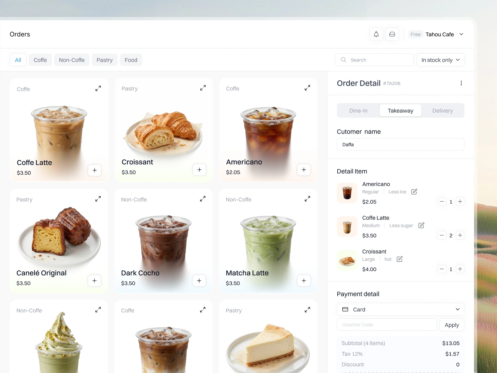
Our approach focused on creating a structured, easy-to-navigate Point of Sale dashboard built around the café ordering workflow. The interface uses a three-column layout, with categorized navigation on the left, a visual product catalog in the center, and a dedicated order management panel on the right. This arrangement helps users browse products, customize selections, and review payment information within a single screen. Consistent spacing, subtle borders, clean typography, and carefully placed action buttons establish a clear visual hierarchy throughout the experience.
Visual Style
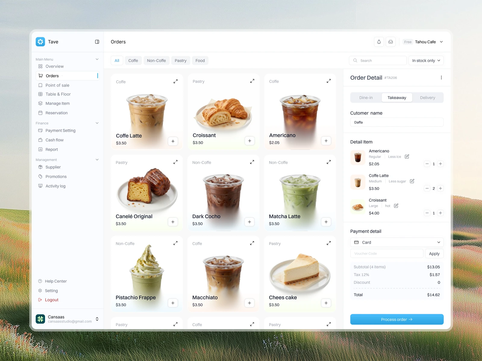
Tave embraces a clean, minimalist aesthetic with a bright light-mode interface and a subtle pastel color palette. Soft blue accents highlight navigation states and primary actions, while gentle gradients introduce warmth to the product cards. High-quality coffee and pastry photography adds personality without overwhelming the interface. Rounded corners, understated borders, and generous whitespace create a friendly visual identity that feels modern, approachable, and professional.
The Result
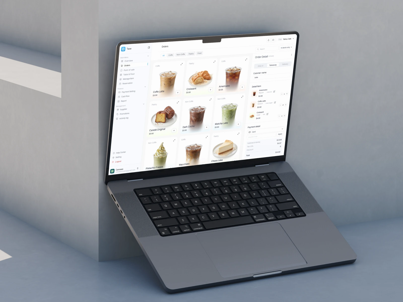
The resulting design concept presents a streamlined Coffee Shop POS Dashboard that connects product selection, order customization, and payment review within a cohesive workspace. By combining thoughtful information hierarchy with a visually engaging interface, Tave demonstrates how modern POS UI/UX design can make everyday café operations feel simpler and more organized. The design offers a strong foundation for a digital café management experience built around usability, clarity, and operational convenience.
Like this project
Posted Oct 30, 2026
Designed a user-friendly POS system for Tave, enhancing café operations.
Likes
0
Views
0