Healthiest Dashboard Design

Cansaas Agency

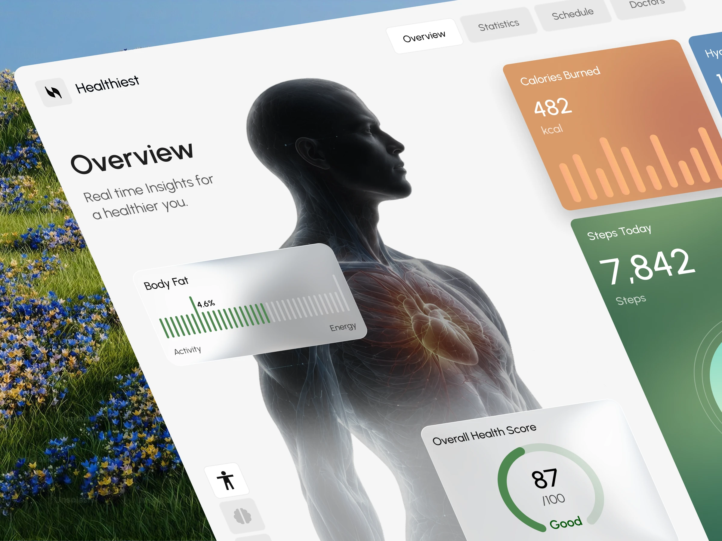
Overview
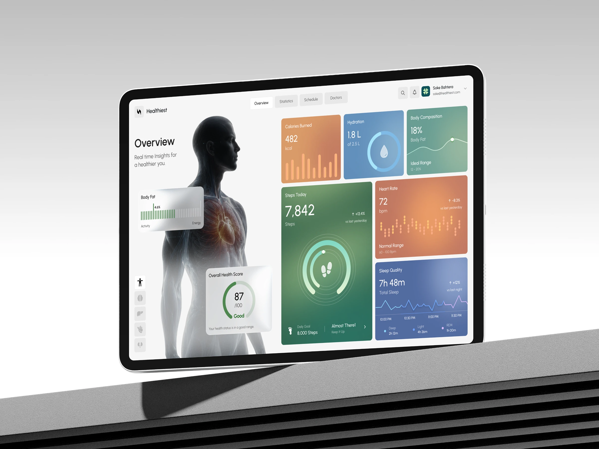
Healthiest is a modern health monitoring dashboard designed to simplify personal wellness tracking through a clean, intuitive, and visually engaging interface. The platform brings together essential health metrics, including heart rate, sleep quality, hydration, body composition, daily activity, and overall health scores, into one organized digital workspace. With colorful data visualization, minimal typography, and a human-centered design approach, Healthiest makes complex health information easier to explore, understand, and monitor.
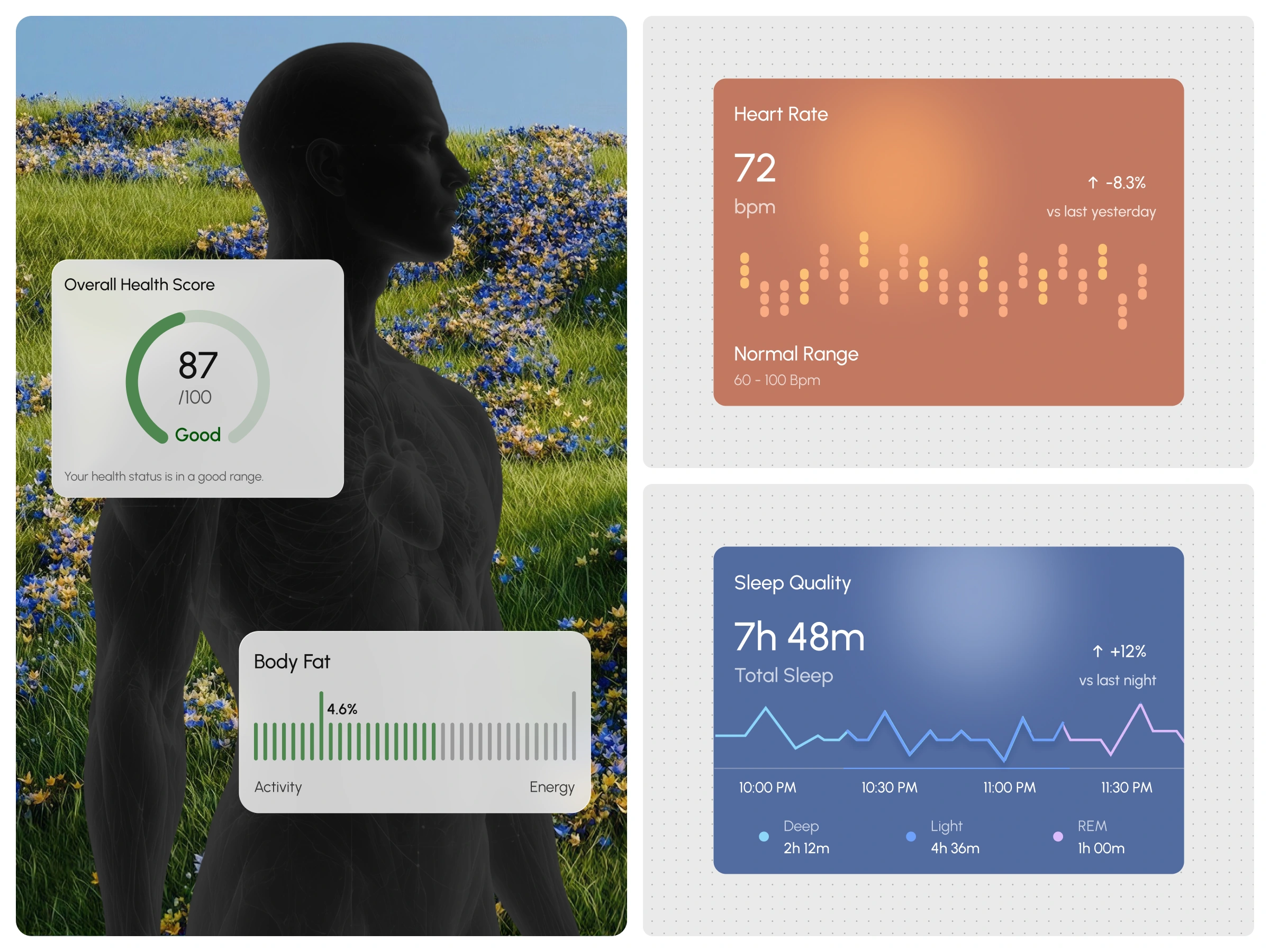
Design Approach
We developed a minimalist light-mode dashboard that combines structured information architecture, colorful metric cards, and intuitive navigation. A prominent anatomical human illustration serves as the visual centerpiece, connecting health data with the human body. Each health metric is presented through a dedicated card featuring distinct colors, progress indicators, and simplified charts. This approach establishes a clear visual hierarchy while keeping the overall interface cohesive, spacious, and easy to navigate.
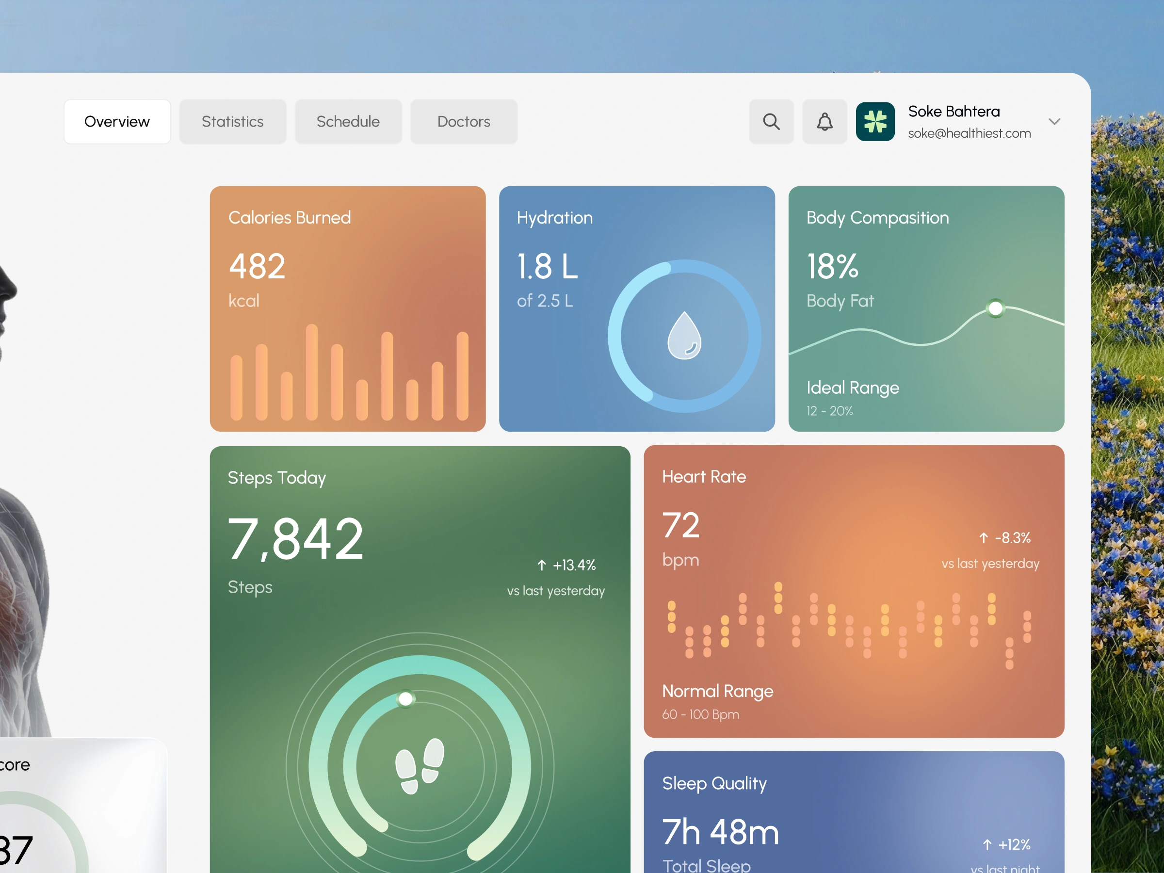
Key Features
Healthiest brings multiple wellness monitoring features into one unified dashboard experience. Users can explore heart rate insights, sleep duration and quality, hydration progress, daily steps, calories burned, body composition, and overall health scores. The interface incorporates circular progress charts, activity graphs, comparative indicators, and health status summaries to communicate information visually. Additional navigation categories, including Overview, Statistics, Schedule, and Doctors, establish a clear structure for exploring different areas of the health management experience.
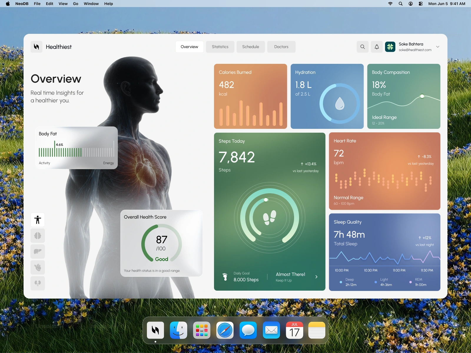
Visual Style
The visual identity combines a clean white interface with soft orange, green, blue, and teal accents to create a refreshing healthcare aesthetic. Rounded cards, spacious layouts, modern typography, and subtle interface details establish a balance between professionalism and warmth. The anatomical illustration introduces a distinctive visual element, while colorful charts and progress indicators make the dashboard feel dynamic, informative, and contemporary.
The Result
The final design presents a polished health monitoring dashboard concept that transforms complex wellness data into a clearer and more engaging digital experience. Healthiest demonstrates how thoughtful UI/UX design, intuitive data visualization, and human-centered visual storytelling can make personal health management feel simpler, more organized, and accessible.
Like this project
Posted Oct 29, 2026
Developed a modern dashboard for simplified health monitoring.
Likes
0
Views
4