Talorify | Pass the ATS Filter - Landing Page

Emmanuel Bliss
1 collaborator


The idea
Job hunting already feels exhausting.
You send out resume after resume, tweak keywords, apply to another role, and wait. Then another rejection lands.
Talorify was built around a simple idea: help people tailor their resumes for the job they're applying for without making things up.
But there was another problem.
The moment you put AI and resume together, the product can easily start looking like every other AI tool on the internet.
Dark backgrounds. Neon gradients. Glowing effects. Lots of futuristic language.
That wasn't the feeling we wanted Talorify to have.
The landing page had to make people understand the product, but more importantly, it had to make them feel like they could trust it.
So that's where I started.
Making Talorify feel different
I didn't want the first impression to be:
"Here's another AI tool."
I wanted it to feel more like:
"Finally, something that understands what I'm trying to do."
That meant going in the opposite direction from the usual AI aesthetic.
No futuristic dashboards.
No glowing gradients.
No unnecessary 3D objects.
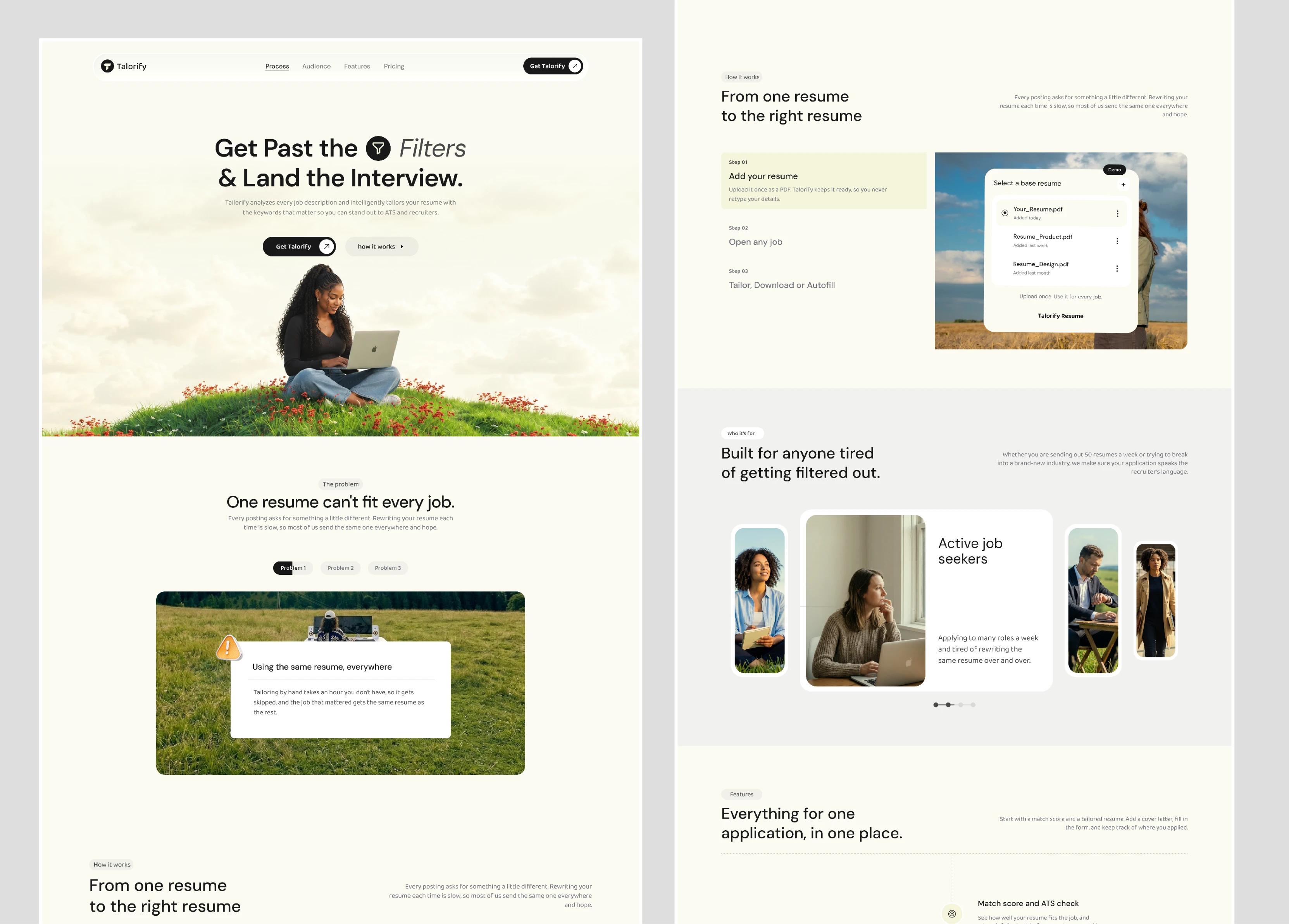
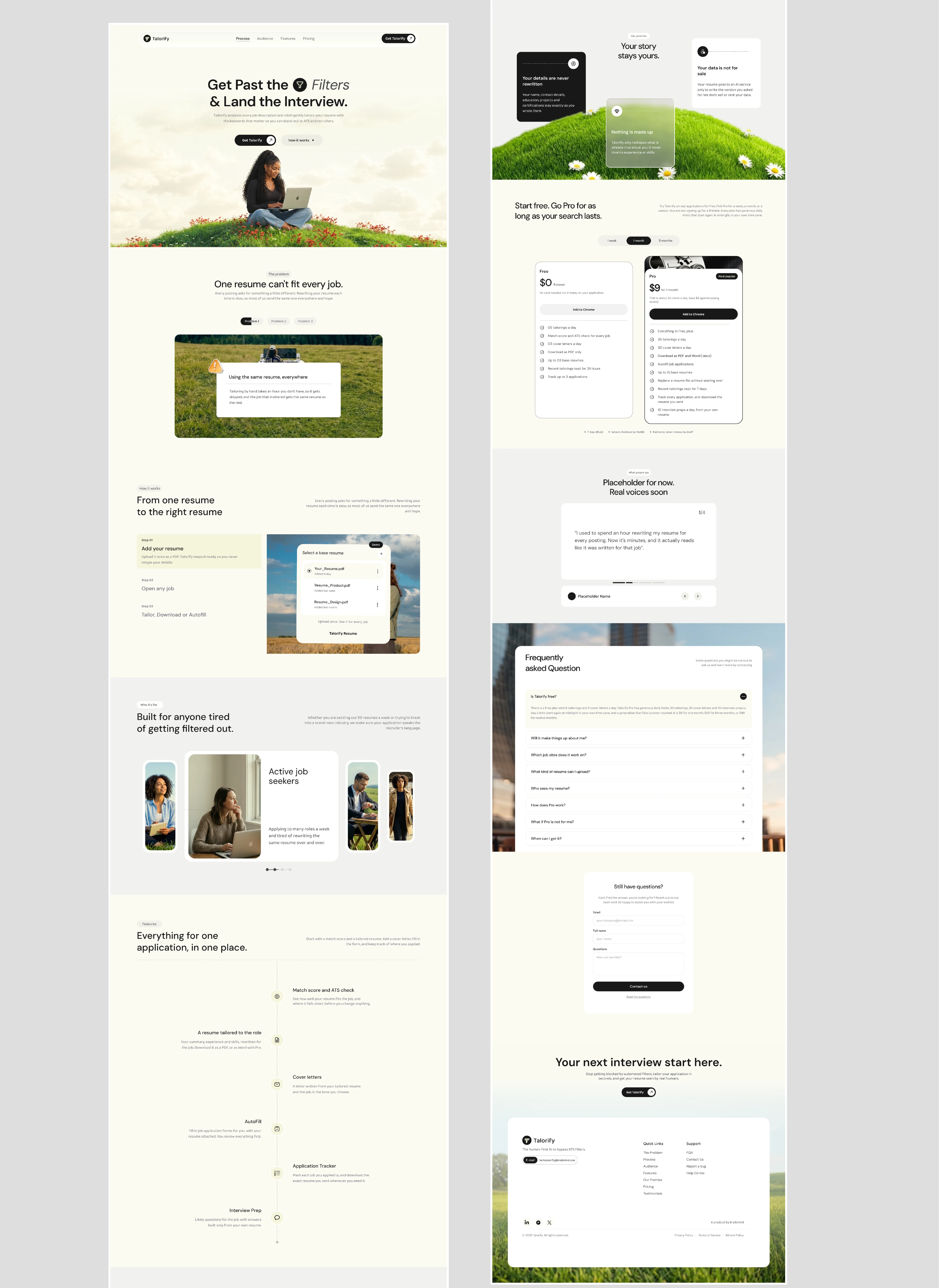
Instead, I built the visual direction around calmness, clarity and familiarity.
The cream background gave the page room to breathe.
Black typography kept the communication direct.
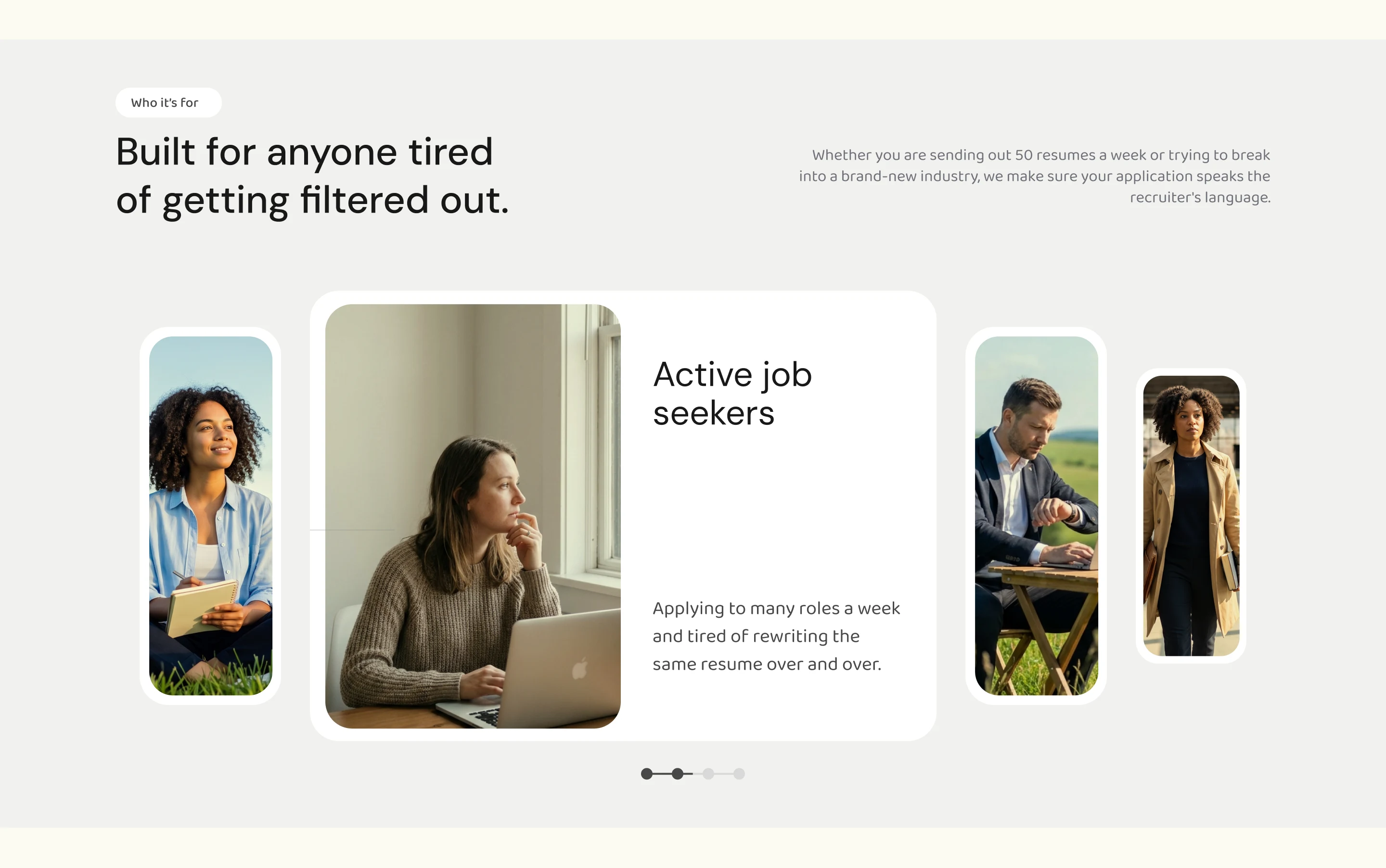
And the photography brought something the typical AI aesthetic often lacks — people.
The grassy fields and natural imagery weren't just there to make the page look nice. They helped create a completely different emotional environment from the anxiety that usually comes with job hunting.
Then came the harder part: explaining the product
A good-looking landing page wasn't enough.
Someone visiting Talorify still needed to understand:
What is this?
How does it work?
Why should I trust it?
And what do I actually get?
So instead of explaining everything through long paragraphs, I treated the page like a conversation.
The hero introduces the core promise.
Then the page moves into the problem.
Then it shows how Talorify works.
Then the features.
Then pricing.
Then social proof and FAQs.
Each section answers another question the visitor might have.
What starts as curiosity gradually becomes understanding.
Showing instead of telling
One of the biggest decisions was to let the interface do some of the explaining.
Rather than saying:
"Talorify helps optimize your resume for ATS systems."
we could actually show what that means.
Resume selection.
Job matching.
ATS scoring.
Tailoring.
The UI cards became part of the storytelling.
This made the product feel less abstract.
You weren't just reading about what Talorify could do.
You could see it.
Keeping trust visible
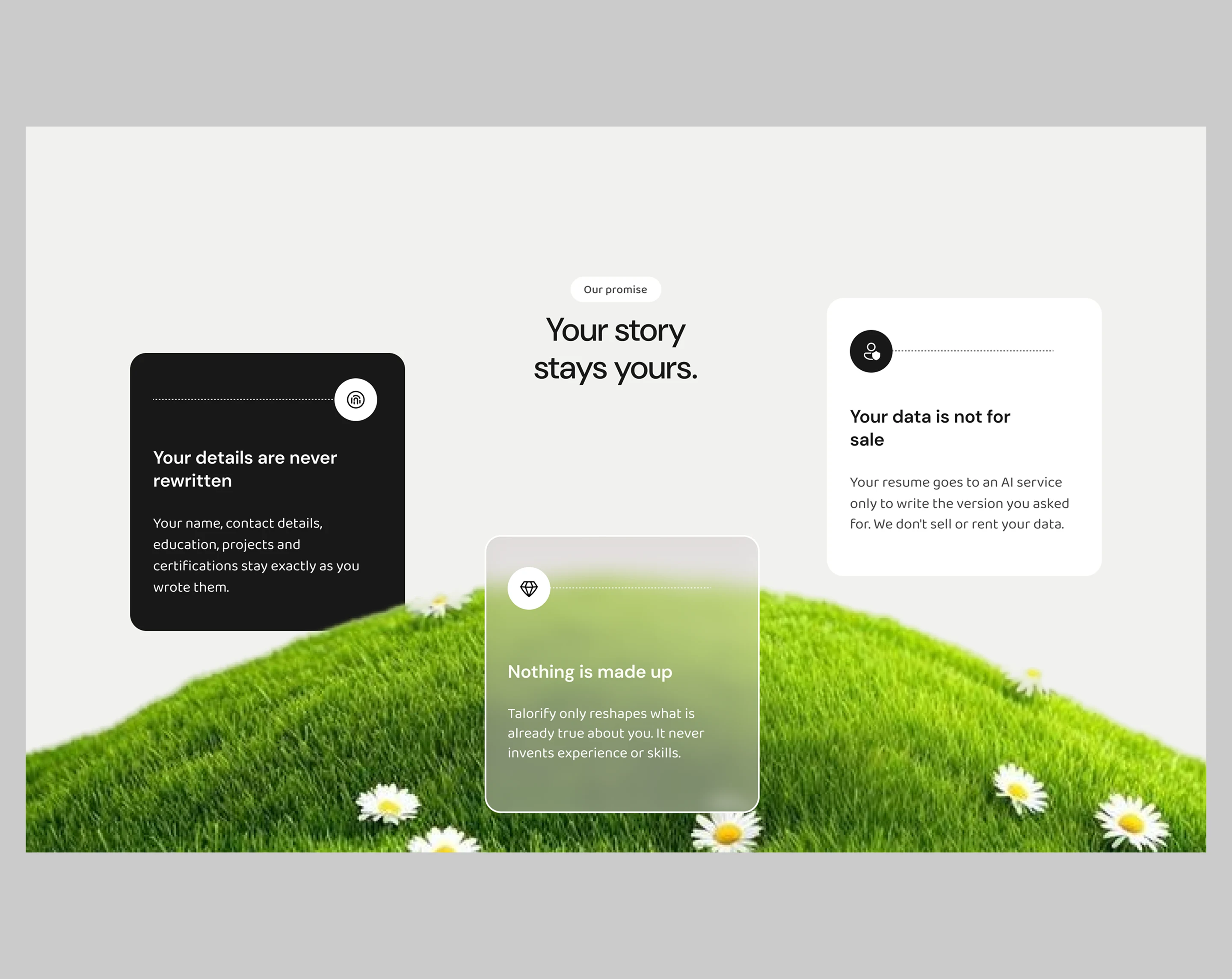
Because Talorify deals with something as personal as someone's career, I didn't want important information hidden behind clever copy.
Pricing is visible.
The free plan is clear.
The Pro plan is clear.
The FAQ is there for the questions someone might have before committing.
The goal was simple:
don't make people work to understand the product.
If they're interested, give them enough clarity to make their next decision.
Take a look at what a good design looks like
The final direction
The finished landing page became a balance between editorial design and product storytelling.
Soft, natural imagery sits alongside sharp typography.
Product UI sits inside simple cards.
Large sections give the content room to breathe.
And the page gradually moves the visitor from the problem to the product, then from the product to the decision.
It doesn't try to scream AI.
It doesn't try to look futuristic.
It just tries to make Talorify easy to understand and easy to trust.
And that was really the point of the design.
Not to make an AI product look more like AI.
But to make the product feel more human.
TALORIFY DESIGNED AND DEVELOPED
Like this project
Posted Oct 2, 2026
Crafted a high-converting landing page using a human-first visual strategy. Successfully built market trust and captured a dedicated waitlist of early users.
Likes
2
Views
2
Timeline
Sep 18, 2026 - Sep 23, 2026
Collaborators