Setwize Brand Identity
Nina Maar
Brand Identity Setwize
The Design Thesis
The SaaS landscape is saturated with "friendly" aesthetics—soft corners, passive blues, and generic approachability. Setwize needed to reject this safety. The challenge was to transform a standard email platform into a tool with a distinct structural soul, moving from a passive utility to an active workspace.
The Wit
The Mark
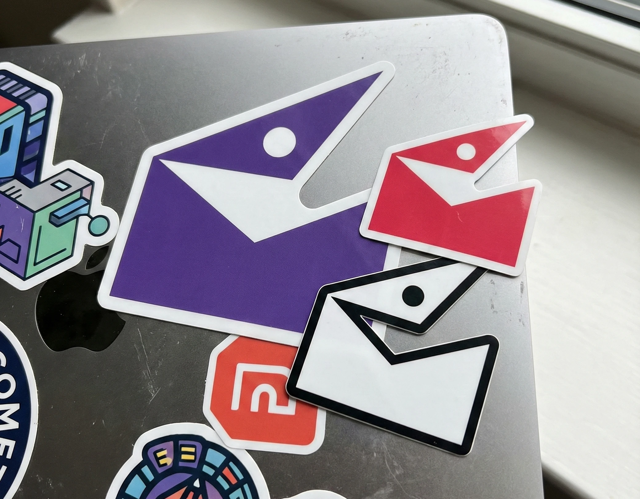
We leveraged pareidolia to create a mark that feels alive without relying on mascot clichés.
Concept: The envelope form was dissected into geometric primitives (rectangle base, vector flap) and disrupted with a single circular counter-form.
Result: The gestalt shifts from object to entity—a courier caught in the act of communication.
Color Dynamics
We engineered a palette to manage cognitive load, not just aesthetics.
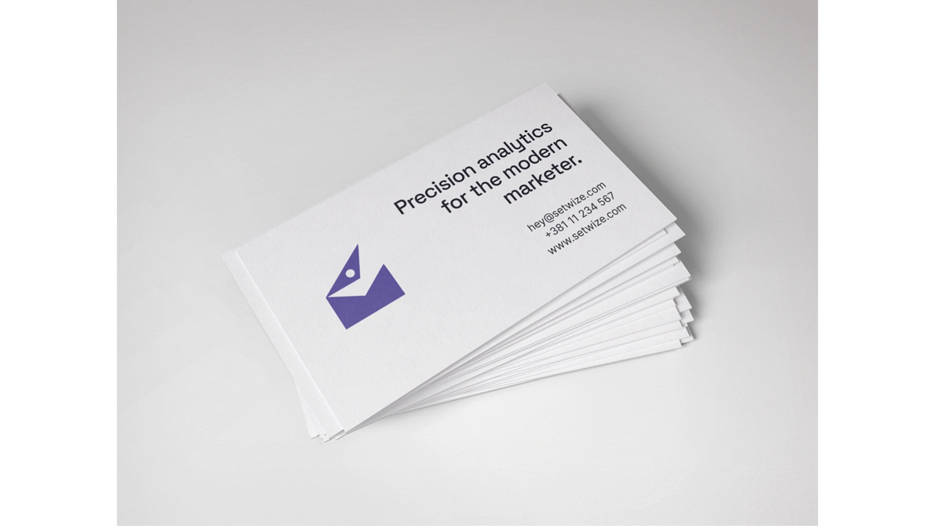
Core Color: Setwize Grape.
Function: Unlike the industry-standard "utility blue," this violet hue anchors the user in a state of "Deep Work." It sits on the boundary of calm and energy, creating an immersive "dark mode" environment that reduces eye strain.
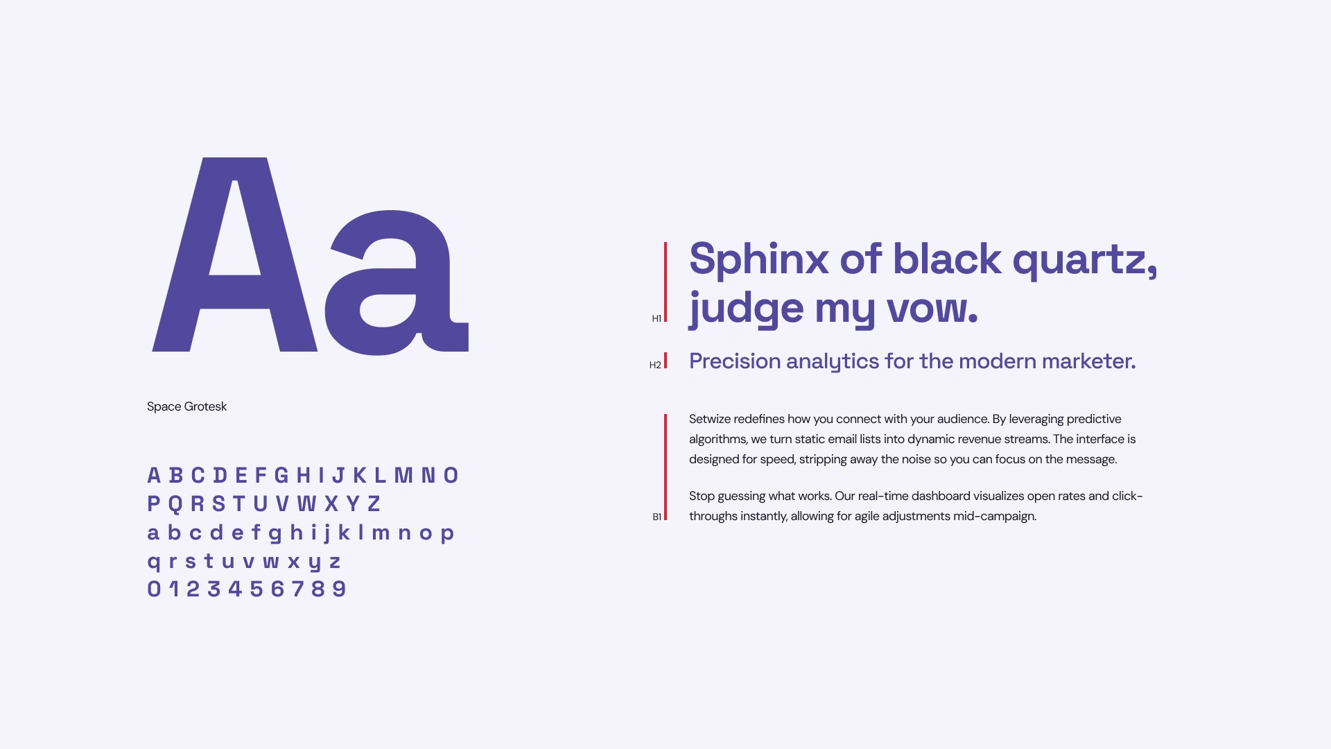
Typography
Typeface: Space Grotesk.
Rationale: Selected for its deep ink traps and near-monospaced rhythm. It bridges the gap between raw code and human conversation, adding a retro-futurist texture that feels technical yet vocal.

The Outcome
The final identity successfully navigates the tension between cold utility and genuine companionship. By balancing aggressive geometry with "coded" typography, we embedded a human connection into the brand, positioning Setwize not just as a tool for browsing, but an environment for thinking.
Like this project
Posted Feb 2, 2026
An identity system that rejects SaaS neutrality by merging geometric wit with a deep-focus color palette.