A Brand System Built to Evolve

Luís Teixeira


Overview
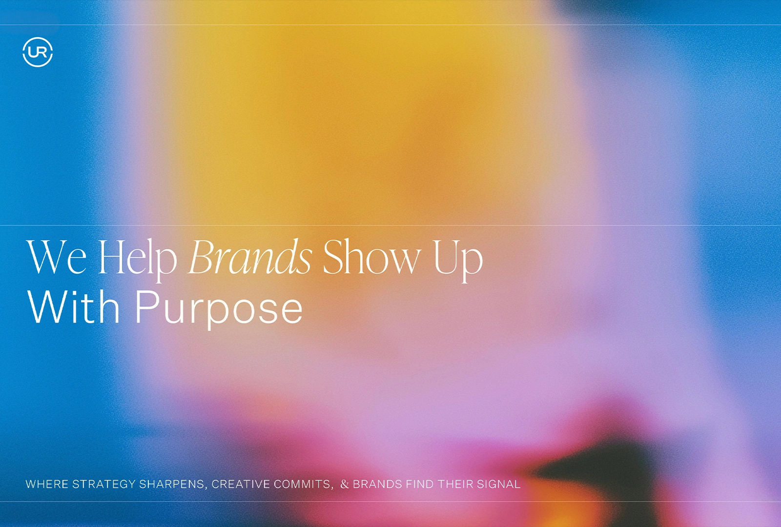
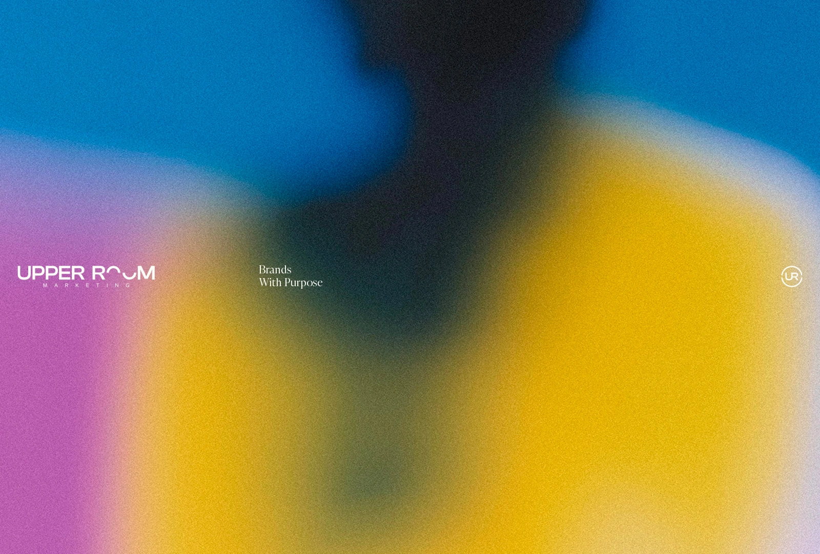
Upper Room’s brand refresh was developed around the idea of preserving continuity while creating a more mature and flexible visual system. The wordmark was refined with a new typographic direction, while the existing two-arc structure was retained and expanded into a broader graphic language.
Building a System from Negative Space
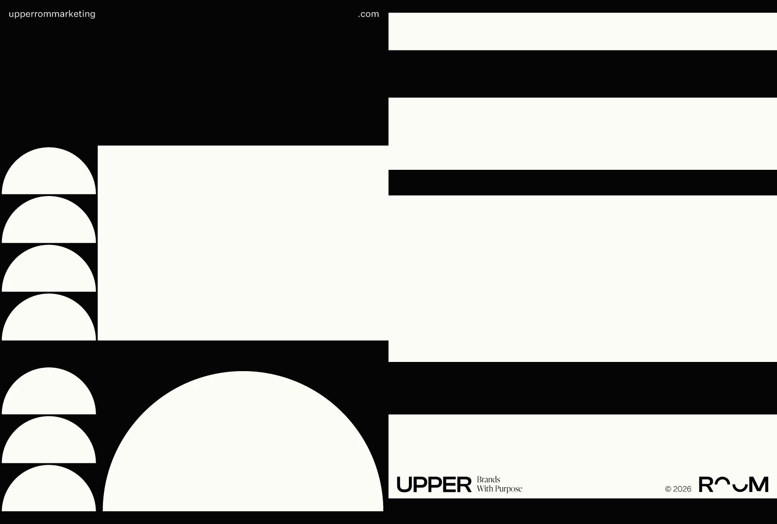
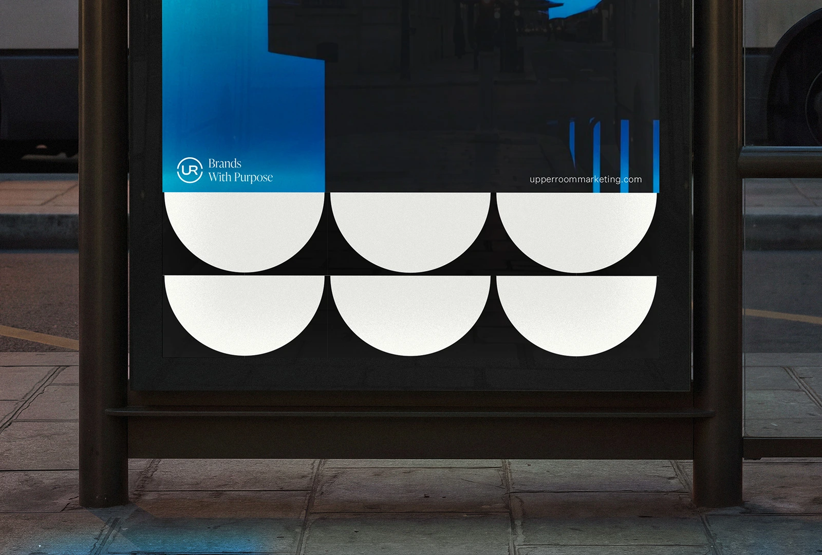
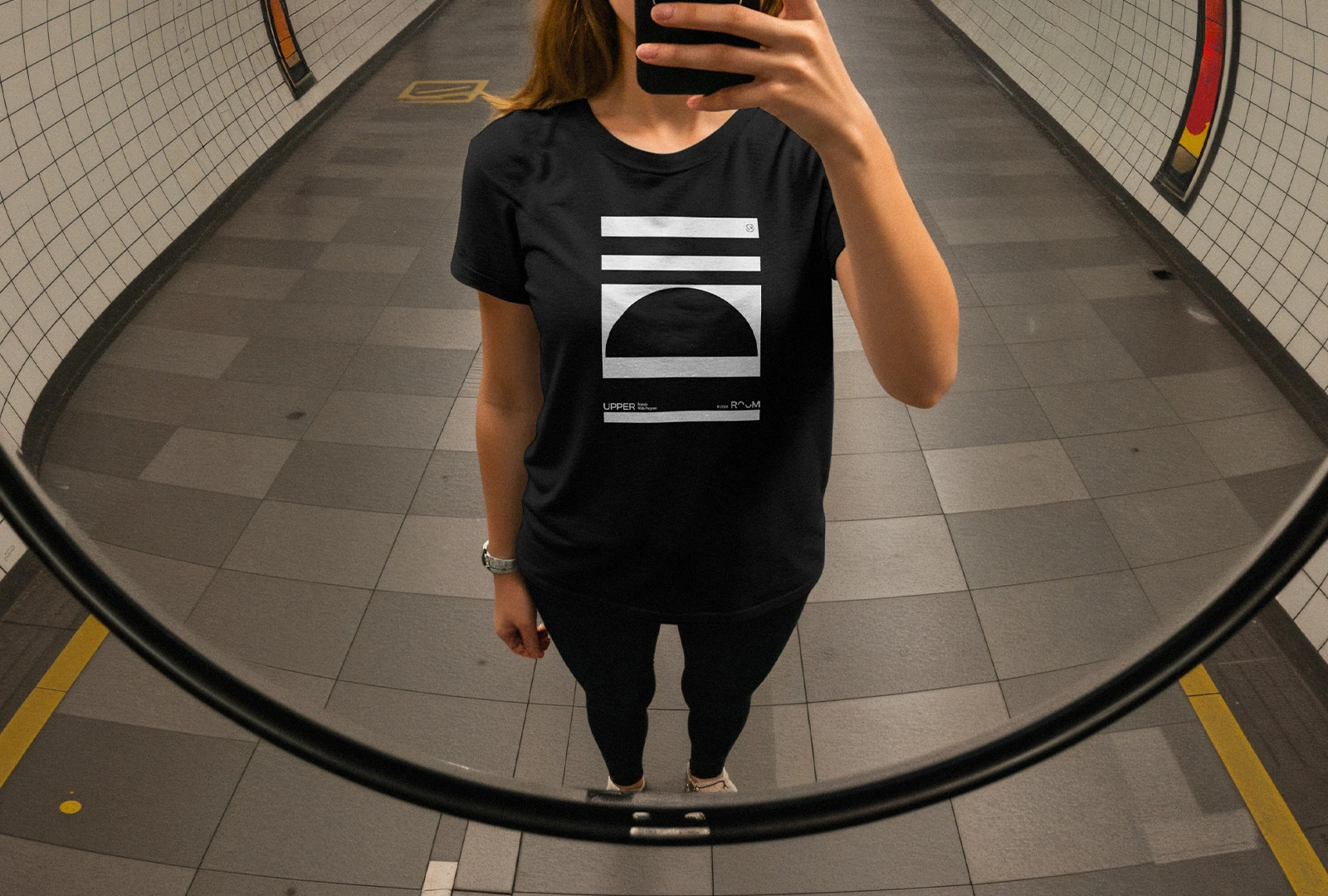
The negative space between the arcs became the foundation for the system, informing lines, blocks, frames, spatial compositions and a new monogram built from the same visual logic. This allowed the identity to move beyond the logo and become a recognisable brand environment, subtle, structured and adaptable across digital and print applications.
A Flexible Brand Environment
Each element works as part of a shared visual vocabulary. The system can shift in scale, composition and emphasis while retaining the same underlying logic, creating room for Upper Room to communicate with consistency across different contexts.
Graphic Language System
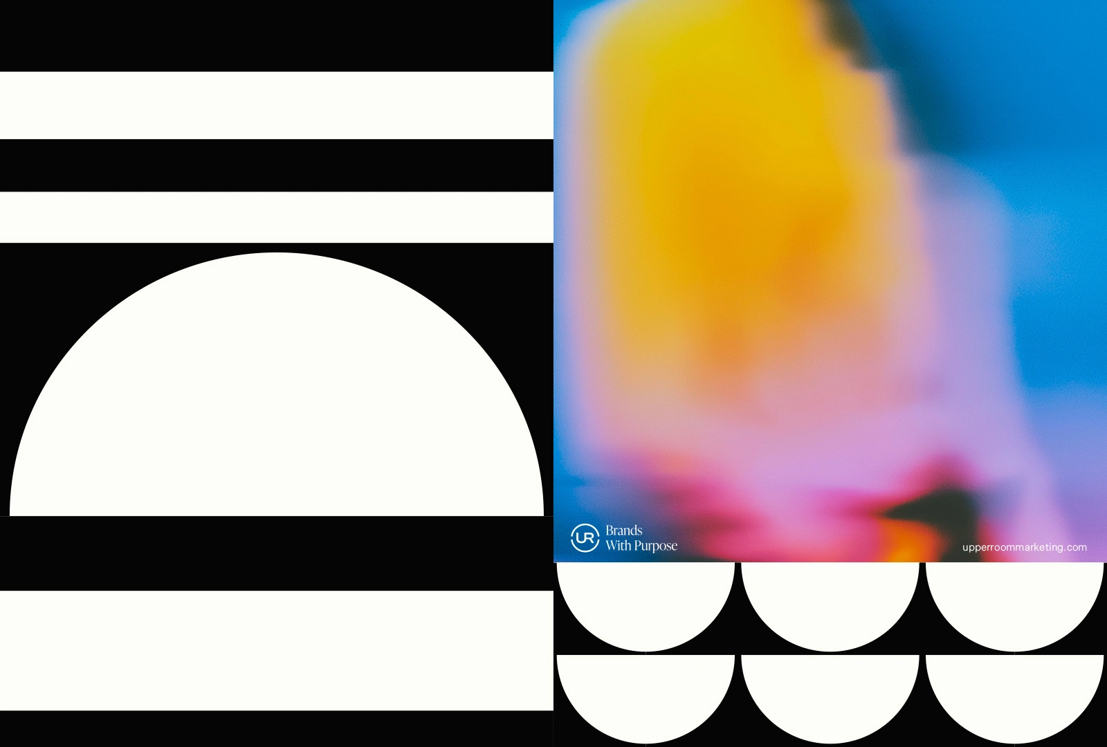
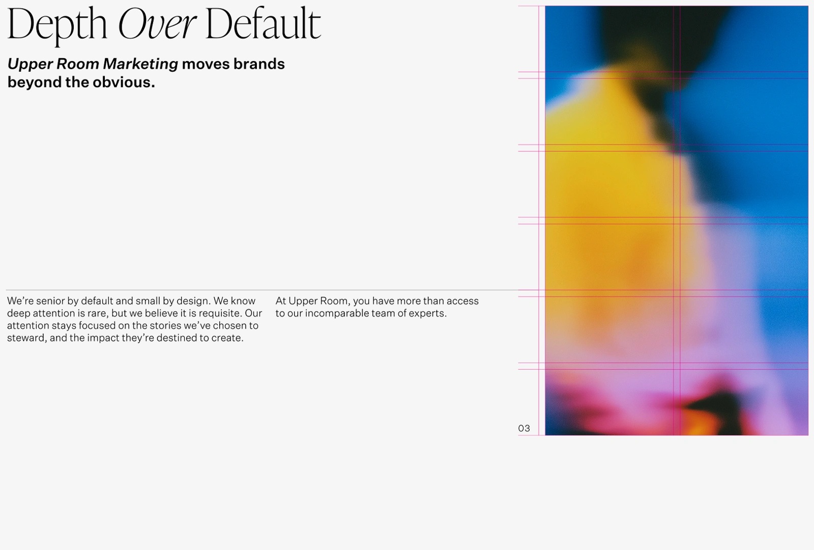
The graphic language system is built around a set of modular elements — arches, lines, and blocks — that work together to structure content, create hierarchy, and support storytelling.
The arches, derived from the identity, introduce rhythm and recognition through repetition, cropping, and pattern; lines provide structure, direction, and visual connections; while blocks create emphasis, containment, and contrast within the layout. Used independently or in combination, these elements form a flexible visual toolkit governed by shared principles of clarity, rhythm, and restraint.
Typography
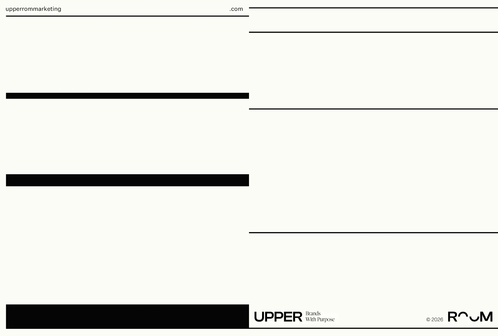
The identity balances a serif and a sans serif typeface to create contrast, hierarchy, and tonal range, allowing the system to move between authority and clarity without losing cohesion. The type compositions explore scale, weight, and spatial relationships between H1, Subheader, Body Copy, and Tags, ensuring clarity, consistency, and flexibility across different content densities.
Like this project
Posted Aug 10, 2026
A brand refresh that evolves Upper Room’s two-arc wordmark into a mature, flexible visual system for digital and print.