Tandem
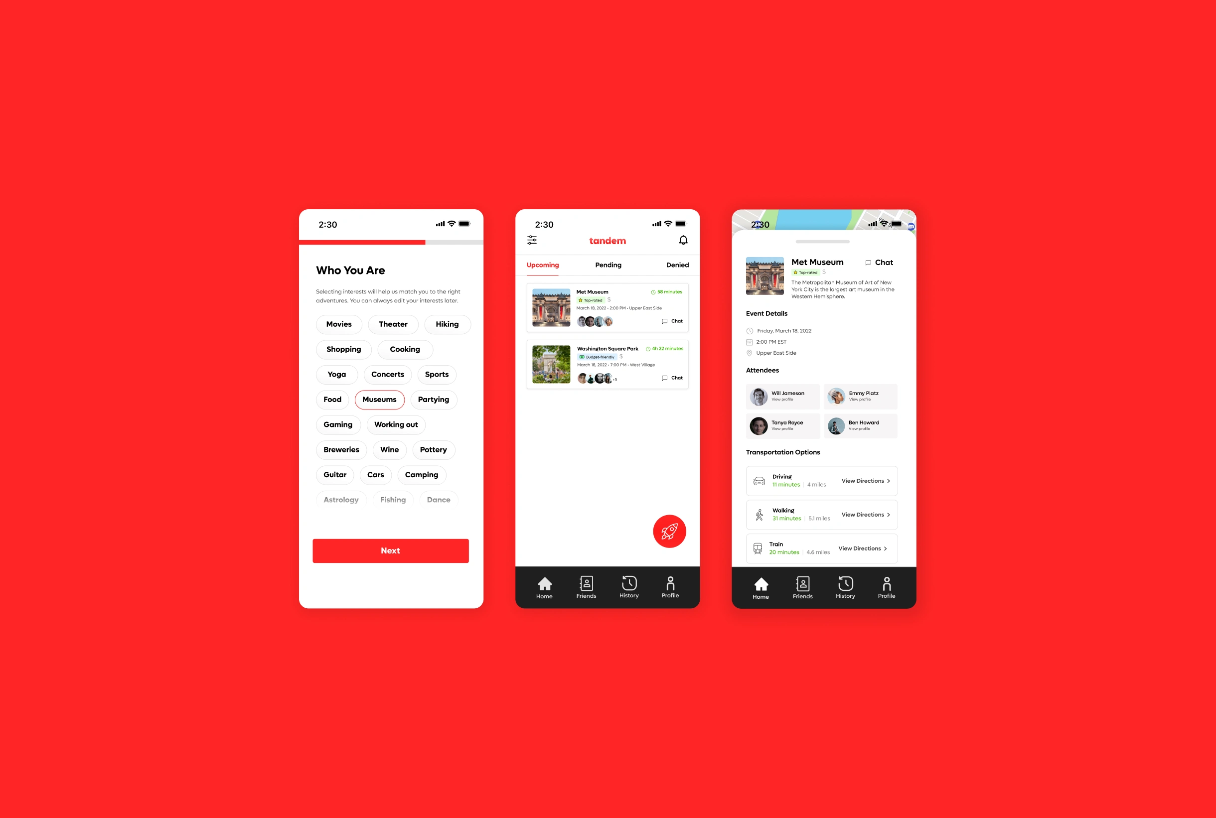
Connecting strangers one adventure at a time. Users have the ability to connect with others without bias and create new chosen families.
3 out of 5 Americans suffer from loneliness. As Americans grow older and take on more responsibilities, society often provides few opportunities to forge new bonds. Young adults need a safe way to find and maintain genuine friendships and community through offline experiences to satisfy the basic human need for connection which is currently hard to achieve in an online world.
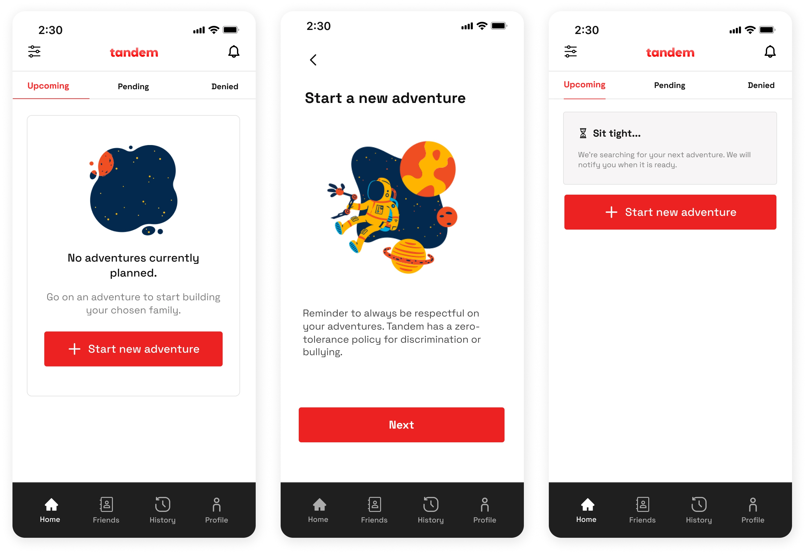
Keeping a simple homepage, we only have one main call to action. The user clicks the button to be matched up with an adventure. These randomized meetup requests help minimize decision-making and pre-conceptions for the user. Once they have accepted, they will be given details of their adventure. In order to allow users to weigh their options and decrease FOMO, they may have the opportunity to accept a previously denied adventure but their spot will no longer be guaranteed.
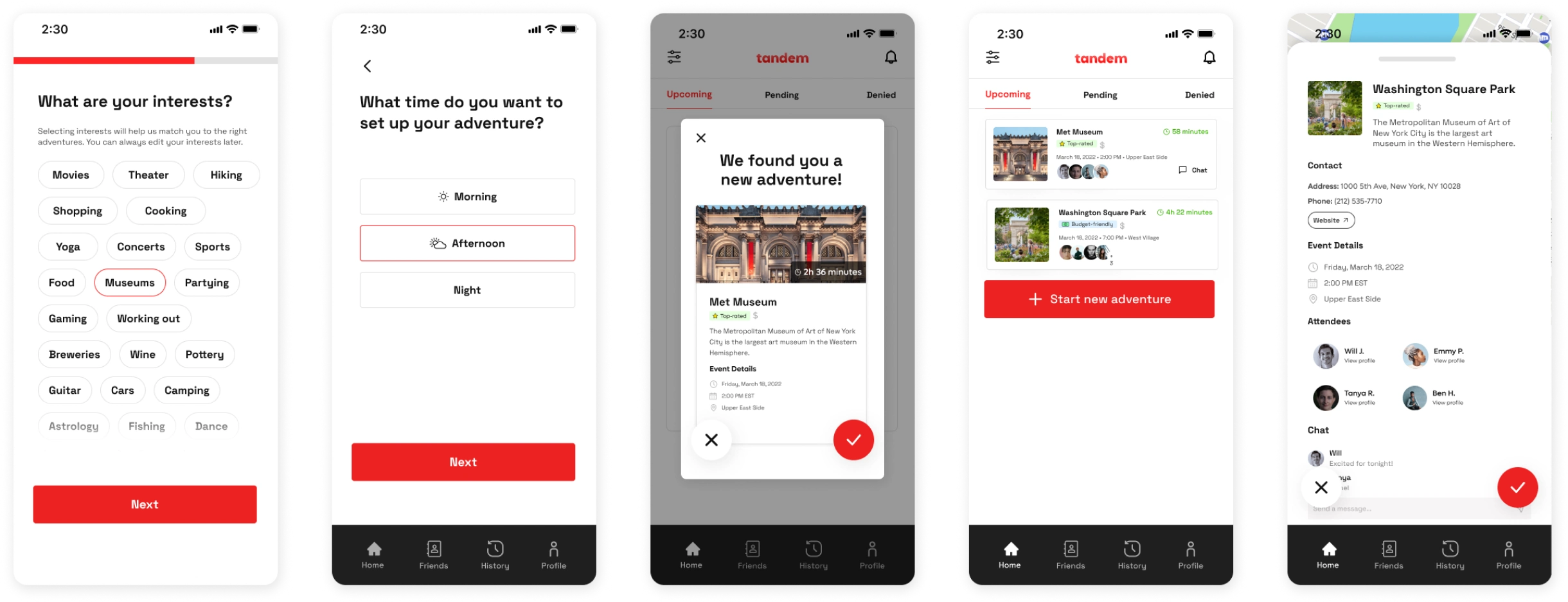
After an adventure, the user can choose to go on adventures with new friends made within the app. The goal is that users may form a friend group through continuous adventuring. The user always has access to shared contacts, meetup history, and preference options via the navigation bar.
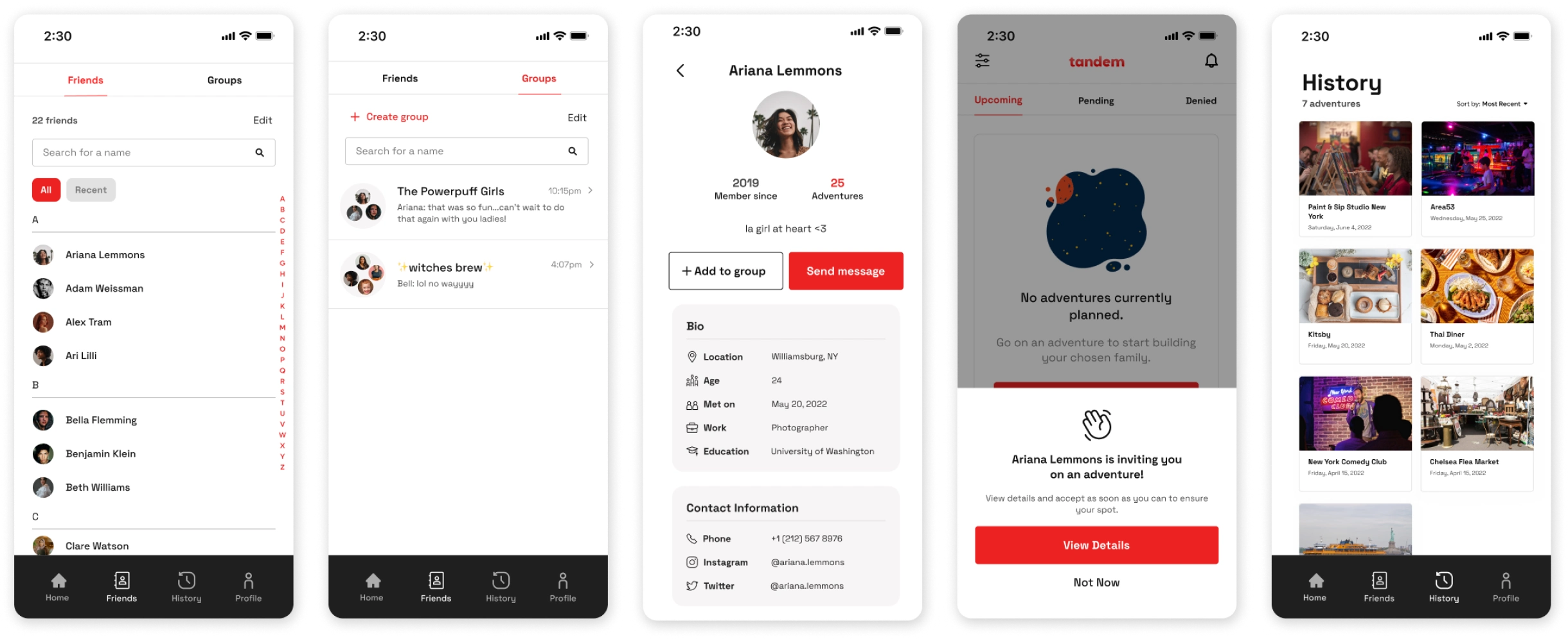
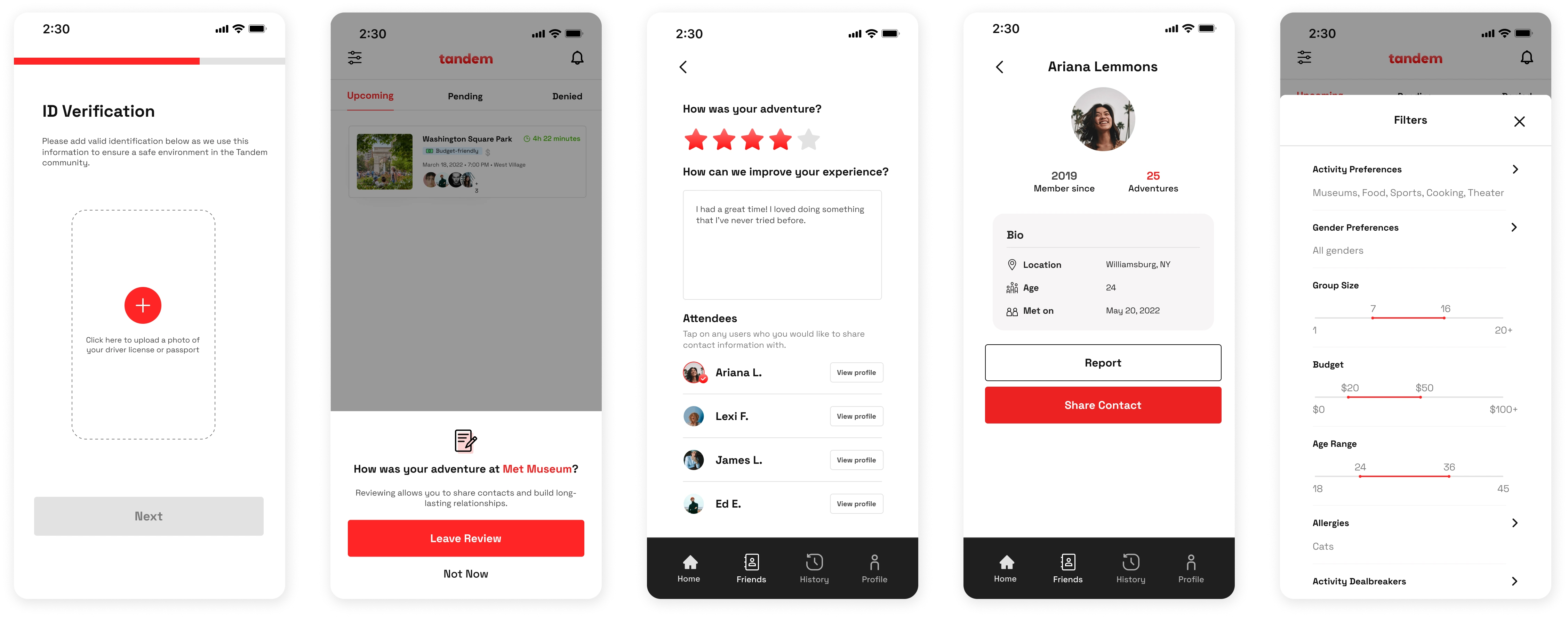
To maximize safety, users are required to go through ID verification. The hope here is that there is safety in numbers, and users are free to filter out the types of people they’d want to be grouped with whether that’s by gender, interests, or age groups. After an adventure, the user is able to rate their hangout, give feedback, share contact information, and report any unfavorable behavior. Information may only be exchanged if both users agree to share to help maximize safety.
In terms of type, I chose a simple clean sans-serif font for easy readability and consistency. We decided to pick red for the primary app color because they suited our intentions in terms of color psychology. Red signifies adventure and we want to foster a spontaneous and bold community.
I designed this logo to portray two people hugging in the shape of a "t" as these two are "in tandem". I wanted to keep the design minimal, only using negative space to differentiate parts, so that it could be mono-colored and thus transferrable to different mediums.
Like this project
Posted Sep 28, 2023
An app connecting strangers one adventure at a time. Users have the ability to connect with others without bias and create new chosen families.


