Hearst Newspapers
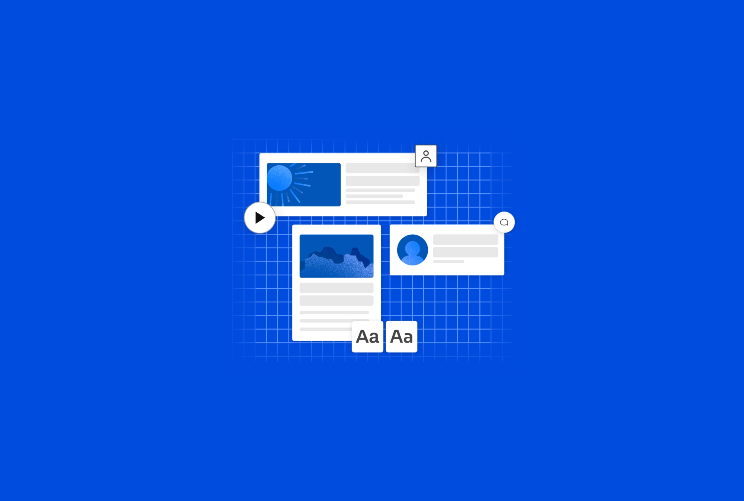
A reusable set of components and styles built from the ground up, acting as the source of truth, for the Hearst Newspapers brand.
Year
2023
MY ROLE
Sole Product Designer — Visual Design, Grids, Typography, Interaction Design, Icons, Systems Design
Goals
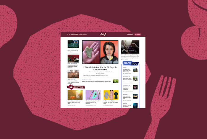
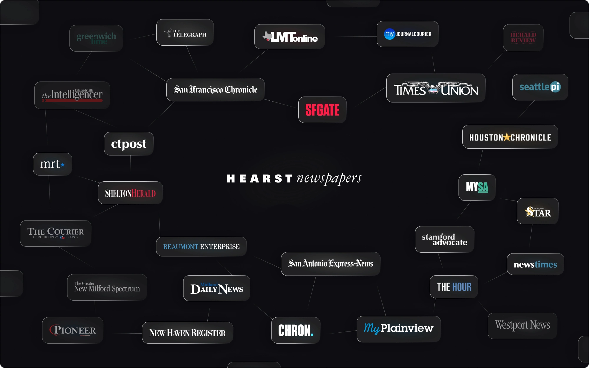
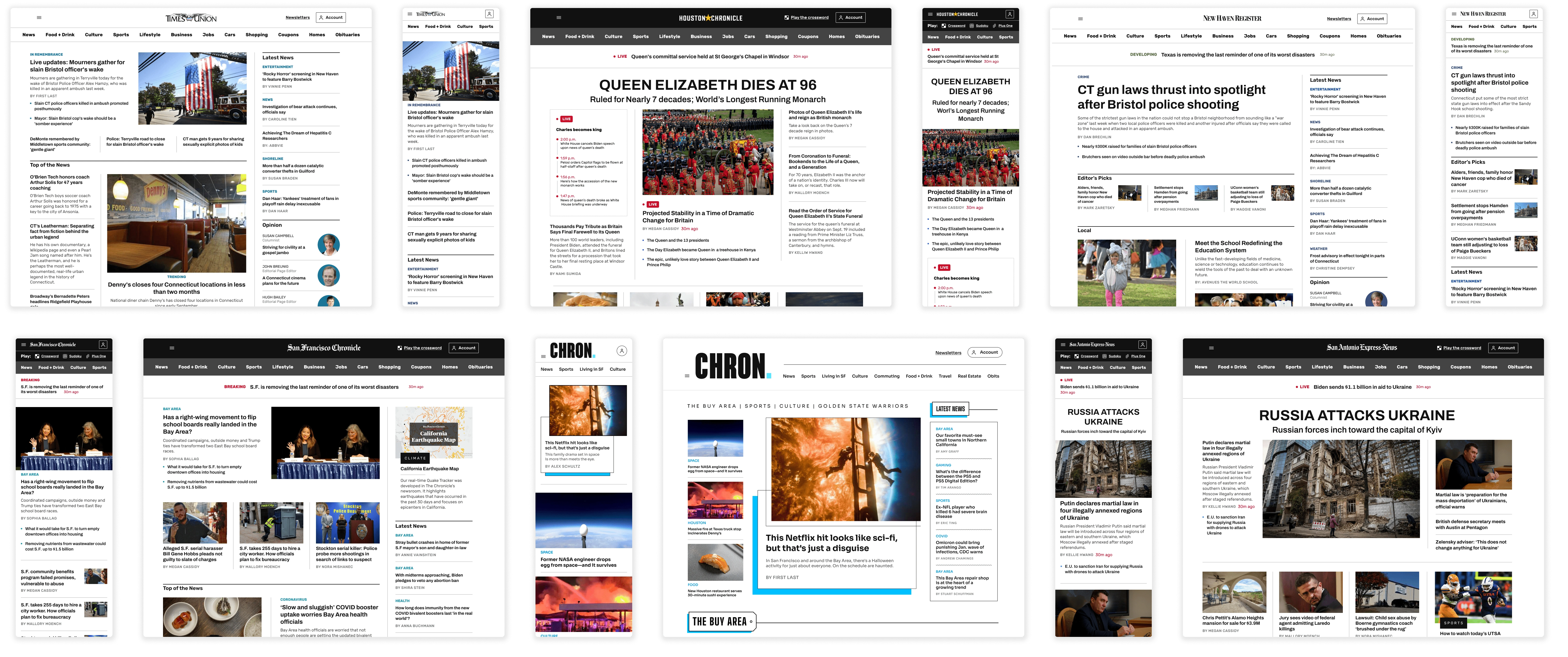
Upon joining the Hearst Newspaper team, I was tasked as the sole designer to create a design system that would help unite the company’s 44 individual brands. I led the front end design of a larger replatforming project consisting of an overhaul of our backend and our frontend. When I joined the team, no design system existed at all. It was my job to redesign the look and feel of our sites and deliver that in a scalable and cohesive system.
PROCESS
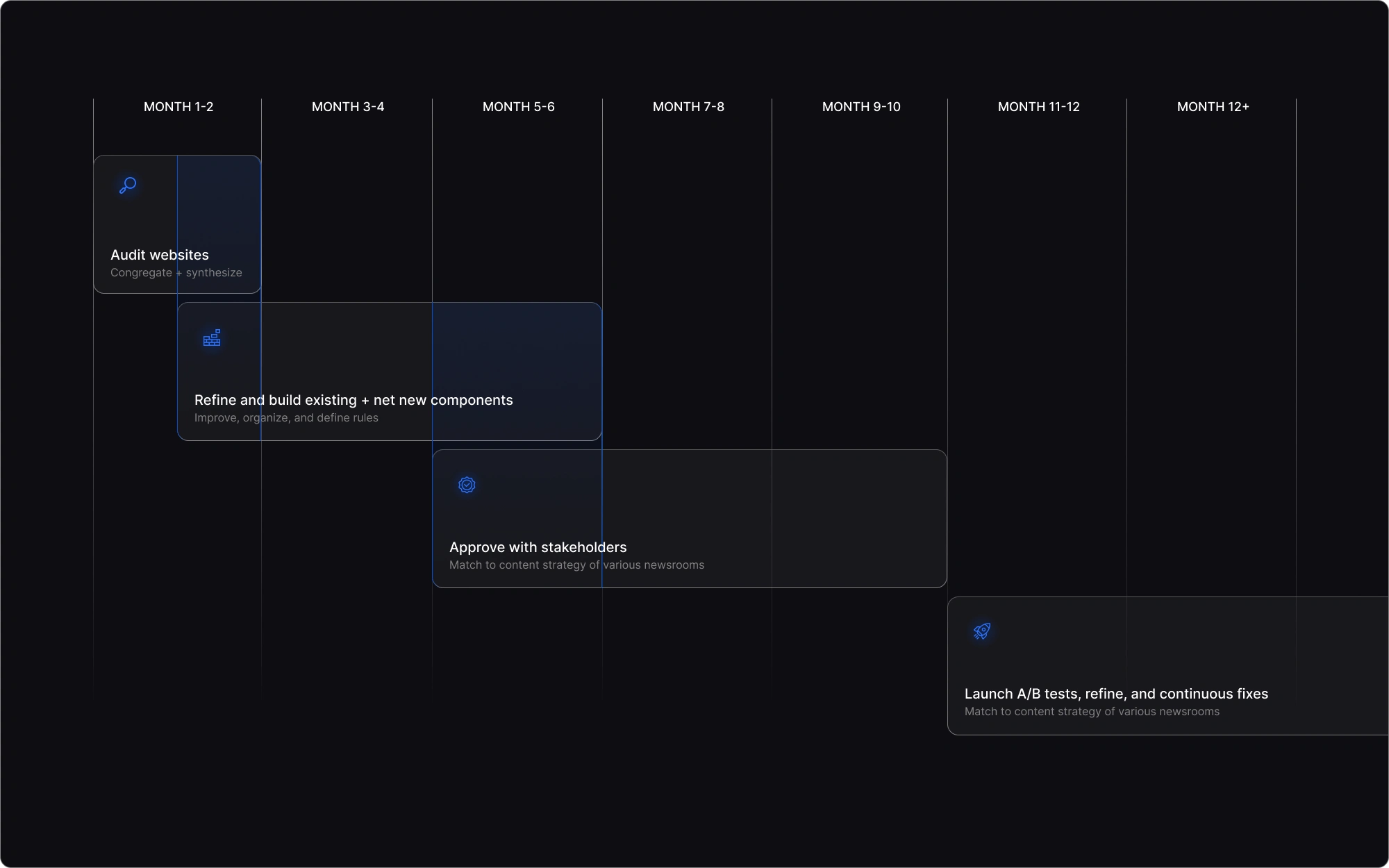
My process involved auditing all our sites, consolidating to the most essential pieces, improving and expanding the component library, organizing, and now constantly improving, maintaining, and working cross-functionally to bring the system to production.
With a limited engineering team and a legacy tech stack, launching on all websites in the Hearst Newspapers portfolio has proved challenging. Slowly, but surely, through time and pixel-perfect scrutiny, our sites are reaching the masses.
the 8px grid
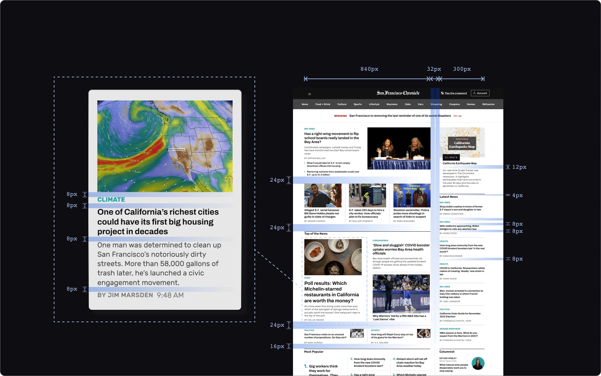
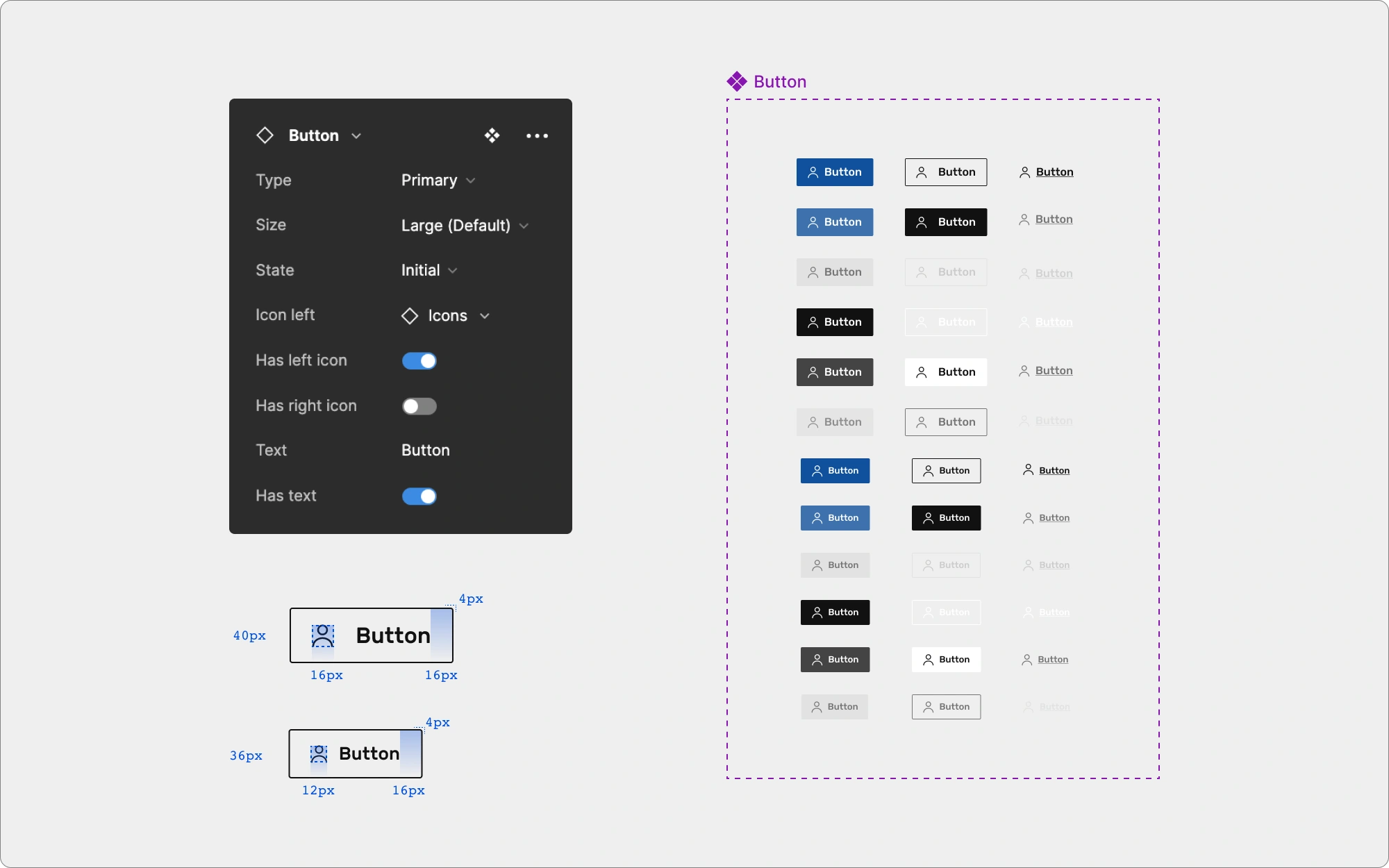
Early on in my design system creation, I discovered the value of the 8px grid. Using numbers such as 8, 16, 24, and so forth to size and space elements makes scaling for a variety of devices easier because many devices are sized in multiples of 8. The system creates a clean visual hierarchy as the multiples fit snuggly into common devices. Additionally, designers have to make fewer decisions while maintaining a consistent visual rhythm.
THE ATOMIC STRUCTURE
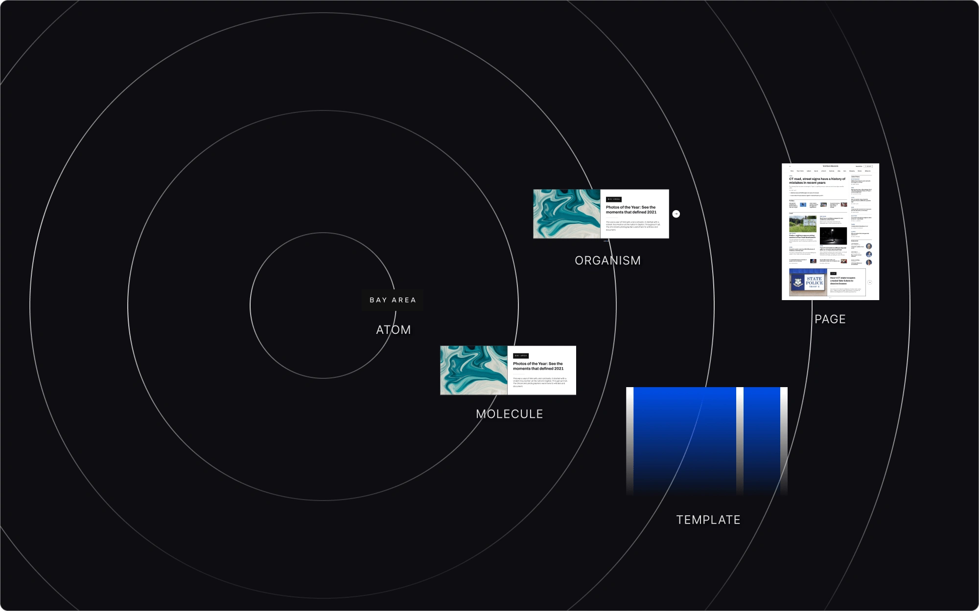
I used Brad Frost's atomic structure for design systems to organize my own system. This methodology helped structure the system in a scalable system. Atoms include bits and bobs as small as a button, molecules and organisms contain clusters of atoms, moving up to page templates, and then pages which combines all atomic elements to create a full page experience.
THEMING
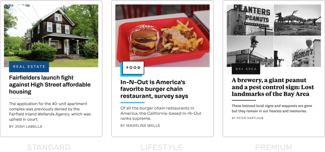
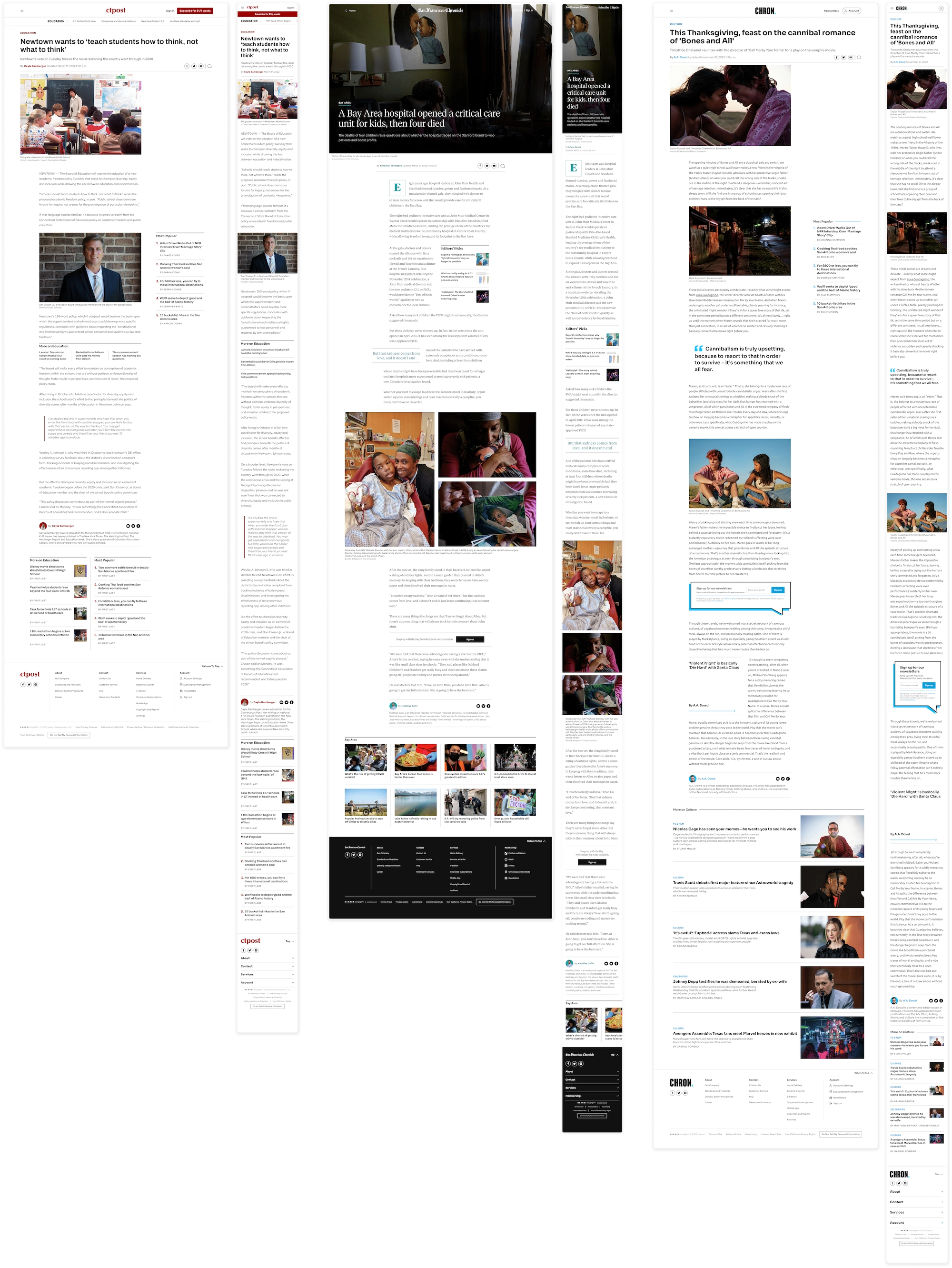
In order to cater to HNP’s various markets around the country without creating bespoke components for each, I developed 3 themes — premium, standard, and lifestyle. Each theme evokes a different feel depending on demographic, business model, and content strategy.
Once I created the single foundational component set, the theme layer is applied which includes spacing, iconography, typography, and ornamentation. Finally, comes the brand layer which includes color, logos, and a custom font stack for any necessary high-traffic markets.
TYPOGRAPHY
For typography, I chose to use a 1.125 - Major Second type scale with a root font size of 16px. Because news publications are vastly text-based, a wide variety of font sizes were necessary to accommodate for all use cases across our sites. Using a musical scale allowed us to maintain that consistency without being limited to the numeric values of the 8px system.
Each font stack is intended to suit the personalities of each of our themes, worked in a variety of use cases, and that were lightweight and variable to reduce complicating code.
I implemented a font mapping system that maps primary and secondary fonts to typeface and weight to allow for flexibility and ease.
DESIGN TOKENS
THE TOUGHESt CHALLENGE
SOURCE OF TRUTH
Working closely with engineers, we have designated Storybook as our source of truth. Storybook contains all the documentation for NewsKit such as brand assets, colors, typography, tokens, components, and guidelines. Designers, engineers, product managers, and newsroom editors can all reference the documentation I have written here that outlines all the variants of a component, how components should be used, and how components should be built.
retrospective
Considering this is the first design system I had built for a corporation, a national brand which touches over 50% of Americans across the country, I was initially overwhelmed to take on this feat on my own.
However, as I learned more about systematizing design work and iteratively improving the design system throughout this process, I gained confidence in the organization, structure, and design of my work. Everyone has to start from somewhere and through slow and consistent effort, everyone can create something beautiful.
While I don’t think the design system is “done” because a design system is not meant to ever be “done”, I'm proud there is a design foundation that will continue to grow beyond my time at HNP.

Like this project
Posted Sep 28, 2023
A reusable set of components and styles built from the ground up, acting as the source of truth, for the Hearst Newspapers brand.

