I designed this logo for
Md Zahid Hasan Khan
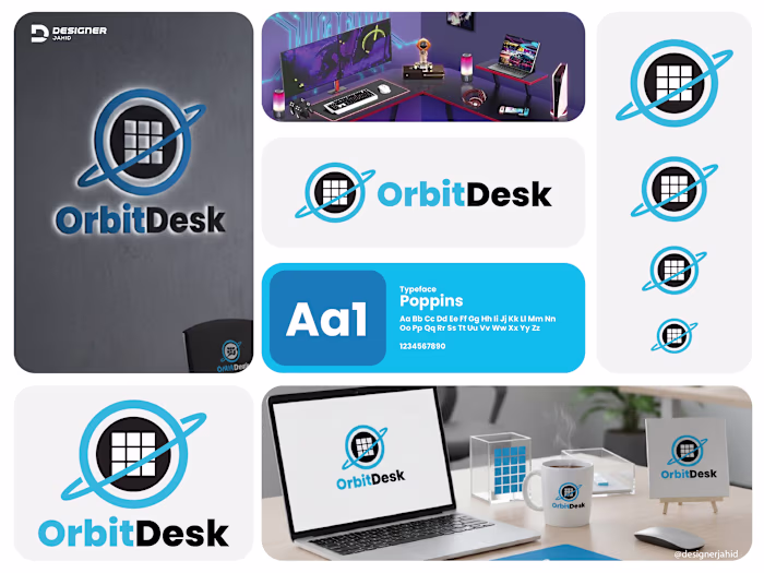
I designed this logo for Orbitix to capture the idea of staying focused and moving with purpose. The circular form represents an orbit, symbolizing consistency, flow, and staying on track. At the same time, it works like a target, which reflects precision and goal-setting.
The central point anchors everything. It represents the user’s core focus, while the surrounding rings show progress and structure. The angled pointer cutting through the circle adds direction and momentum. It suggests action, not just planning. It’s about execution.
I kept the form minimal but intentional. The slight break in the outer ring adds a dynamic feel, like motion in progress rather than something static. It also prevents the logo from feeling closed or rigid.
The gradient transitions from deep blue to lighter cyan to give it a modern, tech-driven look while also adding depth. It hints at growth, clarity, and forward movement.
The typography is clean and solid to balance the symbol. It keeps the brand grounded while the icon carries the motion and concept.
Overall, the logo is about alignment, direction, and staying in orbit with your goals.
Like this project
Posted Mar 29, 2026
I designed this logo for Orbitix to capture the idea of staying focused and moving with purpose. The circular form represents an orbit, symbolizing consisten...
Likes
0
Views
0