Upgrading the Report Builder tool for Clir App 2.0 Vision
Derick Tsang
Summary Overview
Amid Clir’s shift to a SaaS model, the need to enhance user self-service capabilities became apparent. The Report Builder tool was identified as crucial for this transformation, aimed at enabling users to efficiently compile and export data.
Working alongside a cross-functional team, I led the initiative to align the tool with user workflows, which included simplifying the process of creating reports and revamping the grid and widget systems.
The launch of the redesigned Report Builder marked a notable improvement, reflected in a decrease in related help tickets and an rise in engagement.
Table of Contents
Summary OverviewTable of ContentsOn the path to SaaSUnraveling the KnotHow was this impacting Clir Renewables? Delving Into User Behaviours Setting the Design GoalsStreamlining the Initial InteractionEngagement Through Prefabrication Revamping Grid and Widgets Interface Cleanup Separating Sharing from Version HistoryVisual designFacilitating Seamless Transition Between Dashboard and Report Builder Final designBalancing Simplicity and FlexibilityPolishing through Internal Feedback: Business ImpactRetrospective
On the path to SaaS
Joining Clir Renewables, I became part of their transition from a consultancy to a SaaS model, with a focus on enhancing user self-service. Central to this transition were the main Dashboard and the Report Builder. While Design Lead Brent steered the Dashboard redesign, I took the helm of the Report Builder. Our intertwined goals led to weekly sync-ups to maintain alignment.
Clir’s dashboard enables users to analyze data from renewable assets, whereas the Report Builder facilitates capturing and preparing specific data for export as PDFs.
Our objective was to align the Report Builder with the broader design vision, addressing user pain-points.
With no established design systems and a Report Builder misaligned with the new user-centric vision, the task was to harmonize its transformation with the evolving Dashboard, anchoring Clir Renewables' shift towards SaaS.
Unraveling the Knot
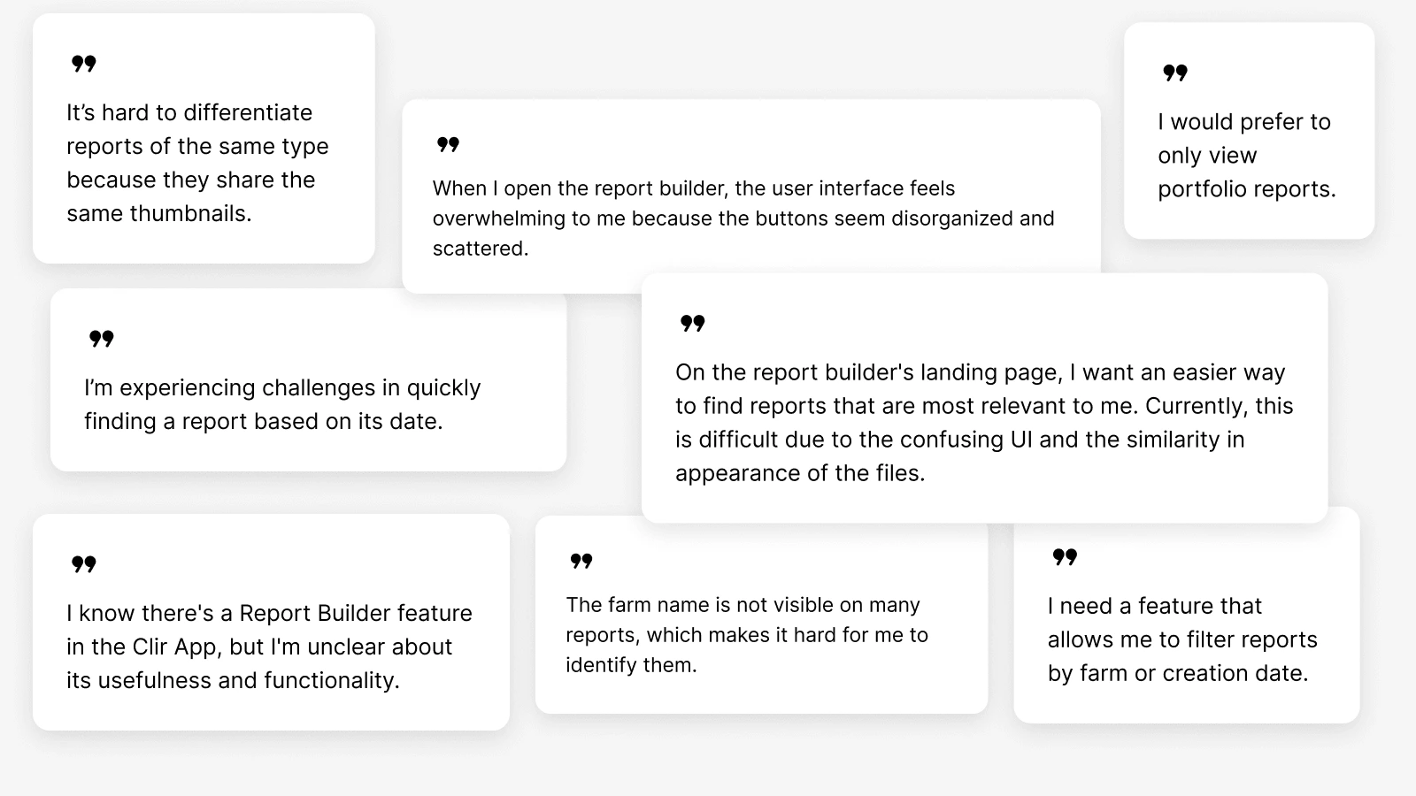
The Report Builder was a promising tool, but its usability hurdles were turning users away. Only 3–4 companies were actively using it, underscoring a disconnect between its intended value and the user experience it delivered.
We delved into the problem, aiming to understand the core issues. A key question arose: If not through the Report Builder, how were users sharing dashboard data?
How was this impacting Clir Renewables?
The issues uncovered were not merely usability hurdles but carried broader business implications:
💼 User Engagement: Only two companies actively utilized the Report Builder, reflecting a significant adoption challenge.
🔄 Feature Misalignment: 'Download to Export' being used as 'Version History' revealed a gap between use and intent.
📲 Competitive Edge: Users opting for other apps for similar functionalities highlighted a competitive threat to Clir.
🛠️ User Workarounds: Sharing data via screenshots illustrated a major usability issue, necessitating design improvements.
These impacts stressed the urgency for actionable design solutions to realign with user expectations and bolster Clir's market position.
Our findings underscored a looming competitive threat. The unique value proposition of Clir's Report Builder was at risk if it remained out of step with user needs and external alternatives.
User feedback
Delving Into User Behaviours
Over the next two weeks, Montse and I conducted three rounds of interviews and usability testing with different participants. Each round helped narrow down and refine the problem areas, accelerating our understanding of the issues at hand.
What we discovered was an intuitive workaround by our users—they were capturing screenshots of the dashboard to share data via email.
Interestingly, the 'download-->export' feature was being utilized as a 'version history,' a way to revisit specific data states at a later time.
Furthermore, we found that the Report Builder was just a fragment of our users’ journey as they navigated through multiple apps, seeking functionalities our tool lacked. This exposed a competitive gap, emphasizing the need to enhance the Report Builder to prevent our value proposition from being overshadowed by competitors.
Setting the Design Goals
Armed with these insights, the path forward was clear:
🔧 Address usability issues: Tackle the usability issues hindering user engagement.
🧠 Align features with mental models: Align with existing user workflows by, for instance, introducing a version history feature.
🧱 System-wide improvement: Smooth transitions between the Dashboard and Report Builder. Consistency across platform.
🔁 Ability to self-serve and automate: Align with the broader vision of enabling users to self-serve, automate tasks
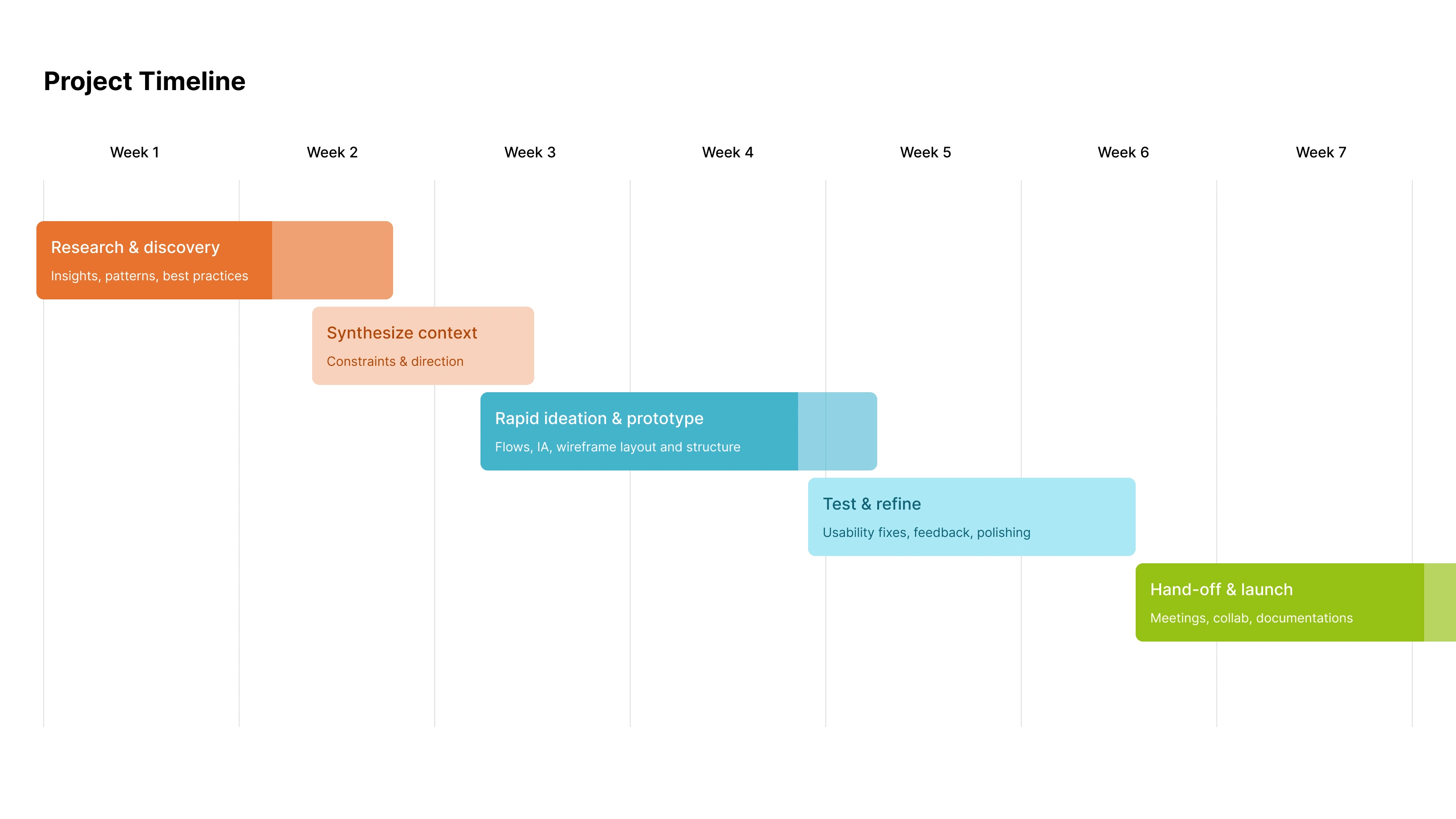
Project timeline
Streamlining the Initial Interaction
The journey commenced with simplifying the initial user interaction. Previously, creating a new report required navigating through four dialogs, many posing low-priority questions. By reducing these decision-making points, we alleviated the user's cognitive load right from the start.
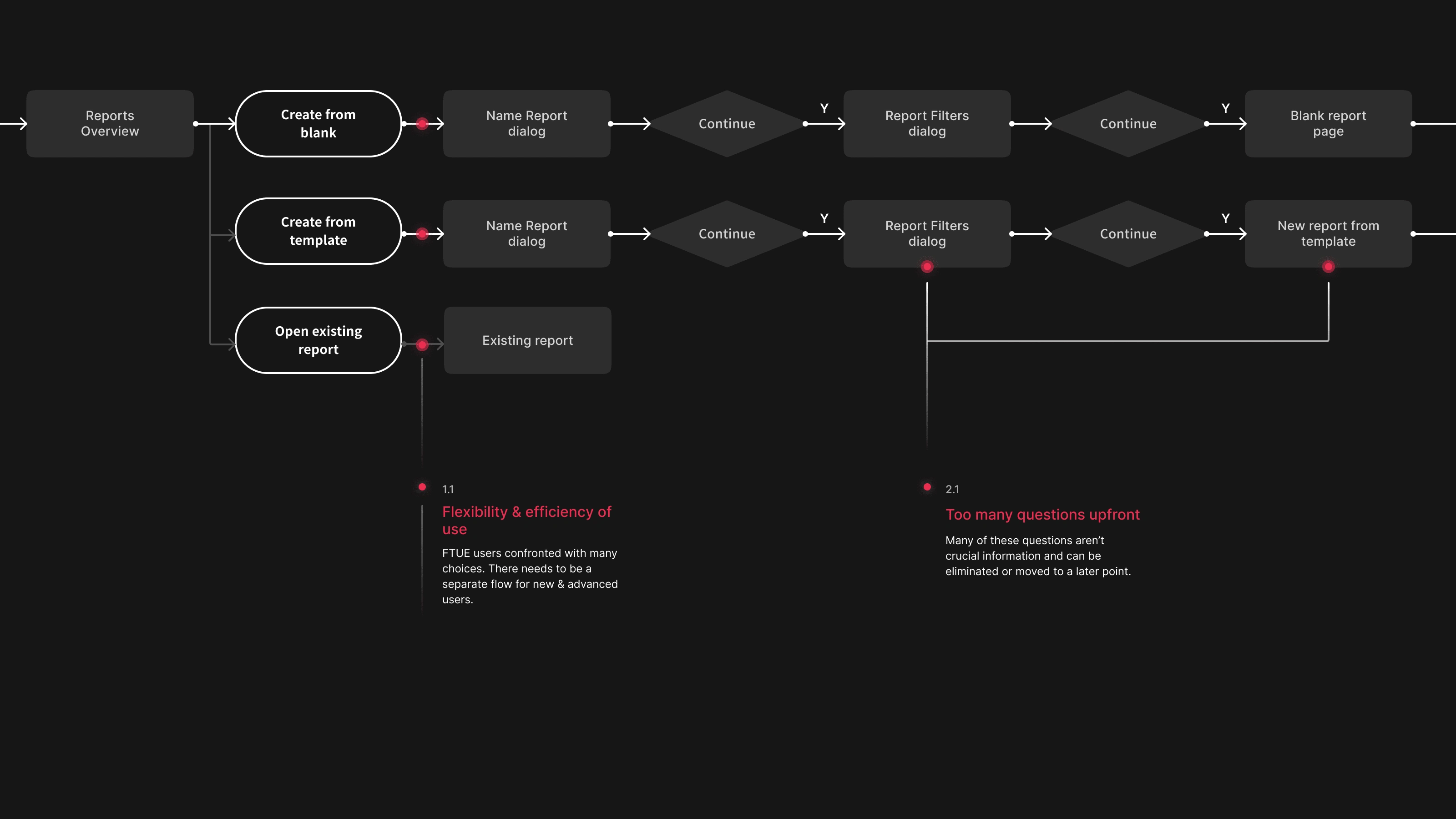
Old user flow
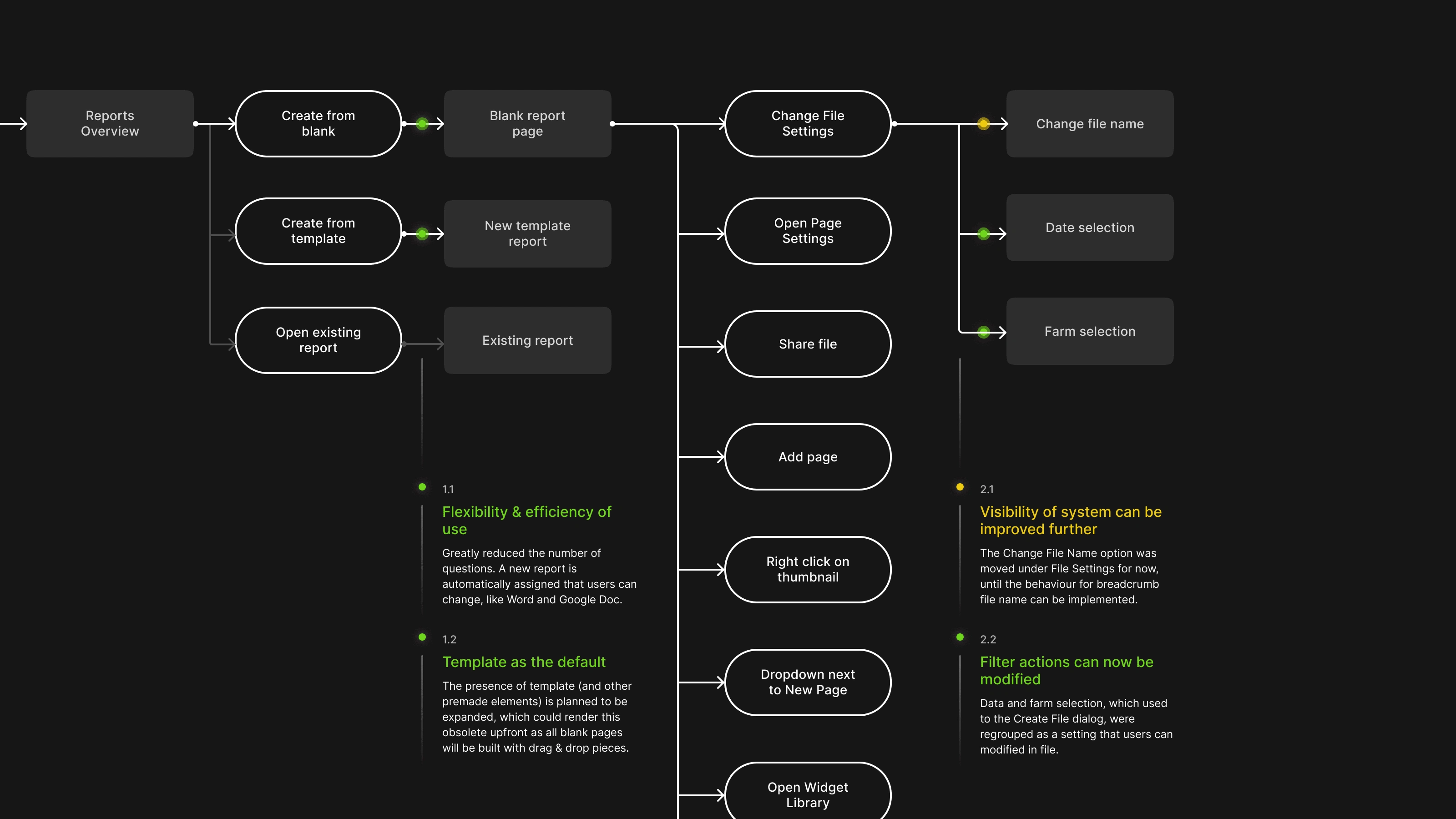
New user flow
Engagement Through Prefabrication
Adhering to our design principle of engaging users, we introduced report templates and enriched our widget library in the Report Builder, providing users with a playground of materials to interact with.
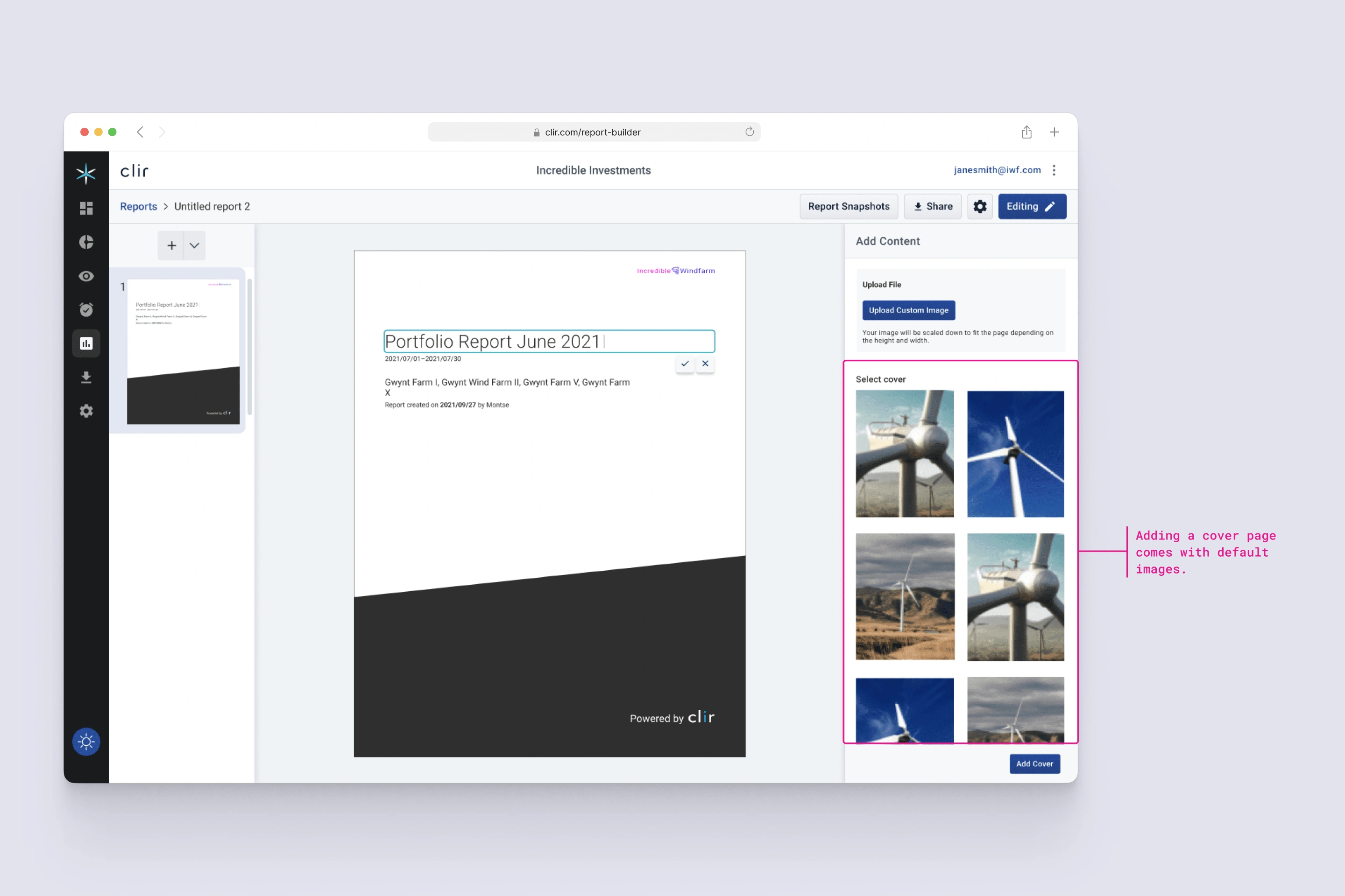
Cover templates
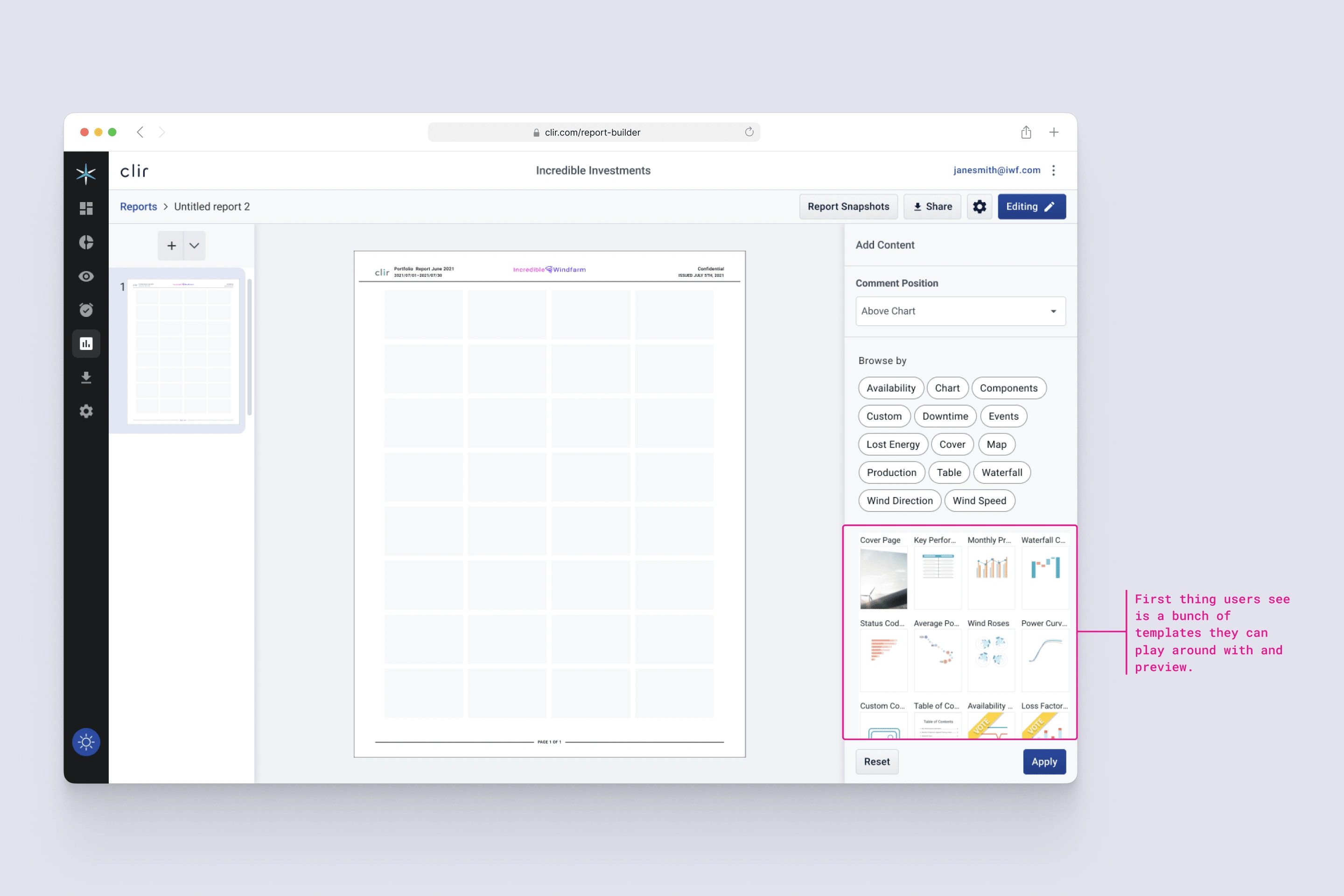
Widget library
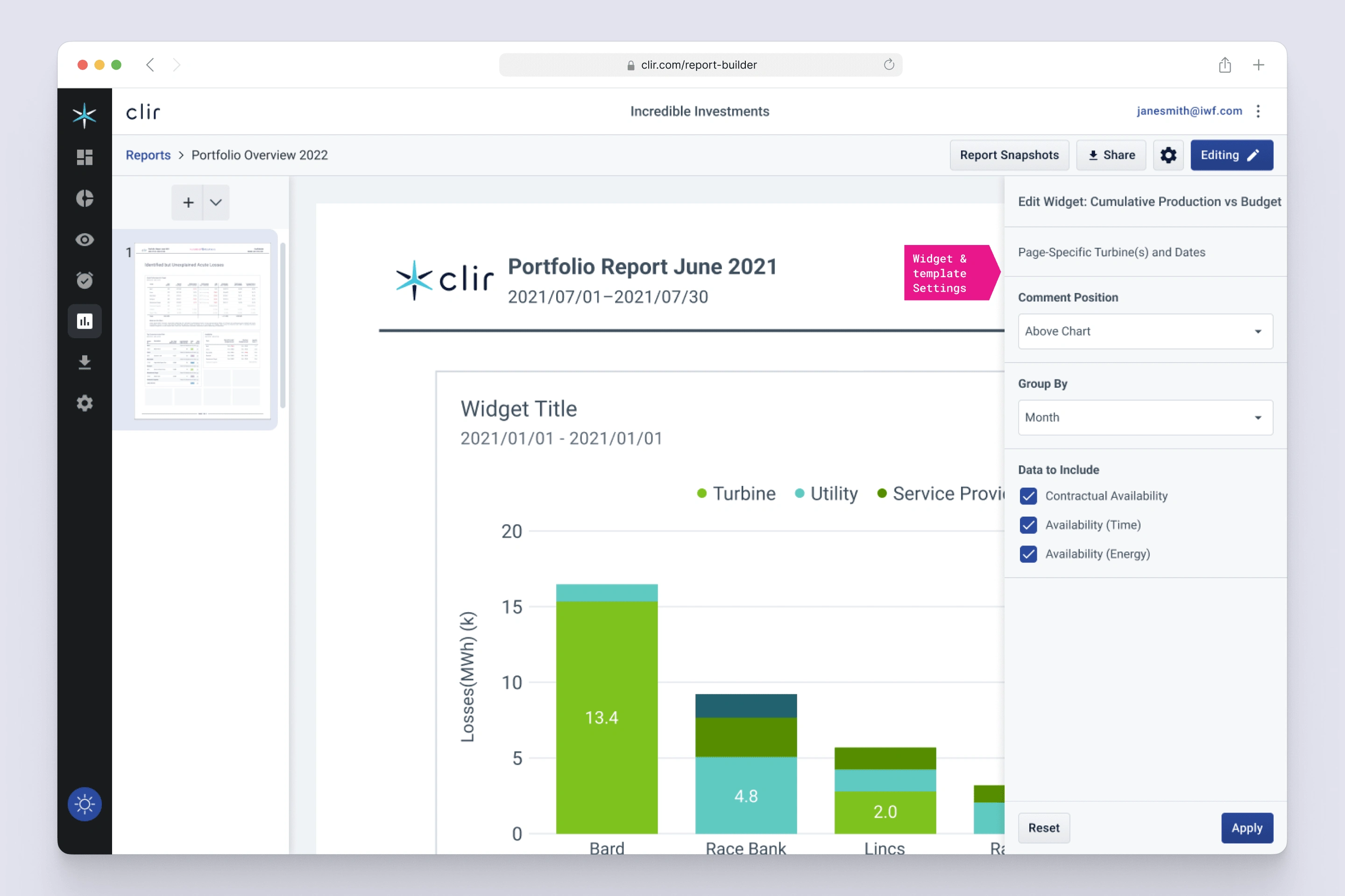
Widget settings
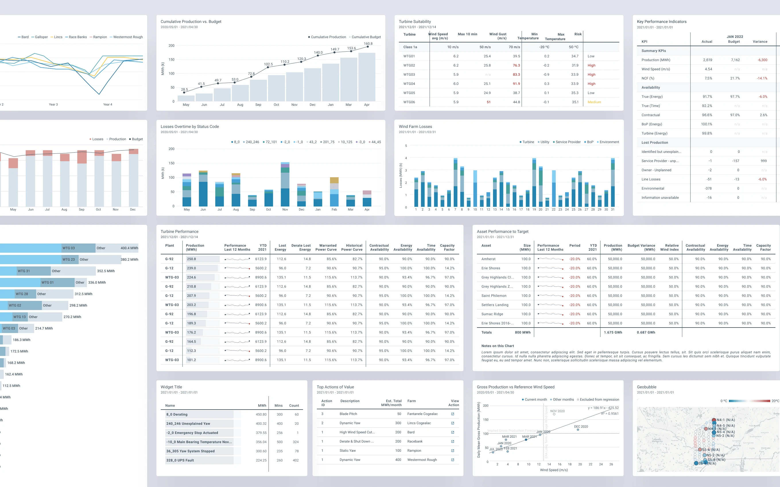
Widgets
Revamping Grid and Widgets
A significant part of the redesign was the restructure of the grid system that holds the widgets. This entailed defining attributes like type, colour, shape, and expansion behaviour for each widget. The endeavour brought together multiple designers to redefine and consolidate the visual language.
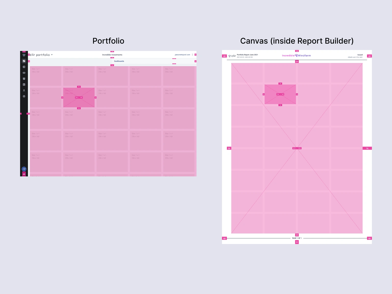
Grid system
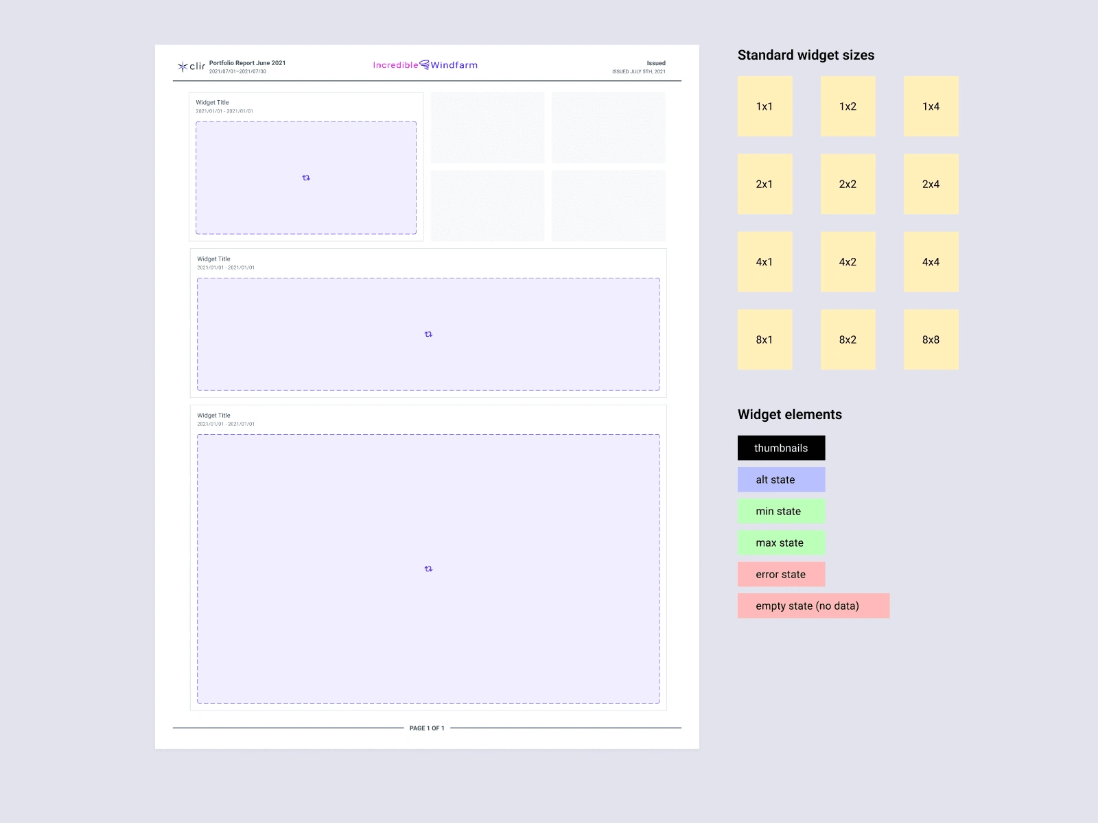
Resize behaviour of widgets
Interface Cleanup
The preceding interface struggled to manage the complex content on the Canvas. In the redesign, I focused on enhancing usability by grouping buttons and features into functional zones: Navigation, Page Control, Canvas, Toolbar, and Settings, thus creating a more intuitive interaction landscape.
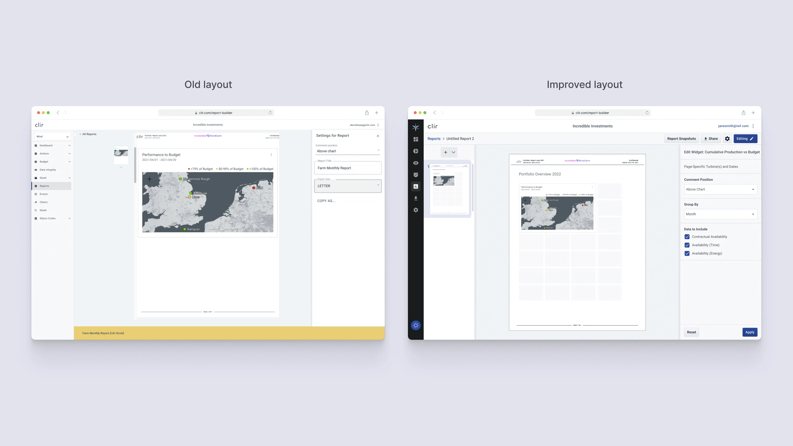
Old vs new layout
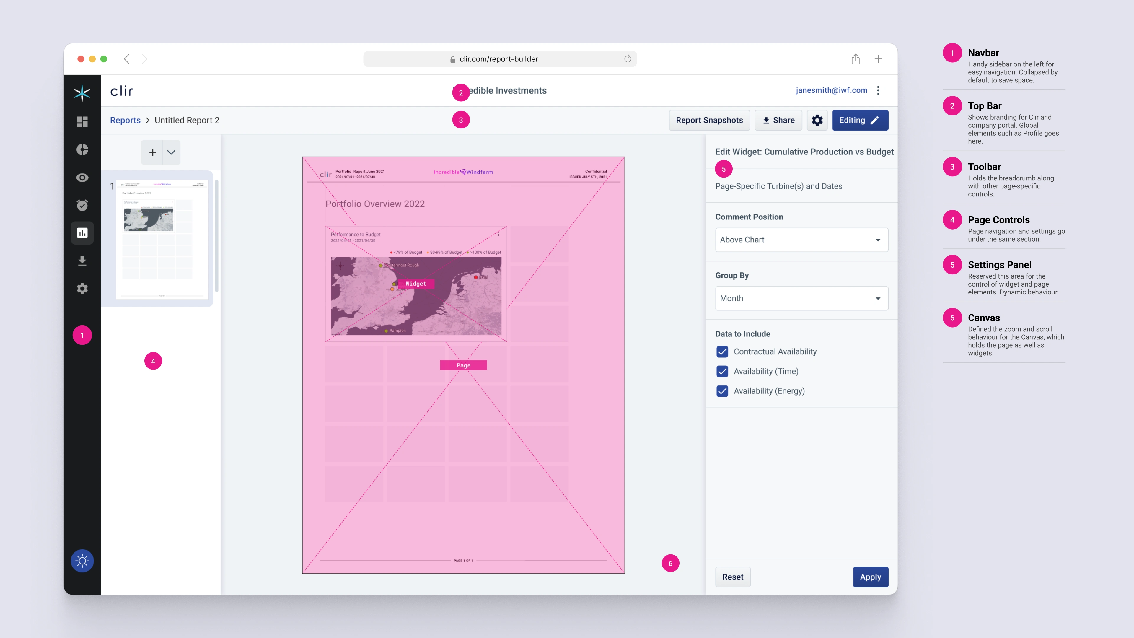
Key areas of improvement
Separating Sharing from Version History
Acknowledging the user’s repurposing of the Snapshot feature for both exporting and versioning, the design was adapted to align with this behaviour. The export function was elevated to a top-level action, and the Snapshot feature was refined into a version history tool.
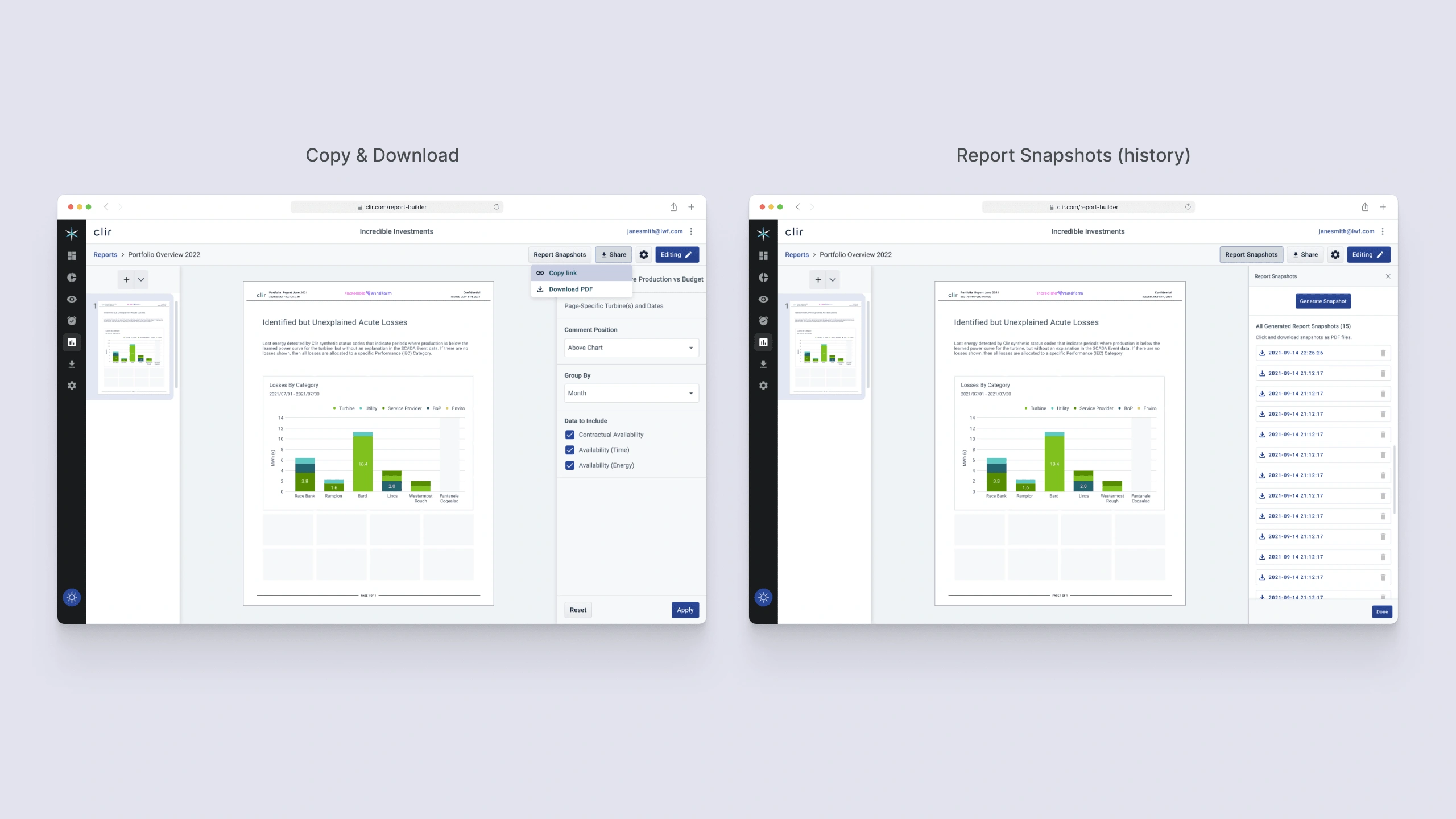
Separation of features
Visual design
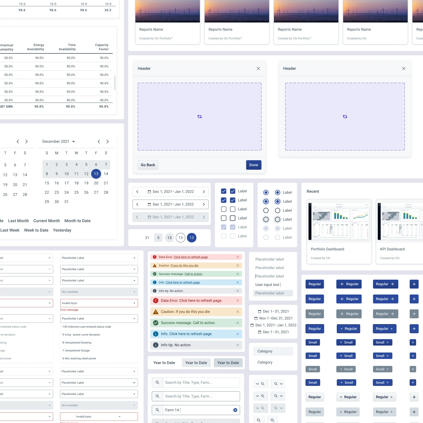
Clir App design system
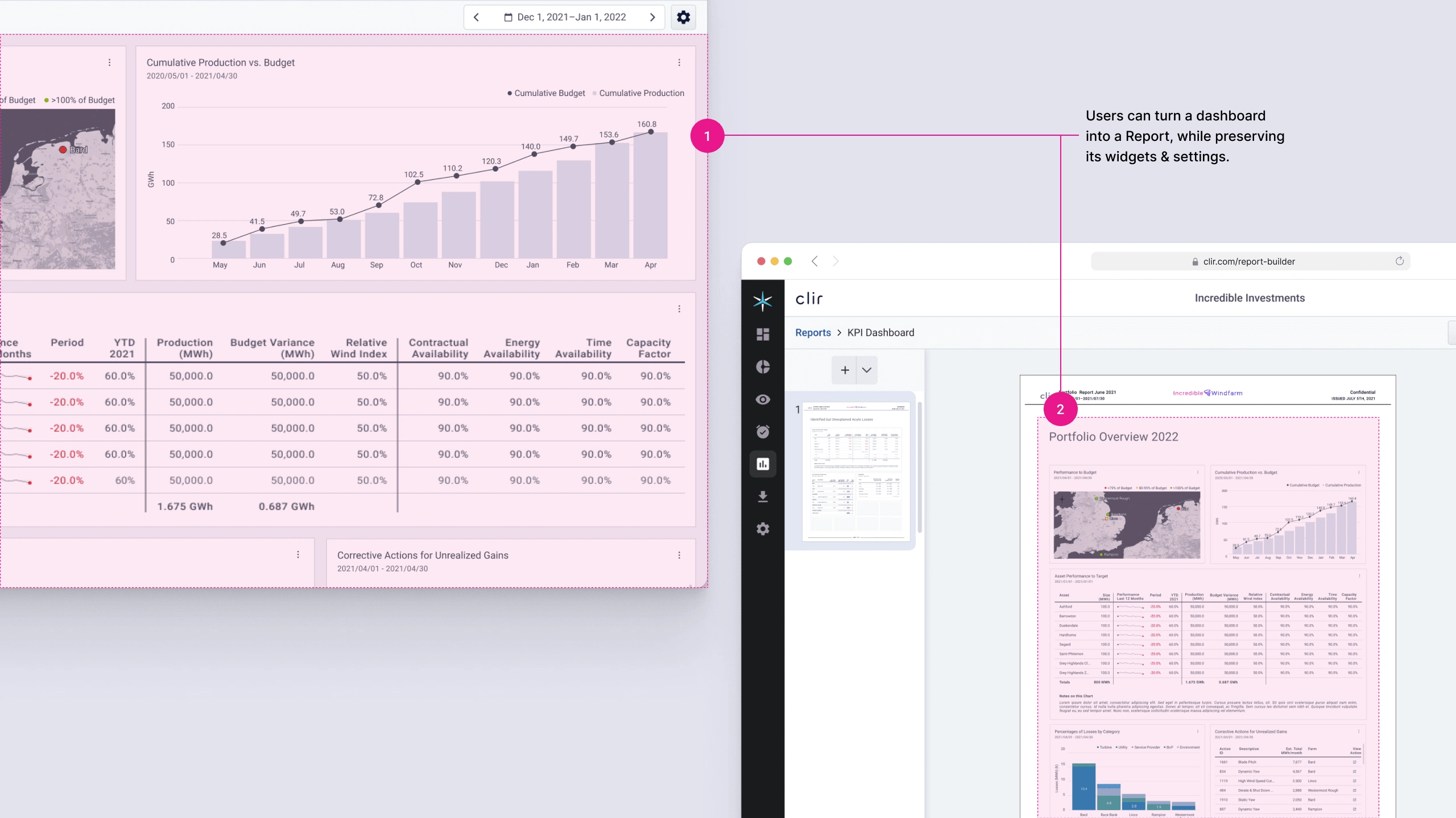
Facilitating Seamless Transition Between Dashboard and Report Builder
Ensuring a fluid transition between the Dashboard and Report Builder was crucial to maintain workflow continuity. By coordinating the transition in both directions, we bridged the interaction gap, allowing for a more integrated user experience across tools.
Final design
Balancing Simplicity and Flexibility
Upon landing on the Report Builder, the design should evoke familiarity, not overwhelm. Ensuring a seamless transition between Dashboard and Report Builder without loss of work was crucial.
Transferable layout
Polishing through Internal Feedback:
Our internal testing round revealed no major usability issues, with over 90% of testers successfully completing tasks like exporting reports, saving snapshots, and modifying widgets. Minor nuisances like similar report thumbnails were quickly addressed.
Business Impact
The redesign aimed at enhancing workflow efficiency and promoting tool adoption among asset managers. Success metrics, established in collaboration with the dev team and product manager, revealed significant improvements:
Help tickets decreased by 37%
DAU/MAU ratio increased by 12%
Feature adoption rate rose by 68%
Laid foundation for a new product, ‘Clir Insights’
Retrospective
The Report Builder redesign was a step forward towards our new design vision, but more work lay ahead.
Embracing a new design vision has system-wide implications:
Adopting concepts like “disposable dashboards” affected the Report Builder redesign and the transition between workflows.
Opportunities for design innovation
The transition to App 2.0 served as a catalyst for a major refresh of multiple areas, such as the widget library, allowing us to find solutions beyond old constraints.
Need to set up a design system for the major overhaul
The shift triggered an extensive redesign of design assets, highlighting the importance of a well-structured design system.
Challenges in user access and permissions
The redesign faced certain limitations due to back-end constraints, particularly in user group access and permissions.
PDF sharing is a legacy practice
Despite the redesign, the continued use of PDF reports for content sharing is outdated, highlighting the necessity for a transition to modern, Google Docs-like sharing mechanisms
Like this project
Posted Feb 1, 2024
Led Clir's Report Builder redesign for SaaS, simplifying reports, improving user self-service, cutting help tickets, and increasing engagement.
Likes
0
Views
80