Cocktail Art Website Design and Development

Niclas Silver


Cocktail Art
Cocktail Art is a personal recipe website for cocktails I make, adapt and return to. I wanted it to feel less like an encyclopedia and more like opening a well-used notebook: quick to browse, clear enough to follow at the bar, and playful enough to encourage experimentation.
I developed the identity and working website prototype as one connected system, carrying the logo, typography, colour, photography and motion into the recipe experience.
A quicker route to inspiration
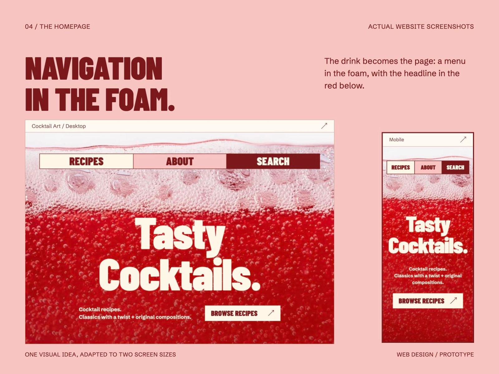
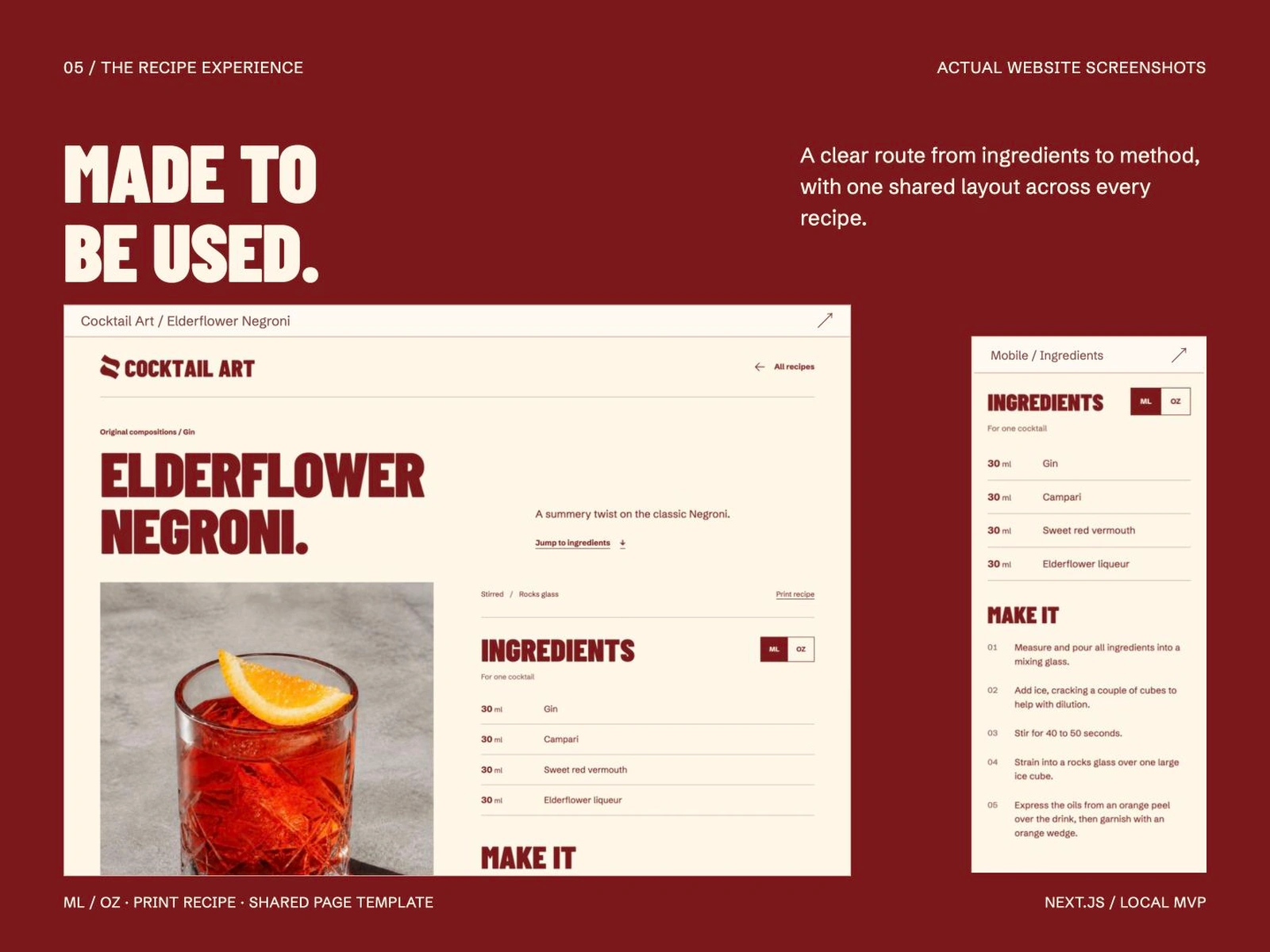
Cocktail websites often wrap each recipe in long histories and background stories. For Cocktail Art, I chose the opposite. Visitors should be able to understand the character of a drink, scan the ingredients and start making it without digging through paragraphs.
The experience is designed for the moment someone actually needs it. On mobile, each recipe stays easy to read while standing in a kitchen with a glass in one hand and a phone in the other.
Play made practical
Cocktail making is an act of experimentation. The identity needed that energy without making the interface harder to use.
Bold condensed type, strong contrast and a small colour palette make every route unmistakable. Large recipe titles, short descriptions, clear measurements and a numbered method keep the experience direct.
A symbol without the obvious
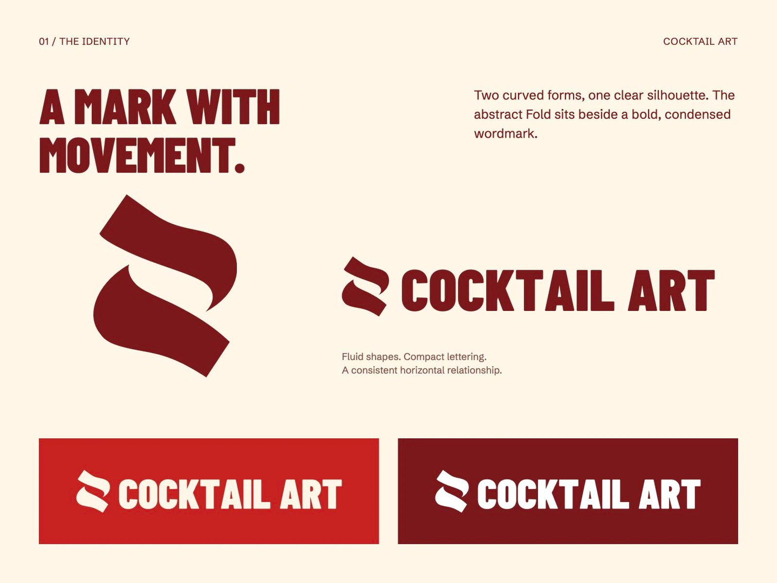
I wanted a mark that was quick to recognise but did not rely on a martini glass, bottle or another expected piece of cocktail shorthand.
The Fold symbol uses two curved forms and the negative space between them to suggest movement and transformation. Paired with a bold condensed wordmark, it carries the same playful confidence as the website while remaining clear at small sizes.
A small palette with a loud voice
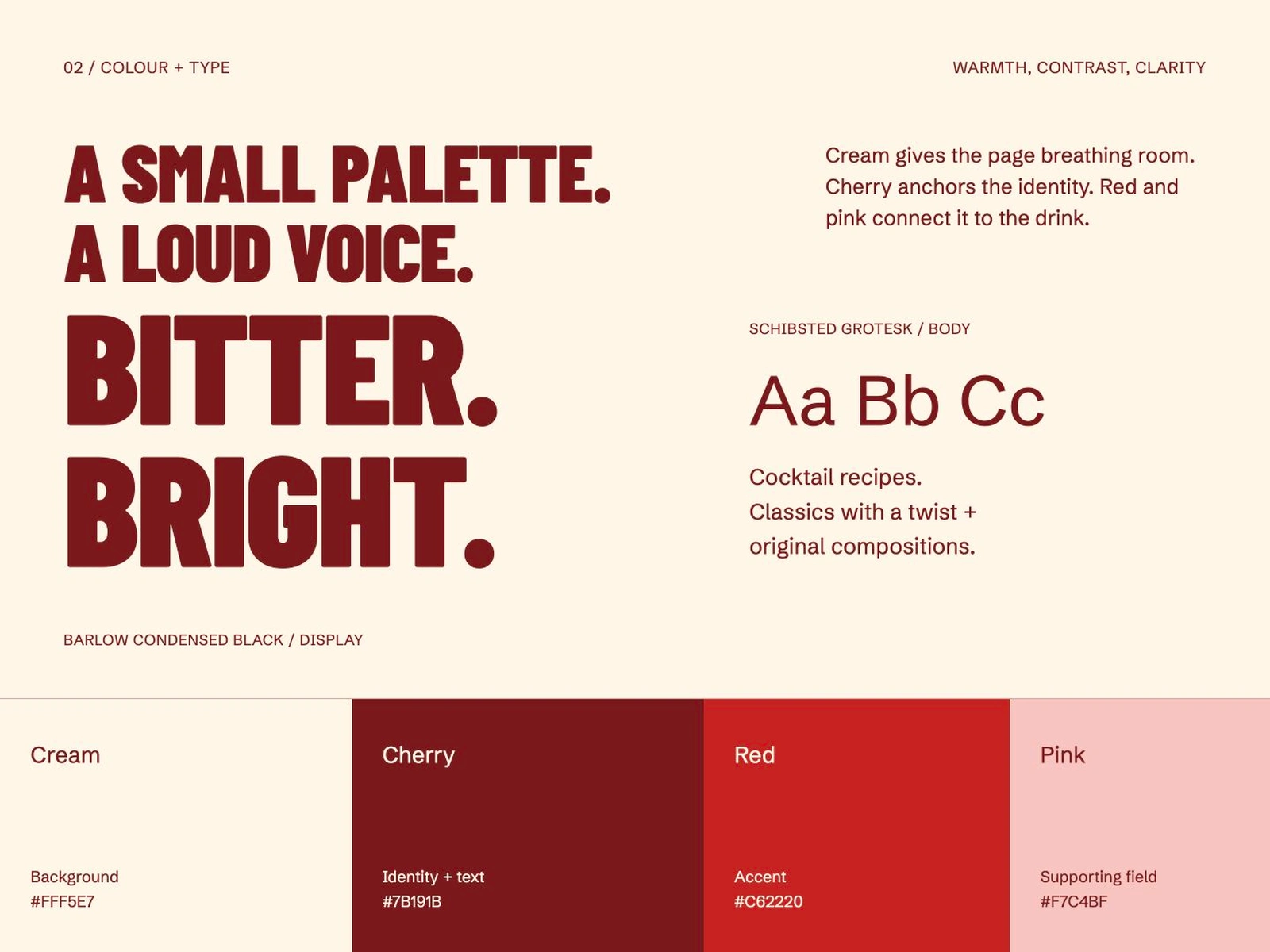
I wanted the colour system to feel simple and clean while still giving Cocktail Art an identity people would remember. The balance was important: elegant enough to frame the recipes and photography, but playful enough to reflect the experimentation behind every drink.
Warm cream gives the layouts space to breathe and softens the bold typography. Deep cherry brings structure and a more refined foundation, while vivid red adds energy and connects the interface to the colour of the drink. A restrained blush pink acts as the lighter counterpoint, adding personality without turning the identity into something overly sweet or decorative.
Keeping the palette small makes each colour more useful. The stronger shades draw attention to navigation and key actions, while the quieter surfaces let the photography and recipe content lead. The result feels expressive without becoming noisy, and polished without becoming too serious.
Like this project
Posted Aug 31, 2026
A cocktail recipe website with a unique design and user-friendly interface.