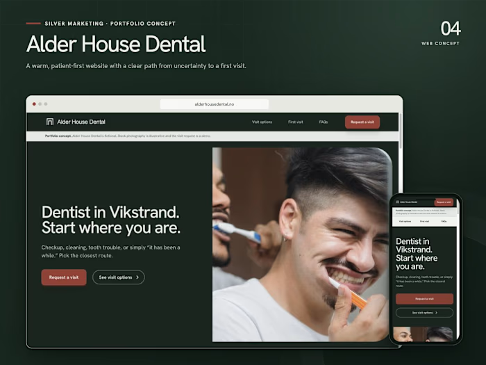
Silver Marketing | Marketing Agency Website

Niclas Silver


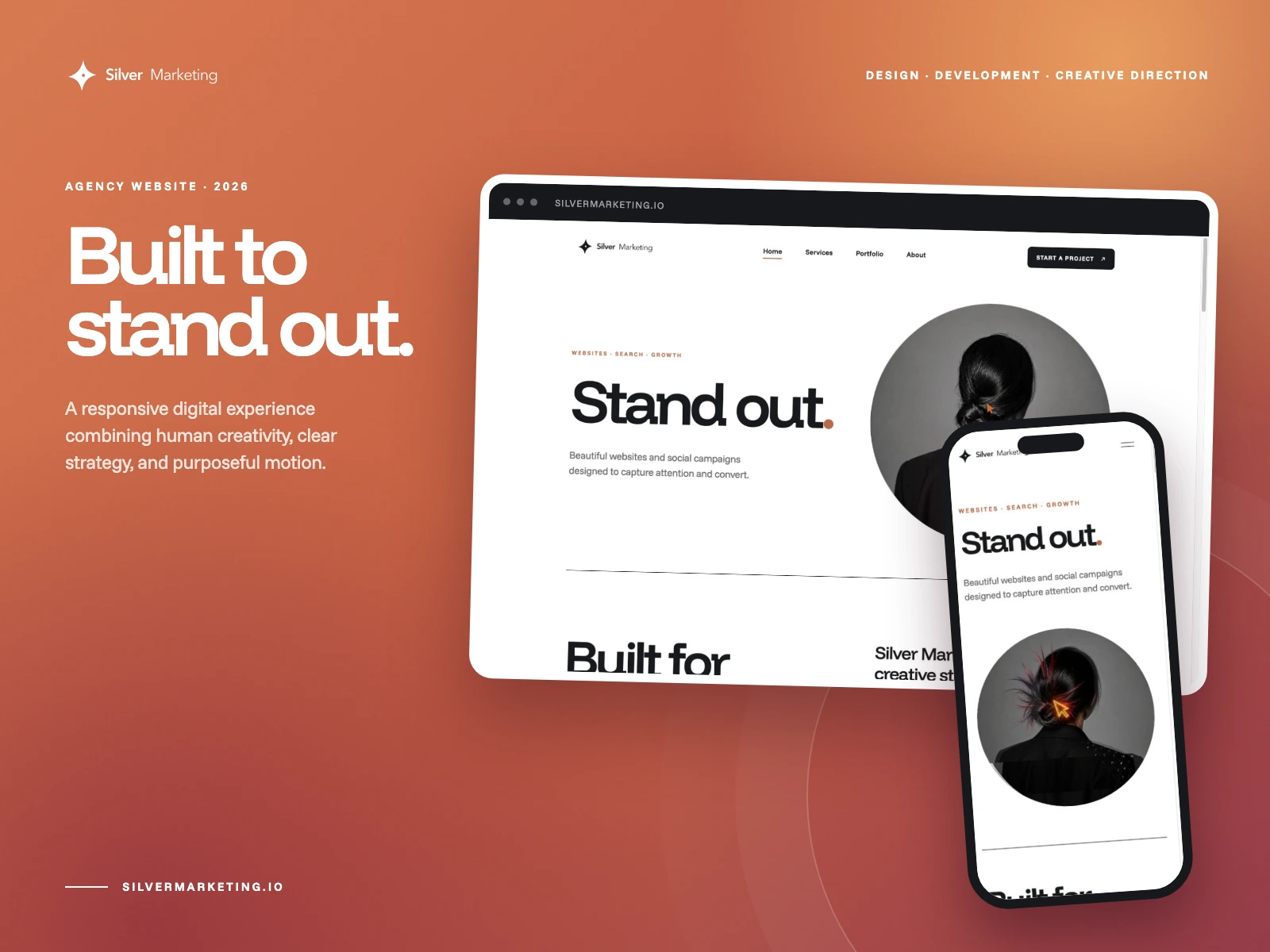
A website built to stand out.
Silver Marketing needed a digital home that could communicate a clear point of view without sacrificing speed, usability, or conversion.
I designed and developed a responsive agency site built around bold editorial typography, circular imagery, generous white space, and purposeful interaction. The experience moves from a clean first impression into a clear story about websites, automation, visibility, branding, and what comes next.
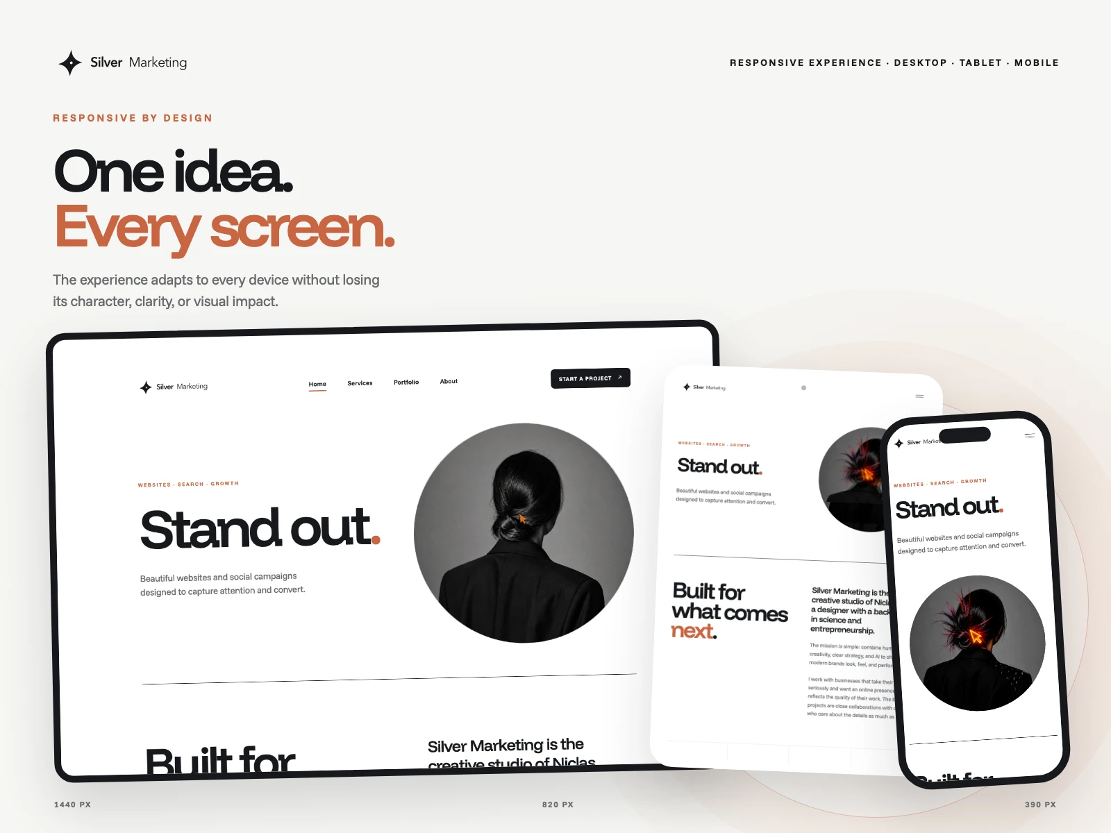
One idea on every screen.
The layout stays clear, balanced, and distinctive across desktop, tablet, and mobile.
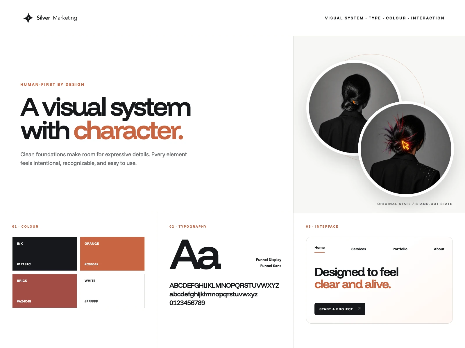
A restrained system with a sharp edge.
Warm colour, bold typography, circular imagery, and clean interface details create one consistent visual language.
Like this project
Posted Aug 21, 2026
A responsive agency website combining bold editorial design, purposeful motion, clear service pathways, and conversion-focused UX.