VIVALDI WINERY - PACKAGING DESIGN

Iris Belortaja


CONCEPT & LOGO
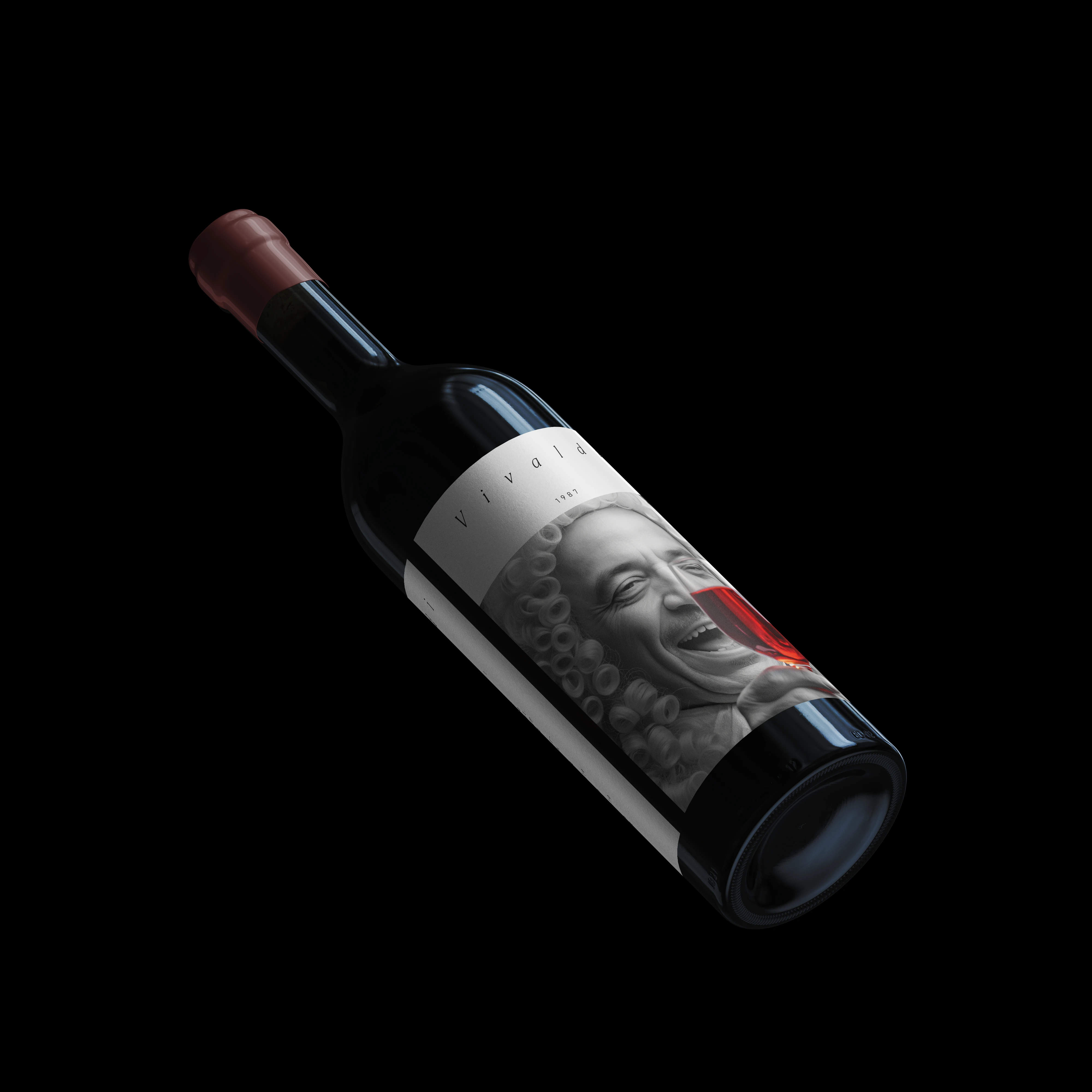
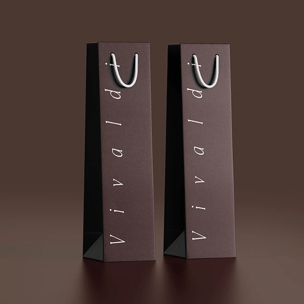
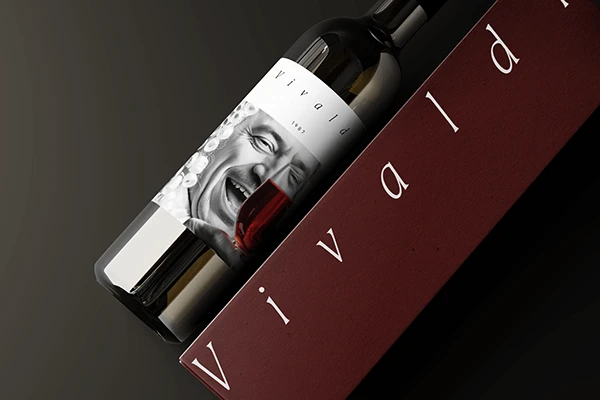
The Vivaldi Winery packaging is a celebration of timeless elegance, musical heritage, and refined craftsmanship. Inspired by the legacy of the composer Antonio Vivaldi, the design embodies sophistication, harmony, and a sense of occasion.
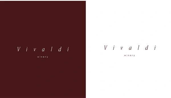
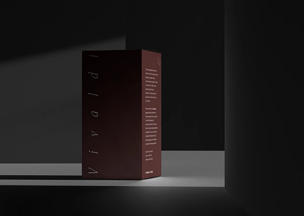
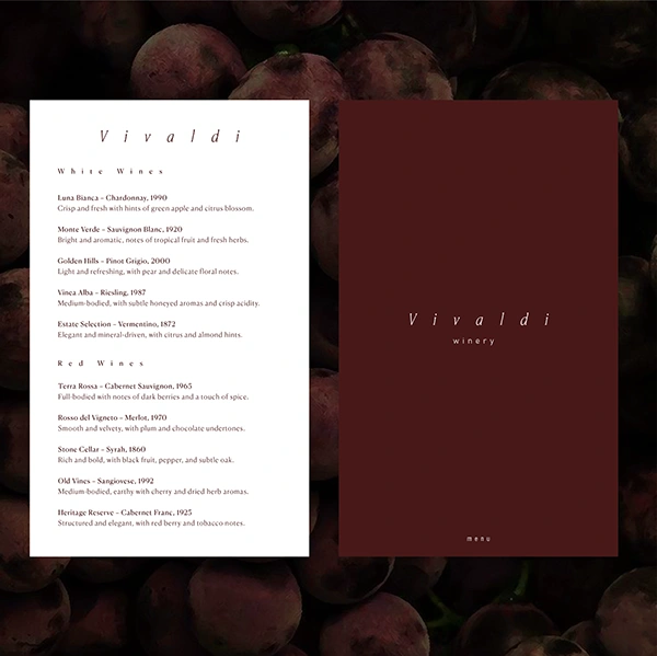
A deep burgundy palette conveys richness, depth, and the intensity of the wines, while off-white accents provide a crisp, minimalist counterpoint, creating a luxurious, timeless contrast. The restrained color scheme emphasizes purity and premium quality, allowing the wine itself to remain the focal point.
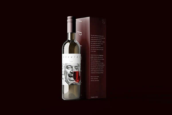
The minimalist design language , clean lines, subtle textures, and carefully considered typography, reflects precision and artistry, echoing the elegance of classical music. The choice of Canela Deck for the logo adds warmth and character, while a modern sans-serif for supporting text ensures clarity and contemporary sophistication.
Every element, from the label layout to the color pairing, is designed to evoke refinement, exclusivity, and heritage, inviting wine lovers to experience the luxury and story behind each bottle. The packaging is not just functional; it is an experience in itself, aligning the sensory richness of the wine with the visual harmony of the brand.
Vivaldi Winery packaging captures the essence of timeless craftsmanship and musical elegance, establishing a brand identity that is at once classic, sophisticated, and unforgettable.
Like this project
Posted Sep 18, 2026
A celebration of timeless elegance and musical heritage, the design pairs deep burgundy with off-white to evoke richness and sophistication. Minimalist typography and refined details reflect the precision and artistry of both the wine and its namesake, creating a luxurious, unforgettable experience.