BLOOM - PACKAGING DESIGN

Iris Belortaja


CONCEPT
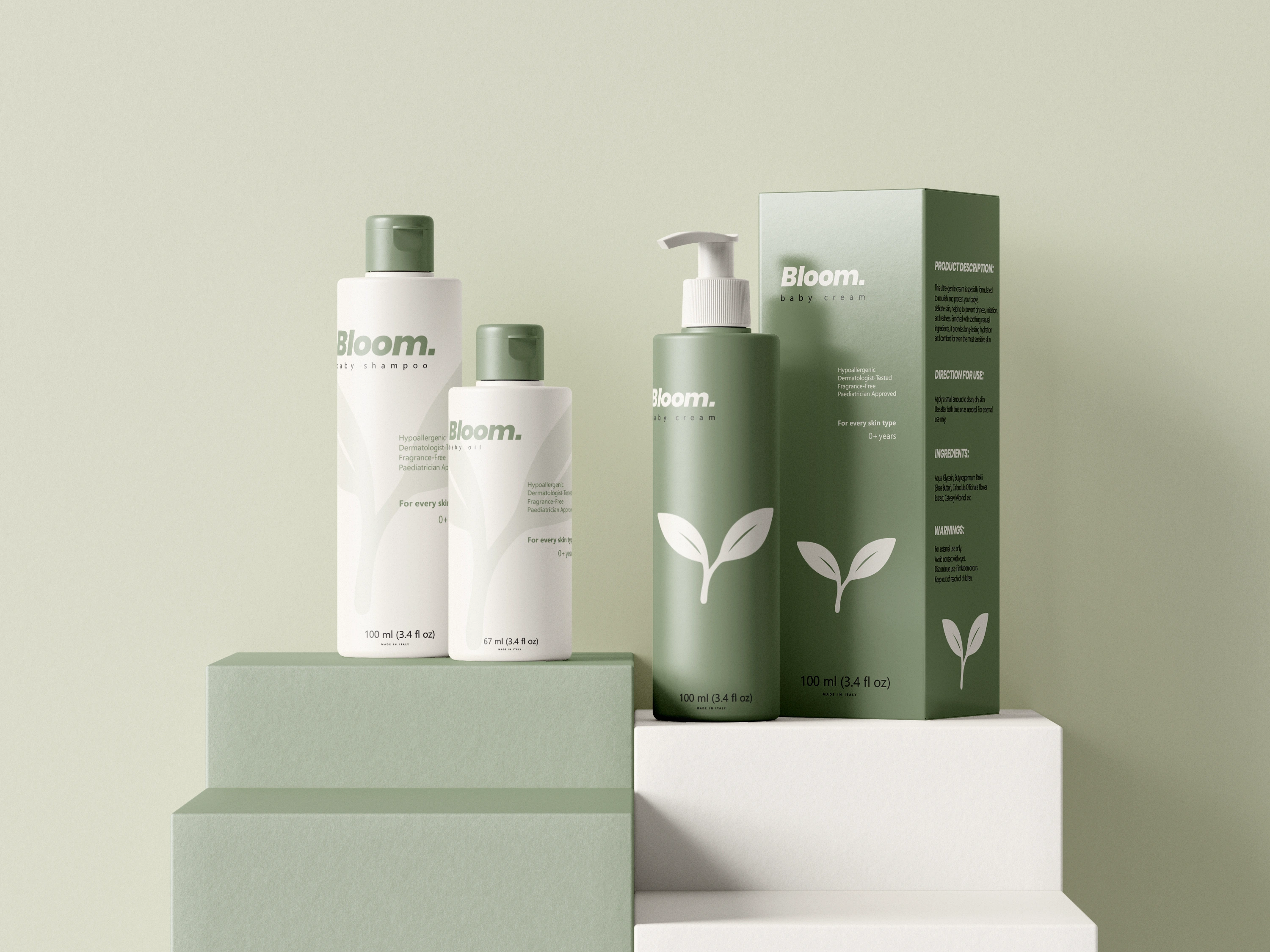
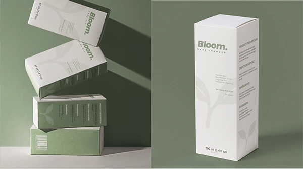
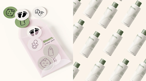
BLOOM is a conceptual baby-care packaging project inspired by tiny moments and everyday cuddles. From gentle shampoo to nourishing baby oil, each product is designed to protect delicate skin while creating a sense of calm, warmth and comfort. The goal was to translate the softness of touch and the safety of routine into a visual language that feels tender, soothing and trustworthy.
LOGO & VISUAL IDENTITY
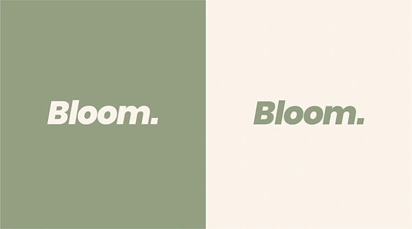
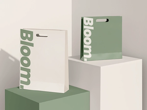
The visual identity is built around pastel green and creamy white, chosen to evoke purity, freshness and emotional warmth. A sans-serif italic logotype adds a subtle sense of motion and care, reflecting the gentle rhythm of everyday baby rituals. Bloom packaging is designed as an experience, using soft pastels, rounded shapes, and gentle illustrations to convey warmth and tenderness. Interactive story panels engage parents and babies with playful, tactile narratives, turning packaging into a memorable, sensory interaction that reflects the brand’s nurturing values.
Like this project
Posted Sep 18, 2026
Bloom is a conceptual baby-care packaging design priject inspired by little moments. Designed with soft pastles, the brand reflect calm, care and emotional warmth, turning daily baby routines into beautiful, comforting ritual.