THE STRUCTURE - BRAND IDENTITY

Iris Belortaja



A conceptual branding project for a modern minimalist architecture studio.
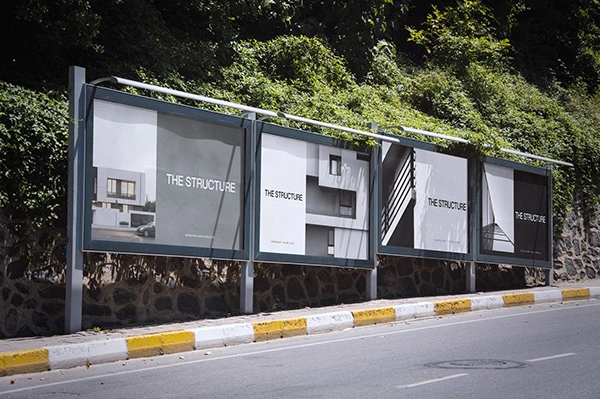
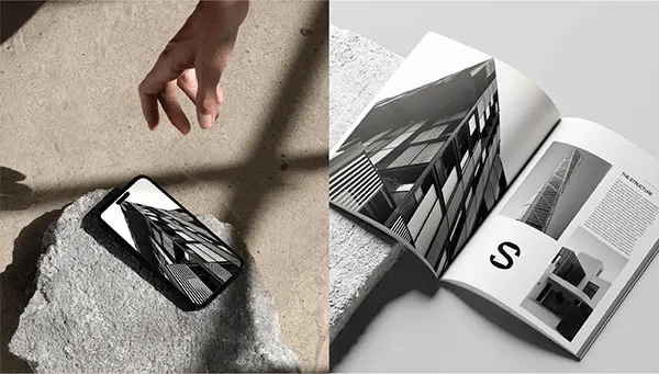
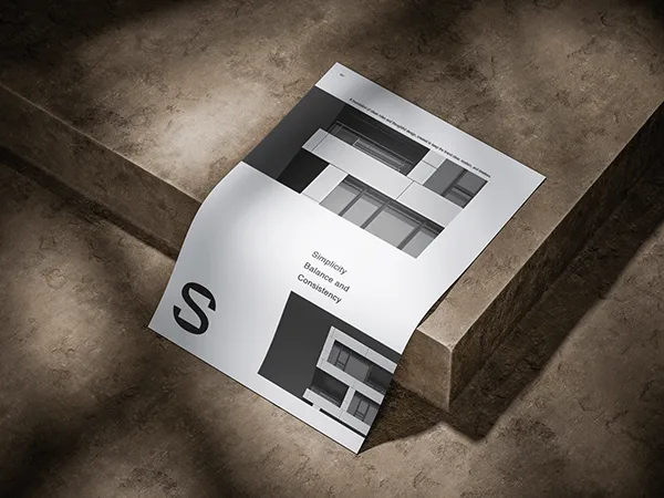
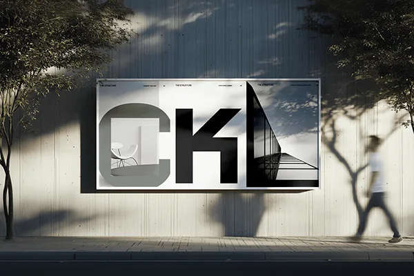
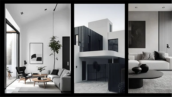
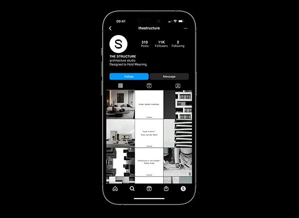
This project created a visual identity reflecting the studio’s philosophy: modern, minimalist, and highly functional spaces. The logotype incorporates geometric shapes to echo architectural precision and minimalist design. The color palette—black, white, grey, and muted green—reinforces simplicity, clarity, and subtle elegance. The identity balances functionality with refinement, making the brand feel deliberate and clean.
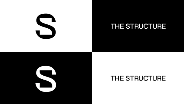
The identity is built around a strong typographic system.
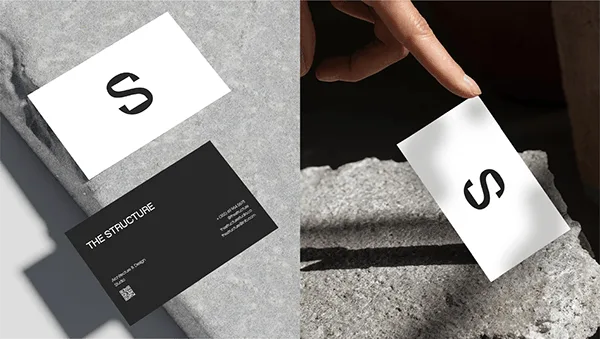
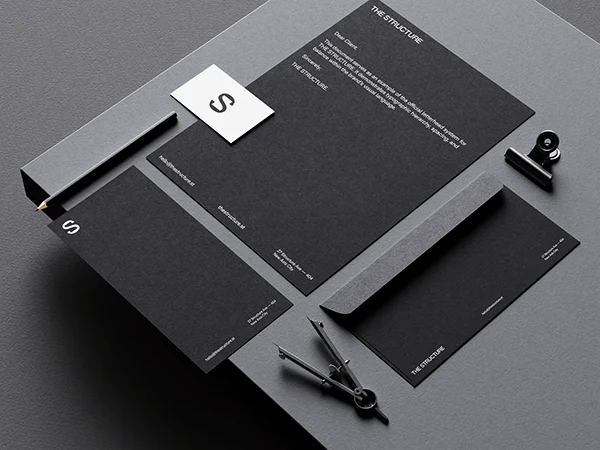
The logotype and the “S” symbol share the same visual language, allowing them to work independently or together as a flexible system.
High-contrast black and white versions ensure clarity, consistency, and adaptability across different backgrounds and applications.
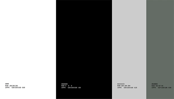
The color palette is intentionally minimal and restrained.
Black and white form the core of the identity, ensuring clarity and strong contrast, while neutral greys add depth and flexibility.
A muted green accent introduces subtle character without compromising the overall structure and balance of the system.




Like this project
Posted Sep 18, 2026
A modern, minimalist brand identity designed for an architectural firm. The visual system embraces simplicity and elegance, using a monochromatic black-and-white palette to reflect precision, sophistication, and timeless design. Every element—from typography to layout—reinforces the firm’s focus on clean lines, structural clarity, and contemporary aesthetics.