Full Branding and Merch Design
Asad Malik
The Challenge:
Nerds Store approached us with the challenge of creating a unique, playful, and sustainable brand identity that would stand out in the crowded world of merchandise.
Their core goal was to create products that not only stood out but were also eco-friendly and emotionally resonant with their customers. They wanted to build a brand that would evoke nostalgia yet remain fresh and innovative.
Our Approach:
The process started with a deep dive into the world of nostalgia, sustainability, and fun. We focused on creating an identity that was instantly recognizable, playful, and aligned with the client’s goal of producing eco-conscious, quality products.
Key Objectives:
Branding - Craft a unique, memorable logo and visual identity that feels modern yet nostalgic.
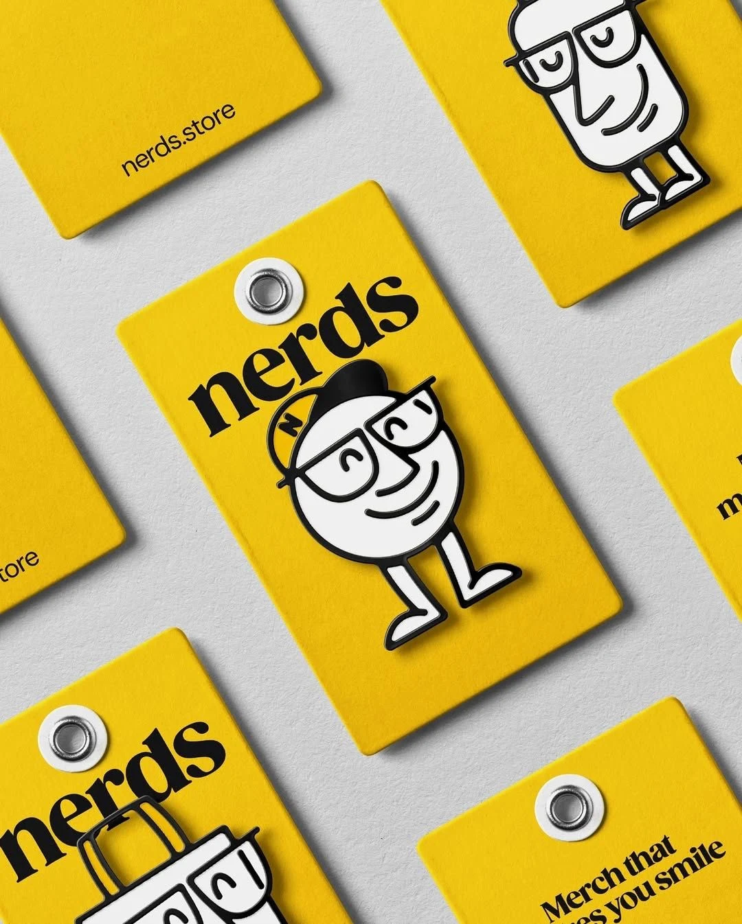
Packaging - Design product tags and packaging that convey sustainability and add a personal, fun touch.
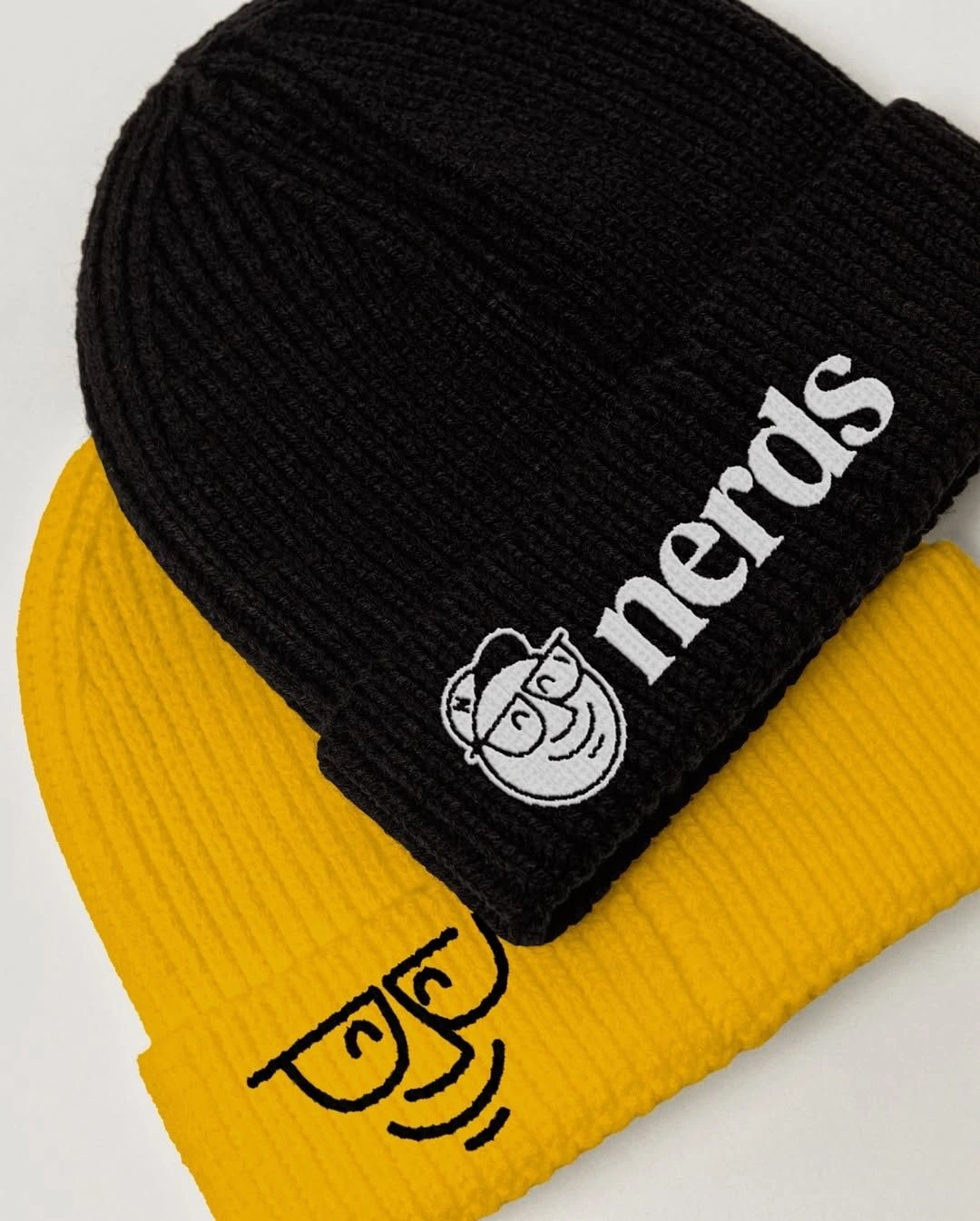
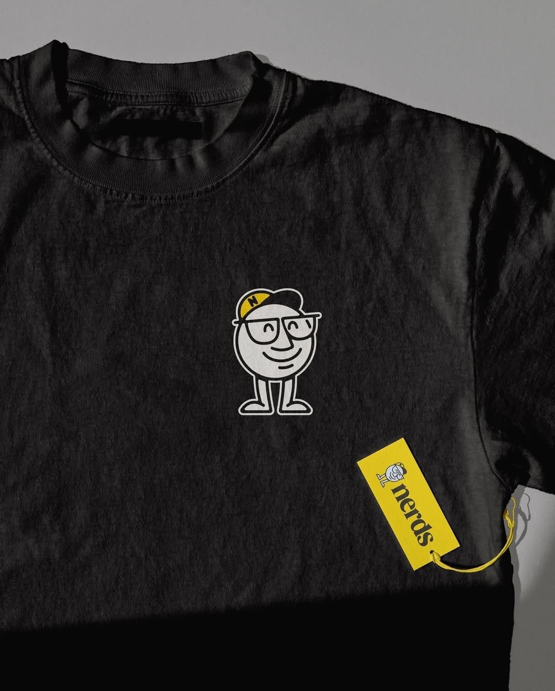
Merchandise - Design merch items that would appeal to the client’s audience, ensuring they were both functional and delightful.
Sustainability - Maintain a clear focus on eco-consciousness, ensuring the product designs were crafted with a durable, long-lasting feel.
Design Execution:
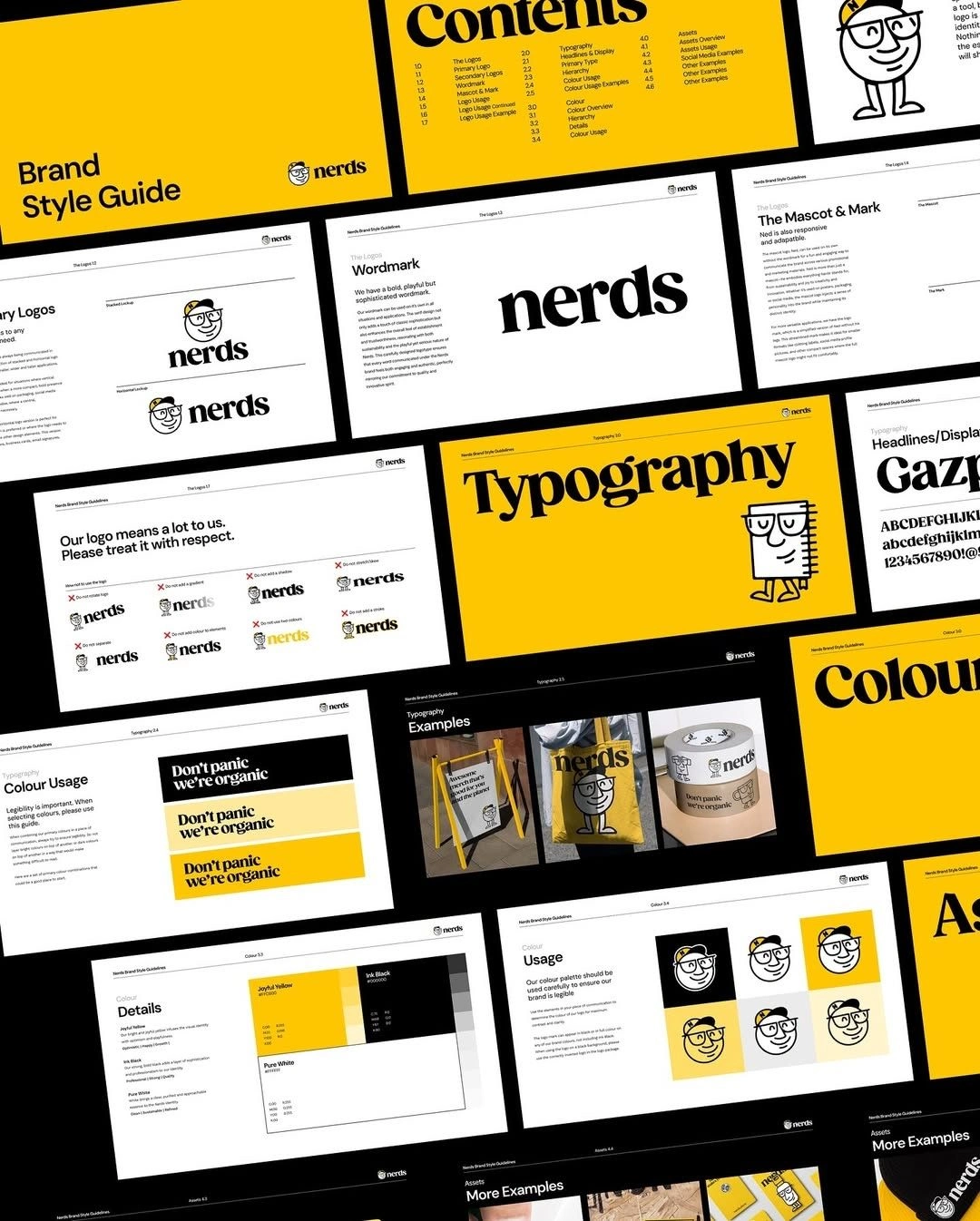
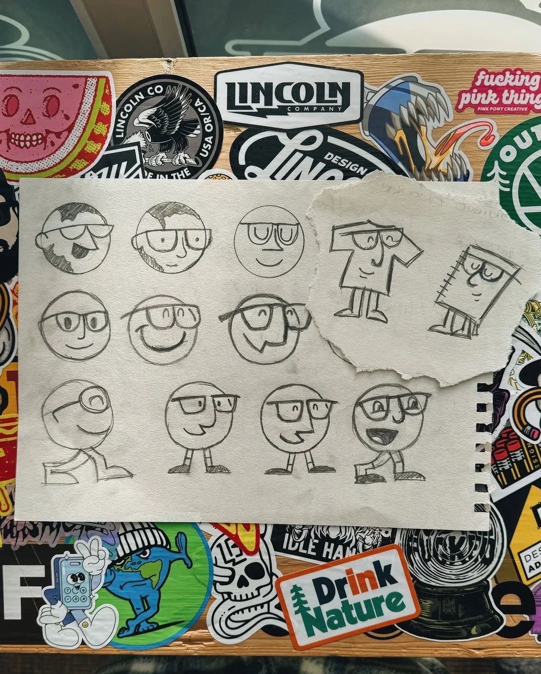
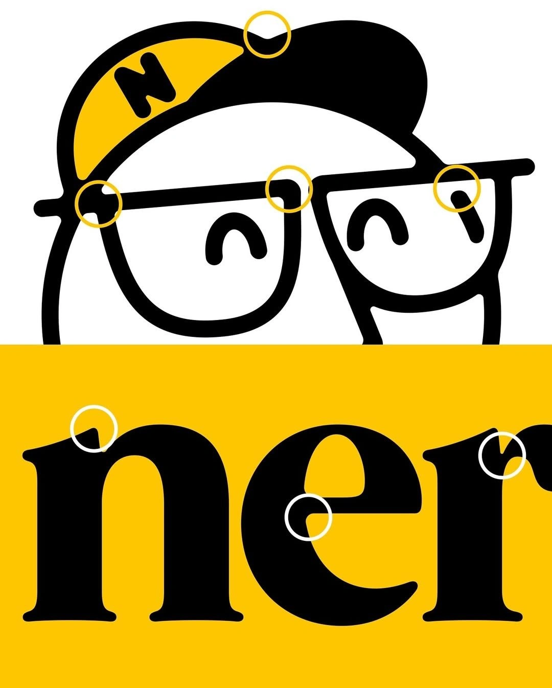
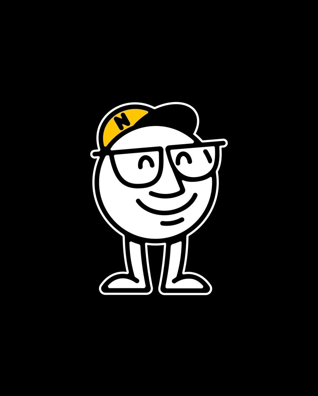
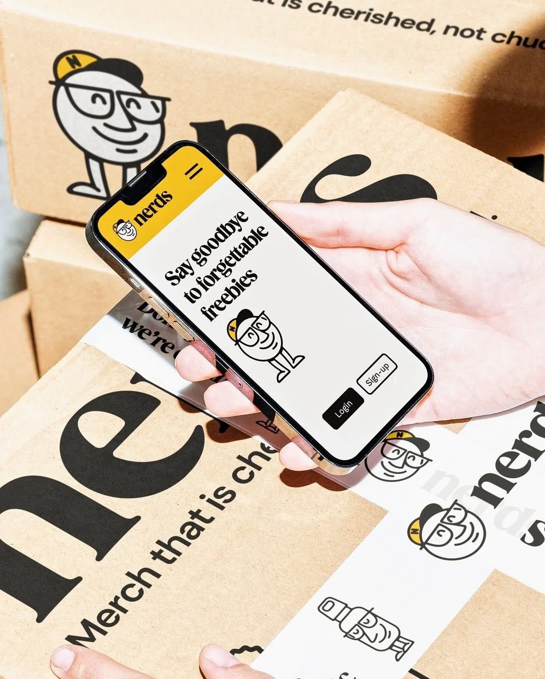
Logo & Iconography:
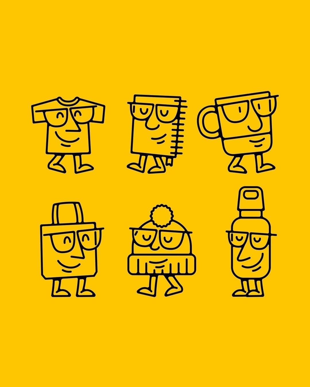
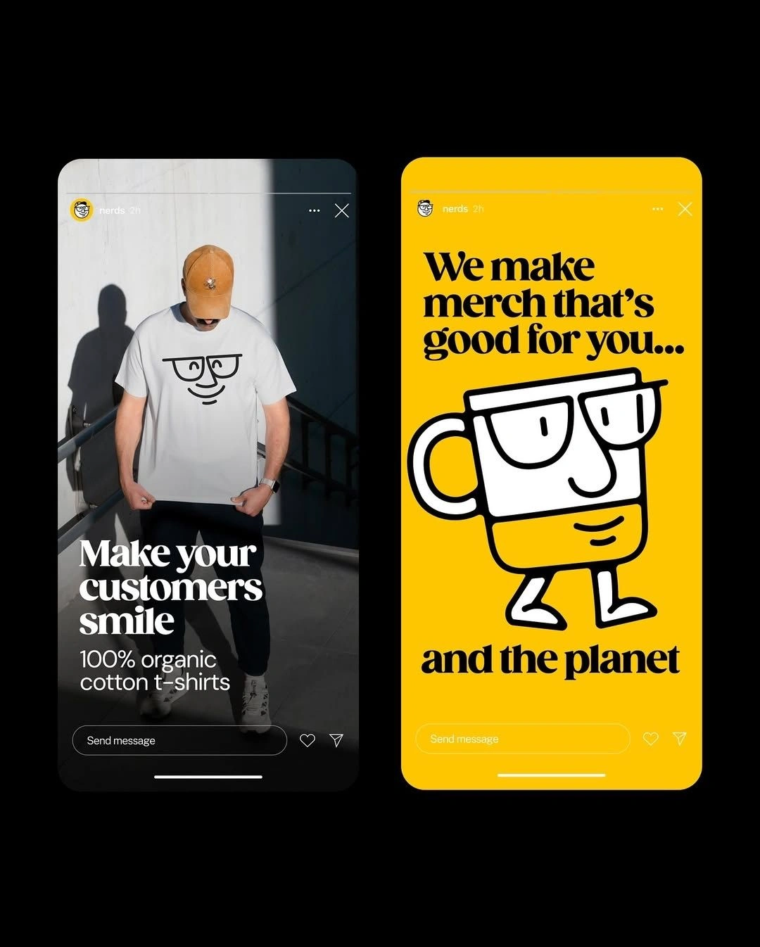
The “Nerd” character became the central figure in the branding—designed with a playful, quirky character that can be applied across different merch items like notebooks, mugs, bags, and hats. The design uses bold lines and a simple, friendly face, making the character versatile and fun.
Color Palette:
Yellow and black were chosen to create high contrast and grab attention. The yellow evokes energy, joy, and positivity, while the black adds sophistication, keeping the brand youthful yet premium.
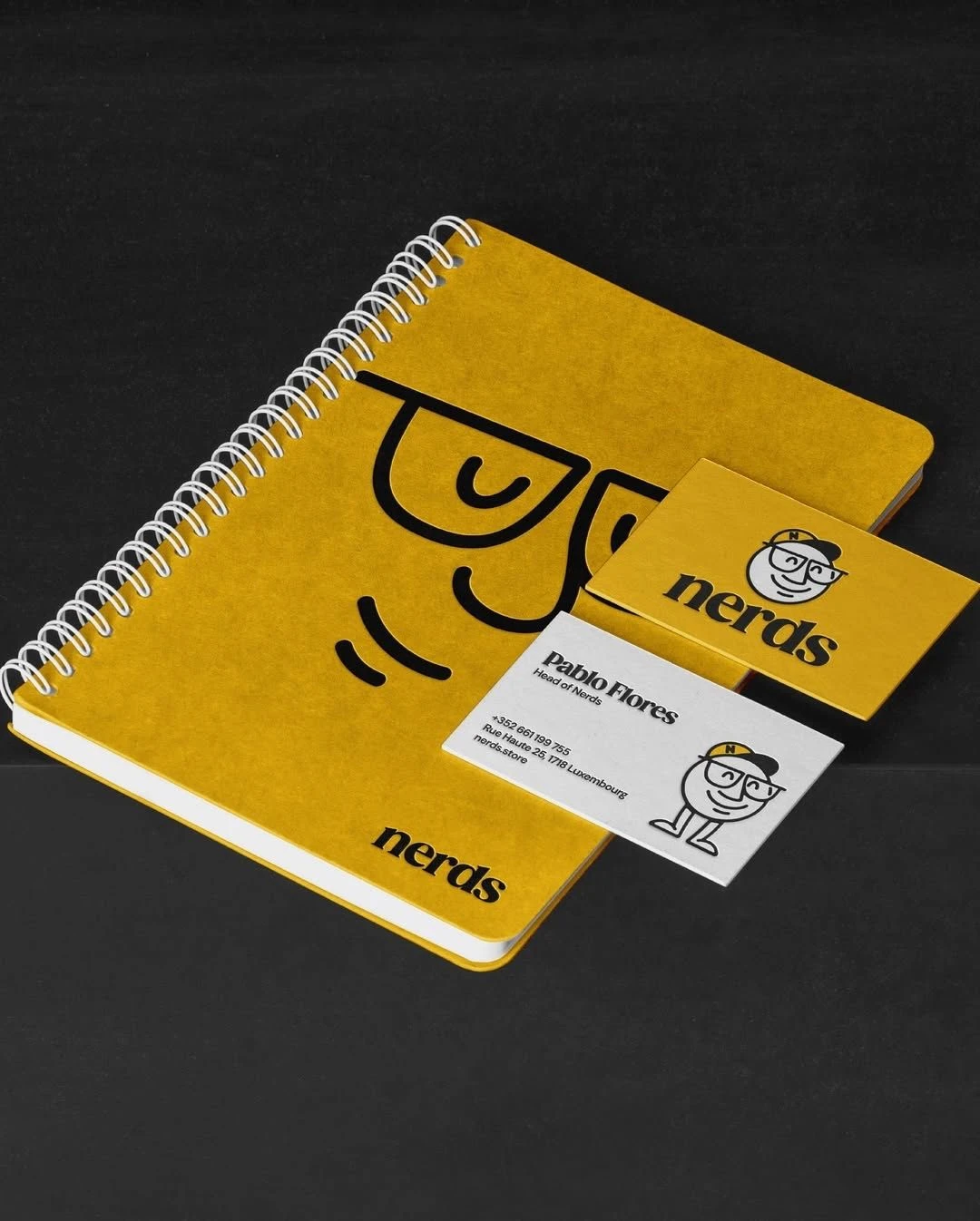
Merch Design:
Every piece of merchandise—whether a notebook, mug, or t-shirt—was crafted to feel personal and full of character. The inclusion of quirky, hand-drawn illustrations of everyday items, such as a mug or a notebook, creates a sense of nostalgia and whimsy, while staying true to the brand's eco-friendly mission.
Tagging & Packaging:
The product tags (shown in the images) carry the bold “nerds” typeface, creating an instantly recognizable branding element. The playful character and consistent use of yellow across all product lines help ensure the brand feels unified.
Results:
Since the launch of the Nerds Store, the brand has seen great traction in the market, thanks to its memorable design and eco-conscious appeal.
The unique character branding has been embraced across various product categories, from notebooks to apparel, with consumers connecting emotionally to the brand's nostalgic, joyful spirit.
Sketching it Out ✏️
Vectorizing 💻

Brand Naming

Towards Perfection
Let's Go Dark Mode
Mockups
Stationery Design
Fan Merch

Like this project
Posted Aug 29, 2025
Analytics showed that the rebranding had a profound impact on Nerds' sales this year. Around 70-80% increase in retention over a period of 6-12 months.