Quiet Mind Lab Brand Identity Design
AdamStav Branding Studio
Project Type: Brand Identity Design
Client: Quiet Mind Lab
The Challenge: Redefining mental wellness with warmth and whimsy
In a world increasingly focused on mental well-being, the challenge was to create a brand identity for "Quiet Mind Lab" that stood out from the often-clinical and sterile aesthetic of traditional wellness centers. The goal was to build a brand that felt approachable, human, and genuinely inviting, reflecting the core mission of helping individuals "cultivate peace through playful, mindful exploration."
The Strategy:
The strategy revolved around injecting personality and warmth into the Quiet Mind Lab brand. I aimed for visuals that were:
Approachable & Human: Moving away from a cold, clinical feel to something that felt handcrafted and relatable.
Playful & Curious: Reflecting the "exploration" aspect of their services and encouraging a sense of gentle discovery.
Rooted in Mindfulness: While playful, the design needed to subtly convey the depth and positive impact of mindful practices.

The Solution: A Harmonious blend of boldness, quirky charm, and earthy tones
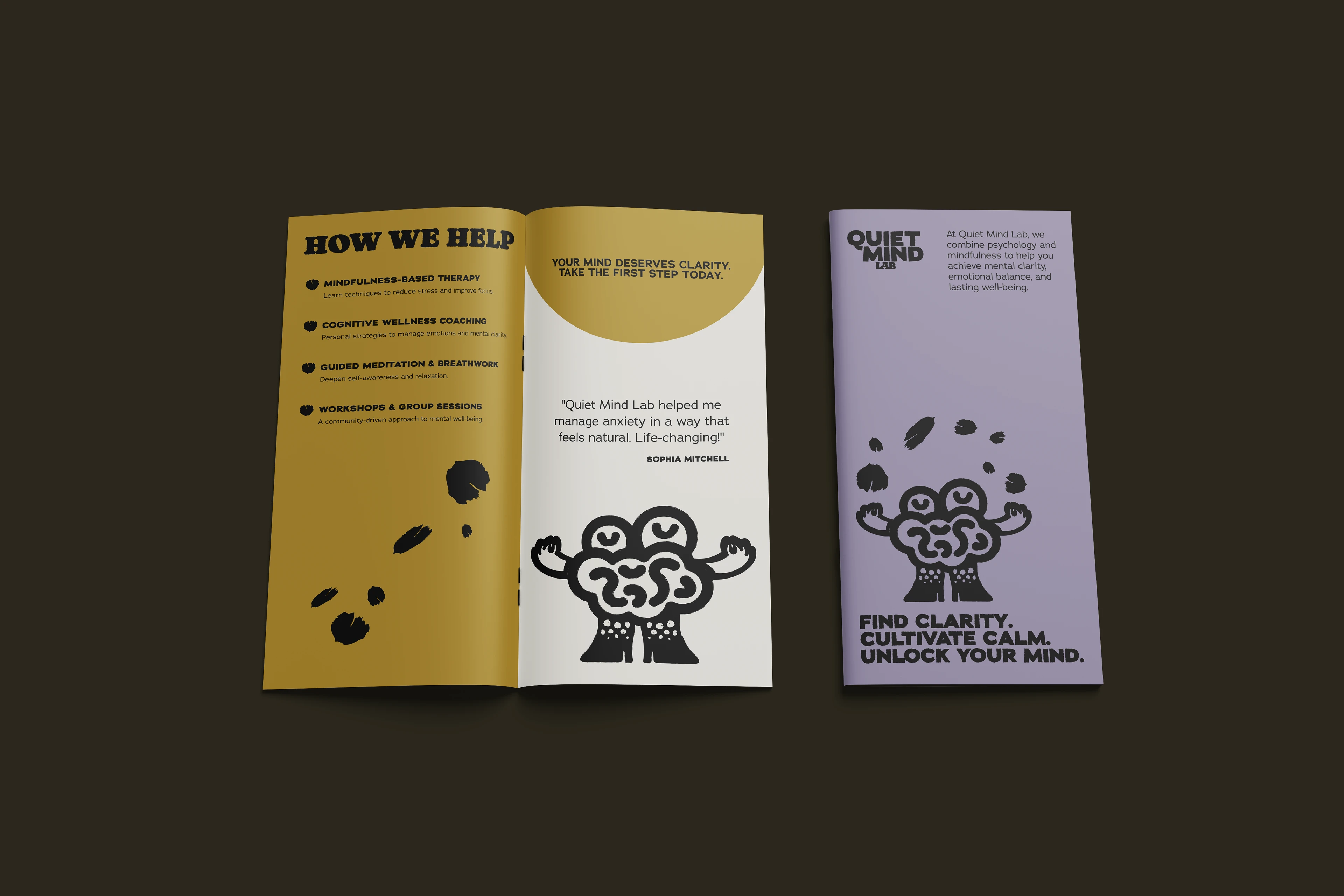
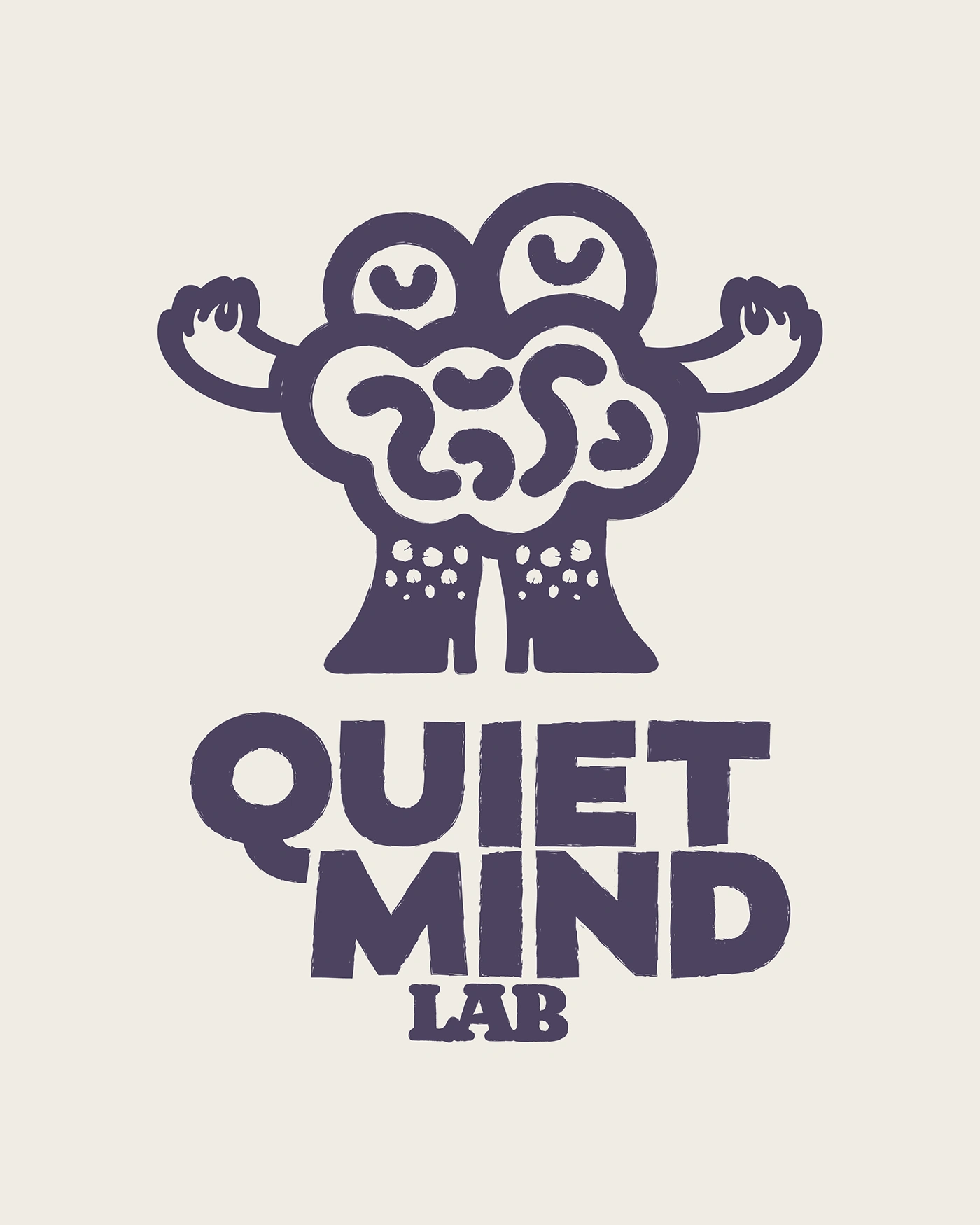
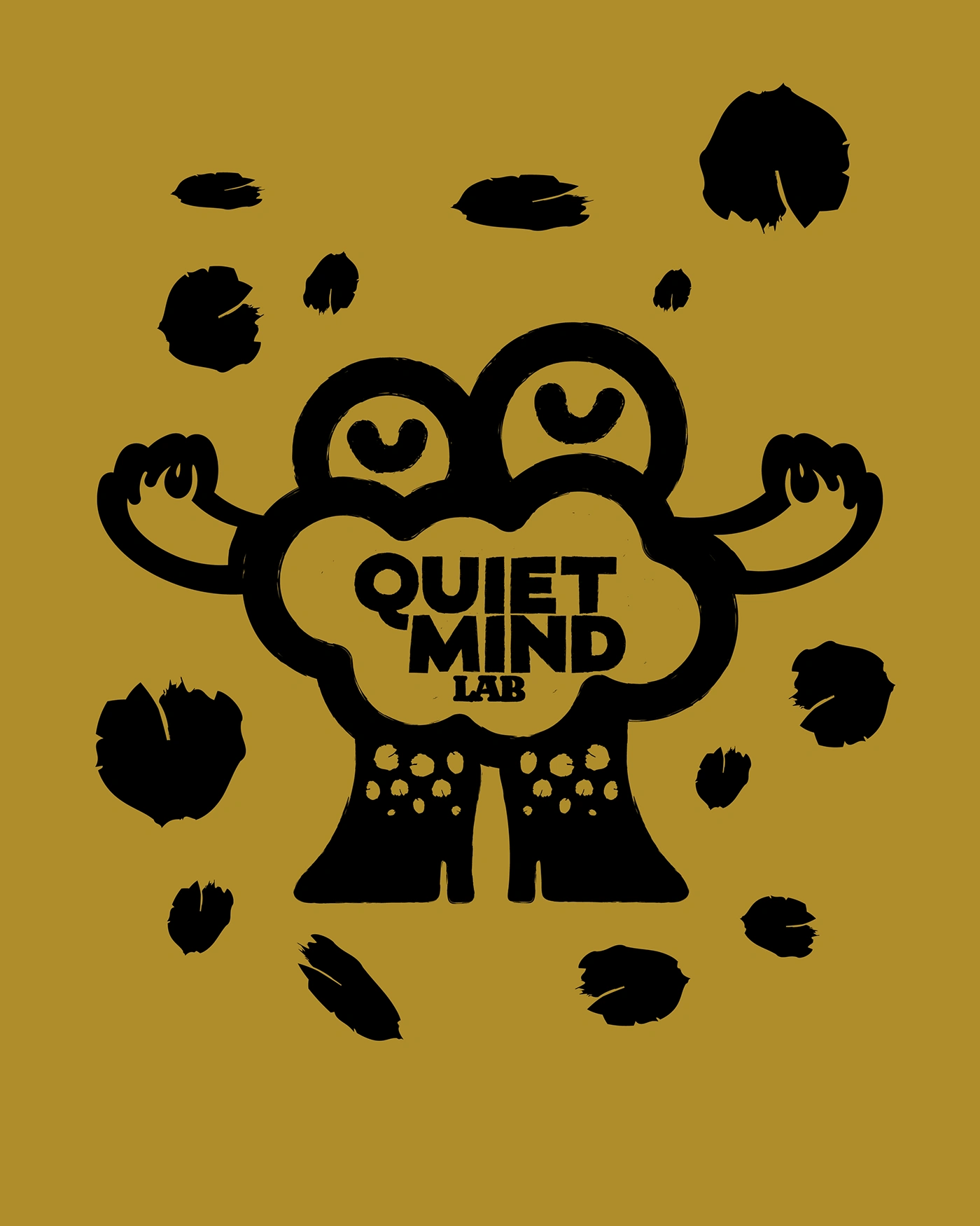
The resulting brand identity for Quiet Mind Lab is a vibrant tapestry woven from bold, hand-drawn visuals, a unique and memorable mascot, and a carefully curated color palette.
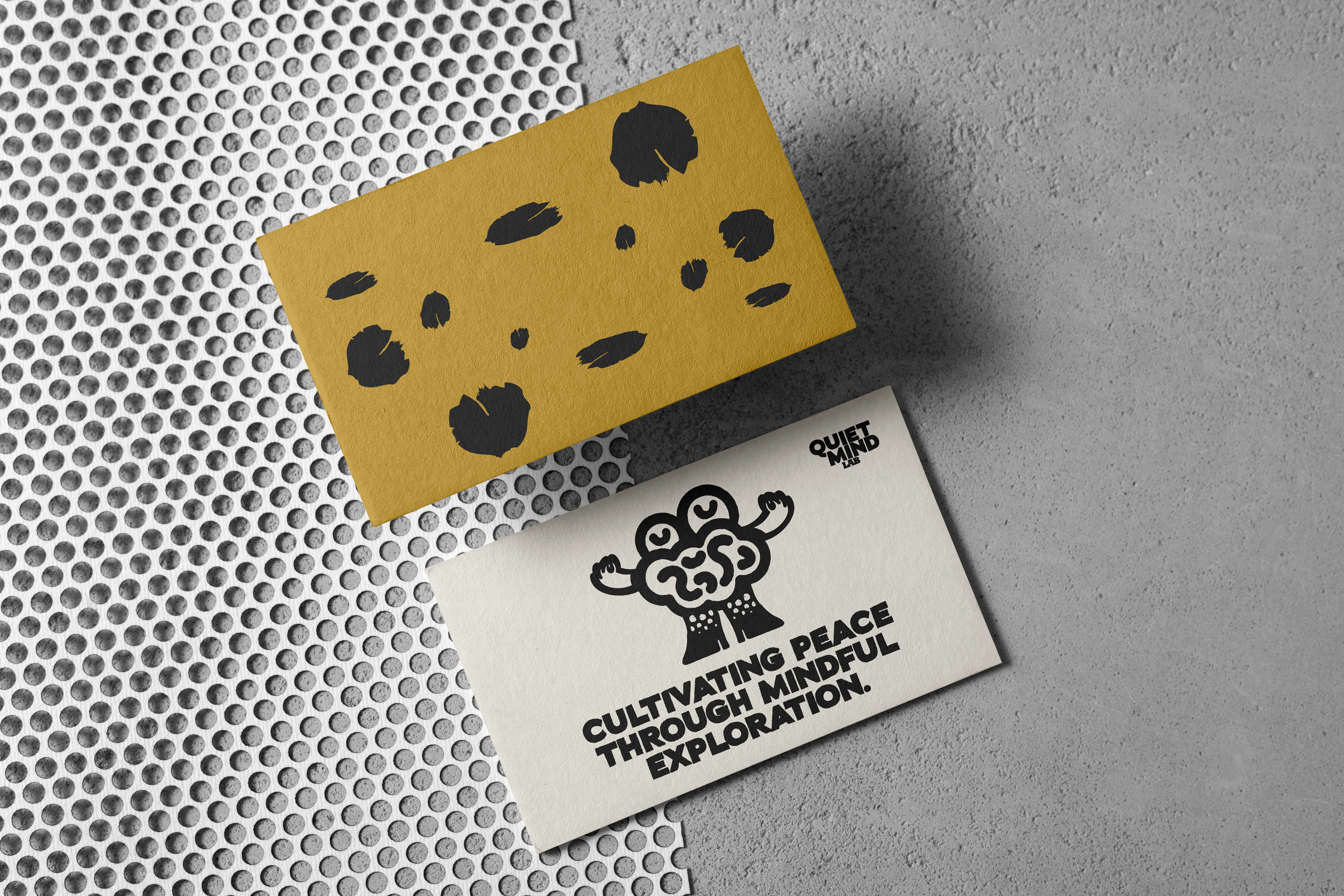
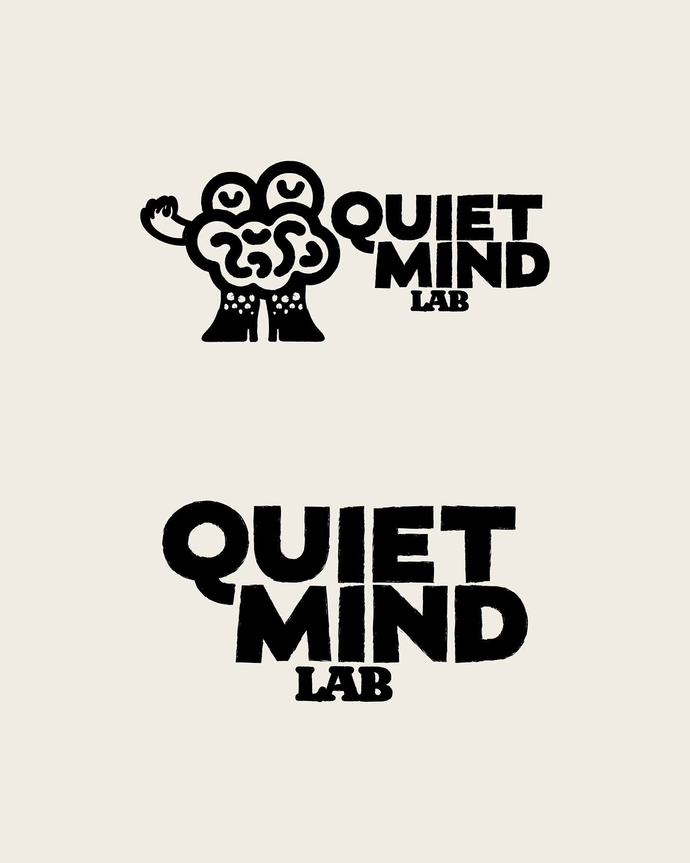
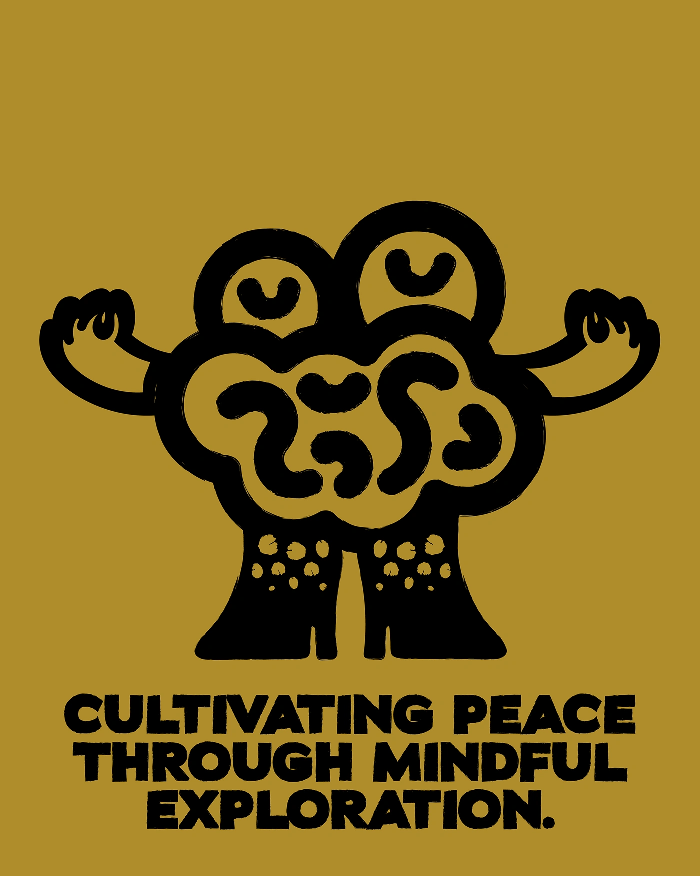
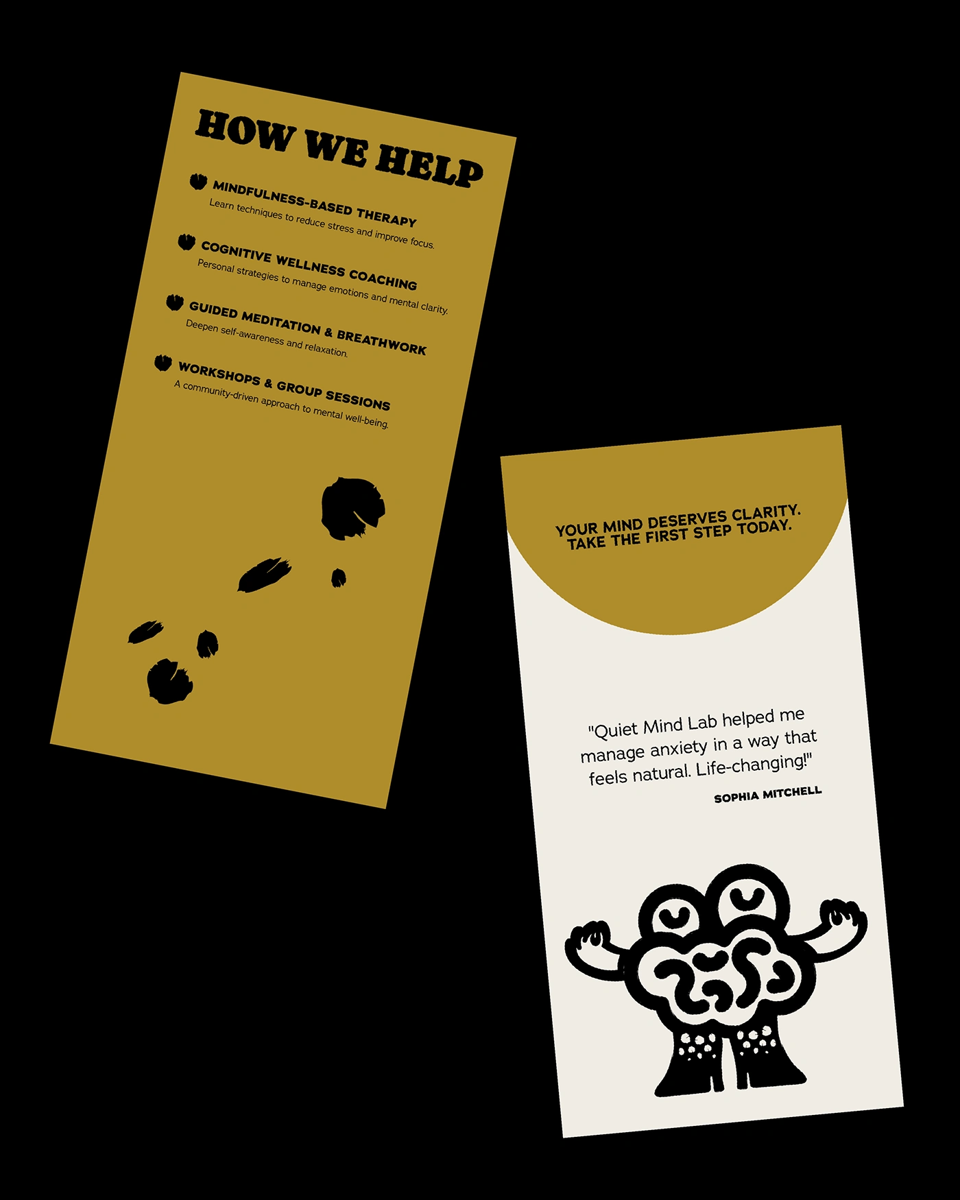
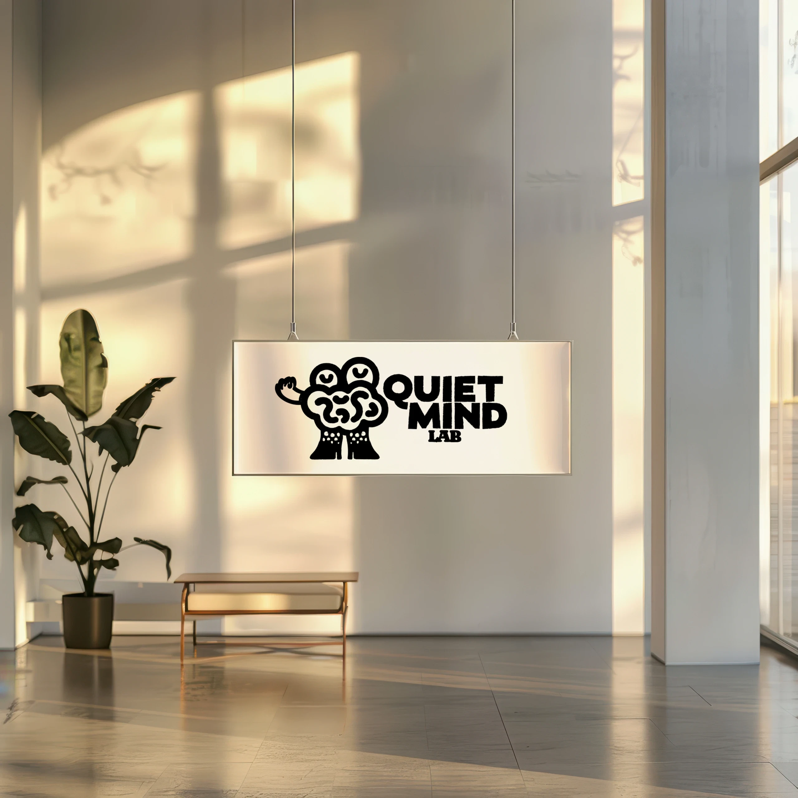
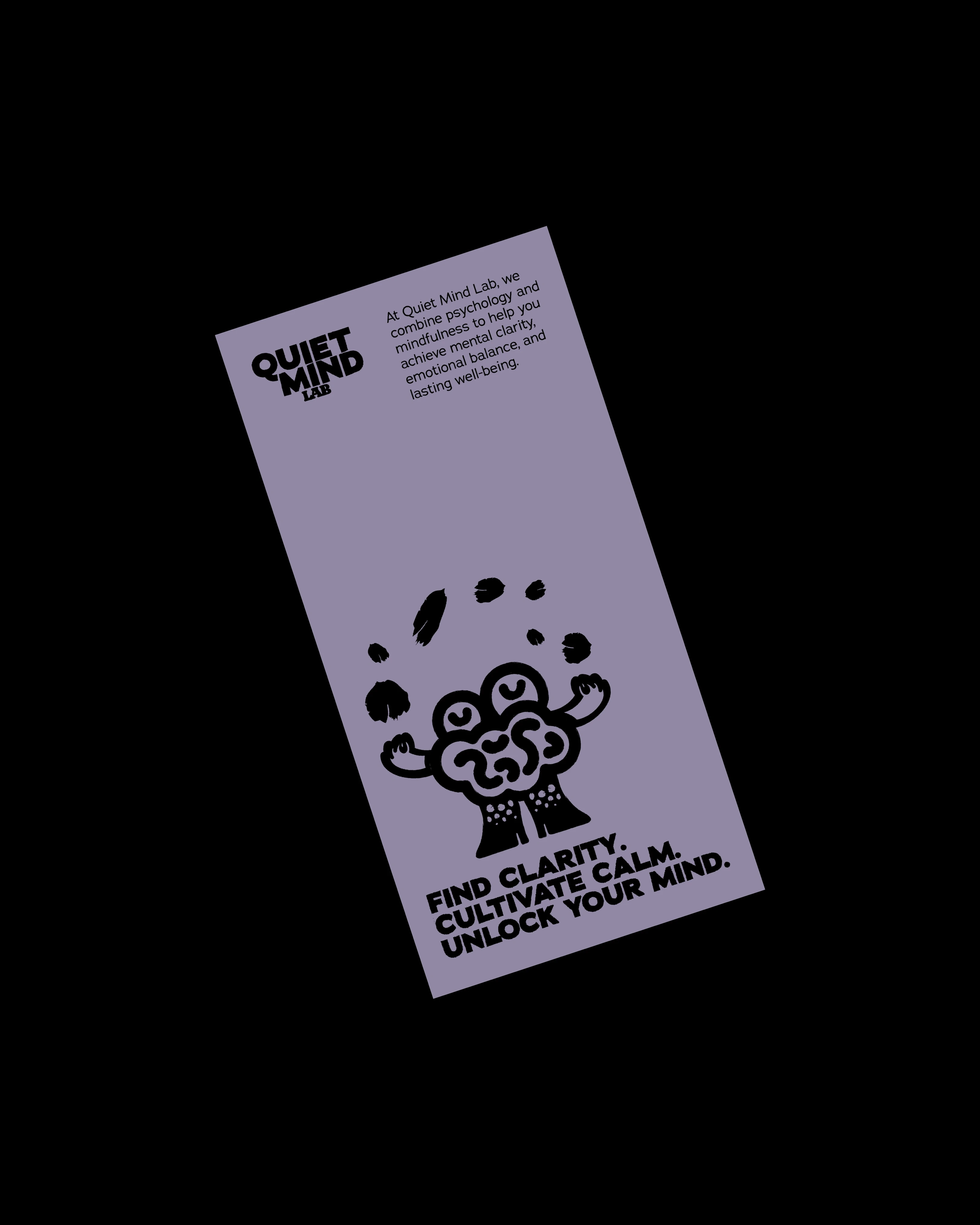
The Quirky Brain Mascot: The heart of the brand is its distinctive brain mascot. Far from a sterile anatomical representation, this quirky, hand-drawn character embodies curiosity and gentle strength. Its expressive eyes and outstretched arms evoke a sense of welcome and wonder, inviting individuals to engage with their inner world. This mascot serves as a friendly guide, demystifying mental wellness and making it feel accessible.
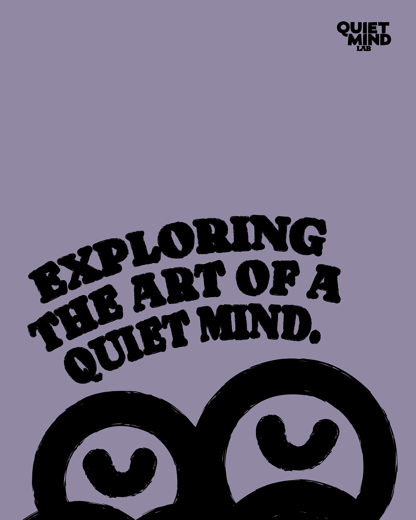
Bold, Hand-Drawn Typography: The typography is bold and impactful, yet softened by a hand-drawn, almost imperfect quality. This intentional looseness contributes to the human and approachable feel.
An Earthy and Inviting Color Palette: The color palette includes a calming lavender, a warm mustard yellow, a grounding black and off-white. The lavender conveys tranquility, mindfulness, and a touch of subtle sophistication. The mustard yellow adds a welcoming warmth, optimism, and a hint of cheerful energy. This combination avoids the typical bright, sometimes overwhelming colors found in wellness spaces, opting instead for a more grounded and mature yet still vibrant feel.
Like this project
Posted Jun 19, 2025
Designed a warm, playful brand identity for Quiet Mind Lab.
Likes
1
Views
14