Zenith Teahouse Logo Design
AdamStav Branding Studio
CLIENT: Zenith Teahouse
The client needed a fresh, minimalist brand identity. The aim was to create a modern yet timeless logo that captured the essence of high-quality tea and a peaceful atmosphere. It was crucial to avoid typical tea clichés for a sophisticated look.
Design Strategy
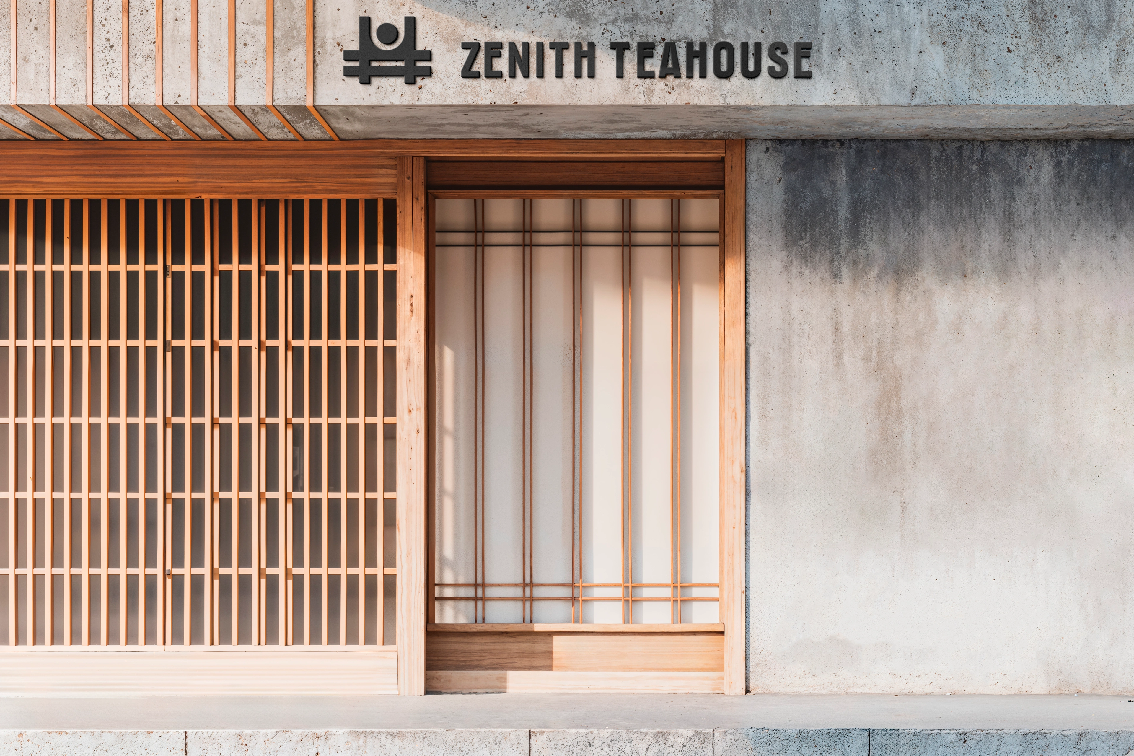
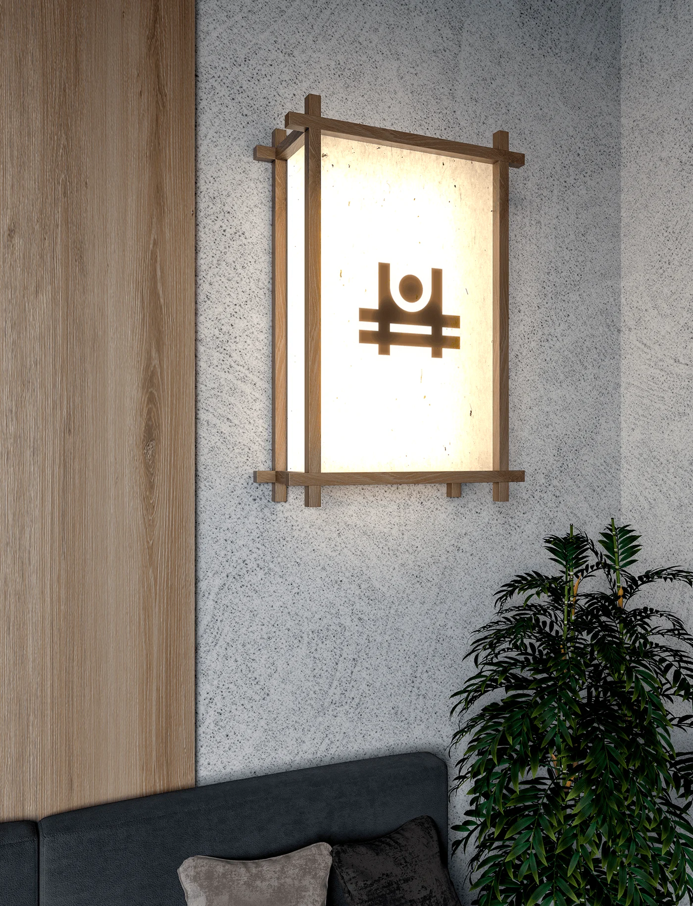
"Zenith": The name "Zenith" inspired a logo that subtly represents reaching the highest point or a premium experience, using clean, abstract forms.
Blending modern simplicity with tea culture: We chose a minimalist style with clean lines for a modern feel.
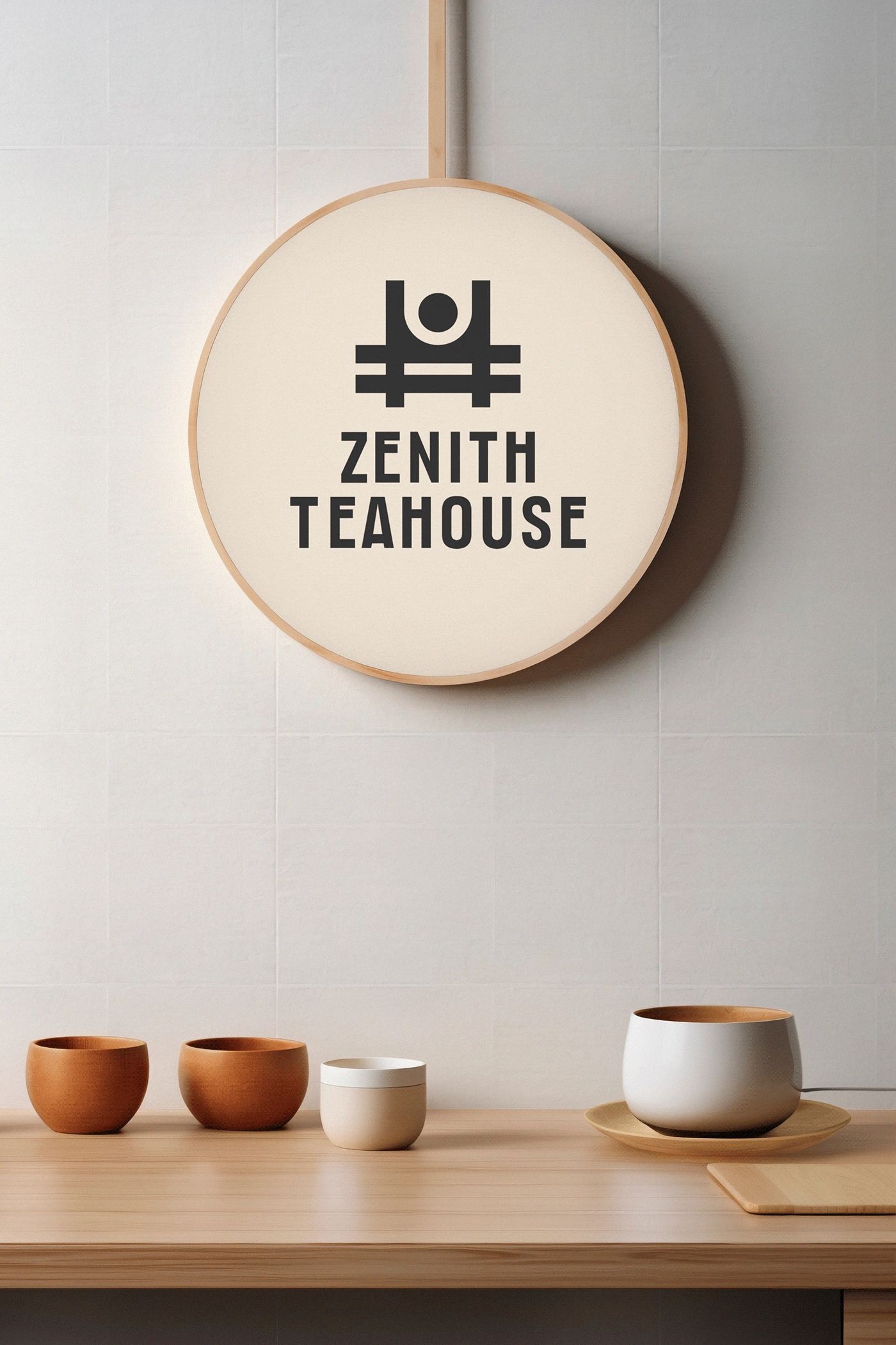
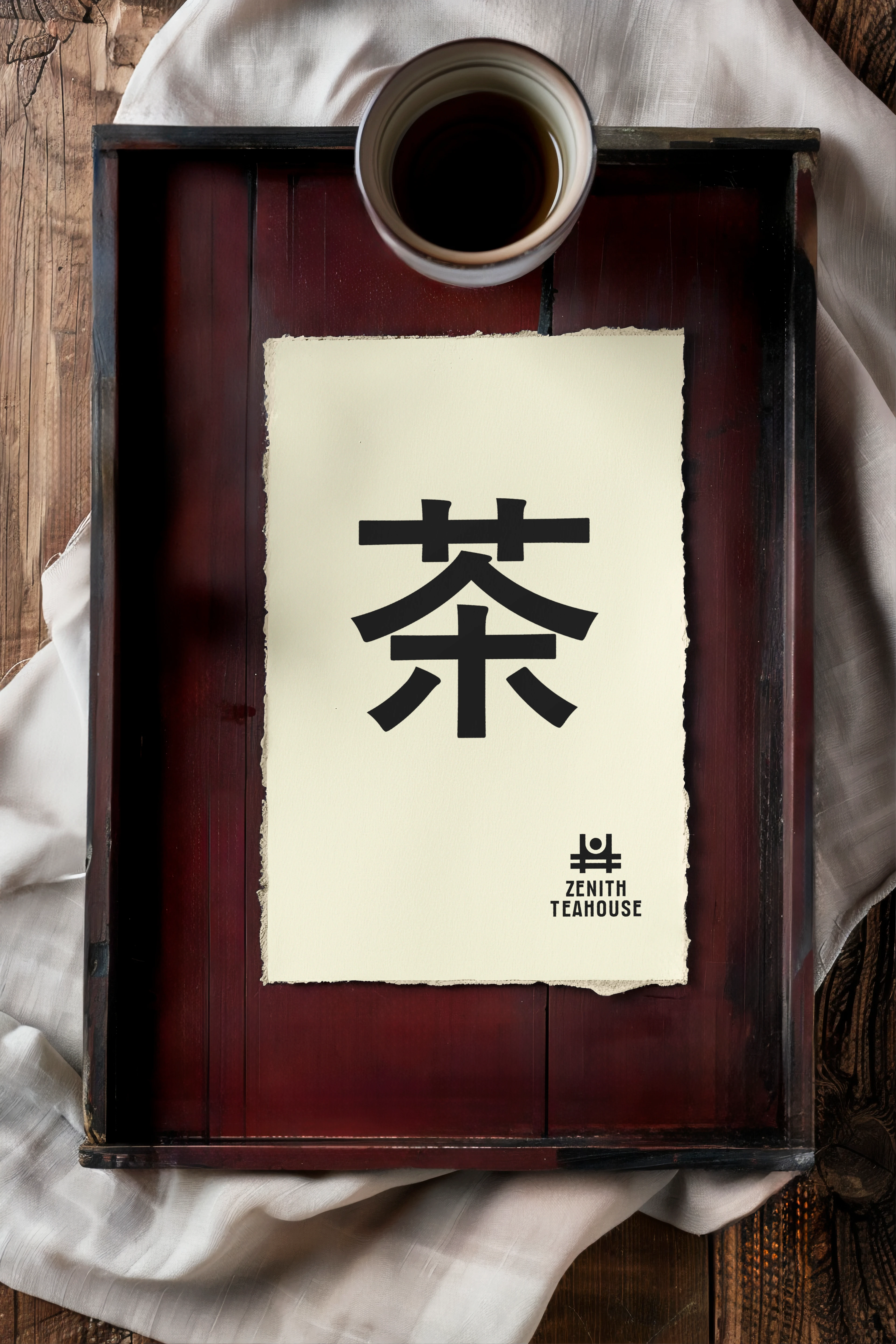
The logo mark: The abstract logo mark holds multiple meanings, encouraging deeper connection. It suggests a simplified Japanese torii gate, symbolizing entry into a special, calm space. This links modern design with cultural heritage. The circle and line can be also seen as a teacup, directly connecting to tea. Additionally, the upward movement visually reinforces the "Zenith" idea, a peak experience or moment of clarity. Its symmetrical design reflects the harmony and peace of tea culture.

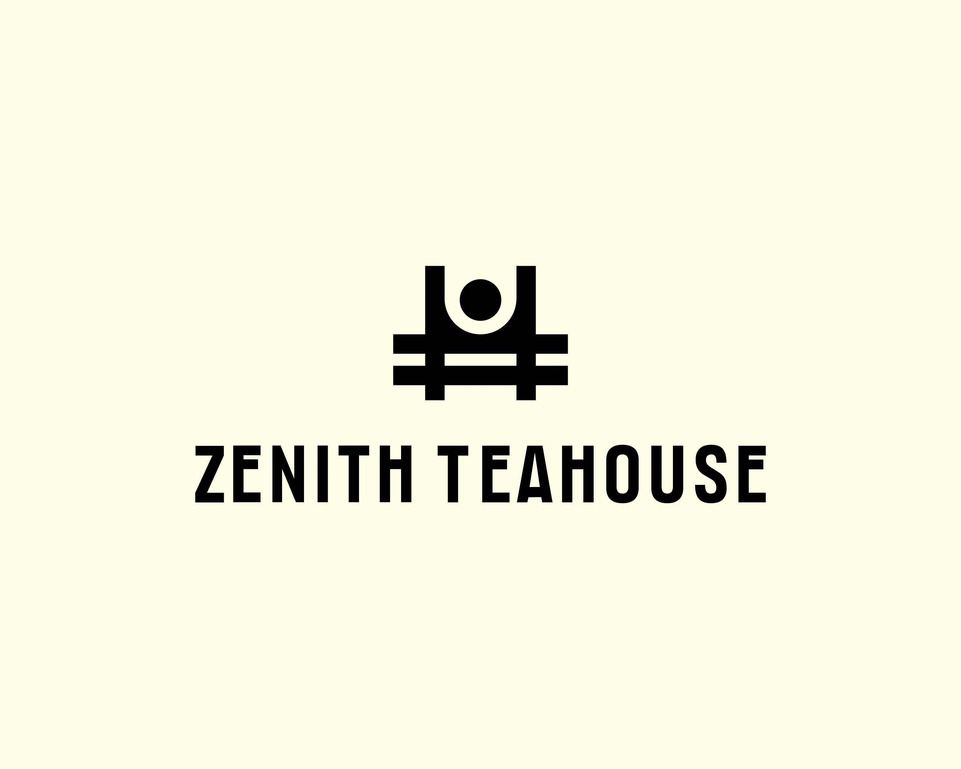
The Zenith Teahouse logo showcases effective minimalist design. By abstractly combining ideas of elevation, tranquility, and the essence of tea, we created a memorable and impactful brand identity. It perfectly aligns with Zenith Teahouse's vision: to offer a modern, premium, and peaceful tea experience.
Like this project
Posted Jun 11, 2025
Designed a minimalist logo for Zenith Teahouse, blending modern simplicity with tea culture.
Likes
0
Views
16