Taste, Rate, Discover: A UX Redesign Case Study for SeekEats
SeekEats is a platform that connects foodies with local restaurant owners, offering exclusive discounts and promoting small businesses in the Los Angeles area.
SeekEats, a vibrant platform based in Los Angeles, started with a visionary concept that uniquely combined fun and food, transforming the way users discover and indulge in their favorite local eats. The platform's ingenious foundation revolved around an engaging poll system, enticing users to answer entertaining daily polls and earn redeemable points for delightful local food and drink deals.
As a UI/UX designer for SeekEats, I embarked on a 6-week project aimed at elevating the user experience, driving increased engagement, and fostering lasting connections between users and their cherished local restaurant community.
Role: UI/UX Designer
Duration: 6 Weeks
Tools: Figma
Skills: Product Design, UX Design, UI Design
The Problem
Before undertaking this project, SeekEats faced a critical challenge: how to increase user engagement and retention in the long run. While the poll system laid the foundation for SeekEats' success, the platform aspired to further enhance the food discovery process and elevate user engagement in the long run, recognizing the need to explore new ideas and enhancements to maintain a competitive edge in the market.
The primary problem SeekEats identified was related to the process of discovering food spots. While users appreciated the exclusive deals, they often felt overwhelmed by the vast array of restaurant choices in the Los Angeles area. The existing user journey lacked personalization and interactive elements, resulting in a less enjoyable experience when searching for their next dining destination.
Competitive Analysis
During the initial phase, I conducted a thorough competitive analysis to understand the strengths and weaknesses of existing food discovery and discount platforms. Key competitors included popular food apps, restaurant review platforms, and other discount-based services. In order to draw in and keep users, the research stressed the value of eye-catching graphics and tailored interactions. We were able to see patterns emerge amongst the apps, pointing to elements we could include in our own product and others we should steer clear of.
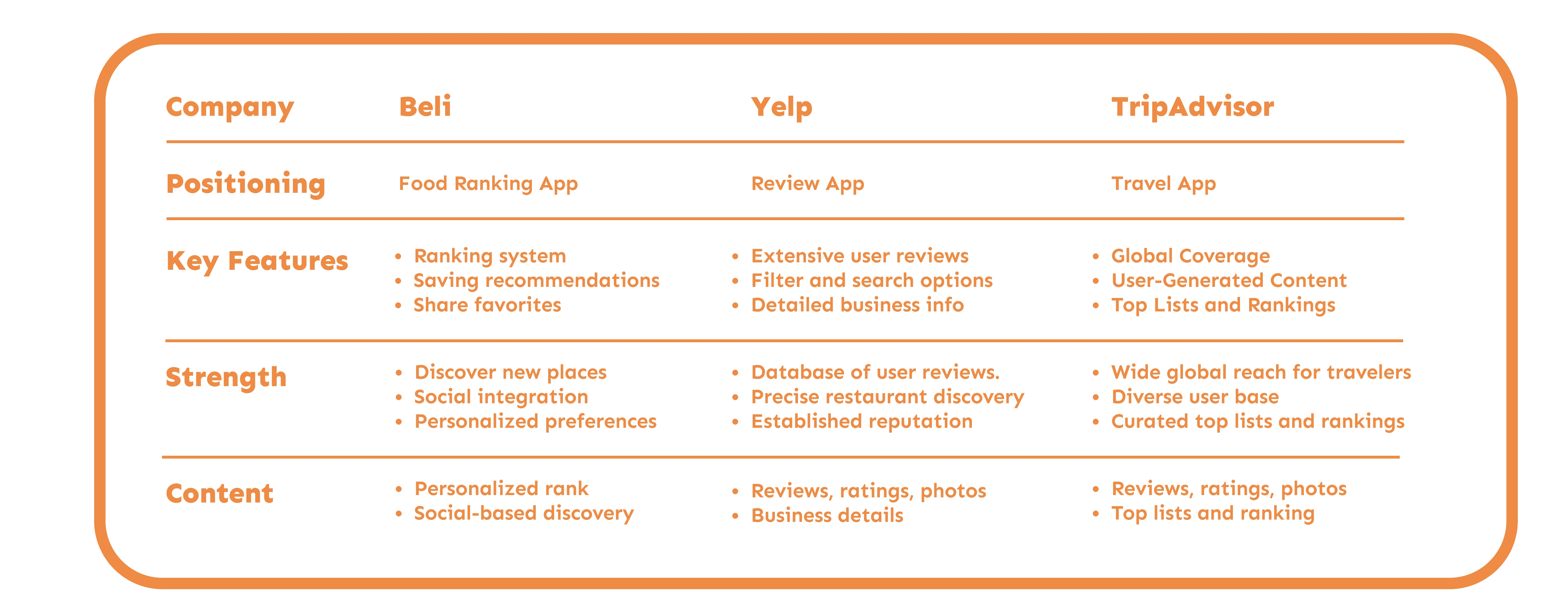
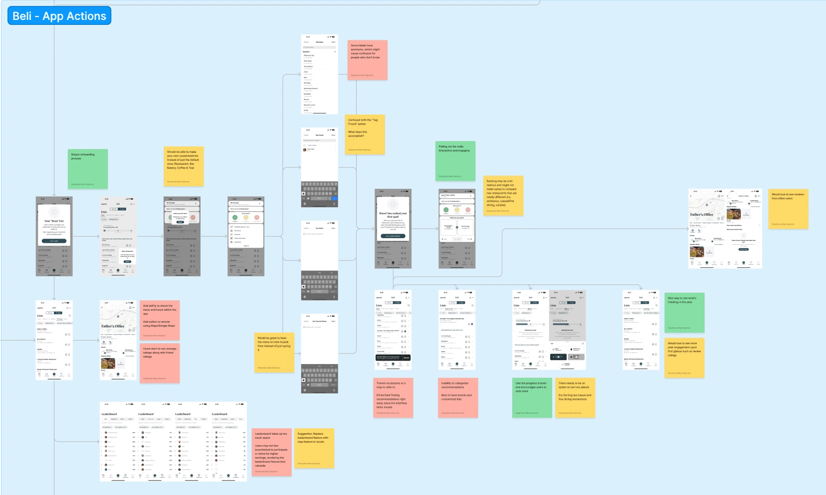
Wireframe Competitor Analysis - Identifying Strengths and Weaknesses of Each App
User Pain Points
Interviews
User Clarity and Consistency: Users value clarity and consistency throughout the app. Displaying distances in "mi" (miles) instead of "m" (meters) and ensuring points visibility while scrolling demonstrate the importance of providing clear and consistent information to users.
Streamlined Navigation: A more streamlined navigation experience is crucial for a positive user journey. Improving the navigation during polls with clear indications for proceeding to the next question and rectifying the confusing "X" button prompt after completing a poll can enhance the overall usability of the app.
Visual Enhancements and Communication: Visual elements play a significant role in communication and engagement. Increasing the visibility of banners, reevaluating emoji usage for better understanding, and ensuring logos are displayed correctly contribute to a more visually appealing and user-friendly interface.
User Journey Mapping
Stakeholder Insights
We relied heavily on insights from key stakeholders, including chief officers and product managers. These stakeholders have extensive interaction and experience with our user base, providing invaluable insights about their behaviors, needs, and pain points.
We conducted a series of meetings and workshops with these stakeholders, where we gathered qualitative data about our users. From these sessions, we were able to infer two primary user types:
"Deal Seekers": Users primarily motivated by finding discounts at local eateries.
"Food Explorers": Users interested in discovering unique dining experiences around Los Angeles.
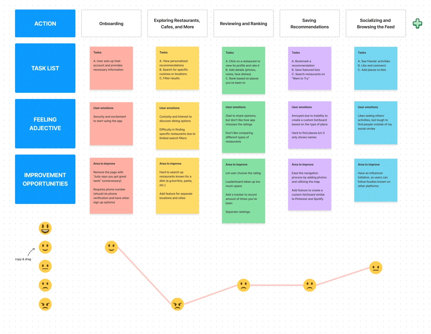
To gain deeper insights into users' interactions with food discovery apps, I created user journey maps for Food Explorers. These journey maps helped identify pain points and opportunities for improvement at various touchpoints.
The Goal
Redesign the app's search journey and implement a new feature to optimize food exploration while nurturing lasting relationships between users and partnering restaurants.
SeekEats aspired to elevate user engagement by creating an interactive and enjoyable food discovery process that encouraged users to explore local eateries regularly. The objective was to increase the time users spent on the app and foster a sense of excitement when searching for dining options.
SeekEats recognized the importance of nurturing lasting relationships between users and partner restaurants. While exclusive discounts were appealing, the company aimed to go beyond one-time visits and foster brand loyalty between users and local establishments.
Ideation
To tackle the challenge of finding a balance between showcasing SeekEats partners and allowing users to discover non-affiliated locations, I initiated the ideation phase. The primary objective was to reimagine the Explore page, making it more inclusive and user-friendly while still emphasizing SeekEats' valued partner restaurants.
Introducing the "Experience Profile"
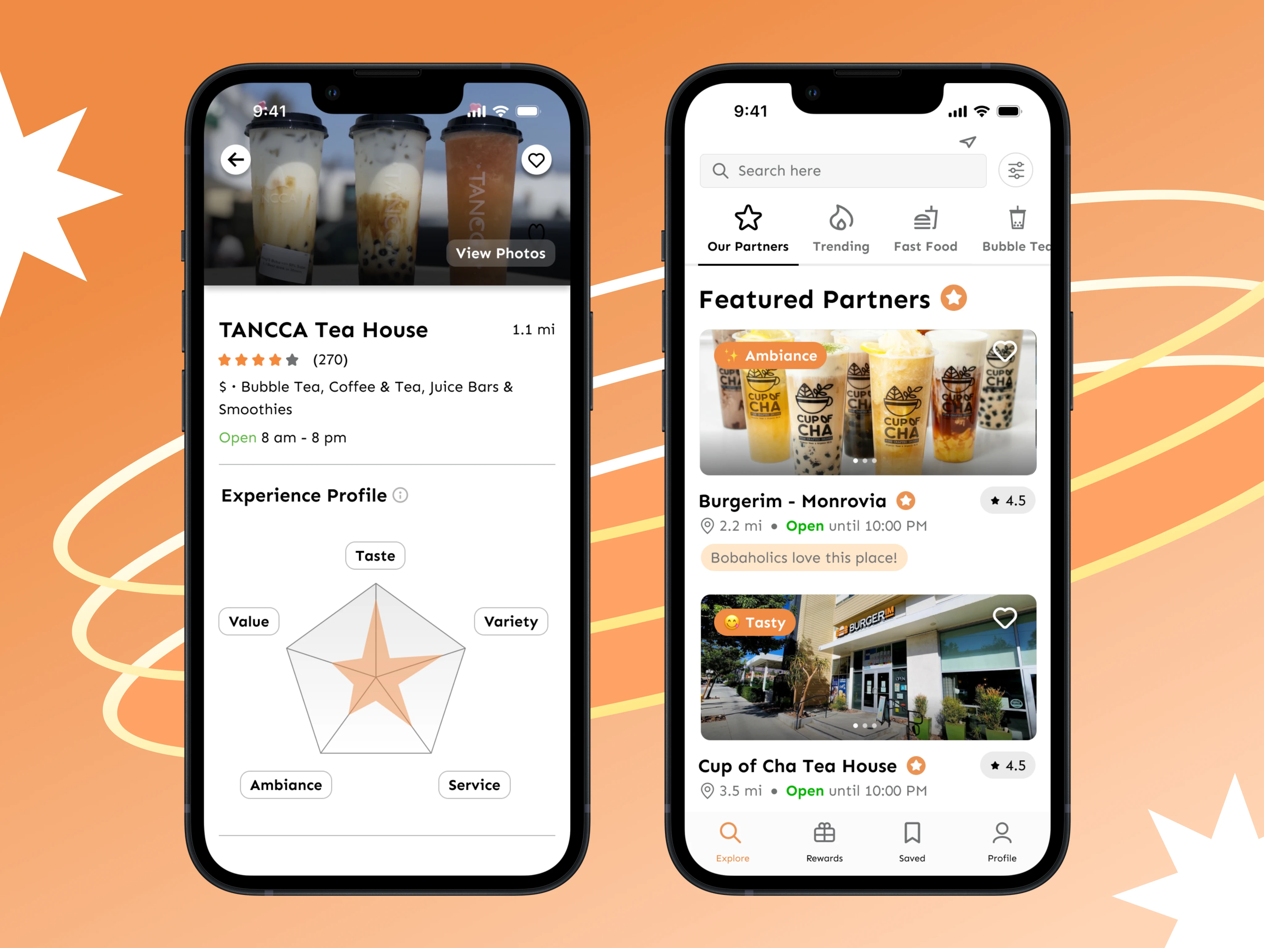
Based on brainstorming sessions with stakeholders, we devised an innovative and interactive way to engage users through an "Experience Profile." This feature aims to showcase five key attributes that contribute to a great dining experience: service, taste, ambiance, value, and variety. Users can rate and provide feedback on each factor after visiting a restaurant, creating a comprehensive overview of each dining spot's strengths. Through the attribute system, SeekEats strives to enrich the user experience by promoting transparency, personalization, and community engagement.
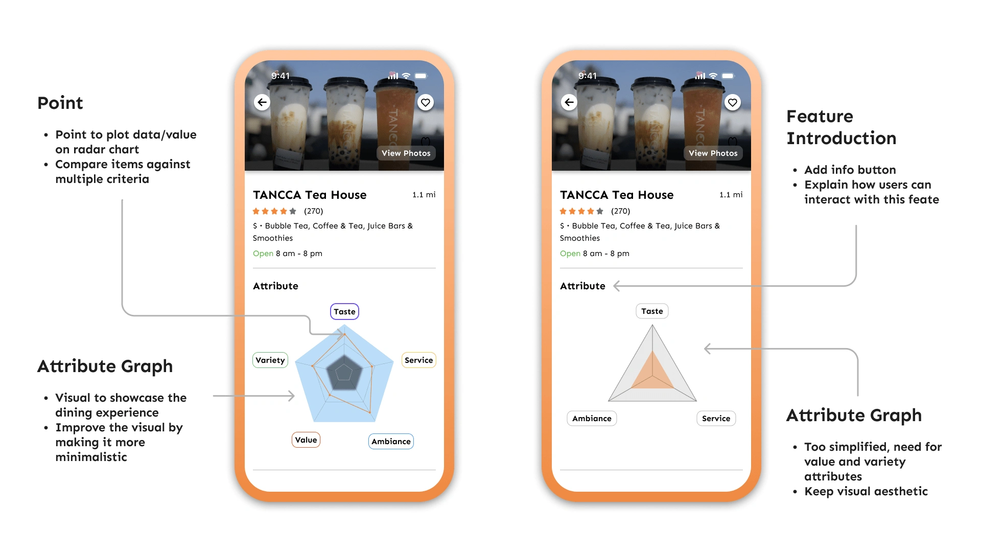
Iterations of the feature
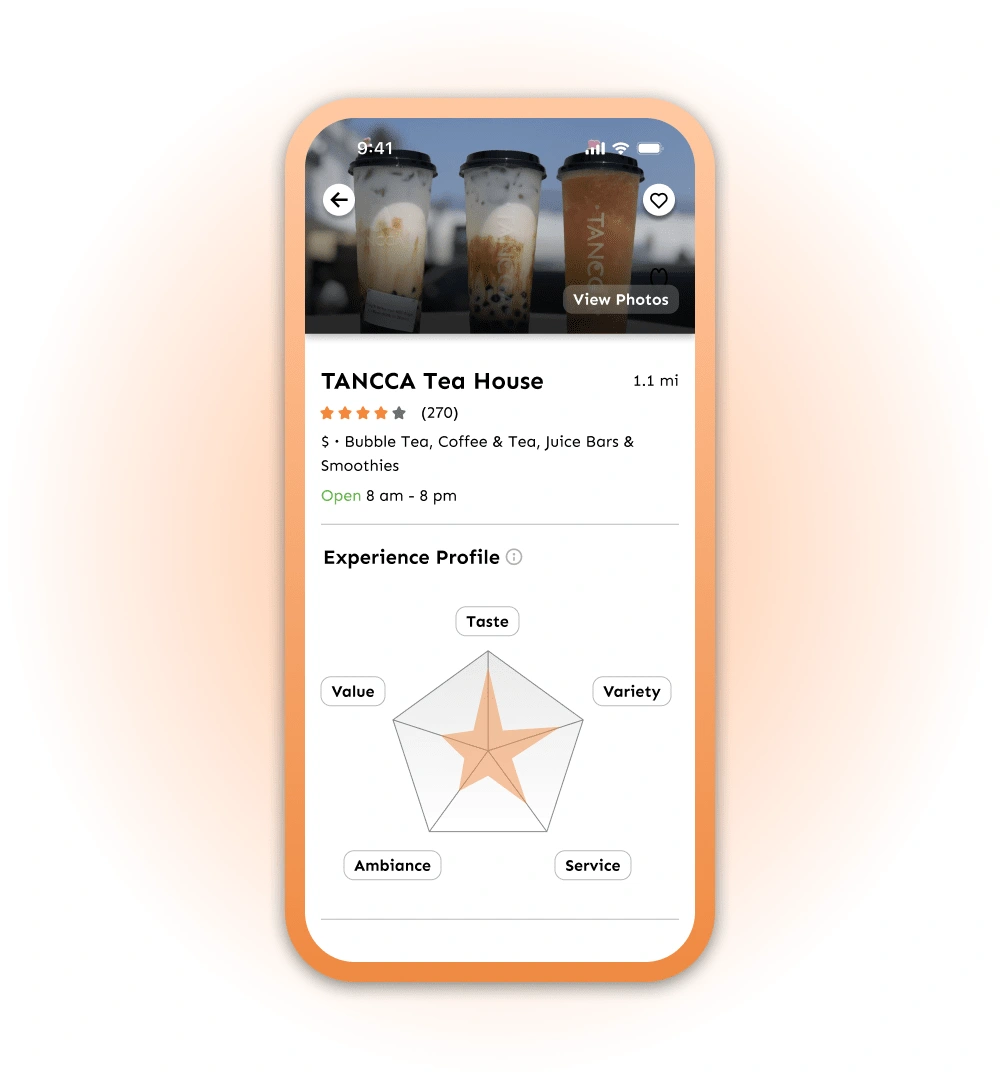
Redesigning the Explore Page
To further enhance the user experience, we decided to make additional improvements to the Explore page. The following enhancements were made:
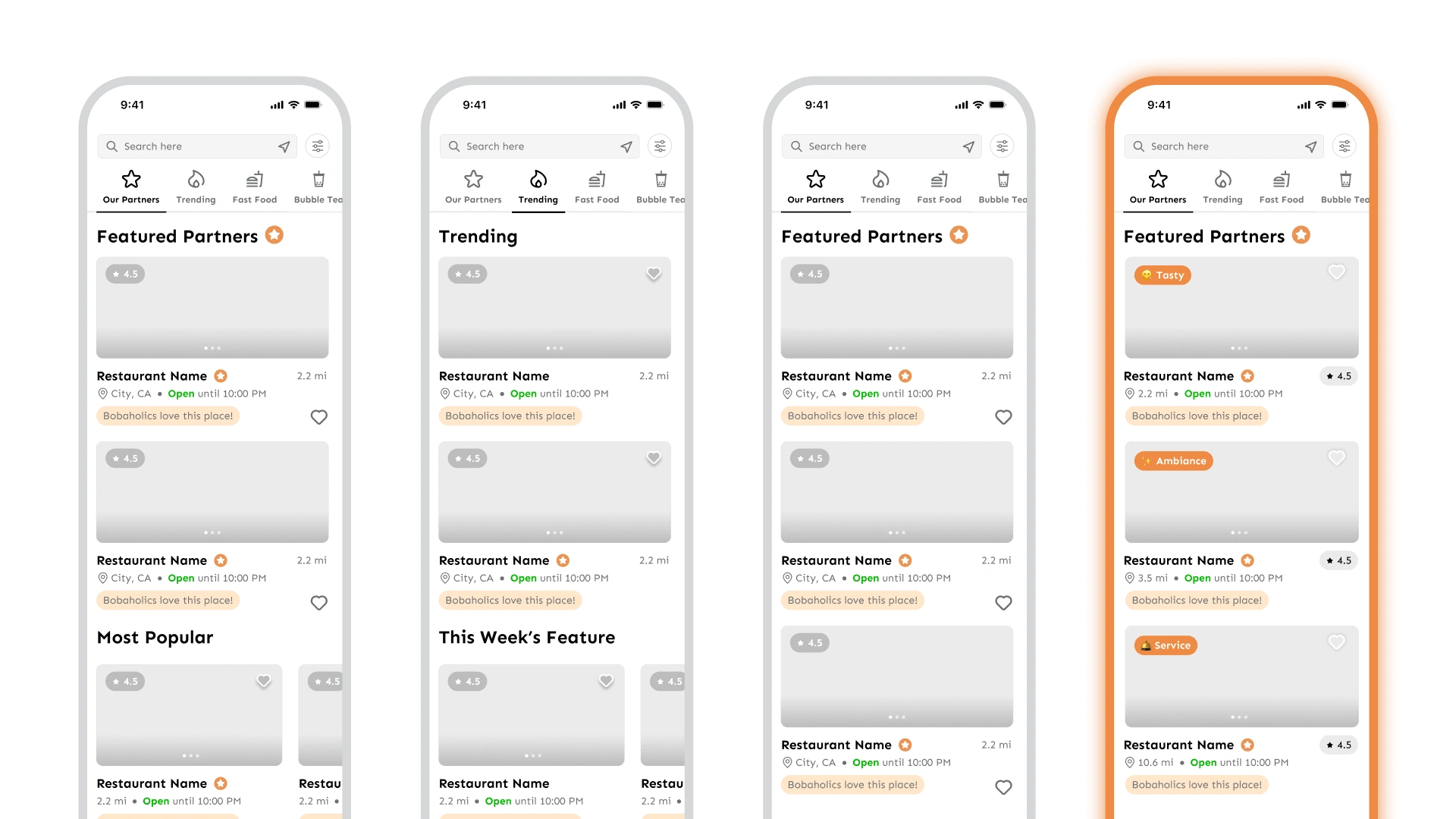
Different iterations of the Explore page
Showcasing SeekEats' Partners
Personalization: We aimed to reduce the time spent searching for popular and nearby dining options, recognizing the significance of tailoring the platform to individual preferences.
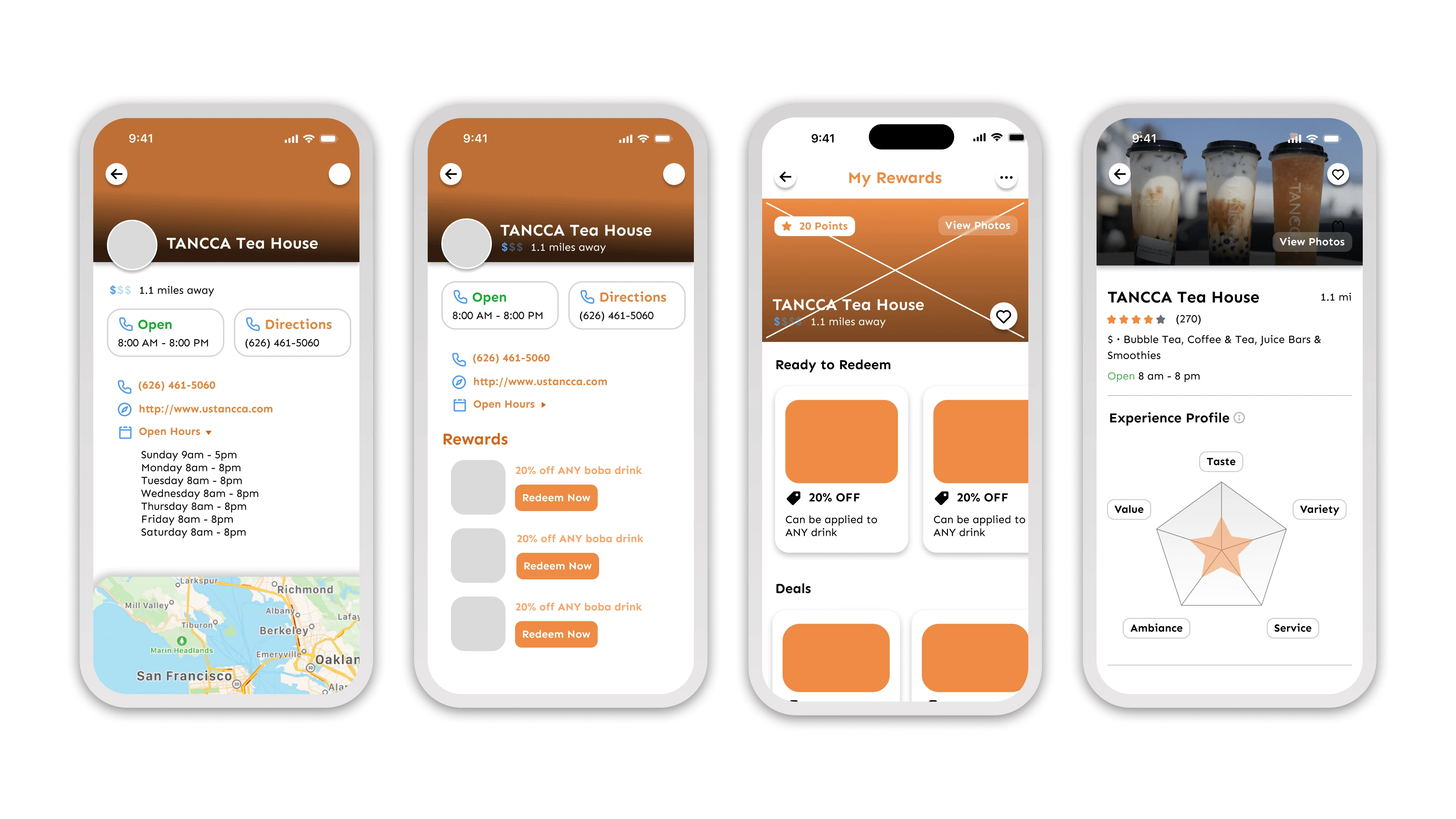
Improved Location Pages
Results and Impact
The introduction of the "Experience Profile" and the enhancements made to the Explore page resulted in significant improvements to SeekEats' user experience:
Increased Partner Visibility: The addition of the partner category and icon highlighted small businesses collaborating with SeekEats, leading to higher user interest in supporting these establishments.
Enhanced Engagement: The revamped location pages provided users with a more immersive and informative experience, leading to increased time spent on the app and improved user engagement.
Strengthened User-Partner Connection: By showcasing partner businesses more prominently, SeekEats facilitated a stronger connection between users and local establishments, fostering a sense of community.
Positive User Feedback: Users appreciated the clear distinction of partner businesses and found the new location pages more helpful in making dining decisions, resulting in positive feedback and app reviews.
Reflection
One of the most significant takeaways from my first UX project was the importance of empathizing with users. Through user interviews and feedback, I learned to view the platform from their perspective, guiding my design decisions, ensuring that each feature and interaction catered to the genuine needs of our target audience.
In retrospect, I believe that involving users in the design process more extensively from the early stages could have yielded even richer insights and opportunities for innovation. Additionally, a more detailed usability testing plan could have further validated design choices and identified potential usability issues.
As a first-time UX designer, I recognize that there is still much to learn and explore in this dynamic field. I am grateful for the guidance and mentorship provided by my team, which fostered an environment of learning and growth.
Like this project
Posted Aug 2, 2023
Redesigning the search journey to optimize food exploration
Likes
0
Views
52

