Samahang Pilipino Cultural Night: Elevating Visual Branding
About 🔍
Every year at UCLA, Royce Hall's world-class stage hosts the Samahang Pilipino Cultural Night (SPCN) theatrical production, which is organized by a committee of student leaders. Every year, our production assembles a cast of over 300 people to take part in modern dances, traditional dances from the Philippines, the writing of an original story, and the production of an original soundtrack.
With a focus on preserving and passing down Pilipino traditions, SPCN provides a platform for Pilipino students at UCLA to express their cultural pride, creativity, and talents while fostering a sense of community and connection to their heritage.
The cultural night serves as a space for intergenerational storytelling, celebrating the Pilipino identity, and addressing contemporary issues that impact the Pilipino community. Through vibrant performances, SPCN aims to educate, inspire, and engage both the Pilipino community and a broader audience, fostering cultural understanding and appreciation.
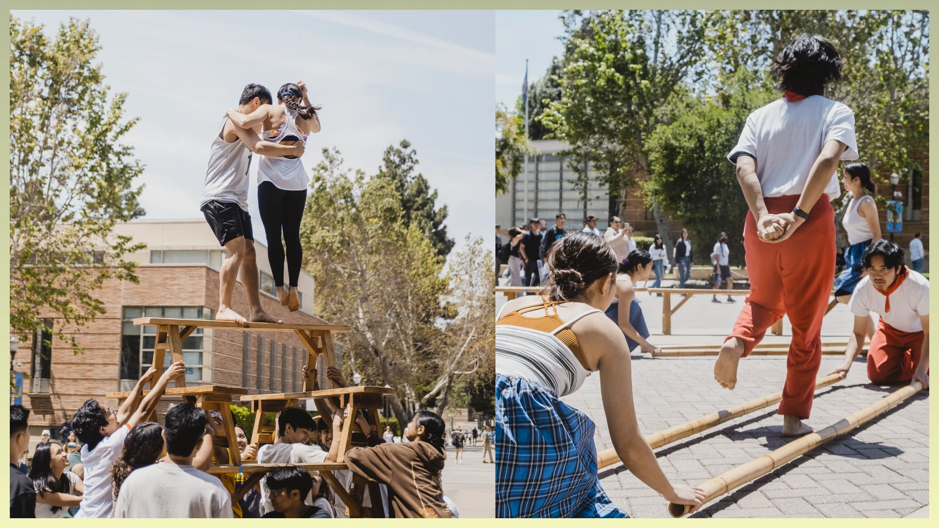
Philippine dances: Sayaw sa Bangko (Left) and Tinikling (Right)
The Role ✨
As the Aesthetics Coordinator for the Samahang Pilipino Cultural Night (SPCN), my role was instrumental in transforming the visual branding and engagement of the event. I took on the responsibility of creating a cohesive and visually appealing experience that captured the essence of Pilipino culture while resonating with a broader audience.
Why did I take on the role?
Preserving and celebrating Pilipino culture is of great personal significance to me. SPCN provided an opportunity to showcase the richness of our heritage, educate others, and foster cultural pride within the Pilipino community. Furthermore, visuals have the ability to transcend language barriers. By creating a visually captivating and authentic experience, we aimed to bridge the gap between generations, ensuring that our traditions and stories continue to resonate and inspire.
What have I worked on?
I developed a comprehensive branding guide that outlined color schemes, typography choices, and graphic elements. By creating a guide and designs along with my co-coordinator that integrated cultural symbols, I successfully captured the essence of SPCN and set the foundation for the event's visual branding.
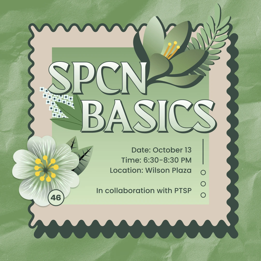
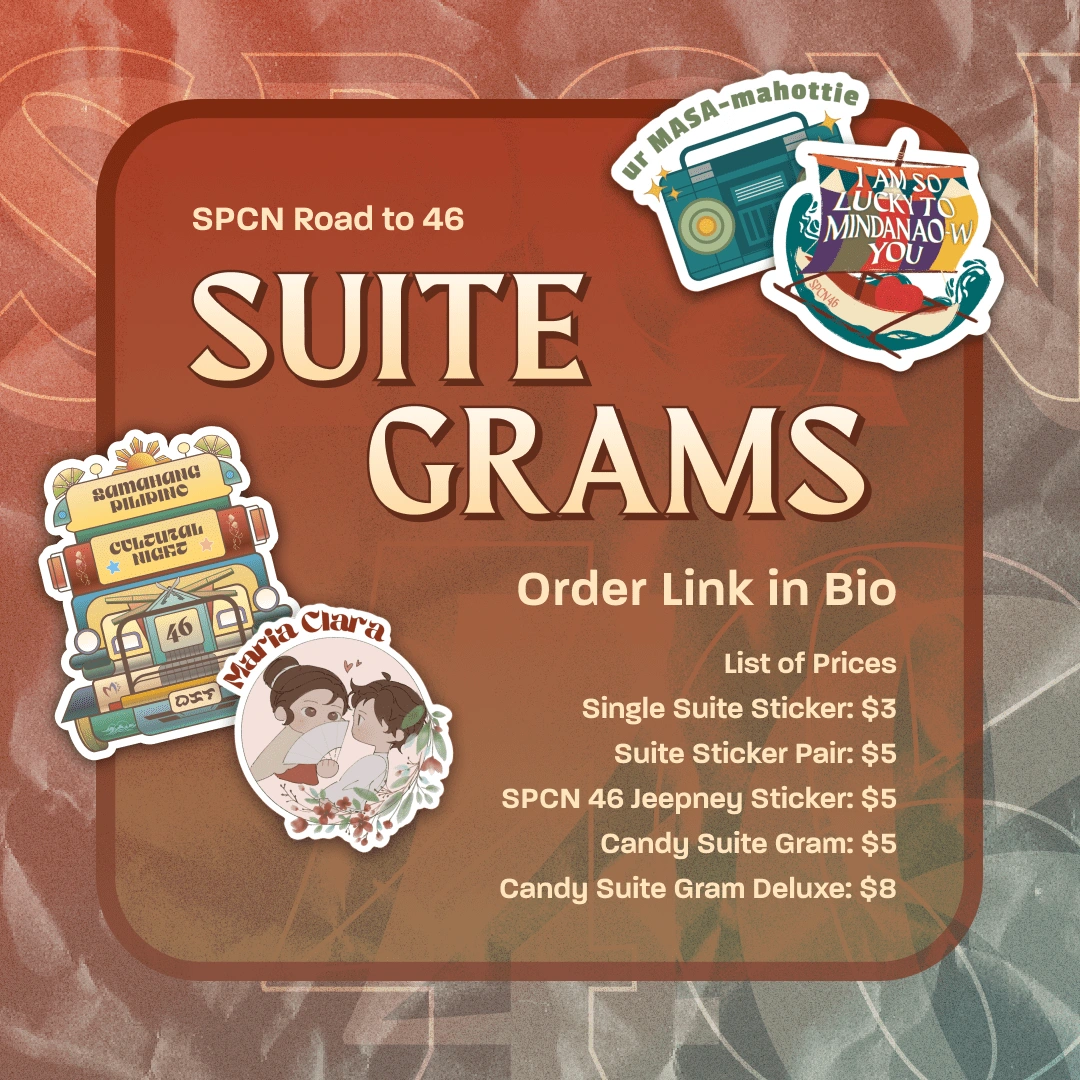
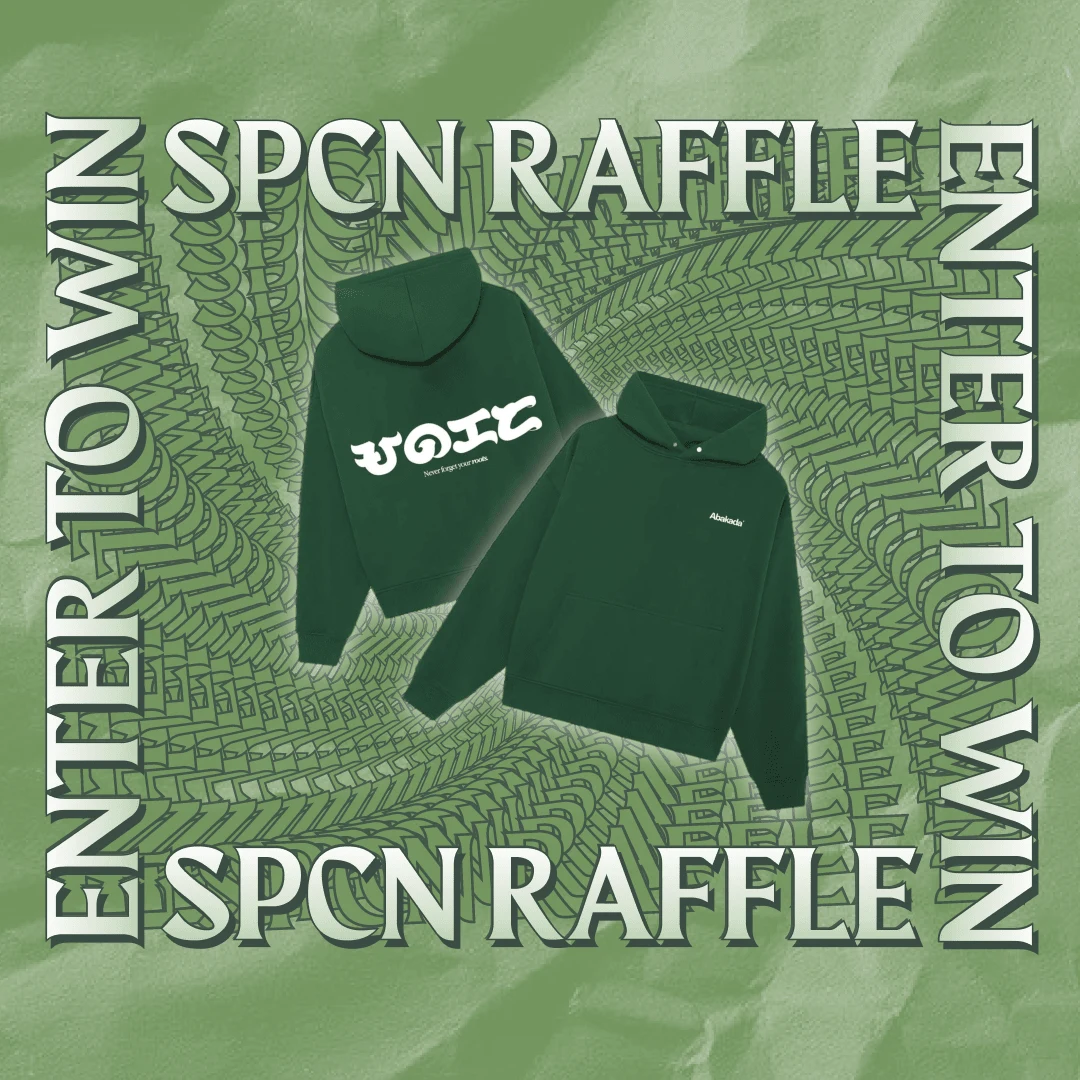
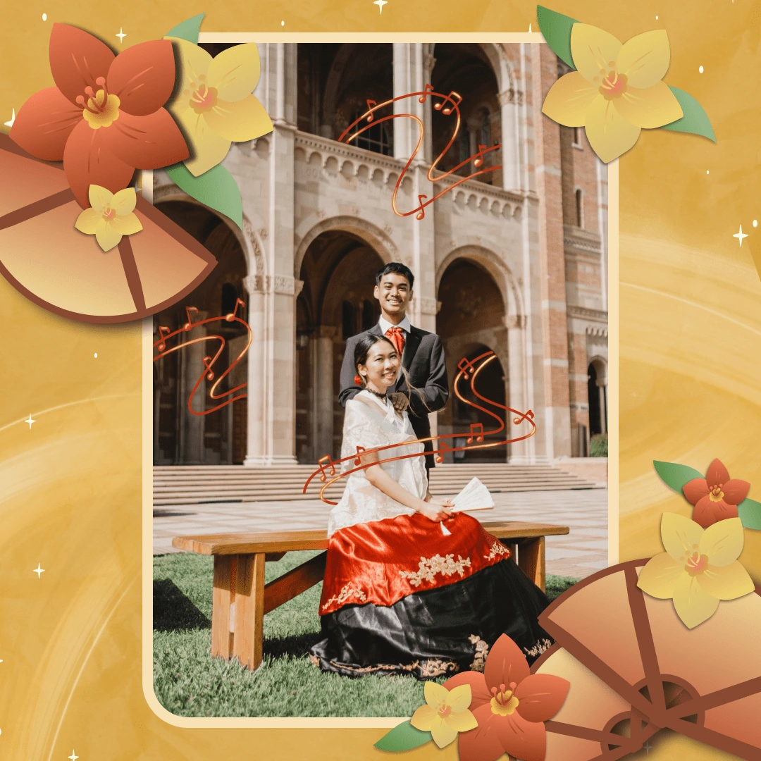
I leveraged social media, particularly Instagram, to showcase SPCN's artwork and designs to a wider audience. Through strategic curation of visual graphics and engaging designs, I successfully increased the following and engagement on the SPCN Instagram page by over 150%. This allowed us to connect with a broader audience and generate excitement for the event.
As the lead designer for the program booklet, I collaborated closely with the organizing committee to ensure it seamlessly incorporated the established branding elements and cultural authenticity. By creating visually appealing layouts, captivating graphics, and infusing cultural elements, the program booklet became a visually enticing memento for attendees, enhancing their overall experience.
Additionally, I played a pivotal role in mentoring and leading the Public Relations and Aesthetics subcommittee. By teaching design principles and fostering a collaborative environment, I motivated subcommittee members to deliver their best work, resulting in a more cohesive and impactful design output.
The Challenge ⚡️
Problem: What were the challenges faced in establishing a consistent visual identity and engaging a wider audience for the Samahang Pilipino Cultural Night (SPCN)?
Lack of a Consistent Visual Identity: At first, SPCN didn't have a clear visual identity, which made it challenging to give the event a consistent brand experience. This made it difficult to effectively convey the cultural theme and connect with the intended audience.
Limited Engagement: The event faced challenges in attracting a broader audience outside of the Samahang Pilipino community, which limited its potential impact and growth for SPCN.
Cultural Relevance: Accurately depicting and celebrating Pilipino culture through visual design elements while appealing to a diverse audience was crucial. Striking the balance between cultural relevance and broad appeal presented a significant challenge, but authenticity remained a top priority.
Branding 🎨
Color Palette
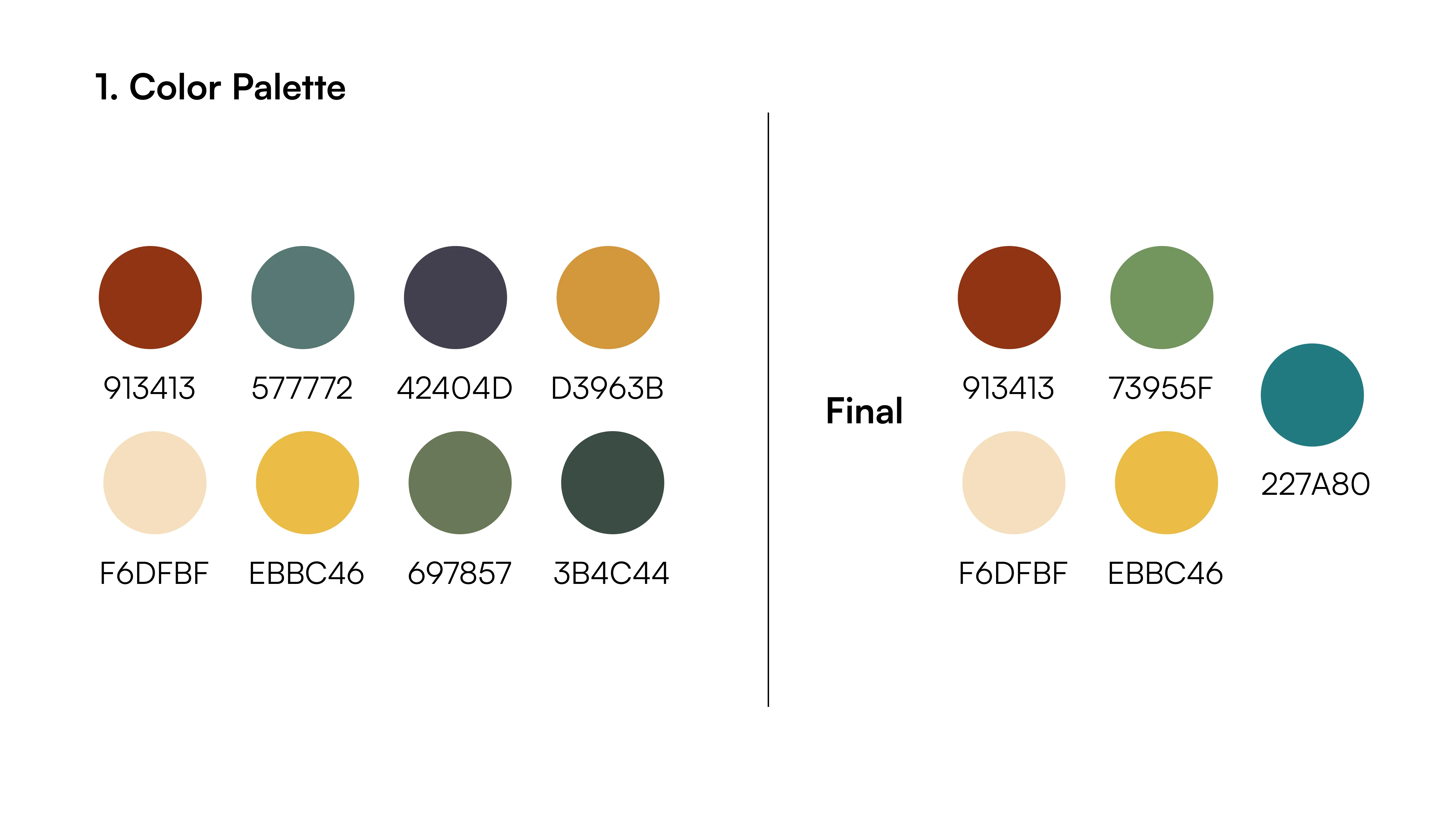
In our visual design for the Samahang Pilipino Cultural Night (SPCN), we curated a muted primary color scheme that effectively captured attention while maintaining a sense of elegance. Here are the hex codes of the colors we utilized and the reasons behind our choices:
#913413 (Red): This deep red hue was chosen to evoke passion, energy, and a sense of cultural vibrancy. It symbolizes the rich heritage and fervor of the Pilipino culture, creating a visual connection to the performances and the emotional impact of SPCN.
#227A80 (Teal): The teal color selection represented a harmonious balance between calmness and vitality. It captured the spirit of the ocean, reflecting the coastal landscapes of the Philippines and the sense of adventure and exploration that SPCN embodies.
#73955F (Olive Green): Olive green was incorporated to signify growth, harmony, and a connection to nature. It paid homage to the lush landscapes of the Philippines and represented the community's shared commitment to nurturing and preserving cultural traditions.
#F6DFBF (Pale Peach): This pale peach shade added a touch of softness and warmth to the color scheme. It symbolized unity, inclusivity, and a sense of belonging, fostering a welcoming atmosphere for all attendees and performers.
#EBBC46 (Golden Yellow): The golden yellow hue represented the vibrant spirit of celebration and joy that permeates SPCN. Also, I drew inspiration from the Pilipino flag. The color reflects the radiance of the Pilipino community and adds a touch of optimism to the visuals.
Typography
My co-coordinator and I carefully selected three fonts to create a cohesive and impactful visual experience. Here's an explanation of why we chose each font and how they contributed to the overall design:
Maragsâ: We chose Maragsâ as a display, semi-serif typeface because of its unique form and cultural significance. Inspired by the pakupyâ accent, which is used to guide the correct pronunciation of Pilipino words, Maragsâ's tapered tips and sharp edges reflected the energy and dynamics of spoken words with stress. We aimed to evoke a sense of movement, mirroring the lively nature of SPCN.
Jordan: The stylish and distinct serif font, Jordan, added an element of elegance and luxury to our designs. Its refined letterforms and timeless appeal made it suitable for creating a high-end visual identity for SPCN. We utilized Jordan to convey a sense of prestige and elevate the overall aesthetic, particularly in applications like the program booklet and formal event materials.
Paralucent: As a versatile typeface, Paralucent offered clean, precise, and elegant letterforms that were also highly legible in small sizes. We selected Paralucent for its clarity and directness, making it well-suited for body text and smaller details in our designs. It ensured that the essential information, such as event details or program descriptions, remained easily readable and accessible to the audience.
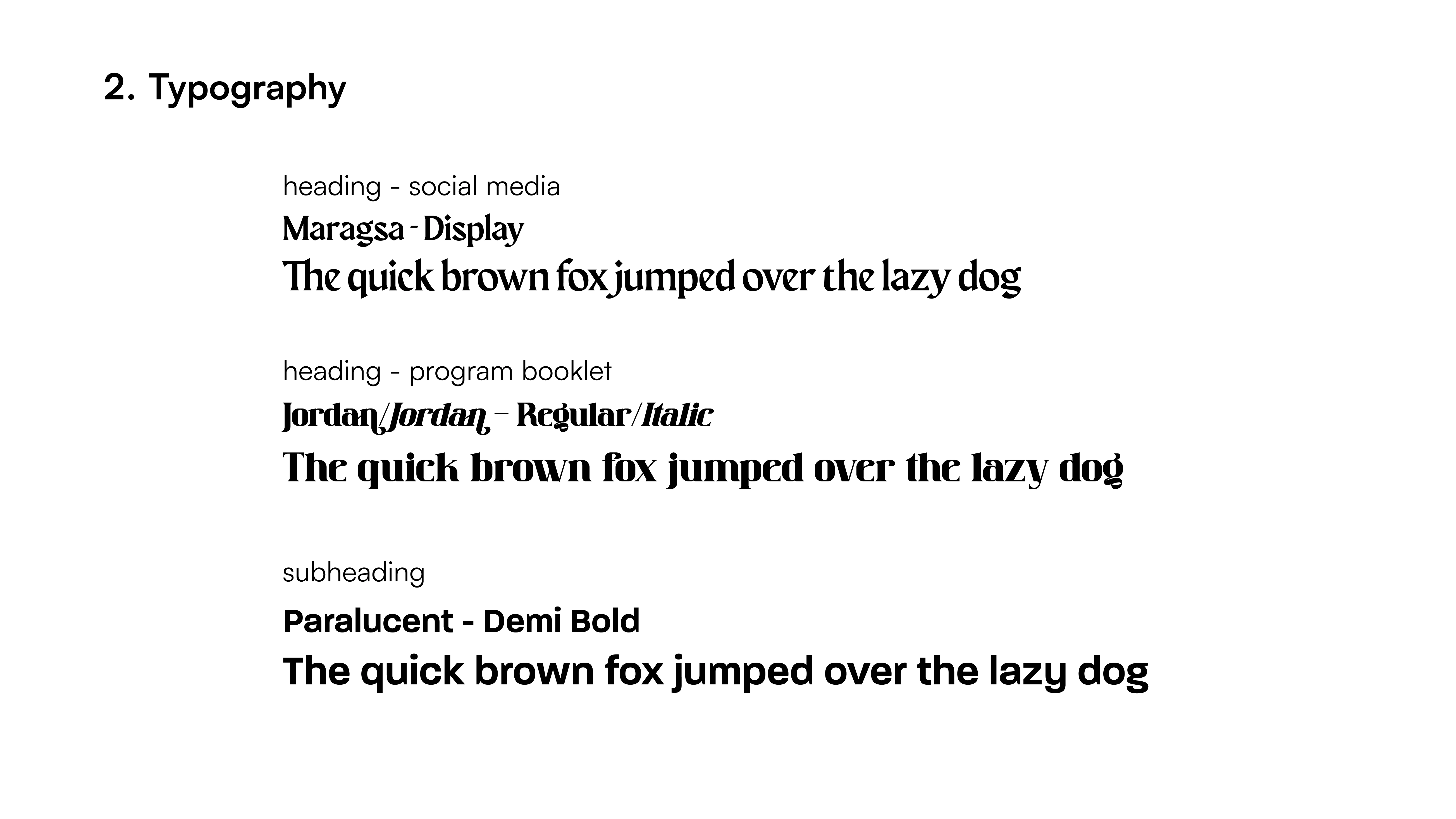
While working on the visual branding for SPCN, we faced the challenge of aligning diverse perspectives within the organizing committee. Each member had their own ideas, preferences, and expectations for the visual direction of SPCN. To address this challenge, we actively sought feedback, incorporating their input and insights into our design iterations.
And so, we crafted a branding guide to capture it. We carefully selected colors, fonts, and visual elements that represented the vibrancy, energy, and cultural pride of the Filipino community. This achievement was a significant high point in our design process as it ensured a cohesive and impactful visual language that resonated with the target audience and showcased the event's uniqueness.
The Process 🌊
Key Design Method
Iterations: During the iterative design process, I presented my initial design concepts to individuals from the Pilipino community, including cast members of SPCN. Through multiple iterations, my co-Aesthetics coordinator and I paid close attention to the specific aspects of our designs that resonated with the community. We actively listened to their insights and perspectives, and we were able to make informed design choices that aligned with their preferences.
In the first iteration, as shown on the very left, we focused on incorporating visual elements that represented the theme of the production, which heavily involved music and legacy. This allowed us to capture the essence of the show.
Based on the feedback received, we made changes in the second iteration. We adjusted the design to better fit the color schemes and typography choices in order to achieve better visual harmony and legibility. Stakeholder input played a crucial role in guiding these adjustments, ensuring that the visual elements aligned with their preferences and cultural sensibilities. This iterative process allowed us to fine-tune the design elements, resulting in a more consistent visual branding for SPCN.
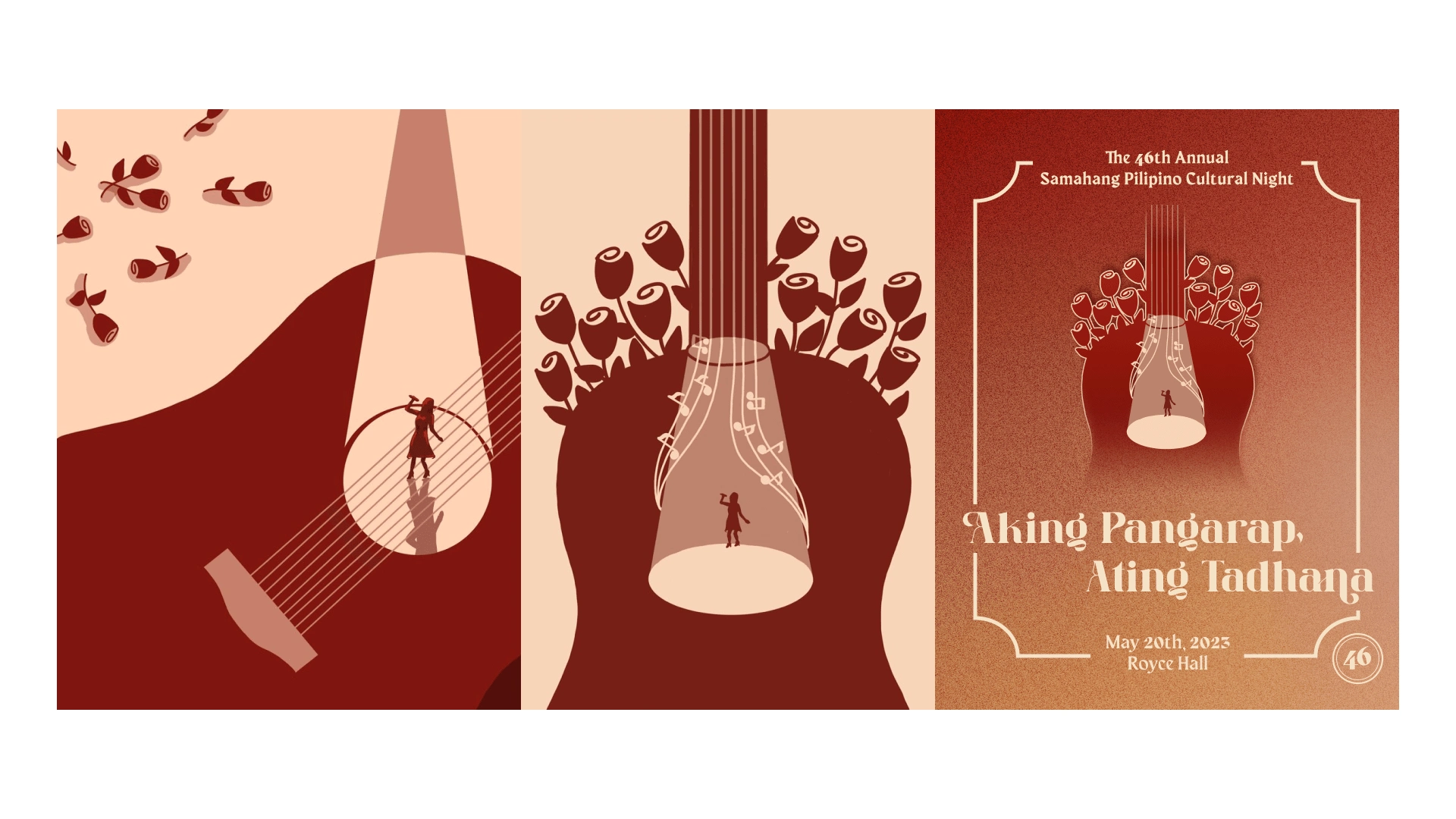
Different iterations of the program cover designed by my co-Aesthetics Coordinator and me
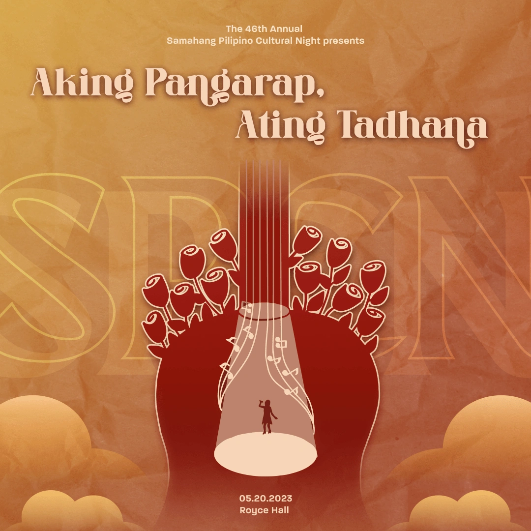
Show Day Announcement
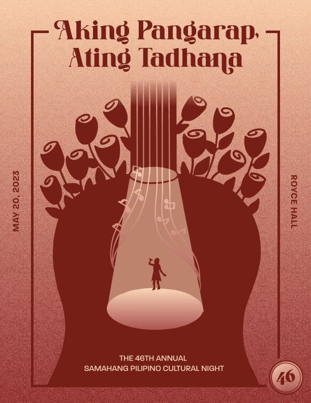
Final Program Cover
Design Tools
Adobe Creative Suite (Illustrator): Adobe Illustrator was instrumental in creating logos and branding materials. We leveraged their extensive features and capabilities to craft designs that showcased the cultural theme.
Figma: Figma played a crucial role in facilitating collaboration within the PR and Aesthetics subcommittee. Its real-time design feedback capabilities allowed us to work seamlessly as a team, providing valuable input and making collective decisions. We fostered a shared understanding of the visual direction and ensured that our designs remained cohesive across different subcommittee members' contributions.

Low-fidelity sketches for our merchandise design

SPCN T-Shirt: Back Design made using Illustrator (Final)
Results 🪴
The results of my efforts as the Aesthetics Coordinator for the Samahang Pilipino Cultural Night (SPCN) were highly rewarding. By implementing a user-centered design approach, leveraging iterative design cycles, and utilizing effective design tools, we were able to create a visually captivating and culturally authentic experience for SPCN. The impact of my design work was evident in several key areas:
Increased Engagement: The visual enhancements led to a significant increase in following and engagement on the SPCN Instagram page. The 150% increase in followers and higher levels of engagement demonstrated the effectiveness of my designs in connecting with a wider audience and generating excitement for the event.
Positive Audience Feedback: The feedback received from SPCN attendees and members of the Pilipino community was overwhelmingly positive. The visual branding resonated with the audience, evoking a sense of cultural pride and connection. Attendees appreciated the visually immersive experience and the program booklet, which deepened their connection to the event.
Collaborative Empowerment: As Aesthetics Coordinator, I had the opportunity to mentor and lead the aesthetics subcommittee. By teaching design principles, fostering a collaborative environment, and utilizing design tools like Figma, I empowered my subcommittee members to design logos and merchandise for our different dance suites. This collaboration resulted in a more cohesive design output.
Lessons Learned and Future Recommendations
Throughout my journey as the Aesthetics Coordinator for SPCN, I gained some valuable insights and experienced personal growth as a designer.
Understanding the preferences and cultural background of the target audience is essential for creating a meaningful and engaging experience. By incorporating user feedback throughout the design process, I ensured that my designs resonated with the desires and expectations of the Pilipino community.
Embracing an iterative design approach allowed me to refine my designs based on feedback and address potential issues. The continuous improvement mindset helped us create designs that were more aligned with SPCN's goals and cultural elements.
Moving forward, we recommend the following for the continuous development and evolution of SPCN's visual identity:
Maintain a collaborative design process: Continue involving members of the Pilipino community, SPCN attendees, and the organizing committee in the design process. Their insights and feedback are invaluable for creating designs that truly resonate with the target audience.
Foster cultural authenticity: Continue integrating cultural elements into the visual branding of SPCN.
Embrace emerging design trends: Stay up to date with industry trends and design techniques to ensure that the visual branding remains appealing.
Social Media Posts and Event Announcements
Like this project
Posted Jun 5, 2023
Samahang Pilipino Cultural Night (SPCN), an annual theatrical production including Philippine dances and the creation of an original soundtrack and script


