Arcanis Brand and Web Design Project

Artur Mikhov


Arcanis is a venture intelligence and investment research platform helping Growth and Late-Stage VC investors make better decisions through AI-powered analytics and structured methodologies.
The project was a complete brand identity and website design from the ground up — creating a visual language that communicates intelligence, transparency, structure, and confidence across both the brand and digital experience.
The identity positions Arcanis at the intersection of finance, technology, AI, and venture capital, transforming complex investment research into something clear, systematic, and verifiable.
Brand strategy. Logo design. Brand identity. Visual identity. Financial branding. FinTech branding. AI branding. Venture capital branding. Technology branding. Web design. UX/UI design. Digital product design. Art direction. Graphic design.
The Tension
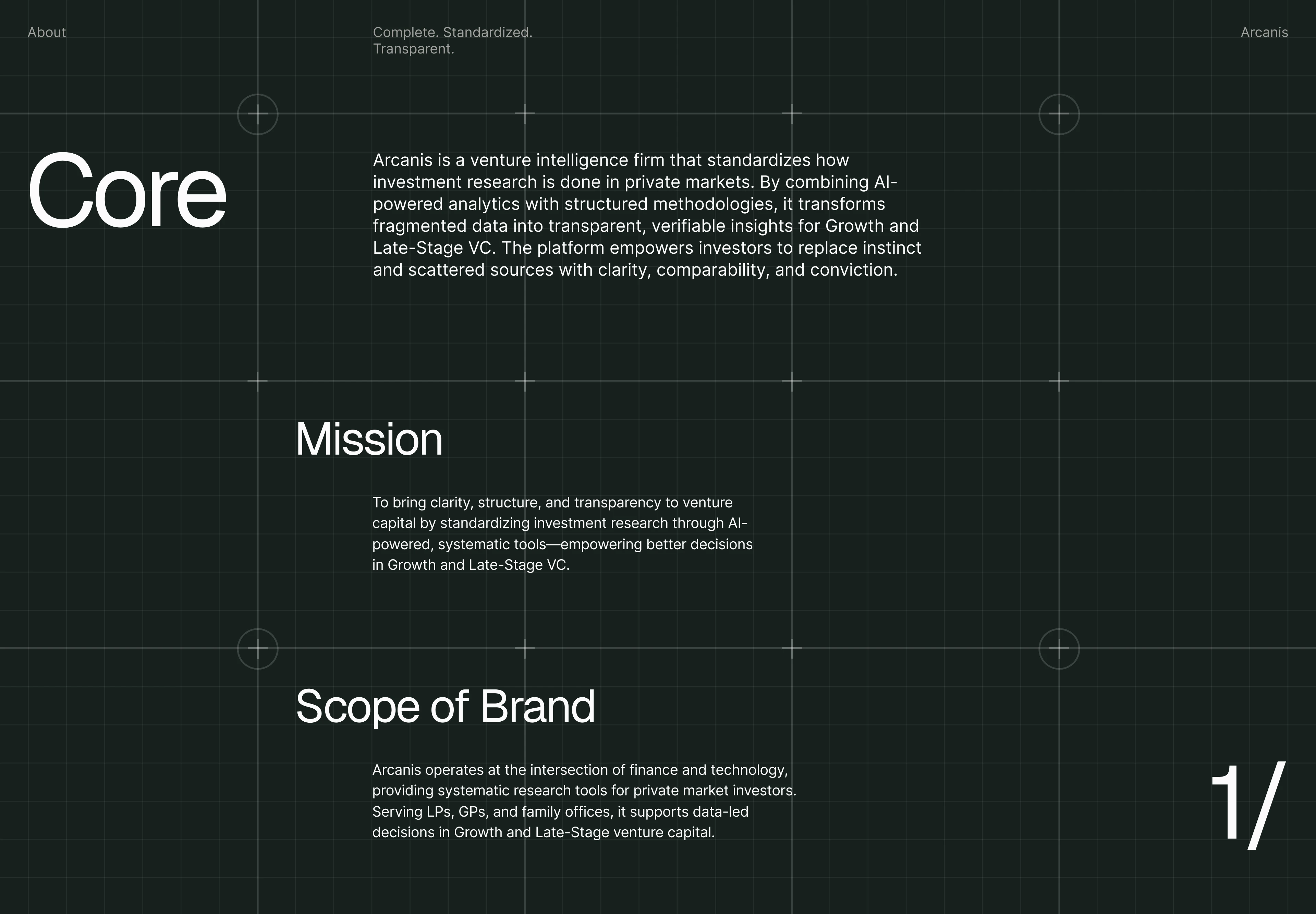
Private market investment research is fragmented.
Investors often have to work across scattered sources, inconsistent information, and complex datasets before they can turn research into a confident decision.
Arcanis was created to change that.
The brand needed to communicate intelligence without complexity, technology without coldness, and financial authority without looking like a traditional investment firm.
The visual identity had to make structure visible.
The website had to make that structure usable.
The Decision
The central idea behind the identity is hidden knowledge becoming visible.
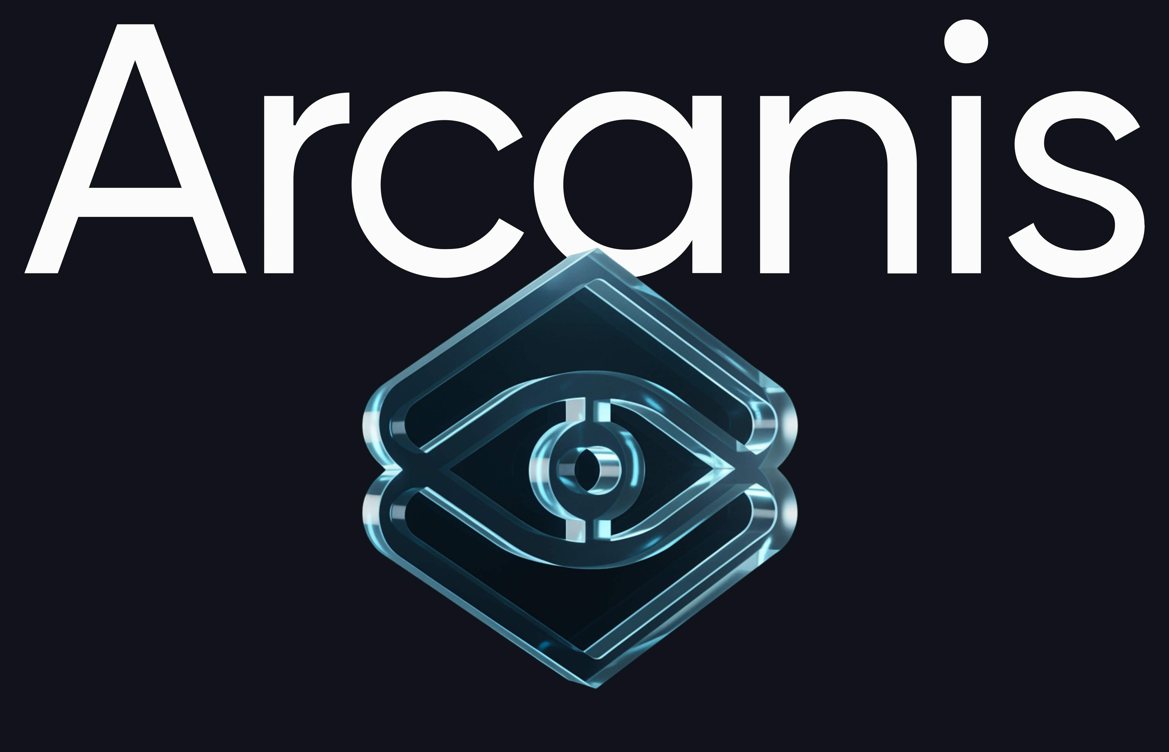
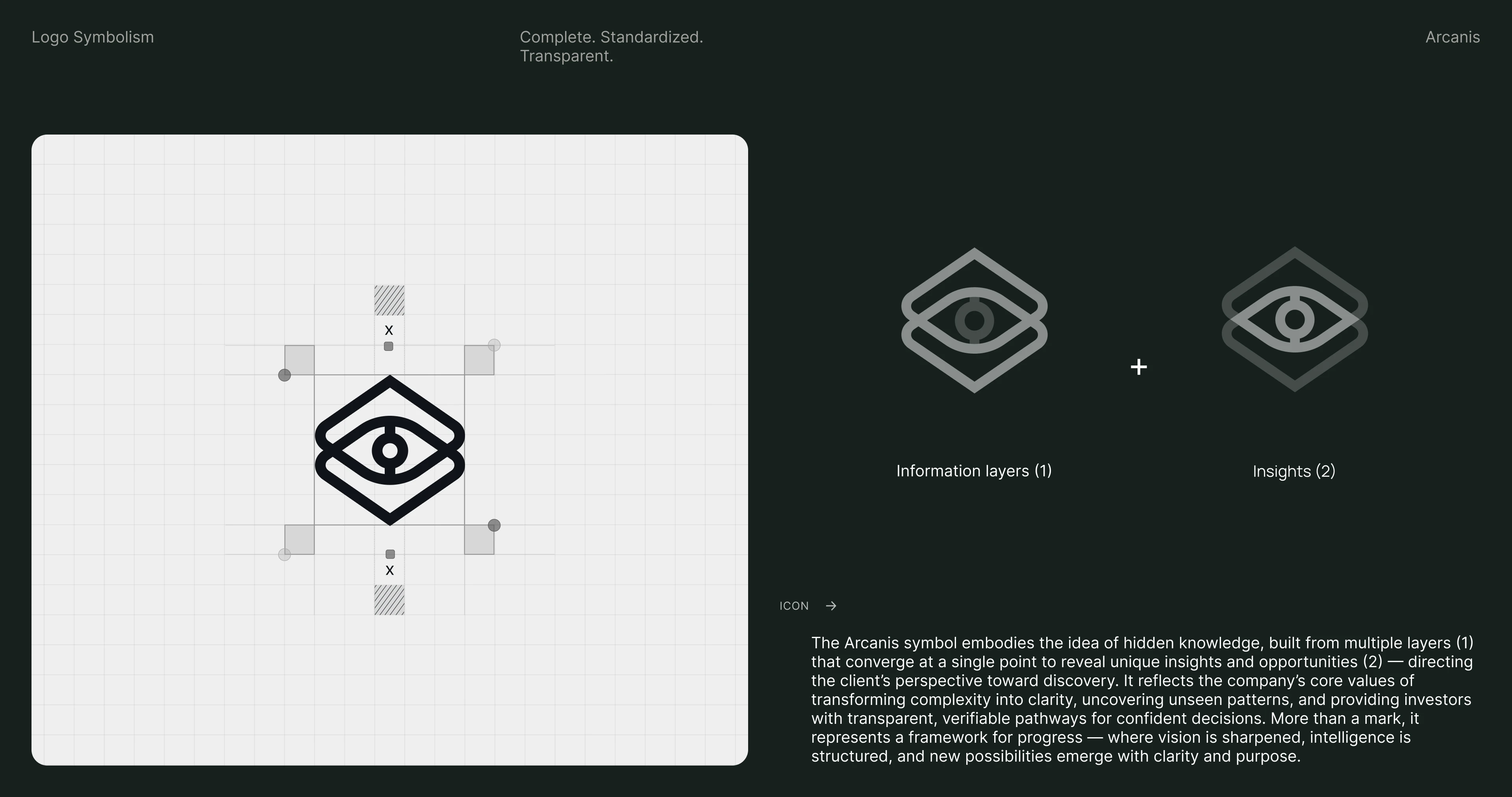
The Arcanis symbol is constructed from multiple layers that converge toward a single point — representing fragmented information being transformed into a clear insight.
The symbol also suggests a directional framework: different inputs moving through a structured system toward a decision.
That became the foundation for the entire brand identity system.
The visual language is precise, architectural, and systematic — reflecting the way Arcanis approaches investment intelligence itself.
The Identity System
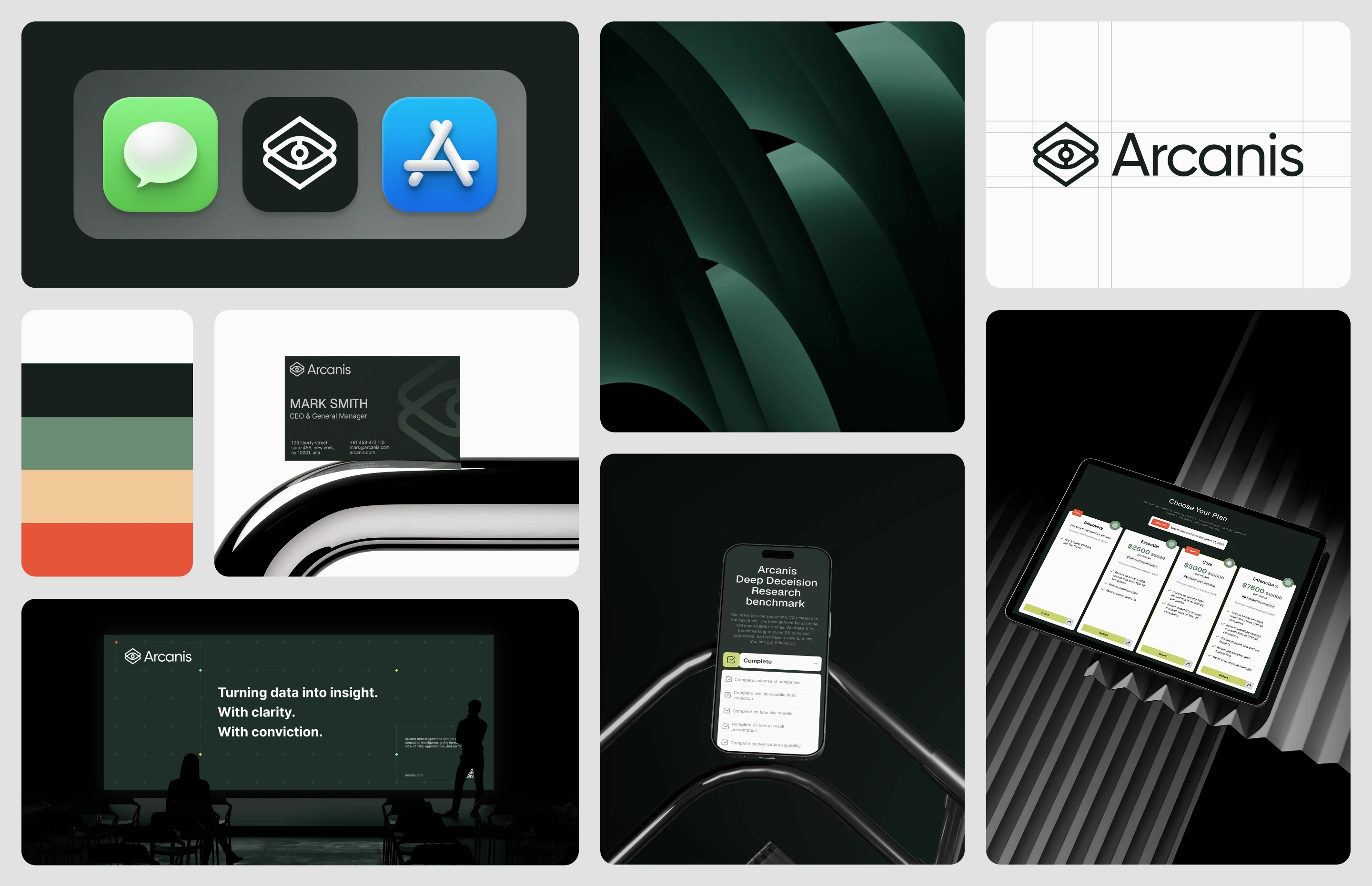
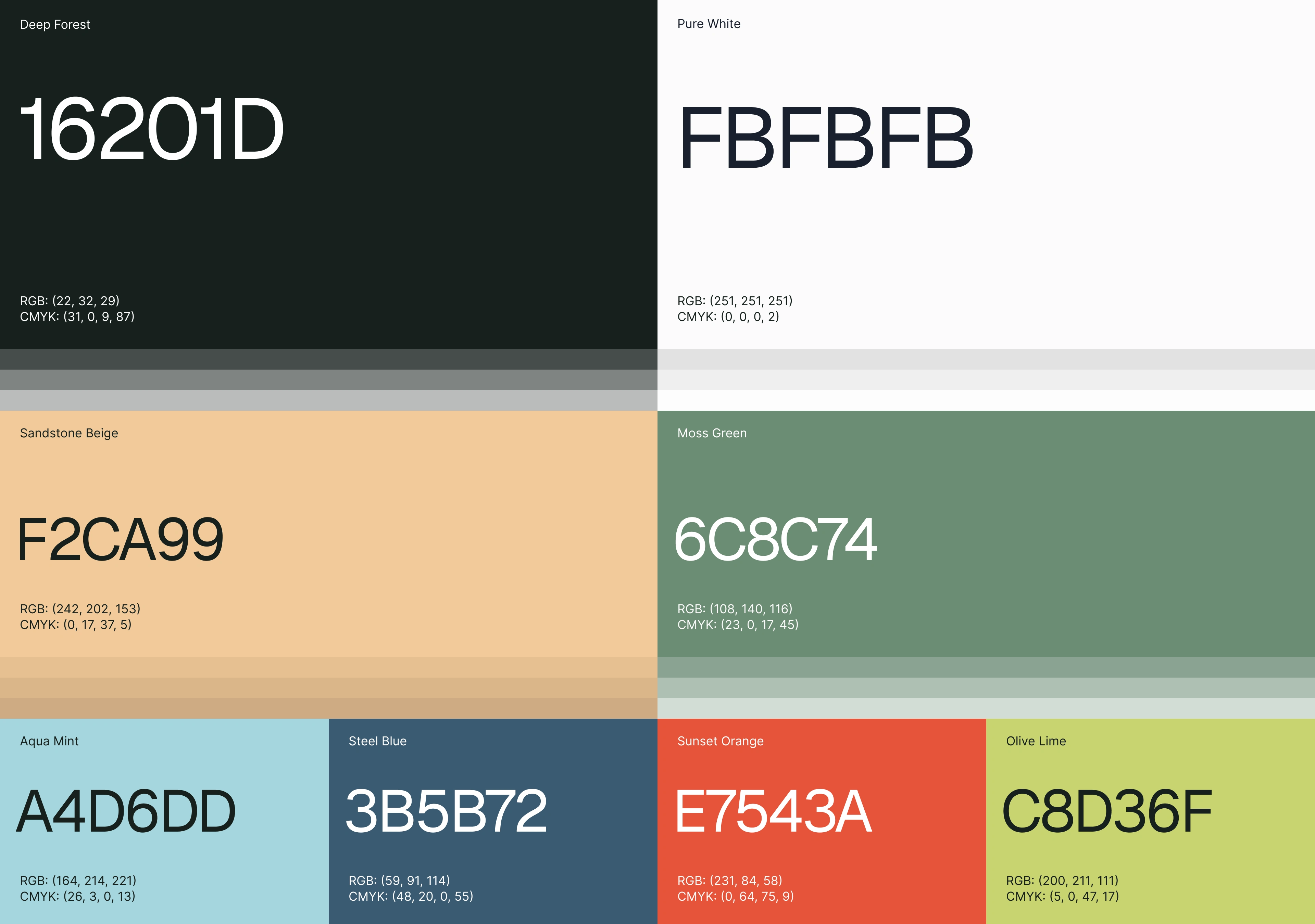
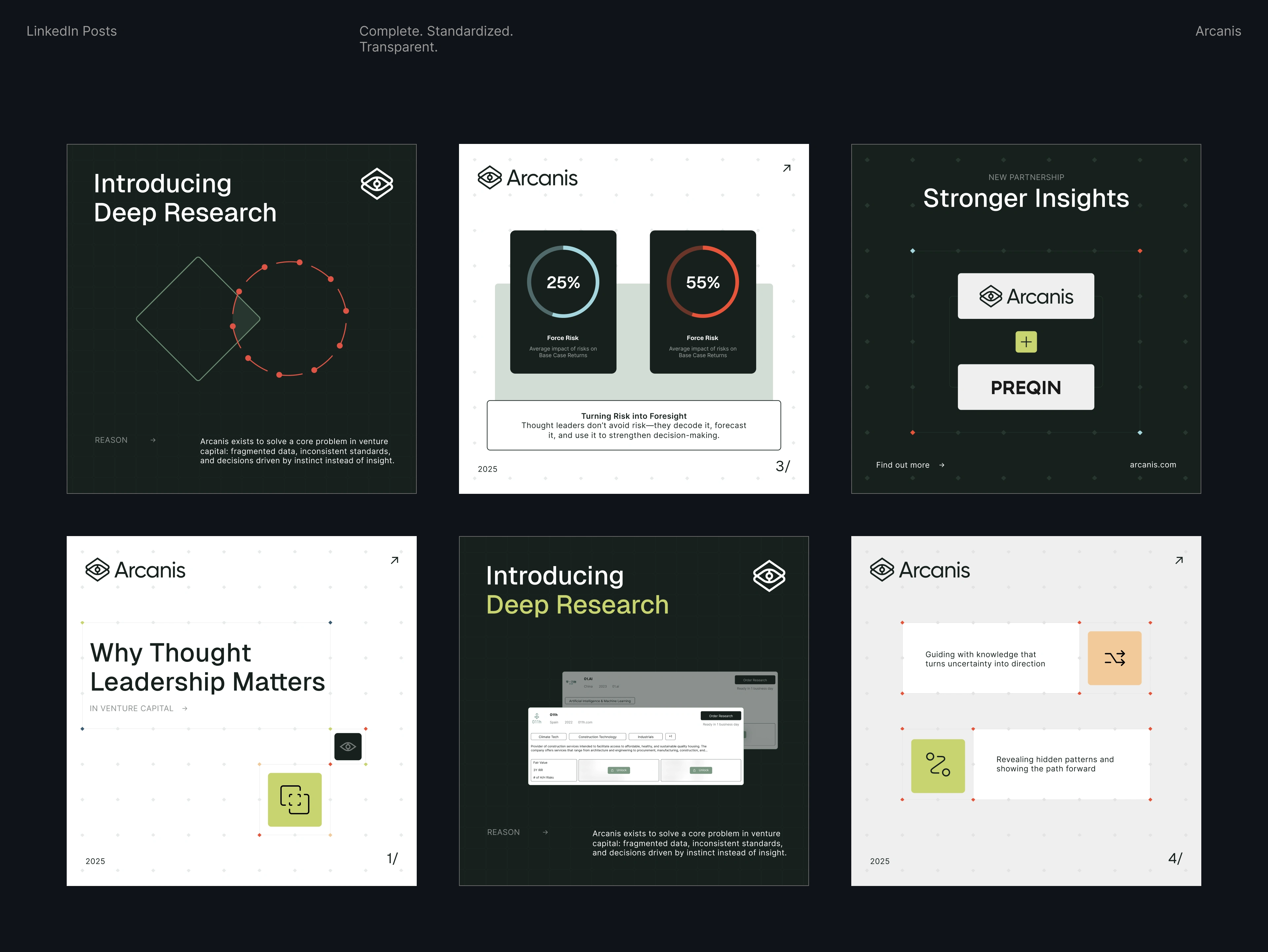
The Arcanis visual identity is built around a dark, sophisticated foundation and a structured grid system.
Fine lines, intersections, coordinates, and geometric layouts reference data architecture, research frameworks, financial analysis, and information systems.
The grid isn't simply a background treatment.
It becomes a visual metaphor for how Arcanis organizes complexity — creating relationships between information, revealing patterns, and bringing fragmented data into a structured framework.
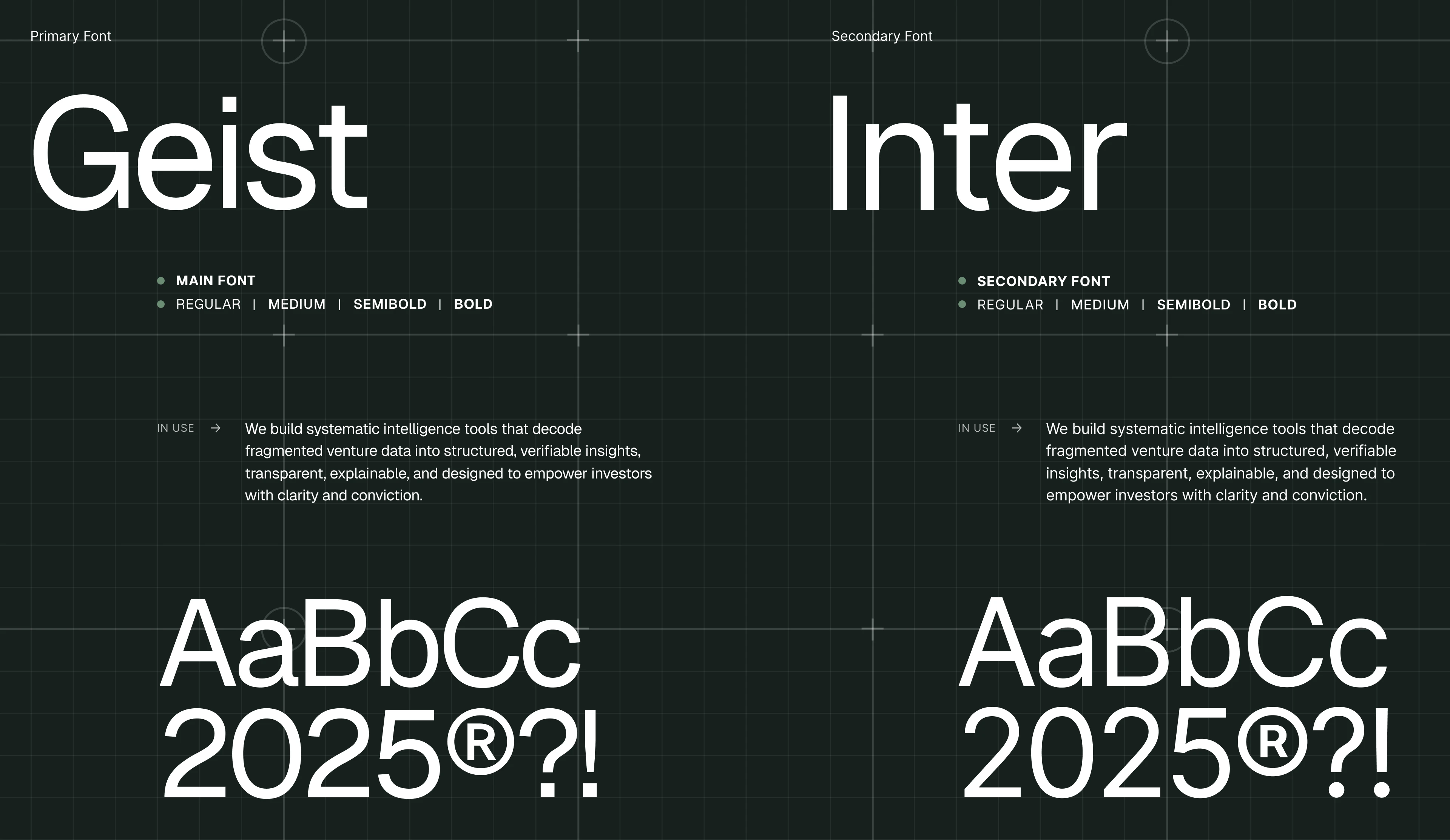
Typography remains clean and highly legible, allowing complex strategic messaging to feel accessible and confident.

The Symbol
The Arcanis logo mark represents the company's core proposition: transforming complexity into clarity.
Multiple layers converge at a point to reveal something that wasn't immediately visible.
That idea connects directly to venture intelligence — finding meaningful patterns within fragmented information and giving investors a clearer path toward a decision.
The symbol functions as more than a logo.
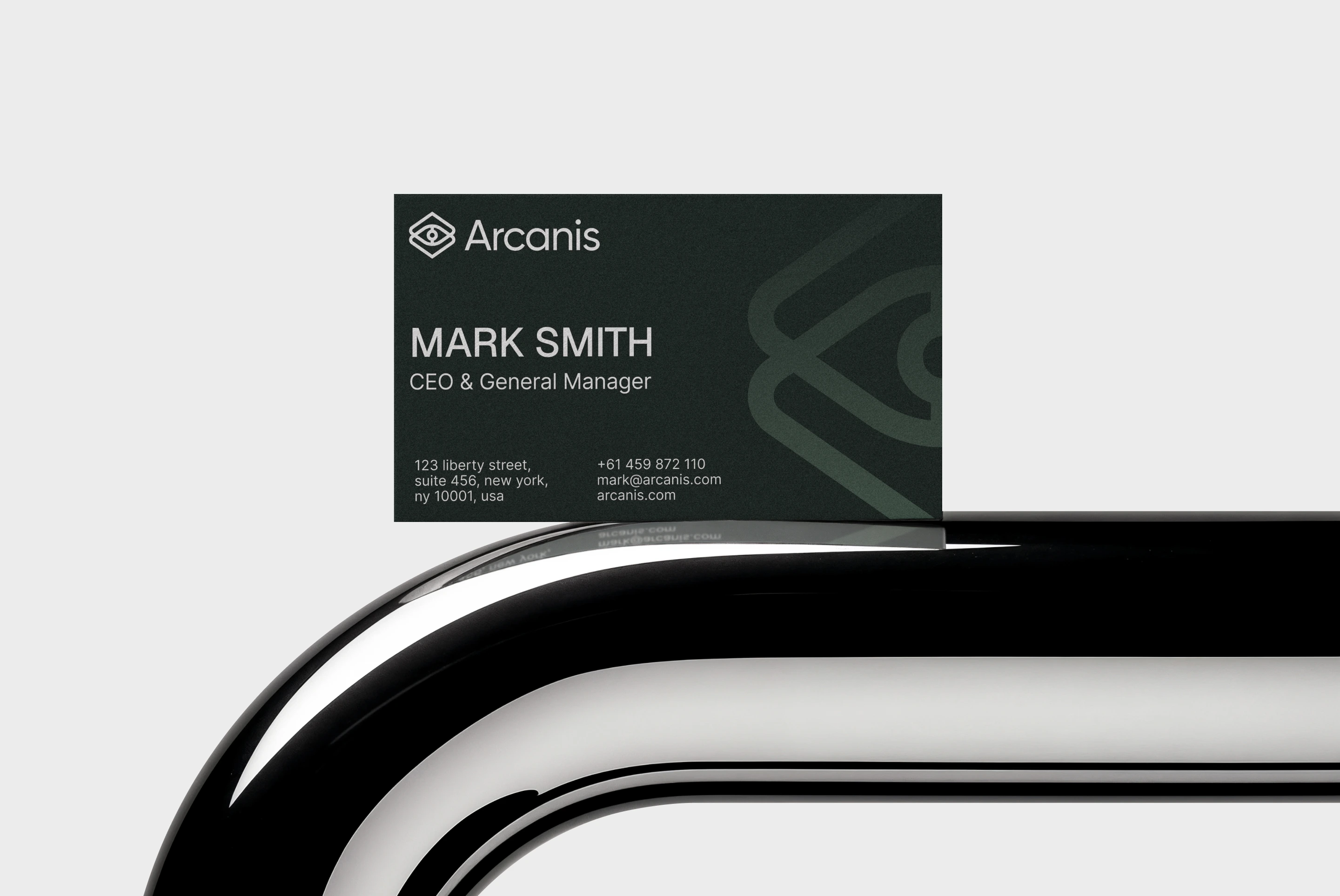
It becomes a visual framework for the brand, extending naturally into layouts, graphic compositions, digital interfaces, and communication materials.
The Digital Experience
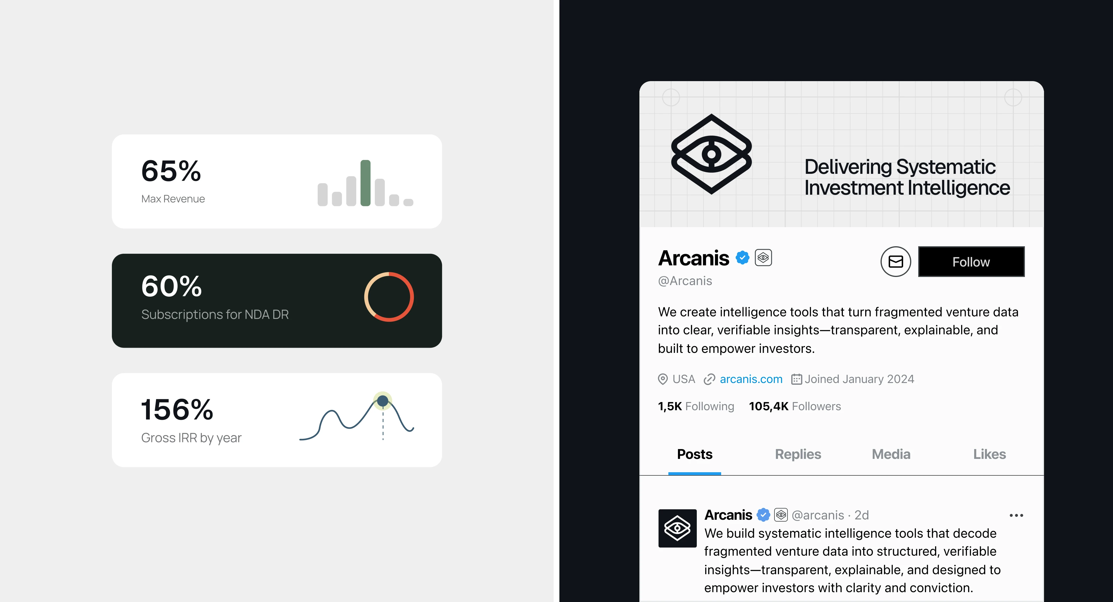
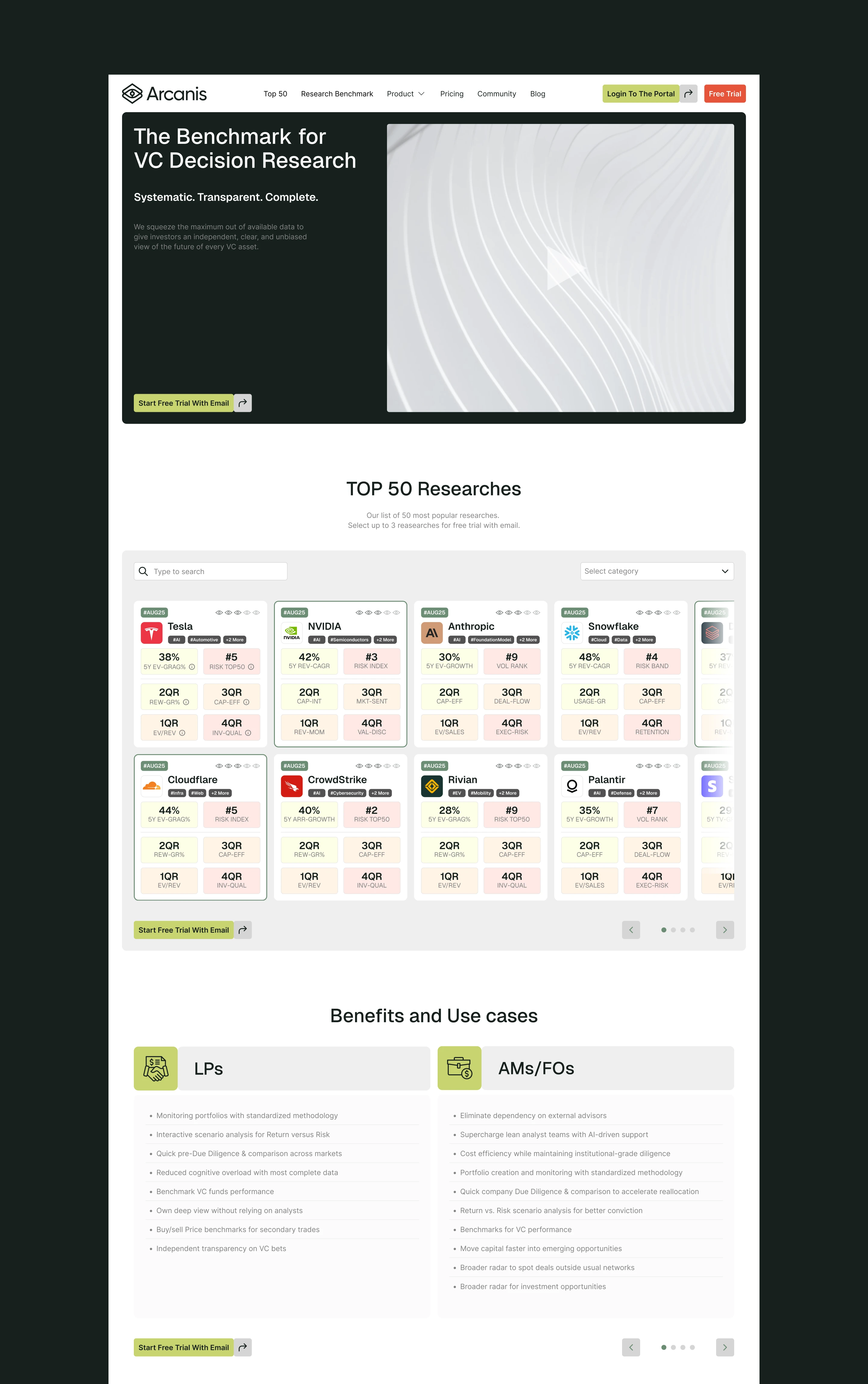
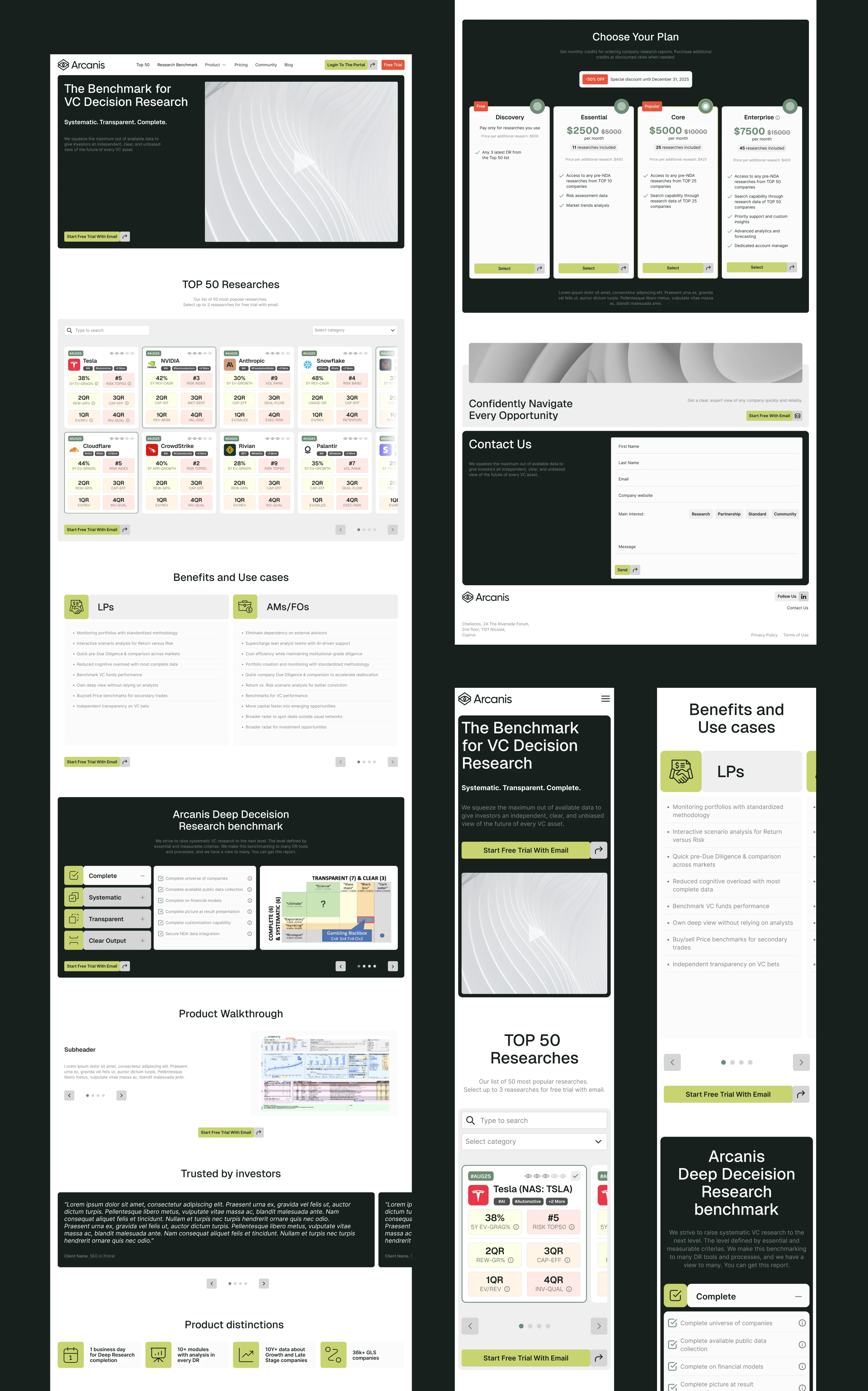
The website was designed from the same strategic foundation as the identity.
Rather than treating the website as a separate marketing asset, we translated the Arcanis brand system directly into the digital experience.
Structured layouts, grid-based compositions, clear typographic hierarchy, and carefully controlled information density create a website that feels analytical without becoming difficult to navigate.
The experience communicates what Arcanis does before asking the user to understand how the underlying technology works.
Complex intelligence becomes clear through design.
Finance Meets Technology
Arcanis operates between two worlds.
On one side: venture capital, investment research, financial decision-making, and institutional trust.
On the other: AI, analytics, data systems, and technology.
The identity needed to belong convincingly to both.
The result avoids the visual language of traditional financial institutions while also avoiding generic AI aesthetics.
Instead, the brand feels precise, intelligent, technical, and mature — appropriate for investors making high-value decisions.
The Digital System
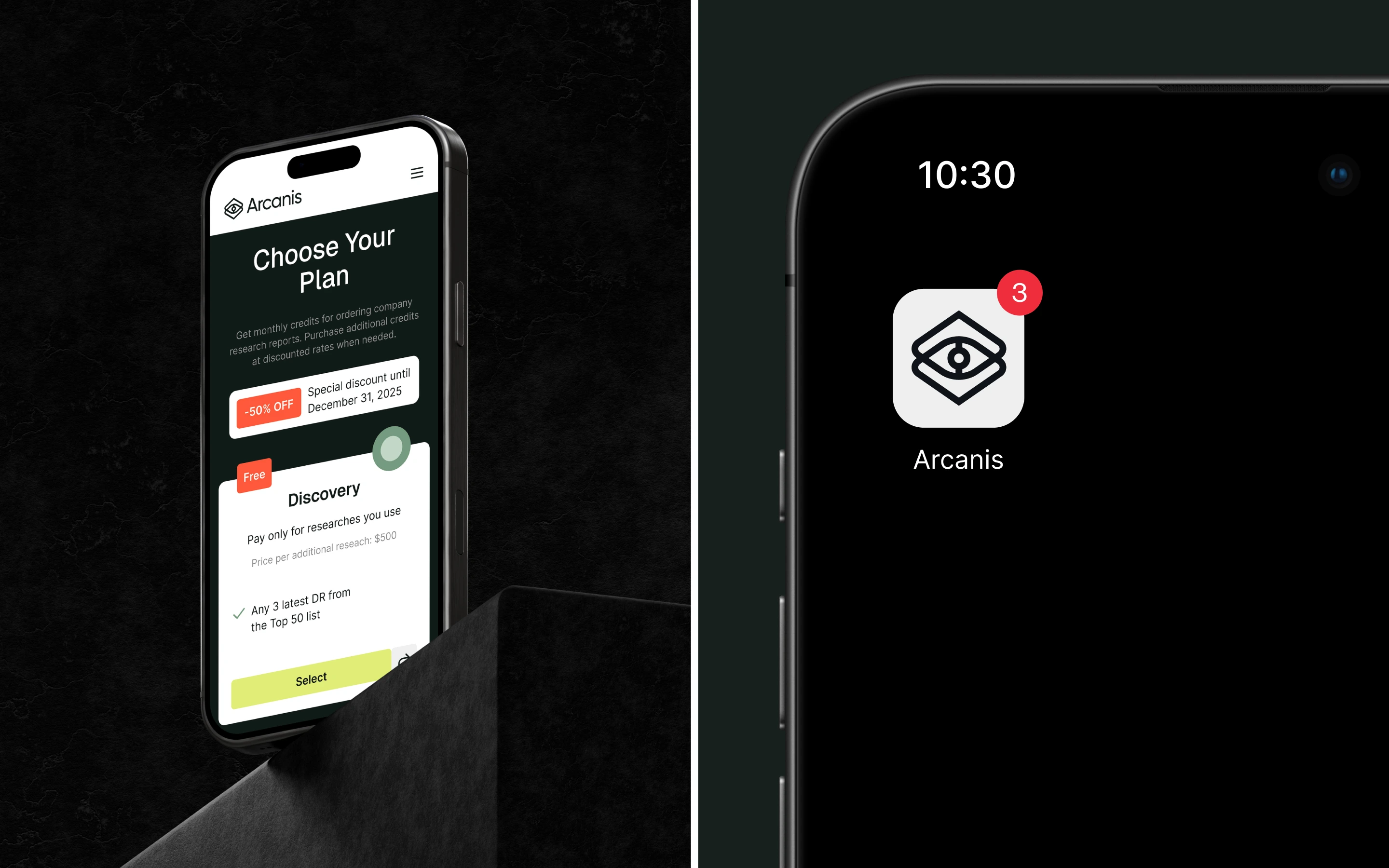
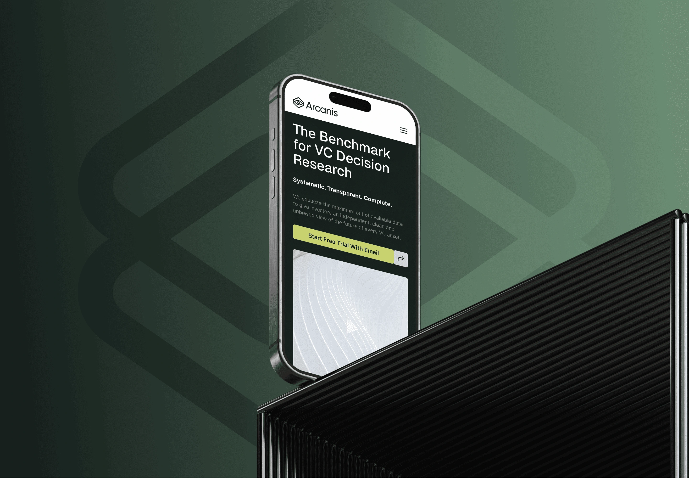
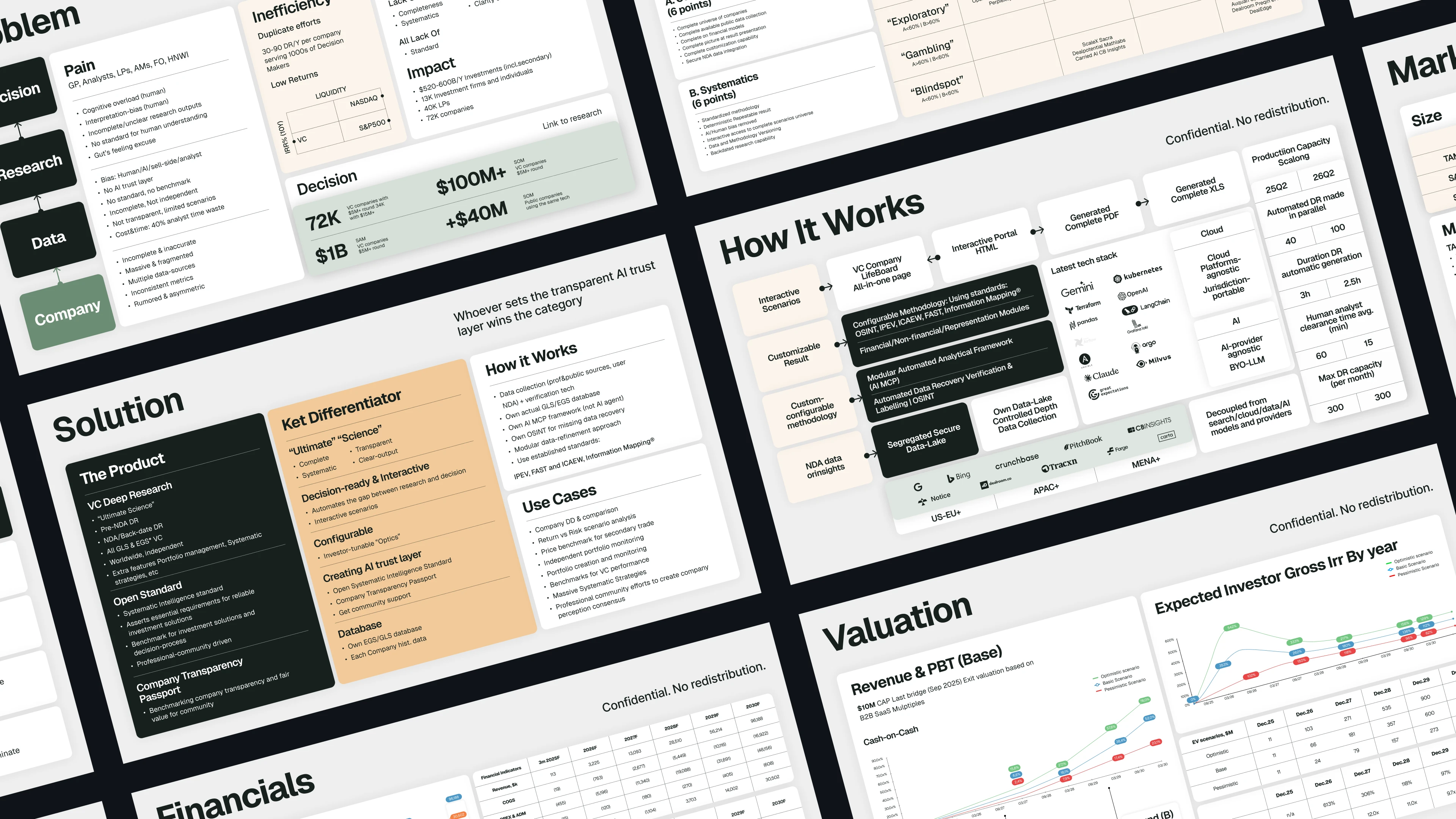
The visual identity was designed to scale across the entire digital ecosystem.
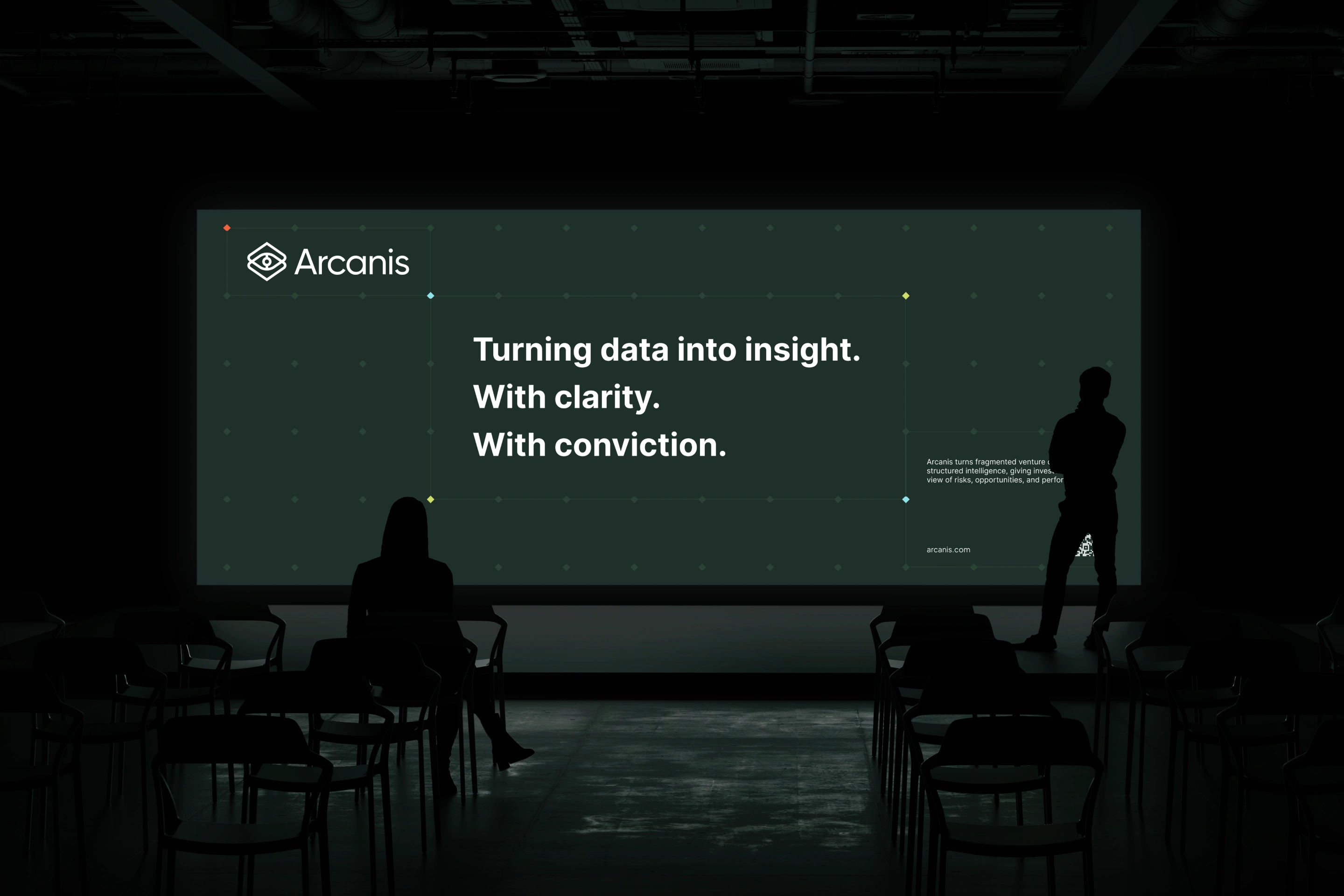
The grid language can become a website background, a data-inspired graphic, a presentation framework, or a product interface.
The logo system works across different sizes and contexts, while typography and spacing create consistency throughout the experience.
This creates a cohesive brand + website + digital product foundation that can grow alongside the Arcanis platform.
The Impact
Arcanis received a complete brand identity and website design system built to position the company as a new generation of venture intelligence.
The project combines branding, logo design, visual identity, financial branding, FinTech branding, AI branding, venture capital branding, web design, UX/UI design, digital product design, typography, and art direction.
A brand built around one powerful idea:
when information is structured, better decisions become possible.

The Takeaway.
Arcanis doesn't promise more information. It creates a clearer way to understand it.

Like this project
Posted Aug 17, 2026
Brand identity and website design for an AI-powered venture intelligence platform, combining FinTech branding, logo design, UX/UI, and digital product design.
Likes
0
Views
13
Clients
Arcanis