Nature-Tech Visual Identity Project

Artur Mikhov


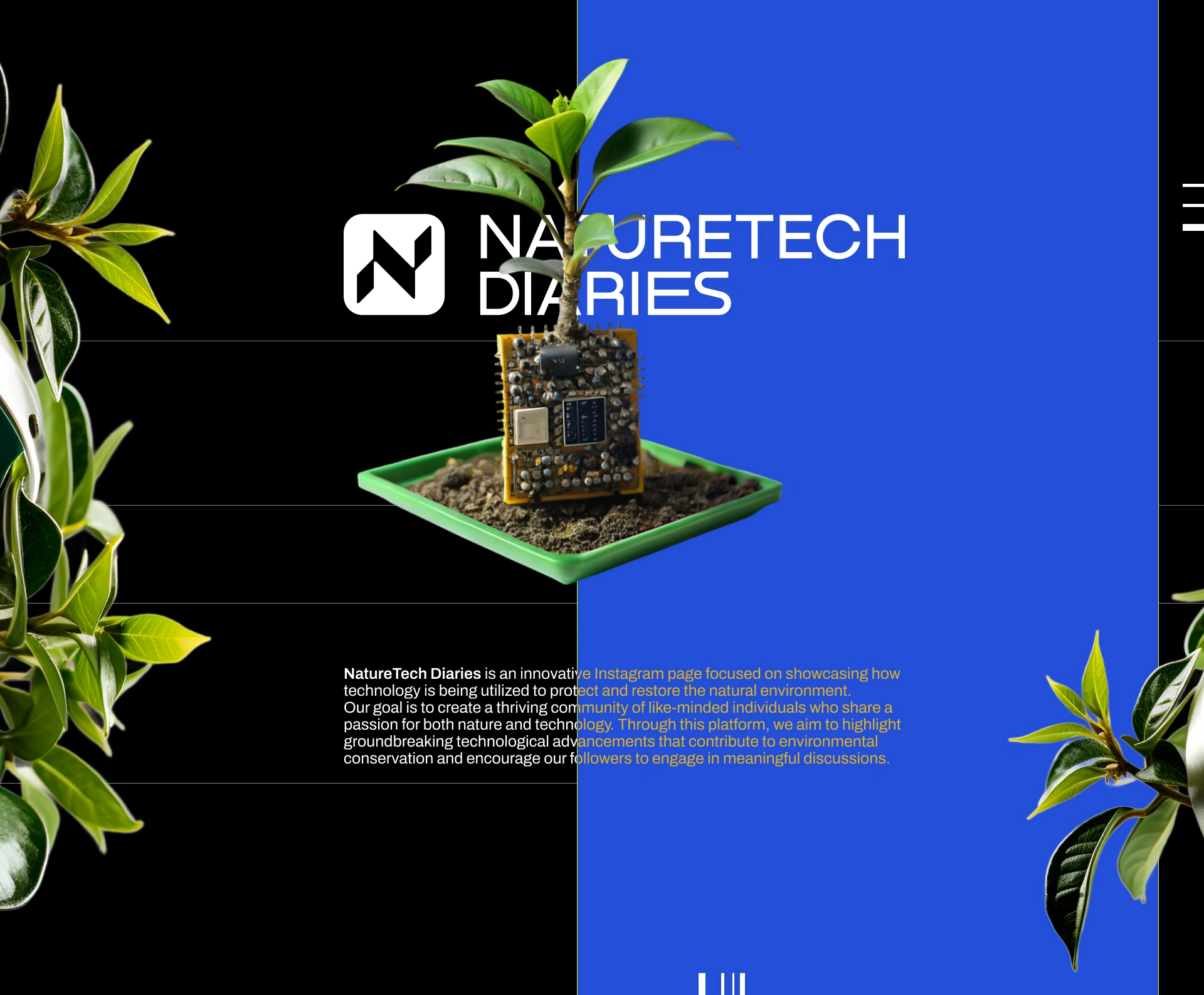
Naturetech Diaries — a visual identity connecting nature and technology
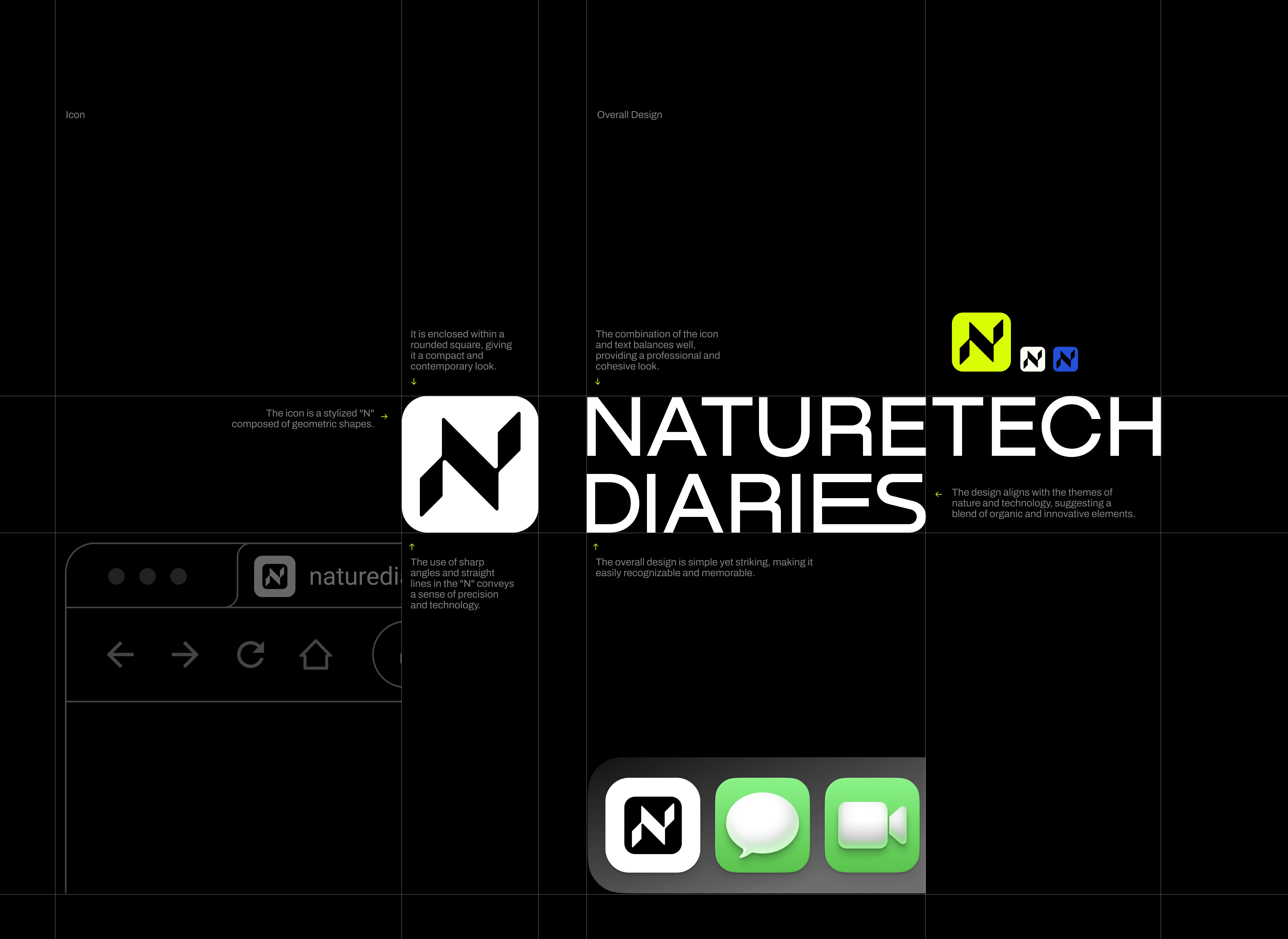
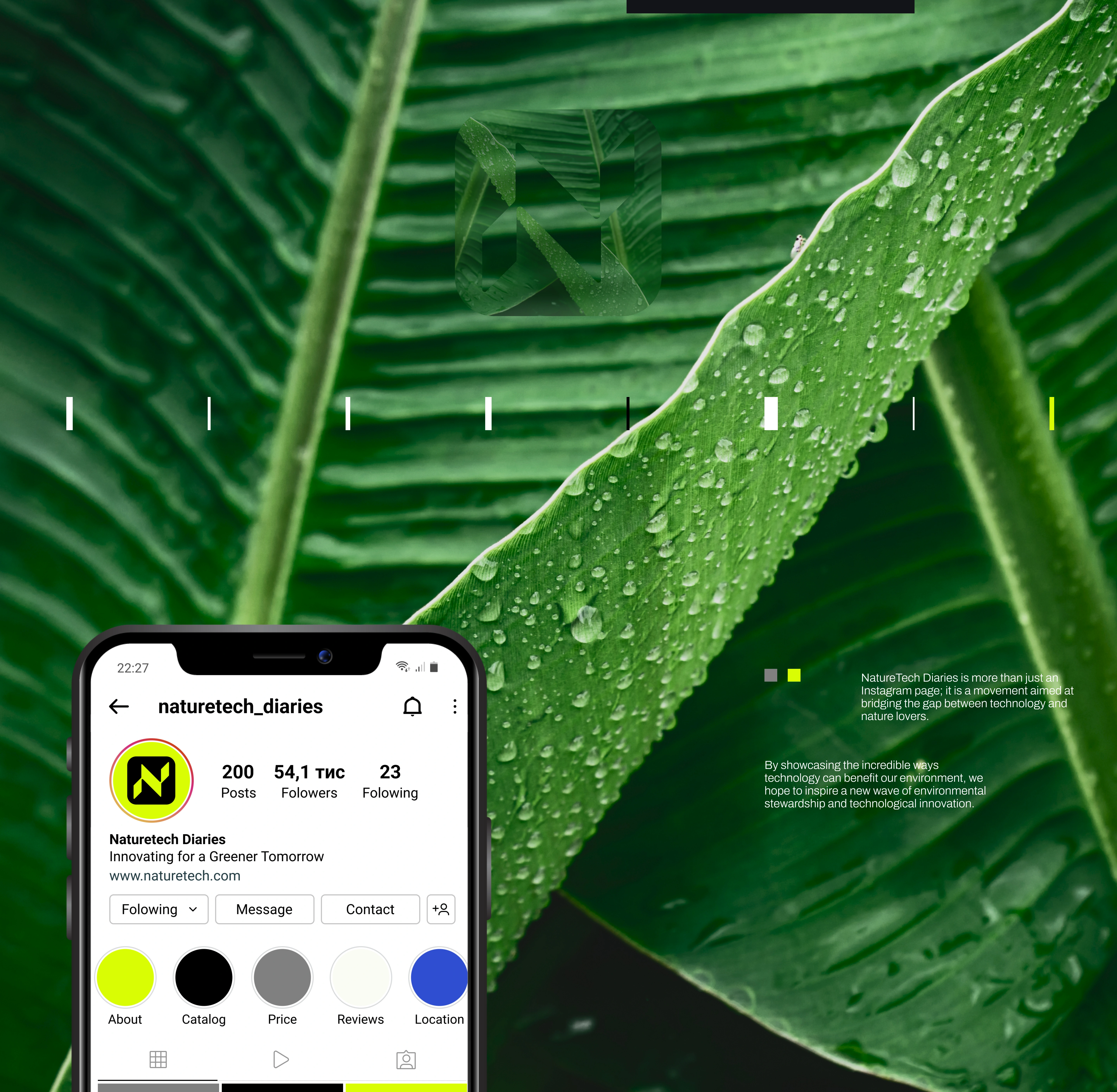
Naturetech Diaries is a community-driven nature and technology platform created to connect nature lovers, share knowledge, and encourage conversations, questions, and real-world experiences.
The project focused on developing a complete visual identity for an AI-powered blog and digital community, combining the organic character of nature with the precision and innovation of technology.
Brand strategy. Logo design. Brand identity. Visual identity. Nature branding. Technology branding. AI branding. Community branding. Digital branding. Graphic design. Corporate identity. Typography. Brand guidelines. Art direction.
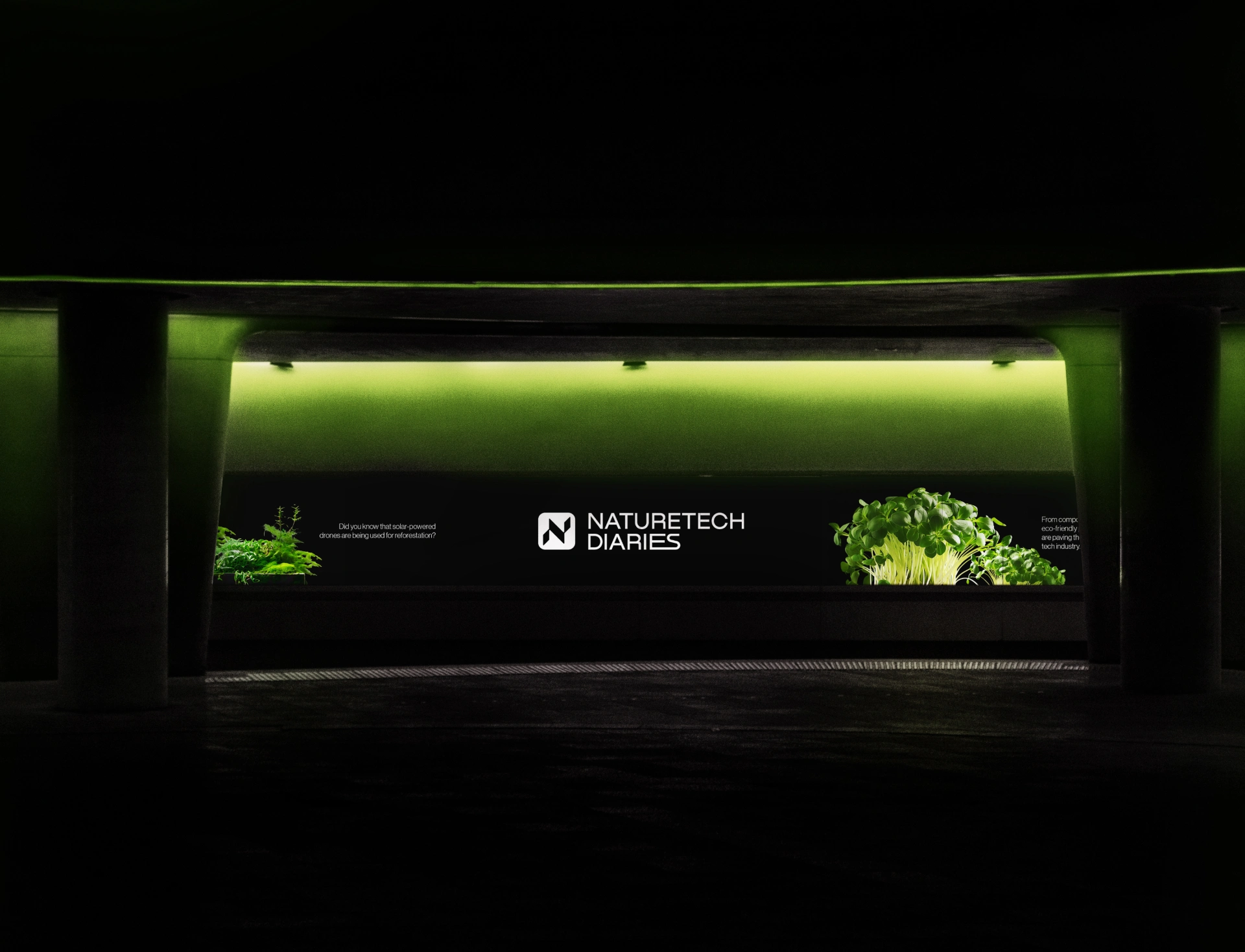
The Concept
The identity explores the intersection between nature and technology.
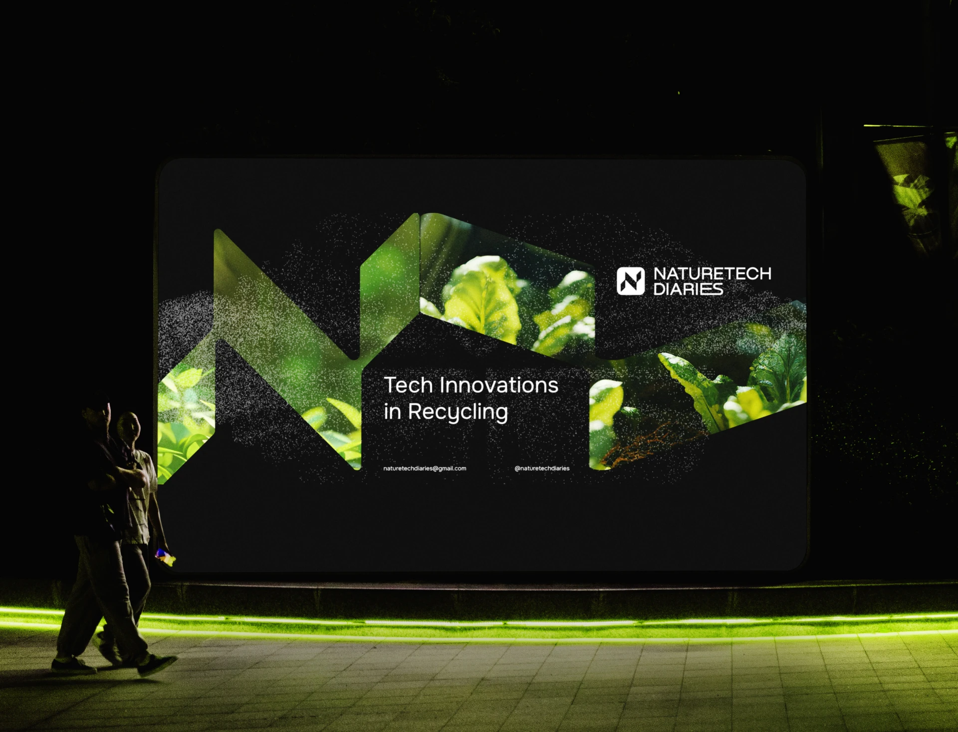
The visual direction combines organic references with a modern digital aesthetic, creating a brand that feels approachable for nature enthusiasts while still communicating the platform's AI-powered foundation.
Audience research helped shape the visual language and ensure the identity would appeal to a community built around curiosity, knowledge sharing, and connection.
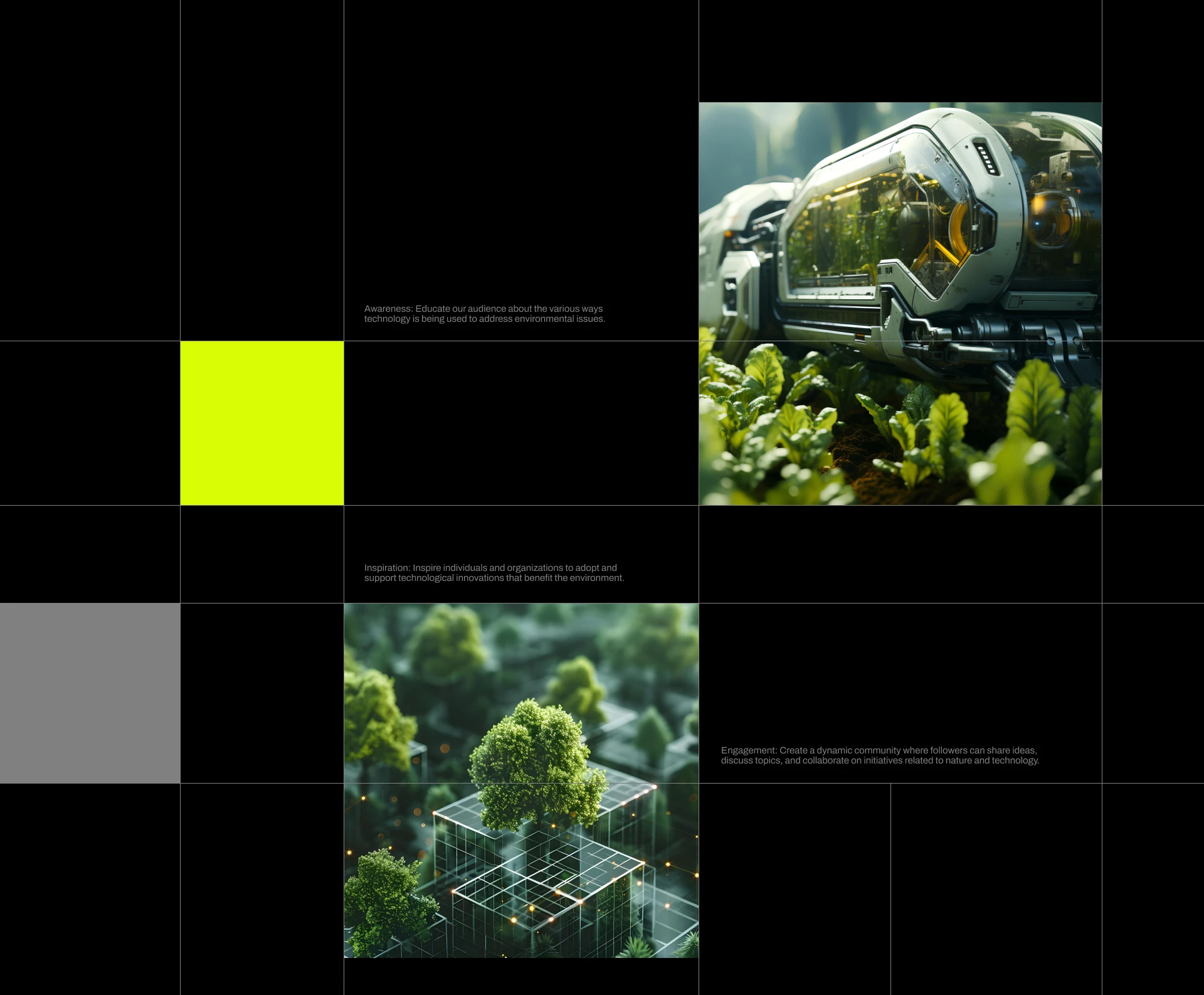
The Visual System
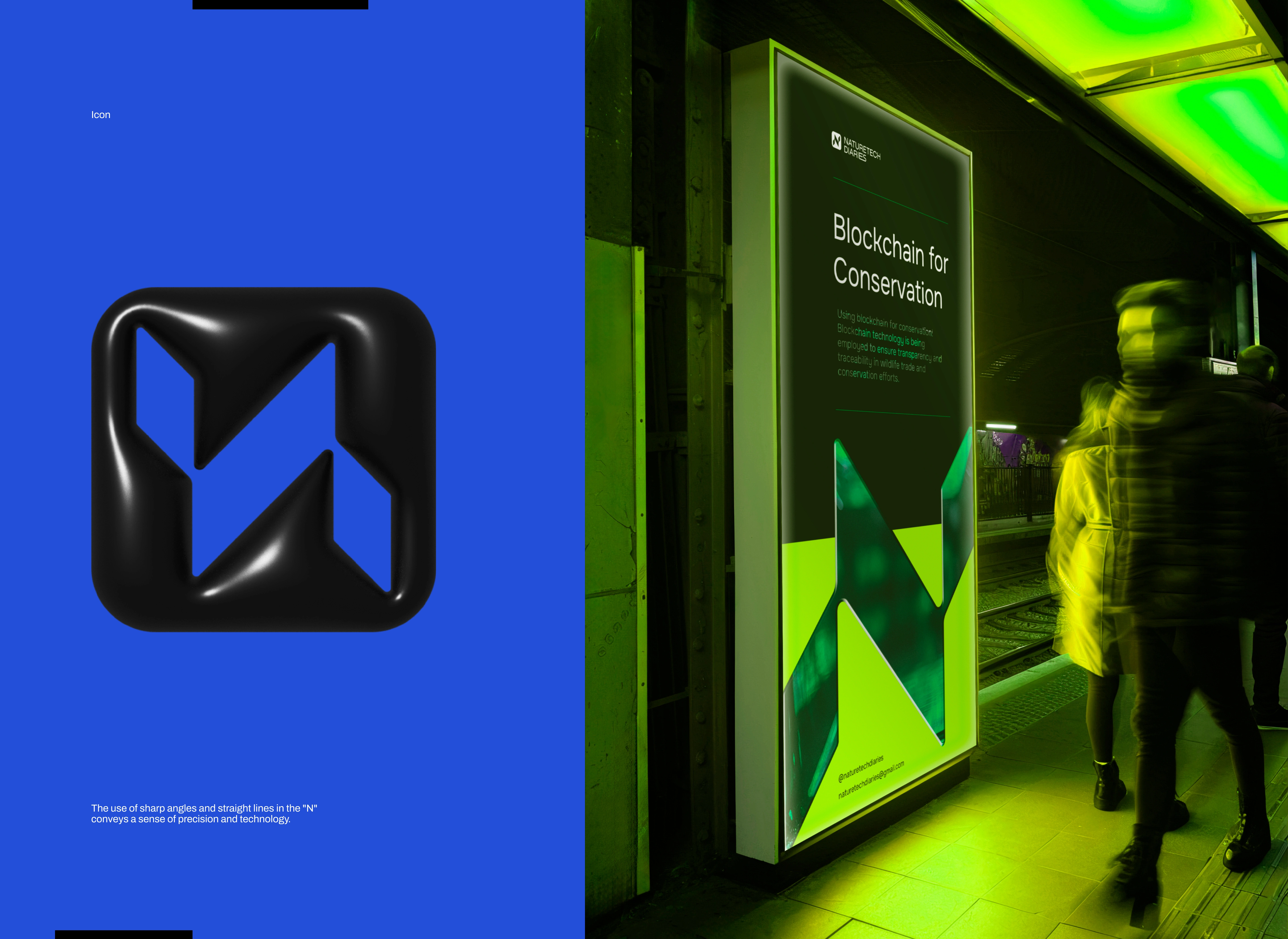
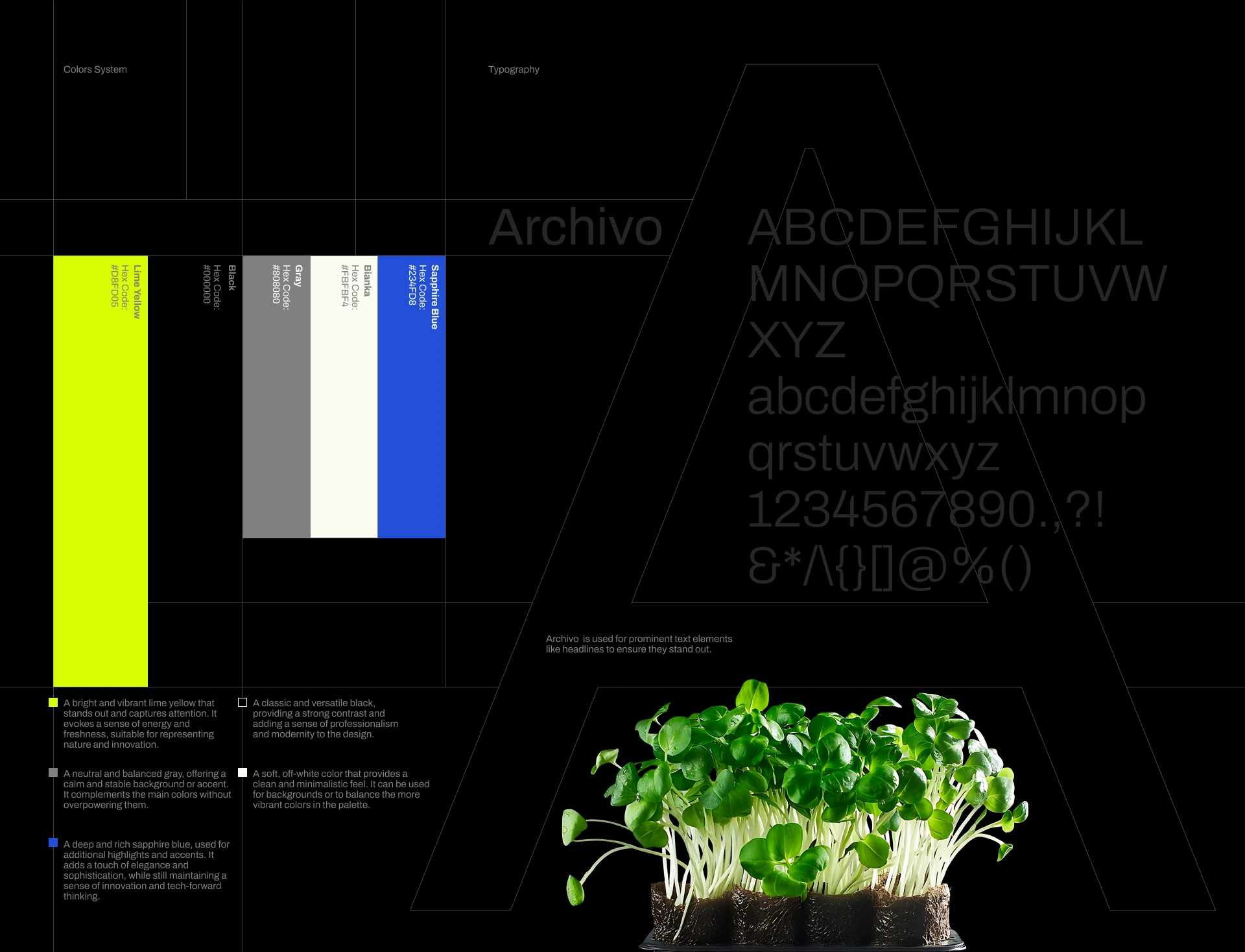
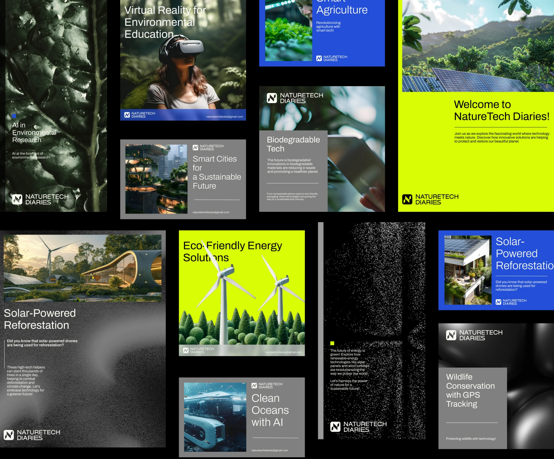
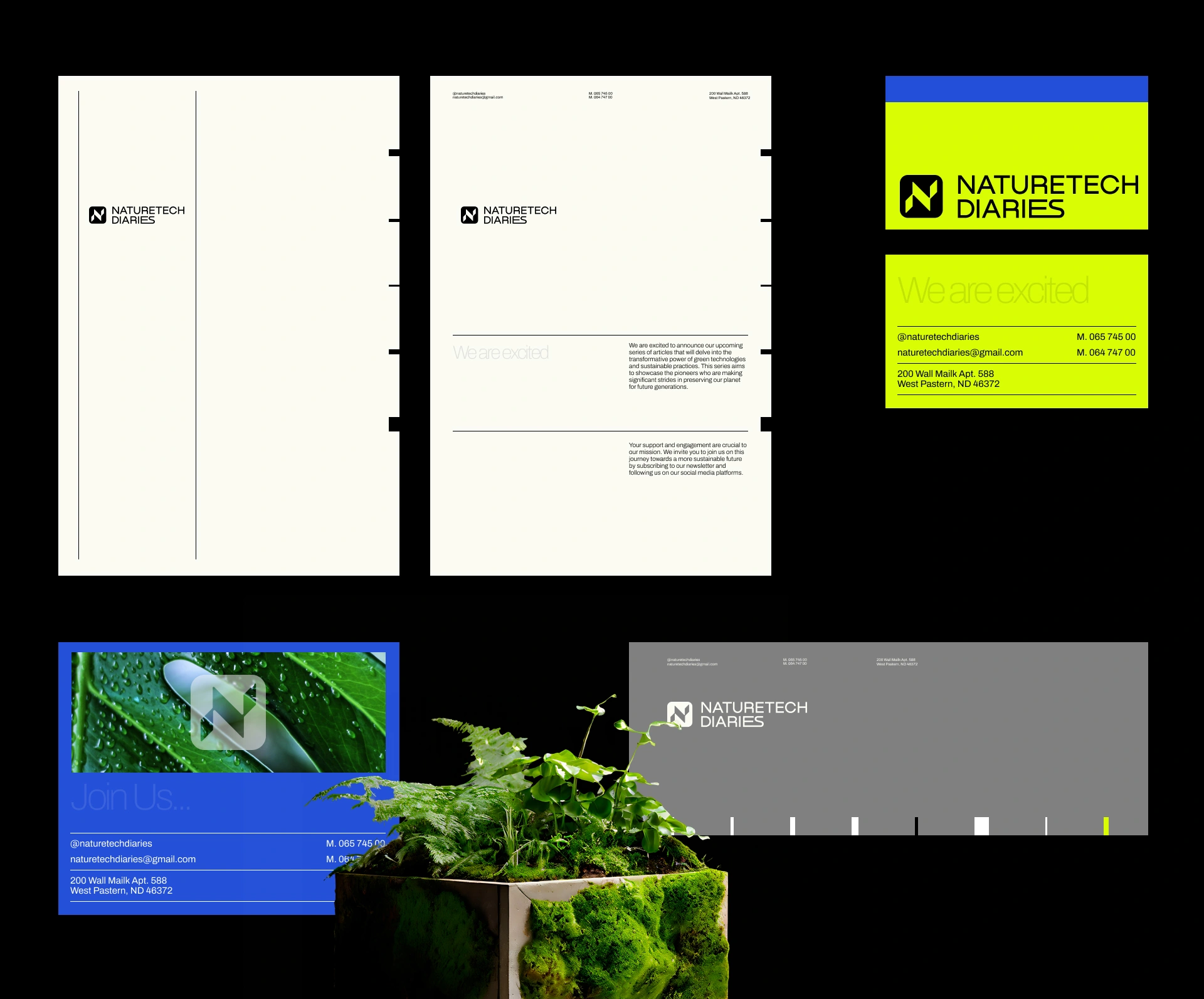
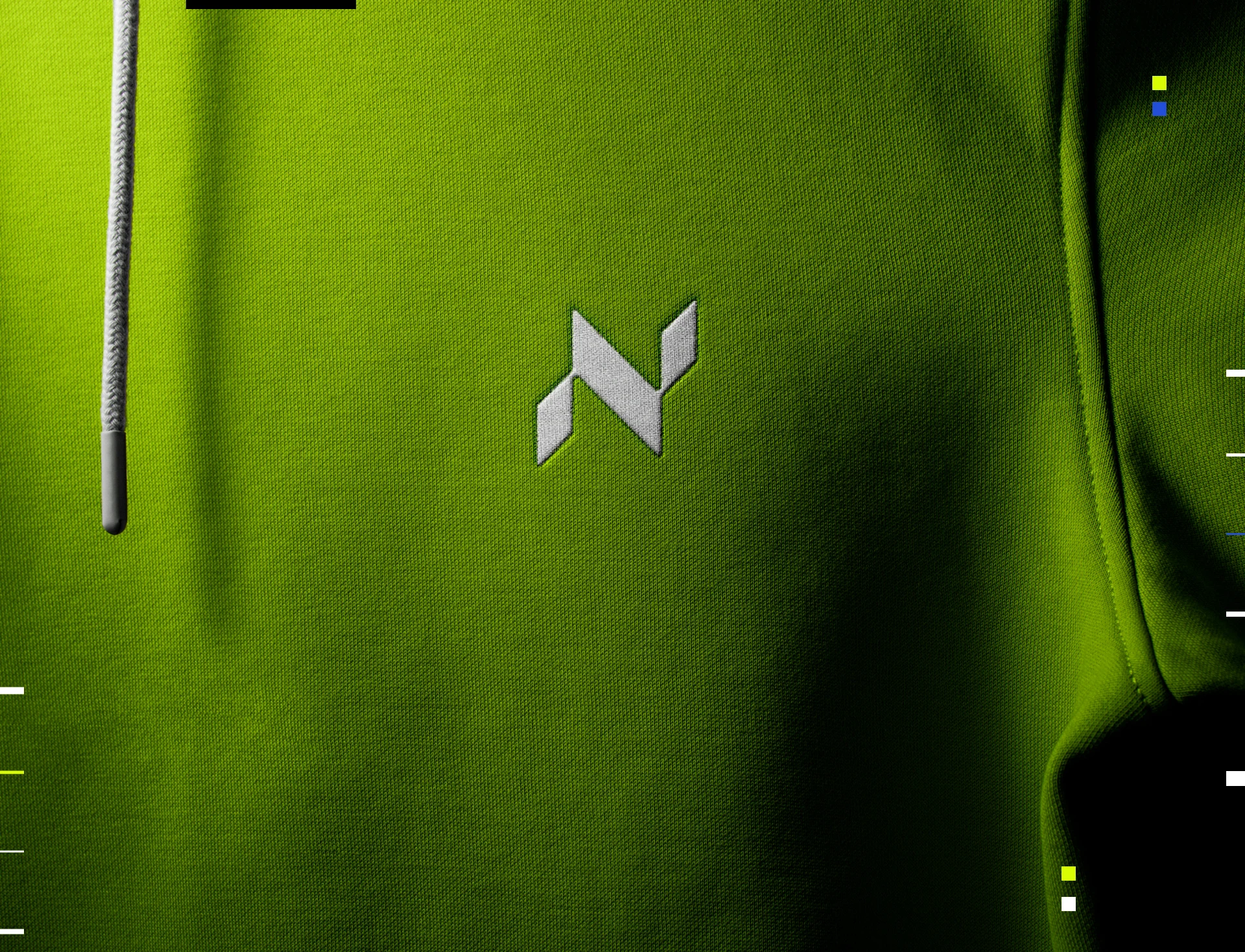
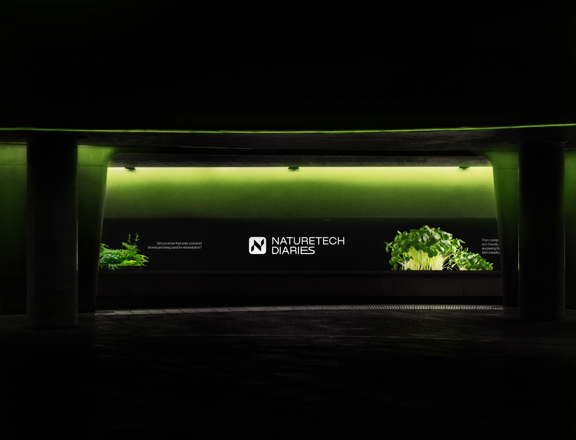
The Naturetech Diaries brand identity includes logo design, graphic elements, typography, and a structured style guide.
The system was designed to remain flexible across blog content, social media, digital communication, community platforms, and future brand applications.
The identity balances natural and technological references without making either side feel disconnected.
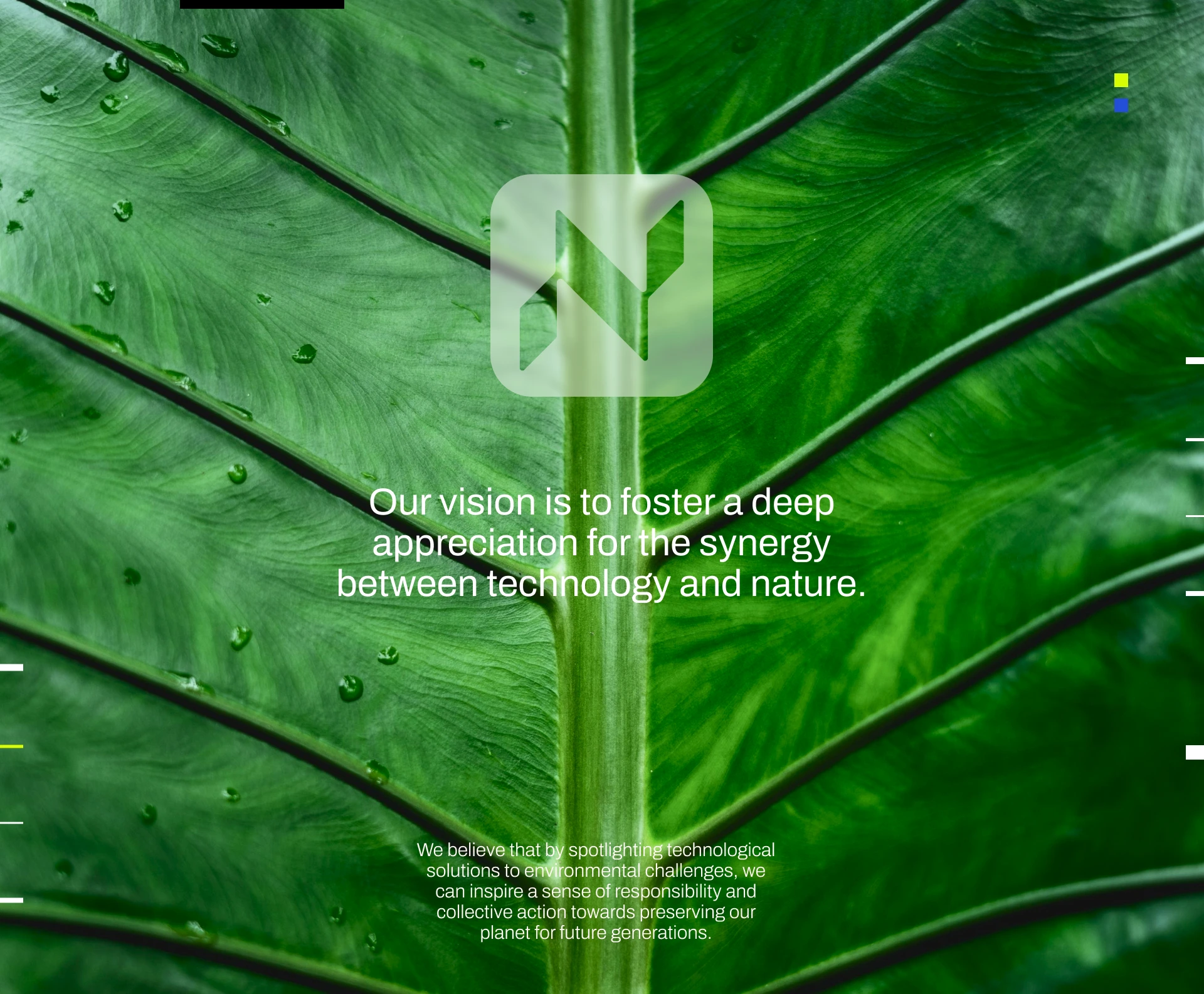
The Impact
The result is a distinctive nature-tech brand identity designed for an AI-powered community platform.
The project combines branding, logo design, visual identity, AI branding, technology branding, community branding, digital branding, graphic design, corporate identity, typography, and brand guidelines.
The Takeaway.
Technology can connect us to nature — and design can make that connection feel human.
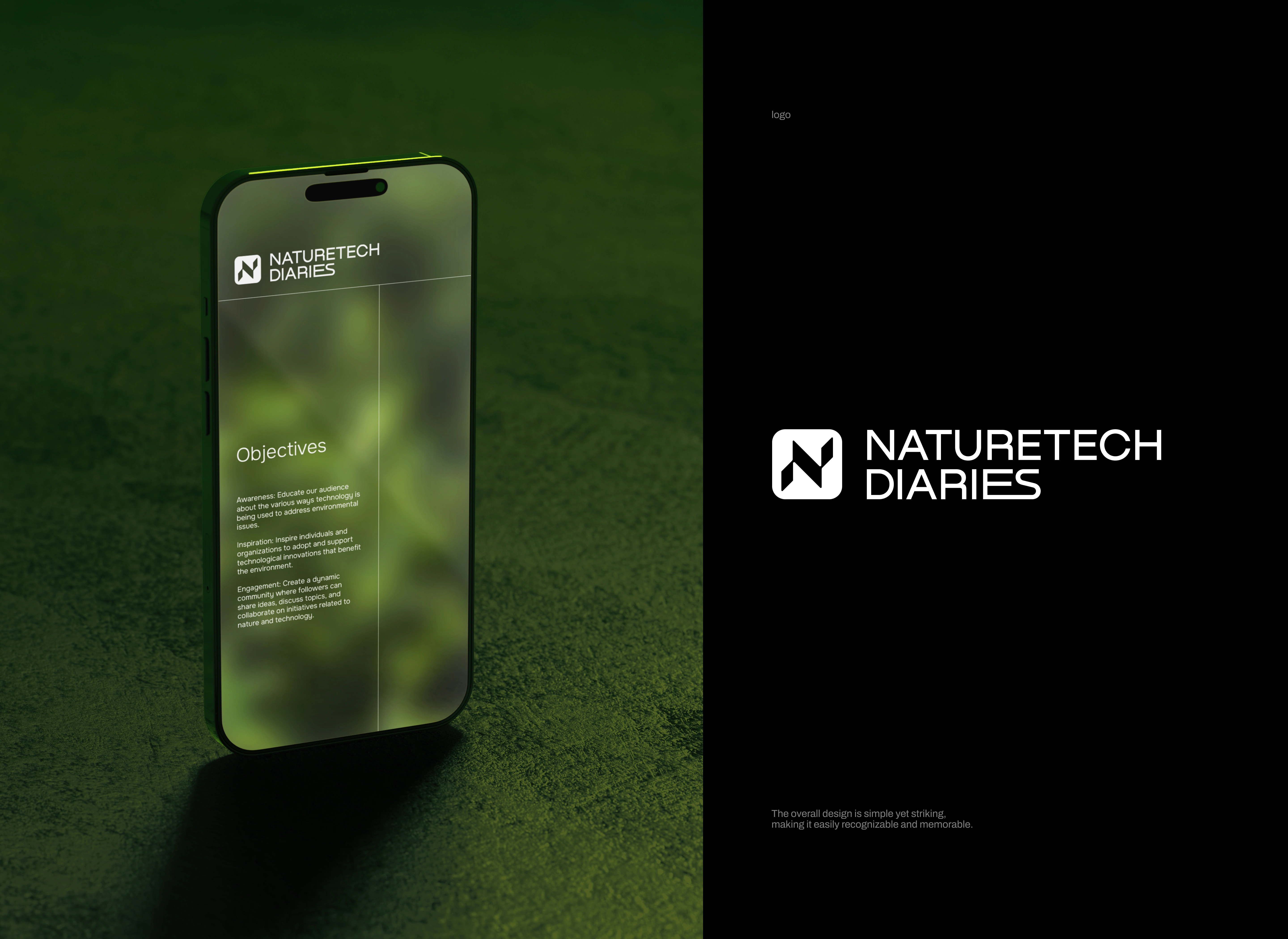
Art Director - Darlin Ka
Designer - Anna Striukova
WHALES:
Like this project
Posted Aug 17, 2026
Visual identity for an AI-powered nature community, combining nature branding, technology branding, logo design, digital branding, and graphic design.