Carver&Kids — brand design for skateboard school
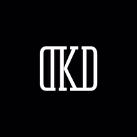
Dmitry Kozlov
Description
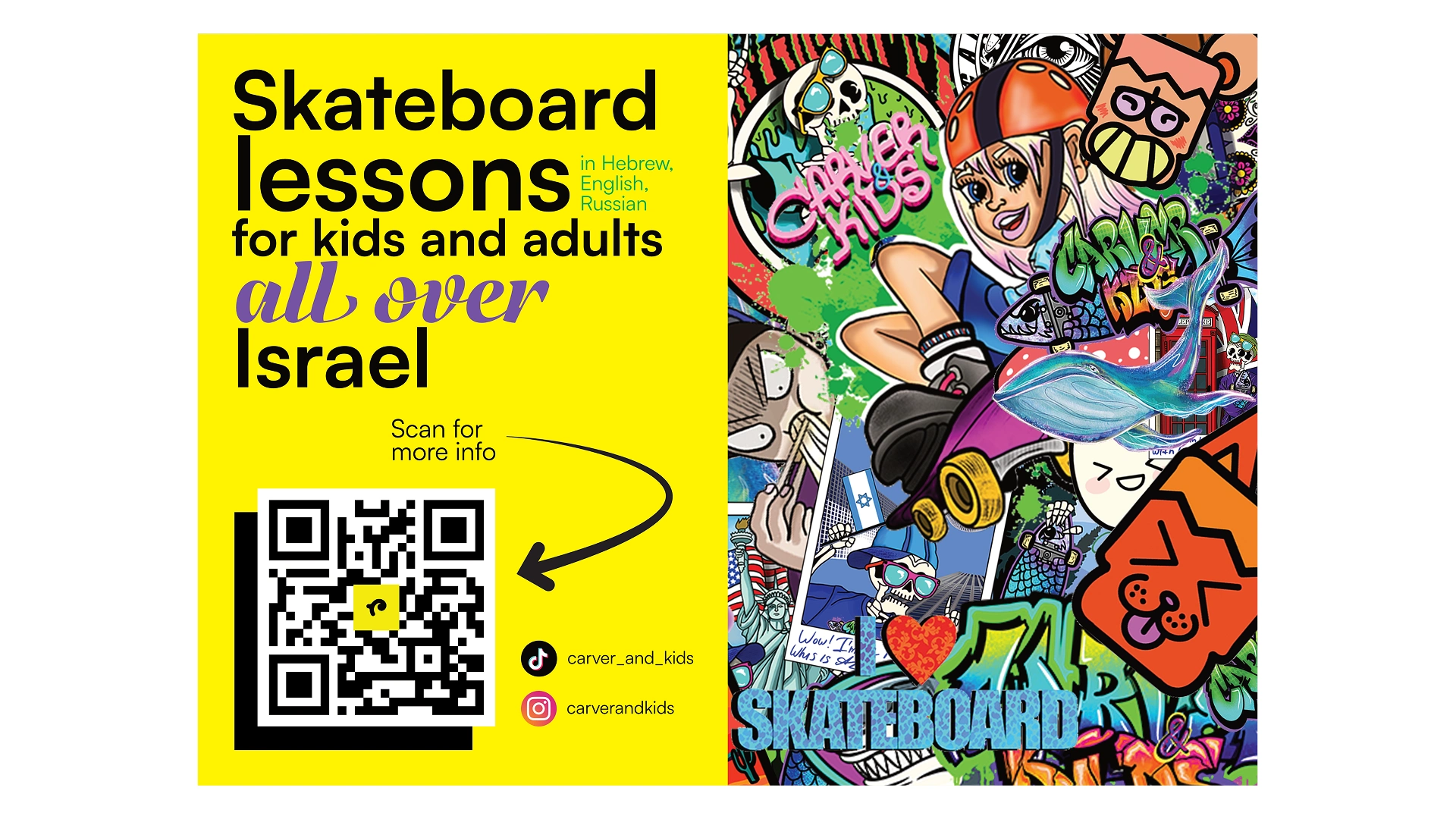
The project aimed to develop a scalable, full-range brand identity for a multilingual skateboard school from scratch. Although the core focus of the school is teaching skateboarding, it also offers a variety of additional services and products — both digital and physical. The brand needed to cover multiple business areas while remaining flexible enough to support future growth, experimentation, and an evolving roadmap.
Design process
The design process went through multiple stages — from in-depth design research, including form exploration, competitor analysis, and reference studies, to upcoming feature integrations and the expansion of the product range, expressed through a variety of final identity applications.
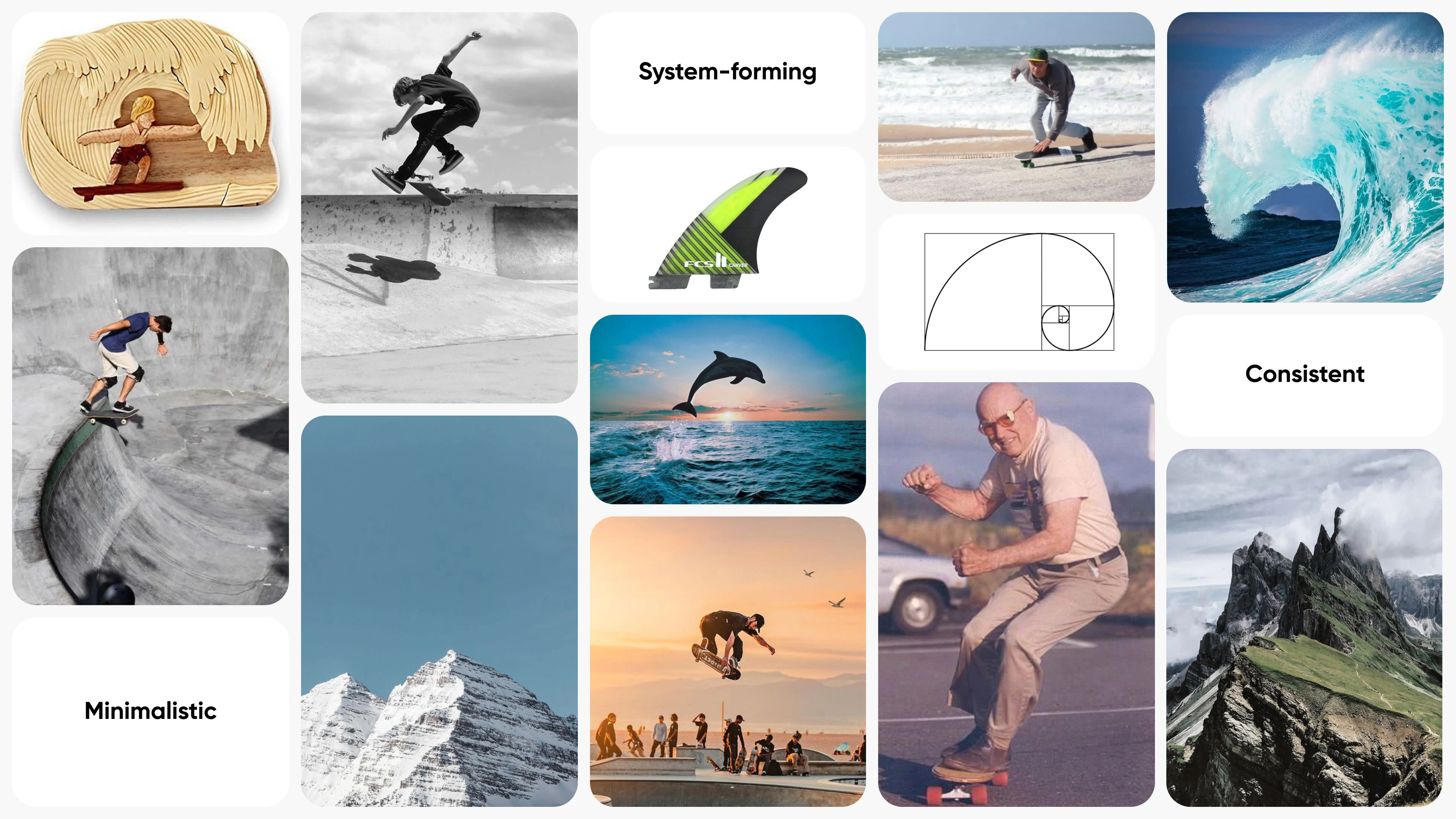
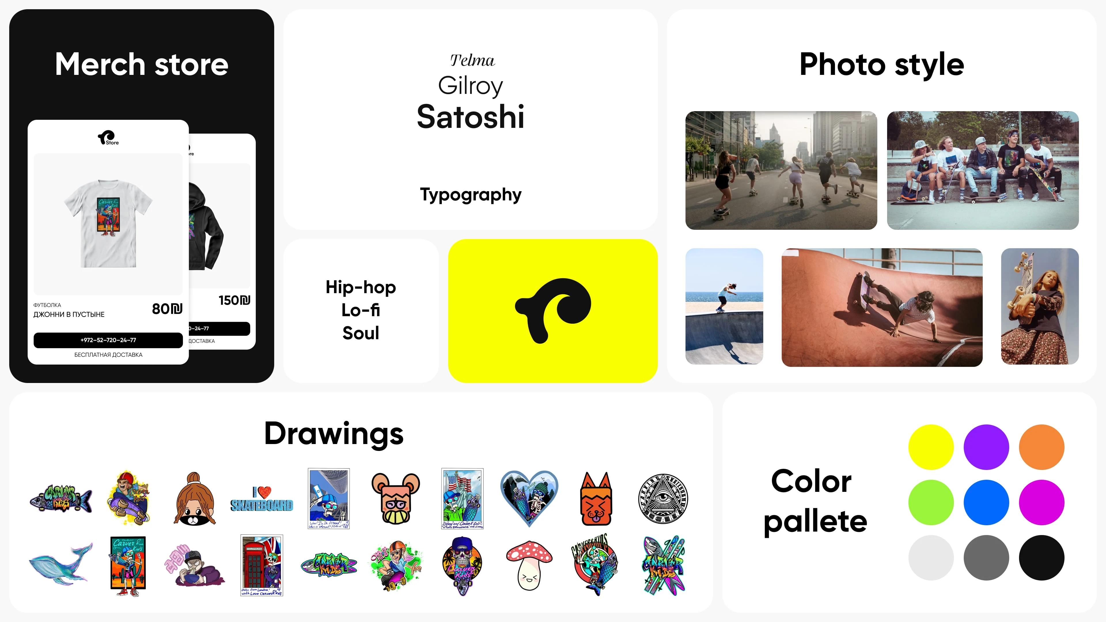
Research summary
Solution
The solution for the logo was to create a versatile, multi-use design centered around a pictogram. This approach simplifies its application across various platforms, as well as in real-world contexts such as printing, merchandise, and more. Different color variations were developed to suit a variety of applications and needs. The logo and overall brand identity were designed to convey professionalism and confidence, while also remaining friendly and playful, reflecting the school’s focus on kids’ classes.
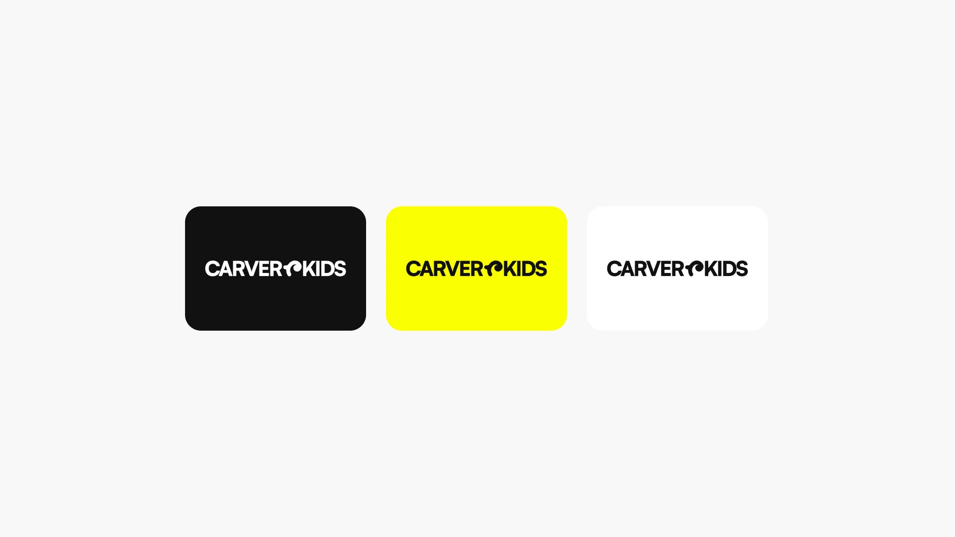
Full logotype version
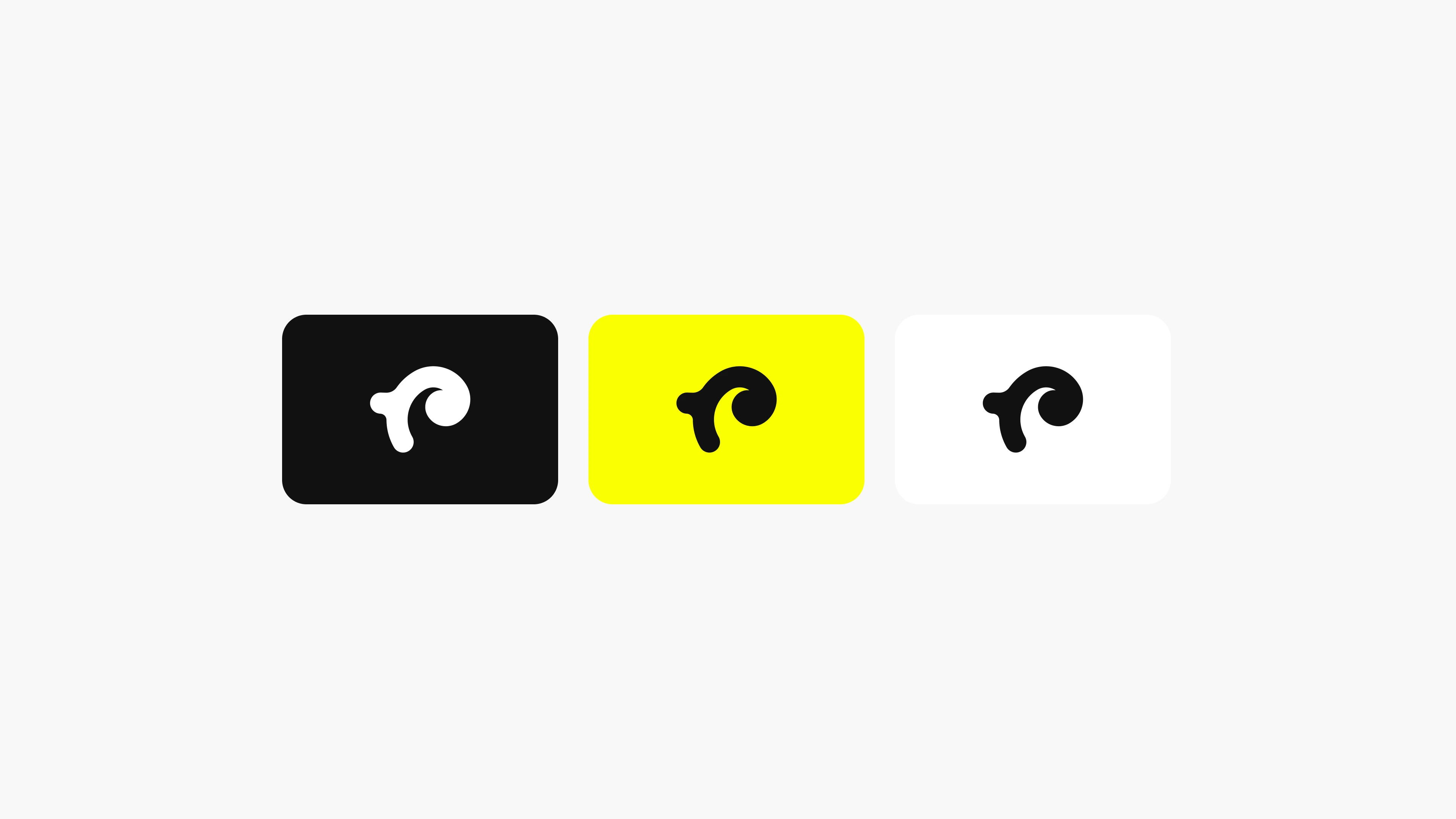
Main pictogram
Pictogram logo
Key principles of identity
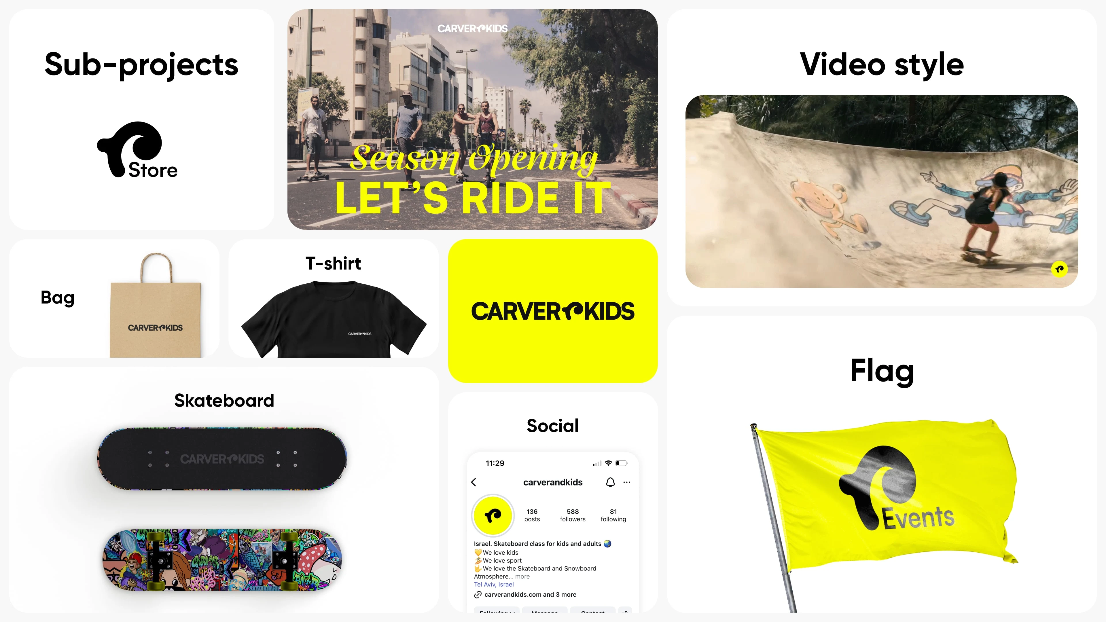
Examples of using identity
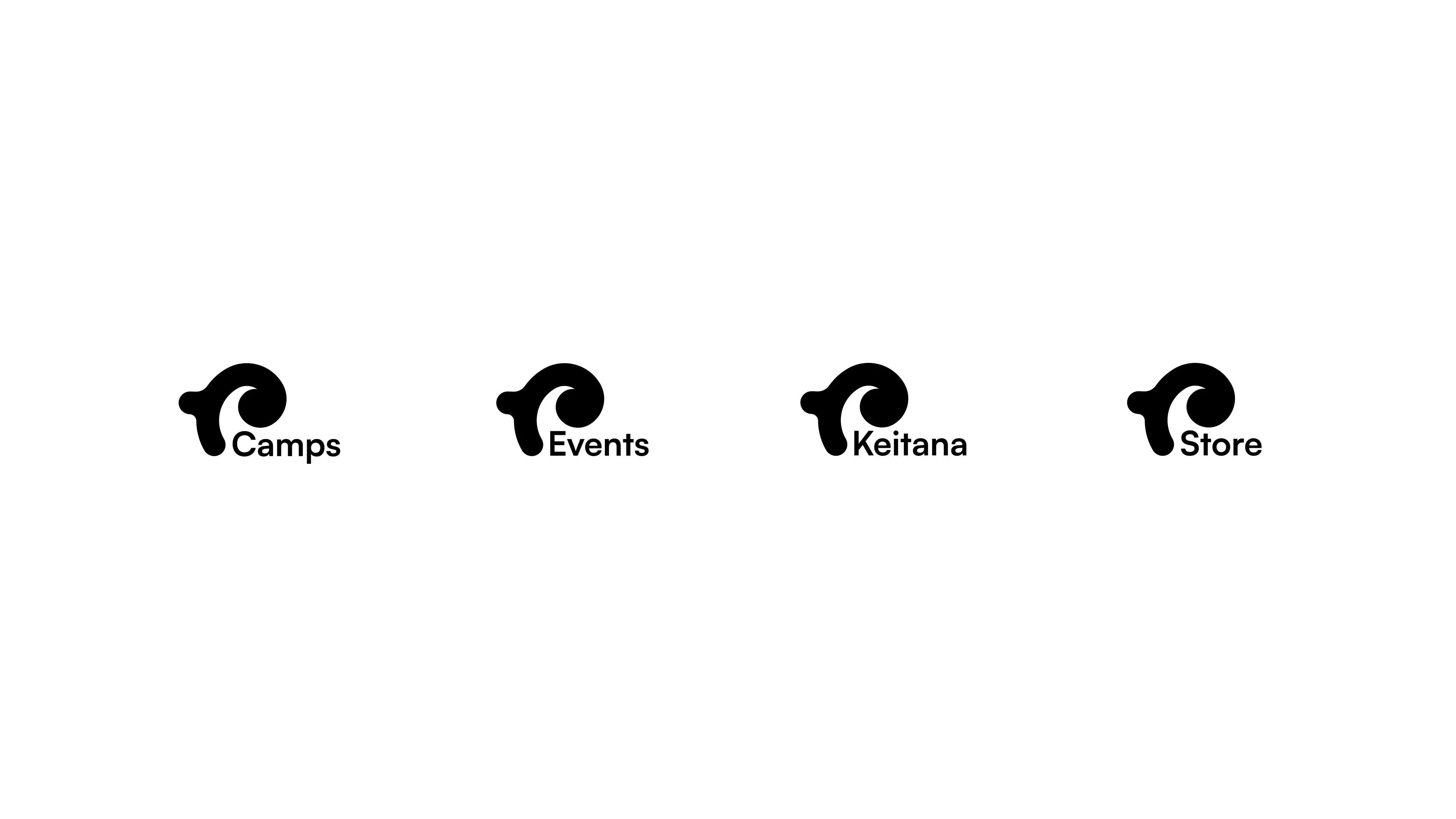
Sub-logos for various events
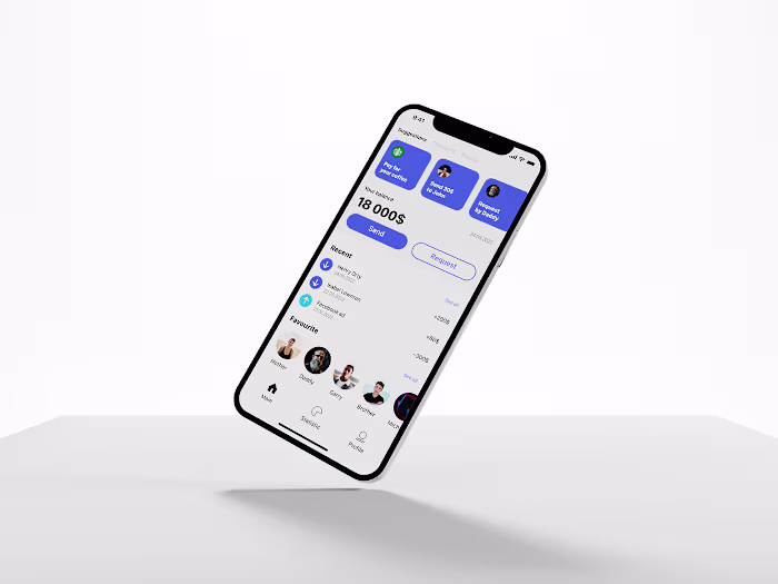
Digital
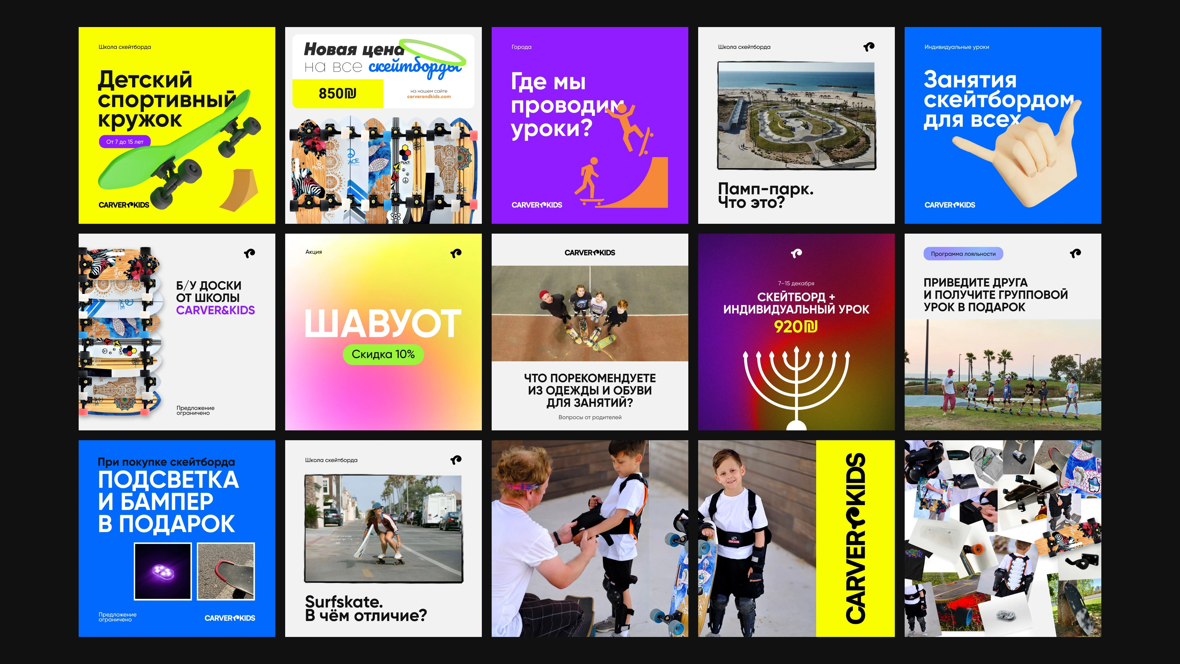
The visual identity was applied across the digital environment, adapting to various social media platforms and communication needs. Custom layouts, cover designs, and post formats were created to maintain consistency while addressing different tasks — from promotional campaigns and event announcements to educational content and interactive posts. The brand’s colors, typography, and logo variations were used strategically to ensure recognition, flexibility, and engagement across all digital touchpoints.
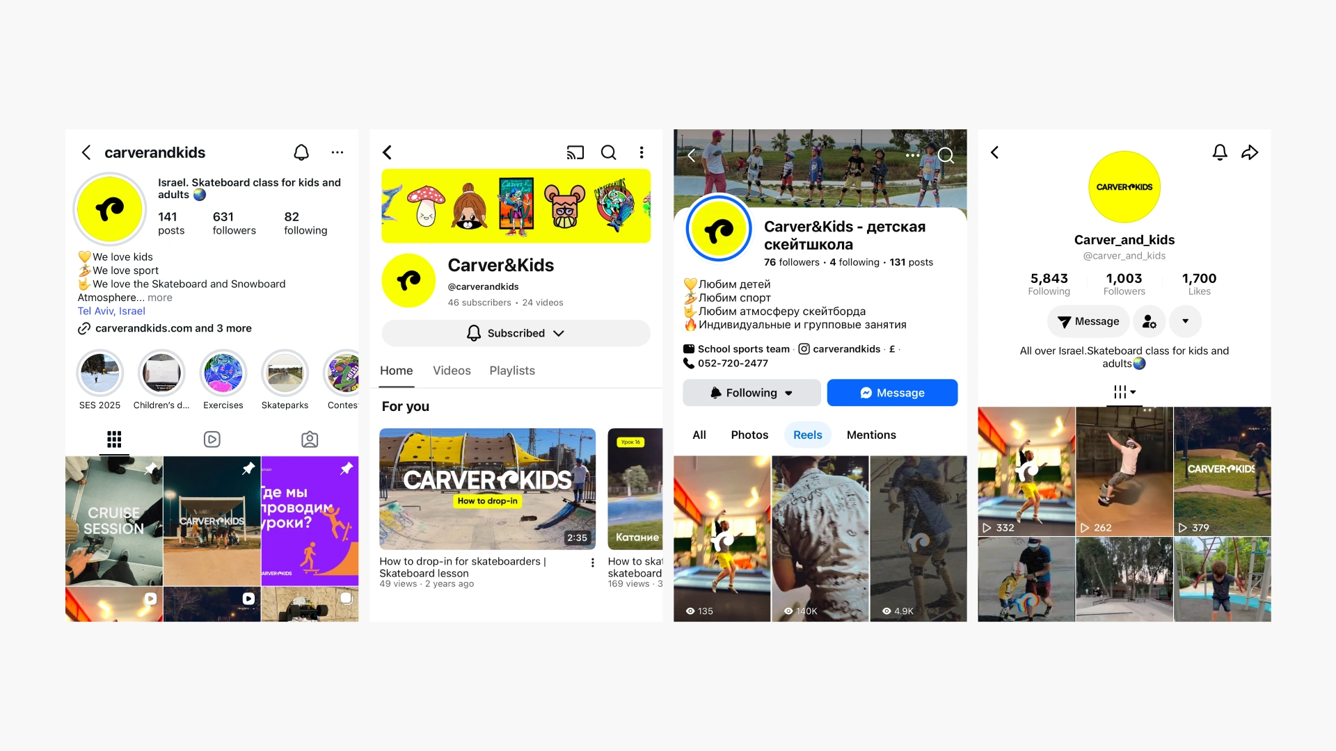
Main social networks

Highlights covers
Social posts design
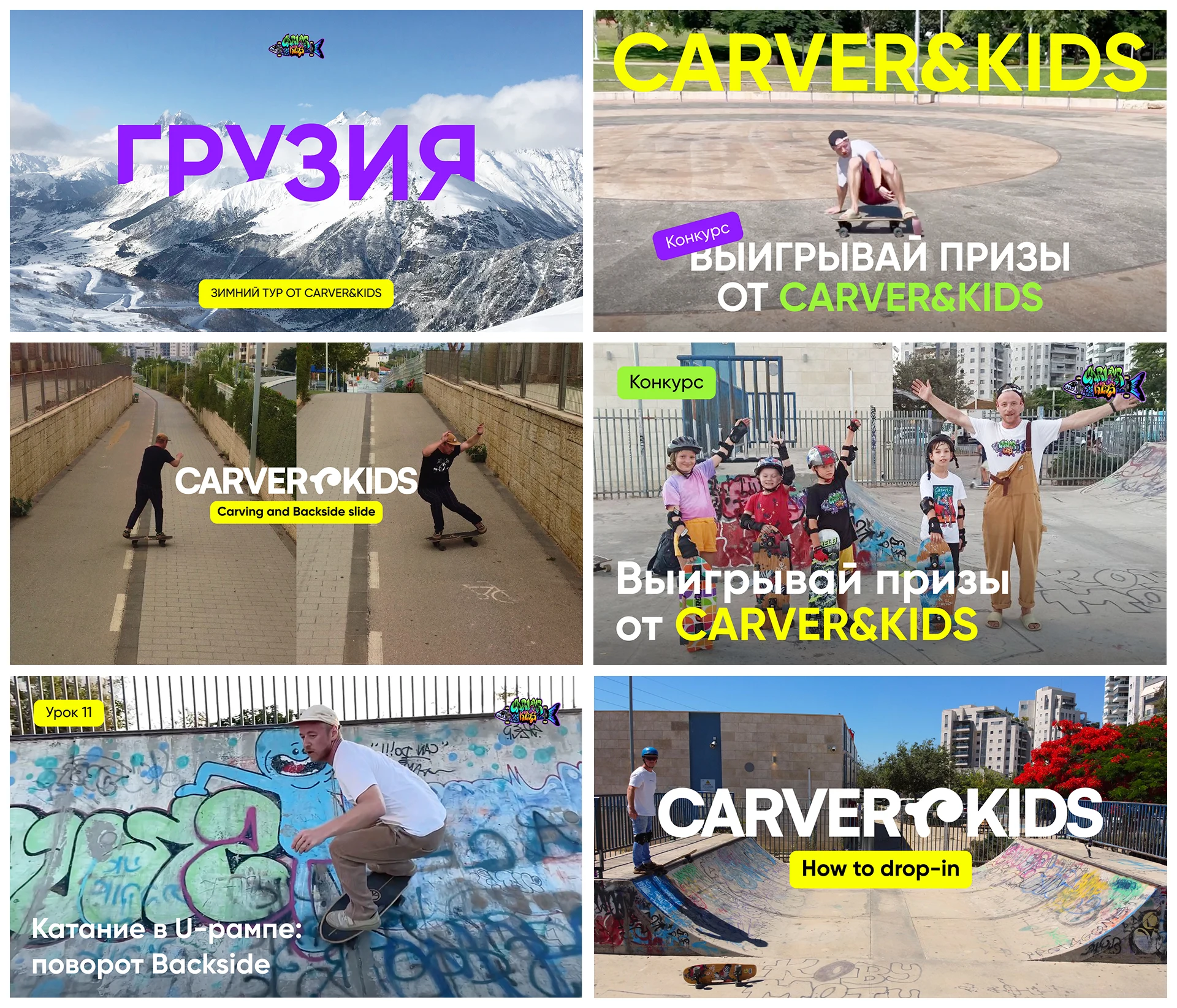
Video covers
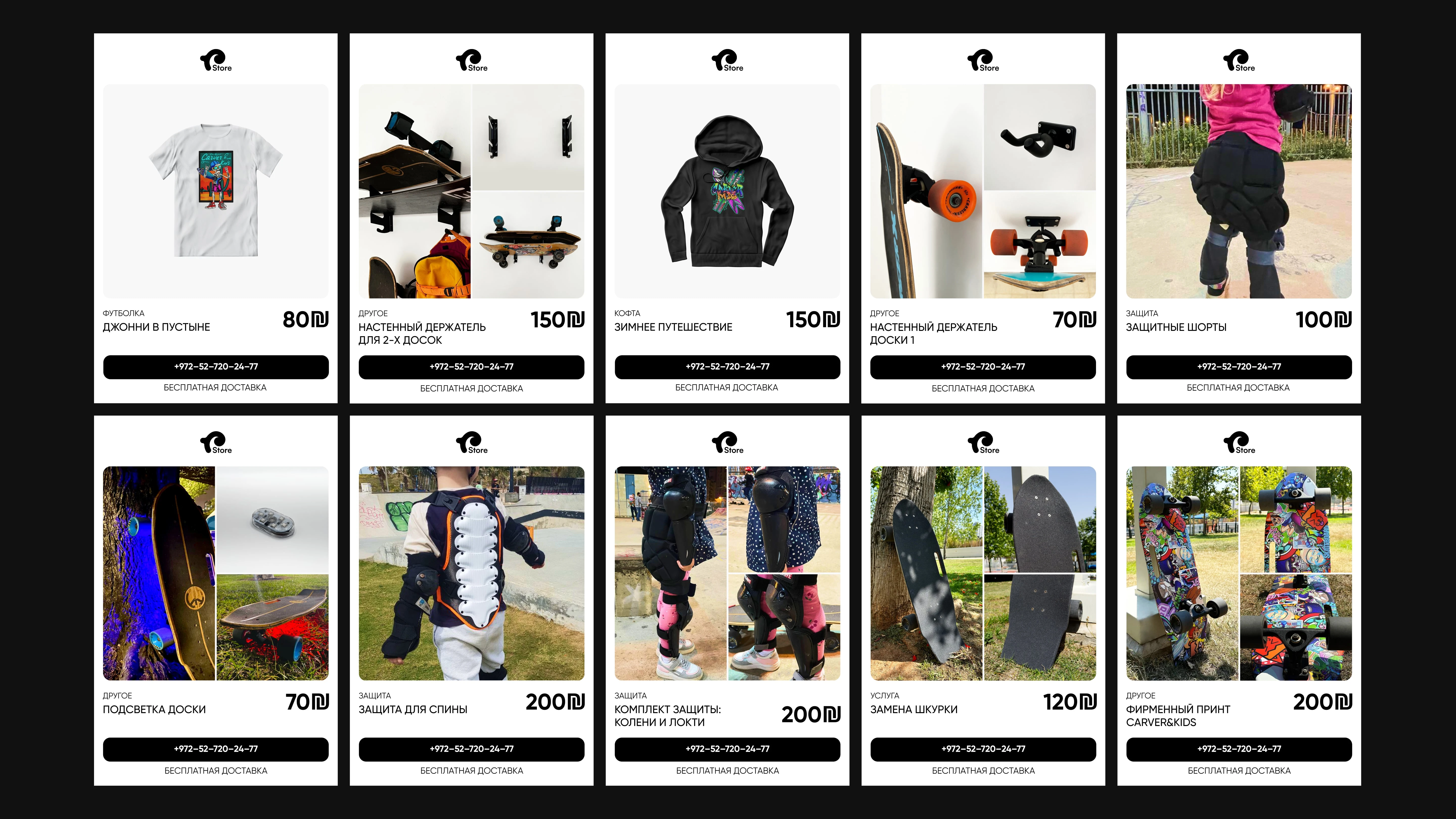
Shareable brand store cards
Physical
The design system was extended to physical applications, where various experiments were conducted to attract new clients using bright, expressive visuals. All materials were adapted for multilingual use, including left-to-right and right-to-left languages, requiring careful layout and typographic adjustments to maintain clarity and consistency. Products were branded with unique, eye-catching designs — for example, custom graphics on skateboards — to reinforce the brand identity and create memorable experiences. This approach ensured that both physical and digital touchpoints were visually engaging, versatile, and aligned with the school’s playful yet professional character.
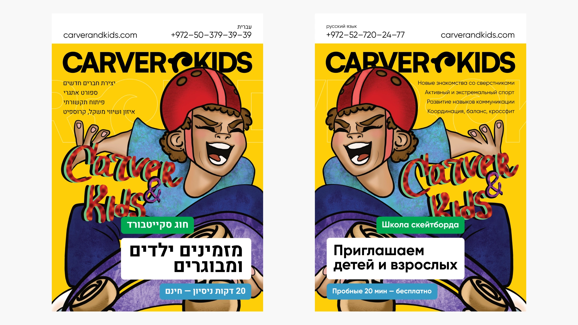
Two-sided bilingual flyer
Example of an informational A5 flyer
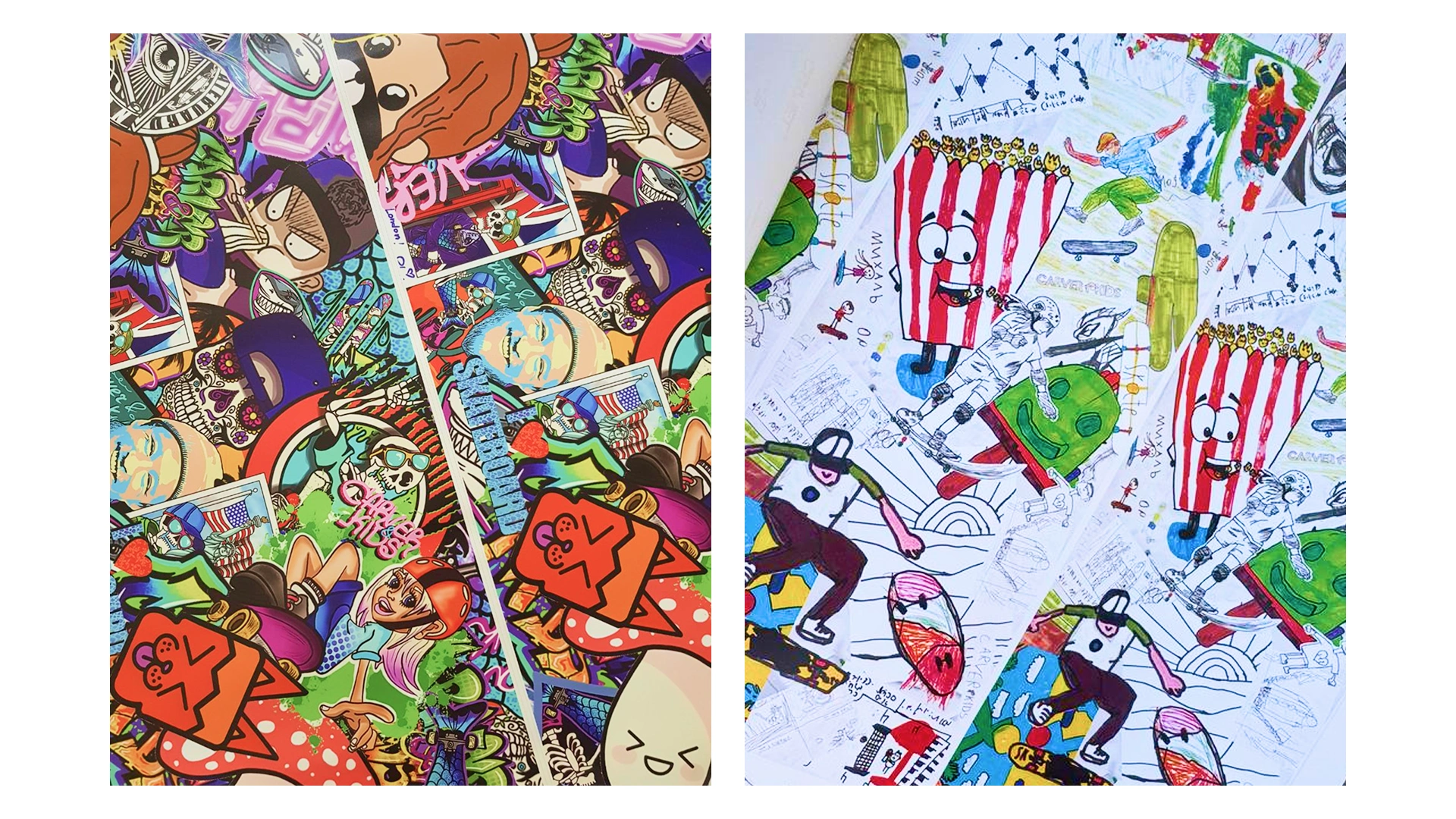
Custom printable skateboard deck designs
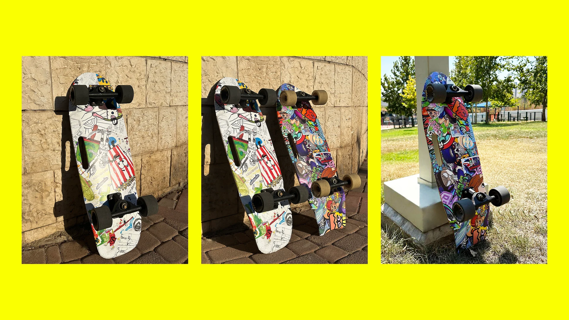
Photos of skateboards with final prints
Addition
As one of the experiments, an advertising campaign was developed using 3D animated characters integrated into filmed footage, creating an augmented reality experience. This approach aimed to diversify promotional materials while highlighting the gamified nature of the skateboarding learning process — a core principle of the school’s teaching philosophy and its focus on kids’ classes.
Animated videos. Characters from Mixamo
Carver&Kids logotype in-out
Like this project
Posted Mar 22, 2026
A scalable brand identity for a multilingual skateboard school. The brand supports diverse digital and physical products, requiring flexibility for growth.