Designing Lytz's Financial Decision System

Krutarth Oza


Money Decisions at Lytz
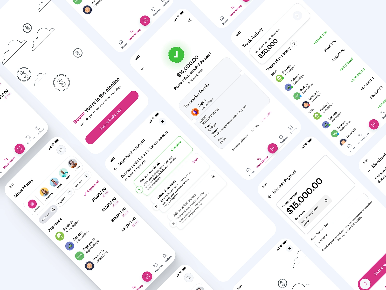
This case study documents how I worked on core product decision systems at Lytz, a US based fintech focused on instant settlement and zero transaction fees.
Overview
The challenge was not adding features, but turning fragmented payment actions into a coherent system that businesses could understand, trust, and plan around.
My work focused on designing decision surfaces that respected real financial constraints while helping founders and engineers align on long term product direction.
Rather than optimizing for surface level UX, the goal was to improve decision quality around money movement, onboarding trust, and product narrative.
This work helped evolve Lytz from a payment utility into a more intentional financial decision system.
This case study focuses on product decision making under real world constraints. You can skim the bold decisions or read deeper into the reasoning and screens below.
The Core Problems
When I joined, several important features already existed, but they did not yet function as a system.
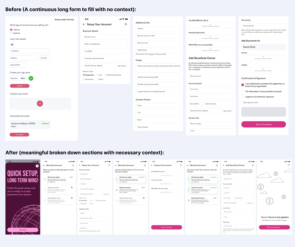
Onboarding introduced too much information too early, asking users to trust the system before it had earned that trust. This increased cognitive load at the most sensitive moment in the product experience.
The Move Money tab occupied a central place in the product, yet only supported basic send and request actions. It lacked depth, ownership, and a clear reason to exist as a destination, which made the product feel shallow despite having powerful backend capabilities.
Internally, founders also struggled to explain the product without relying on the word “free,” which positioned Lytz as transactional rather than strategic.
My Role and How I Approached the Problems
I worked as a Designer in close collaboration with founders and engineering in an high ambiguity product environment.
Because decisions made at this stage set long term constraints, my focus was on clarity, correctness, and system thinking.
To avoid designing misleading abstractions, I:
Studied internal documentation and the codebase to understand how payments, approvals, and financial states truly behaved
Mapped backend realities to user facing states so the UI never promised something the system could not deliver
Analyzed established fintech products like Stripe, Mercury, Ramp, and Wise to understand how trust and financial decisions are communicated through structure rather than copy alone
This approach ensured the product felt calm and understandable while still respecting real world financial complexity.
Problem 1: Fixing Onboarding Without Adding Noise
Problem:
Onboarding asked users for critical information without explaining why it mattered, increasing friction and anxiety at the moment of first trust.
Design reasoning:
In fintech, confidence matters more than speed. If users do not understand why they are being asked for something, they hesitate or abandon.
What I changed:
Broke long forms into structured, goal oriented sections
Used cards and hierarchy to visually separate compliance from configuration
Added contextual explanations only where trust and regulation were involved
Business outcome:
Reduced perceived friction without removing required steps
Improved trust signaling during the earliest interaction
Created a foundation that scales as compliance requirements grow
Problem 2: Redefining “Move Money” as a System
Problem:
Payment related actions were scattered, making the product feel reactive instead of intentional.
Design reasoning:
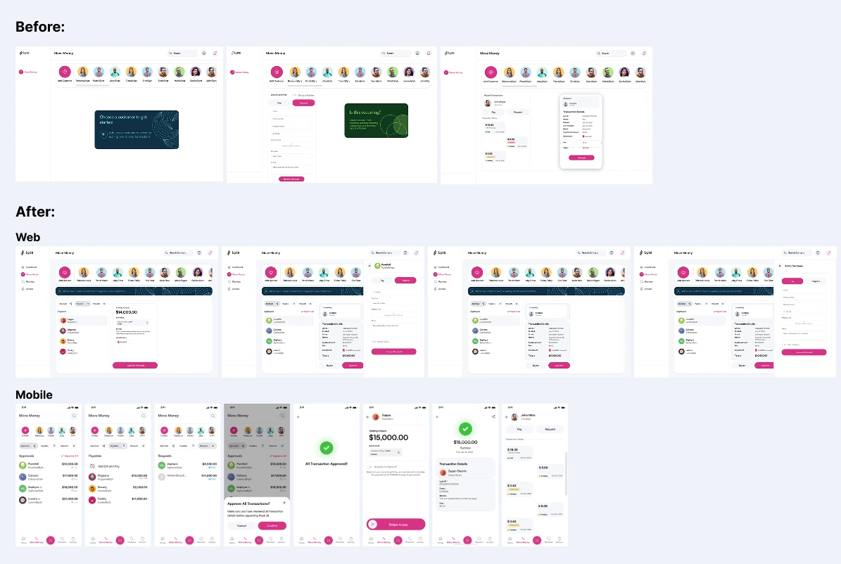
Money movement is not a single action. It is a sequence of decisions. These decisions should live in one place so users can maintain context.
What I designed:
I redefined Move Money as a unified system where users can:
Approve payments
Send and request money
Create and manage invoices
Search, invite, and manage counterparties
Edit and track transactions
Business outcome:
Reduced screen hopping and decision fatigue
Made the product easier to explain internally and externally
Turned Move Money into a control center instead of a utility screen
Problem 3: Reframing Marketing Through Outcome Driven Copy
Problem:
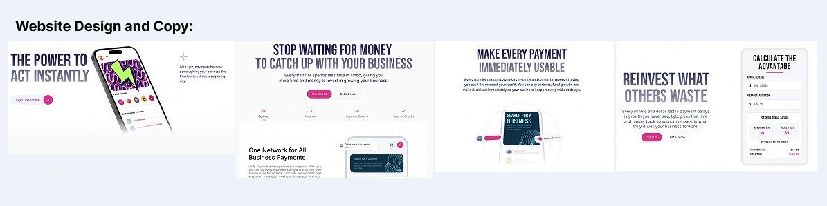
The product delivered instant settlement and zero transaction fees, but this value was difficult to communicate. Relying on the word “free” felt transactional, reduced perceived trust, and did not help business owners understand how Lytz would change the way they operate financially. check out the site I build here.
Internally, this also made it harder for founders to explain the product clearly and consistently across the website and onboarding.
Design reasoning:
Businesses do not buy features. They buy outcomes and confidence.
In fintech especially, language plays a critical role in trust. If the copy focuses on price alone, it creates skepticism. If it focuses on impact, it helps users visualize how the product fits into their real workflows.
The goal was to shift the narrative from what Lytz is to what Lytz enables.
What I designed:
I rewrote key product and website copy to emphasize outcomes rather than mechanics, including:
Framing instant settlement in terms of cash flow certainty
Positioning zero fees as operational efficiency rather than a discount
Using clear, human language to explain complex financial actions
Aligning copy across onboarding, core flows, and marketing surfaces so the product spoke with one voice
These changes were informed by competitor analysis and by understanding how the backend actually worked, ensuring the copy was both aspirational and accurate.
Business outcome:
Improved clarity and confidence in how the product is explained
Reduced reliance on the word “free” without losing its value
Made the product easier to pitch to larger, trust sensitive businesses
Created a narrative foundation that scales beyond early stage positioning
Designing the Mobile App from Scratch (0 → 1)
Problem:
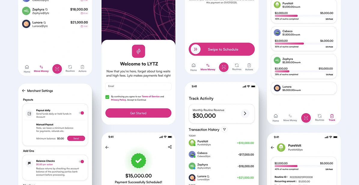
There was no defined mobile product, only the assumption that web features would scale down.
Design reasoning:
Mobile users in fintech are often making time sensitive decisions, not creating complex setups. Treating mobile as a compressed dashboard increases risk and hesitation.
Key decisions:
Mobile was treated as a decision surface rather than a creation tool
Approvals, status, and visibility were prioritised over configuration
Complex financial states were translated into glanceable, trustworthy views
Business outcome:
Clear differentiation between web and mobile use cases
Stronger positioning beyond price based messaging
A mobile foundation that supports scale without redesign
The Money Flow Concept (Forward Looking System)
Problem:
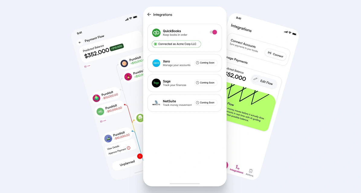
Businesses could see transactions, but not how today’s payment decisions affected future balances and confidence.
Lists and tables showed what happened, not what would happen.
Design reasoning:
Financial confidence comes from understanding cause and effect over time, not just reviewing past activity. Without visibility into future balances, users hesitate, delay decisions, or overcompensate.
The concept:
Treat money movement as a time based system rather than a transaction history. Money Flow visualizes past, present, and future payments in a single surface. Users can adjust approvals and schedules in a sandbox like environment and immediately see how predicted balances change.
AI supports scheduling and suggestions, but users retain final control.
Business outcome:
Created a long term differentiator beyond basic payments and aligned the team around a shared mental model of financial planning.
Impact and Reflection
This work helped evolve Lytz from a payment utility into a more cohesive financial decision system.
It reduced internal ambiguity, clarified product direction, and established a scalable foundation without increasing complexity.
Across all features, my approach remained consistent:
Reduce chaos
Respect real world constraints
Design systems that help people make better decisions with their money
Like this project
Posted Aug 23, 2026
Turned Lytz's fragmented payment actions into a coherent decision system: rebuilt onboarding trust, redesigned Move Money, and shipped mobile 0 to 1.