Building Trust into Compliance at e-Doc Online

Krutarth Oza


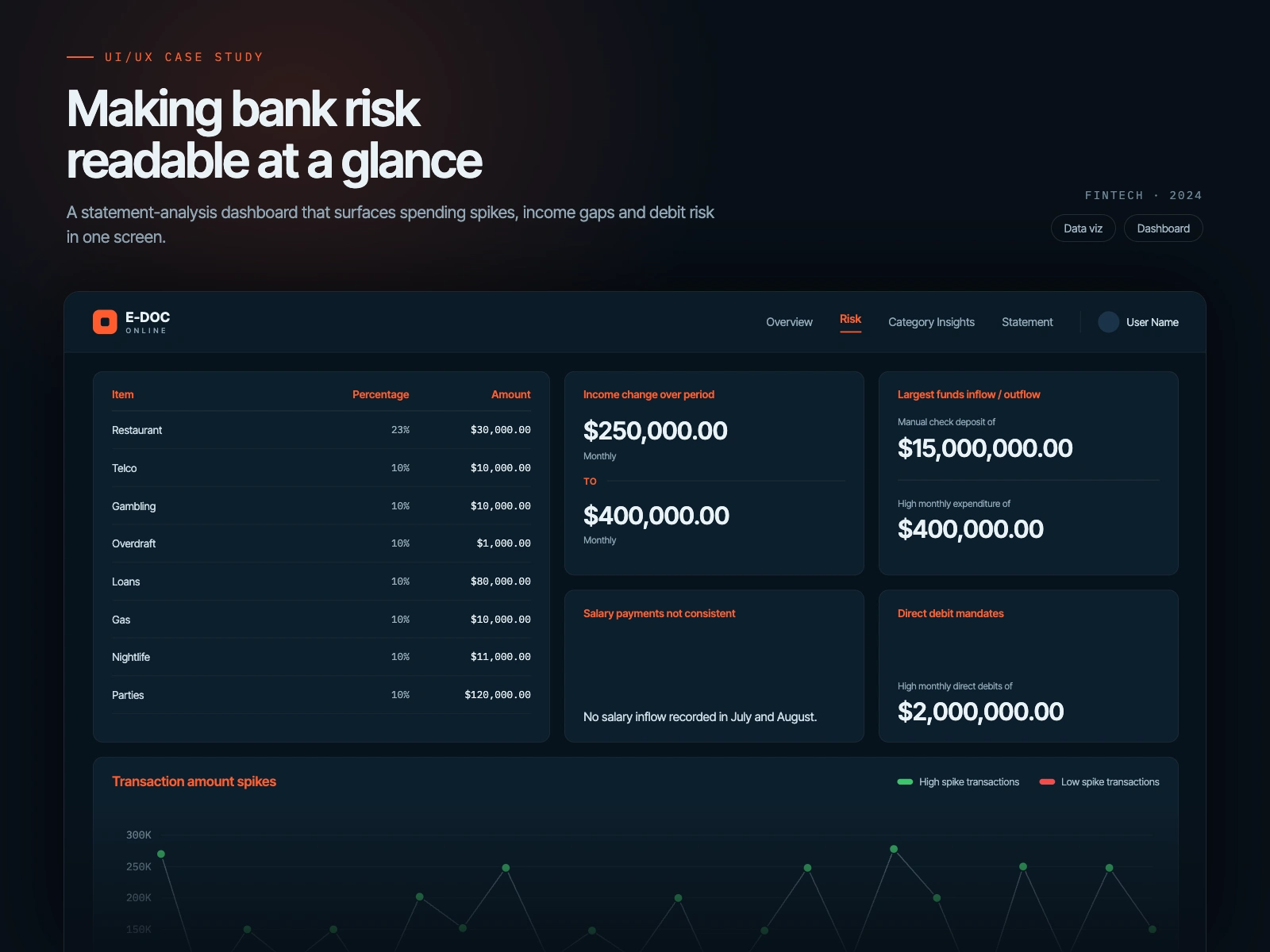
This case study documents how I designed and delivered both the public website and the full web application for e-Doc Online, a UK based fintech platform handling regulated financial operations such as direct debit mandates, income verification, and KYC.
The challenge was not visual polish. It was translating compliance heavy financial processes, the kind that are legally rigid and unforgiving, into flows that ordinary users could understand, trust, and complete without friction or fear.
My work focused on a single tension that runs through every regulated fintech product: the system has to be strict, but the user cannot feel the strictness. Every screen had to satisfy real compliance and validation requirements while feeling calm and navigable to people who were neither financially nor technically sophisticated.
This work took e-Doc from a set of backend capabilities and requirements into a complete, launchable product with a coherent front end that users could actually move through.
This case study focuses on designing usable experiences on top of rigid financial systems. You can skim the bold decisions or read deeper into the reasoning below.
Overview
When I joined, e-Doc had the backend logic and the regulatory requirements defined, but no coherent product surface. The assumption was that if the compliance steps were captured, the interface would follow.
The problem is that compliance heavy flows do not degrade gracefully. A direct debit mandate, an income verification journey, and a KYC check each carry legal weight, validation rules, and failure states that most consumer products never deal with. Exposed directly, this complexity would land on users who did not have the vocabulary or patience for it.
There were three connected risks. Users faced with raw complexity would abandon at the most sensitive moments. Trust, the entire currency of a fintech product, would erode the first time a user did not understand why something was being asked. And the business would inherit operational friction from every user who got stuck, dropped out, or submitted the wrong thing.
The goal was to design front end experiences that hid the machinery without lying about it, so the product felt simple while the system underneath stayed accurate and compliant.
My Role and How I Approached the Problems
I worked across product design and business analysis, directly with the client and the development team, in an environment where requirements were still being shaped as I designed.
Because these flows carried legal and operational consequences, my priority was correctness before polish. A beautiful screen that promised something the system could not deliver, or skipped a step compliance required, was worse than no screen at all.
To design responsibly, I:
Mapped how the system worked behind the scenes first, including data flow, validation steps, and compliance requirements, so the interfaces I designed were accurate and actually implementable rather than aspirational mockups.
Gathered requirements directly from stakeholders and converted them into interactive prototypes, so ambiguity got resolved in design rather than surfacing later in development.
Aligned on approvals early and supported a clean handoff into engineering, so what shipped matched what was designed.
This kept the product honest. Every simplification on the surface was backed by a real understanding of the constraint it was hiding, not a guess.
Problem 1: Direct Debit Mandates Without the Fear
Problem:
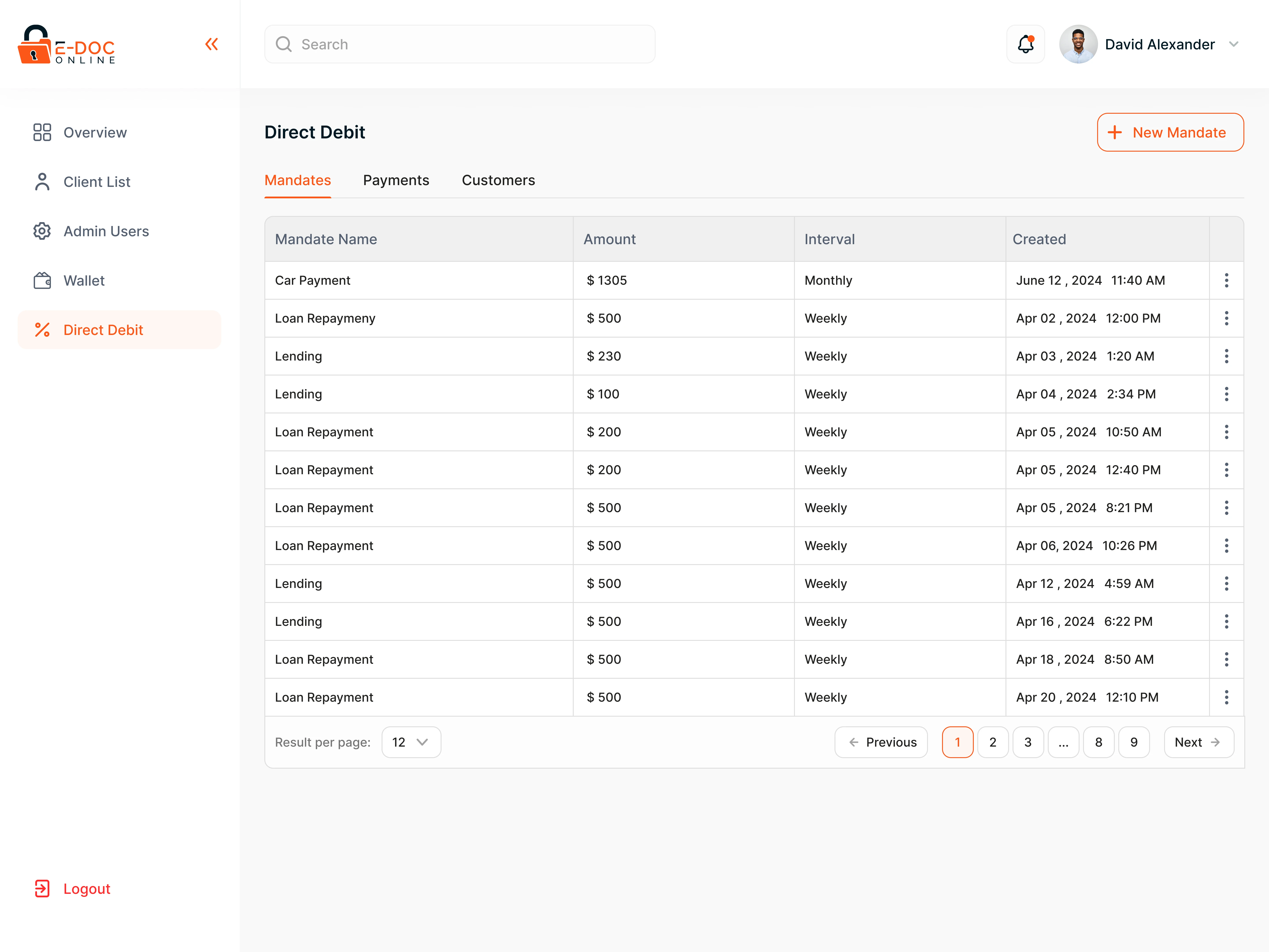
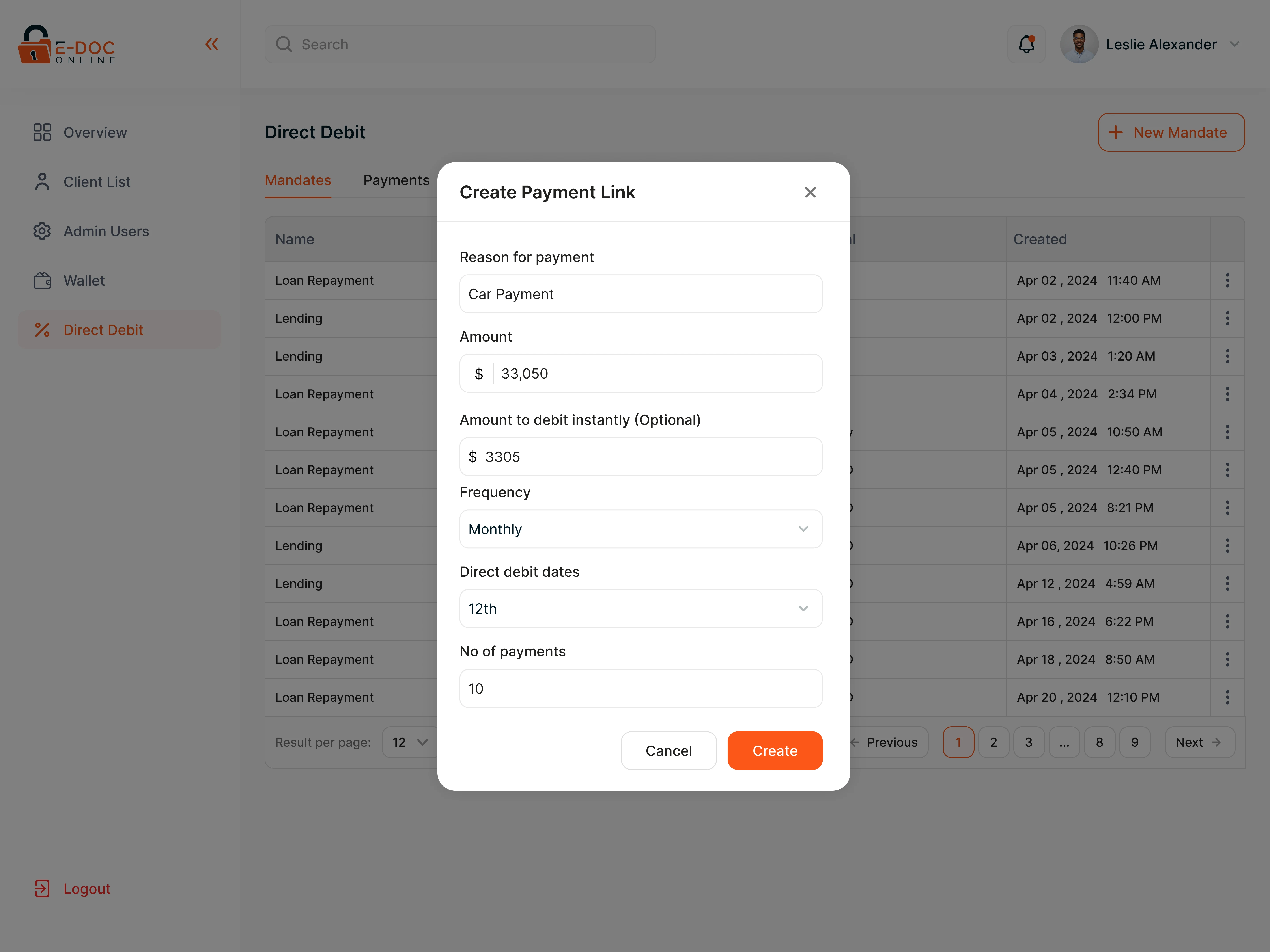
Direct debit mandates ask users to authorize a business to pull money from their account on an ongoing basis. This is one of the highest anxiety actions in consumer finance, and the legal language around it does nothing to calm that anxiety.
Design reasoning:
When users are granting recurring access to their money, hesitation is not a UX flaw to be optimized away. It is a rational response. The design job is not to remove the pause, it is to earn the yes by making the terms legible: who is being authorized, for what, and how it can be stopped.
What I designed:
Structured the mandate flow so authorization came after the user understood the terms, not before. Separated the legally required language from the plain language explanation of what it meant. Made the user's control, and how a mandate could be reviewed or cancelled, visible rather than buried.
Business outcome:
Reduced abandonment at the point of authorization by lowering perceived risk rather than hiding it. Produced a mandate flow that could stand up to compliance scrutiny while still feeling voluntary and clear to the user.
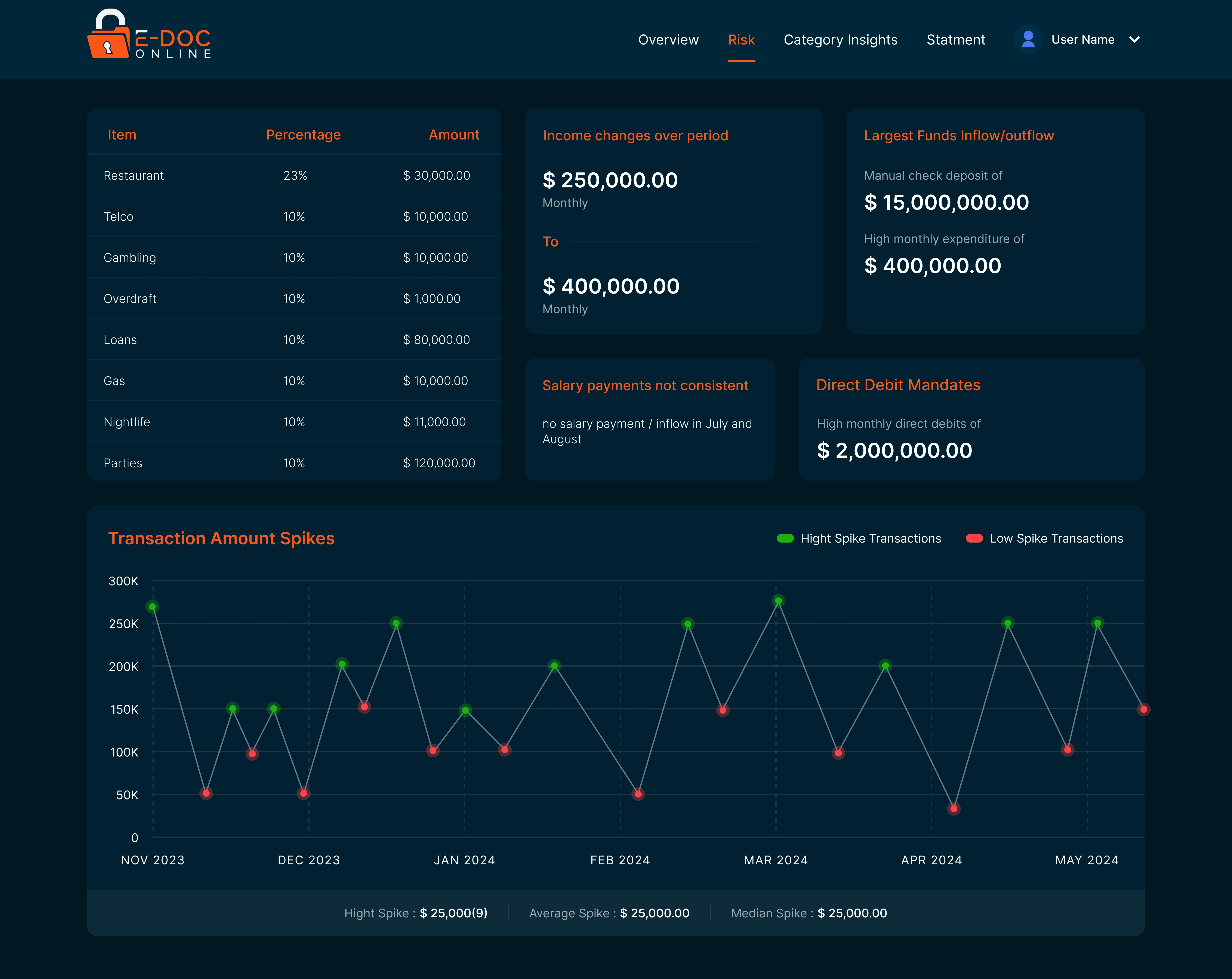
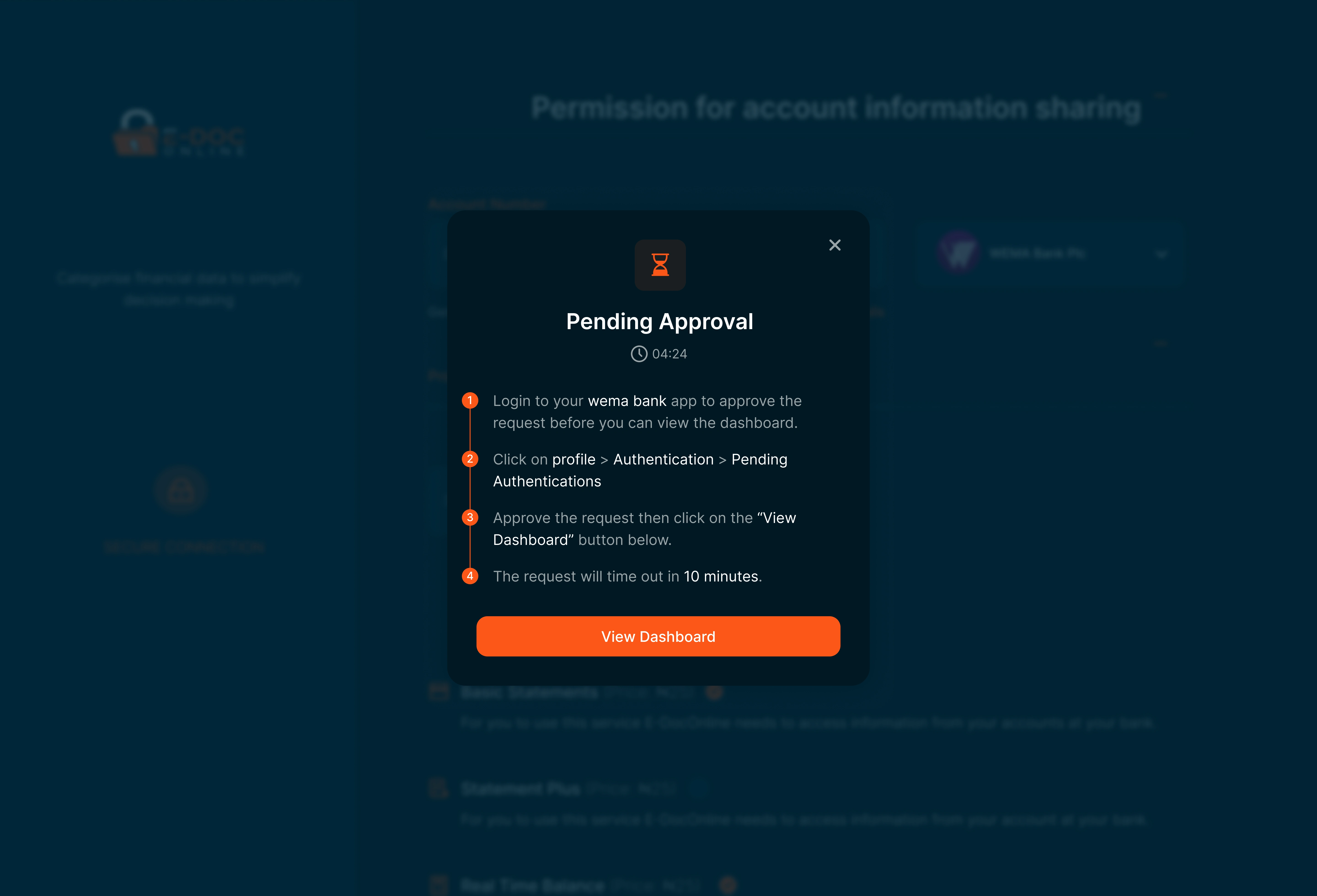
Problem 2: Income Verification and KYC as Guided Journeys
Problem:
Income verification and KYC require sensitive documents and personal data, requested from users who often do not understand why any of it is needed. Presented as a raw checklist, these steps read as intrusive and arbitrary, which is exactly when people abandon or submit the wrong thing.
Design reasoning:
In identity and income checks, the friction is rarely the number of fields. It is the absence of a reason. A user who understands why a document is required will find it. A user who does not will assume the worst and leave. Explanation is not decoration here, it is the mechanism that keeps people moving.
What I designed:
Broke each verification into a guided, step by step journey rather than a single wall of requirements. Attached a clear reason to each request, so the purpose was visible at the moment of asking. Designed states for the messy realities of these flows, including pending, in review, and failed checks, so users were never left staring at a dead end.
Business outcome:
Turned intrusive compliance steps into journeys users could complete on their own. Reduced the operational load of users getting stuck, submitting incorrect documents, or contacting support to understand a requirement.
Problem 3: Designing the Web Application as a System
Problem:
The individual flows, mandates, verification, KYC, and account management, were being specified in isolation. Designed separately, they would have produced a product that felt like disconnected features stitched together, which in a fintech context reads as untrustworthy.
Design reasoning:
Trust in financial products is cumulative. It is built or broken across the whole experience, not screen by screen. A user who feels confident in the KYC step and then hits a jarring, inconsistent account management screen loses trust in both. Consistency is not an aesthetic preference here, it is a trust mechanism.
What I designed:
Designed the flows as one coherent system with shared patterns for how information is requested, how progress is shown, and how states are communicated. Carried the same explanatory, low anxiety approach across every surface, from the most sensitive compliance step to routine account management, so the product spoke with one voice.
Business outcome:
Enabled the platform to launch as a complete, usable product rather than a set of disconnected features. Established a consistent foundation that new flows could extend without redesign.
From Requirements to Handoff
Alongside design, I acted as the bridge between business and engineering. I gathered requirements directly from stakeholders, translated them into interactive prototypes, and used those prototypes to resolve disagreements about scope and behavior before they reached development.
This reduced the ambiguity that usually sits between business intent, design, and engineering. Decisions got made against something concrete, and the handoff into development carried far less guesswork.
Impact and Reflection
This work took e-Doc from a set of backend capabilities and compliance requirements into a complete, launchable fintech product.
It let the platform go to market with a usable, coherent experience rather than disconnected features, reduced ambiguity across business, design, and engineering, and delivered a product that feels simple on the surface while handling genuinely complex financial operations underneath.
Across every flow, my approach stayed consistent:
Respect the real constraints of regulated finance.
Explain rather than expose.
Design systems that let people complete serious financial actions without fear.
Like this project
Posted Sep 2, 2025
Designed the full web app and site for e-Doc Online, a UK fintech, turning complex KYC, direct debit, and verification flows into simple, trusted journeys.
Likes
2
Views
62
Timeline
Oct 21, 2023 - Apr 15, 2025