Built with Jitter
YEAR ZERO LONDON: Independent Digital Archive Direction

Abdullah Eroğlu


YEAR ZERO LONDON
01 — HERO
Independent Digital Archive Direction
An independent speculative digital direction created for Year Zero London. Not commissioned by the brand.
Year Zero already had the difficult part: nearly two decades of identity.
Founded in London in 2006, the brand has built a world around hand-painted clothing, one-of-one pieces, commissions, art objects and an archive that feels closer to a physical collection than a conventional fashion catalogue.
The opportunity wasn't to reinvent that identity.
It was to give it a digital environment capable of carrying the same history, irregularity and physical character.
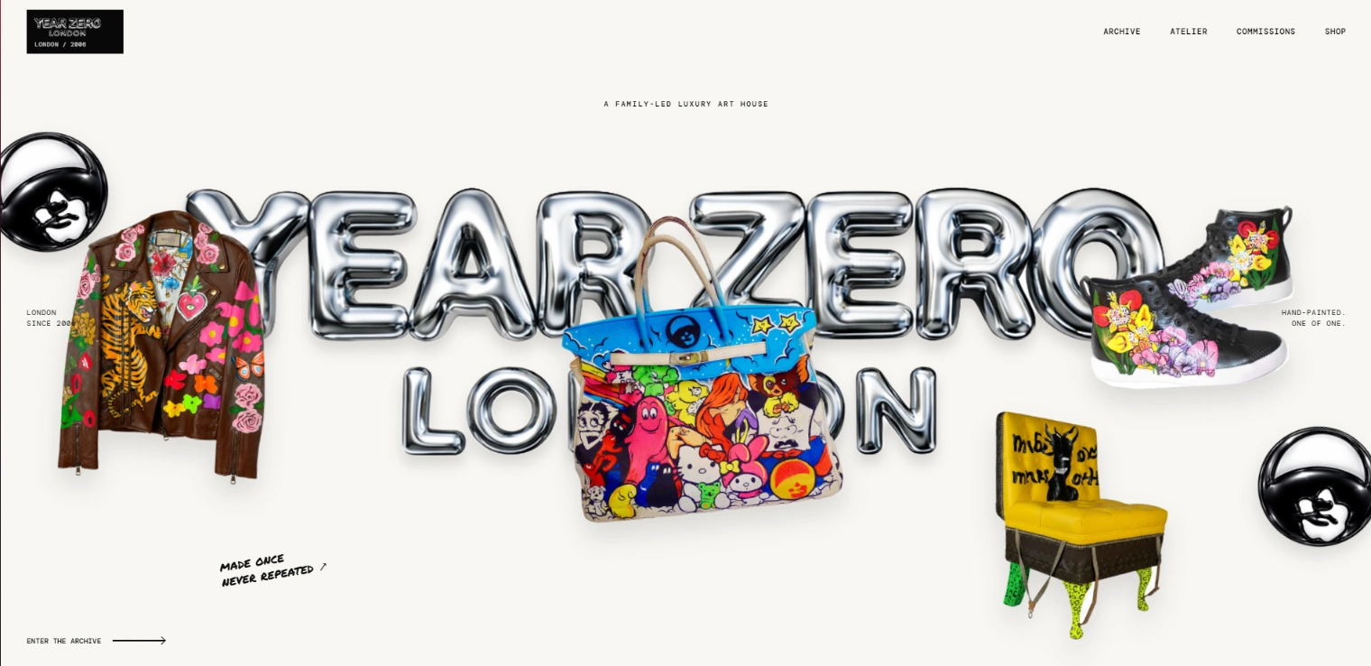
Website Hero
Hero Interaction And Idles
02 — THE OPPORTUNITY
THE OPPORTUNITY
Year Zero's strongest asset isn't simply its product range.
It's the accumulation of objects, people, collaborations, commissions and memories surrounding the brand.
A conventional ecommerce structure would inevitably flatten that history into categories and product cards.
I wanted to explore the opposite approach.
What if browsing Year Zero felt more like moving through twenty years of physical artefacts than navigating a conventional fashion store?
The archive became the starting point of the interface rather than a secondary page within it.
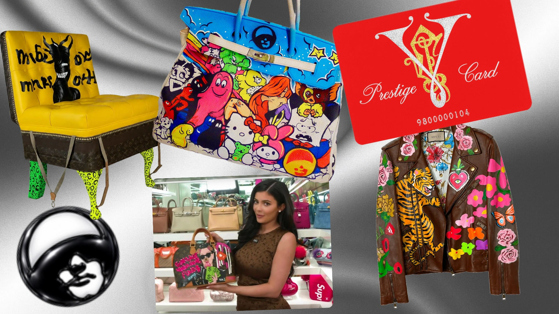
Style Of Year Zero London
03 — DIRECTION, NOT REBRANDING
DIRECTION, NOT REBRANDING
I deliberately avoided introducing a new visual identity.
Year Zero already had handwritten marks, irregular compositions, archive photography, hand-painted objects and almost twenty years of accumulated visual language.
Adding another design system on top of that would have made the brand cleaner, but less itself.
Instead, I focused on creating a digital framework around what already existed.
The principles were simple:
Preserve the irregularity.
Improve hierarchy without sterilising it.
Treat individual pieces as objects rather than inventory.
Use motion to suggest physical behaviour.
Make the archive and commerce feel like parts of the same world.
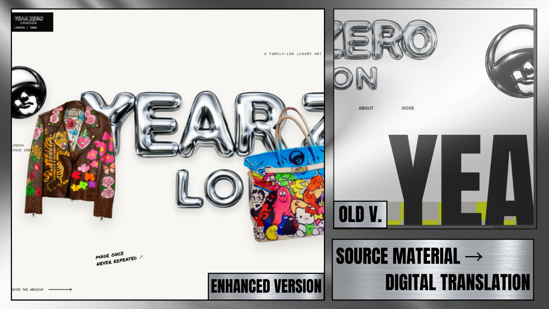
Enhanced / Old Version
04 — 2006 → NOW
2006 → NOW
The first interaction begins before the interface appears.
The loader counts from 2006 to the present, using Year Zero's founding year as the visitor's first point of contact with the brand.
Rather than adding a decorative loading animation, I wanted the transition itself to establish context.
Twenty years compressed into a few seconds.
Loader & Reveal Motions
05 — ART OBJECTS, NOT SKUs
ART OBJECTS, NOT SKUs
Many Year Zero pieces are hand-painted, commissioned or produced as one-of-one objects.
Presenting them through identical ecommerce cards felt fundamentally wrong.
The interface gives objects different scales, positions and movement behaviours so they retain some of the individuality they have physically.
They drift, rotate and occupy space rather than simply sitting inside a grid.
Motion remains subtle enough that the object stays more important than the animation around it.
Görsel 06 — Full motion section
Art Object, NOT SKUs section.
06 — THE ARCHIVE AS INTERFACE
THE ARCHIVE AS INTERFACE
Instead of isolating the brand's history inside an About page, archival material appears throughout the experience.
Past pieces, people and cultural moments interrupt commerce and become part of navigation itself.
Chronology is something the visitor encounters while moving through the site rather than something they need to stop and read.
WORN.
COLLECTED.
REMEMBERED.
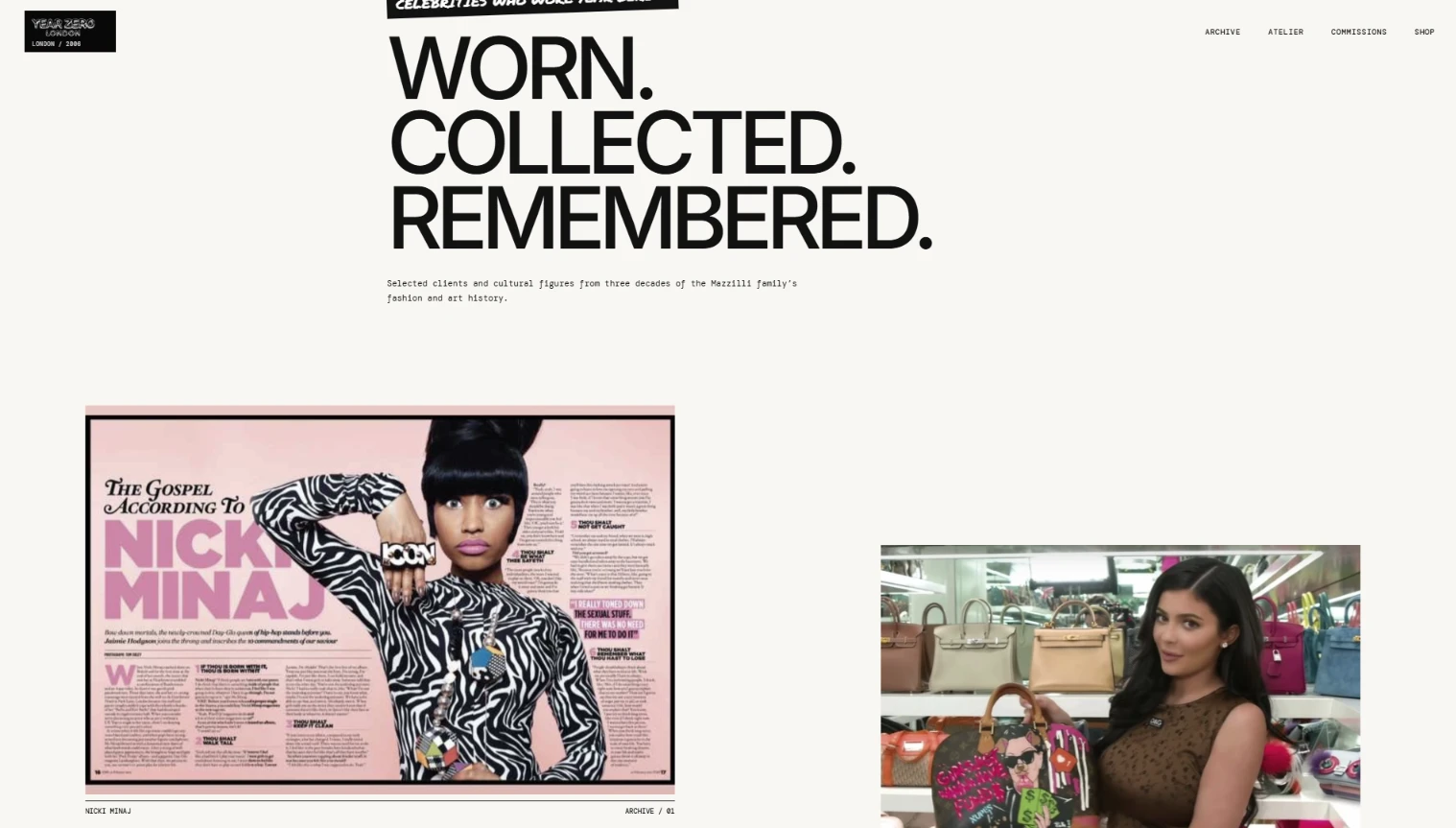
Worn Collected Remembered Section.
07 — COMMISSIONS
COMMISSIONS
The visual rhythm changes when the experience reaches bespoke work.
The bright archive environment gives way to a darker and more concentrated section built around a simple line:
ONE CONVERSATION.
ONE SINGULAR WORK.
A commission isn't simply another product variation.
It's a direct creative exchange between the client and the atelier.
Changing the palette and pace gives this part of the experience its own emotional weight without separating it from the wider identity.
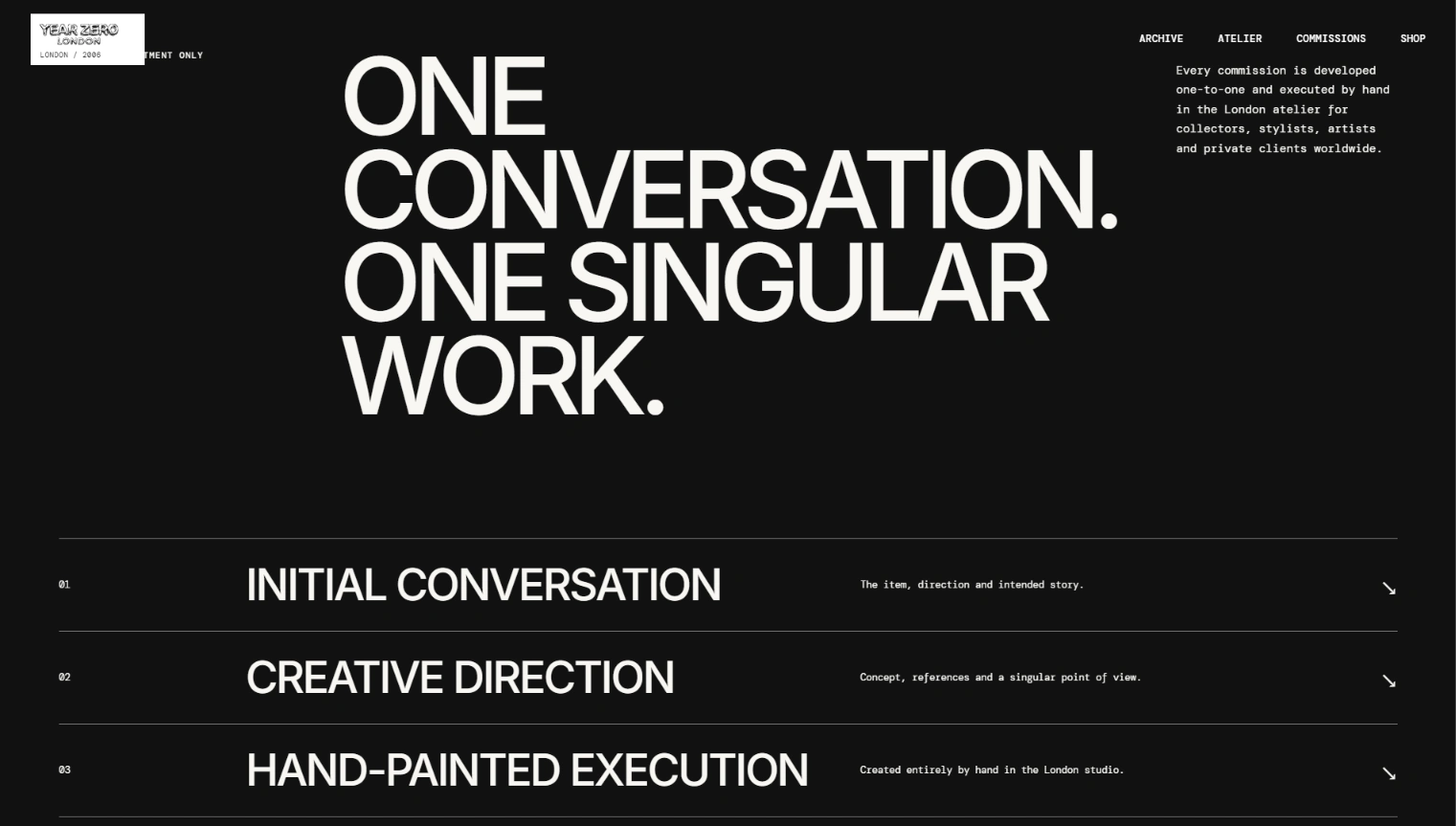
Black Weighted Site Section
Archive To Commision
08 — MOBILE WAS RECOMPOSED, NOT SHRUNK
MOBILE WAS RECOMPOSED, NOT SHRUNK
The mobile experience wasn't created by simply reducing the desktop composition.
Objects, typography, archive material and navigation were recomposed specifically around a narrow viewport.
Year Zero's handwritten and collage-based language also gave me an opportunity to make the mobile navigation itself feel more expressive.
The menu behaves closer to a small hand-assembled archive while remaining immediately understandable and usable.
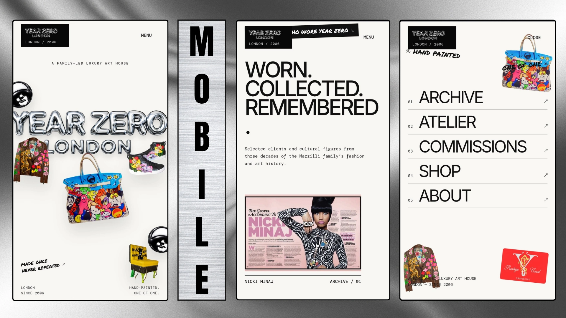
Mobile Hero, Archive and Hamburger Menu
09 — MOTION AS PHYSICAL BEHAVIOUR
MOTION AS PHYSICAL BEHAVIOUR
The motion system was designed around physical behaviour rather than spectacle.
Objects:
drift
rotate
suspend
settle
reveal
Not every object behaves identically.
That slight irregularity is intentional.
A perfectly uniform motion system would contradict a brand built around objects that are painted, altered and produced individually.
Year Zero Stuttered Motion Loop
10 — RESPONSIVE SYSTEM
DIFFERENT COMPOSITION. SAME IDENTITY.
Responsiveness wasn't treated as a technical clean-up step.
Spacing, object scale, typography, interaction density and navigation were authored independently for different screen sizes.
The layout changes.
The identity doesn't.
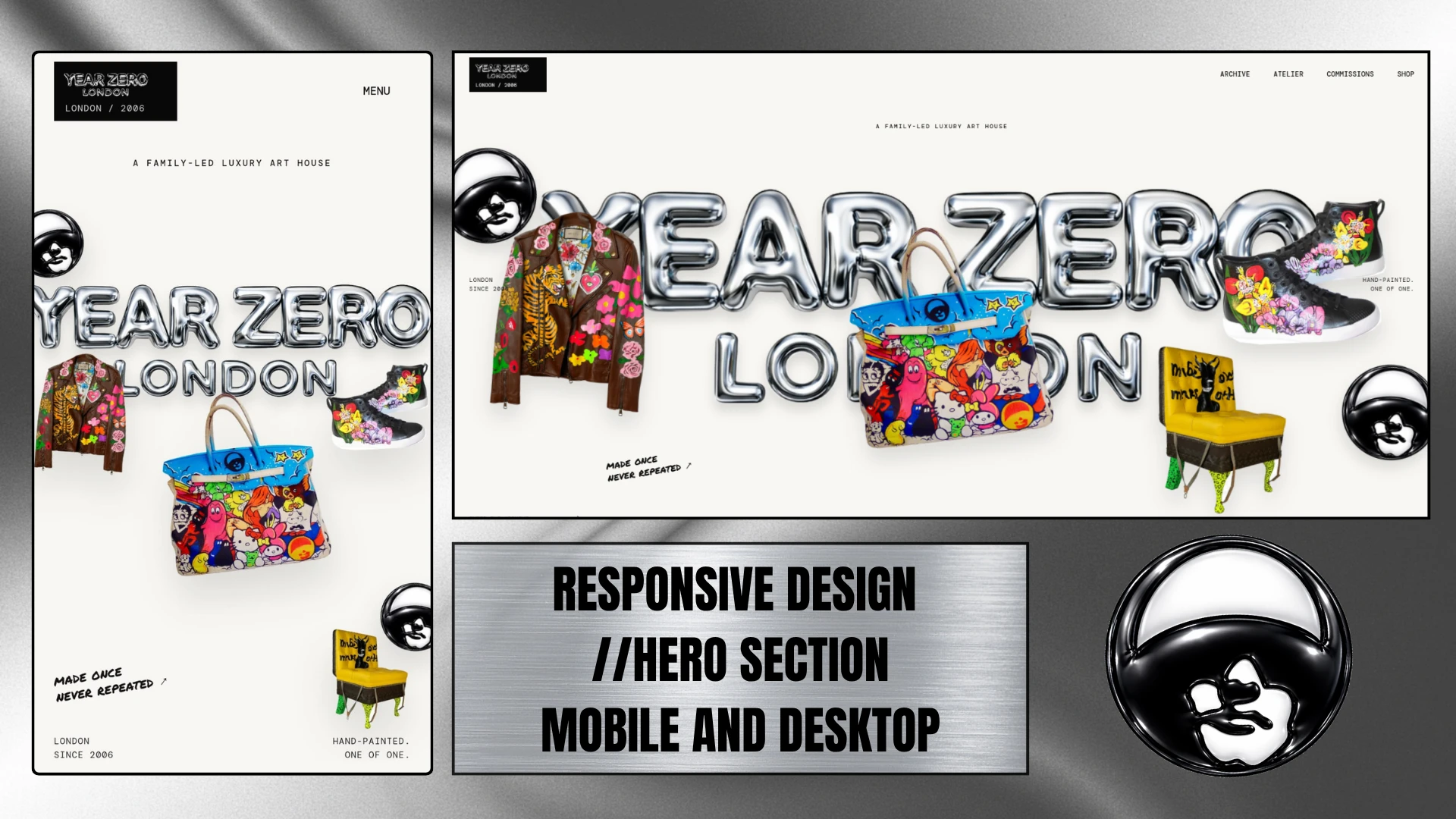
Responsive Design
11 — THE SYSTEM
BUILDING AROUND WHAT ALREADY EXISTED
The project uses Year Zero's existing imagery, artwork and visual language as its foundation.
I deliberately avoided inventing new campaign material simply to make the concept appear stronger.
The experiment was more interesting to me this way:
Could stronger digital direction reveal more of the value already present in the brand?
Scope
Creative Direction
Art Direction
Responsive Web Design
Archive Structure
Interaction Design
Motion Direction
Creative Development
Product-detail infrastructure, CMS, checkout and backend systems were outside the scope of this independent concept.
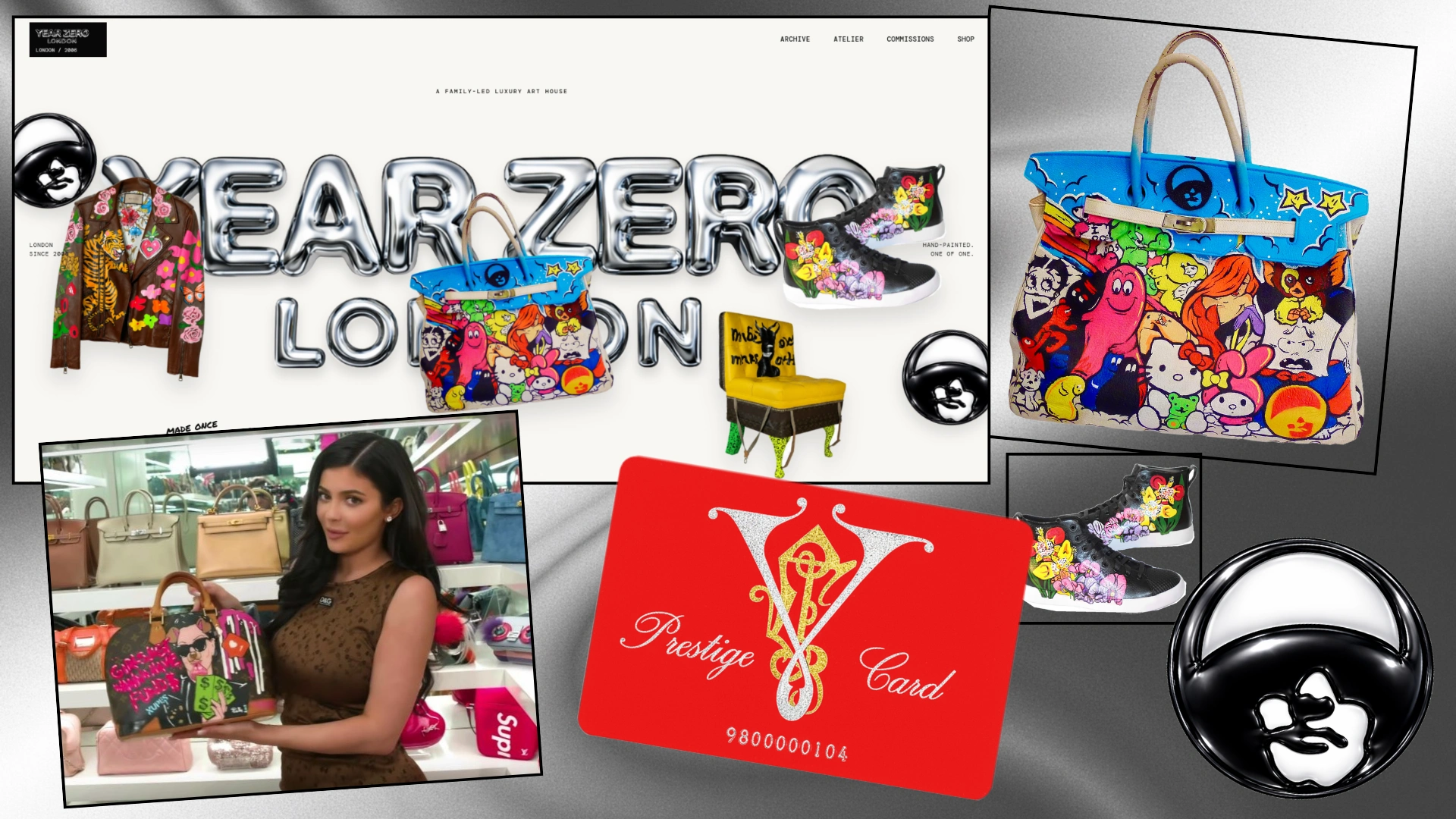
Overall Mosaic
12 — RESULT
THE RESULT
The final experience isn't intended to turn Year Zero into a different brand.
It's an exploration of how nearly twenty years of identity could occupy digital space with the same irregularity, history and physical character found in the work itself.
A TWENTY-YEAR ARCHIVE DOESN'T NEED MORE DECORATION.
IT NEEDS ROOM TO BEHAVE LIKE AN ARCHIVE.
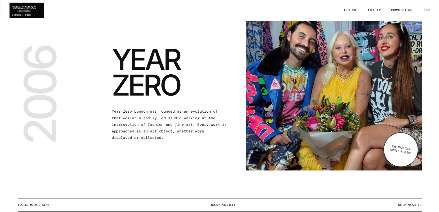
Rocky Mazıllı Site Section
View the live concept → erogludemo.com/yearzerolondon
Like this project
Posted Aug 24, 2026
An independent digital direction for Year Zero London, transforming nearly two decades of one-of-one fashion, commissions and archive material into a responsive interactive experience built around collectability, physicality and cultural memory.