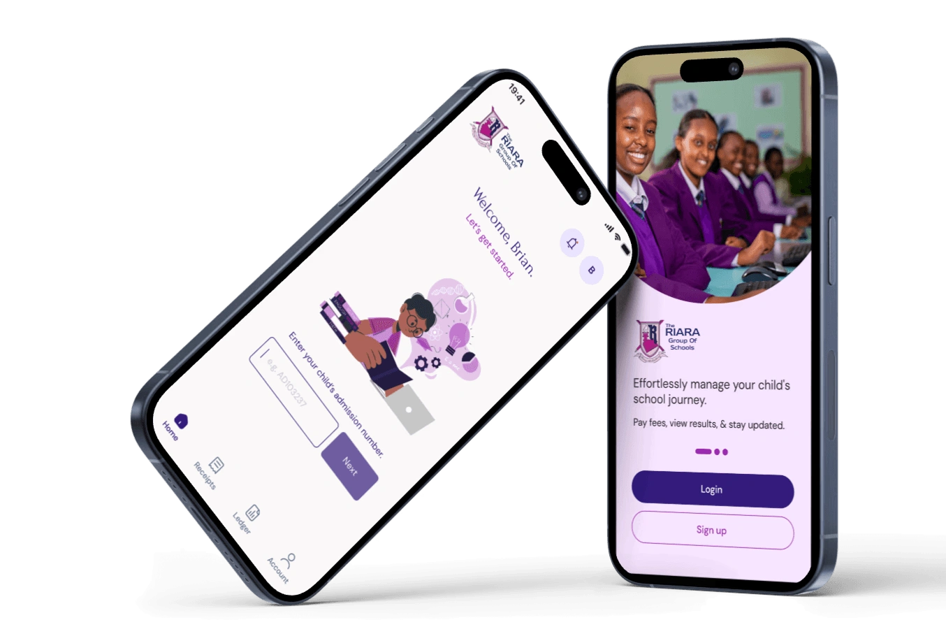
Riara Mobile App | UI/UX Design
Eliza Kinuthia
Background
Riara Schools required a mobile application designed specifically for parents and guardians to easily enroll their students into various school activities. The app would enable parents to make payments towards these activities, and track their payment history.
The initial phase of this project involved a series of interviews with Riara representatives to establish the pain points they were facing. Solutions to the issues raised would then inform the requirements of the application.
Issues
The following issues were brought to light:
• Lack of Real-Time Notifications – Parents don’t receive instant updates on enrollment status or payment confirmation, or deadlines.
• Unclear Payment Status – No easy way to check if a payment has been processed or is still pending.
• Desire for All-in-One Solution – Parents want a single platform to handle enrollment, payments, and history tracking seamlessly.
• Juggling Multiple Children’s Enrollments – Parents with multiple kids need to manage different activities in one place.
• Lack of Centralized Access – No single platform to view all available activities and enroll students easily.
• Lack of Payment History – No central place to track past payments or outstanding dues.
Requirements
Based on these insights, the following key features were defined:
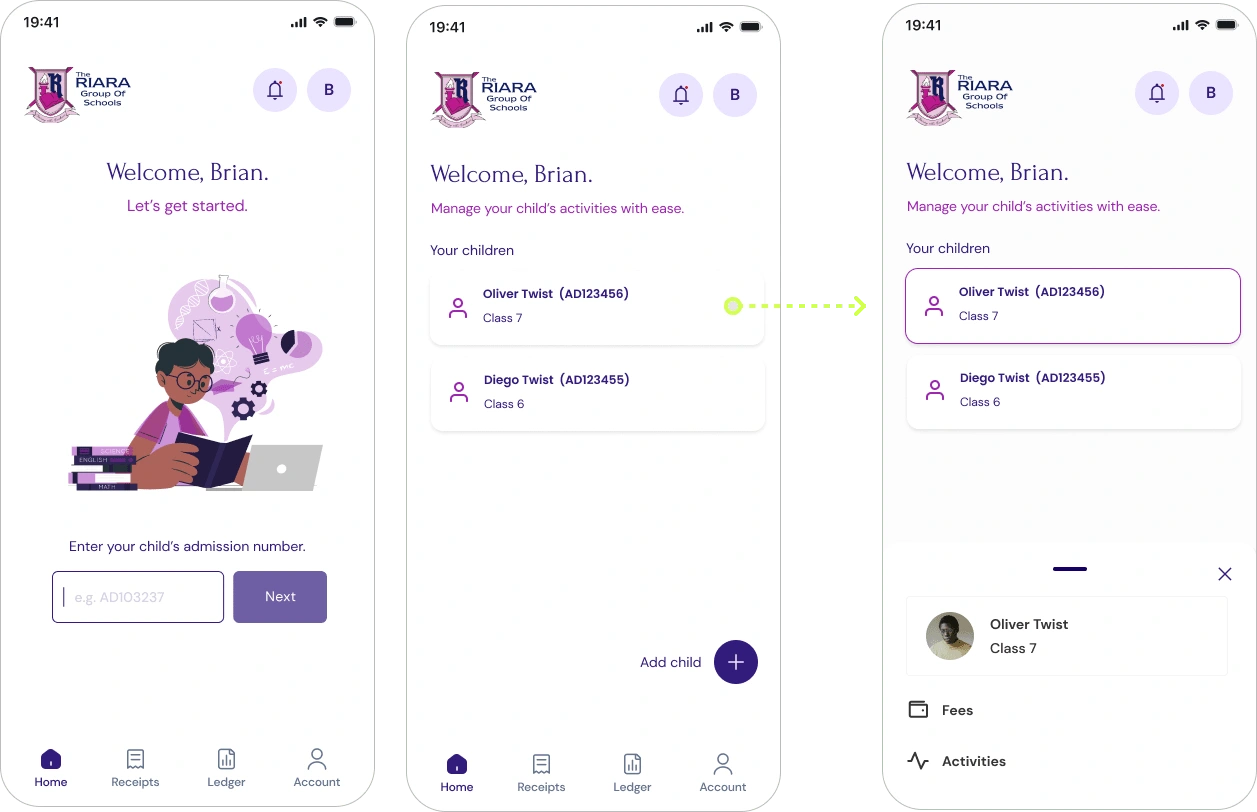
Multi-Child Management – Allow users to manage and oversee activities pertaining to each of their children
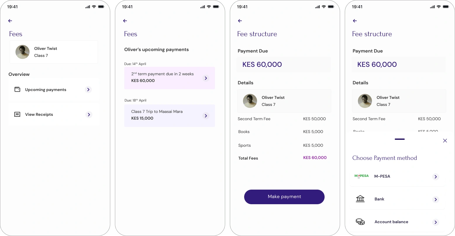
Seamless Mobile Payments – Enable payments through Bank or M-PESA for convenience.
Payment History Tracking – Provide a ledger & receipts for users to review past transactions.
Activity Fee Transparency – Display activity costs clearly and facilitate easy enrollment.
Research
To kick of the design process, I carried out benchmarking and qualitative research to better understand the design patterns the target group is familiar with.
Target audience: Parents & Guardians of Riara students
Social status: Middle to Upper middle class Kenyans
Lifestyle: Corporate workers & Entrepreneurs, with limited time on their hands
Most frequented apps: WhatsApp, Instagram, Facebook, Budgeting & Note taking apps.
UI preferences: Straightforward, simple to navigate, easy to learn
UI dislikes: Technical, intimidating, cluttered
It was clear that the app required a friendly and fast UI that would enable users to quickly perform their intended task.
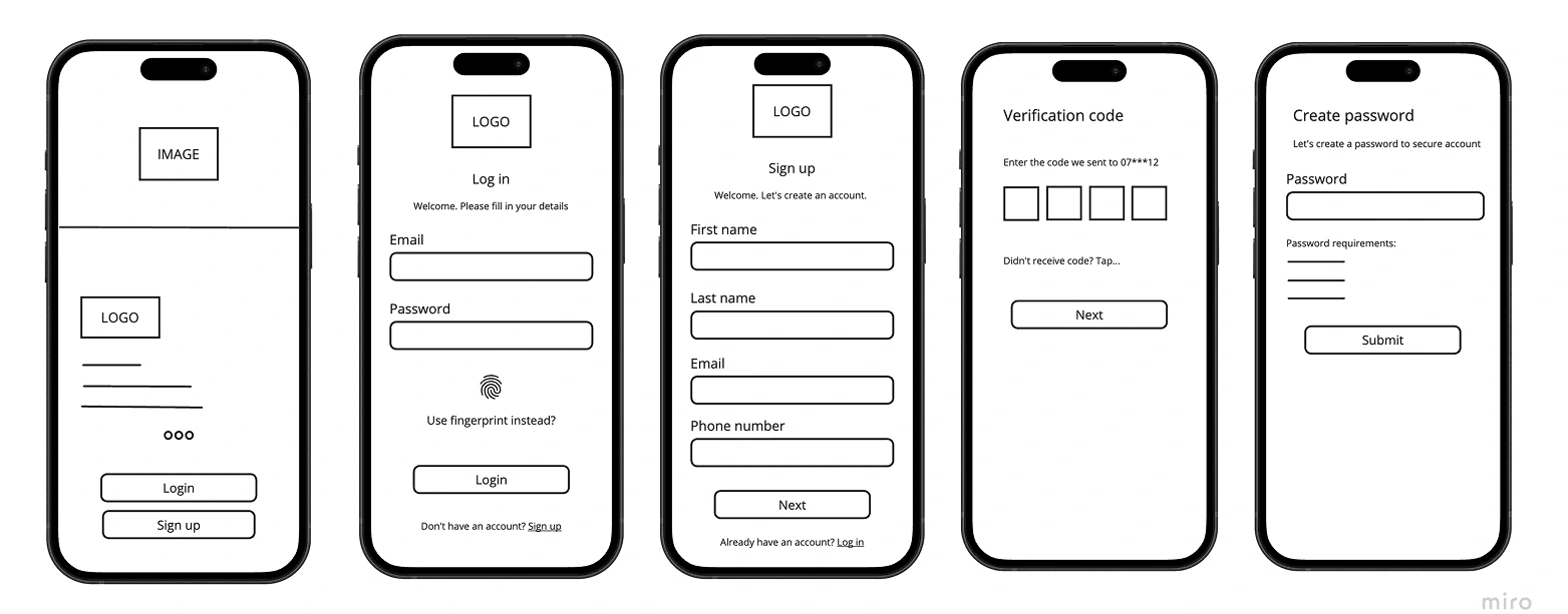
Low Fidelity diagrams
I drafted low fidelity designs to plan out the layout of the application, and visualize the flow with stakeholders.
Mid-fidelity diagrams
Once the basic structure was approved, I moved on to mid fidelity designs, to give a better feel of the direction we were headed in, and to gather insights from usability testing. Below are a few samples of the mid-fidelity screens.
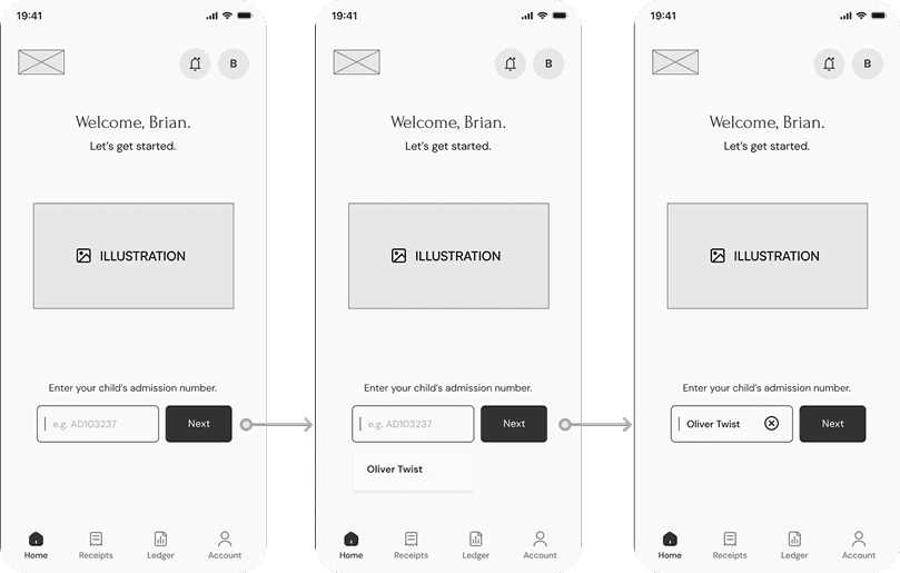
Adding a child
———————————————
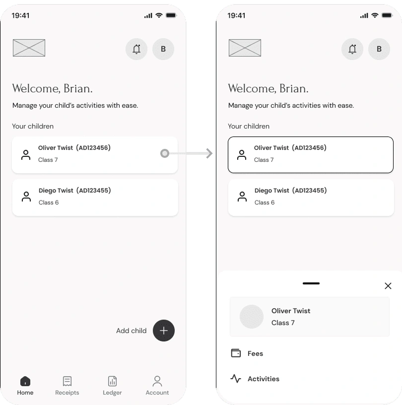
Home screen: Tapping on a child’s card opens drawer with menu options pertaining to them.
———————————————
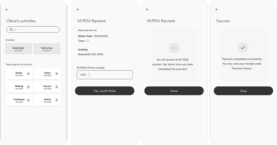
Activities & M-PESA Payment - User taps on desired activity and proceeds to enroll their child by making M-PESA payment.
Usability testing
Usability tests were carried out on five participants. These were the insights, including additions from stakeholder reviews.
"Interface layout is straightforward and easy to use."
"Activities layout takes a while to scan where there are many activities."
"At first glance, one might think user has to enroll to all activities listed. Need for clearer communication."
"Would like to see more activity details, as well as contact details for teachers in charge."
Iteration
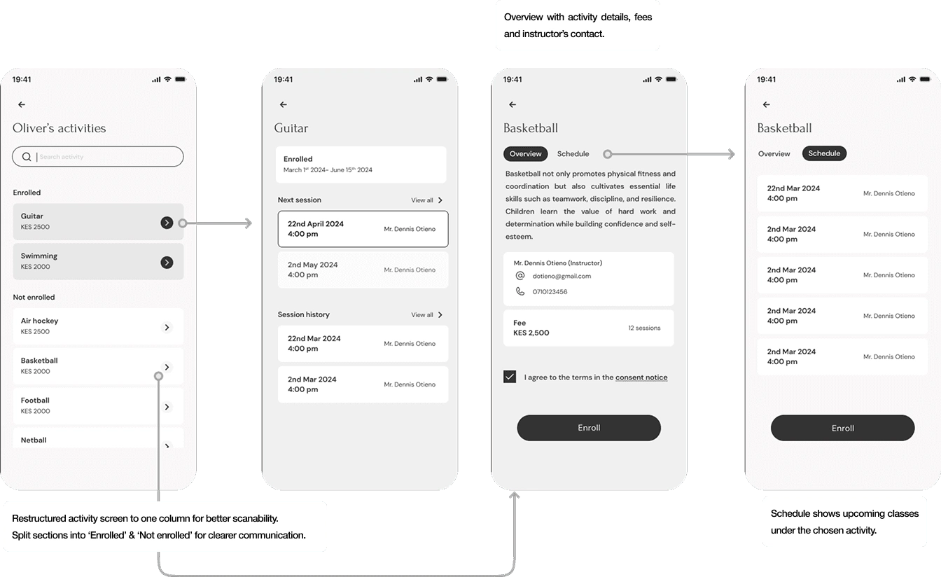
Based on the feedback, I made the following improvements to the activities section:
Restructured the activity screen to one column for better scanability.
Split sections into 'Enrolled & 'Not enrolled', with difference in color for clearer communication.
Made the activity section more descriptive, and added the instructor's contact details.
High Fidelity
After iterating on the designs, I conducted further testing and reviews with stakeholders. Once the update was approved, I moved on to high fidelity designs.
To maintain cohesion throughout the application, I utilized a design kit aligned with Riara's brand colors. This kit facilitated a seamless design flow with reusable components, ultimately streamlining the development process.
Design system
Samples from design system
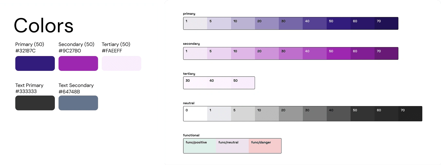
Colors from design system
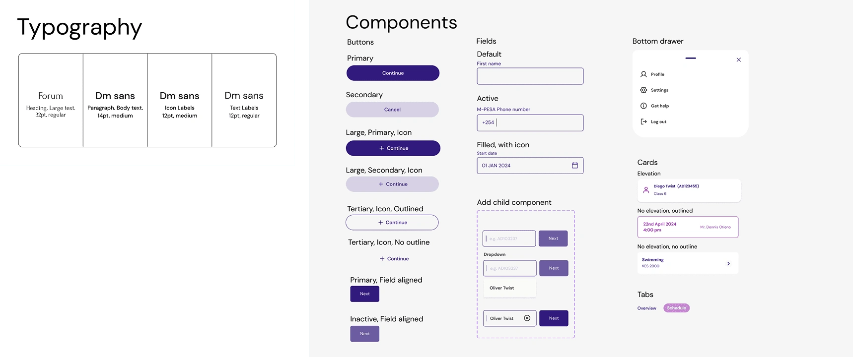
Typography - Forum from Riara's brand guide, paired with DM sans for ease on the eye and better readability.
Components - Reusable components enabling efficiency and consistency across the design.
Samples
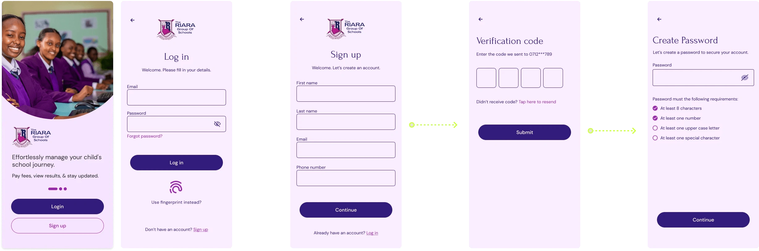
Some samples from the high fidelity design:
Implementation
Once the high-fidelity designs were tested and approved, we moved on to the implementation phase. Close collaboration with the development team was key, maintaining regular review sessions to ensure that the final product adhered to the design.
Testing insights
User testing brought encouraging feedback, with parents finding the app intuitive and easy to navigate. They particularly appreciated the streamlined enrollment process and clear payment tracking.
Future plans
Future updates will allow users to seamlessly view their children’s exam schedules, check results, and manage attendance. I ensured the UI navigation is scalable to make room for these features, prioritizing ease of use while maintaining a visually cohesive and efficient experience.
Explore the prototype here
Like this project
Posted Feb 13, 2025
School mobile app that allows parents and guardians to easily enroll students in school activities, make in-app payments, and track their payment history.
Likes
0
Views
6