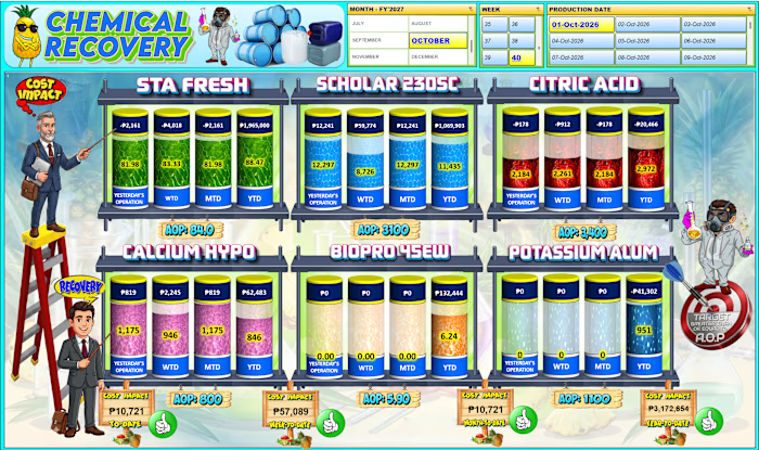
An interactive Power BI dashboard

HENRY JR Cabang


An interactive Power BI dashboard designed to monitor and analyze carton wastage and its cost impact against the Annual Operating Plan (AOP).
The dashboard provides daily, weekly, monthly, and yearly analysis of:
Carton wastage and quantity trends
Wastage cost impact vs. AOP
Causes of damage and their contribution to total wastage
Team performance, including the team with the highest damage
Daily, weekly, monthly, and yearly trends
Interactive buttons for easy navigation between different time periods
Power BI Q&A page for users to ask questions and explore the data interactively
The dashboard transforms raw operational data into clear graphical insights, helping management identify major wastage drivers, monitor trends, compare actual performance against AOP, and determine areas that require corrective action.
Key value:
From wastage data → KPI analysis → graphical visualization → business insights → actionable decisions.
Like this project
Posted Oct 2, 2026
An interactive Power BI dashboard designed to monitor and analyze carton wastage and its cost impact against the Annual Operating Plan (AOP). The dashboard p...