Case Study: Money Manager UX Audit
Eugene Adavore

Ever had that Eureka moment when you have the renewed enthusiasm to turn your whole life around in an instant? Well I have those every two or three weeks and just recently I had yet another.
So a few weeks ago I thought to develop a new habit of being able to keep track of each and every money spent or gotten. Sure I can do it, I will become a money manager, a master of finances if you will, those guys.
So I went on a hunt, what products out there can help me develop this habit that I so desperately desire. I asked a couple of my friends and I got a few suggestions. One of which is the Money Manager Application. An amazing product if I do say so myself. Join me on a journey as I share my experience, findings and an eventual redesign of the already amazing product, walk with me shall we?
Initial Confusion
‘Uhm, what am I suppose to do now, wait is this the right app though? This is the app silly, it is (Right??).’

Well, download and access to the application was without hitches of course, I was welcomed with a host of important parameters to help me track my expenses but the slight issue with it is, there were a lot and all over the place, it was so easy to get distracted just looking at all the information I had to digest at a go.
Well, I want to change my life and be more financially responsible, so I needed to start using this magic wand of an app. With that in mind, I started to use and I began to see I had questions upon questions at each turn.
Being a UX Designer, the application, design and experience fascinated me and I thought to dig a little deeper, documenting the issues I was having and thought maybe a lot more users could be experiencing the same too.
What people are saying: Reviews from users
Well I just might be overly critical because of my design background that I fail to just enjoy the product. So I thought to do a bit of research. What are people saying about the application? Are they having any complaints whatsoever? If so, what are they? Let’s find out.
I went to the app store to check out what people that have been using the product had to say. Good experiences, bad experiences? Let’s have them all.
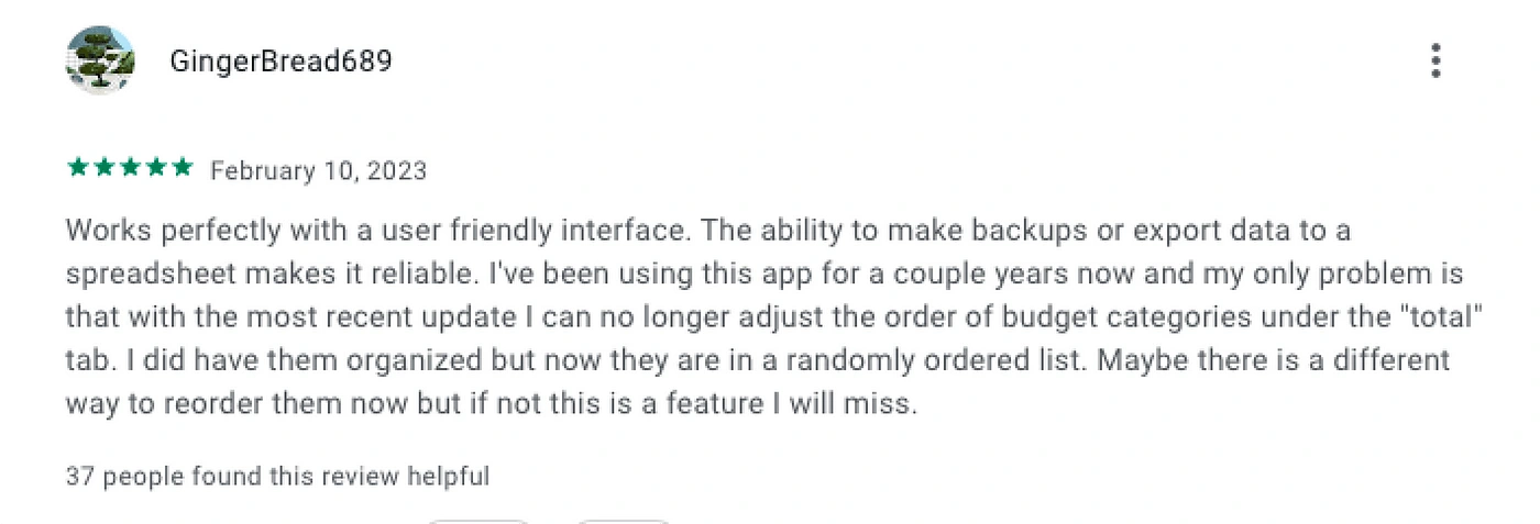
Key Insight from GingerBread689:
Friendly Interface.
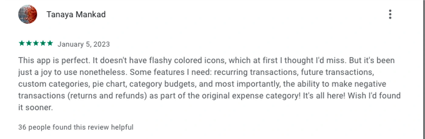
Key Insight from Tanaya Mankad:
Helpful features.
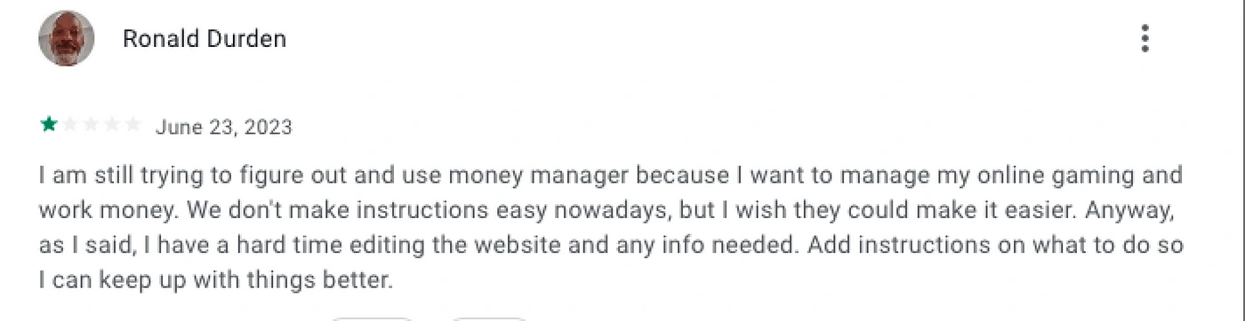
Key Insight from Ronald Durden:
No clear instructions.
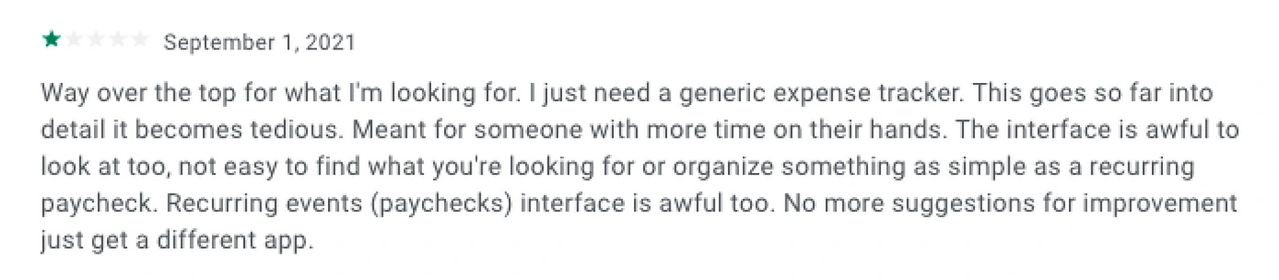
Key Insight from user
Unclear interface design.
Too more detail that it is tedious
User Interviews
For this, I decided to group my participants into two different category of users. One category of users will be those that are already familiar with the application and have been using it for a few months and the other category of users will be those that I will be onboarding to use the application.
The goal of this categorization is so I can get an unbiased view from both class of users.
Category A — Active users
Here are some of the questions I asked this class of users and the responses I got from them.
Participant: Ameerat (F): I do not have a set income and fixed bills to pay. I just want to know where my money is going to know how much I am spending and how much I need to lock down.
Q.What has your experience been like using Money Manager?
A. Its been good, easy and straightforward.
Q. Have you encountered any difficulties or frustrations while using the app? Can you provide specific examples?
A. Oh there are no difficulties that I can think of.
Q. What are some of the things you record and how do you do it usually?
A. Transportation, clothing, a few bills and of course airtime.
Q. Have you recommended the app to anyone before? How did they take it?
A. I did recommend it to a friend of mine, but she was not interested.
Category B— New users
Here are some of the questions I asked this class of users and the responses I got from them.
Participant: Ori Abang (F): A designer looking to get a grip on her income and expenses.
Q. How was the onboarding process for Money Manager like?
A. The onboarding was nice, short. No email/phone number.
Q. After spending a little time on the app, how intuitive can you say it is?
A. It was not intuitive. It did not feel like I was communicating with the app. For an unfamiliar looking environment I hoped they had asked me questions or given me a better user guide. it very was confusing.
Q. What are your thoughts on the overall application, experience and all else?
A. It looks simple but had a lot of things going on, It was sort of confusing to navigate.
Major Takeaways
I did a couple of other interviews with participants of both categories and some of the recurring variables kept coming up especially from new users are as follows:
New usersSome of the concerns expressed by the new users are as follows:
It was overwhelming at first with not enough guides to carry out actions.
It looked like a forex product and had some finance terms that are unfamiliar.
It gets easier as I began to use it.
Existing users
Some of the concerns expressed by the existing users are as follows:
Little to no difficulty encountered.
Took a while to get used to but it became easier.
Heuristics Evaluation
Now I have been able verify to a certain degree what the pain points of users of the Money Manager Mobile Application are. And I did a thorough Heuristics Evaluation of some of the major Screens.
By using the heuristics Evaluation Laws, I outlined some UX issues and I went on to solve them using design.
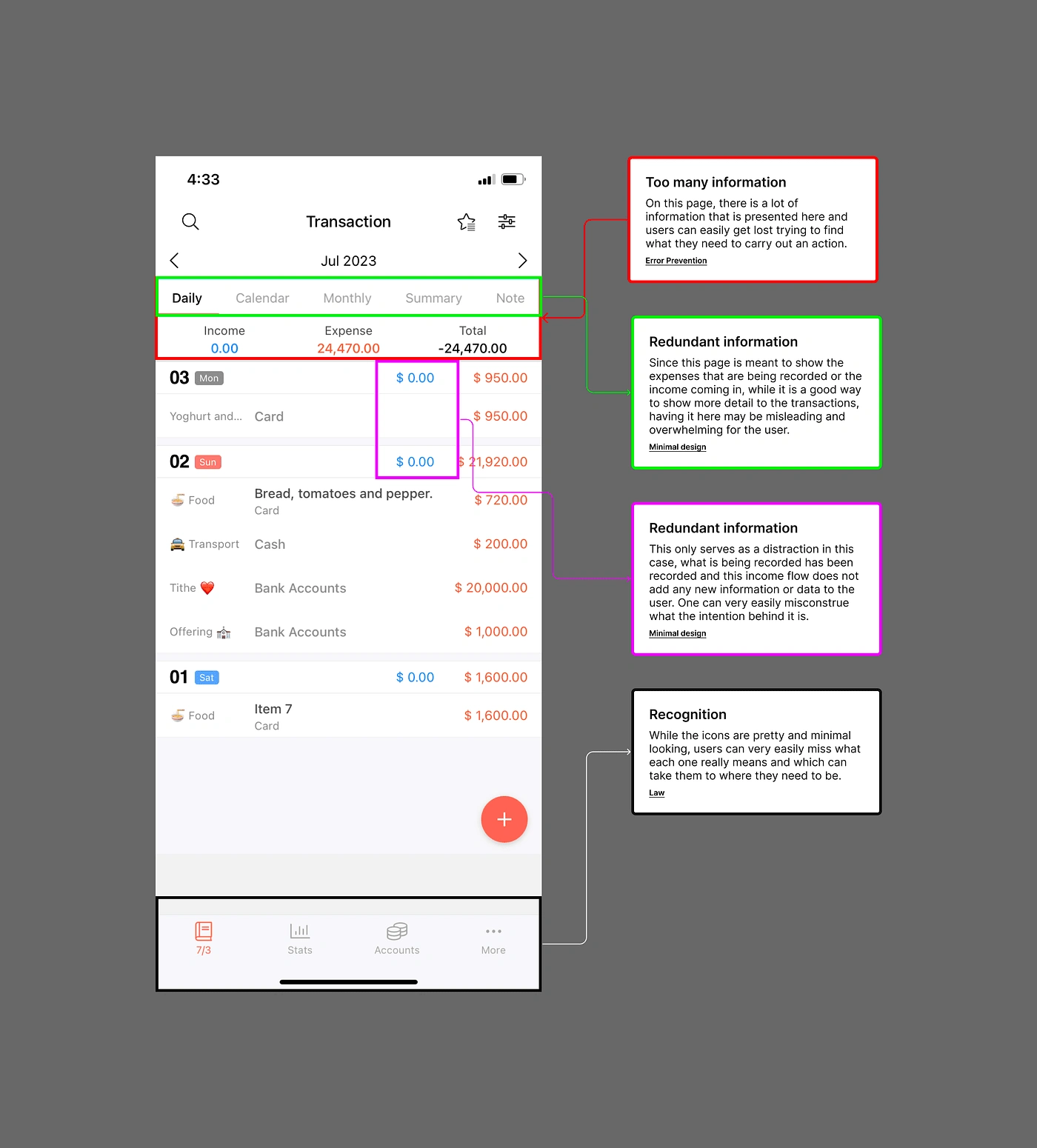
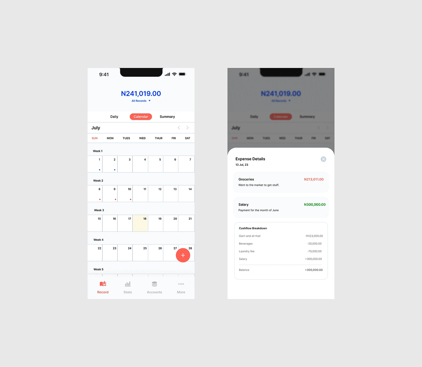
There is a whole lot going on in this home page and it may take a little while for users to be able to completely digest everything going on without being overwhelmed by all the information laid out.
Some the information being represented on the picture above, elements should be removed seeing that their relevance to the user trying to just record an expense and go is not very high.
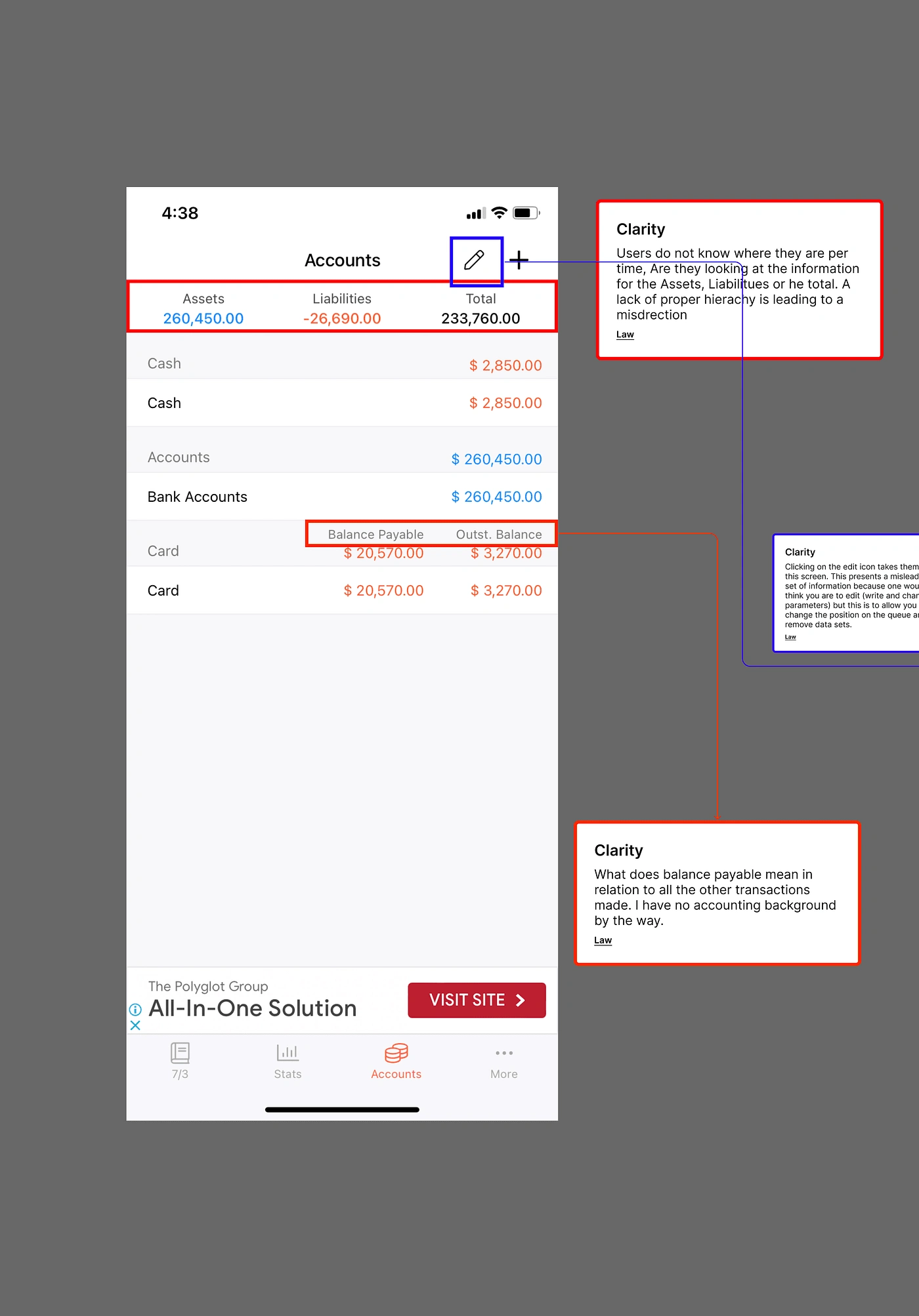
All information represented in this design are all important of course, the idea that needs to be fixed is being as clear as possible so user do not assume at every point what they are supposed to be doing at any point.
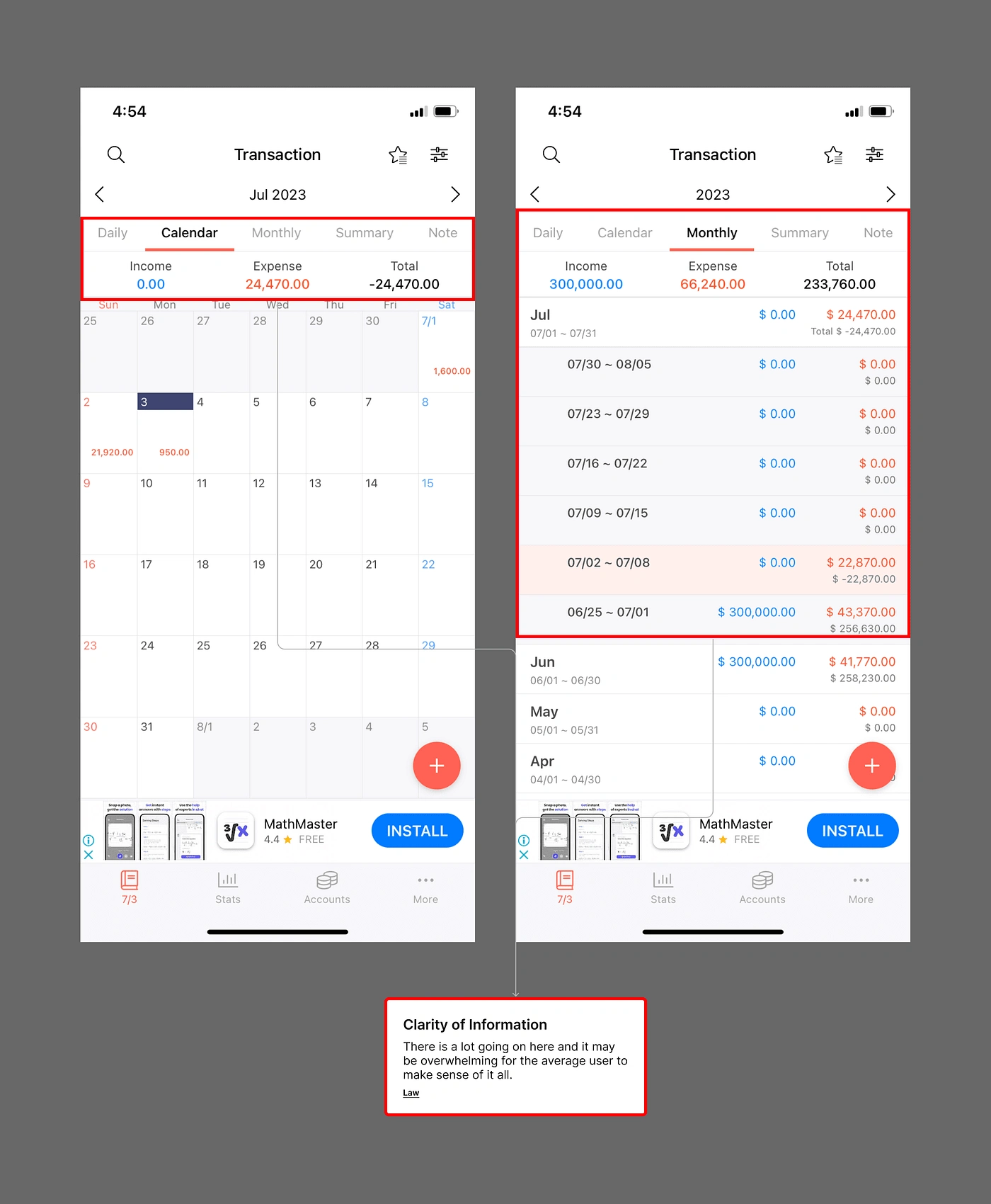
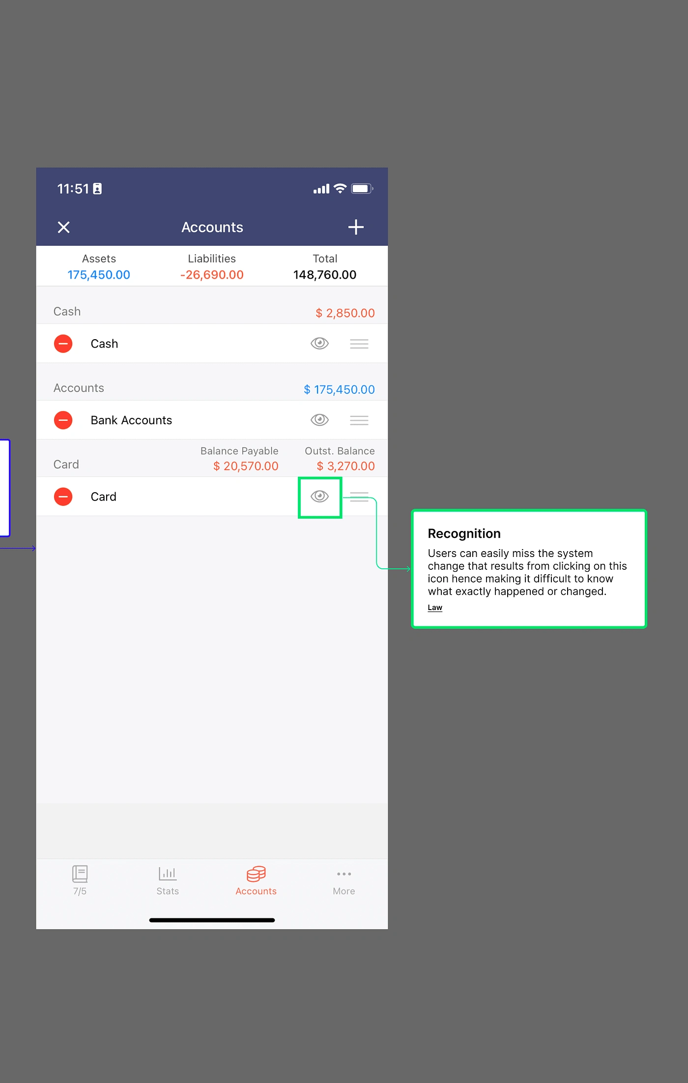
It is very easy to get lost in this, from the buttons on top to the expense and income section and then the calendar itself. And for the second screen, a lot still appear to be going on and decluttering the pages will prove to give a better user experience than what we currently have on the designs.
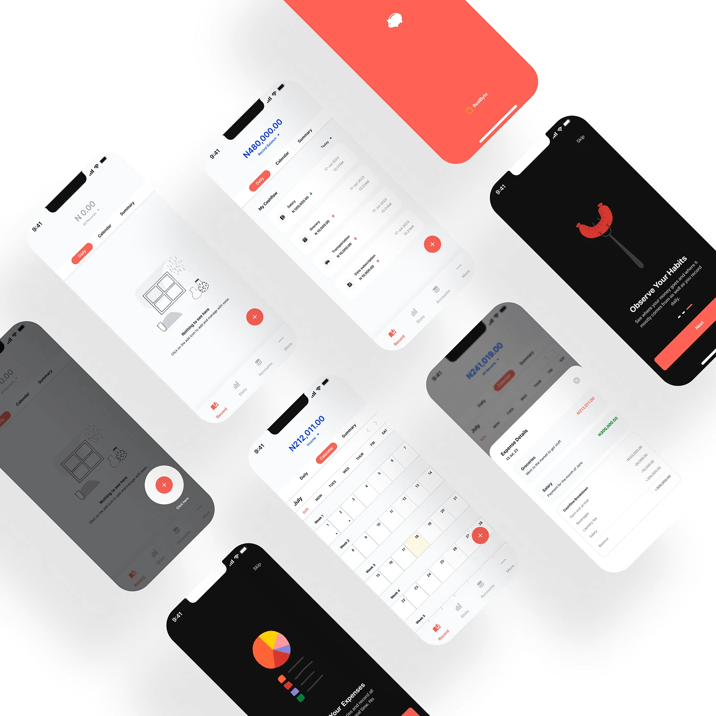
Redesign
Based on the data gathered from my research into the product, conversations with my interview participants as well as a proper Heuristics review of the product, I thought to focus on a few things:
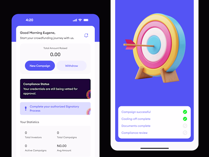
Proper Onboarding: With a proper onboarding into what the app is about and educating the users as they go along will better improve their overall experience. With the onboarding below, users are welcomed by a friendly and an inviting set of screens that will educate encourage them to use the application while promising ease and simplicity.
Ease of Navigation: With a proper onboarding and user education, having just the right number of options to choose from when trying to navigate will give users a better sense of clarity than being bombarded by a lot of choices. With the designs below, the goal is to allow users ease into the application withh as little difficulty as possible.
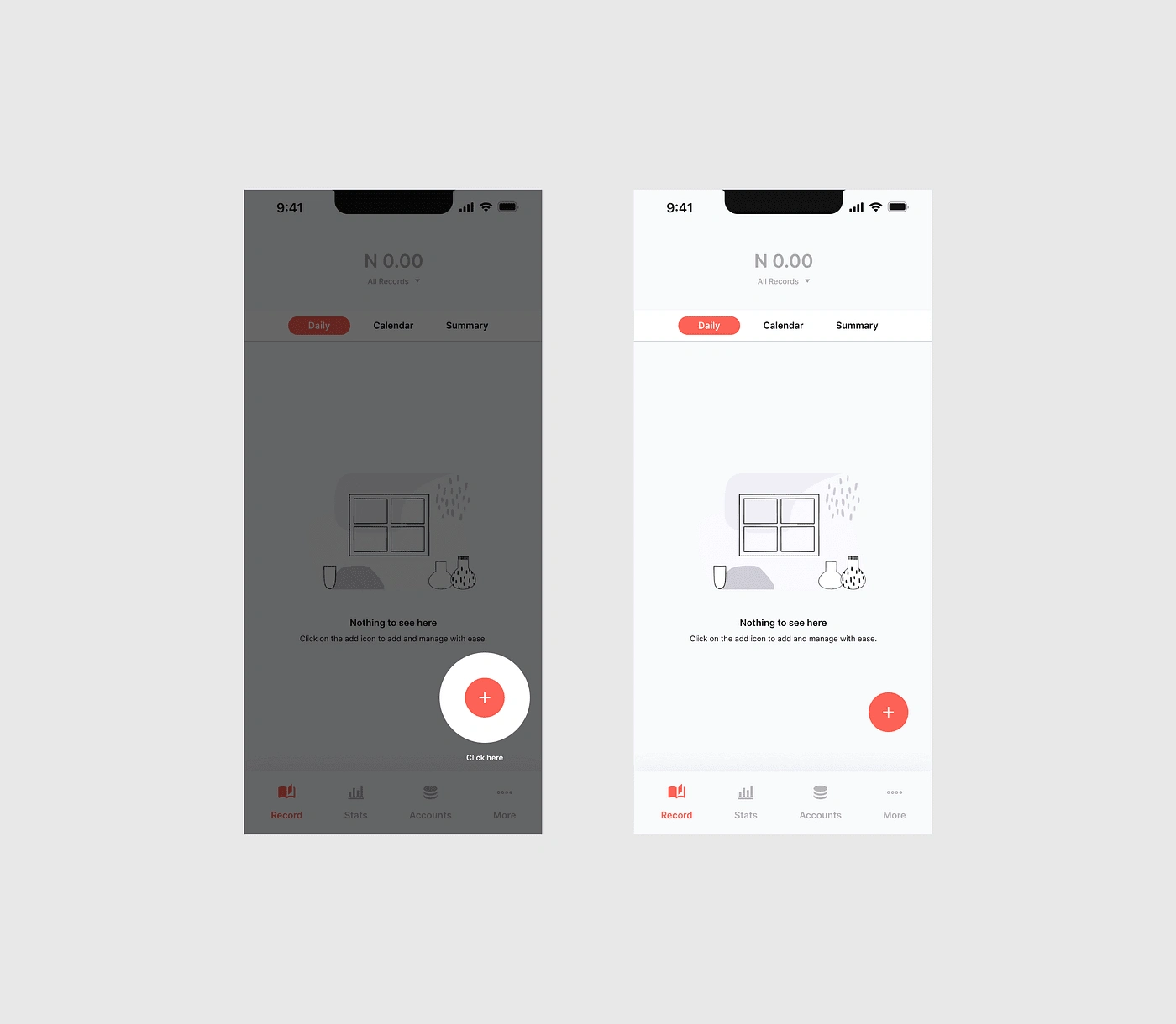
Reduction of Information Overload: The designs below hope to declutter the information represented in the original design. Make the information users are exposed to per time is progressive so as not to be overwhelmed.
Among other things taken into consideration are Overall Ease of use and clarity of information.
Screens.
Conclusion
A product may be useful in itself but if users have a hard time making use of it, over time they will stop using the product and look for an easier alternative. People will always gravitate towards an easy to use and enjoyable product that meets the needs of users.
See you on my next audit.
Eu
Like this project
Posted Jul 20, 2023
Did a UX Audit and a redesign of a finance manager mobile application. The goal was to highlight usability issues while designing to correct issues identified.
Likes
1
Views
6