3-Sided Facing Volunteering Platforms [MVP Creation]
Role: Design Lead, Product Designer, UX/UI Designer
Date: April 2020 - October 2021
Project Overview:
Developed an innovative online platform to facilitate pro-bono connections between skilled professionals, non-profits, and companies seeking to enhance employee volunteer programs.
Role and Responsibilities:
As the pioneering Product Designer, I led the design from MVP creation to Beta launch, overseeing UI/UX design, and post-launch feature roadmap and usability testing. I spearheaded a team to ensure the platform met diverse user needs, coordinating closely with cross-functional teams for strategic product direction.
Challenge and Solution:
Faced with the challenge of creating a seamless interface for three distinct user groups, I synthesized complex business requirements into a cohesive design, ensuring efficient communication and interaction among all users.
Research and Development:
My approach to refining the platform's core features began with an in-depth analysis of existing research, including interviews and user personas from potential target audiences. This foundational work allowed me to align closely with the company's vision during strategic discussions with the CEO and CTO, where we visualized the future of our digital platform. By synthesizing insights across diverse team perspectives, I played a key role in streamlining the product development cycle, ensuring our efforts were aligned for continuous improvement and innovation.
Information Architecture:
I crafted three distinct sets of information architecture, encompassing the user journey from initial sign-up to navigating the main dashboard and engaging with core features. These diagrams served as a pivotal tool for visualizing the structure of our web app, enabling us to refine our core features with greater precision.
More importantly, they facilitated alignment across all teams, bridging differing perceptions of the product into a unified vision, ensuring coherence and shared understanding in our product development efforts.
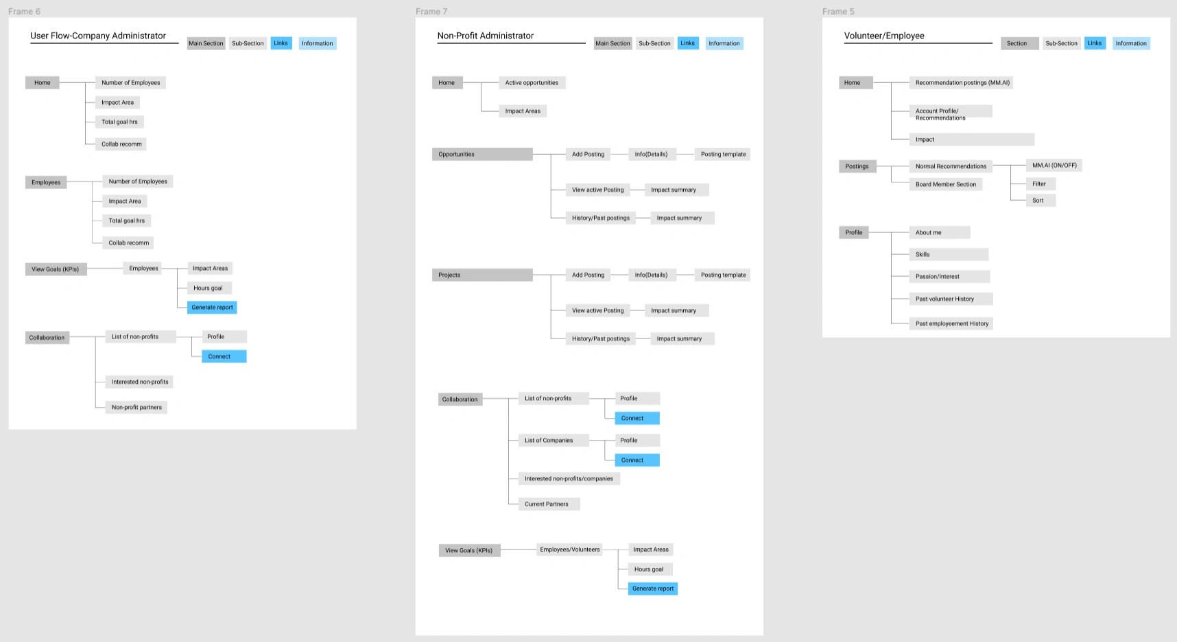
3 Sided Platform Infomation Architecture
User Flow:
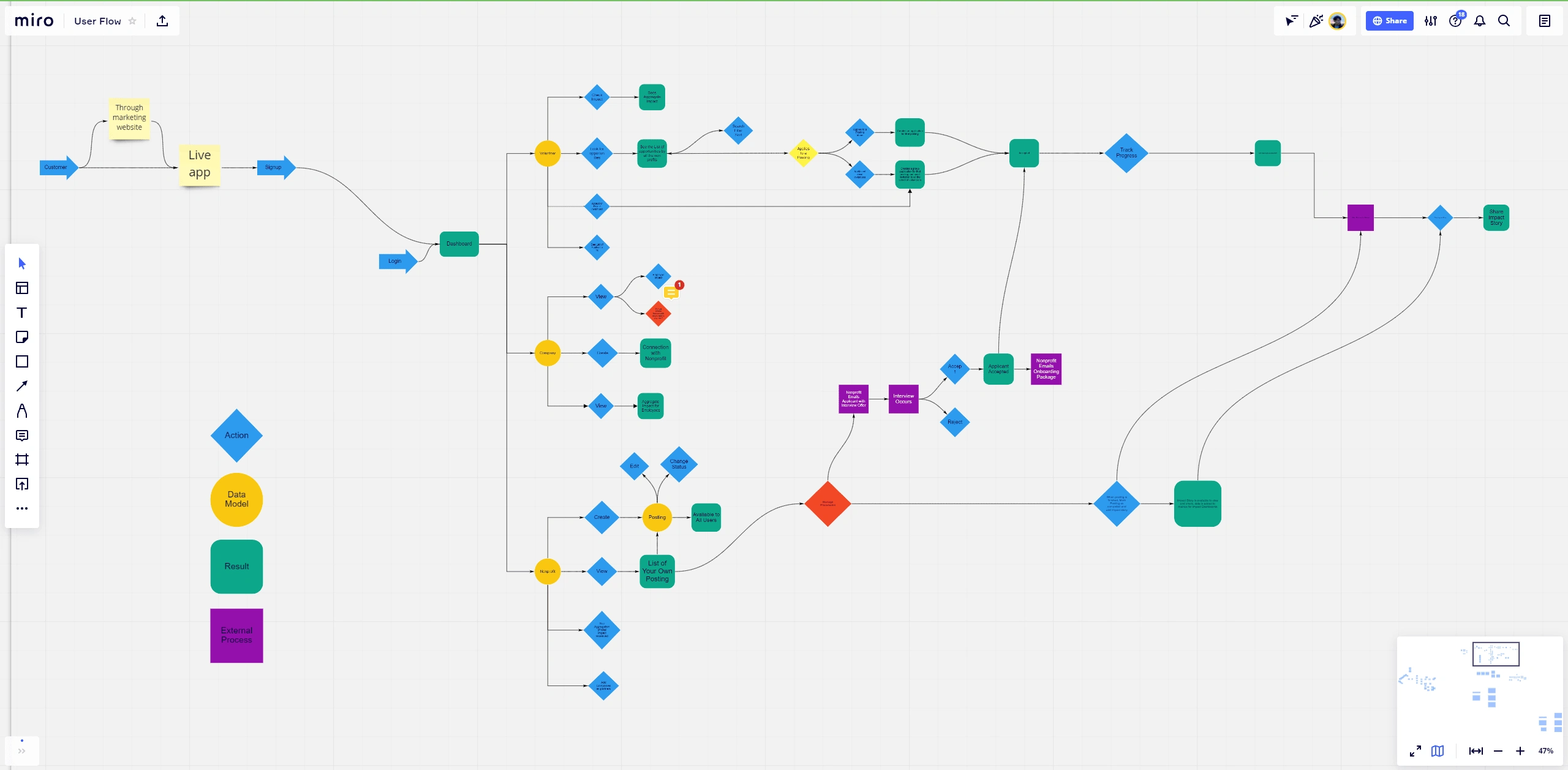
With a clear understanding of the core features and business requirements, I shifted my focus toward maximizing user value. This entailed a deep dive into previously established User Personas, allowing me to empathetically navigate the information architecture from the perspective of our target users.
Through this process, I developed comprehensive user flows that illuminated the paths users would take within the application, how they would interact with different user types, and, crucially, where they derived value. These user flows not only highlighted previously unnoticed loopholes but also prompted revisions to the information architecture to enhance usability and user satisfaction.
Wireframing:
With the information architecture and user flow unanimously approved, I utilized these blueprints as the foundation for our application's visual design phase.
Low-Fidelity Design:
I initiated the design process with a mobile-first approach, focusing on the login and sign-up sequences. However, insights from our research indicated that our primary users—companies and nonprofits—predominantly access volunteer platforms on desktop devices while at work. This pivotal discovery led to a strategic shift to a desktop-first design philosophy, ensuring our design aligns with user behaviors and preferences.
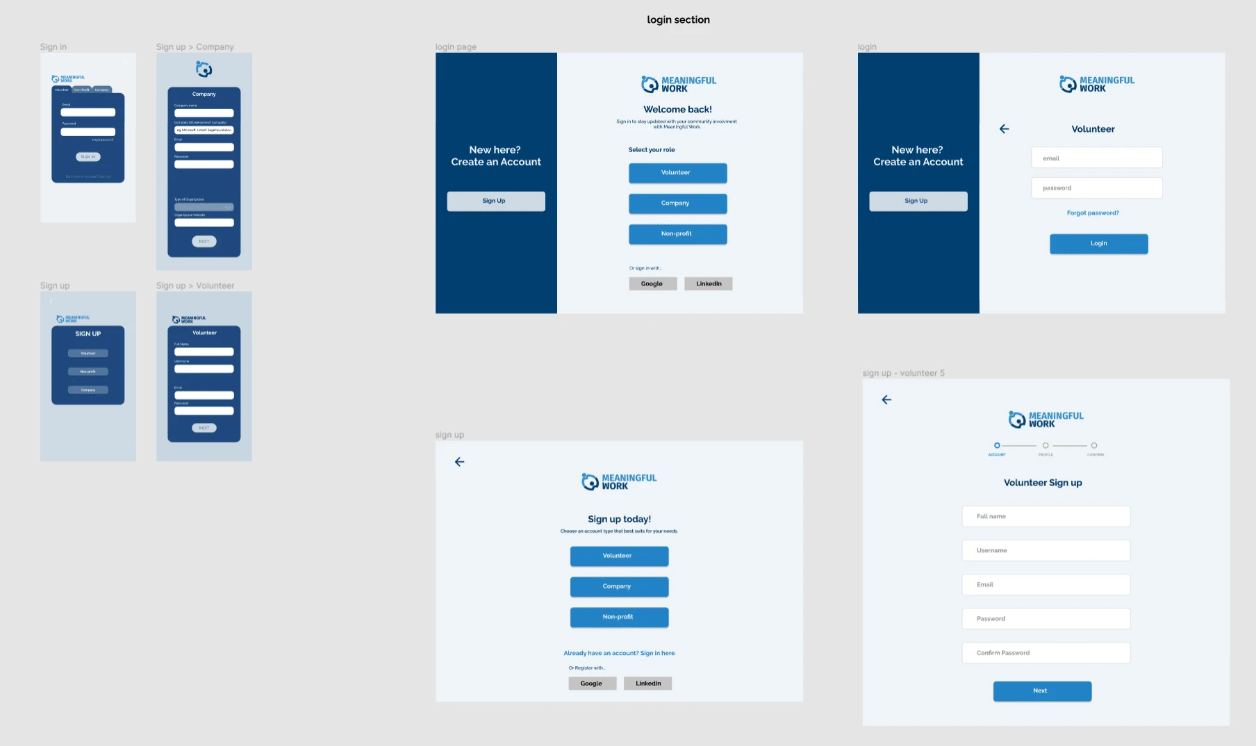
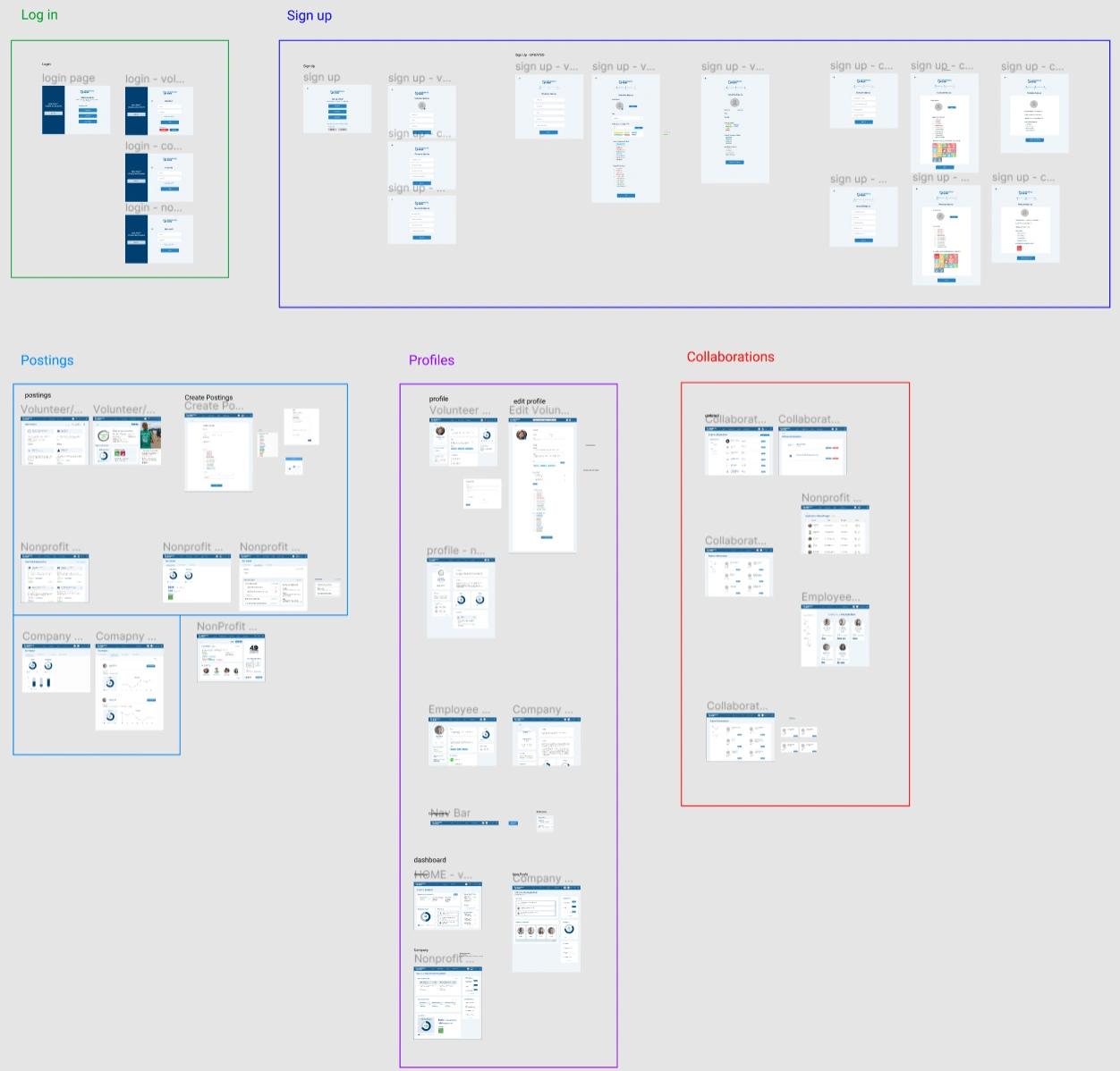
Upon completing the signup design, I methodically tackled the application's design for each user type, starting from the dashboard. This process resulted in three distinct application interfaces, each tailored to a specific user group's needs. The development of these low-fidelity wireframes involved numerous iterations, particularly as we innovated on several core features, often requiring close collaboration with the development team to integrate existing APIs and streamline the development process.
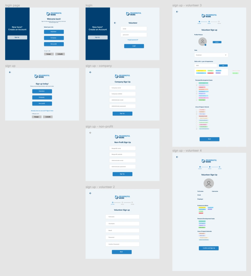
Testing
To validate our design and functionality, I engaged initial supporters and colleagues who represented our target users to test the low-fidelity prototypes. This feedback was invaluable, highlighting areas for improvement such as missing information in the volunteer opportunity creation process and friction in certain account creation workflows. Despite the desire for extensive testing, the impending beta launch deadline necessitated a more condensed feedback cycle, focusing on quick iterations with a smaller group of testers to refine the application while adhering to our timeline.
High fidelity
As we approached the high-fidelity prototype phase, with the product release looming in less than three months, I was joined by two junior UI designers. To meet our ambitious deadline, we devised a rigorous schedule to finalize the designs within two months.
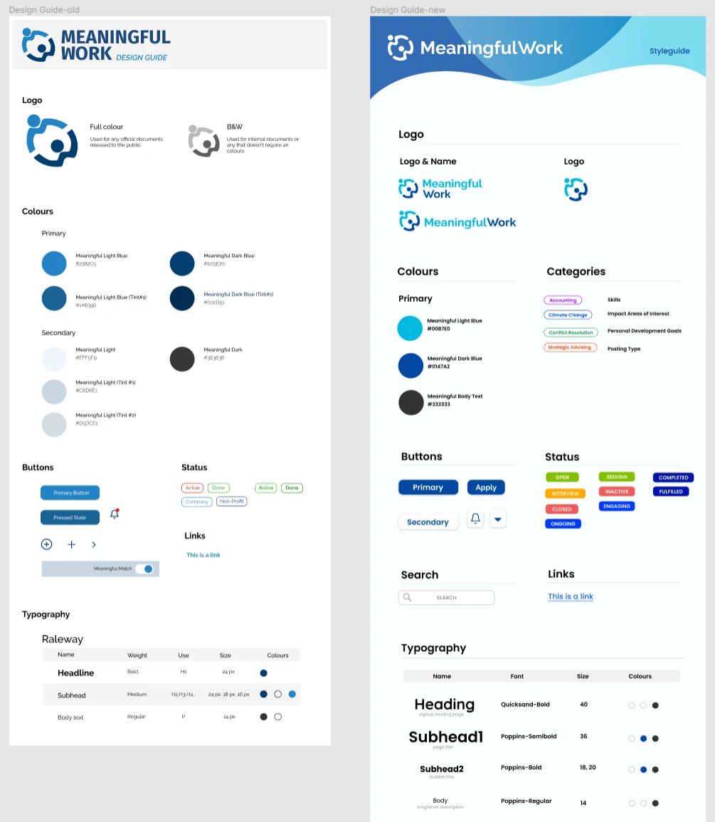
Rebranding and Style Guide Development: The initial two weeks were dedicated to rebranding, addressing feedback that our brand appeared too corporate for a volunteer platform, which should evoke a bright and fun atmosphere. Together with my team, we overhauled our style guide, infusing it with a more appropriate aesthetic for our mission. This period also served as an essential phase for the new designers to acclimate to our platform's design ethos.
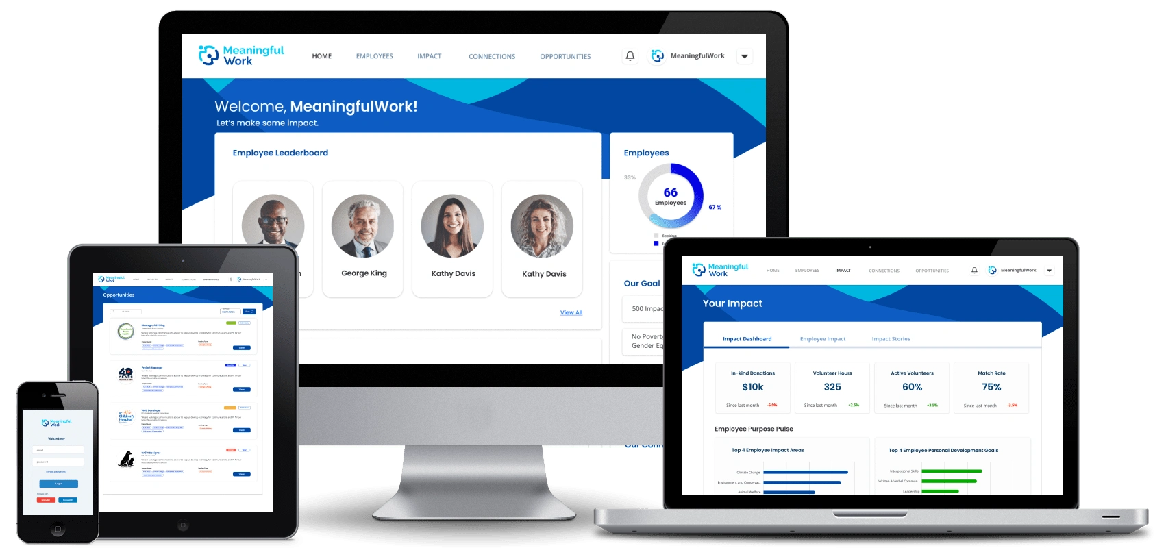
UI Implementation and Interactivity: With our new style guide as our foundation, we spent the following four weeks translating our low-fidelity wireframes into polished UI designs. I allocated the first two weeks to designing for one user type, providing a template for the subsequent designs, which were completed in 1 to 1.5 weeks each. My primary responsibility was to elevate these designs into interactive prototypes, connecting all screens with seamless Figma animations, and ensuring a coherent and intuitive user experience across the board.
Usability Testing Strategy:
To ensure our platform met user needs and expectations, I orchestrated 5-8 usability testing sessions for each target user group following the completion of their respective UI designs. These sessions were meticulously planned to extract valuable insights, focusing on user value, emotional response to the design, and identifying any friction points.
Session Structure and Preparation:
Preparation: Detailed scripts and documentation templates were prepared, centering on critical aspects like value creation, emotional impact, and user friction.
Duration: Each session was designed to last between 45 to 60 minutes, beginning with pre-test questions to understand testers' backgrounds, their experiences with volunteering, and familiarity with other platforms.
Initial Interaction: Testers were given 5 minutes to explore the prototype independently. This acclimatization period was crucial for minimizing discrepancies in interface literacy among participants.
Task Scenarios: Testers were then presented with scenario-based tasks, crafted to be achievable through multiple approaches. We meticulously recorded the number of interactions and time spent on each task, using these metrics as efficiency indicators while acknowledging they are part of a broader assessment framework.
Feedback and Analysis:
Post-Test Inquiry: Following the tasks, open-ended post-test questions were posed to delve deeper into the users' experience, focusing on the perceived value and the intuitiveness of the functionality.
Open Feedback: A significant portion of time was reserved for open feedback, a stage often yielding unexpected insights crucial for refining the product.
This structured approach to usability testing was instrumental in identifying opportunities for enhancement, ensuring our platform not only met but exceeded user expectations for value, ease of use, and emotional engagement.
The Handover Process:
The transition from design to development was a critical phase in our project, marked by careful coordination and communication with the development lead. This process ensured a smooth handover and effective backend preparation in alignment with upcoming design implementations.
Coordination and Preparation:
Continuous Updates: Throughout the design phase, I kept the development lead informed about the progress and the specifics of what would be handed over next, allowing the backend team to prepare in advance.
Design Finalization: After each UI component underwent usability testing and necessary adjustments, I meticulously refined and cleaned up the design files for clarity and coherence.
Collaborative Quality Assurance:
Joint QA Sessions: Once the development team had integrated all design elements, both the design and development teams convened for comprehensive quality assurance (QA) sessions. This collaborative effort aimed to identify and rectify any discrepancies or issues, ensuring that the final product faithfully represented the intended design and functioned seamlessly.
This structured handover and collaborative QA process were vital in bridging the gap between design and development, facilitating a unified and polished final product that met our high standards of quality and user experience.
Post-Launch Overview:
Four months following our platform's launch, we observed encouraging signs of engagement and growth. With over 100 volunteer opportunities posted, and 20% of these either ongoing or completed, our platform is gaining traction among our target users. This initial success serves as a positive indicator of the platform's utility and its ability to facilitate meaningful connections between volunteers and organizations.
Final Reflections:
This project was a crucible for accelerated learning in design and product management within a high-velocity startup environment. The necessity to continuously evolve my skills through online workshops and podcasts, coupled with the absence of extensive professional mentorship, propelled me into a cycle of experimentation across research, design, product development, and management. Embracing a "fail fast, adapt quickly" mindset, all while working remotely due to the COVID-19 pandemic, underscored the project's challenges and triumphs as we collaboratively built a product without in-person interactions for over a year.
Areas for Improvement:
Enhancing Usability Testing: The B2B nature of our platform presented challenges in recruiting a substantial number of target users for usability testing. Recognizing the need to compensate for quantity with quality, future efforts will focus on more precise testing and comprehensive pre-test research.
Valuing the Research Process: Under business pressures, some research steps were overlooked, leading to post-launch fixes. Going forward, a firmer commitment to the research process is essential, acknowledging its value in preempting issues.
Improving Interdepartmental Communication: With a lean startup team, facilitating effective communication was challenging. Rethinking feedback sessions to be more engaging and inclusive could enhance collaboration and yield more constructive feedback.
Cultivating a Positive Work Culture: Recognizing the risk of burnout in a remote setting, and injecting fun and positivity into meetings is crucial. Developing deeper personal connections with colleagues can mitigate the emotional and physical distance endemic to remote work, fostering a more cohesive and resilient team.
Reflecting on these experiences and insights paves the way for growth, emphasizing the importance of resilience, adaptability, and the continuous pursuit of improvement in both personal and professional realms.
Like this project
Posted Mar 14, 2024
From start to end product building of a 3-sided Platform to facilitate Skilled Volunteering. From compiling Research to Mockups to Validation to Testing.


