Enhancing Card Security: Seamless Feature Integration
Project Overview
In a bid to elevate our web application's user experience, we embarked on a two-staged project aimed at integrating advanced card-locking features and introducing a vital reporting functionality for lost or stolen cards. This initiative was driven by the need to offer our users enhanced security and control over their financial cards, ensuring peace of mind and ease of management directly through our application.
Role and Responsibilities
As the sole Designer on this project, my primary objective was to assimilate the features proposed by Central1, evaluating their compatibility with our existing web application from a developer's perspective. This entailed a meticulous process of feature selection, conceptualizing seamless integration methods, and crafting the final designs to align with our current design systems, thus maintaining brand consistency.
Challenge and Solution
The introduction of this feature marked a novel venture for us, catalyzed by our clients' requirement for it to be cohesively integrated with a lost and stolen card reporting feature, thereby compounding the complexity of the task at hand.
Phase 1: Core Feature Identification
Initially conceptualized as a straightforward card locking mechanism, the feature was designed to allow users to effortlessly lock their cards via a simple toggle switch, displayed alongside all associated cards of an account. This simplicity was the bedrock upon which the feature's user-friendly nature was established.
Phase 2: Expansion of Locking Features
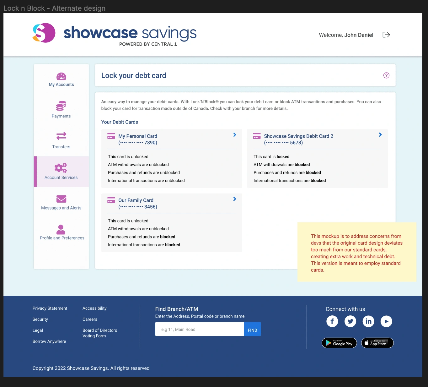
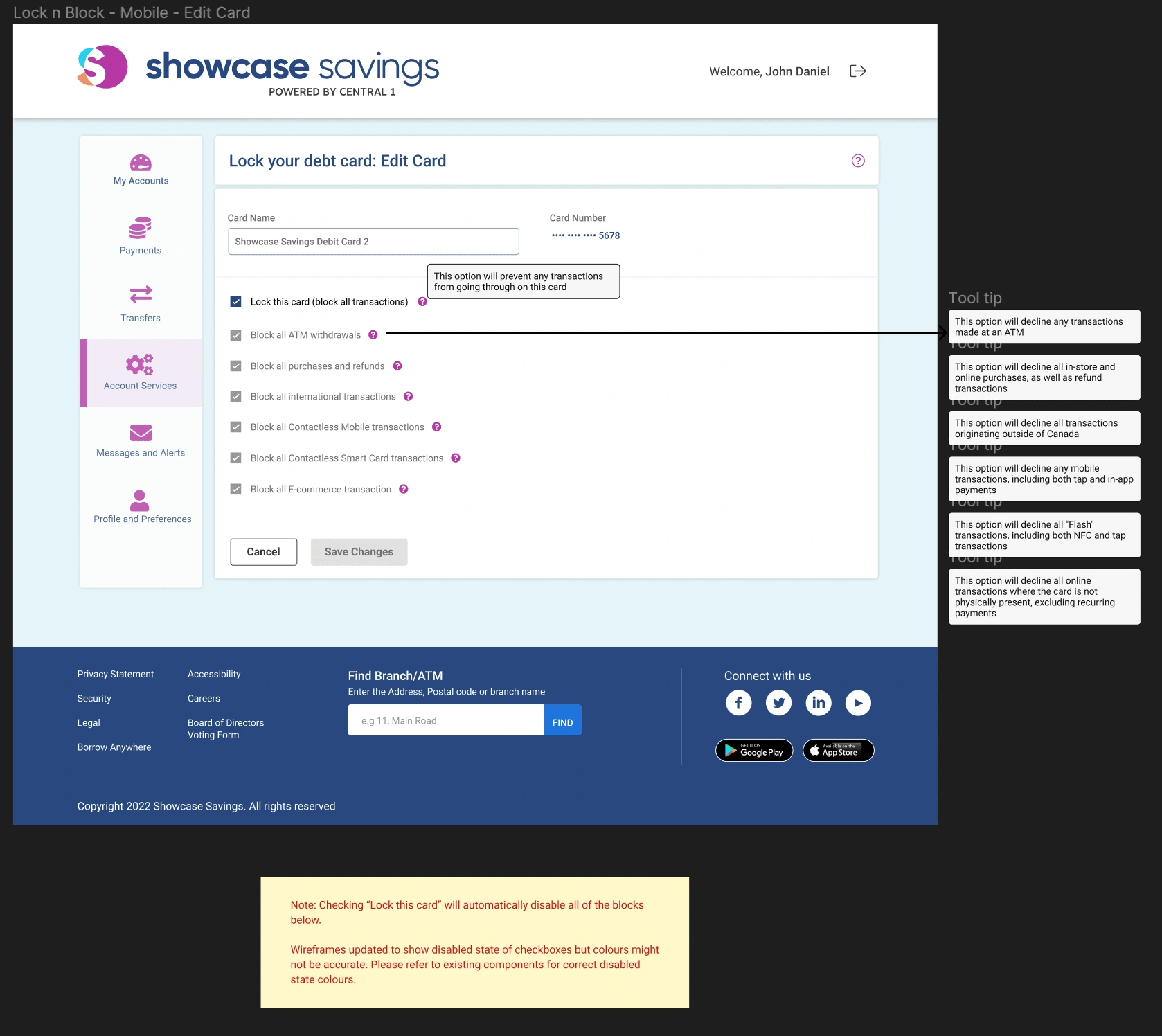
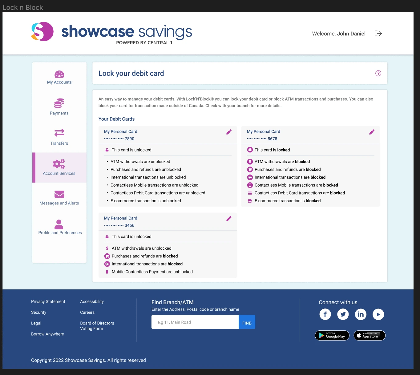
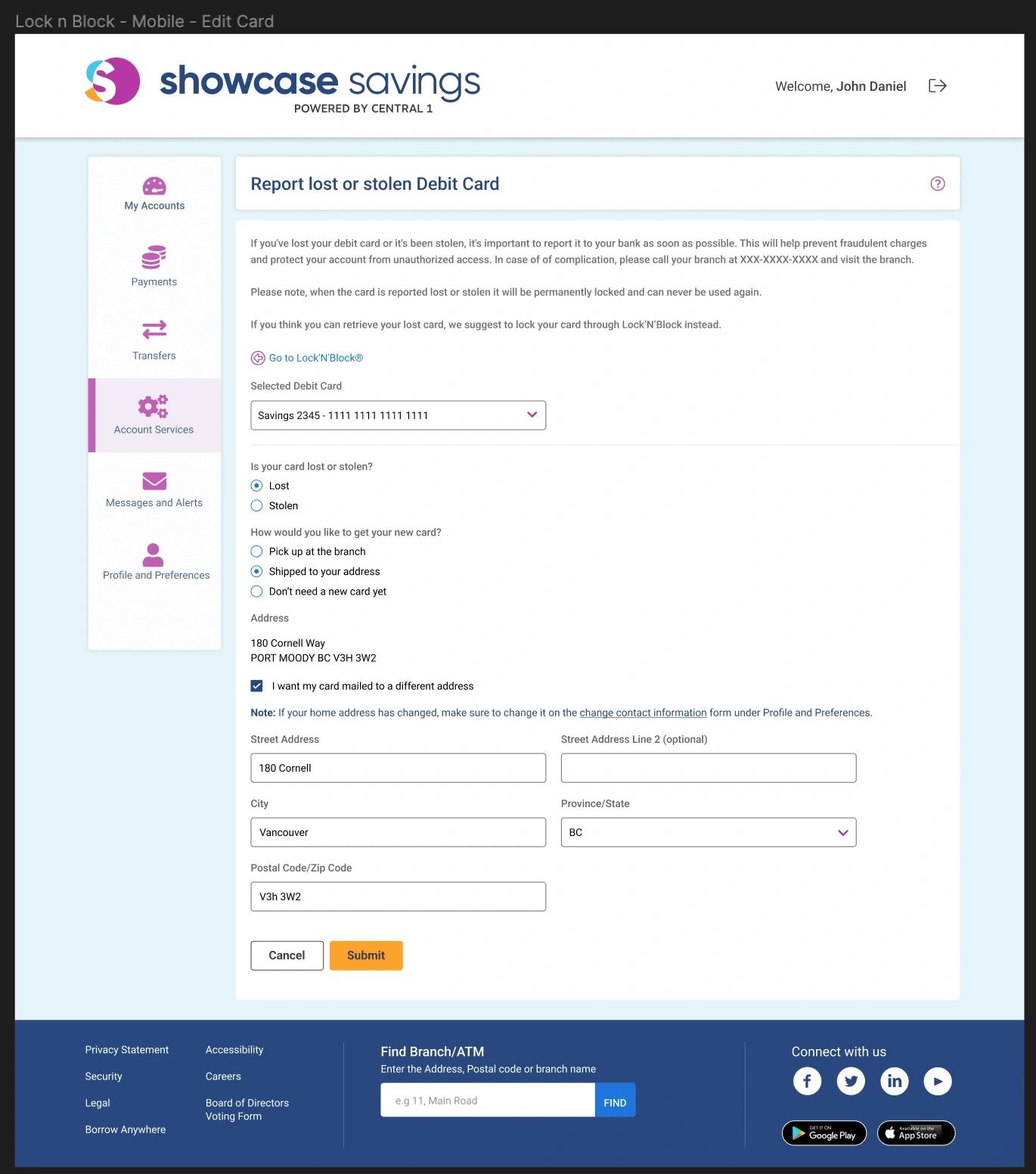
Subsequent enhancements were spurred by the card company's introduction of configurable locking options, such as disabling international POS transactions, tap and pay, and setting e-commerce limitations. My role expanded to liaising between our clients' needs and our development team's capabilities, ensuring the feasibility of integrating these sophisticated features. The design solution that emerged featured a user-friendly list of checkboxes for easy configuration, taking into account various edge cases to ensure intuitive user interaction.
Phase 3: Lost or Stolen Card Reporting Feature
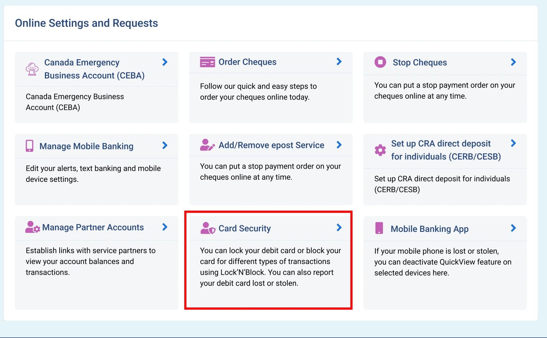
The project scope widened with the addition of a lost or stolen card reporting feature. Tasked with ensuring its accessibility, I explored several integration strategies. The final design positioned this feature prominently within the app, establishing 'Card Security' as a new category to house both locking and reporting functionalities. This strategic placement, coupled with the option for users to navigate seamlessly between features, underscored our commitment to a user-centric design philosophy.
Outcome and Reflections
This project not only fortified our application's security features but also deepened my understanding of integrating complex functionalities within existing systems. The successful implementation was a testament to the power of thoughtful design in solving real-world problems and enhancing user satisfaction. Through this journey, I honed my skills in balancing client requirements with technical feasibility, all while adhering to a stringent design system that serves hundreds of our clients.
Looking Ahead
Moving forward, the insights gained from this project will serve as valuable reference points for future endeavors. The emphasis on seamless integration and user-centric design will continue to guide our approach, ensuring that we remain at the forefront of delivering solutions that meet our users' evolving needs with agility and precision.
Like this project
Posted Mar 14, 2024
I led the design and integration of advanced card security features, including card locking and lost or stolen card reporting, into our web application. My work


![3-Sided Facing Volunteering Platforms [MVP Creation]](https://media.contra.com/image/upload/w_400,q_auto:good,c_fill/os4x6sfv8ie5pfui76i6.avif)
