UX/UI & Brand Design for Travls Travel Companion App
Oyegoke Praise

Overview
Travls is a travel companion app built to make trip planning simple, personal, and stress-free. It gives users a clean way to organize their trips, explore new places, and move confidently through unfamiliar cities. The goal was to create a brand and mobile experience that feels light, intuitive, and helpful for everyday travelers who want clarity instead of chaos.
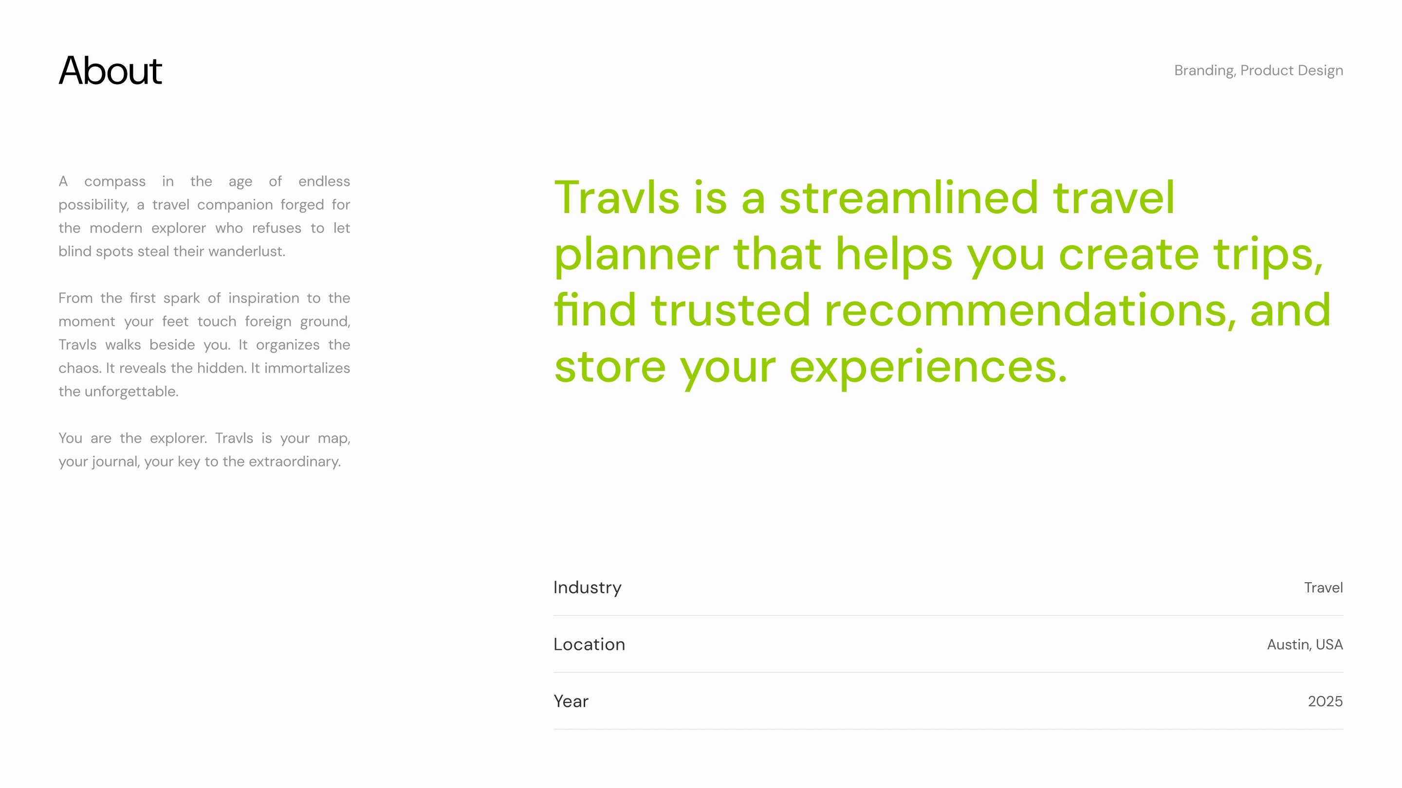
.A brief overview of the products, mission, and vision along with location.

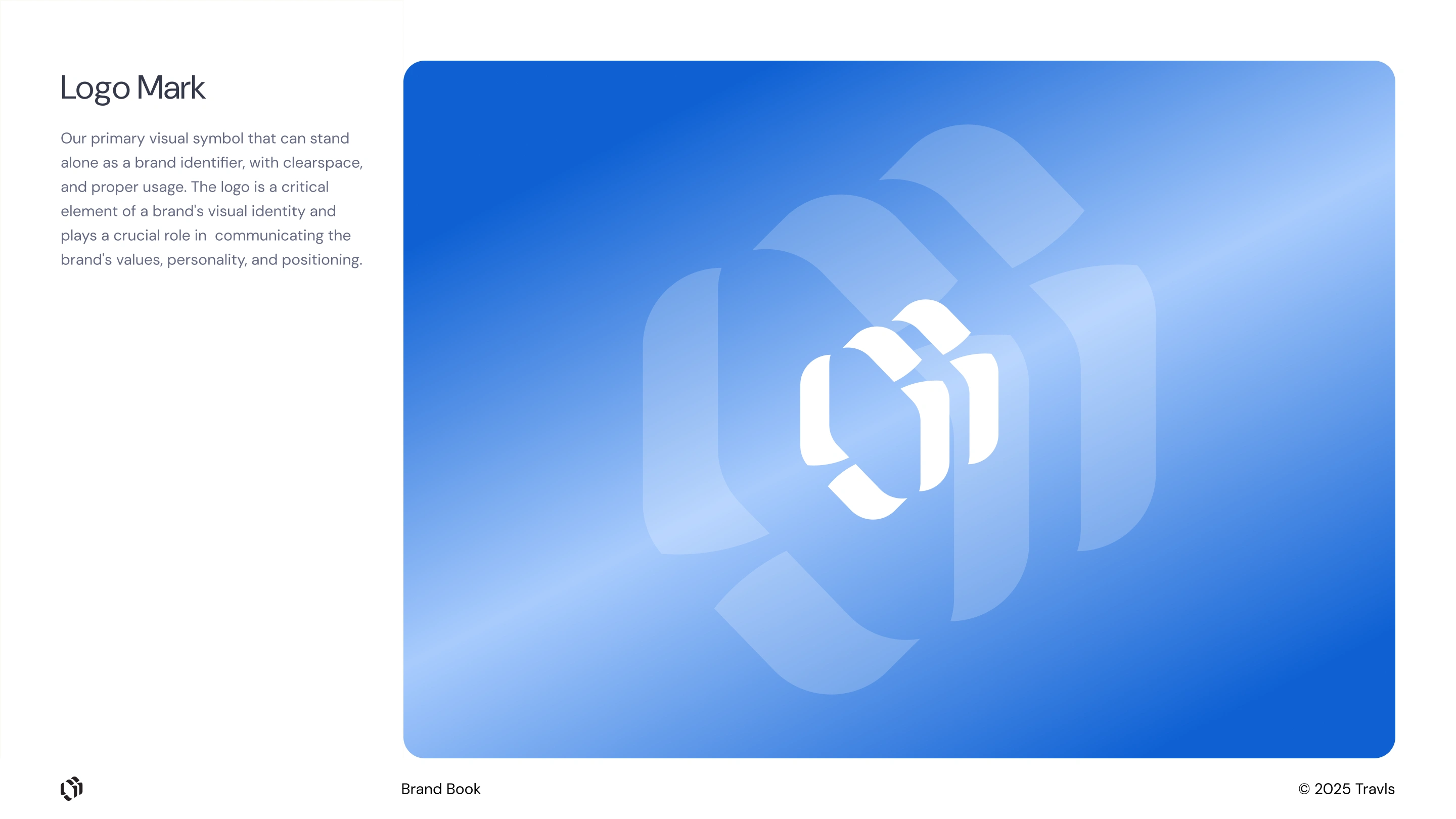
Brand Logomark
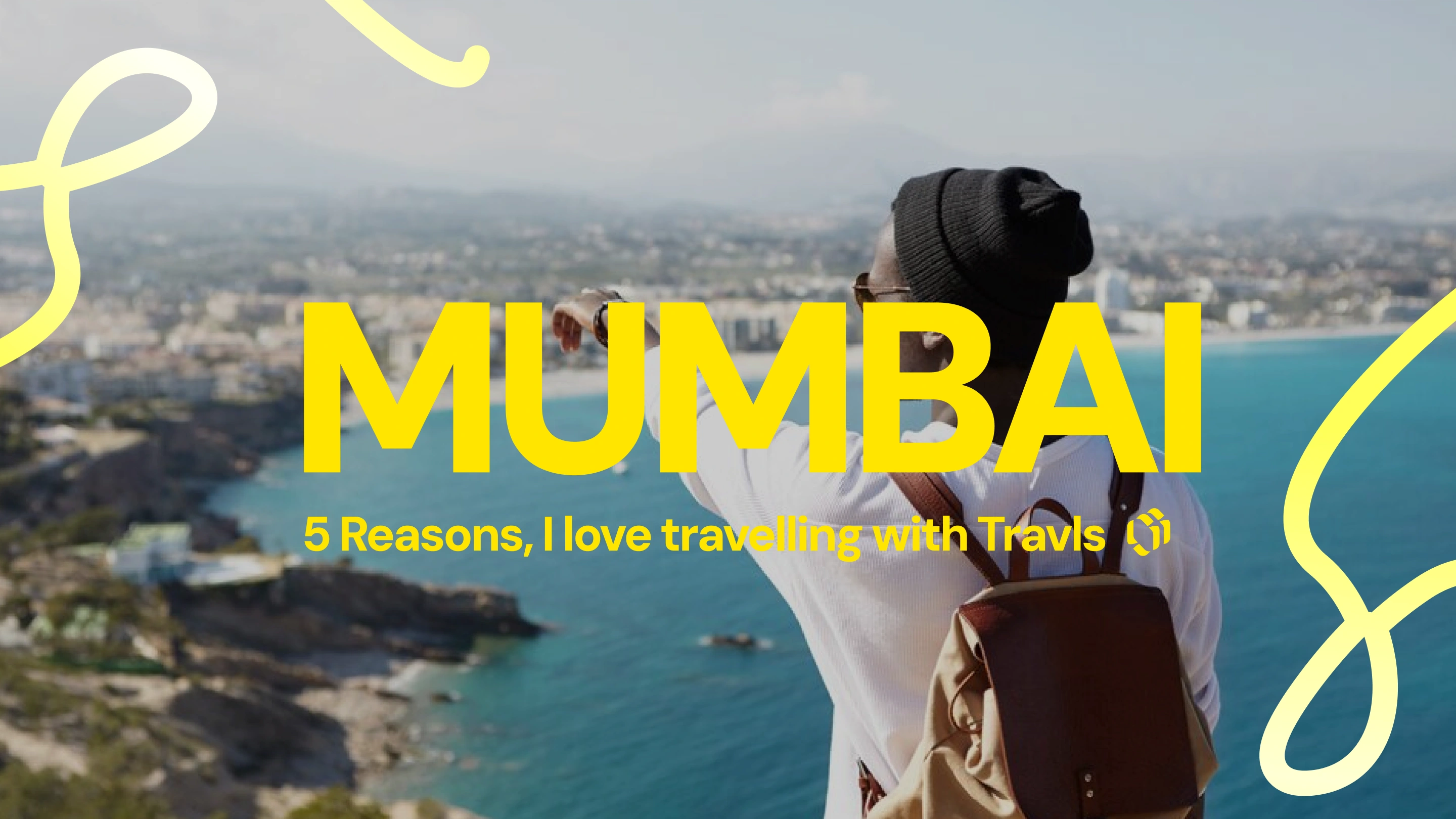
Branded video thumbnail for Travls.
The Problem
Travelers often juggle multiple apps when planning a trip. They discover destinations on social platforms, save places on separate maps, track bookings in email, and use note apps for daily itineraries. It creates a messy flow that leads to confusion, duplicated effort, and missed details.
People wanted one place to organize their trips, find nearby spots, and manage their travel days without switching between tools. The challenge was to design a system that felt simple, fast, and helpful from the moment a user opens the app.
Logomark in Brand book.

3 ladies in a branded Travls advert.
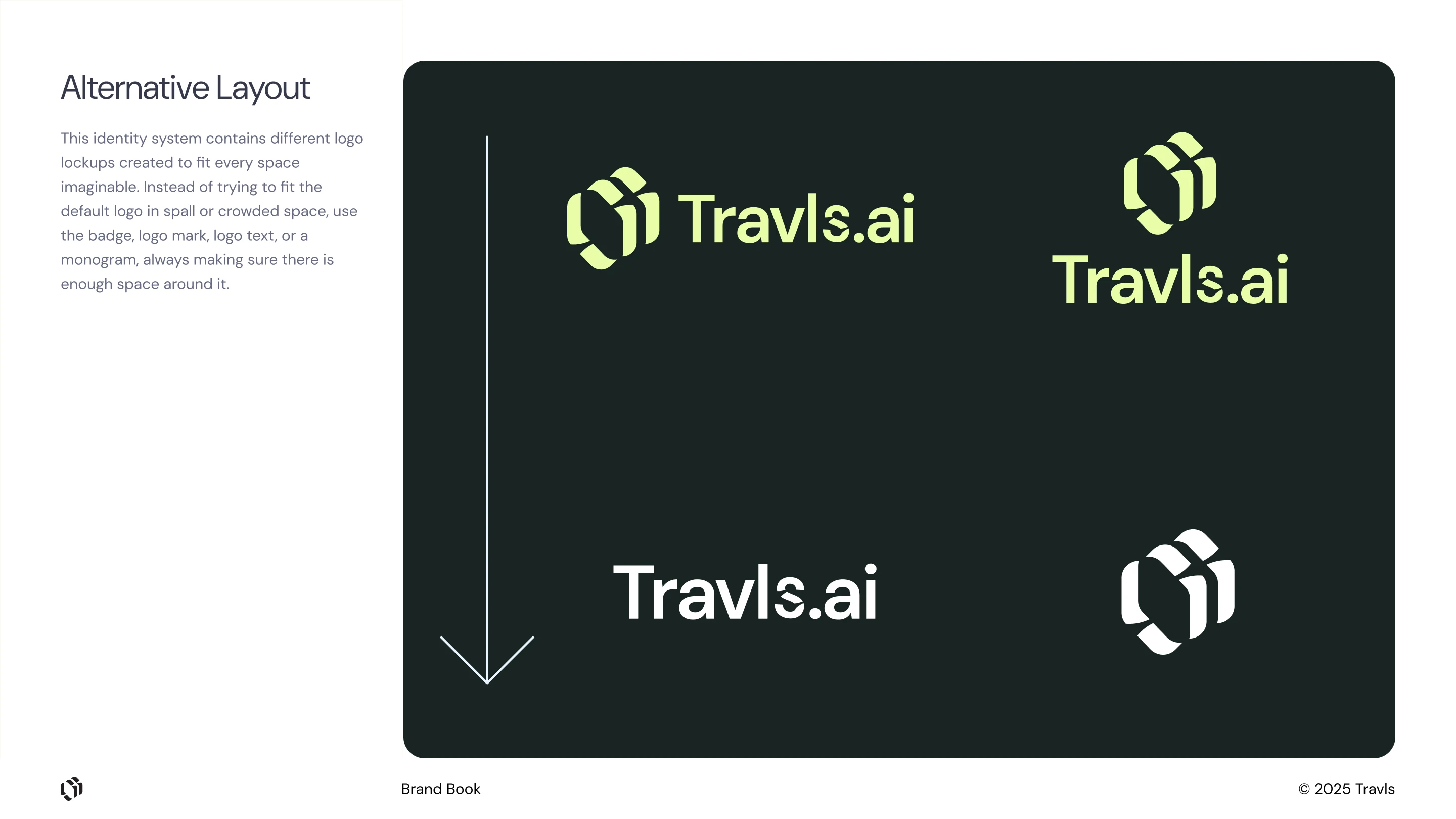
Logosystem and alternative layout for available spaces.

3d render of Travls Logo
Approach
The work began by understanding how everyday travelers plan their trips. This helped highlight friction points: lost links, forgotten notes, and the difficulty of remembering local spots once on the move. The priority was clarity: clean screens, readable content, and interactions that didn’t overwhelm users.
The brand direction took inspiration from modern travel: favourite locations, soft shadows, organic shapes, and friendly illustrations. Every part of the interface was designed to feel reassuring. Instead of packing in features, the focus was on a flow that reduced steps and placed important actions at the forefront.
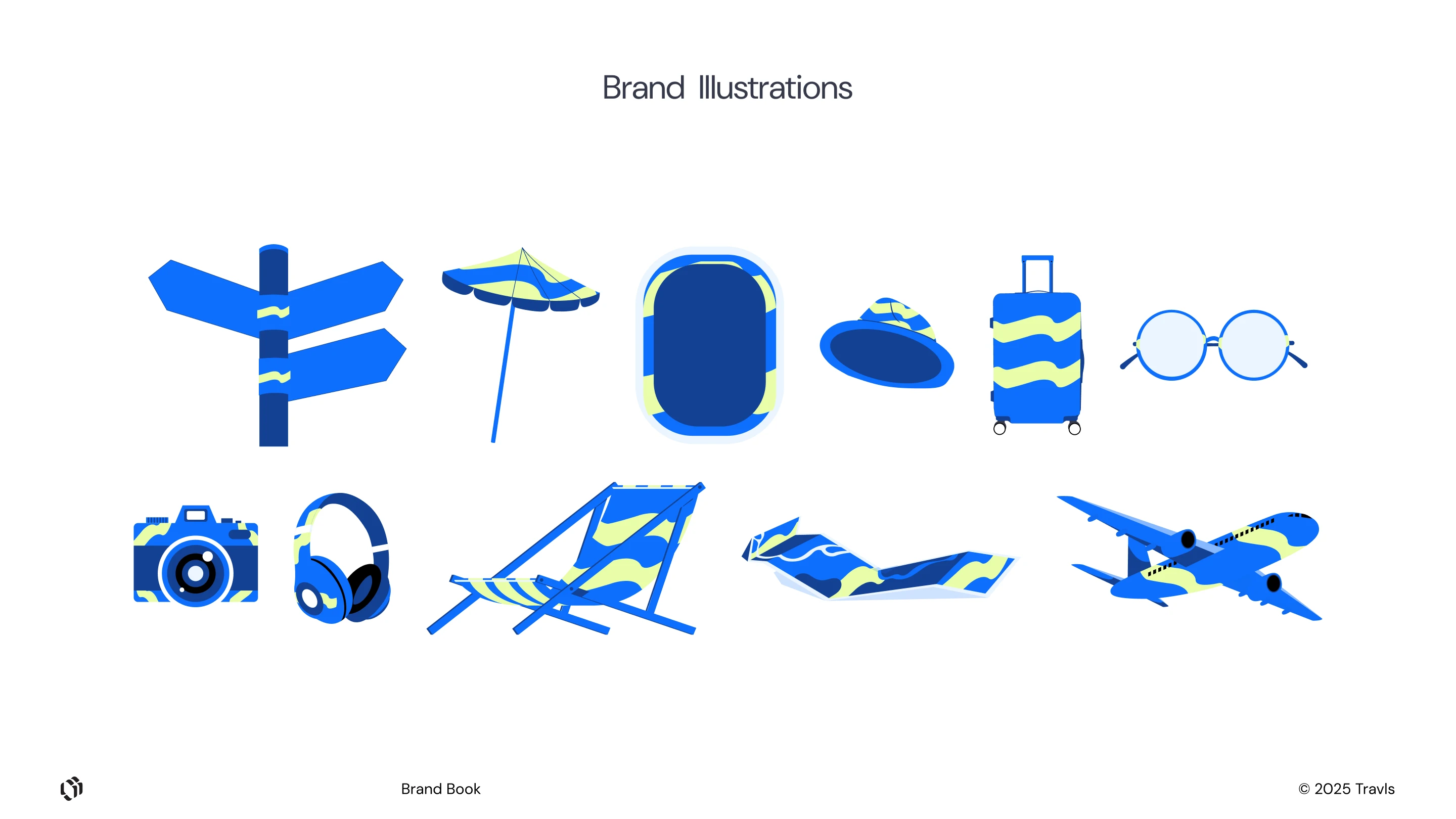
A collection of branded Travls illustrations.
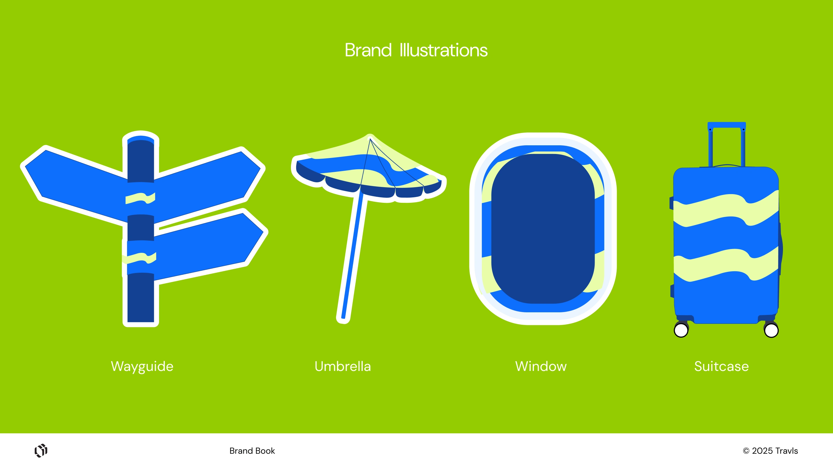
Wayguide, Umbrella, Window and Suitcase Illustrations.
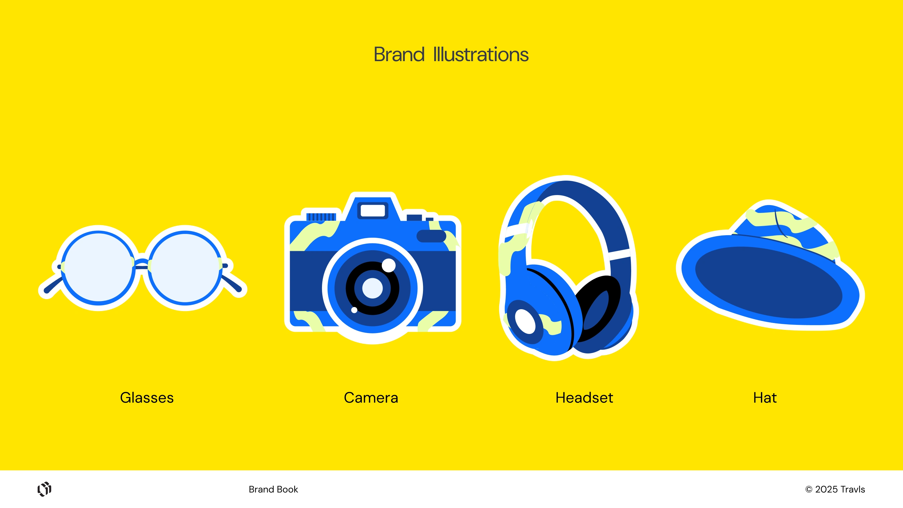
Glasses, Camera, Headset, and Hat Illustrations.
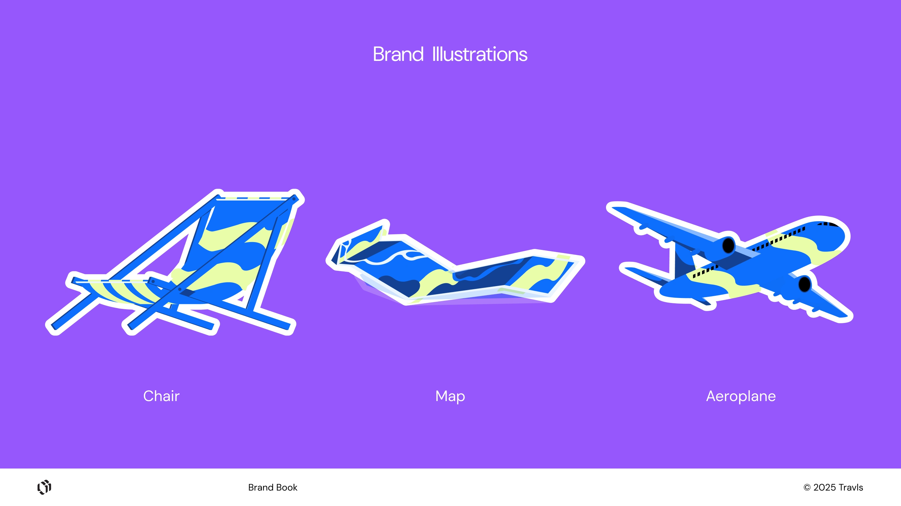
Chair, Map, and Aeroplane Illustrations.

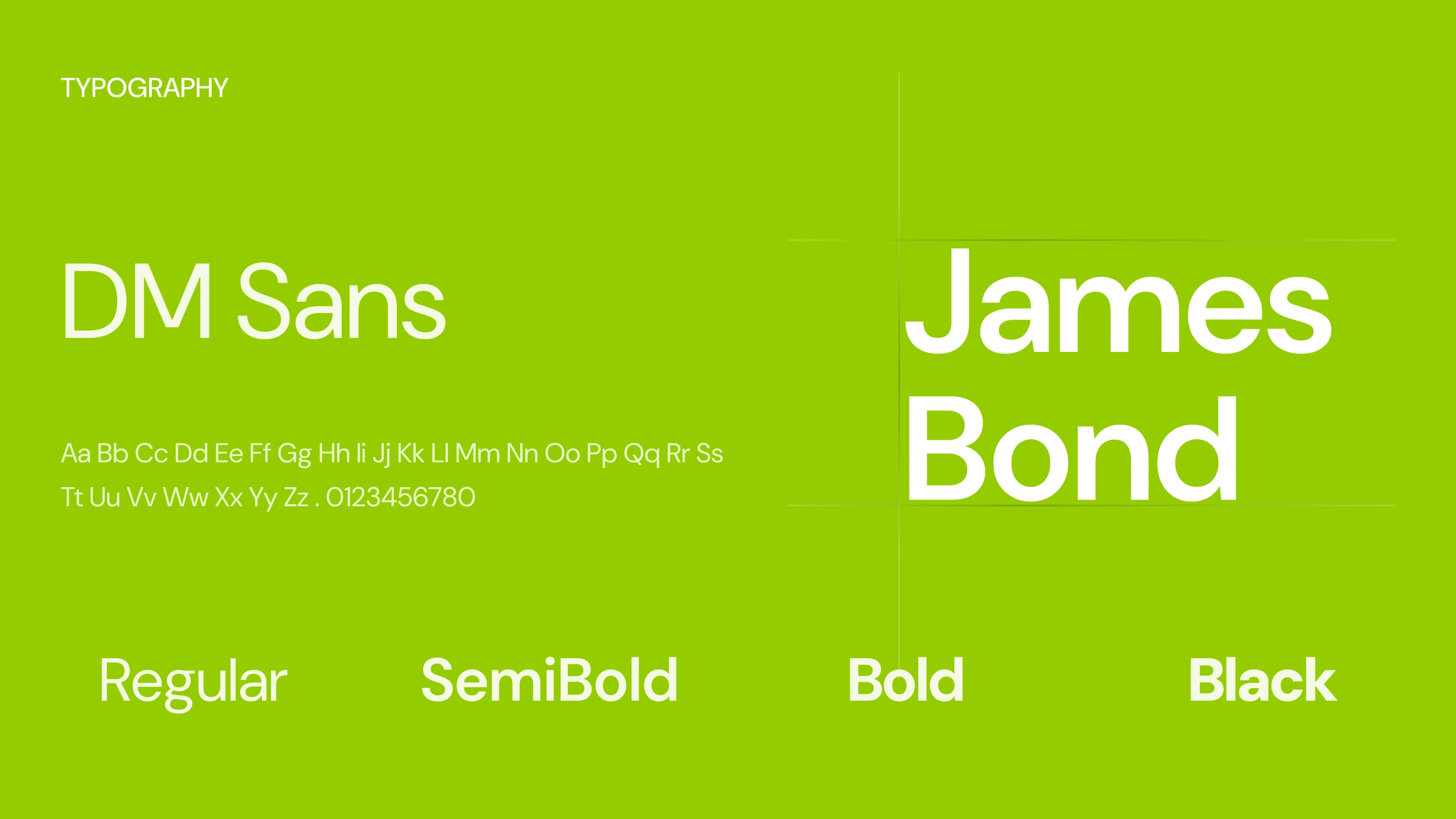
Brand Typography DM Sans
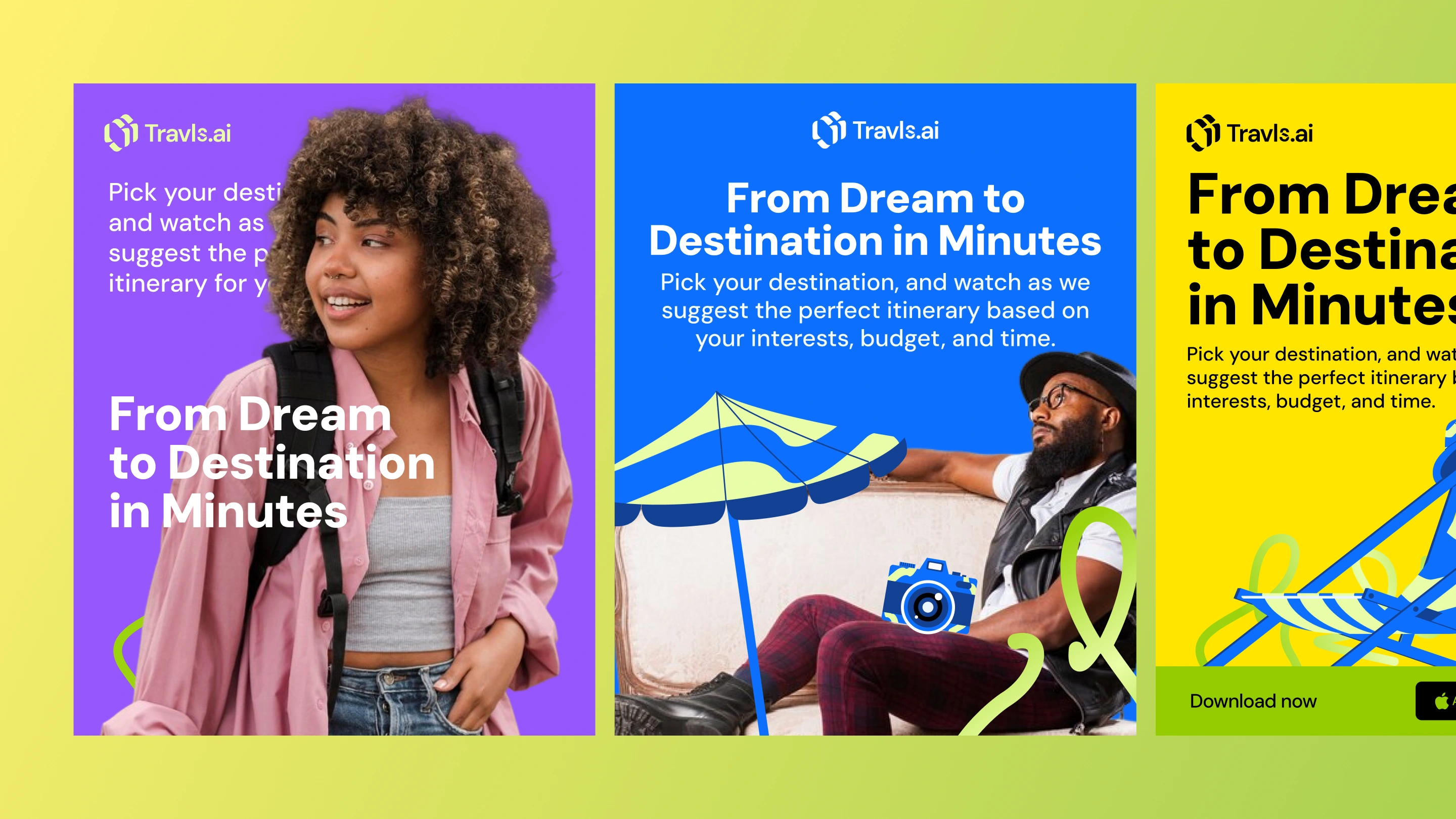
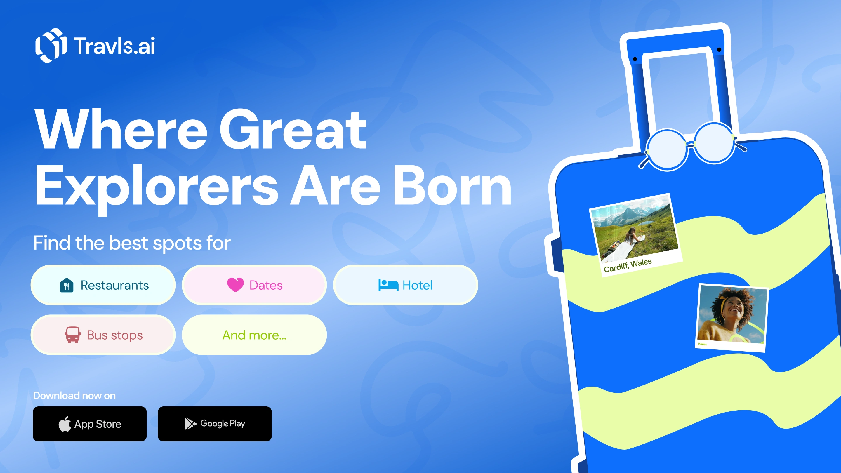
Social media graphics for Travls.
Solution
The final product is a mobile app and brand system built around clarity and ease. Travls gives users a central place to manage trips, explore new destinations, and navigate unfamiliar areas with confidence.
Travls delivers a unified place to create trips, explore nearby spots, and move through cities confidently. The app uses a soft visual style, simple navigation, and a clear structure for trips and guides. Core screens highlight upcoming trips, local recommendations, and profile tracking.
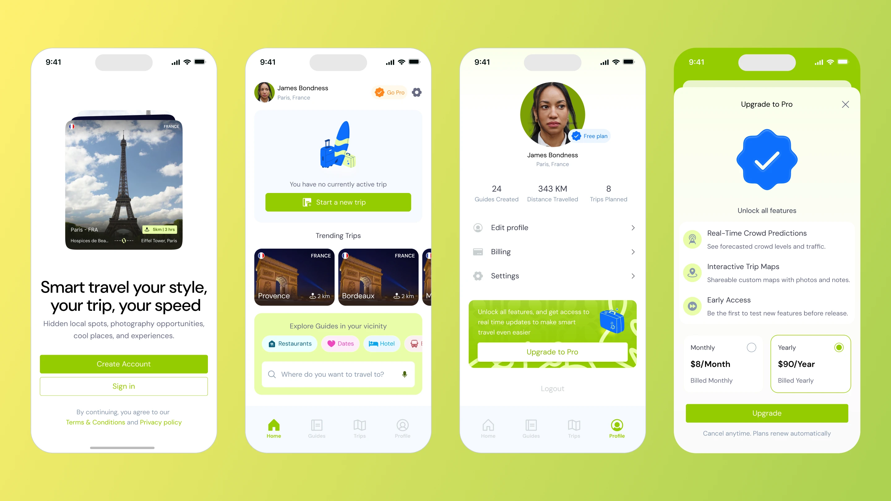
A collection of screens from the mobile app.
Featured screens from the mobile app.
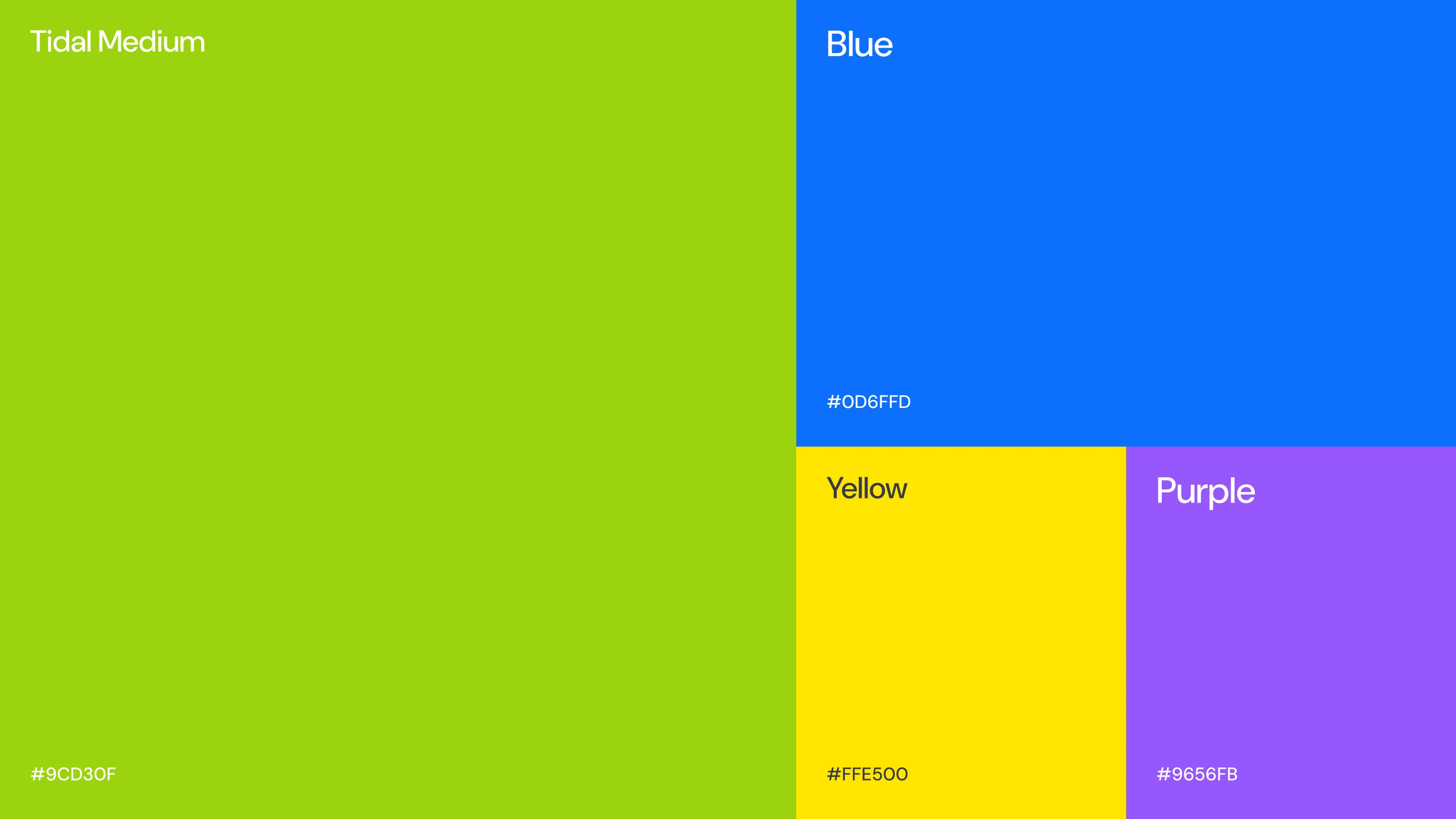
Brand color palette of Neon Green, Blue, Yellow and Purple.
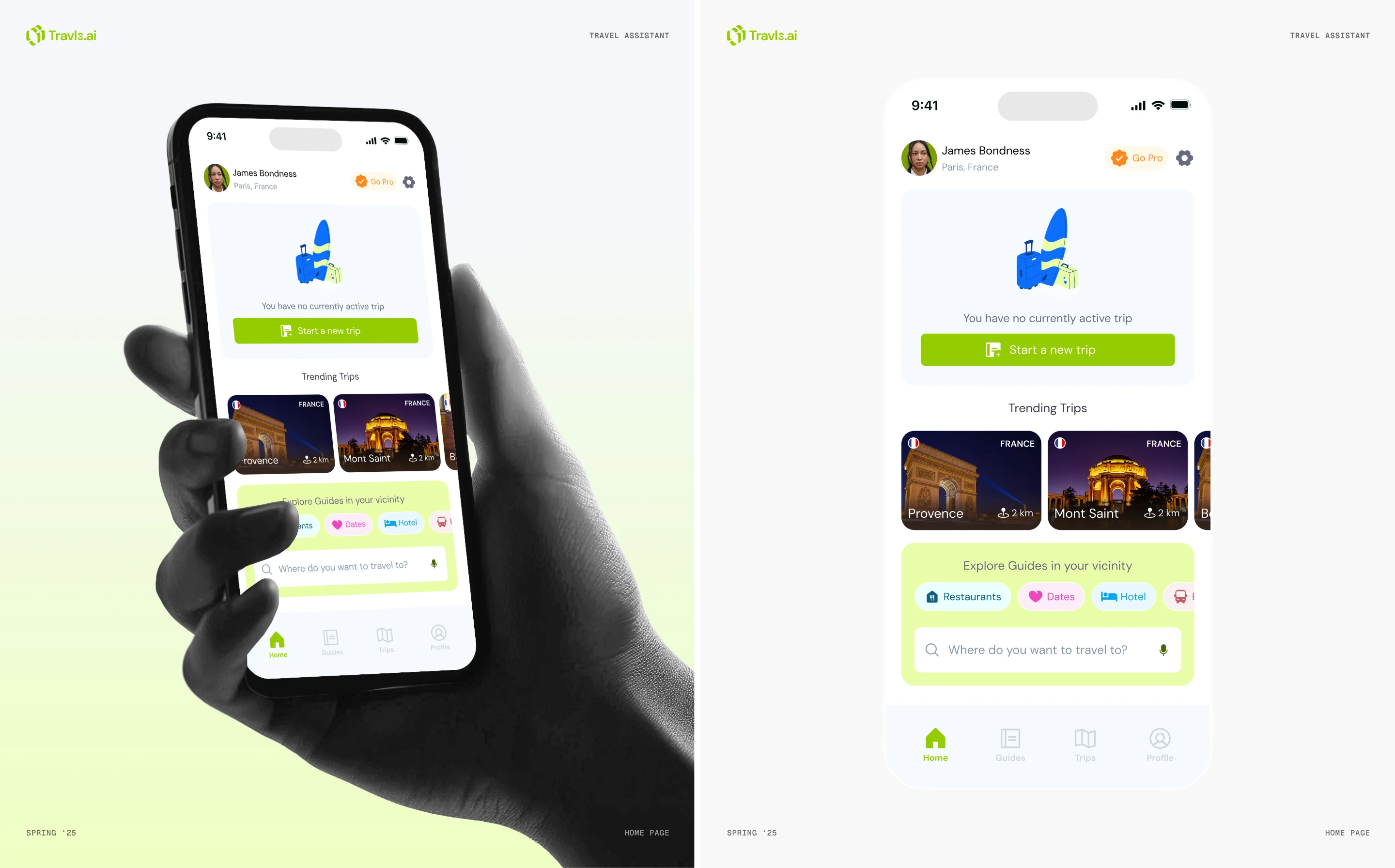
Default home screen on the mobile app.
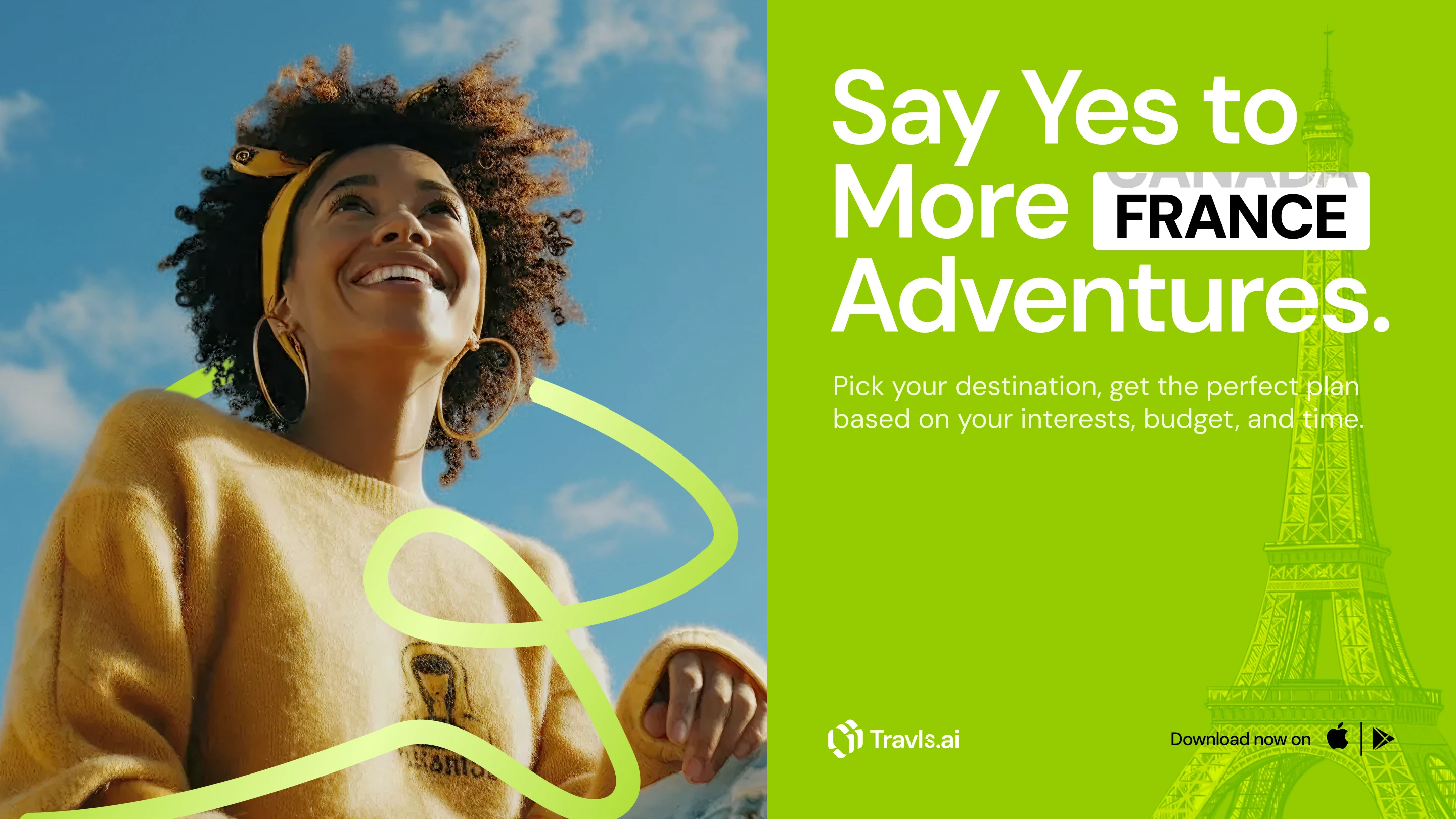
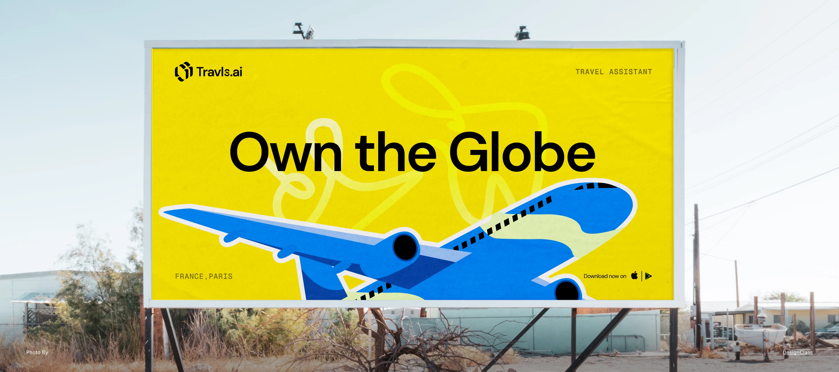
Landscape advert for France.
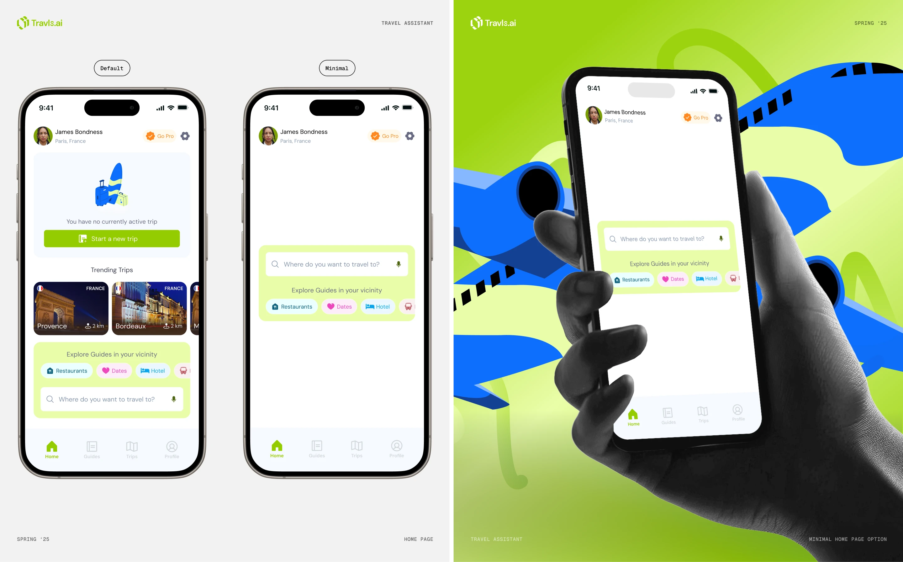
Minimal homepage layout alternative for the mobile app.
Download focused Travls social media post.
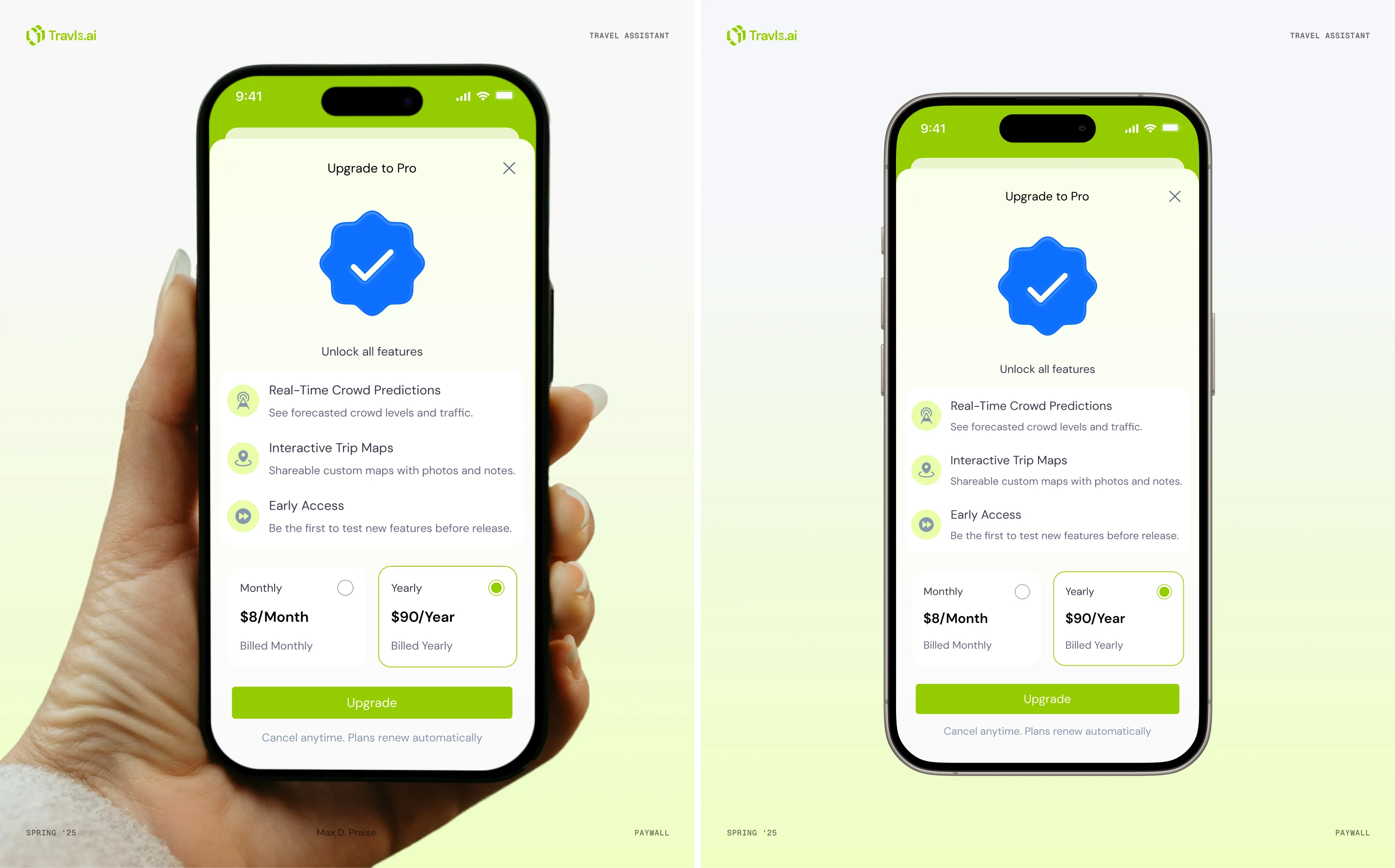
Pricing and paywall screen on the mobile app.
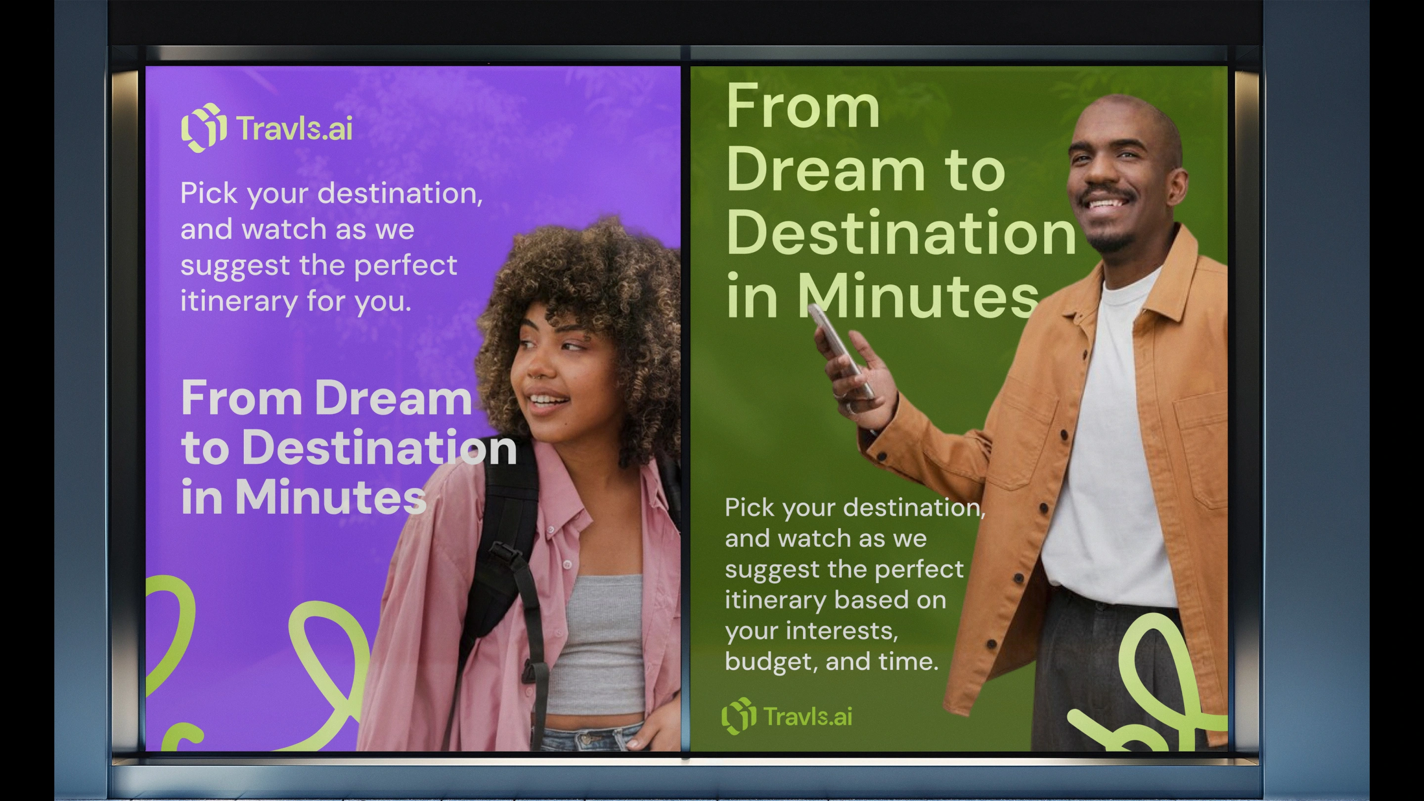
Public wayside adverts for Travls
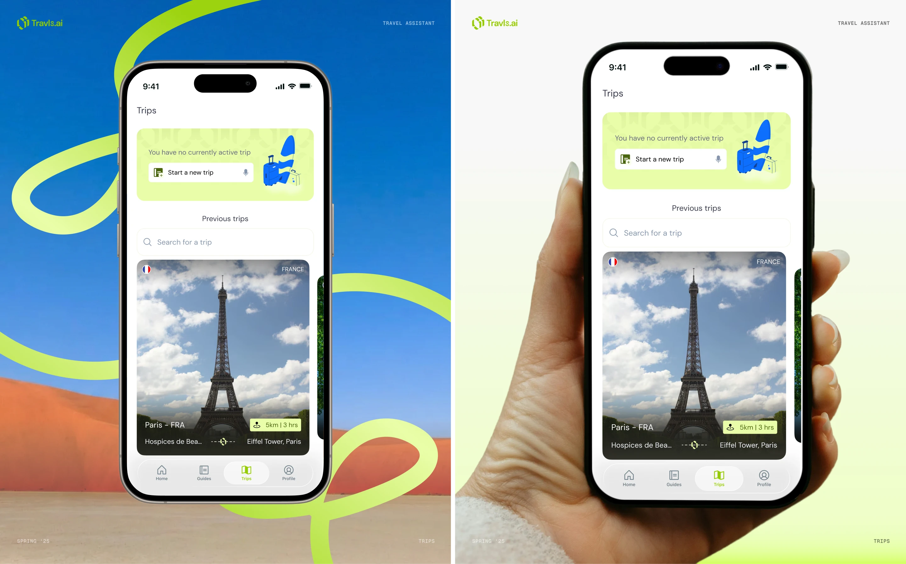
Trips screen on the mobile app
Live billboard advert.
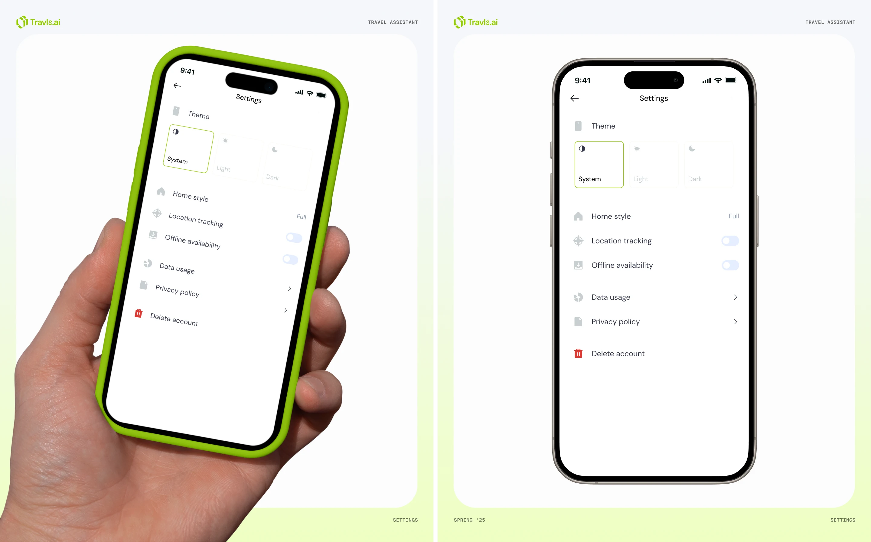
Settings screen on the mobile app
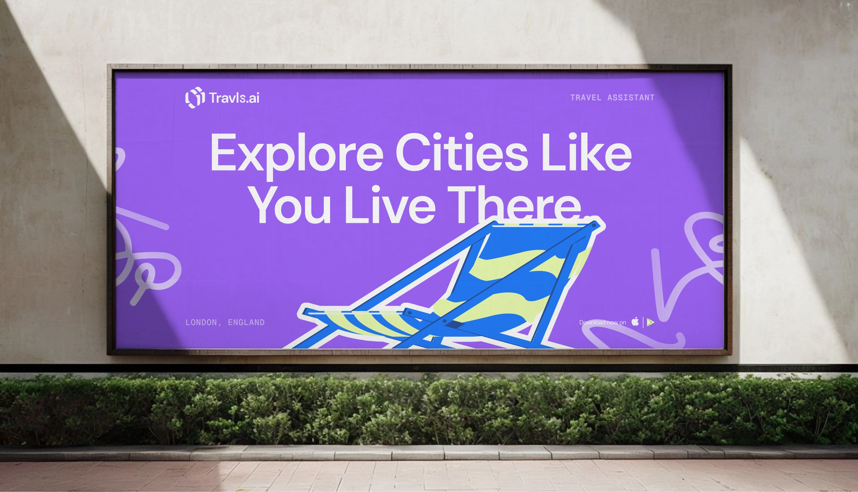
Urban billboard advert
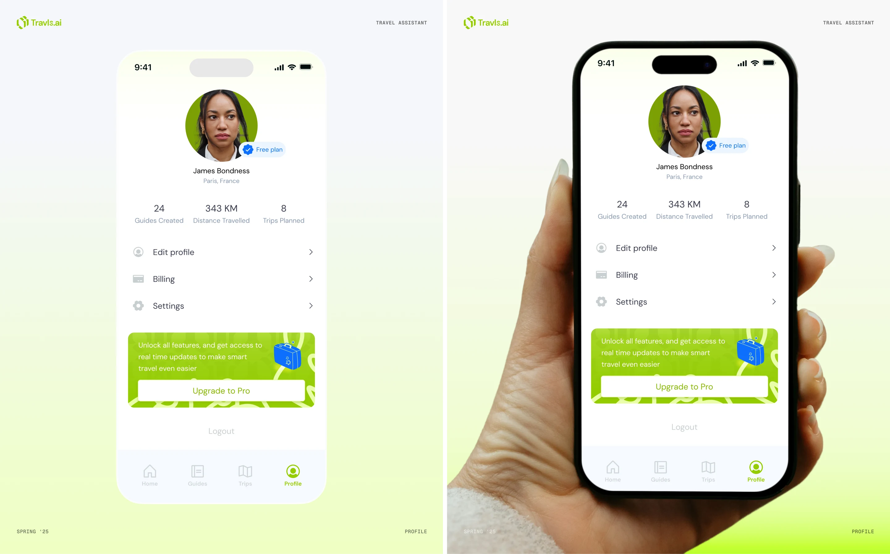
Profile screen on the mobile app
Reflection
Travls was a chance to translate real travel habits into a product that solves everyday problems. The project taught me how much clarity matters, especially when people rely on an app during trips. It reinforced the value of designing with the user’s mental load in mind and building systems that guide instead of overwhelm.
Travls as a brand allowed us to turn a complex travel routine into something simple and enjoyable.
Animated paywall showcase.
Closing thank you for reading and viewing.
Like this project
Posted Dec 12, 2025
Designed the UI/UX for Travls, a travel planning app, focusing on clarity and ease of use. The branding was created for easy recognition and association
Likes
1
Views
3
Timeline
Mar 4, 2025 - Mar 20, 2025