Mobile App Redesign | Shell Asia Mobile App
SCQA (Situation, Complication, Question, Answer)
Situation:
Complication
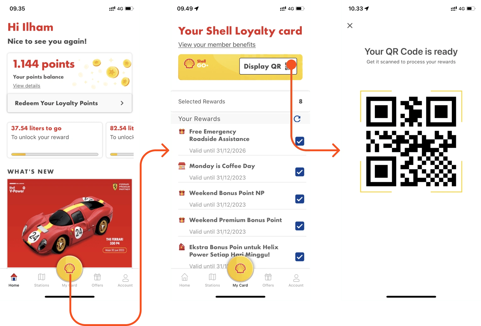
On the My Card page, there are rewards that can be selected using checkboxes. However, as a user, I do not yet understand the function or purpose of these checkboxes.
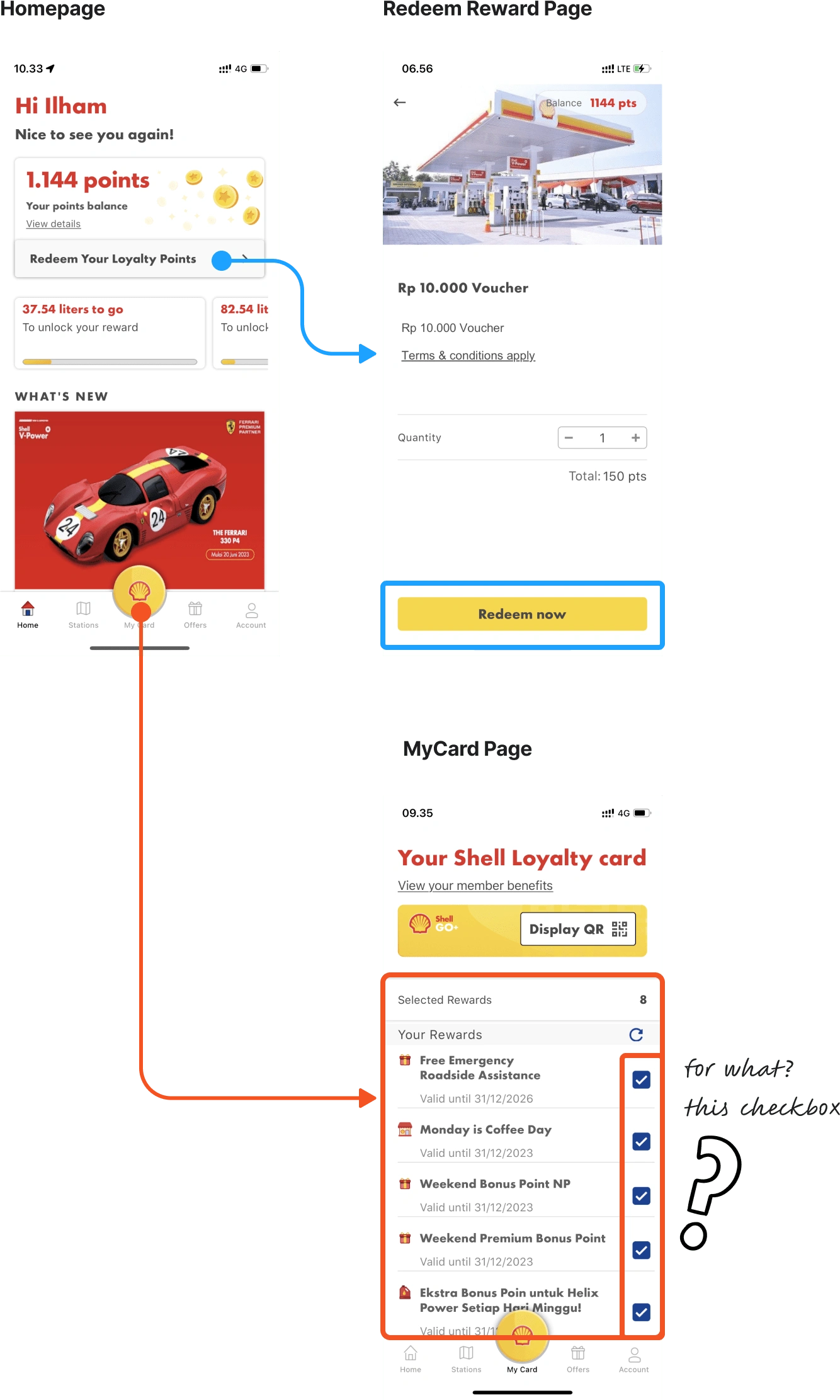
The application design used does not pay attention to the latest design principles, such as the use of intuitive design patterns, visual consistency, and modern aesthetics.
Question
HMW improves the user experience of shell apps, so users can easily show barcodes to cashiers, and delivers an app design that follows design principles
Answer:
Lets Dive In!
Design Process
To find out and be able to provide solutions based on problems experienced by other users. I did it using the thinking design method.
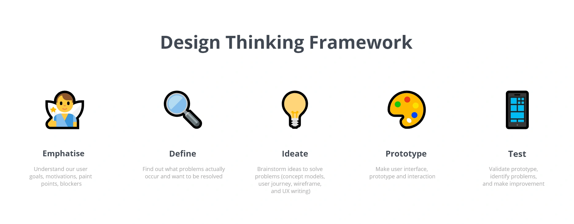
🔍 Stage 1 - Research
The first stage I did was empathize, I did it in 2 ways, namely usability testing and surveys.
I wanted to explore and deepen more problems, so I chose to conduct heuristic evaluation and qualitative research with loyal Shell customers.
Scoping
Who: Loyal Customer Users (Using more 1 years Shell Asia App)
Gender: Female/Male
Age: 24 - 46 Years
Defining Research Question
What is your experience in using the Shell application to access information related to Shell gas stations?
Have you experienced any technical problems or failures in using the Shell application? If yes, what do you do when you face this problem?
What do you think about the ease of use of Shell applications? Is the user interface intuitive and easy to understand?
Do you feel there are any features or functionality missing in the Shell app? What can be improved or added?
Conduct Research
I got 2 participants who have been using shell applications for more than 1 year.
(for participant research, the minimum should be 3 participants, but due to limited time, I continued with the insights obtained from 2 participants)
🎯 Stage 2 - Define Problem
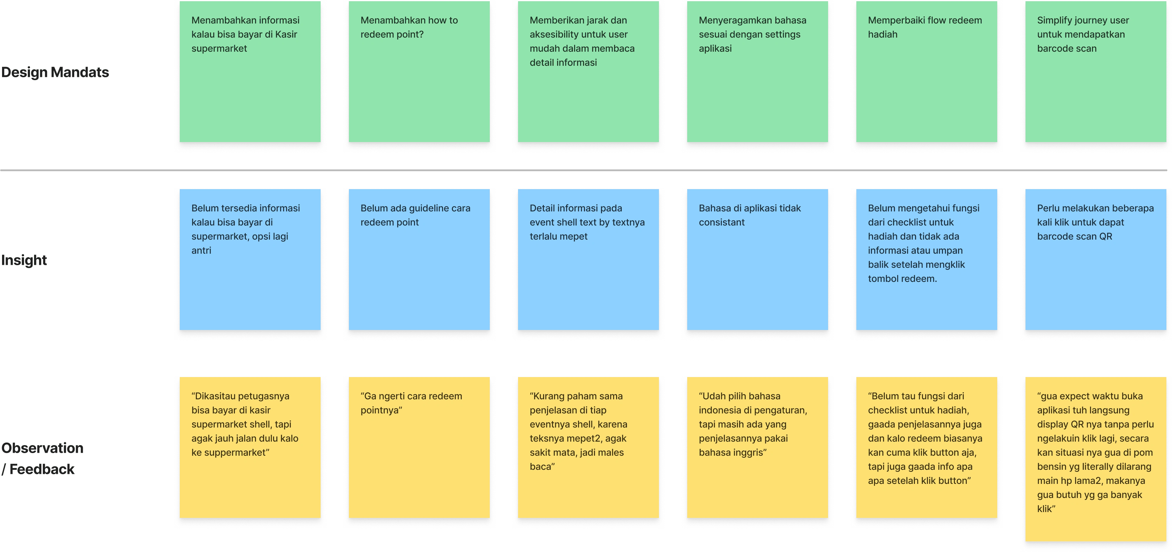
Affinity Diagram
From the results of the interview, there will be many pain points from the respondent's answers which will become the object of observation. Then the answers are classified based on their similarities.
Priority Matrics
Here I do not solve all problems, but I choose and prioritize which problems I want to solve. From the insights I got from Design Mandates:
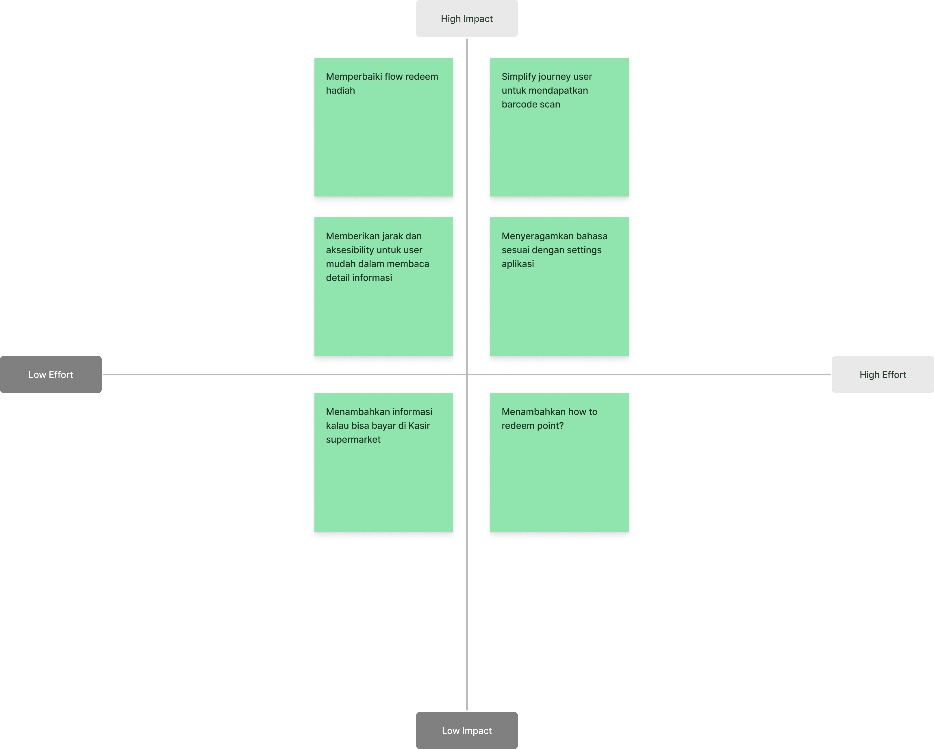
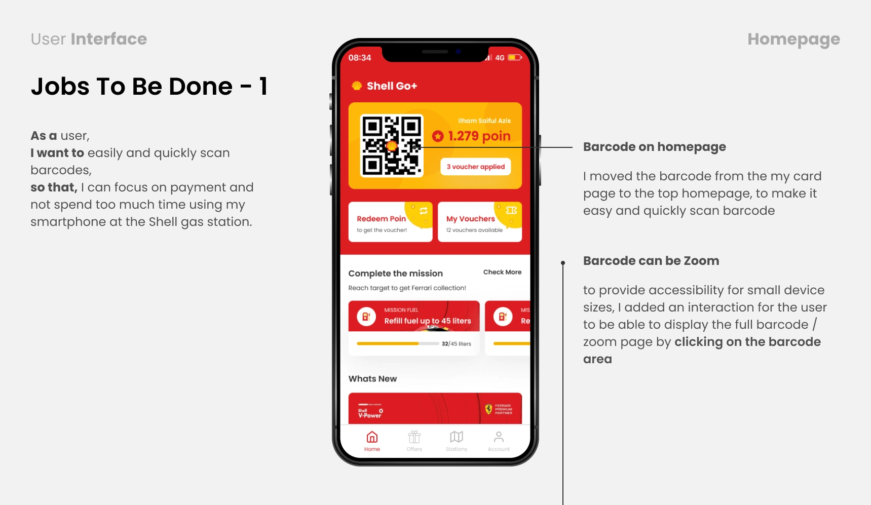
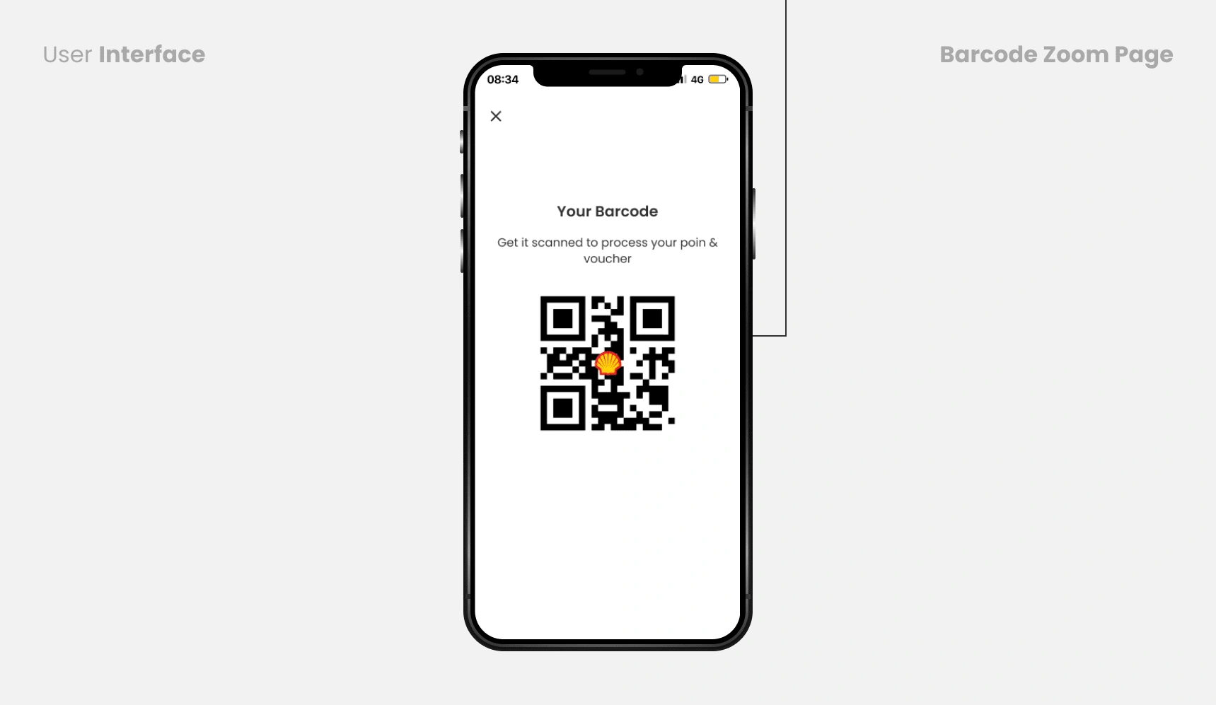
Simplify the user's journey to get a barcode scan
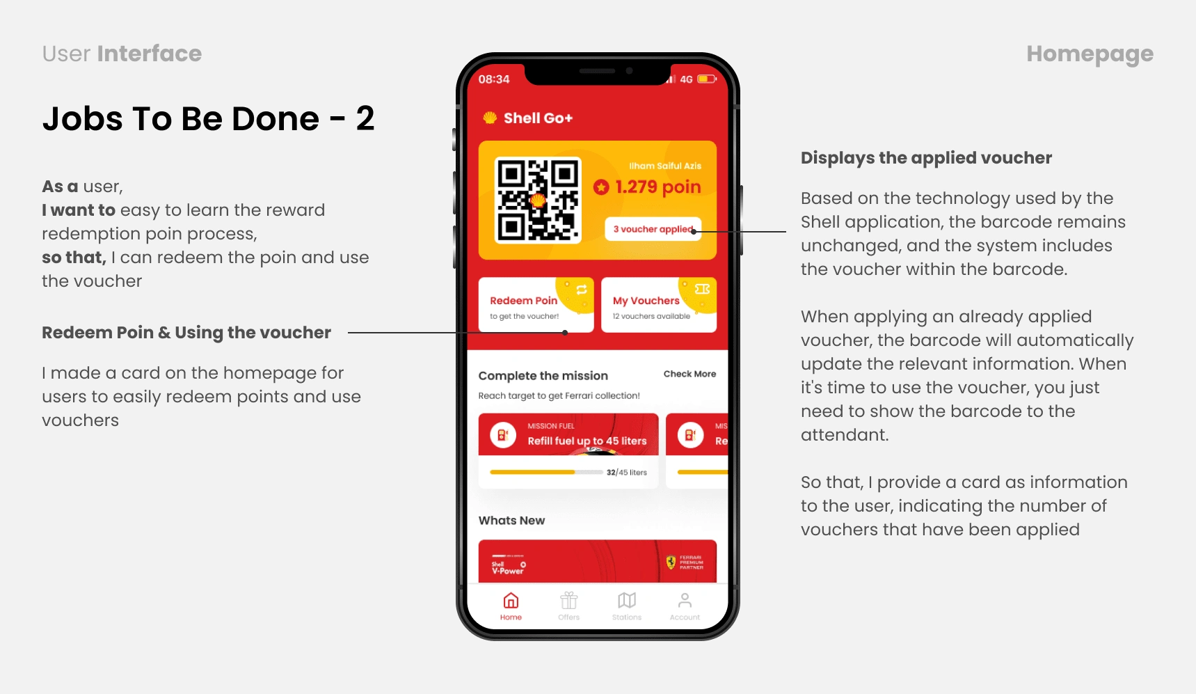
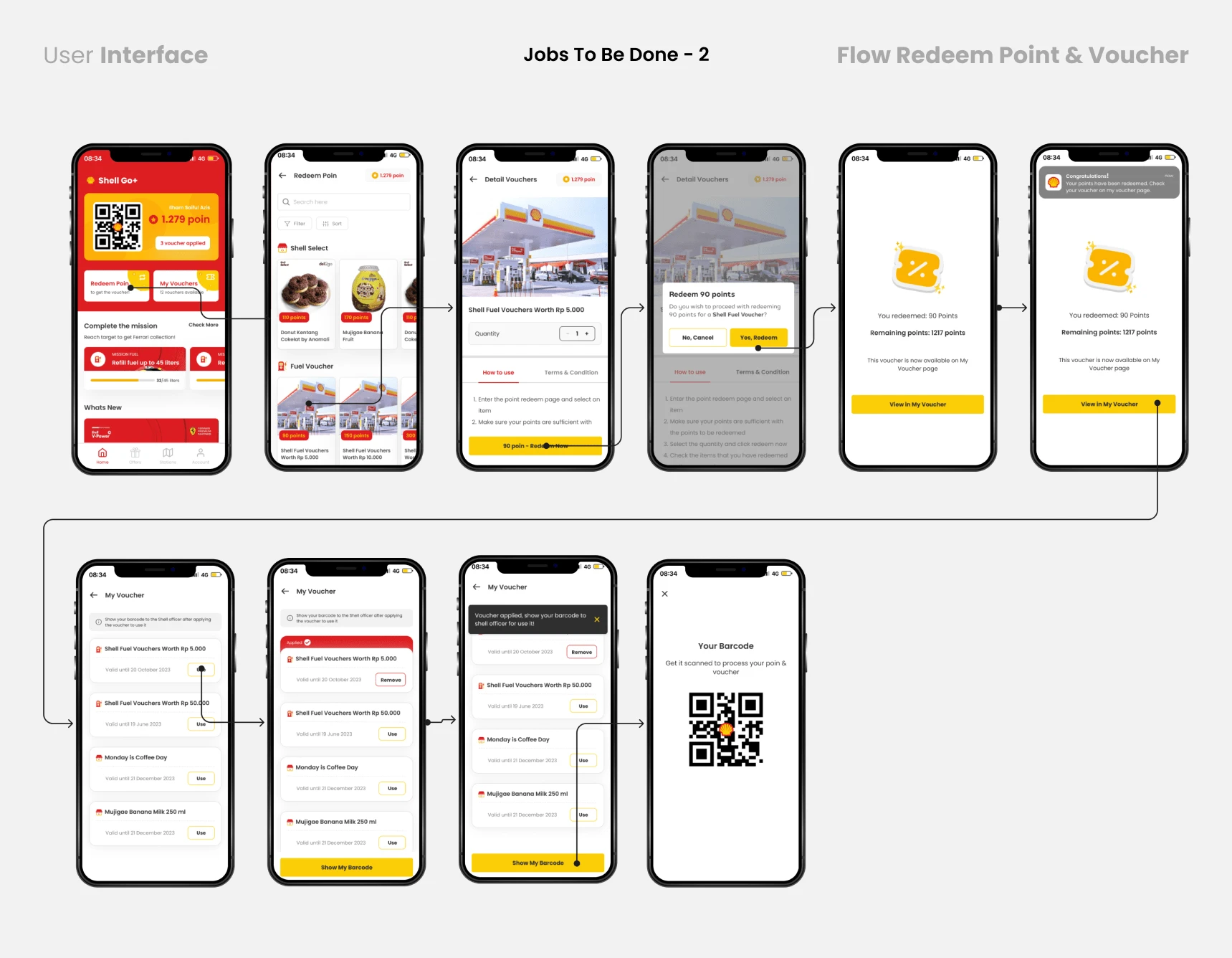
Fixed the gift redeem flow
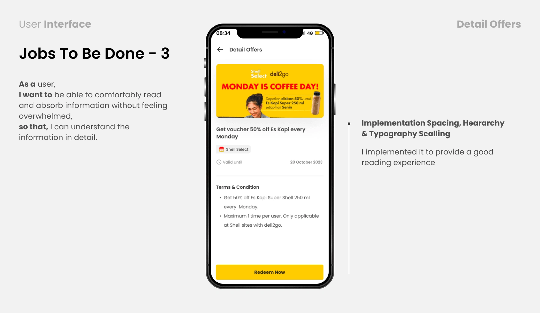
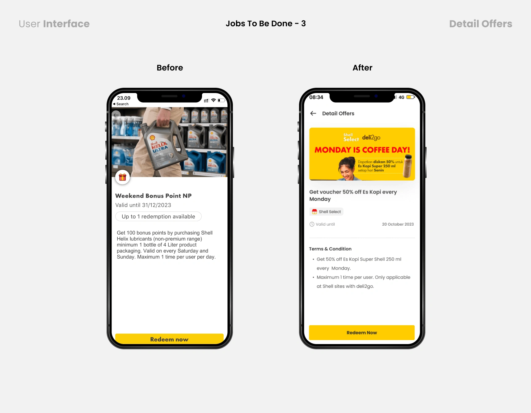
Provide distance and accessibility for users to easily read detailed information.
Heuristic Evaluation
Heuristic Evaluation is an assessment of the usability of digital products by UI/UX practitioners to improve user experience. This evaluation focuses on the Shell Asia Application.
The task is to start at the homepage, note the heuristics that are violated, and complete the task while taking a screenshot.
After noting violations of the 10 Heuristic principles by the Norman Neilsen Group:
Then I will give a severity rating: (cosmetic problem) 1 - 4 (usability catastrophe; imperative to fix)
I'll summarize the assignment, show screenshots, list the heuristics that were violated, and describe the violations and their severity.
Homepage
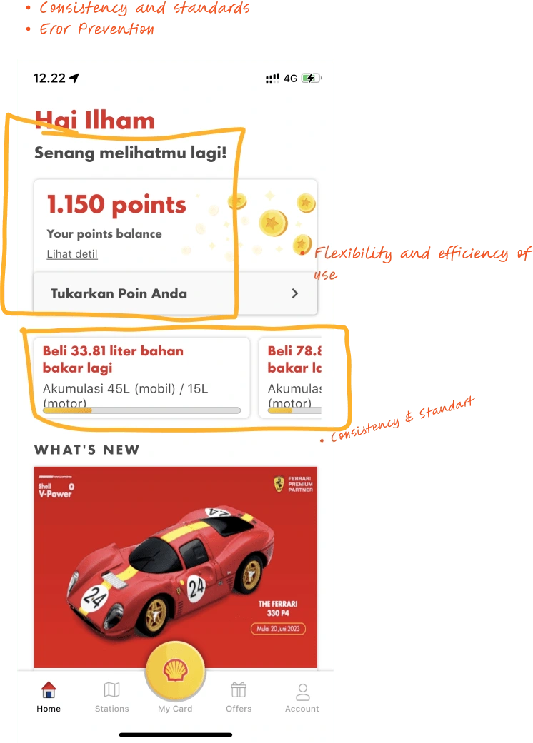
Findings:
Heuristic Violated:
Recomendation:
Sevirity Rating:
2. My Card Page
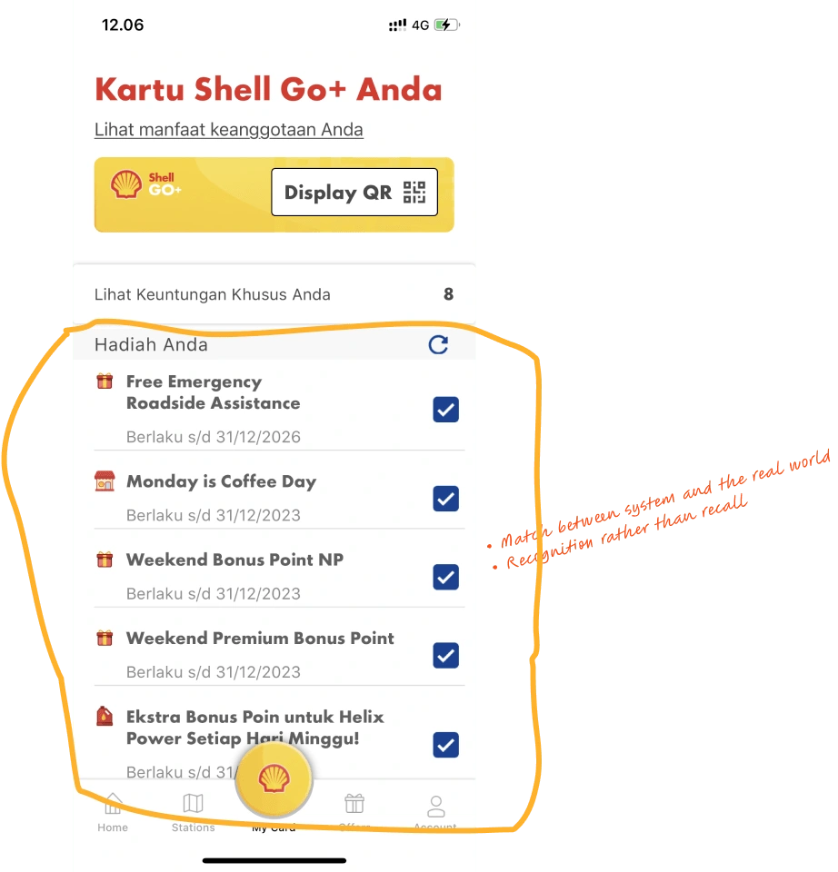
Findings:
Heuristic Violated:
Recomendation:
Sevirity Rating:
3. Redeem Poin Page
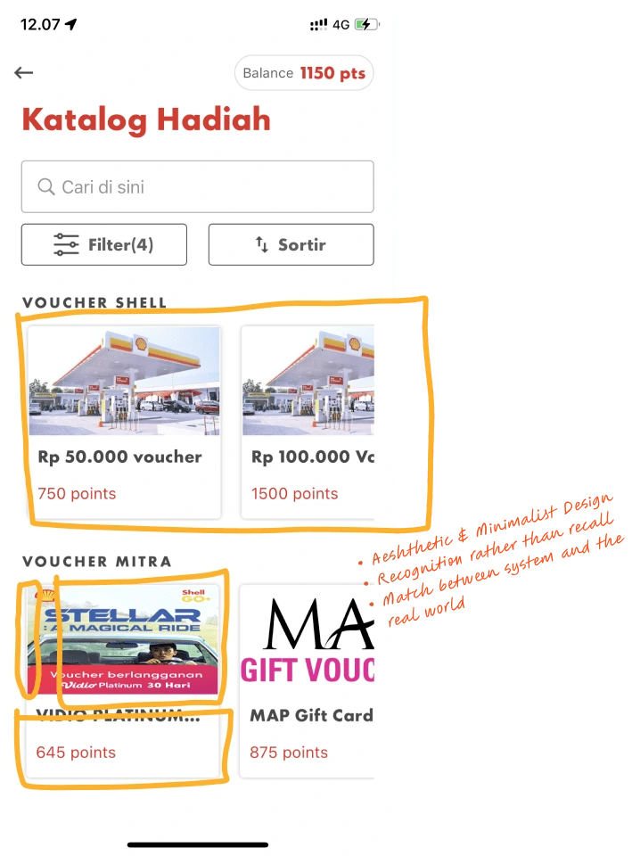
Findings:
Heuristic Violated:
Recomendation:
Sevirity Rating:
4. Detail Card Page
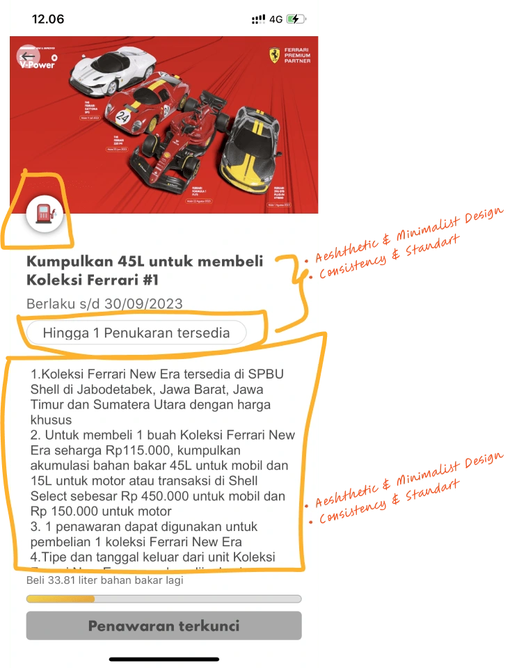
Findings:
Heuristic Violated:
Recomendation:
Sevirity Rating:
💡 Stage 3 - Ideation
Opportunity Based on Research
After several brainstorming sessions, the solution became clearer and I tried to see the big picture. I identified by using the HMW Framework:
How to simplify the user's journey to scan barcode loyalty points
How to simplify the prize redemption process
How to provide distance and accessibility to make it easier for users to read detailed information
User Stories
I also use the Jobs To Be Done framework to make statements based on user interviews to better understand their motivations, situations and results in using Shell Applications.
User Jobs & User Journey
I created a user job to help find what the user wants. I was indirectly tasked with fulfilling their expectations. The first thing to do is create user jobs to be done.
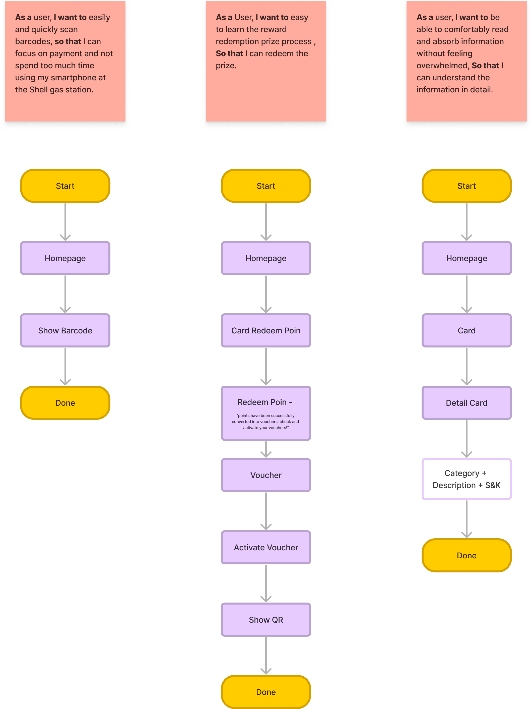
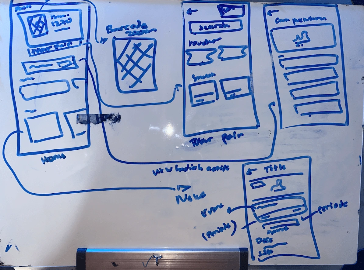
After that, I created a Lo-Fi wireframe using a whiteboard because this was the easiest and cheapest part. Wireframes will help strengthen the applications that will be created before entering the Hi-Fi design.
📱 Stage 4 - Prototype
Design System
I created a mini system design that is used to speed up workflow.

Once the wireframe phase was complete, I moved on to creating the HiFi version.
High Fidelity
Like this project
Posted Sep 6, 2023
HMW improves the user experience of shell apps, so users can easily show barcodes to cashiers

