Virtual Office & Meeting Management SaaS Design

Umair Shakeel


Virtual Office & Meeting Management SaaS | Product Design & UI/UX
A modern B2B SaaS workspace designed to help distributed teams schedule meetings, manage virtual rooms, track activity, monitor workspace usage, and collaborate from one centralized product experience.
Overview
Remote and hybrid teams often rely on multiple tools to manage meetings, calendars, team availability, virtual rooms, workspace activity, and account information.
This product brings those workflows together into a single virtual office and meeting management SaaS platform.
I designed the product experience around two priorities:
Make meeting activity immediately understandable
Give users one place to manage daily collaboration without jumping between disconnected tools
The result is a scalable SaaS interface combining meeting scheduling, live sessions, upcoming meetings, virtual rooms, team presence, calendar management, workspace analytics, and account activity.
The Challenge
Meeting-heavy products can quickly become difficult to navigate when live sessions, upcoming calls, completed meetings, rooms, schedules, members, and workspace data all compete for attention.
The key UX challenges were:
Separating live, upcoming, and completed meetings clearly
Making meeting status visible without opening every event
Giving users fast access to scheduling and room actions
Showing important workspace information without overwhelming the dashboard
Supporting repeated meeting workflows through consistent components
Keeping team presence visible while preserving screen space
Creating a SaaS structure that could scale as more collaboration features are added
The Design Approach
Rather than treating every feature as an independent screen, I designed the experience around the user's daily workflow.
01. Clear Information Architecture
Meetings, dashboard activity, rooms, calendar, members, and account tools were organized into predictable navigation patterns.
The goal was to reduce cognitive load and make high-frequency actions easy to locate.
02. Status-Driven UI
Live, upcoming, confirmed, offline, and completed states use clear visual indicators so users can understand meeting status before interacting with a card.
03. Reusable SaaS Components
Meeting cards, avatars, status badges, analytics widgets, room cards, calendar elements, buttons, and navigation patterns were designed as reusable components suitable for a scalable Figma design system.
04. Action-Oriented Dashboard
The dashboard prioritizes what users need to do next:
Review activity → check upcoming meetings → join or create a room → manage the schedule
This keeps the product focused on task completion rather than simply displaying data.
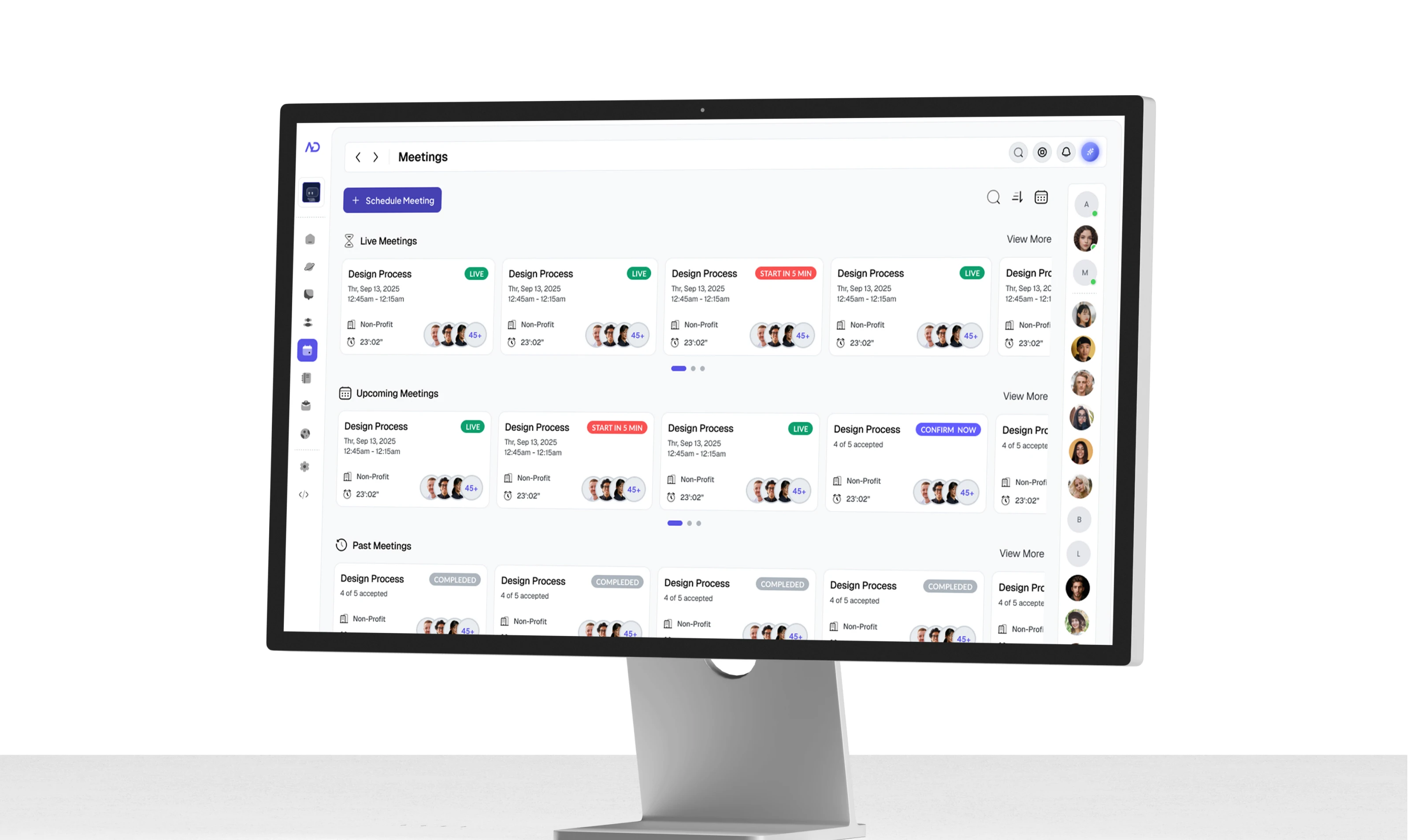
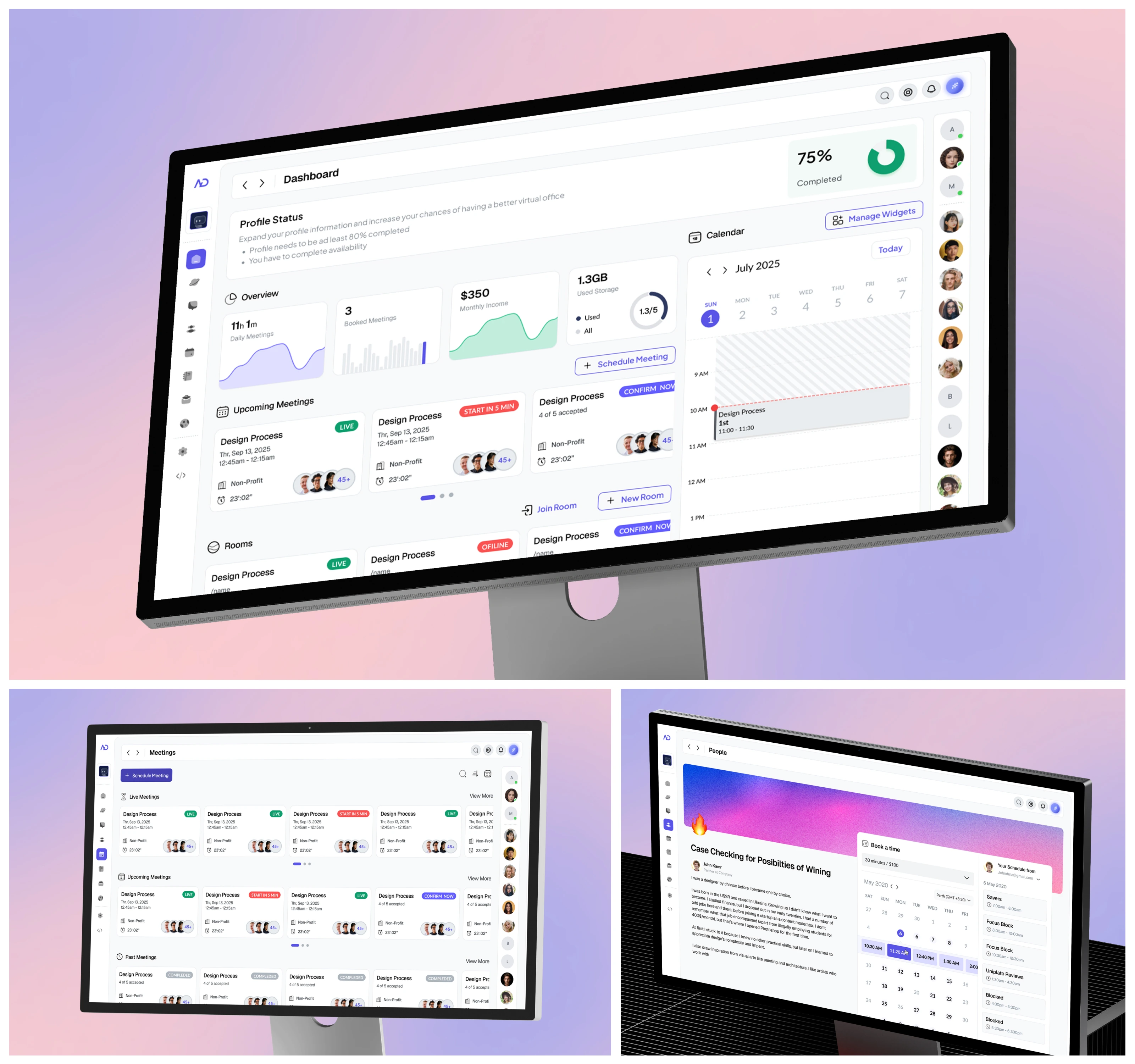
Meeting Management Dashboard | Scheduling & Virtual Collaboration
Problem
Users needed a faster way to understand what was happening across their workspace without opening individual meetings or switching between multiple calendar and communication tools.
Live sessions, future meetings, and completed activity needed to remain visually distinct while still feeling part of one connected workflow.
Solution
I designed a centralized meeting management interface that separates activity into:
Live Meetings
Upcoming Meetings
Past Meetings
Each meeting card surfaces the information users need before joining:
Meeting title
Date and time
Organization or workspace
Participant avatars
Meeting capacity
Status
Confirmation state
High-priority actions such as Schedule Meeting remain immediately accessible, while a persistent member panel provides visibility into team presence.
The card-based system also creates a flexible foundation for future meeting filters, search, recurring sessions, invitations, and team management features.
UX Outcome
The screen reduces the amount of navigation required to understand meeting activity and creates a clear meeting lifecycle:
Schedule → Confirm → Join → Complete → Review
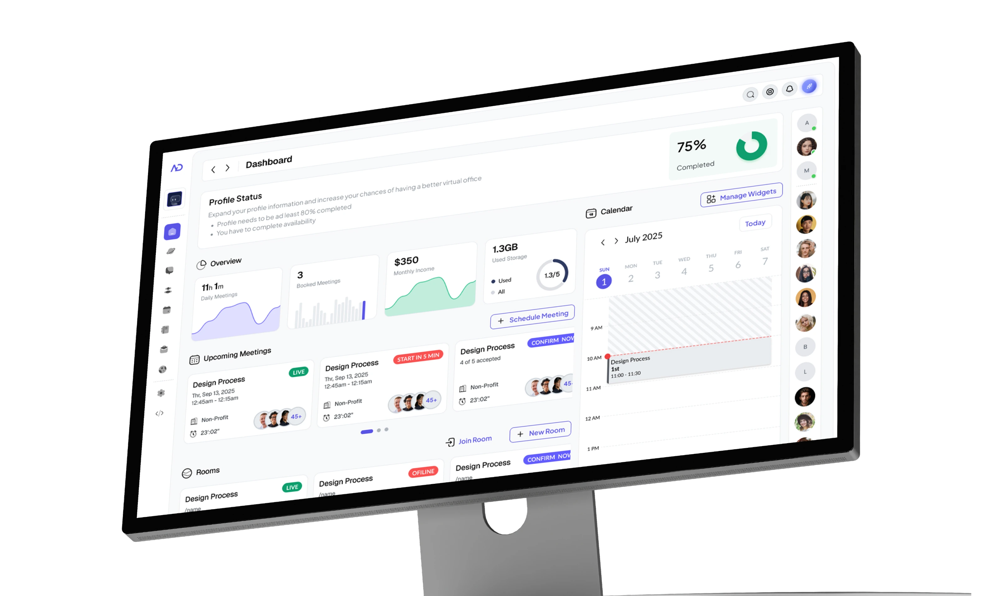
B2B SaaS Dashboard | Virtual Office & Workspace Management
Problem
Users needed a single overview of their daily workspace activity, but displaying meetings, account status, revenue, storage, rooms, members, and calendar information together could easily create an overloaded dashboard.
The challenge was deciding what deserves immediate attention and what should remain secondary.
Solution
I designed a modular SaaS dashboard that combines operational information with high-frequency actions.
The dashboard includes:
Profile completion status
Daily meeting activity
Booked meetings
Monthly income
Workspace storage usage
Upcoming meetings
Calendar and schedule
Virtual rooms
Join Room action
Create New Room action
Team member presence
The layout uses clear hierarchy and modular dashboard widgets so users can scan key information quickly without losing access to detailed workflows.
The calendar remains visible alongside meeting activity, helping users connect upcoming events with their daily schedule instead of treating them as separate systems.
UX Outcome
The dashboard creates a clear operational command center for the virtual workspace:
Monitor → Schedule → Join → Collaborate → Manage
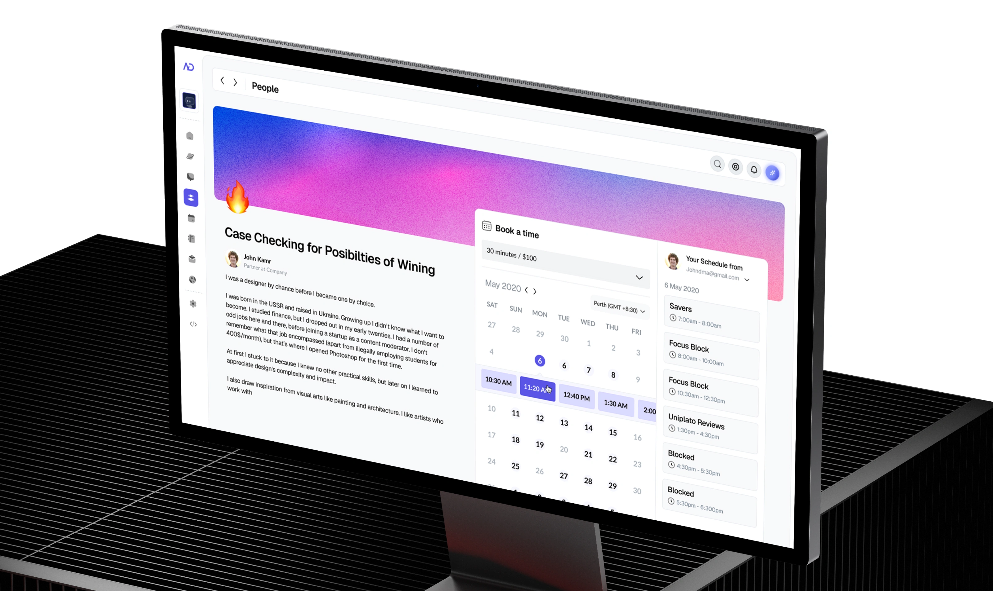
Expert Profile & Meeting Booking | SaaS Scheduling UX
Problem
Users needed a simple way to discover people inside the workspace, understand their background, and book time with them without leaving the platform or moving between a profile page and a separate scheduling tool.
The challenge was combining personal profile content, availability, meeting duration, pricing, time zones, and calendar scheduling in one experience without making the screen feel overloaded.
Solution
I designed a unified People Profile and Meeting Booking experience that connects professional discovery with scheduling.
The screen includes:
Expert / team member profile
Bio and background information
Meeting duration and pricing
Calendar availability
Available time slots
Time zone selection
Personal schedule visibility
Blocked and focus-time states
Direct booking workflow
The layout keeps profile context on the left while the booking interaction stays immediately accessible on the right, helping users move naturally from:
Discover → Evaluate → Check Availability → Select Time → Book
UX Outcome
The experience reduces friction between discovering the right person and scheduling a meeting with them. Instead of treating profiles and calendars as separate workflows, both are connected inside one focused SaaS interaction.
This also expands the platform beyond meeting management into a broader professional networking, expert booking, team collaboration, and virtual workspace experience.

User Interface Design User Experience (UX) Design Interaction Design UI UX Web Design Mobile App Design Wireframing UX Prototyping Usability Testing Design Expert Information Architecture App Design SaaS Platform Design User-Centered Design Presentation Design Visual Design Adobe Suite Photoshop Illustrator Figma Graphics Graphic Design Creative Design Human-Centered Design Material Design Desktop Design iPhone IOS App Design Usability Analysis Website Design Logo Creation Responsive Design Adaptive Design Responsive Design Website Prototyping Wireframe Creation Design Solutions Long-Term Collaboration Effective Design Experienced Team Sketch Advertising Branding Identity Design Design Thinking User Research User Persona User Flow User Interface (UI) Elements A/B Testing User Feedback Accessibility User Journey Mobile Responsiveness UI Patterns Design Thinking Color Theory Typography User Engagement UI/UX Optimization
Like this project
Posted Aug 17, 2026
Designed a centralized SaaS platform for virtual office and meeting management.