
Brief
Flare Ecom is a US e-commerce growth company. They needed an identity as sharp and fast as the growth work they sell.



Approach
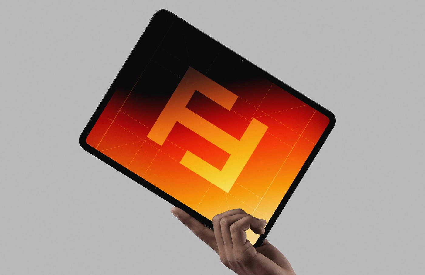
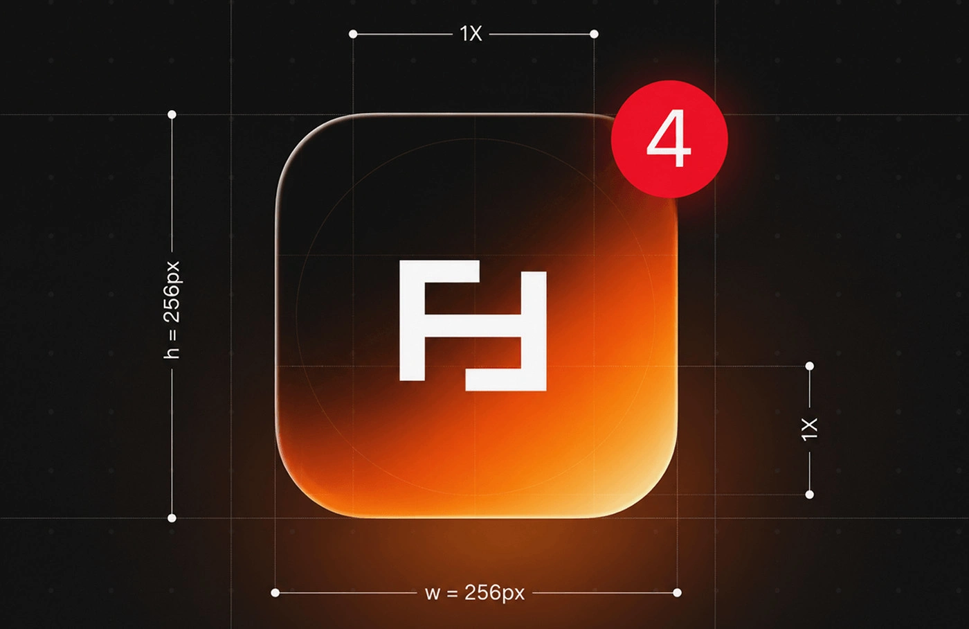
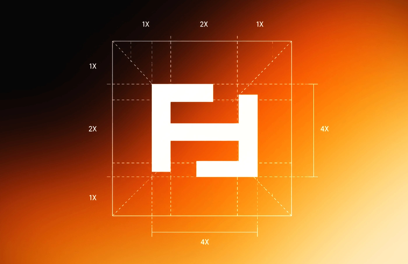
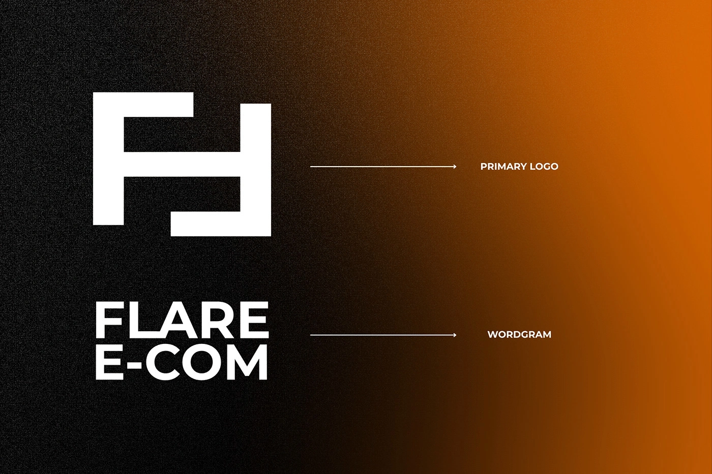
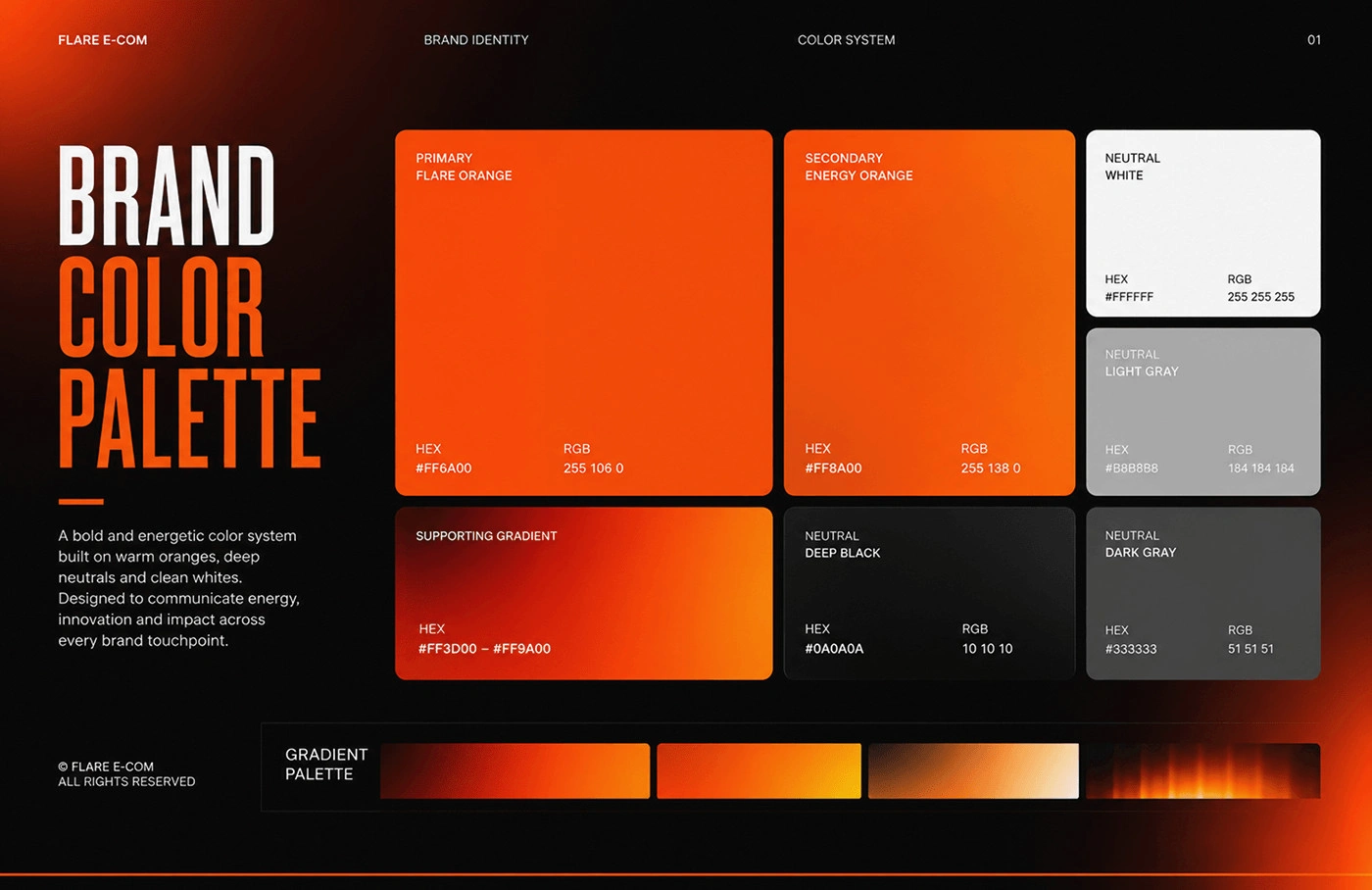
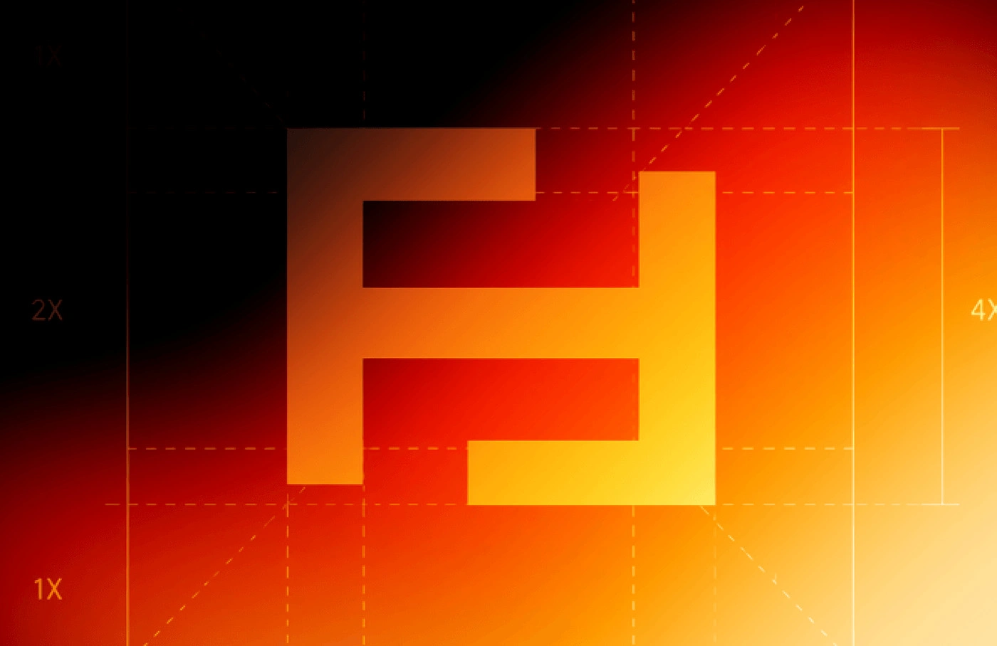
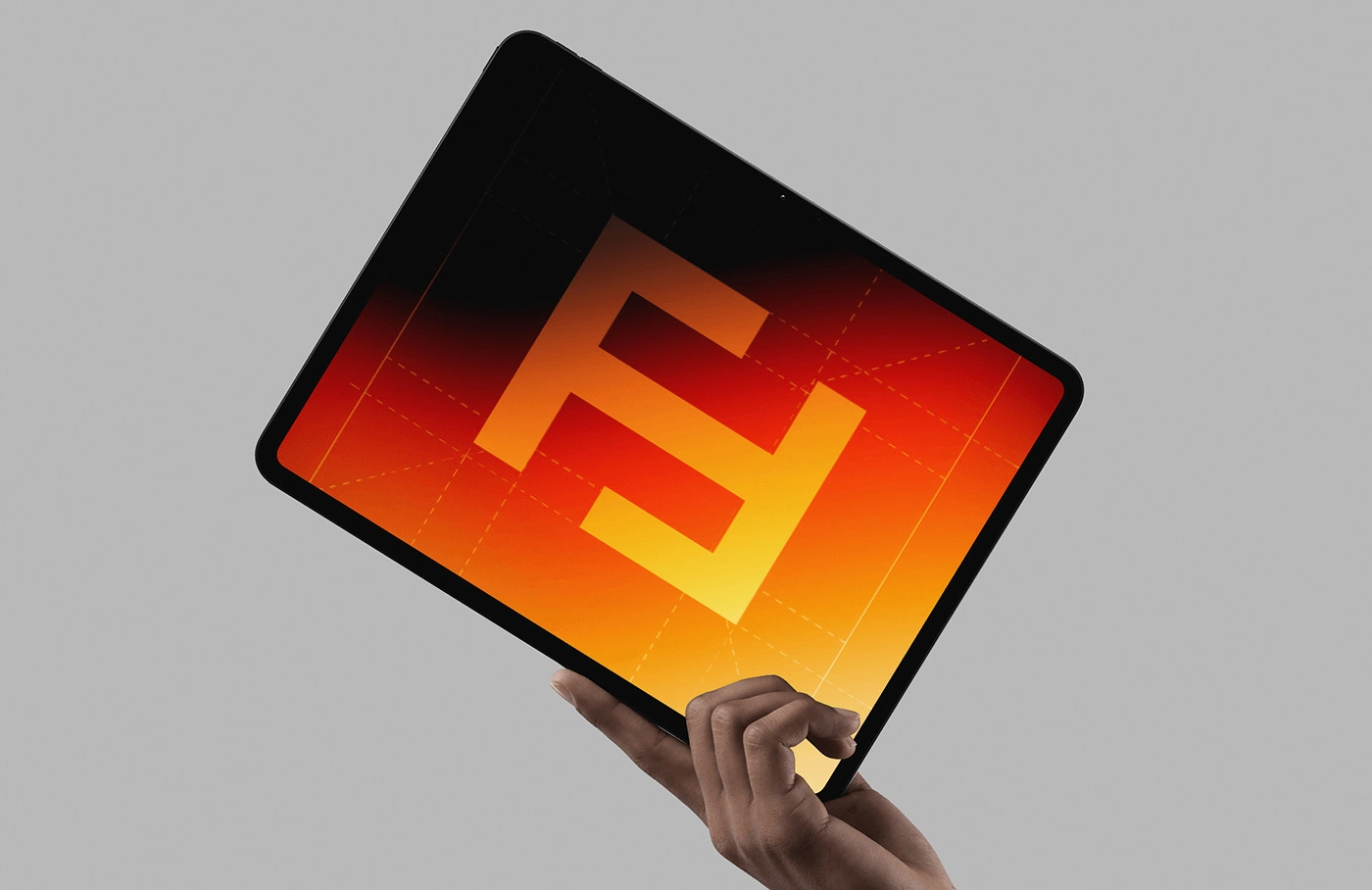
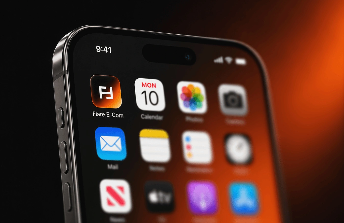
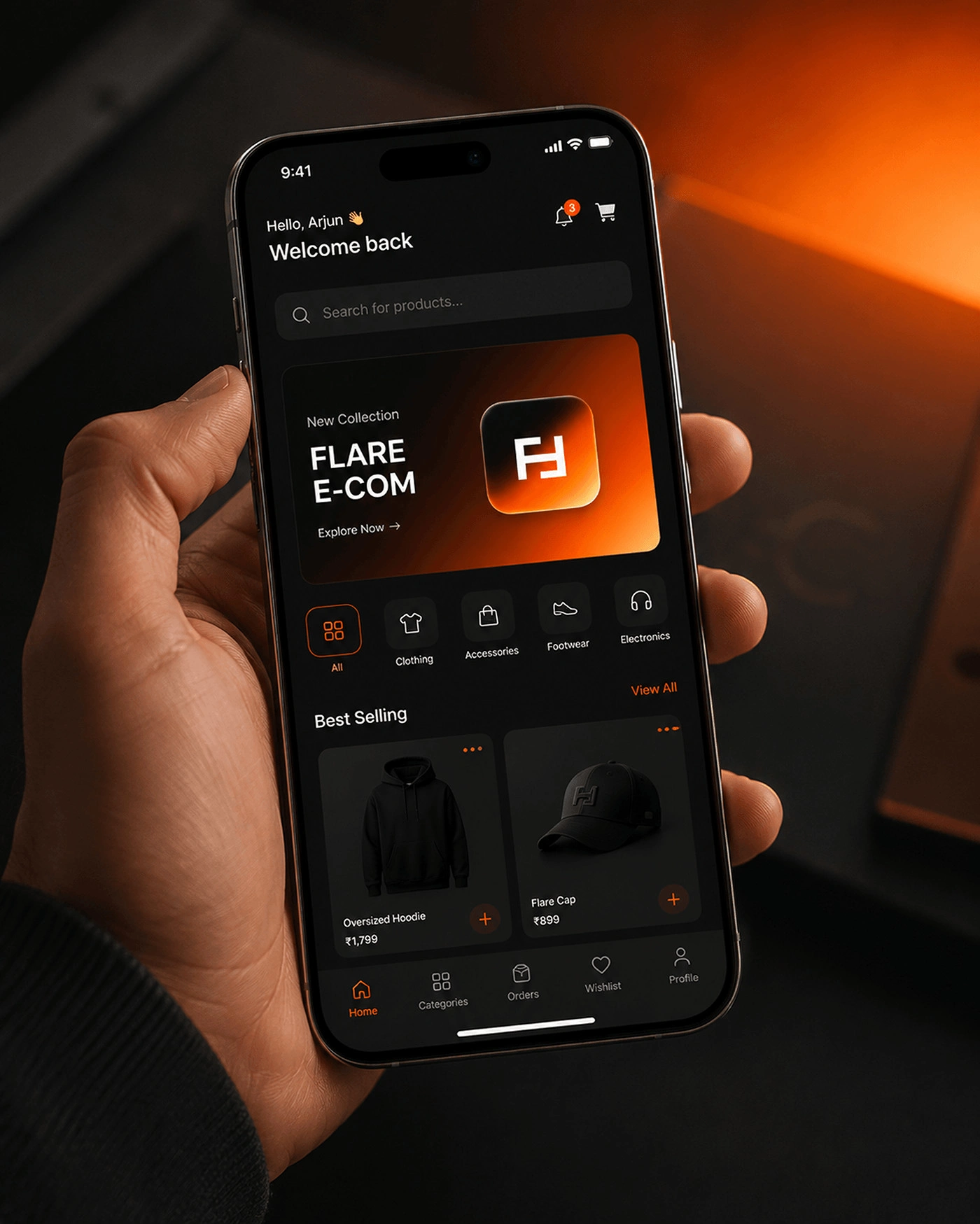
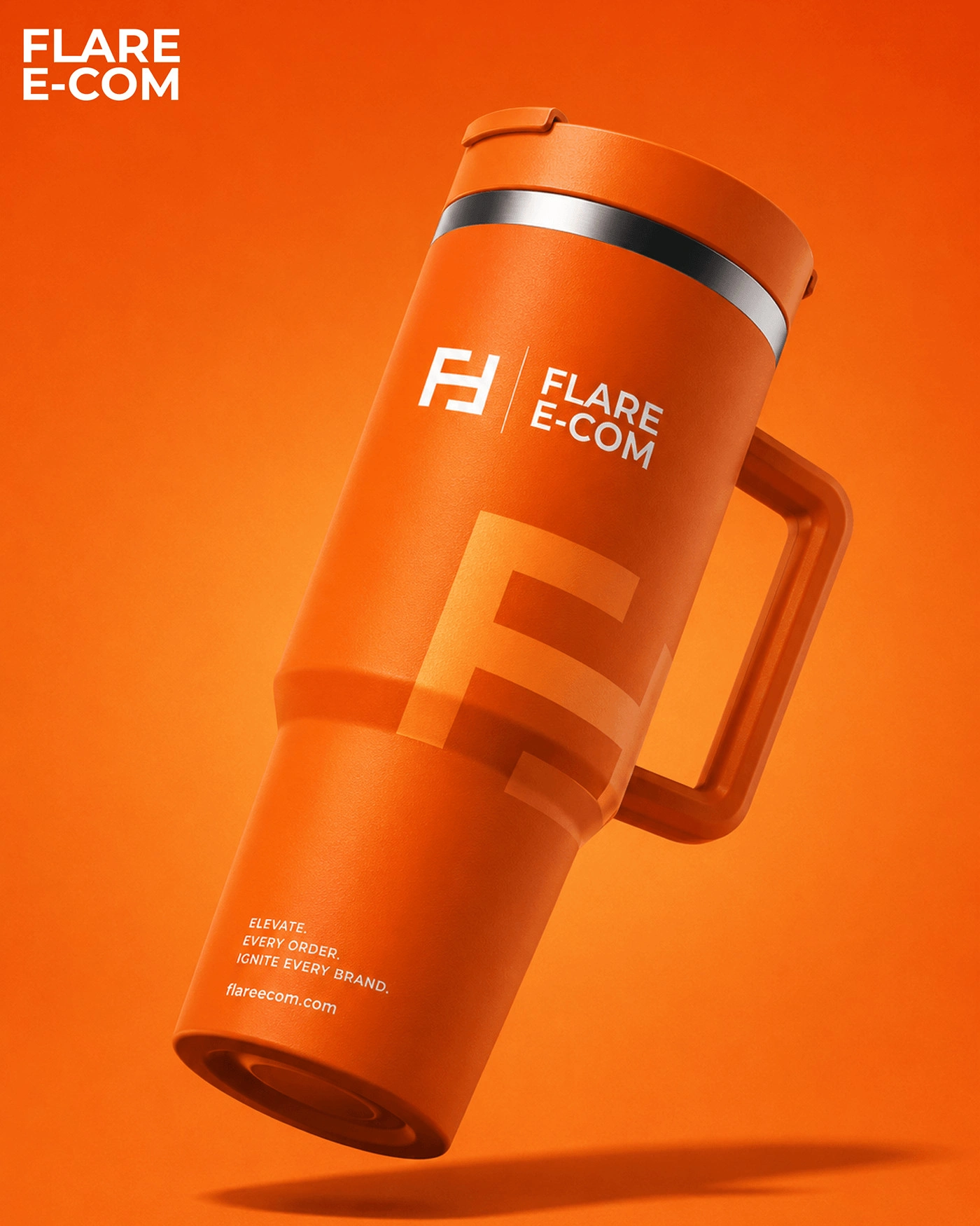
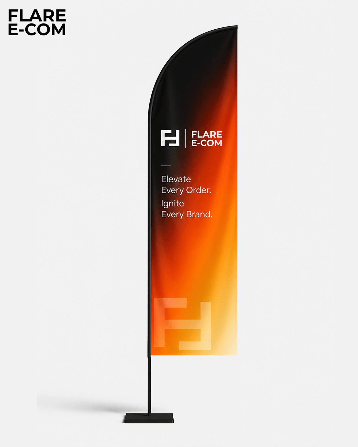
I kept the system minimal: an F monogram made of two mirrored strokes that also read as E, built for speed and scale and sized to work as an app icon, a tight type pairing, and a palette that holds up across dashboards, decks and the website. Every element was designed digital-first.





Outcome
Logo, visual system and digital presence across web, decks and social.
0 likes · 2 views · Sep 29, 2026
Identity for Flare Ecom, a US e-commerce growth company. Sharp and minimal, built for speed and scale, from the mark to its digital presence.

